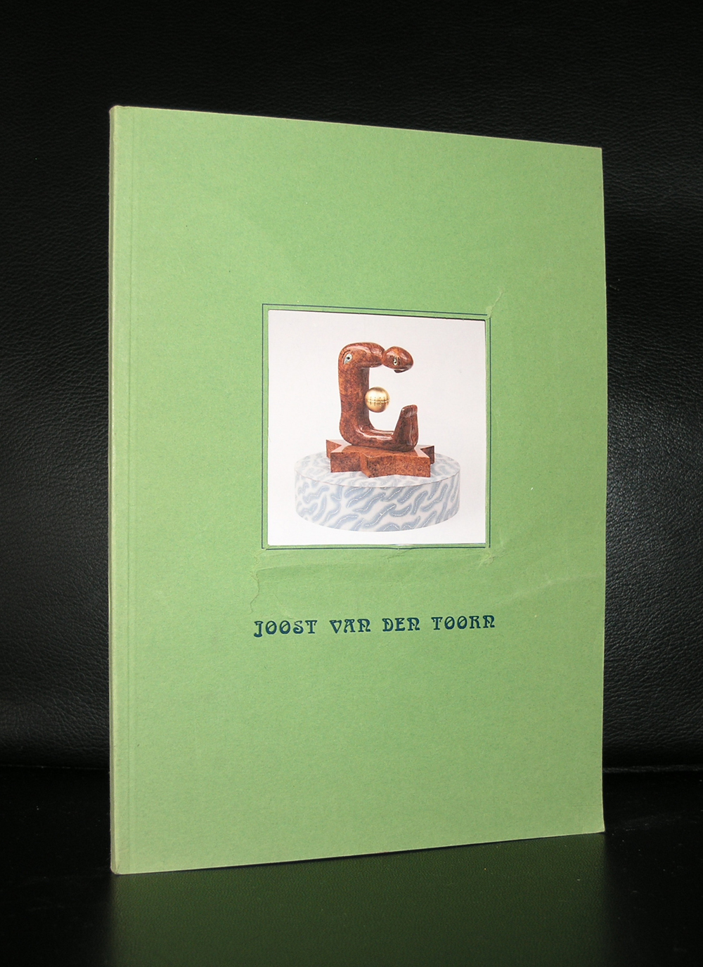
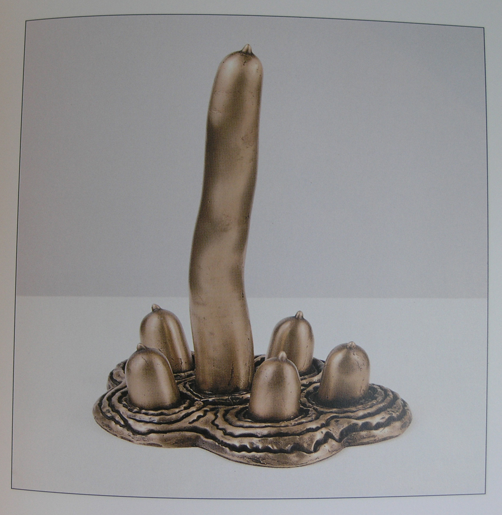
Joost van den Toorn…an artist i literally stumbled upon when we visited Kasteel Het Nijenhuis. At the entrance there was at that time a small statue by van den Toorn a statue which i overlooked and did not see……..so i stumbled upon it and made half a fall. Now that i have received an invititation for the presentation at Galerie Jacoba Wijk i remembered what happened. Van den Toorn a recognizable artist who’s works have a lot of humor within them is an excellent excuse to visit the gallery in Groningen. The exhibition is until the 29th of January, but you can also find his publications in my store. www.ftn-books.com
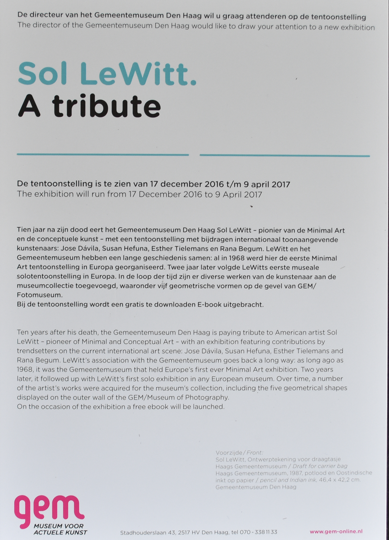
Yesterday, i received an invitation for the opening on the 17th of december 2016 of a Tribute exhibition on Sol LeWitt. There is a long lasting relation between the Gemeentemuseum Den Haag and Sol LeWitt, which collaboration first resulted in the very first European Minimal art exhibition in Europe and later the wall sculptures on the Schamhart wing some 20 years ago. In between exhibitions were held , including his drawings exhibition and of course he made several wall drawings on location.
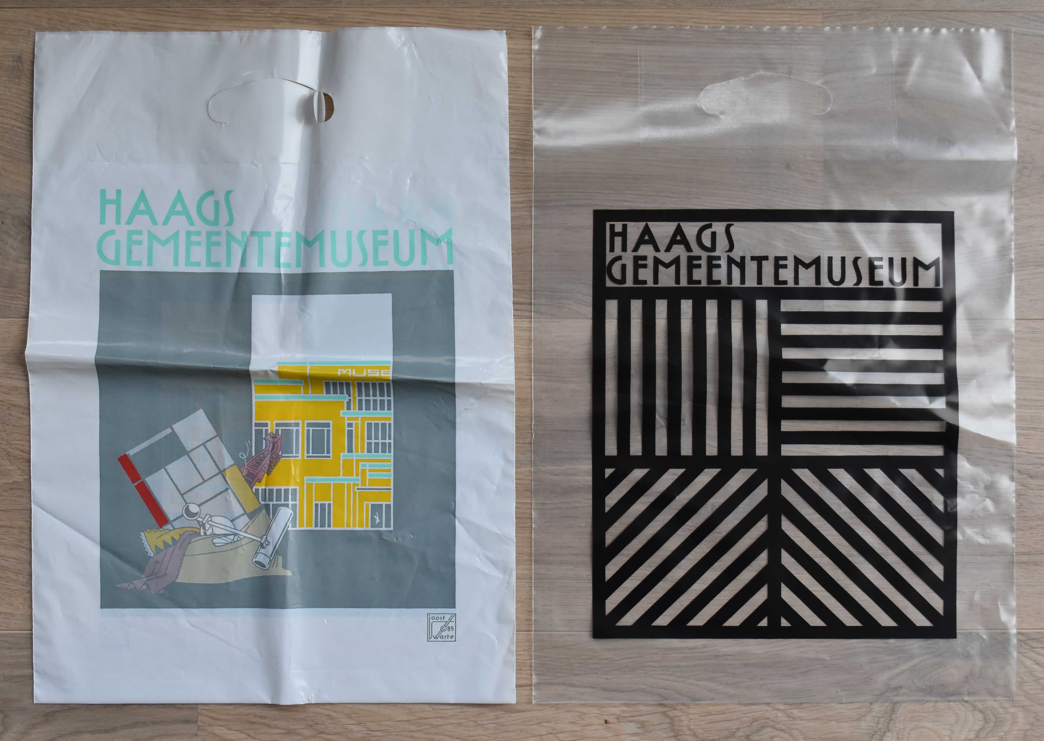
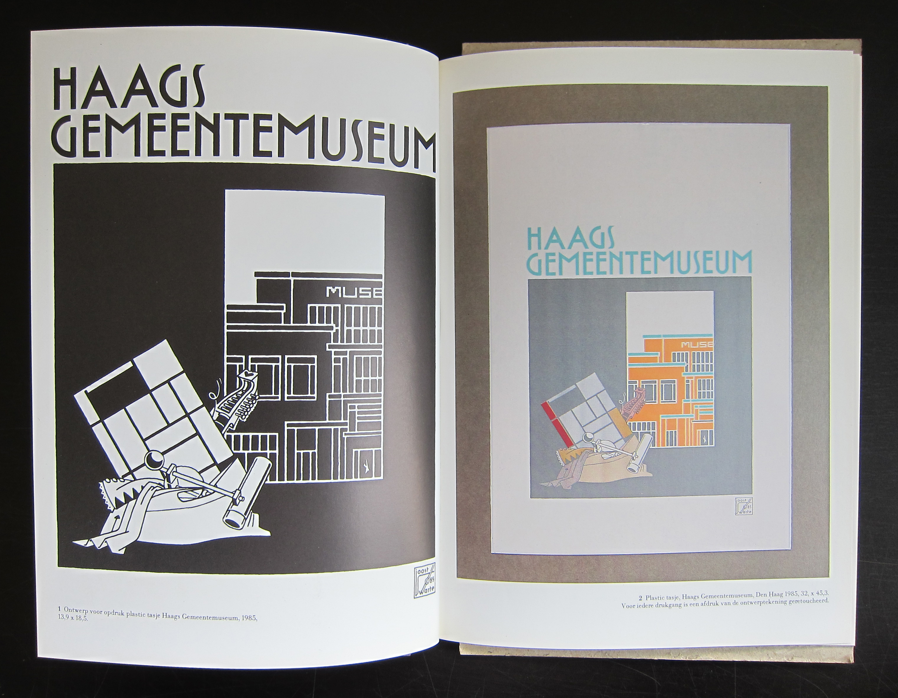
Because of this relation, Sol Lewitt was invited in 1987 to design one of the plastic bags which was used in the shop of the Gemeentemuseum. Sol designed 2 bags, one in color and one in black on transparent polyethyleen. 2 excellent designs and both were executed and used for a couple of years in the shop. Now the black drawing is used for the invitation of the tribute exhibition. What people forget is that the typography is not done by Sol LeWitt , but it was “borrowed” from an earlier bag designed by Joost Swarte, who designed a plastic bag, including the typography, with the different collection parts in mind. This lettering was used for 100% by Sol for his own designs. So the main part is done by LeWitt but the typography was done by Joost Swarte in his very recognizable lettering. A beautiful bag was the result and only a few copies of this bag remain available for sale at www.ftn-books.com
Exhibition Sol LeWitt a Tribute opens on the 17th of december and runs until the 9th of april, 2017
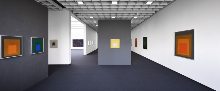
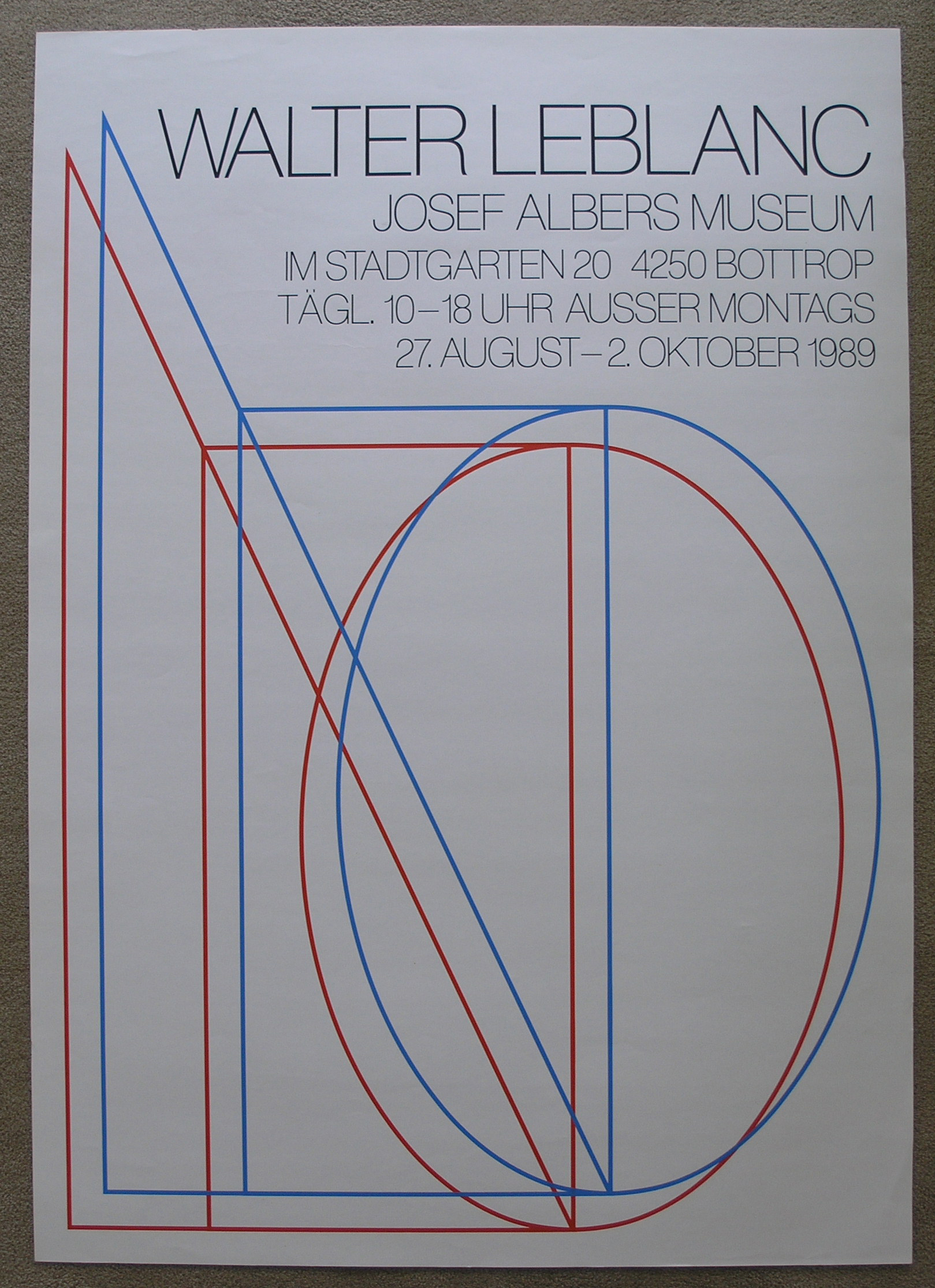
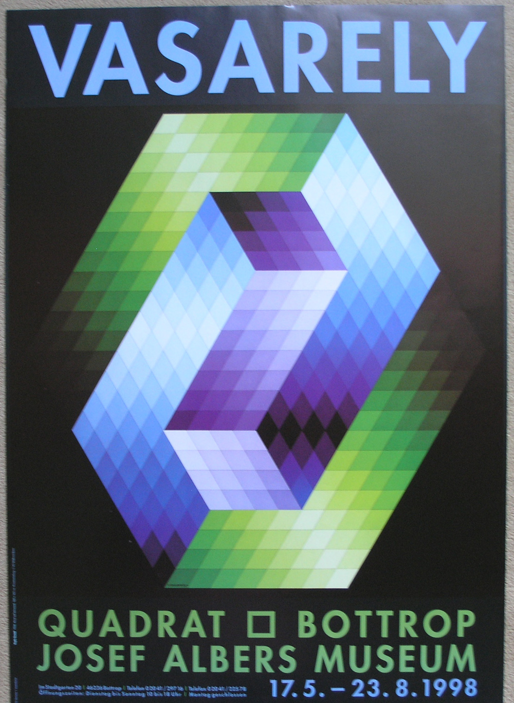
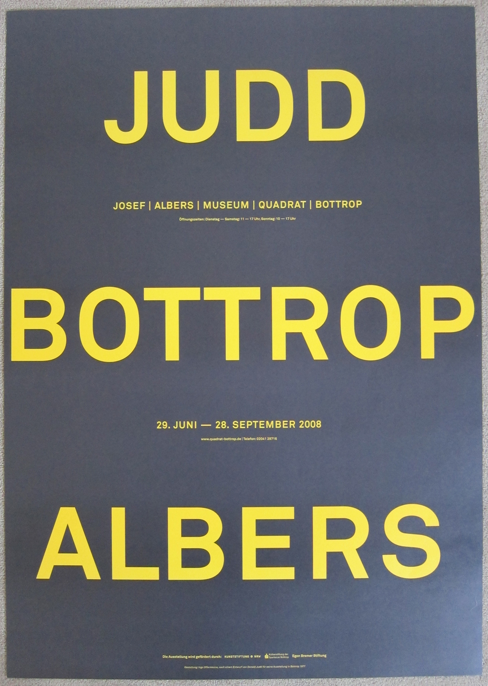
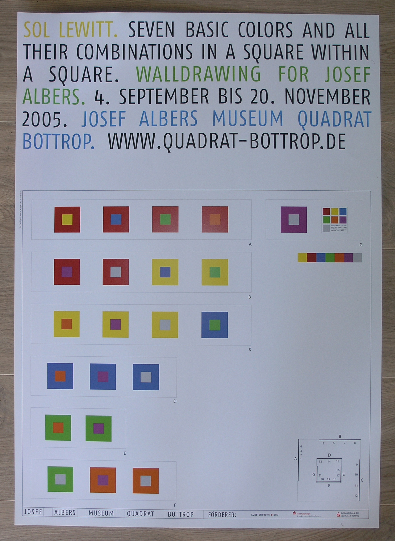
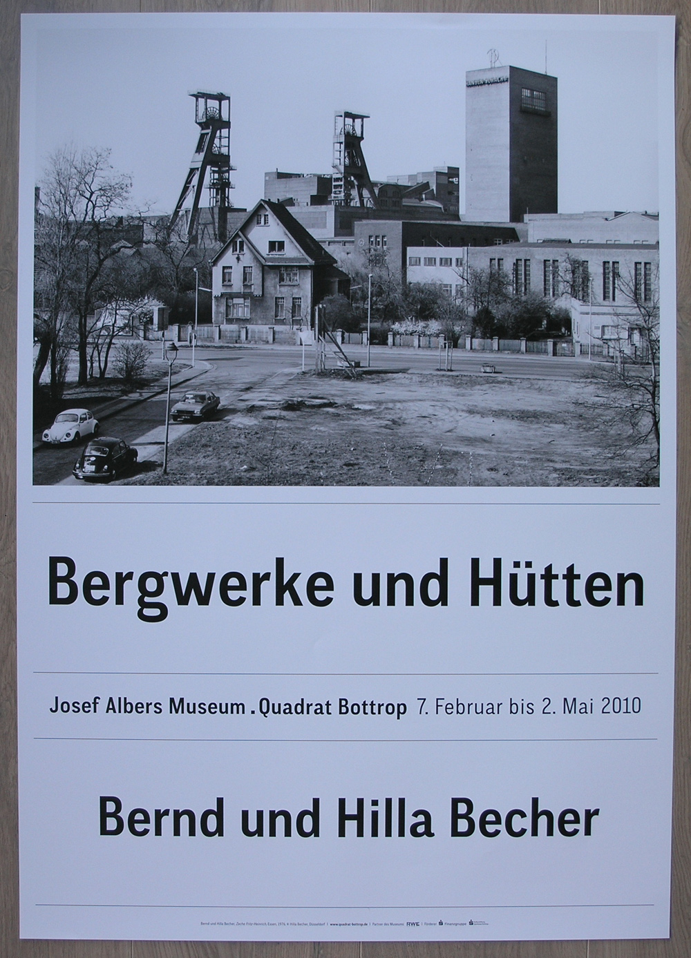
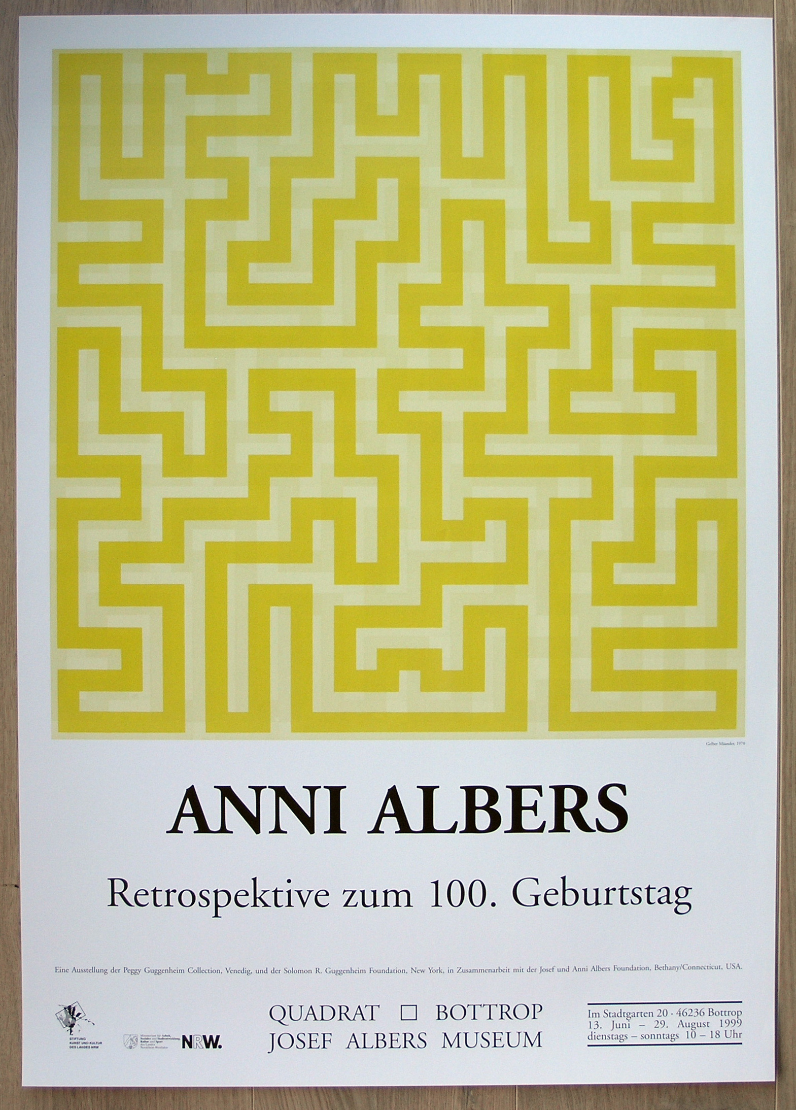
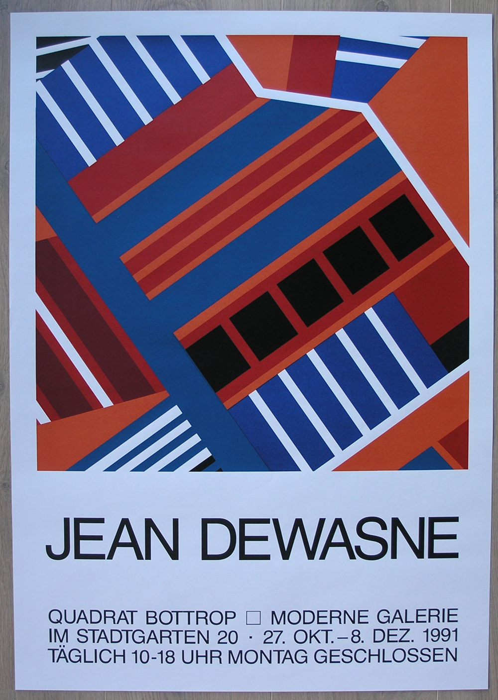
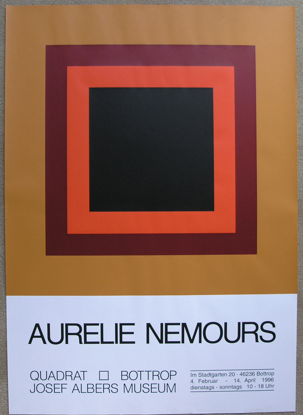
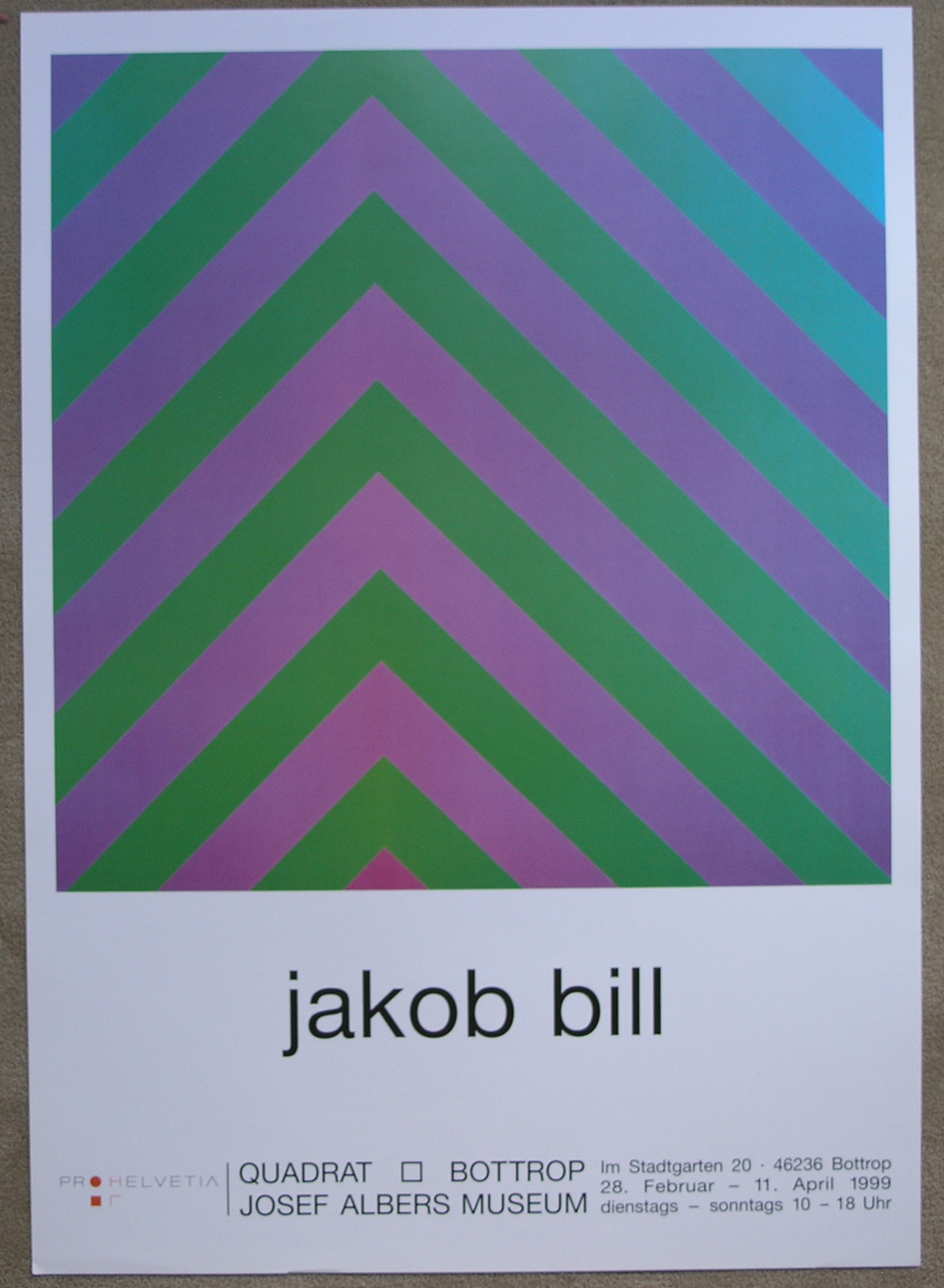
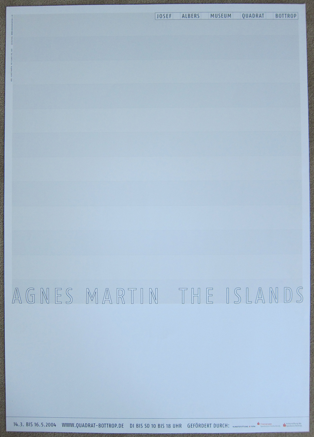
I have visited this museum 5 times in a period of over 15 years and on every occasion i was impressed with the excellent publications they have for sale. Their program is simple….. They publish with every exhibition one large poster, if possible an extremely well designed catalogue and if the artist cooperates they publish a special print in a signed , numbered and limited edition. Because of this simple but effective publication program their publications are highly recognizable and are among the best in Germany/ Europe. I really like their publications…you must have guessed that…but what is more, i collected many of these beautiful posters and books over the years and bought extra copies to sell and these are now for sale at www.ftn-books.com
so please have a look at these below to get an impression and search on my site for Albers, Bottrop or Quadrat and you will get the complete overview of all available.
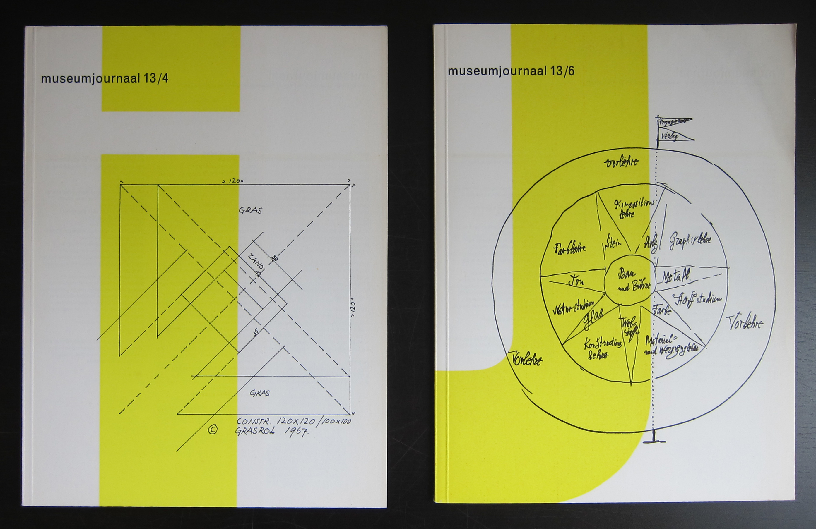
Last Sunday we visited the Stedelijk Museum for the Tinguely exhibition ( see blog in a few days) and the Willem Sandberg exhibition. Sandberg was not only the director for over 2 decades at the Stedelijk ( 1945-1963), but also took care of almost all the design and typography for the Stedelijk Museum Amsterdam, which was made during his years as a director. 5 rooms are filled with a multitude of publications. Mostly for the Stedelijk and some for the Israel museum in Tel Aviv.
What struck me most is that his designs are timeless and still belong to the very best designs that were made in last century. The 3rd room was filled with Stedelijk Museum publications and i was proud to find that 100% of the book publications shown in that room was available at www.ftn-books.com.
This is an exhibition you have to visit when you are a Sandberg admirer and study the publications on show. Beautiful, in many cases handcrafted typography and designs and among the Sandberg designs the very best that were made. It was good to see that so many of these publications still are timeless and of the highest quality and never looked old fashioned. For me Willem Sandberg is still one of the very “greats” in design and typography from the 20th century.
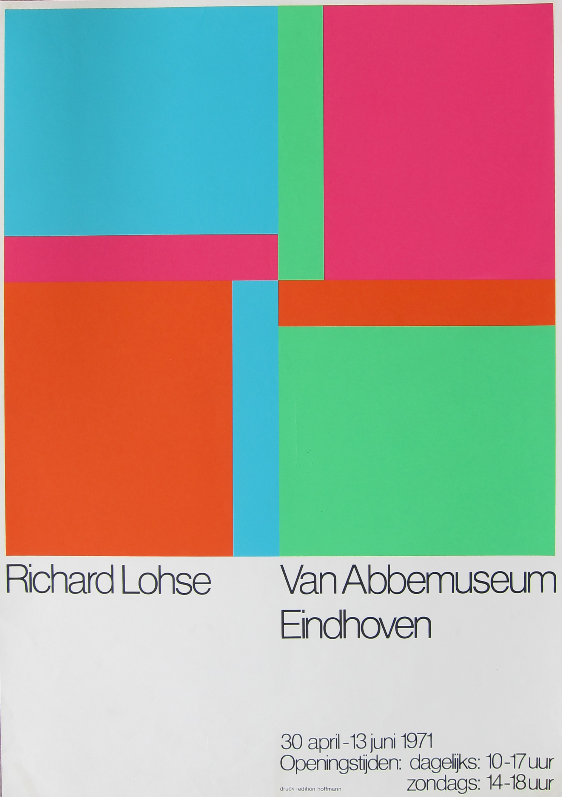
Just a single item to blog about this day. Not an ordinary one , but a very special poster. The original silkscreen print was used as the exhibition poster for the Richard Paul Lohse exhibition in the van Abbemuseum in 1971.
One of the secrets of the dutch publications which were published in the 50’s, 60’s and 70’s is that in some cases a special printing method ( lino/silkscreen/woodblock) was used for the publicity and exhibition publications….result a true piece of art. This Lohse poster is such a special production. A very large screenprint , printed by Hoffman and a special design by Richard Paul Lohse makes this a highly collectable Lohse item. A large screenprint with an impressive composition by Lohse. It is not a cheap poster, but once framed it shows its true quality and will impress all. A special item and a true piece of art of which i think it is probably the only one available on the market at this moment.
There are only 7 R.P. Lohse’s in dutch collections but these are excellent ones ( see above).
The poster on offer can be compared to these beautiful paintings because it is from the same period.
Willem Mengelberg, conductor of the Amsterdam Concertgebouw Orchestra, was grasped by Mahler’s music when he attended the first performance of his Third Symphony in Krefeld (G) in 1902. Right from that moment, he vigorously took on promoting Mahler’s music, claiming Mahler to be “the Beethoven of his time”. In his persistent efforts to introduce Mahler’s music, Mengelberg gradually acquired an outstanding position both in The Netherlands and in Europe, in this respect leaving behind other contemporary conductors.
Time and again, Mengelberg tried to persuade Mahler to conduct his own works in Amsterdam. This materialized in 1903, 1904, 1906 and 1909. During these visits, the composer was staying with the Mengelbergs at their home. However, because of his numerous engagements elsewhere, Mahler was often compelled to decline Mengelberg’s invitations for conducting.
Mengelberg’s commitment to promote Mahler’s music should not be underestimated. At the time, a substantial part of the public would leave the concert hall to demonstrate their disapproval of Mahler’s music, which was, on top of that, often ridiculed by the critics. Mengelberg was convinced of Mahler’s genius, which inspired him to persist in his dogged endeavours, taking for granted that this implied rowing against the stream . Only after years of sustained perseverance, a ‘Mahler community’ came into existence in The Netherlands, which formed the basis of the unprecedented success of the ‘Mahler Feest’ in 1920, drawing worldwide attention. In the 1920’s, Mengelberg, who had by then also become conductor of the New York Phiharmonic, repeated his efforts to promote Mahler’s music to the American public.
Mengelberg was one of the most important Mahler pioneers who deserves a special place of honour in our remembrance. His tireless efforts to make Mahler’s music better known to a greater public contributed greatly to the international Mahler culture of this era.
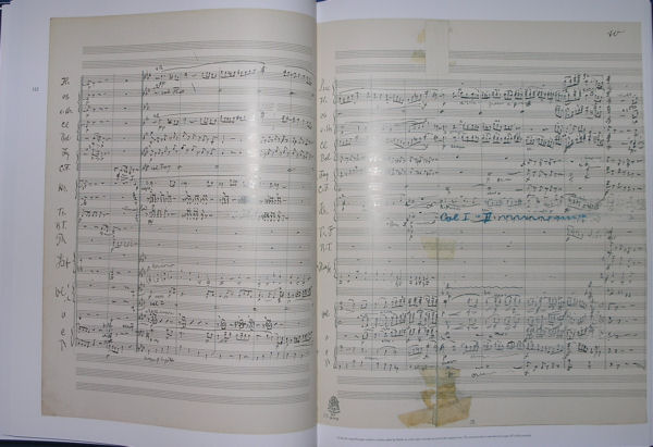
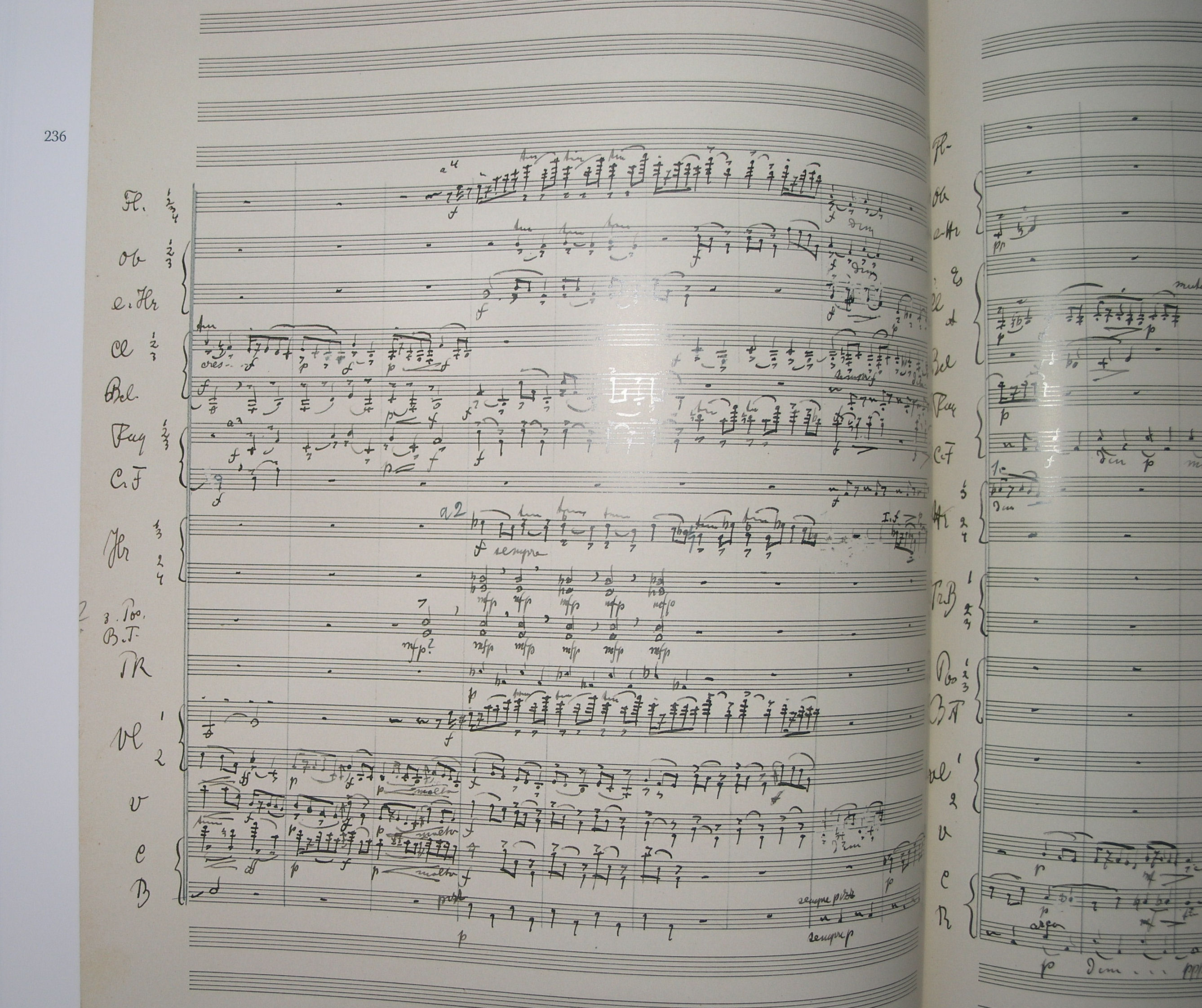
The Willem Mengelberg’s archives in the Netherlands Music Institute contain, amongst other things, his conducting scores, which are characterized by his colourful annotations that clearly indicate his conductors interpretation of the work concerned. In addition, many of these scores also contain instructions and remarks of Mahler himself: tangible and visible evidence of the close ties between Mengelberg and Mahler.
the above text is from willemmengelberg.nl
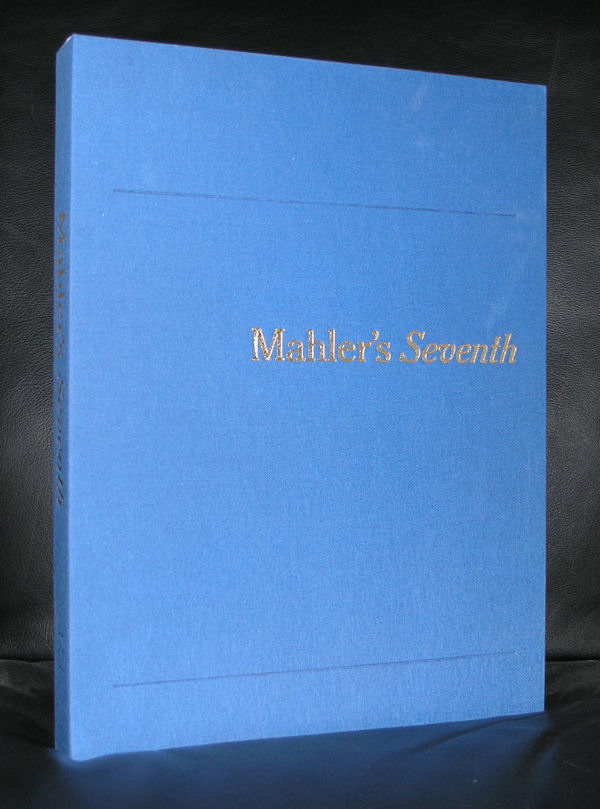
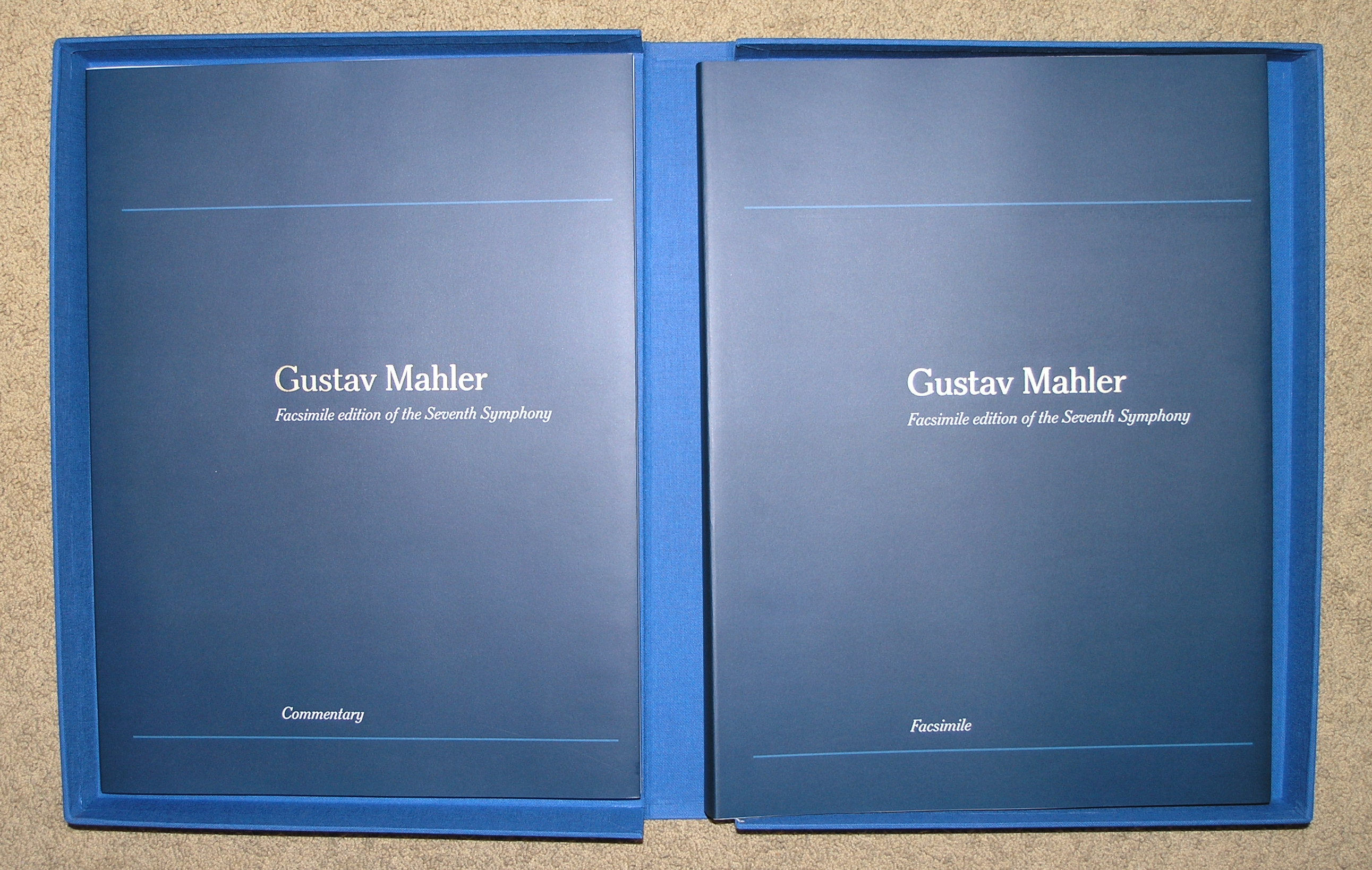
Why this blog on Mengelberg? It was about 20 years ago that well before the “craze” of huge and impressive publications ( Newton, Araki) that this tremendous large publication was published on the occasion of the Mengelberg Festival 1995. It is indeed a huge publication. Weight being well over 5 kg and published in a cardbox blue linnen covered container with a text plublication and in a different volume the musical score by Mengelberg with his annotations . This is the perfect facsimile.
Best of all: designed by one of my heroes ….Wim Crouwel. This is such a publication that will be in demand for a very long time and very hard to find. Now i have two copies available from a remainder stock and both in “new” condition at www.ftn-books.com
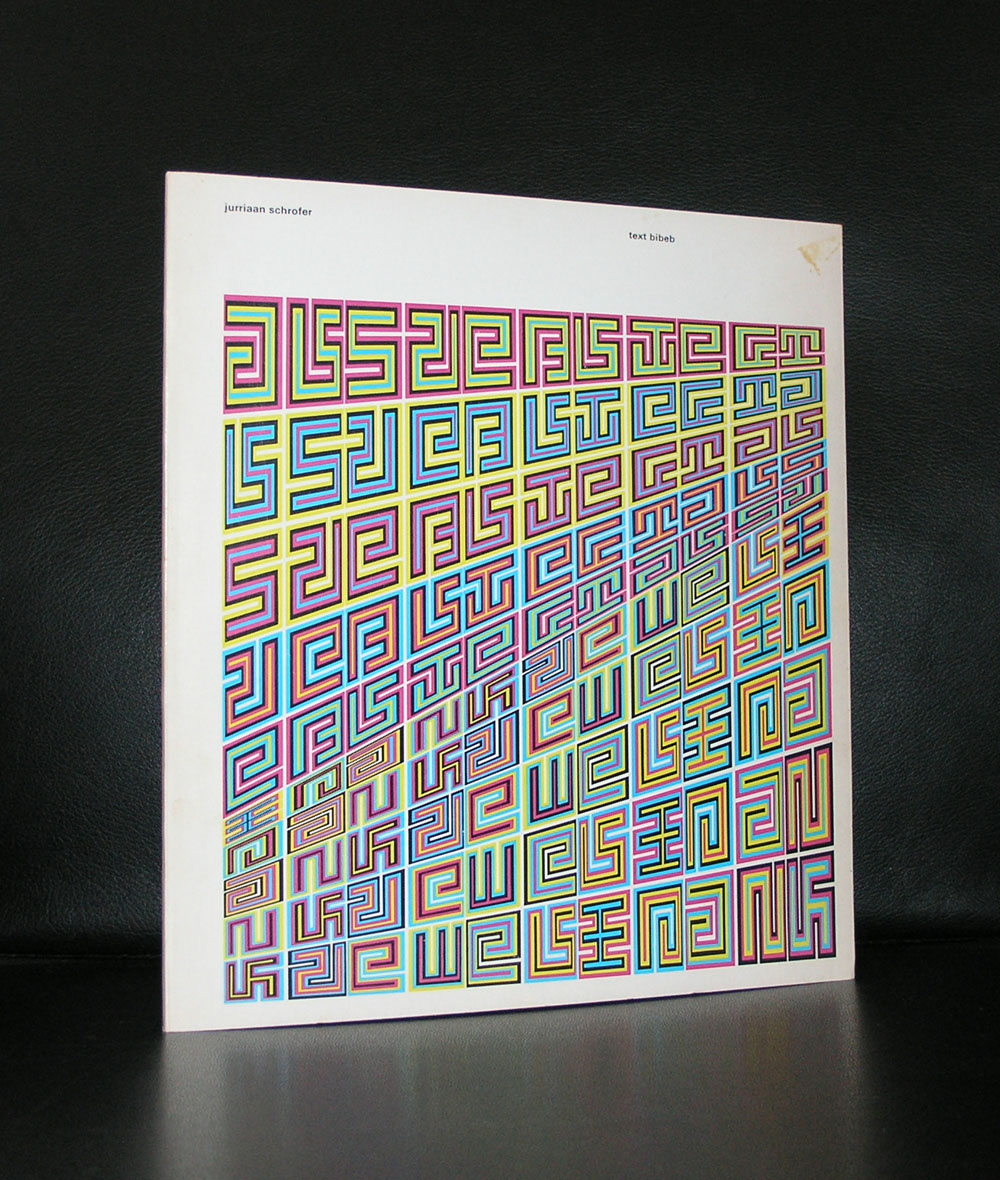
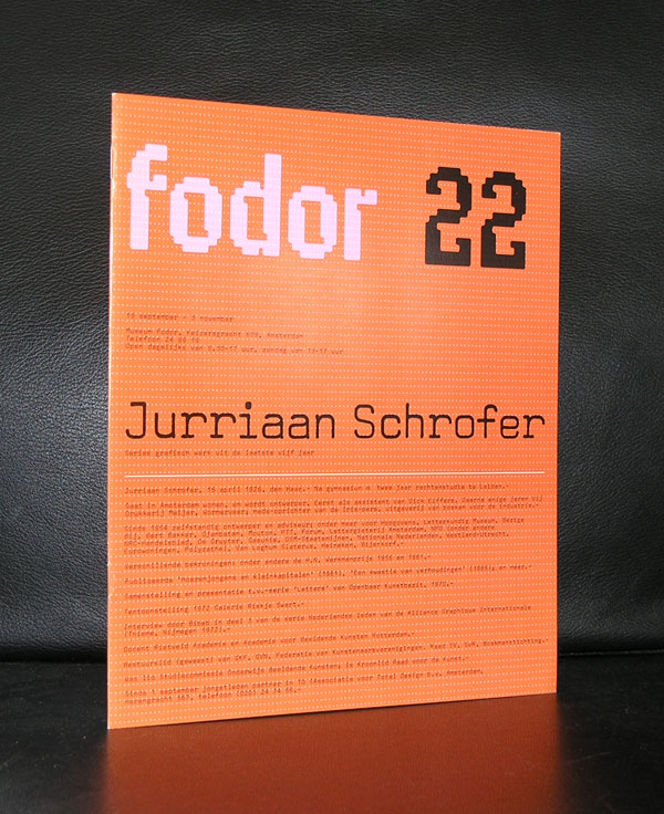
Yesterday we ate with our good friend Annemarie Schrofer and because of the beautiful paintings by her father on the walls, i remembered another member of the Schrofer family ……Jurriaan Schrofer.
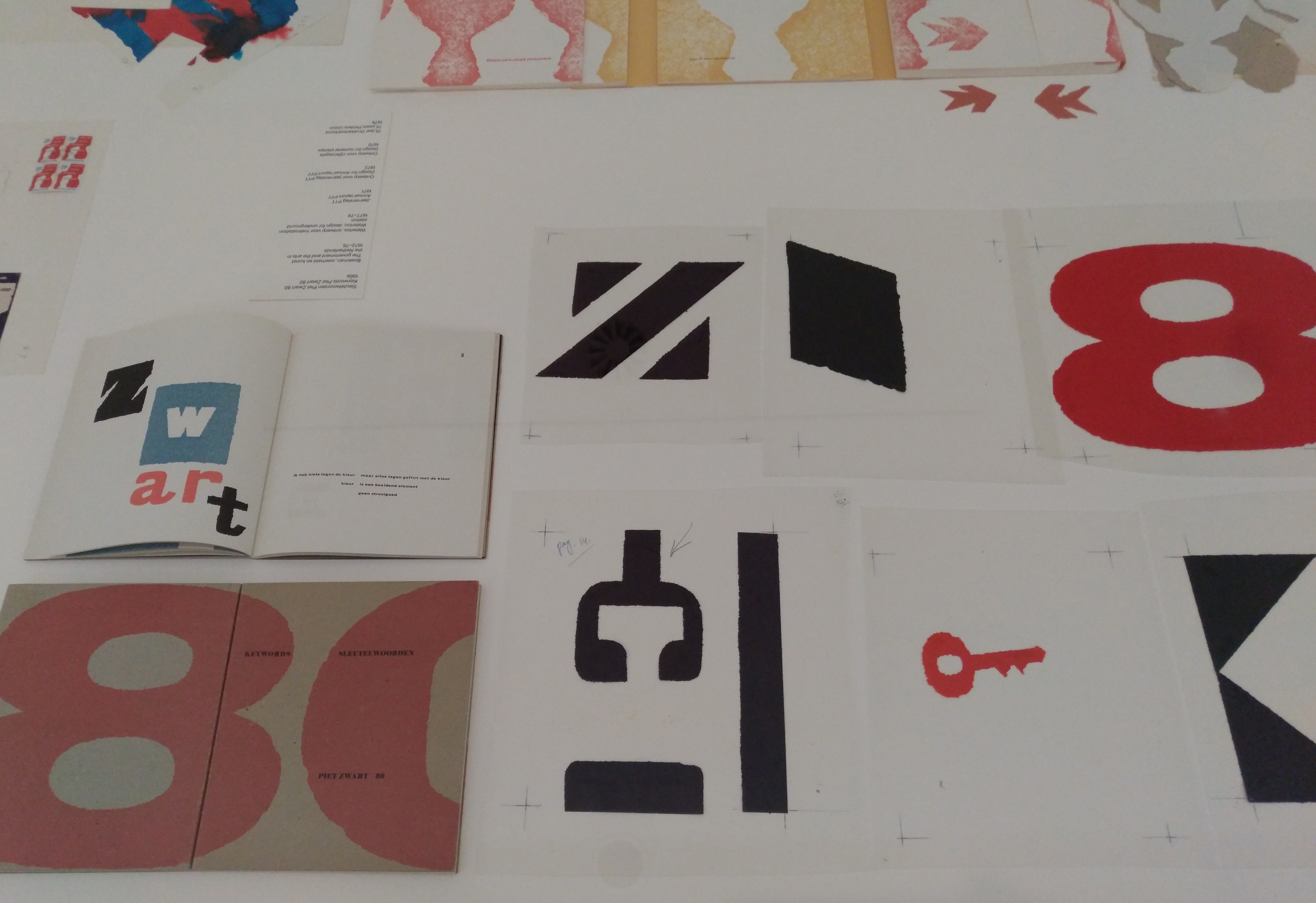
Born in 1926 and also a child of Annemarie’s father Willem Schrofer he would become one of the leading typography and graphic designers in the Netherlands. His works can be considered as “avant garde” design, thinking “out of the box” and soon he would develop his very own style . He originally wanted to become a film director, but ended being the assistant to Dick Elffers. This was the starting point of a splendid career as a graphic designer. For a few years in the seventies he was a member of Total Design, but soon followed again his own path. Highly original and recognizable are his designs. He was commissioned by many dutch important institutions and was appreciated for the designs he made for them, but his true recognition as one of the leading graphic designers from last century is only 25 years old. His works would become internationally known and appreciated. There now is a high interest in his works from leading British Graphic design schools and recently the same interest comes from the US.
Jurriaan Schrofer books can still be picked up at reasonable prices and for those interested in dutch graphic design, the designs by Schrofer are an absolute and quintessential part in the history of Graphic design and not to be missed in any collection. www.ftn-books.com
Artist/ Author: Oliver Boberg
Title : Memorial
Publisher: Oliver Boberg
Measurements: Frame measures 51 x 42 cm. original C print is 35 x 25 cm.
Condition: mint
signed by Oliver Boberg in pen and numbered 14/20 from an edition of 20