Posted on Leave a comment

the prints of Frank Stella (1936)

Schermafbeelding 2017-03-16 om 09.44.00

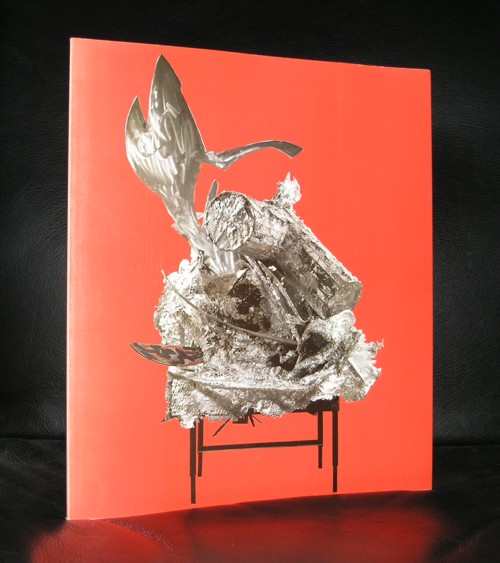
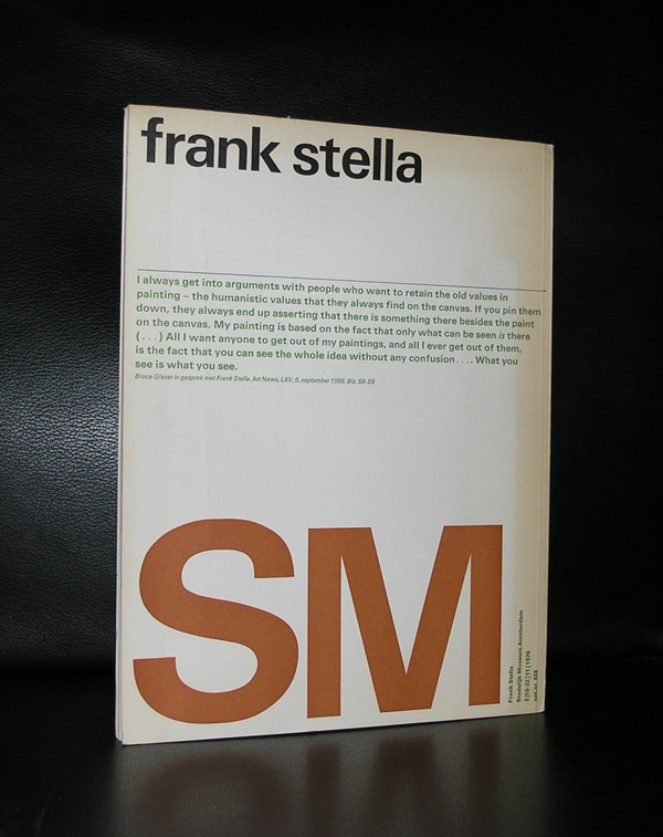
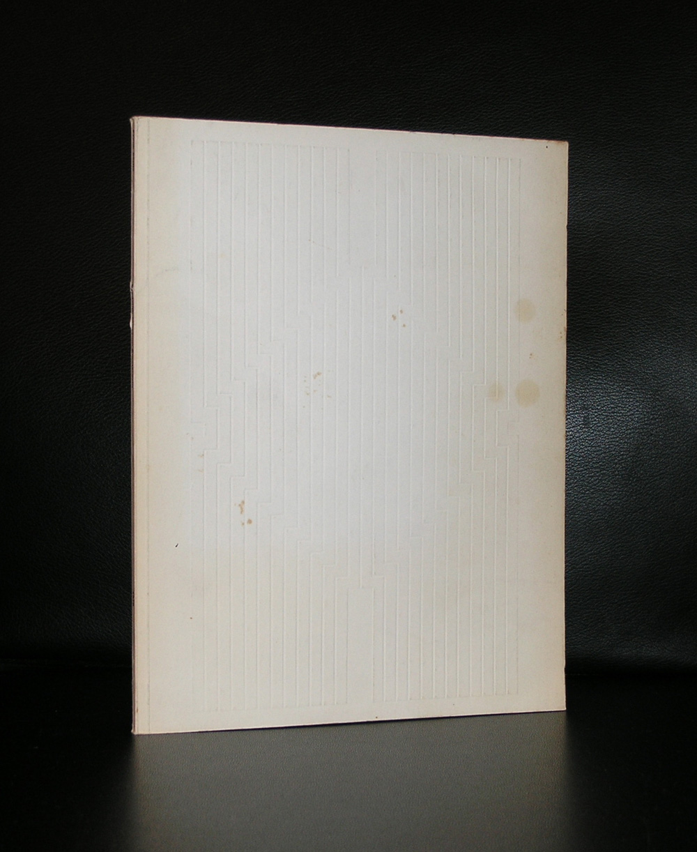
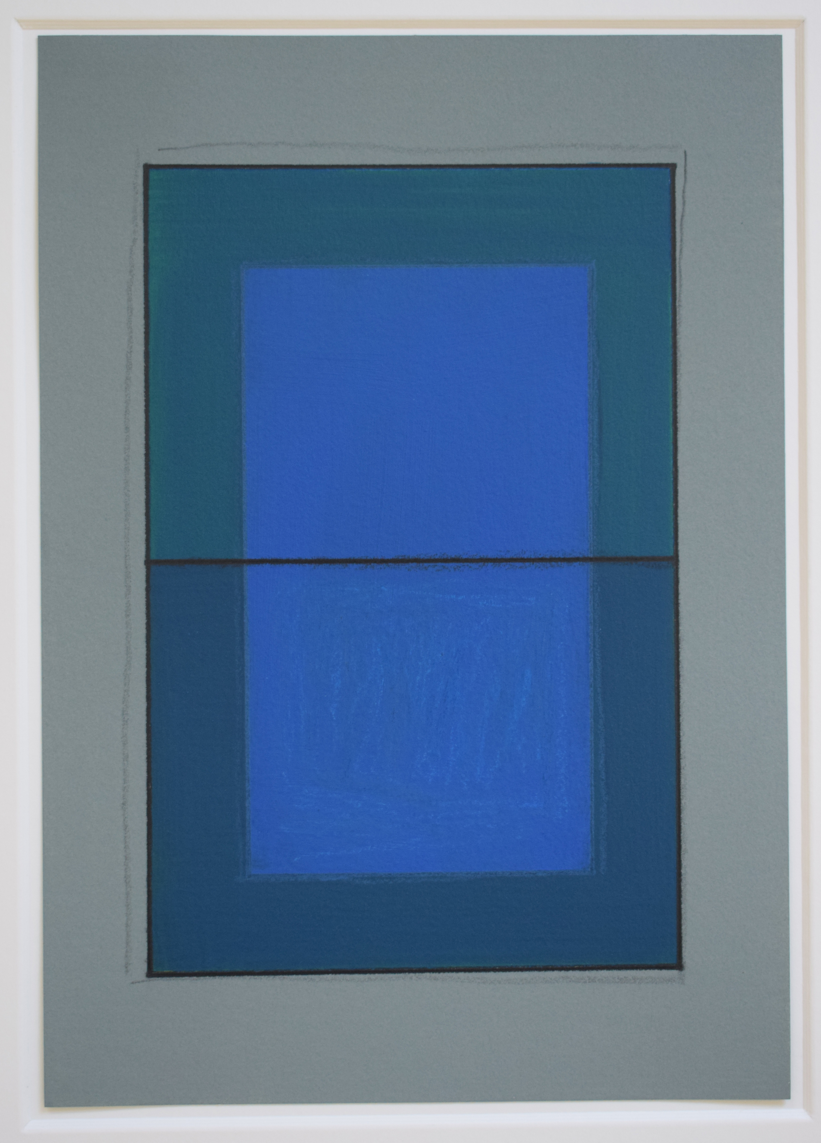
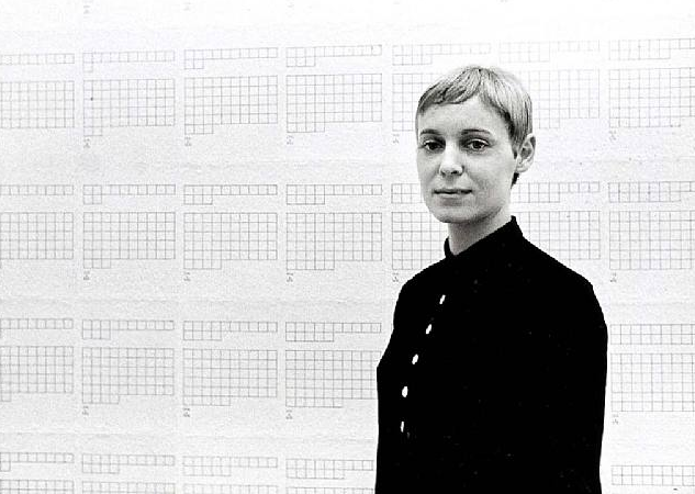
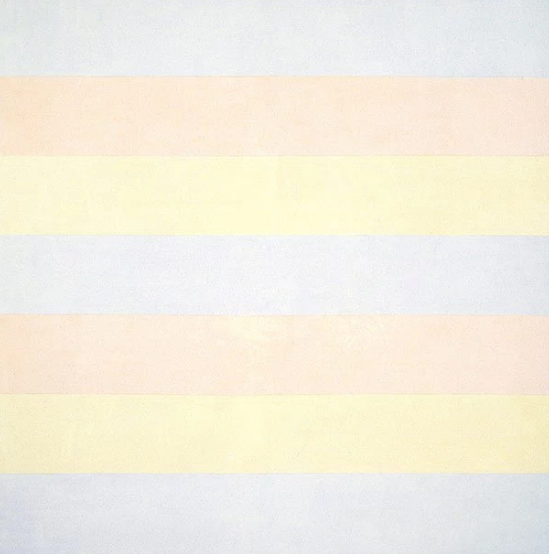
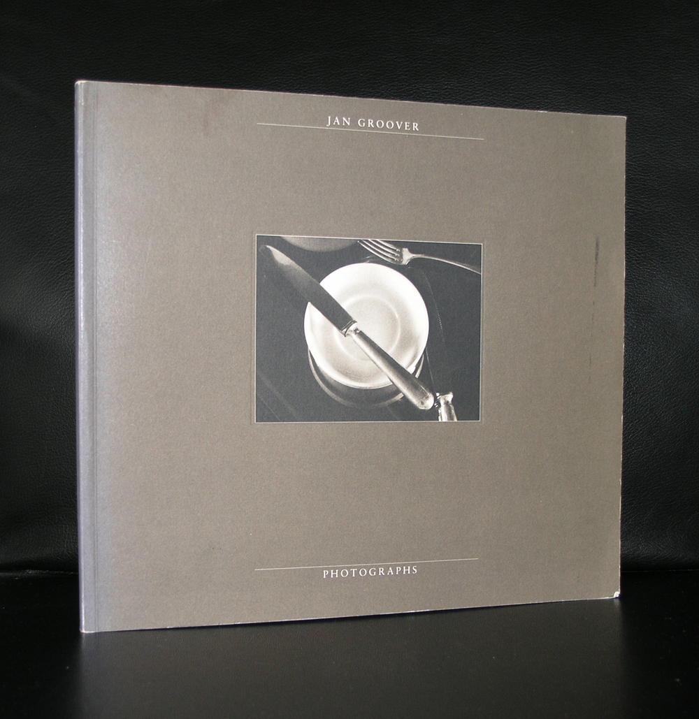
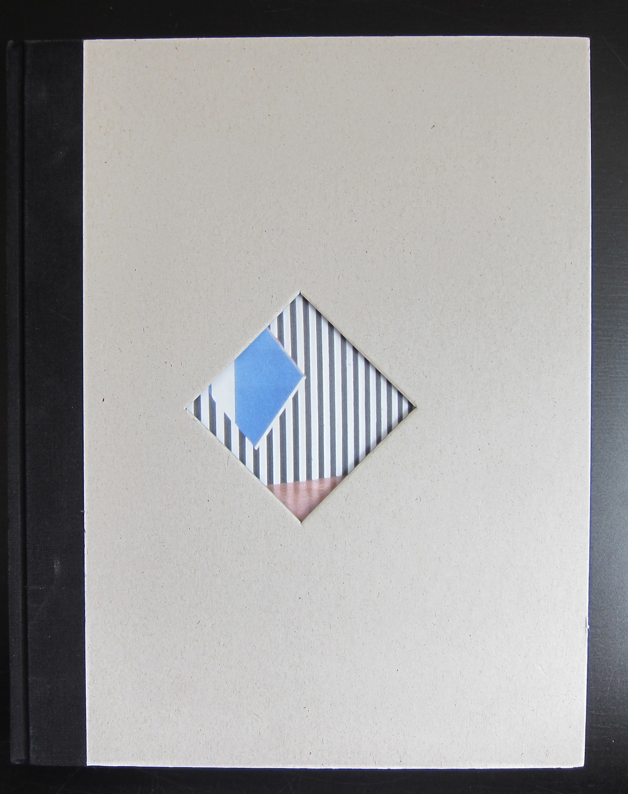
Two reasons to devote a blog to Frank Stella. First there is an acquisition by the Gemeentemuseum Den Haag which i do not understand. For me it is a “stand alone” work of art with no relation with other works within the collection and at the time i saw it , i recognized it as a Stella, but was not very impressed by it. I would have thought the Stedelijk Museum Amsterdam would have bought a work by Stella, because it fits in….but at the Gemeentemuseum it looks to be “a stranger at our midst”. Still Frank Stella is a great print maker and one of the reasons for this blog is to point out a very fine publication the Stedelijk Museum has published in 1970. The design was done by Wim Crouwel, but the best is there is a highly original “blind print” used as cover for this great catalogue.

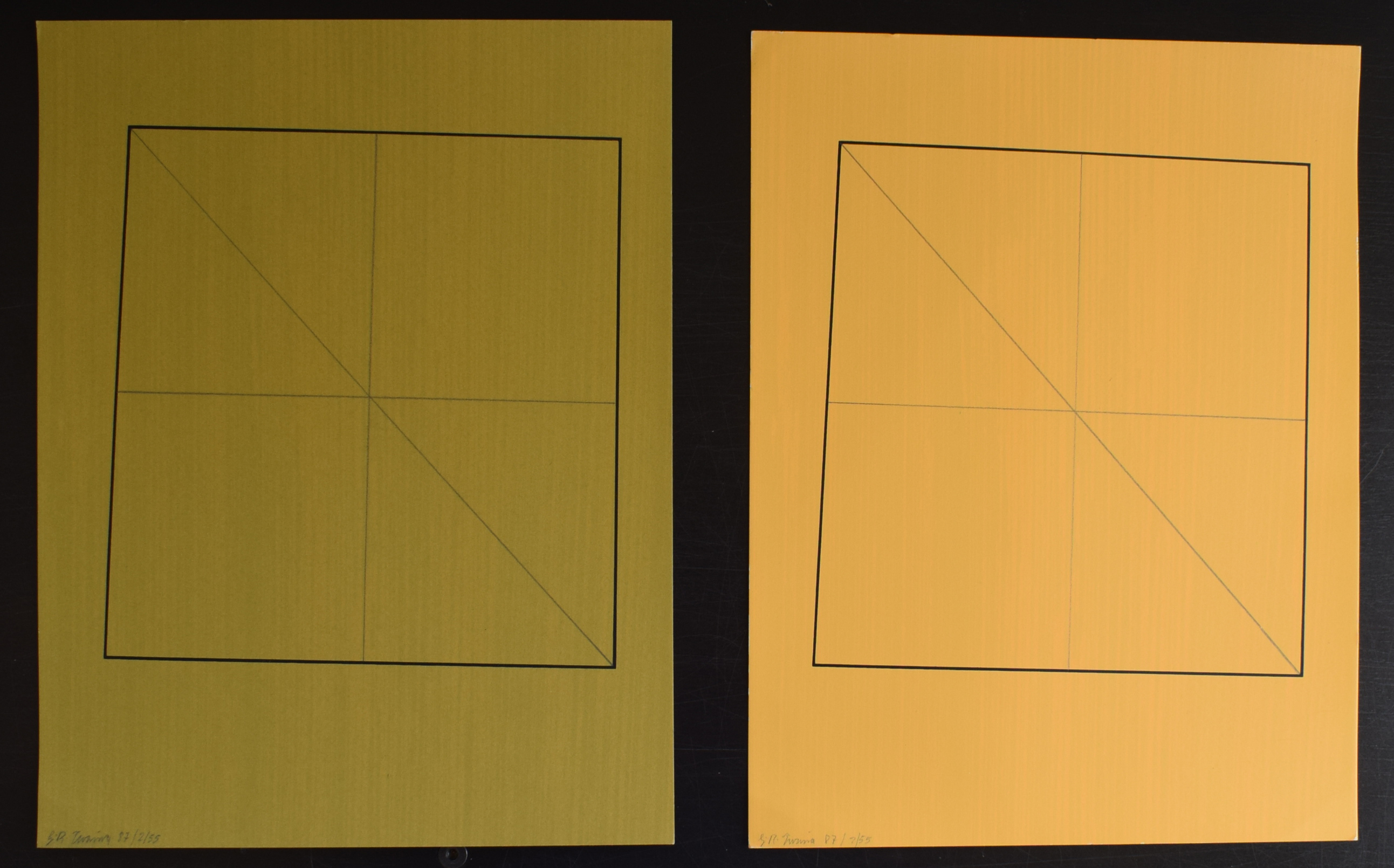
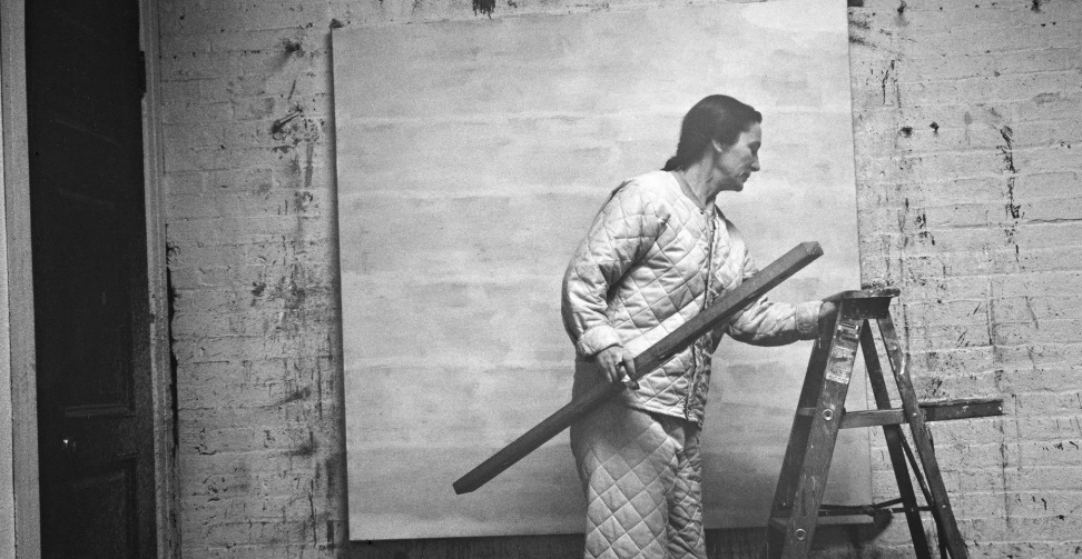
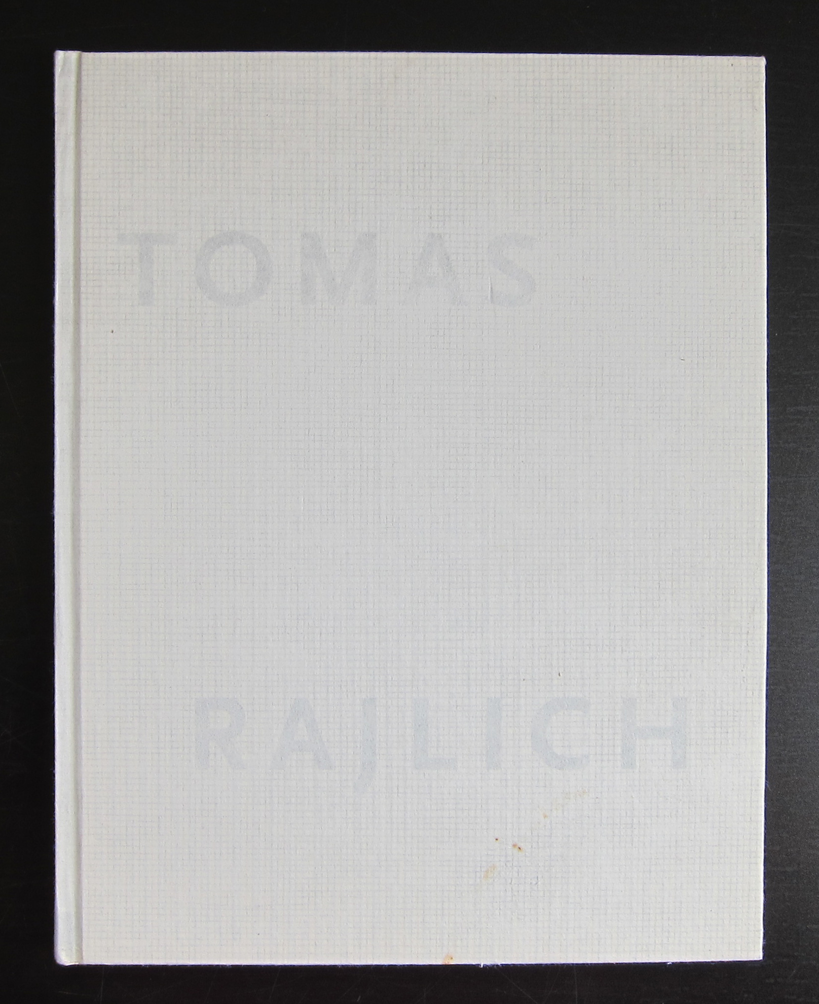
It is one of the most spectacular catalogues from the 70’s with its embossed cover. A special artist cover which relates to one of the first “shaped canvases” use of multiple papers and ink colors. Typical Crouwel design. Book measures 10.8 x 8.2 inches, contains 78 pages plus cover. text in dutch and english.

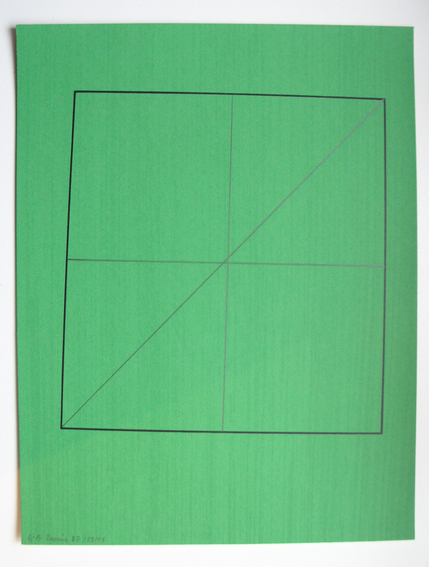
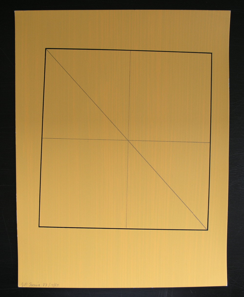
Frank Stella is an important artist, has made some great works of art, but especially his minimal early works are for me among his best, including this great 1970 catalogue.

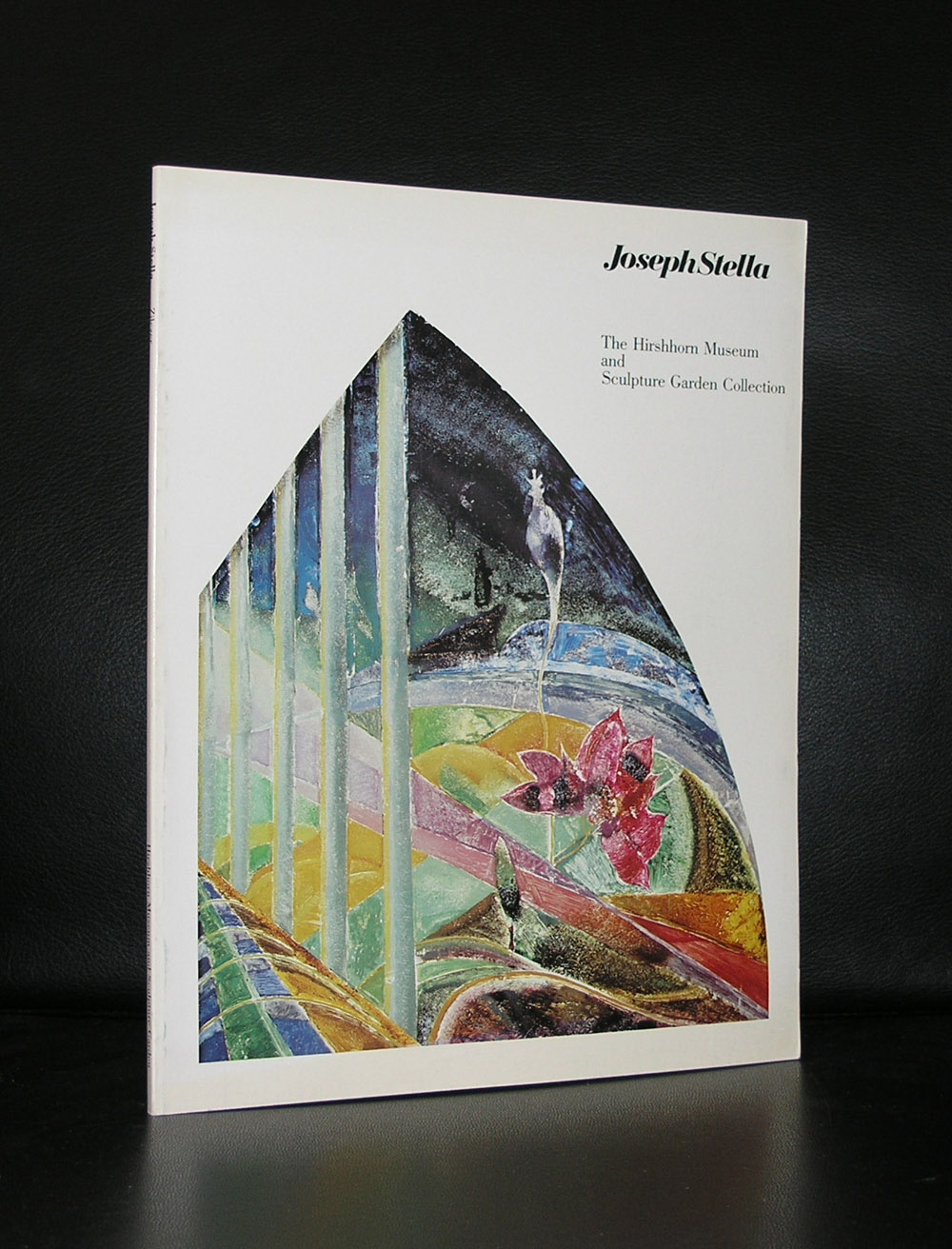
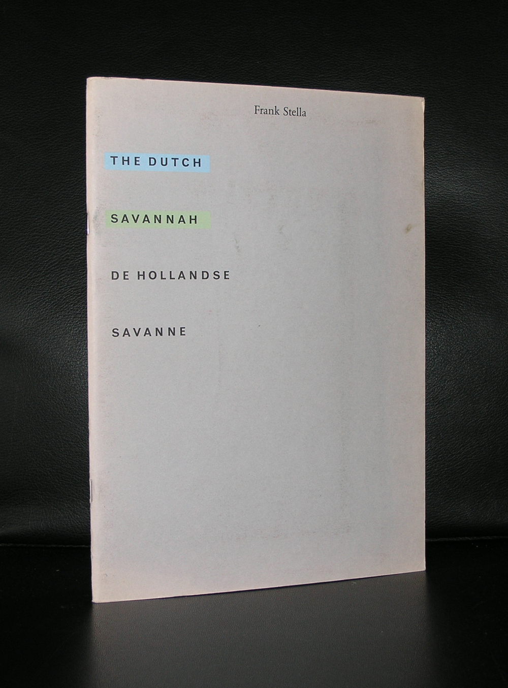
The Wim Crouwel / Stella catalogue from 1970 and other Frank Stella publications are available at www.ftn-books.com


Posted on Leave a comment

Dan Flavin (1933-1996)

Schermafbeelding 2017-03-08 om 09.15.29
Dan Flavin


Minimal Art, but for me completely different because of the great change his art makes to its direct environment. Colors, size and composition of the lights change the room  where the light sculptures are exhibited completely.

There must be a wealth of unfinished projects, because Flavin generally conceived his sculptures in editions of three or five, but would wait to create individual works until they had been sold to avoid unnecessary production and storage costs. Until the point of sale, his sculptures existed as drawings or exhibition copies. As a result, the artist left behind more than 1,000 unrealized sculptures when he died in 1996.


His earliest works were exhibited in the van Abbemuseum in 1966. The Netherlands were at that time one of the earliest countries to adopt the Minimal Artists. Major exhibitions by LeWitt, Andre and Judd in the late 60’s  were held in Den Haag and Amsterdam.

Schermafbeelding 2017-03-08 om 09.25.41

Flavin realized his first full installation piece, greens crossing greens (to Piet Mondrian who lacked green), for an exhibition at the Van Abbemuseum, Eindhoven, Netherlands, in 1966. Flavin’s “corridors”, for example, control and impede the movement of the viewer through gallery space. They take various forms: some are bisected by two back-to-back rows of abutted fixtures, a divider that may be approached from either side but not penetrated (the color of the lamps differs from one side to the other). The first such corridor, untitled (to Jan and Ron Greenberg), was constructed for a 1973 solo exhibition at the St. Louis Art Museum, and is dedicated to a local gallerist and his wife. It is green and yellow; a gap (the width of a single “missing” fixture) reveals the cast glow of the color from beyond the divide. In subsequent barred corridors, Flavin would introduce regular spacing between the individual fixtures, thereby increasing the visibility of the light and allowing the colors to mix.[24]

By 1968, Flavin had developed his sculptures into room-size environments of light. That year, he outlined an entire gallery in ultraviolet light at documenta 4 in Kassel, Germany. In 1992, Flavin’s original conception for a 1971 piece was fully realized in a site-specific installation that filled the Solomon R. Guggenheim Museum’s entire rotunda on the occasion of the museum’s reopening.

www.ftn-books.com has many titles on Minimal Art and some on Dan Flavin


Posted on Leave a comment

Gunter Tuzina…. 3 works for sale

I already showed in an earlier blog the 2 Tuzina works i have for sale, but now can add another work. This was made some years later (2002) as the 2 previous ones.

Measures 29 x 17 cm. / Mint condition .For the price please mail me.


Posted on Leave a comment

Hanne Darboven ( 1941-2009)

  • ARCO Foundation Collection, Madrid
  • Centre Georges Pompidou, Paris
  • Dia:Beacon, Beacon / NY
  • Dia:Chelsea, New York
  • Hamburger Bahnhof, Berlin
  • Hamburger Kunsthalle, Hamburg
  • Kaiser-Wilhelm-Museum, Krefeld
  • Ludwig Forum für Internationale Kunst, Aachen
  • MADRE, Neapel
  • Museum Abteiberg, Mönchengladbach
  • Museum für Moderne Kunst, Frankfurt am Main
  • Museum Küppersmühle, Duisburg
  • National Museum of Art, Architecture and Design, Oslo
  • Bundeskunstsammlung, Bonn
  • Schaulager, Basel
  • Stedelijk Museum voor Actuele Kunst (S.M.A.K.) in Gent

An impressive list and far from complete is this list of Museums that have a work or works by Hanne Darboven in their collection. Hanne Darboven was one of the most extreme Conceptual Artist from the last century. Making works with text, letters and numbers…always written and notated by hand in sequences reminding of the sequential works by the Minimal Art artists, by whom she was influenced ( LeWitt and Judd).

The calendar sequence has consistently formed the basis for the majority of her installations, and the ‘daily arithmetic’ consisting of checksums came to replace the year’s calendrical progression according to a complex and challenging mathematical logic. Always written out by hand, her paperwork thus comprised rows and rows of ascending and descending numbers, u-shapes, grids, line-notations and boxes. Employing this neutral language of numbers and using pen, pencil, the typewriter, and graph paper as materials, she began to make simple linear constructions of numbers that she called Konstruktionen. 

Whenever you encounter a Darboven, the detail is of less importance. It is the pure extreme large scale that impresses , which is the same reason that so little of her works are on permanent display. When you encounter one of Darboven’s works…. Take your time and experience the space and the walls, covered with her works from top to bottom and never forget it anymore.

Some nice publications available at www.ftn-books.com


Posted on Leave a comment

Agnes Martin (1912-2004)

The 3rd blog on a female artist. Tate, Moma, Lacma, Guggenheim, Centre Pompidou, Stedelijk Museum…..They all have in common that they have a work or works by Agnes Martin in their Permanent collections. Martin is considered by most as a Minimal artist but she herself thinks more of herself as an abstract expressionist painter. Anyway ,she is absolutely one of the most important and original artists from the 20th century. Personally i think her paintings have a unique quality. More Minimal than abstract, but made with a technique that is typical Agnes Martin. The Guardian says the following on Martin.

A late starter, Martin kept on going, working at the height of her powers right through her 80s; a stocky figure with apple cheeks and cropped silver hair, dressed in overalls and Indian shirts. She produced the last of her masterpieces a few months before her death in 2004, at the grand old age of 92. But she was also so deeply ambivalent about pride and success and the ego-driven business of making a name for yourself that in the 1960s she abandoned the art world altogether, packing up her New York studio, giving away her materials and disappearing in a pickup truck, surfacing 18 months later on a remote mesa in New Mexico.

When she returned to painting in 1971, the grids had gone, replaced by horizontal or vertical lines, the old palette of grey and white and brown giving way to glowing stripes and bands of very pale pink and blue and yellow. “Sippy cup colours”, the critic Terry Castle once called them, and their titles likewise address states of pre-verbal, infantile bliss. Little Children Loving Love, I Love the Whole World, Lovely Life, even Infant Response to Love. And yet these images of absolute calm did not arise from a life replete with love or ease, but rather out of turbulence, solitude and hardship. Though inspired, they represent an act of dogged will and extreme effort, and their perfection is hard-won.

Martin’s work is in museums and collections across the world, and changes hands for millions of dollars at a time. All the same, she hasn’t achieved quite the renown of her mostly male contemporaries in abstraction, partly because the subtleties of her paintings are almost impossible to reproduce in print.
I think there is one exception. the excellent poster that was an original silkscreen for the Quadrat Bottrop exhibition. It is still available at www.ftn-books.com
please follow this blog on www.ftn-blog.com
martin-bottrop-a
Posted on Leave a comment

Jan Groover (1943-2012) and the Tabletop still life

schermafbeelding-2016-12-18-om-11-46-13

Jan Groover, one of those photographers that have a cult following but are hardly known with the large public. The post of some months ago on Henk Tas and his staged photography reminded me of Jan Groover and her still life photography. The Smithsonian made a wonderful catalogue on the subject of her Tabletop photo’s and it deserves to be better known. That is the reason for this blog, because Groover is a great photographer.

Pictures tell a far better story than i can, but there is a great short biography over here:

www.nytimes.com/2012/01/12/arts/design/jan-groover-postmodern-photographer-dies-at-68.html

Groover publications that are available at www.ftn-books.com

Posted on Leave a comment

Daniel Buren

schermafbeelding-2016-11-21-om-17-46-04

For this day’s blog i thought of something more colorful. This to compensate for the rather sombre previous ones and i immediately thought about Daniel Buren, who has done some tremendous beautiful projects with light and color. The latest i have seen of him was 1,5 years ago in Strasbourg where he altered the ceiling with colored panes of glas. I have put together some examples of his projects below, so you can see yourself the impact it has on the space.

One of his projects was during the seventies in the Stedelijk Museum, on which occasion a catalogue was published titles “HIER”.

Is this minimal art?…..possibly, but it is highly recognizable and what is more ….the effect on the space where the colored stripes are applied is extremely large.So i agree with what Wikipedia says about him that he is more a conceptual artist. Many of his art can be seen in public places in France , but the largest collection of Buren’s work is still in French museums like the Centre Georges Pompidou.

Some very nice items by Buren are available at www.ftn-books.com

and yes….the one on the left are expresso cups by illy


Posted on Leave a comment

Tomas Rajlich…Structures in paint


schermafbeelding-2016-10-03-om-12-13-05

Just a short blog to let you know that a large retrospetcive on Tomas Rajlich will be opened on the 15th of October 2016 which will be on show until 22nd January 2017.

Tomas Rajlich, a minimal painter for whom the grid is the measure of things. Rajlich’s starting point is usually a network of horizontal and vertical lines, which he lays down and then covers them with loose brushwork. The result – constructed with an exceptional feel for colour, sheen and the substance of his materials- is a painted surface  in which texture and structure predominate.

The exhibition is made partly with works that Rajlich recently has donated to the collections of the Gemeentemuseum.

The Irma Boom designed book is available at www.ftn-books.com

Posted on Leave a comment

Gunter Tuzina

Why Tuzina in this blog. Tuzina is one of those artists who remained true to a certain principle in art and researched it over 40 years now. Het started with a line in one corner and developed his art from there on. Tilted rectangles, which are crossed from corner to corner in different kinds of colors is the main figure used by Tuzina and is very recognizable and one can find an excellent walldrawing with this “window” in the Gemeentemuseum Den Haag.

The Gemeentemuseun  was one of the first who presented his works and in the eighties Pablo van Dijk commissioned Tuzina to make 55 separate drawings in different colors for his Bebert publishing house. The one depicted here is one of these 55. Signed and dated by Tuzina and in excellent mint condition. This one is available at www.ftn-books.com and soon there will be a second “green” one listed from the same series. Impressive art from an artist who can be considered as a post minimal artist.

I found an excellent biography on Art index:

Günter Tuzina studied at the Hamburg Art Academy between 1971 and 1977. He has been exploring the fundamental principles underlying painting since 1975. Günter Tuzina combines lines, squares, rectangles and Colour Fields within a frame in a fascinating and inexhaustibly rich quest for equilibrium and tension. In its stringent simplicity Tuzina’s work is based on Minimal art and the principles laid down by Theo van Doesburg and De Stijl.
Tuzina was awarded a Villa Romana Prize in Florence in 1981. A retrospective was mounted in 1985 at the Gemeentemuseum in The Hague, for which Tuzina executed a mural two years later that was, unfortunately, lost when the museum was restored.
From 1982 until 1999 Tuzina lived and worked in Cologne but now lives in Berlin. He has had numerous exhibitions: at the David Nolan Gallery in New York (1991), the Cologne Kunstverein (1992), the “Städtische Galerie im Lenbachhaus” in Munich (1993) and again at the Gemeentemuseum in The Hague in 2002.


wilfried

www.ftn-books.com

https://ftn-books.com/products/gunter-tuzina-drawing-with-lines-on-yellow-1987-signed