Posted on Leave a comment

Milco Onrust (1961-2015)

Schermafbeelding 2020-12-28 om 13.10.14

It took me some years to realize that the dutch gallery owner Milco Onrust was one of the driving forces in the gallery and art world. NOt only in the Netherlands his gallery became famous, but abroad his gallery became famous because of the independent choices his owner made during its existence.

Starting at a young age, during his art studies he already collected Modern art, he soon would become one of the most important young gallery owners in the Netherlands, presenting artists like LeWitt, Partenheimer, Gunn , Knobel and Swarte.


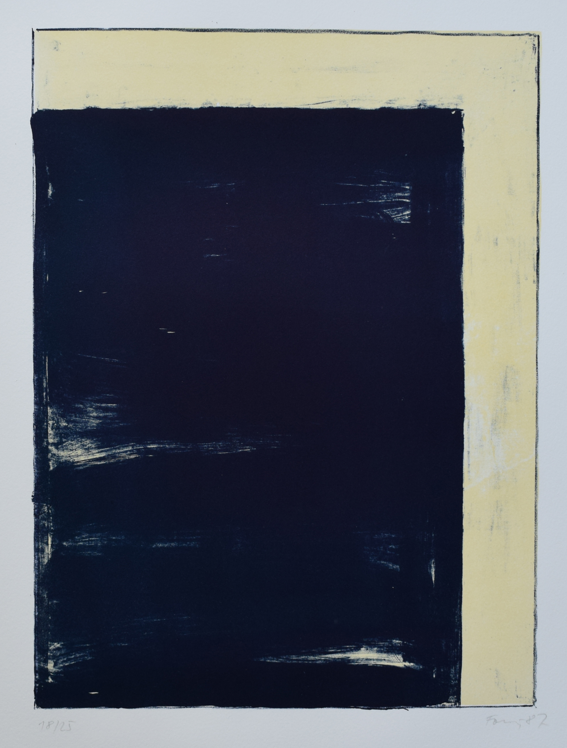
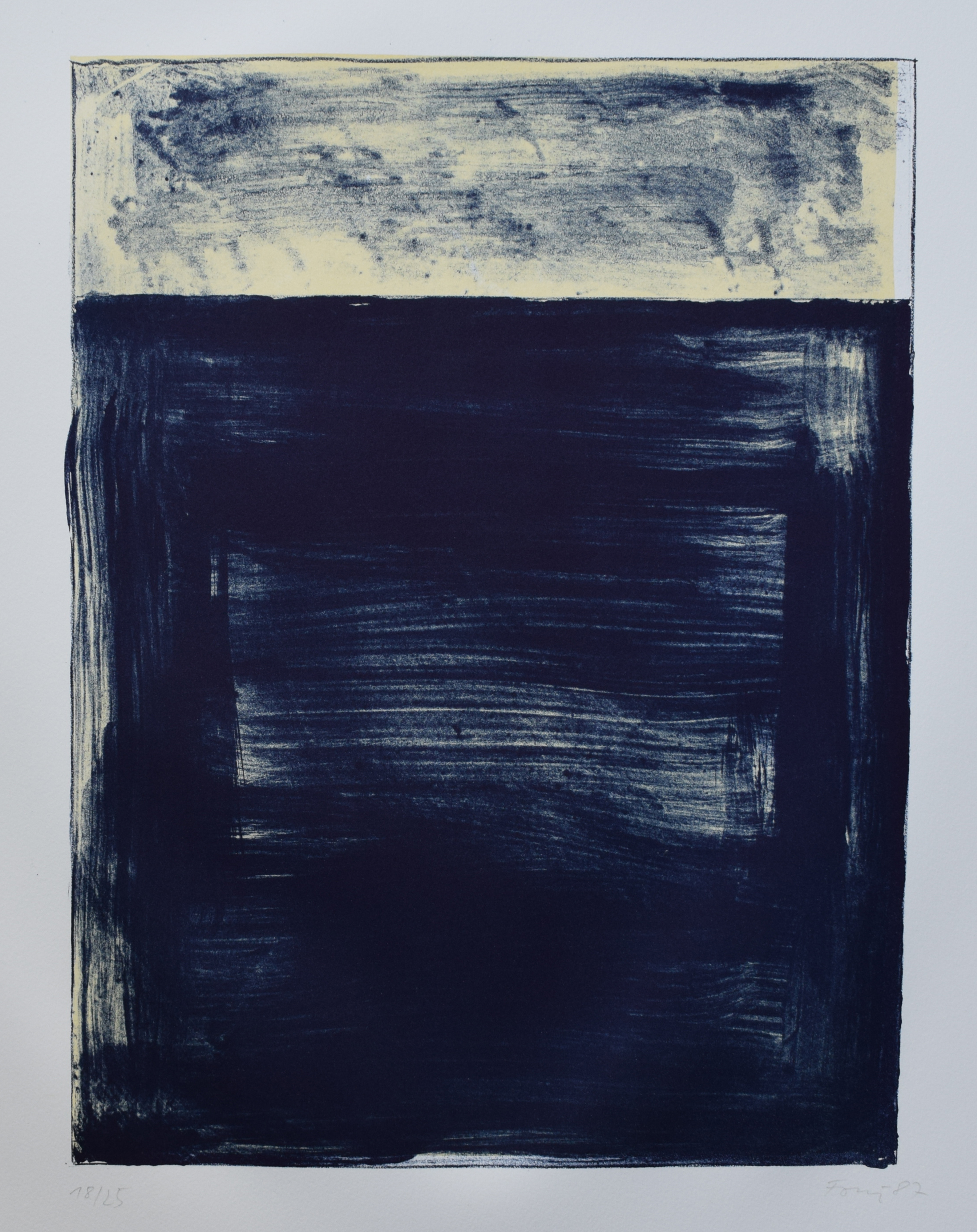
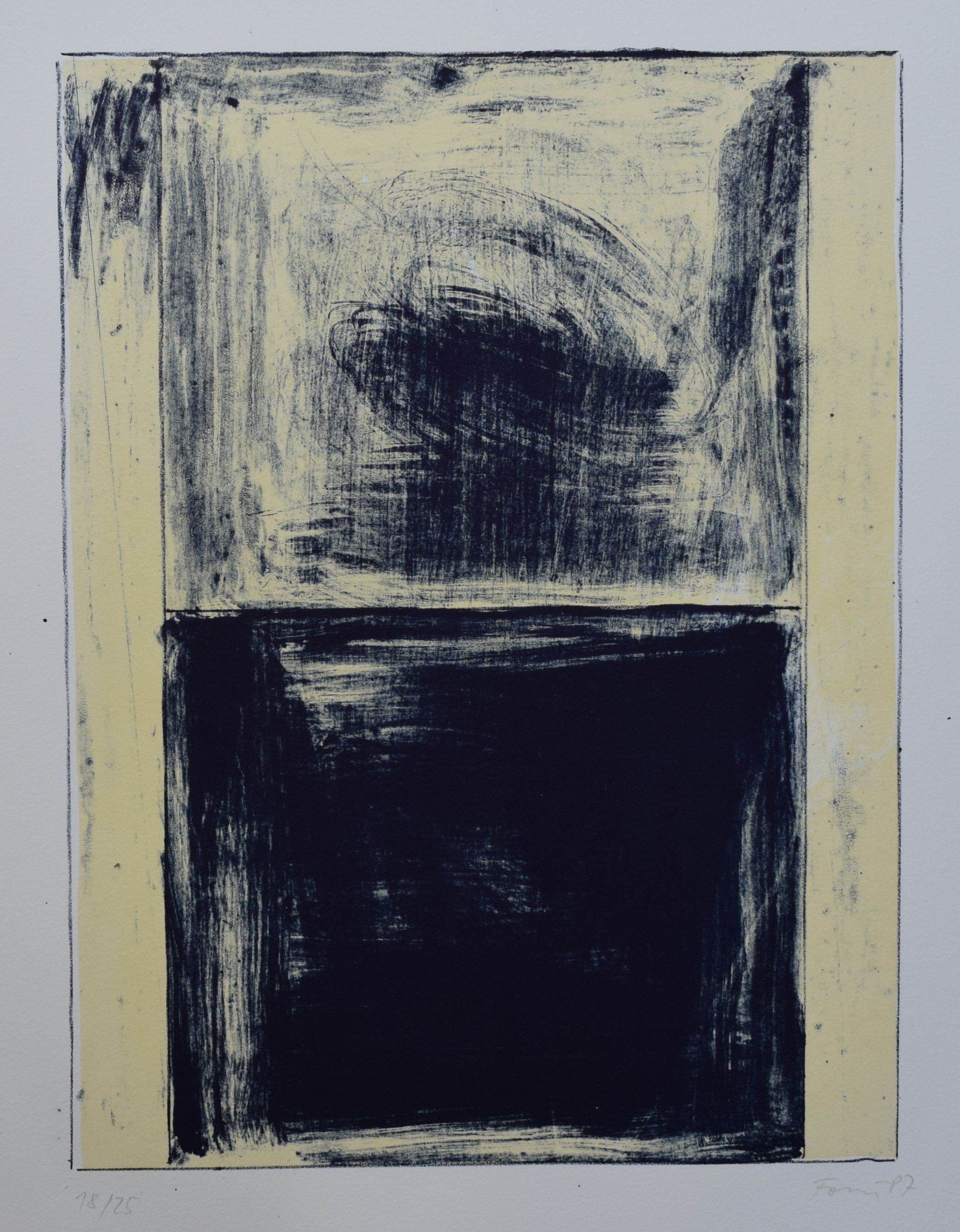
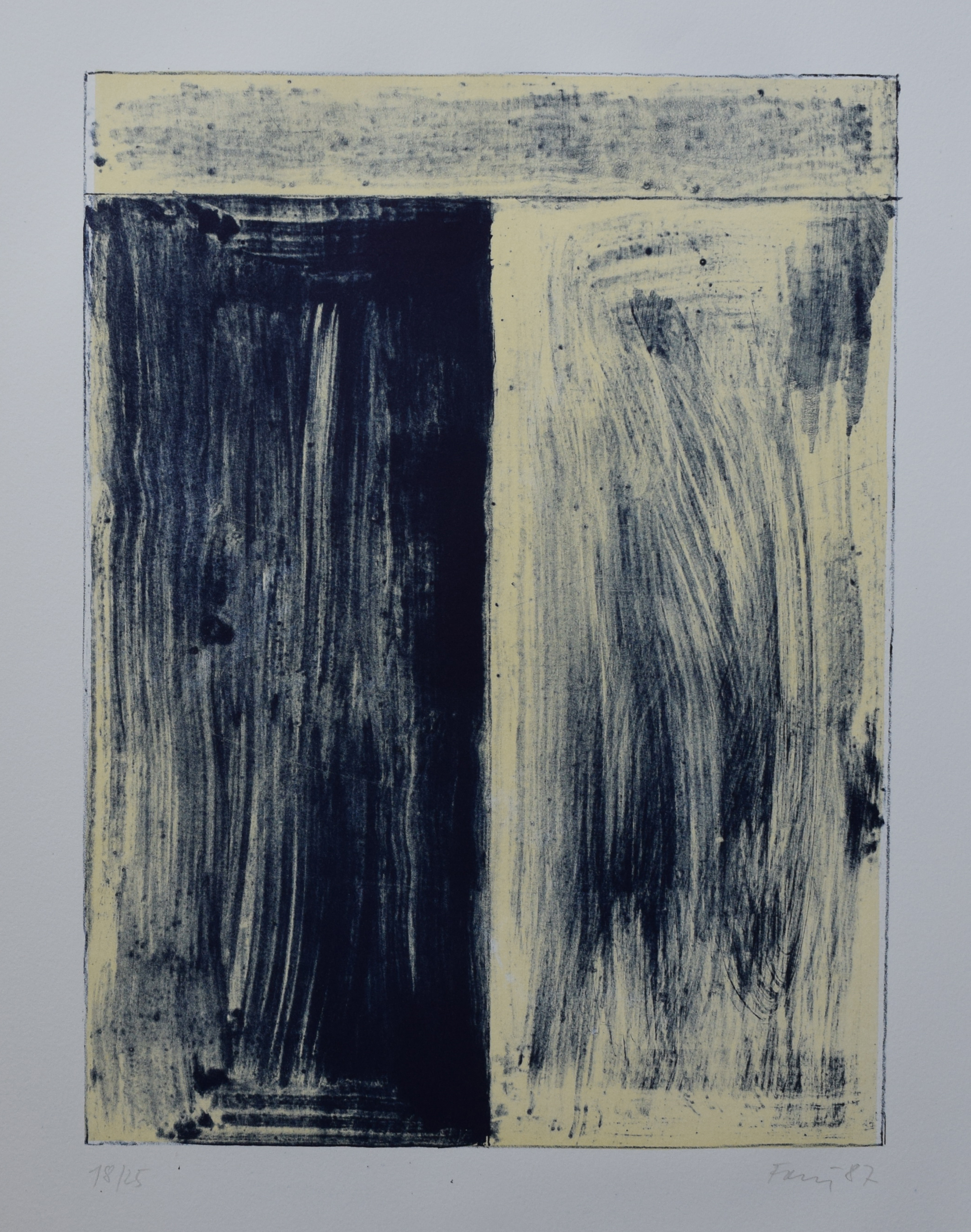
I did not visit his small gallery many times, but i remember it to be nearby Wim van Krimpen his gallery in Amsterdam.. What strikes me most now, after so many years follwing his gallery and buying his publications, is that the Onrust pubications are all from a small edition and in most cases look and feel like true artists books.  They are little gems among the other gallery publications. This i realized when i dove into my own art book collection and found some precious ones on Partenheimer which have some original drawings inside.

www.ftn-books.com has some of these ONRUST publications available


Posted on Leave a comment

Hadassah Emmerich (1974)


Schermafbeelding 2020-01-05 om 11.33.32

The first time i heard about the artist Hadassah Emmerich was at the time she had an exhibition at GEM. Curated by Roel Arkesteijn this exhibition was one of the first at the GEM museum. The Neighbor of the Gemeentemuseum Den Haag and dedicated to contemporary art. I think her paintings are overwhelming, extremely attractive, but far too exuberant to add to any private collection beside a museum collection. Still i admire her paintings, because there is no artist alike and her works are highly original.

Schermafbeelding 2020-01-05 om 11.39.57

In her paintings, work on paper and painterly installations Hadassah Emmerich interweaves varied themes such as identity and the body, representations of the exotic and the dialogue between abstraction and figuration.
Emmerich selects material from a variety of sources including vintage photography books, texts, advertising and art historical reference books, which are fused together through a process of photomontage which is then transferred onto the canvas using a combination of painting and printing.
Negotiating a universe where tropical colors merge effortlessly with cold grey tones, where graphic silhouettes inhabit ephemeral spaces and where references to modernist painting are incorporated into urban space, Emmerich creates a fictionalized narrative in which ‘multiculturalism’ is questioned in a painterly sense.
Displaying monumental and immersive qualities, the viewer is confronted with a visceral immediacy, urging to engage conceptually as well as physically. In continuing the legacy of female ‘pop’ artists such as Evelyn Axell or Angela Garcia, Emmerich pursues a practice that combines a bold visual language with an investigation into the undercurrent of visual culture.

www.ftn-books.com has the GEM publication on Hadassah Emmerich now available now available.

emmerich

Posted on Leave a comment

Stang Gubbels …. a dutch designer

Schermafbeelding 2018-01-08 om 12.23.47

It was at the time Wim van Krimpen was the director for the Gemeentemuseum Den Haag that i met Stang Gubbels. Stang had worked with van Krimpen before on some projects he did with the KUNSTHAL/ Rotterdam. His style and designs are truly original , highly recognizable and together with the designs by Irma Boom and Gracia Lebbink, belons to the best dutch designs produced during the last 2 decades in the Netherlands.

Stang has an excellent internet site which can be reached at www.stang.nl and for those looking for his scarce publications…..www.ftn-boooks.com has two nice STANG titles available.

Posted on Leave a comment

the attraction of Robert Zandvliet (1970)

Schermafbeelding 2018-01-31 om 14.49.48

I can not add more than the short documentary the fantastic HOLLANDSE MEESTERS series made on this artist. Unfortunately it is in dutch, but the images tell more than a 1000 words.

books available at www.ftn-books.com on Robert Zandvliet


Posted on Leave a comment

Günther Förg and the gallery van Krimpen edition.

The year 1988…the exhibition…the first major Günther Förg exhibition organized by the Haags Gemeentemuseum and curated by Rudi Fuchs. On show large lead paintings with constructivist patterns on them and emphasized by Günther Förg his photography of blown up architecture and portraits. Impressive exhibition and one of the first Fuchs curated for the Gemeentemuseum. In Amsterdam a little earlier in time, Wim van Krimpen,  who became director himself of the Gemeentemuseum, organized a Günther Förg show and published with this show a beautiful set of lithographs in a very small edition of 25 ( 1987). Large sized sheets of quality paper printed with 4 typical Günther Förg works. I bought the set and had it on the wall for over 10 years, removed it from the wall and forgot about it until….Wim van Krimpen became the director of the Gemeentemuseum Den Haag and i told him we had met before on the occasion of me buying this set in his gallery. He said i was lucky to have the complete set. I asked him why. He told me he stocked what was left after the show in his basement to “save them for a rainy day”, but unfortunately he had a leakage in his basement and all were damaged and destroyed. I asked him how many series there were left within the edition and he told me that more than half was destroyed. This would mean that only 10 copies of each print have survived.

A great loss, but still there are some to be found if you keep searching for them 😉

Günther Förg publications are of course available at www.ftn-books.com

wilfried

and….

PS. I searched years and years for a second set and finally found one ….it is now for sale.

Posted on Leave a comment

Gunter Tuzina

Why Tuzina in this blog. Tuzina is one of those artists who remained true to a certain principle in art and researched it over 40 years now. Het started with a line in one corner and developed his art from there on. Tilted rectangles, which are crossed from corner to corner in different kinds of colors is the main figure used by Tuzina and is very recognizable and one can find an excellent walldrawing with this “window” in the Gemeentemuseum Den Haag.

The Gemeentemuseun  was one of the first who presented his works and in the eighties Pablo van Dijk commissioned Tuzina to make 55 separate drawings in different colors for his Bebert publishing house. The one depicted here is one of these 55. Signed and dated by Tuzina and in excellent mint condition. This one is available at www.ftn-books.com and soon there will be a second “green” one listed from the same series. Impressive art from an artist who can be considered as a post minimal artist.

I found an excellent biography on Art index:

Günter Tuzina studied at the Hamburg Art Academy between 1971 and 1977. He has been exploring the fundamental principles underlying painting since 1975. Günter Tuzina combines lines, squares, rectangles and Colour Fields within a frame in a fascinating and inexhaustibly rich quest for equilibrium and tension. In its stringent simplicity Tuzina’s work is based on Minimal art and the principles laid down by Theo van Doesburg and De Stijl.
Tuzina was awarded a Villa Romana Prize in Florence in 1981. A retrospective was mounted in 1985 at the Gemeentemuseum in The Hague, for which Tuzina executed a mural two years later that was, unfortunately, lost when the museum was restored.
From 1982 until 1999 Tuzina lived and worked in Cologne but now lives in Berlin. He has had numerous exhibitions: at the David Nolan Gallery in New York (1991), the Cologne Kunstverein (1992), the “Städtische Galerie im Lenbachhaus” in Munich (1993) and again at the Gemeentemuseum in The Hague in 2002.


wilfried

www.ftn-books.com

https://ftn-books.com/products/gunter-tuzina-drawing-with-lines-on-yellow-1987-signed