Posted on Leave a comment

Peter Wörfel (1943)

Born in 1943, Peter Wörfel drew strong creative inspiration from the vivacious decade of the 1960s. The art scene exploded with fervent ideologies and hidden agendas, witnessing the simultaneous emergence of Pop Art and Minimalism as the defining movements. In New York City, Pop Art embraced the culture of mass media and consumption, with prominent artists like Andy Warhol, Roy Lichtenstein, and Tom Wesselmann finding inspiration in television, comics, billboards, and other capitalist products for their masterpieces. Meanwhile, on the other side of the country in California, the foundations of Conceptual Art began to take shape.

The impact of the 1960s was undeniably far-reaching, spanning across the globe. This pivotal decade stirred both hope and anger, giving rise to a plethora of avant-garde philosophies and movements that were truly sensational and awe-inspiring. Historically shaped by the Cold War and the stark division of Europe through the Iron Curtain, the 1960s left an indelible mark on the world stage. The construction of the Berlin Wall in 1961 further exacerbated this division.

The 1960s was a time of redefinition, challenging existing beliefs and norms on matters of gender, race, and justice. Revolutionary movements, such as the civil rights movement and the second wave of feminism, constantly questioned education, morality, and individuality. The era was also marked by the rapid rise of mass consumerism, giving birth to new trends in marketing and advertising.

Minimalism pioneered the crucial concept that art should subsist within its own reality, without attempting to imitate the tangible world. Originating from a yearning to uproot conventional beliefs about art, Minimalism evolved into a radical and highly influential movement, with renowned figures like Frank Stella, Donald Judd, and Dan Flavin at its forefront. Artists such as Morris Louis, Kenneth Noland, and Helen Frankenthaler delved deeper into the fundamental ideologies of Abstract Expressionism, stripping away the emotional and highly personal aspect that typically accompanied it. This gave rise to Colour Field painting, which aligned closely with Minimalism. The influential impact of Minimalism was also evident in the works of artists like Victor Vasarely and Bridget Riley, while Pop art emerged as a by-product of the movement, simultaneously critiquing and glorifying popular culture. Resonating through the 1960s wave of radicalism, the iconic contemporary art movements had their own distinct characteristics and varying influences, often specific to different regions or countries. Spatialism, for instance, took root in Italy through the works of Lucio Fontana and Piero Manzoni, with the Zero group in Germany embracing its ideologies. Across Europe, Existentialism left a profound mark on artists like Francis Bacon and Alberto Giacometti, who strove to portray the raw human emotions and existential reflections on death and the looming dread of the insignificance of life.

www.ftn-books.com has several Wörfel publications available.

Posted on Leave a comment

Gjalt Blaauw (1945)

Gjalt Blaauw’s work is characterized by distinct forms and a poetic playfulness. His material of choice is steel, painted in cheerful colors or red-brown rusted, and stone. Despite the weight and solidity of the material, the sculptures exude a lightness in their essence. They often seem to flutter like a flag or flicker like a flame. Other works resemble a cloud or plume of smoke. With Narcissus, Blaauw even managed to suggest a rippling water surface with steel. Many of his works consist of two or more separate elements, arranged in a seemingly precarious composition. They give the impression of being constructed with an oversize set of building blocks rather than being the result of an artistic concept. Yet, it is precisely this direct and unpretentious nature that gives these sculptures their attraction.

GJALT BLAAUW (1945) was educated at the art academies of Leeuwarden, Arnhem, and Groningen. After graduating in 1969, he participated in over one hundred exhibitions both nationally and internationally, including ‘Op losse schroeven’ at the Stedelijk Museum Amsterdam (1969), ‘Lyrisch schetsboek voor de stad’ at the CBK Groningen (1994), and ‘Beelden op de Scheldeboulevard’ in Terneuzen (2012). He had solo presentations at the Fries Museum (1992) and around Borg Rusthoven in Wirdum (2005). For public spaces, Blaauw created the untitled sculptures for the Winschoterbrug in Winschoten (1989), the nature and recreation area Kardinge in Groningen (1999), and Park Sijtwende in Leidschendam-Voorburg (2010).

Gjalt Blaauw currently resides and works in Groningen.

www.ftn-books.com has several Gjalt Blaauw publications now available.

Posted on Leave a comment

Jannes de Vries (1901-1986)

Schermafbeelding 2021-08-24 om 12.33.43

People who studied Werkman, Siep van den Berg and Dijkstra,….probably have encountered the name of Jannes de Vries who was in the Fifties a respected artist in the northern part of the Netherlands. Member of “de PLOEG” his works resemble those of Dijkstra and were influenced by DIE BRUCKE. Later he became less abstract and painted more and more realistically, but always using a colorful painters palette.

He used his colors like in the days of the Fauves exagerating reality and creating a colorful world which was in reality much less colorful.

www.ftn-books.com has now some Jannes de Vries publications available.

jannes de vries

Posted on Leave a comment

Ignasi Sumoy (1953)

Schermafbeelding 2020-04-28 om 11.42.29


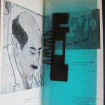
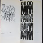
We are the same age and in all these years of collecting I had never heard of Ignasi Sumoy, an artist born in Barcelona, but beside Spain and the Netherlands hardly known in the rest of Europe, It is because I acquired the “Galerie de la TOUR” catalogue ( available at www.ftn-books.com) /Groningen(1989), that I now know Sumoy and his works. Leafing through the book i noticed elements from Ethnic art, Basquiat and the dutch painter Lucassen combined into a personal painting “language”.

Schermafbeelding 2020-04-28 om 11.44.41

I like these kinds of paintings with realistic and symbolic elements composed in an abstract setting. here is the article I found on the Sumoy site which explains more on this artist:

IGNASI SUMOY BOLUFER (Barcelona, 1953)

Ignasi Sumoy’s painting is, paradoxically, in the desert. It is a dessert that can be turned into a likely metaphor as an implicit reference to all the progressive shifts -at times geometric- that many of the visuals arts have been going throughout in the last few years: a stage empty in origin like the desert in which under controversial but more or less homogeneous appearances there lies concealed the changing outline of the dunes. Not only do the sand-hills move, covering large distances because of their specific weight, they take on their own corporality and dimensions, non-transferable, subtly recognizable and subject at times to sudden change both in direction and composition, weight and mass. So the shift and well-nigh solid individuality of the dunes enable us to speak of some of the essences of the artist’s work. But Ignasi Sumoy’s painting, on the contrary, takes its point of departure from this kind of metaphorical recurrence of the idea of the dune, arid and almost prosaic, to participate immediately in its complete geographical opposite, in its opposition of ideal behaviour: life in and of the city, always understood from the particular viewpoint of one who seeks to locate it as an entity midway between apocalyptic-futurist and a re-creation deriving from the experiences of life and aesthetics of the past, a point in time where this Futurist aspiration occurred, together with other reminiscences of Primitivism still close in time and, even more, in the segment of space.

Schermafbeelding 2020-04-28 om 11.45.31

Formally, this is one of the points of departure of his work. Without abrupt breaks, the connection between the various stages of his work has been maintained intact -and completely traceable- during the course of recent years: where formerly there existed a primitive, rather schematized being, without any clearly defined environment, urban, metropolitan man now lives. Unlike the universal prototype established by Musil, he is endowed with attributes that are not only specifically human, they serve to identify him, and even more, he identifies himself through them, thereby constructing a peculiar life-from in a peculiar kind of city locales somewhere between the ideal and the throw-away, formed by beings that mimic the physical elements of their environment so well that it finally takes them over, and in so doing becomes them themselves, assuming all the risks but also all their virtues, and hovering thus between outright apologetic qualities and the most violently critical allusions, maintaining a specific space, a private no-man’s-land where the action unfolds and where the most immediate and evident narrative events of his painting take place.

There is a kind of split suggested by the overall theory of his work that relates as much to the hypothetical apology-refusal already mentioned as to the fact that the characters take one another voice, that is, the recourse to the other and the double so strongly personified here, as though it were some terrifying Bernhardian voice imitator. This basically constitutes one of the founding elements the artist likes to play with, out of which he can build a new aesthetic space and, why not?, a new living space, made up of a personal symbology charred with unique systems and references. Out of reinterpretations, Ignasi Sumoy ends up creating a new, self-contained building, inside which the elements that live there and those that slip in from the world of meaning outside, function according to their own laws. In the realm of idiolect, the slight degree of referentiality matters little, nor what side the scale of referentiality tilts, whether towards resemblance or something real. So the problems of illusion are equally unimportant there too.

In an odd kind of pensée du dehors, Ignasi Sumoy’s painting includes an active and always strange theory that begins with inclusion and ends with rejection, working through a considerable process of selection and refinement both formal and conceptual in nature. In a process not so much of mimicry as ingestion and consumption, anything that resides outside of man ends up assimilated inside, participating in what we could call his natural conditions, becoming one more part of his anthropomorphic definitions to which it is added and which it modifies to a greater or less extent. The use of metasigns and the written language -of the word, in short- has the effect of intensifying the characteristics of reflection: What more human, therefore, than the possibility of voice in the form of articulate speech? And what more civilized than recourse to written cries? So then, his titles become external words and elements equally derived from outside; not simple denominating devices, they frequently coincide, having already been quickly and violently digested. Also, having recourse to verbal/written language allows parallels to be set up between the textual unfolding occurring in the pictures and a kind of iconographical unfolding, formal in the repertoire, that servers to distribute the leading roles. But they are always the same characters, the same characters, the same doubles, treated alike and referring of similar questions.

The building are bodies; spirals, bodies too. Triangles are heads, the gears mouths, tracks are feet, and forks, the sexual organs. But this is not the man-machine, as Kraftwerk sang; rather, we are confronted with the same process that schematizes thought and action. Nor is it a clumsy or puerile criticism of the general dehumanization or advanced industrialization that depersonalizes and homogenizes humans and objects. That would be too immediate. It may be a search for Utopia, not as a liberation, unattainable because so strongly desired, but as future, a kind of private S.F. that invites us to speculate on this present, however subjective.

sumoy

Posted on Leave a comment

Siep van den Berg….the follow up

Schermafbeelding 2020-04-10 om 10.53.38

The painting by Siep van den Berg now is a part of our collection which started some 12 years ago when i first encountered a sketchbook by Siep at auction. Complete sketchbooks by an artist were a rare find at auction in  those days and i decided if i had a chance to buy some of these sketchbooks as an investment i would do so. The first auction i bid for a sketchbook i was successful at a much too high  price, but i still cherish this one because it was specially made for Niesje (his wife) and contains over 20 drawing/collages and is one of the best i have ever seen by this artists. The next auction i was successful with another 3 sketchbooks and i decided to make these drawings separately available through eBay, Catawiki and Kunstveiling. After these auctions other people became interested and these books were sold at much higher prices. But since i have sold over 100 drawings/sketches/collages at reasonable prices making these great drawings available for even the smallest of collectors. I still have some 100 drawings left so check regularly the Kunstveiling pages for any new ones. The small drawings come from a sketchbook which was made in and titled “Andelaroch (Fr)” and dated July 1990. This sketchbook contains all sorts of drawings. Collages mix with Constructivist drawings and even a rare realistic drawing is included.  I just counted the remaining contents of the sketchbook and there are still over 60 drawings which will become available in the next years.

berg andelaroch a

berg andelaroch

berg andelaroch b

Posted on Leave a comment

Siep van den Berg … a painting

Schermafbeelding 2020-04-09 om 13.57.23

My blog readers know of my admiration for Siep van den Berg. A dutch constructivist painter who was at the end of his life recognized as one of the most important dutch modern painters from last century. A true constructivist with some side steps in which he searched for the perfect landscape, still life or portrait, but the main part of his sketchbooks is filled with sketches of possible constructivist compositions ( see tomorrows blog) but in the end, out of hundreds of sketches he choose the best one and painted. First the sketch, after the sketch the alterations with small pieces of paper cut from the edge of the sheet and then he filled in the colors and noted his findings on the sketch. Followed by painting the canvas. One of the ultimate paintings i now have acquired for our collection. It was one of the highligjts of the Siep van den berg exhibition at the Genootschap Pictura in Groningen :…yes and here it is presented in landscape mode.

So my previous post on this painting has to be altered in a small way. I am getting convince more and more it has to be presented horizontally. Like this.

Schermafbeelding 2020-04-09 om 13.58.29

This and other Siep van den bBerg publications and original works are available at www.ftn-books.com and ftn-art


Posted on Leave a comment

Peter Pontiac (1951-2015)….Infanticide


Schermafbeelding 2019-02-08 om 11.40.02

This is the farewell exhibition of the Groninger Stripmuseum . It stops after this appealing exhibition in which comic artist show that beside their talents as comic artists they are in many cases also serious and very accomplished painters. Here is the painting that struck me most. It is INFANTICIDE by the late Peter Pontiac.

Schermafbeelding 2019-02-08 om 11.34.36

I am an admirer of Peter Pontiac for a long time now and this painting shows in an excellent way that there is more to his art than his stand alone comics. www.ftn-books.com has some nice Peter Pontiac items and limited editions available.


Posted on Leave a comment

Memphis…no not the city in the US!

memphis veur

This is a blog on Memphis as a design and art form. Memphis was born in 1982 in Italy in Milano and founded by ao Ettore Sottsass. They designed Postmodern furniture, fabrics, ceramics, glass, and metal objects from 1981 to 1988. and were of great influence to many designers started their careers in those days. The design ideas by Memphis spread all over the world and culminated possibly in one building ….the Groninger Museum. Memphis designs are known for us dutch by one gallery shop in Den Haag who presented all these artists and had many specials an limited editions from the Memphis group. The COPI shop in the Prinsenstraat / Den Haag does not exist any longer but ask any dutch collector interested in Memphis, they know the name for sure. Because of the blog i finally know the origin of the name and found it on Wikipedia and want to share this information with you:

On December 11, 1980, Ettore Sottsass organized a meeting with designers, and in 1981 formed a design collaborative named Memphis. The name was taken after the Bob Dylan song “Stuck Inside of Mobile with the Memphis Blues Again” which had been played repeatedly throughout the evening’s meeting. They drew inspiration from such movements as Art Deco and Pop Art, including styles such as the 1950s Kitsch and futuristic themes. available at www.ftn-books.com are the following Memphis publications.


Posted on Leave a comment

A very special Wim Couwel publication for the H.N. Werkman 1964 exhibition

Some combinations are hard to beat and this one is surely a classic. Wim Crouwel was not yet promoted to the position of designer of the catalogues of the Stedelijk Museum Amsterdam and had just left the van Abbemuseum with his designs. In the in between period he did some free lance works and one of these was the catalogue he designed for the H.N.Werkman exhibition of 1964 in the Groninger Museum and this catalogue became the standard for all his future designs. He chose a slim sized catalogue, but within the book he used some of the papers which he had used in the van Abbemuseum catalogues and would use again for the Stedelijk Museum catalogues. Making it simple but still complex.

On the cover a bold and typical Werkman print which emphasized the graphic quality of the catalogue. The back…. a typical red with clear black and white lettering. This is in my opinion one of the very best graphic designs ever made in the Netherlands and i am proud to still have a copy for sale of this beautiful and splendid Wim Crouwel catalogue.

For this catalogue please visit www.ftn-books.com

Posted on Leave a comment

Jonieke van Es (1966-2012) and the ultimate Samuel Jessurun de Mesquita book.

Schermafbeelding 2017-08-20 om 09.44.27

It was in the very first beginning of her museum career that i met Jonieke. Jonieke studied at Groningen University and after an apprenticeship at ao.  the Gemeentemuseum, she became curator at this museum. Moving forward after this job to Curator of collections at the Boymans van Beuningen Museum, but sadly died at too young an age in 2012.  In those early Gemeentemuseum days she started a project on the works by Samuel Jessurun de Mesquita, Yes the one who taught M.C. Escher, which resulted in the most spectacular book on Samuel Jessurun de Mesquita. A true catalogue Raisonne, which will be the standard book on his works for at least a century. The book was published in 2005 by Waanders and is completely sold out for over a decade now. But now i finally found another copy and for those of my readers that were looking for this one….it is now for sale at www.ftn-books.com

jessurun es a