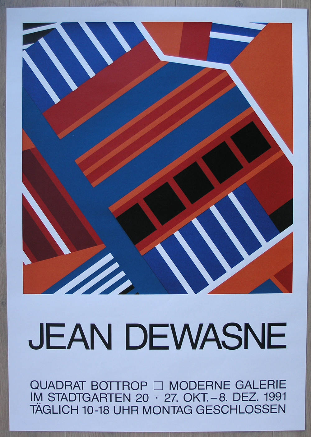
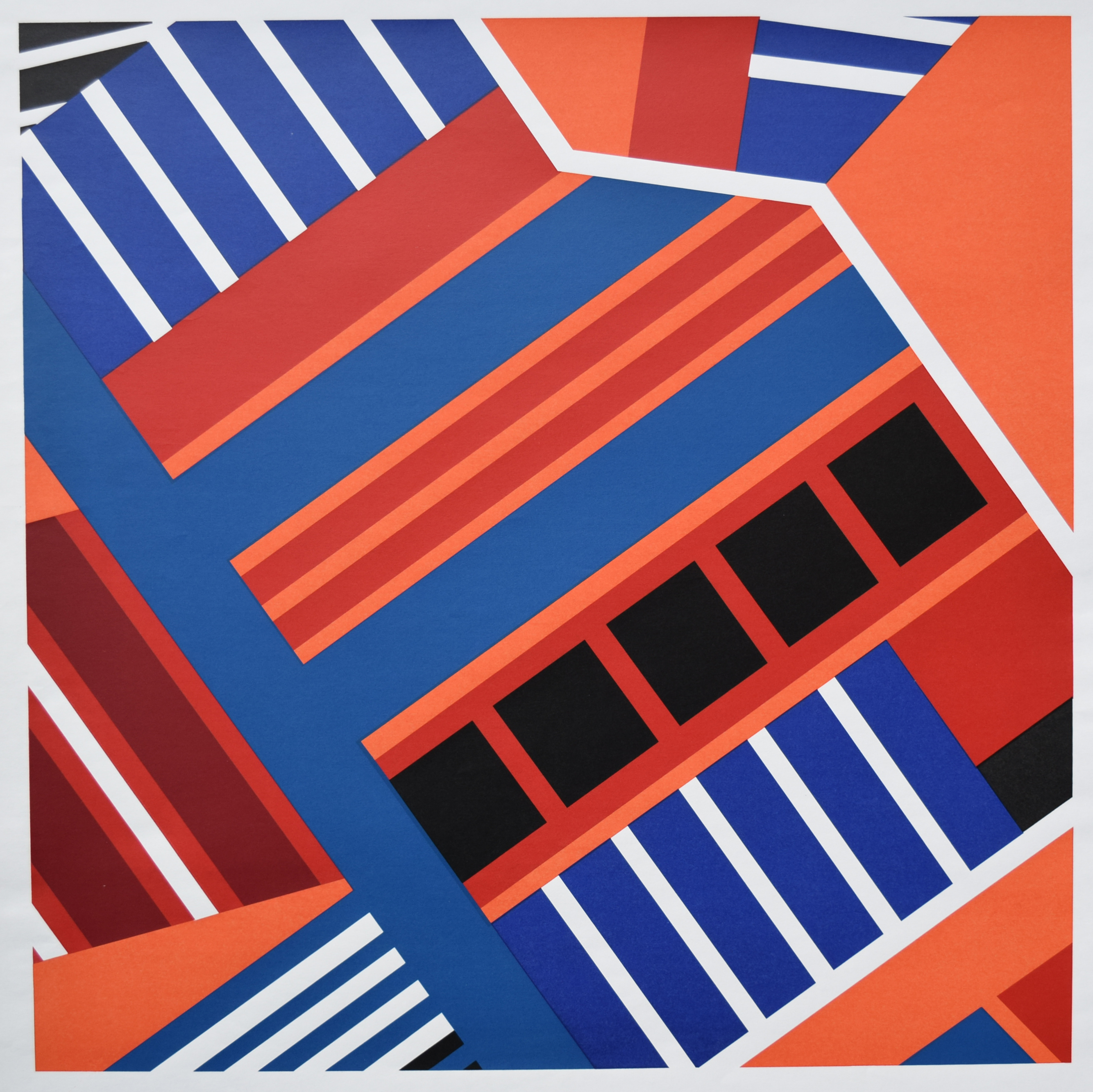
The end of 2017 is near and it is time to share one of my personal favorite dutch graphic artists with you. It is Guillaume le Roy.
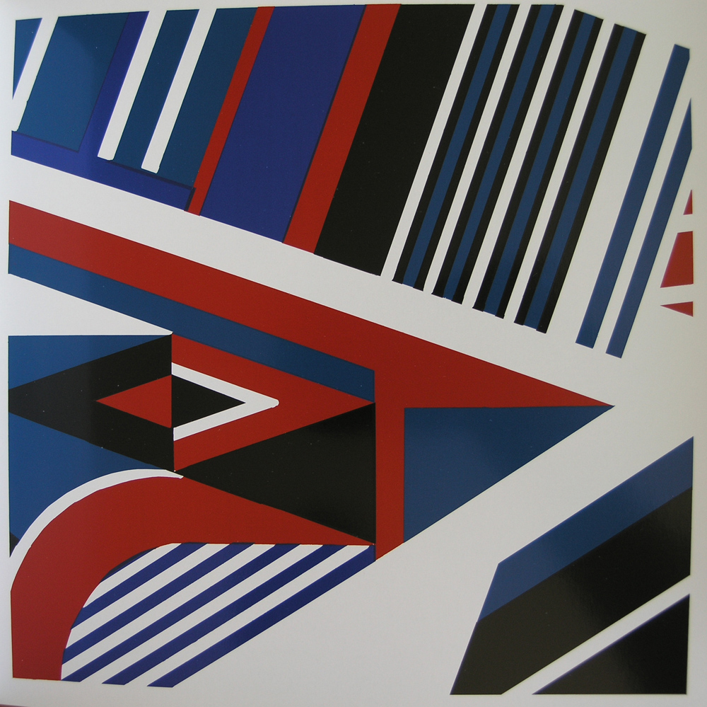
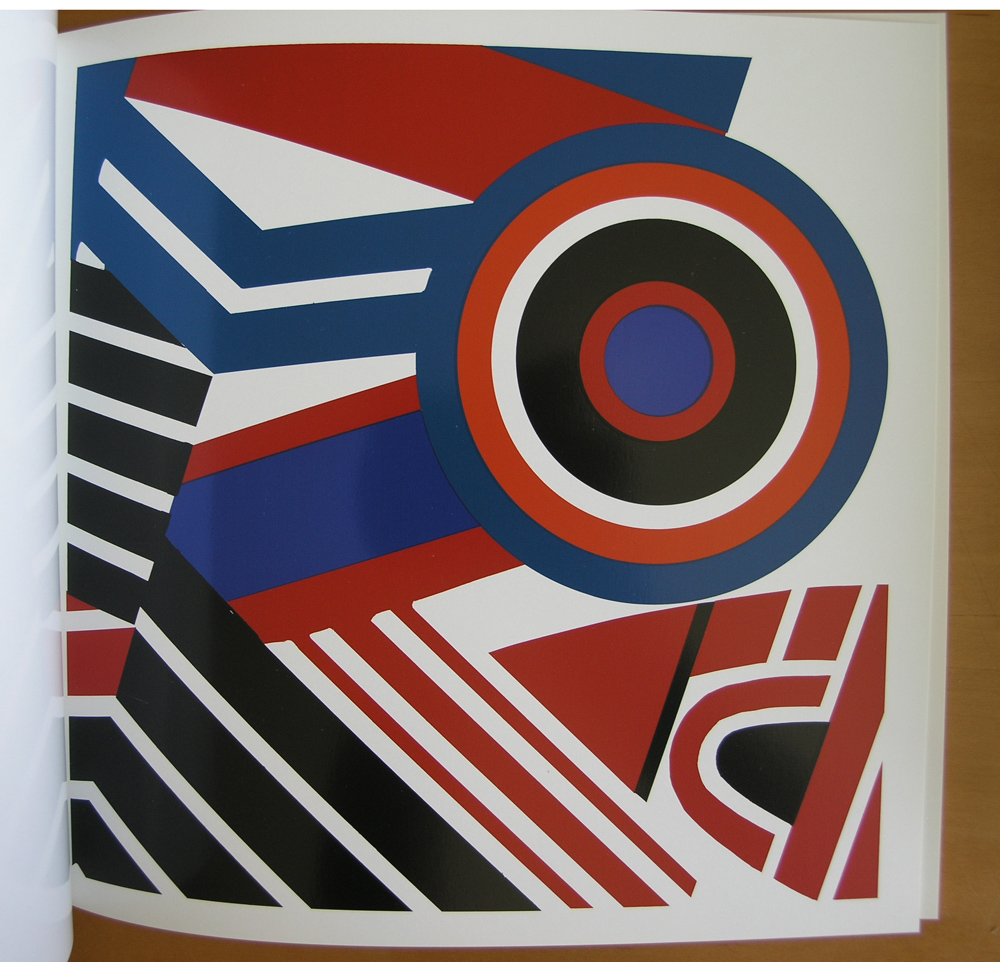
He is not a great name in art, but to me his works belong to the best the second half of the dutch art scene has brought. In most cases his ( woodcut) prints are of an extremely large size and when 2 sheets are put together in one composition it is truly impressive.
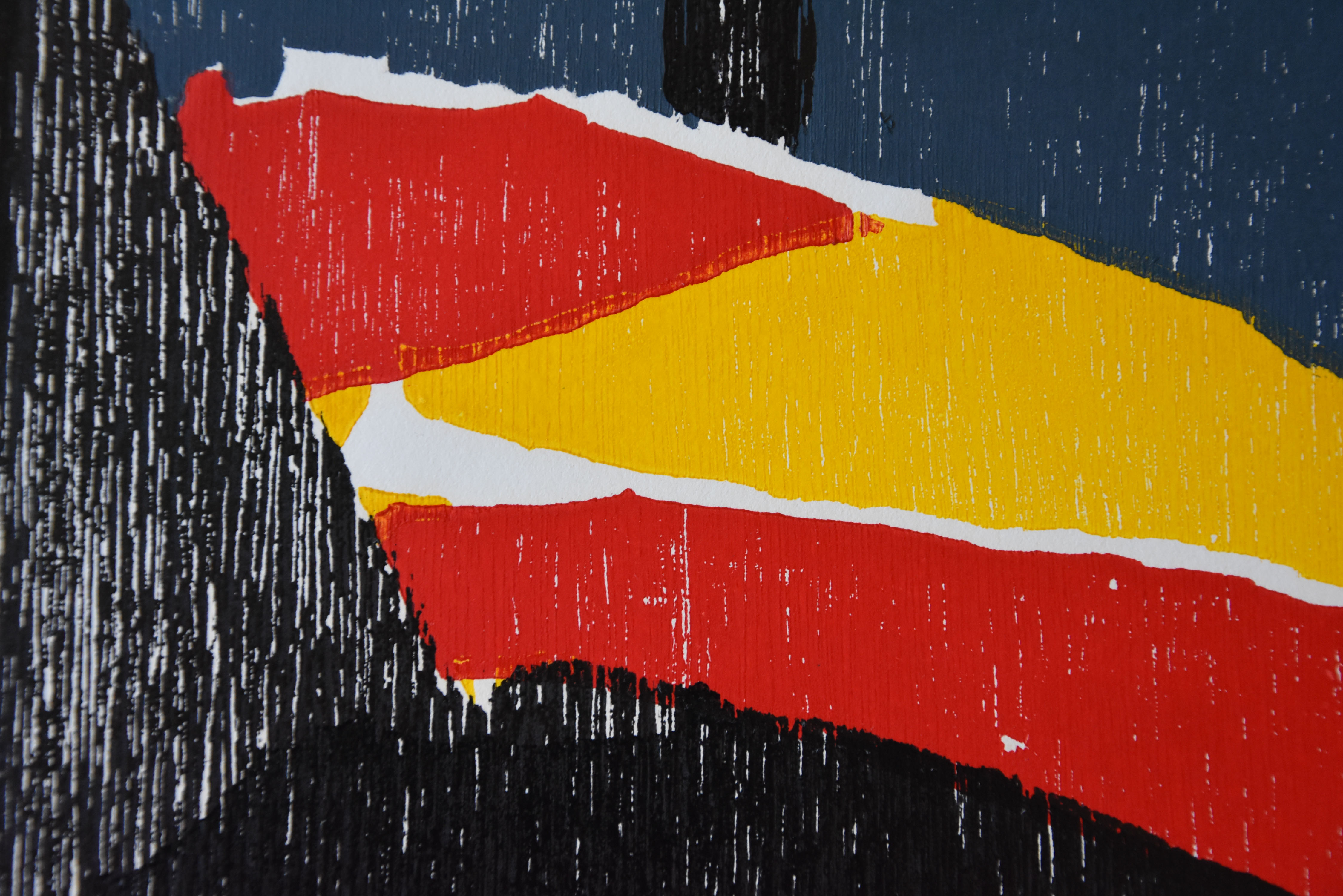

Being almost 200 x 120 cm. These compositions look more like paintings than woodcut prints, but study them closely and you will notice lots of (wood) details in these prints. Executed on heavy paper these are sturdy compositions, a bit like the Soulages paintings. Executed on Japanese paper they resemble the best in Japanese printing but instead of figures within the composition , the use of constructivist elements. I am fortunate to have collected these beautiful works over the past 15 years and now i have decided to part with my duplicatie copies by this magnificent artist. please inquire at www.ftn-books.com