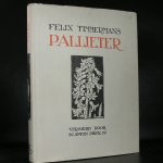
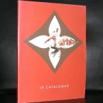
I know there are a lot of Panamarenko admirers and the books he had published are collected all over the world. My most recent Panamarenko went all the way to Korea adn i never could expect that in such a far away country there would be an interest in this great artist.
The 3 publications i now announce are found and purchased at my local bookmarket and are all three well worth collecting. You can find them now at www.ftn-books.com
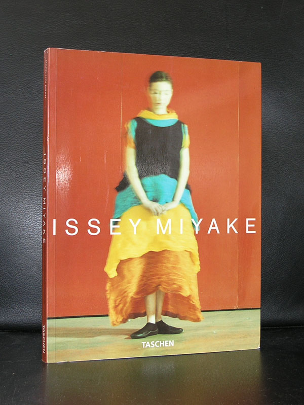
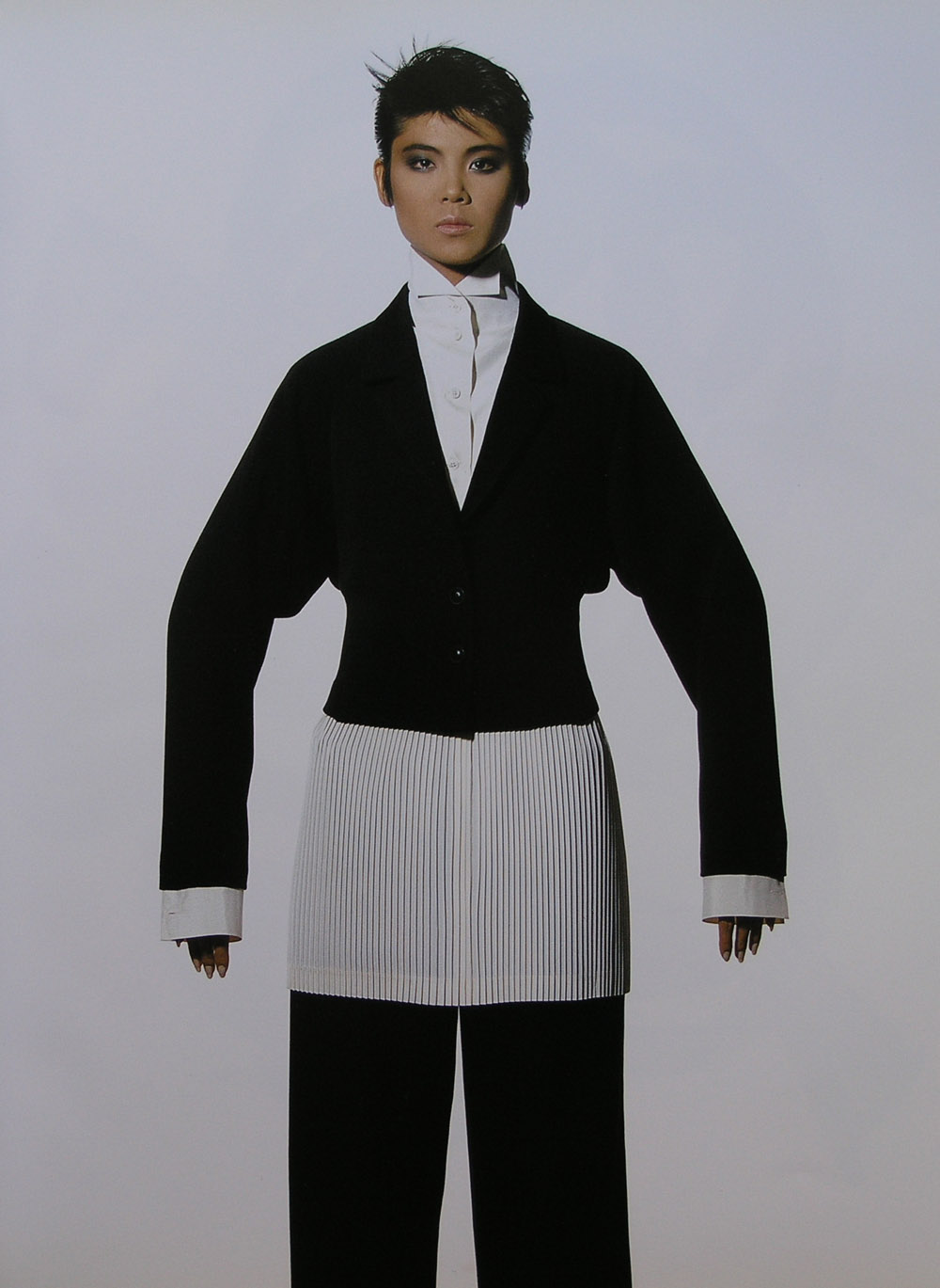
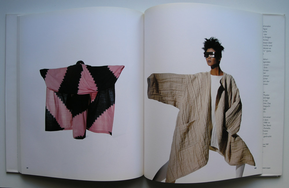
The first time i encountered the name of Issei Miyake was when an exhibition in the Nederlands Kostuummuseum was organized by curator Ietse Mey. The pleated fabrics by Miyake impressed and on a later occasion at the Groninger Museum i became an admirer of his designs.
Miyake has not become a mainstream designer and his designs are to complex to be worn in daily life, but he is important and he developed under his own brand name “l’Eau d’Issey” a range of balms and aftershaves which have become highly successful and made him a wealthy man. One publication must be discussed in this blog, because it is one of the best fashion photo books ever and its printing is outstanding and probably the reason why this is such a beautiful book. The fashion designs “shine” and look to float on the white blank pages. The photography is by Irving Penn, who made this the ultimate Issey Miyake book. Highly recommended and available at www.ftn-books.com
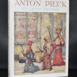
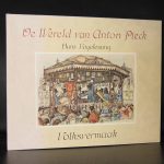
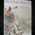
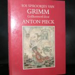
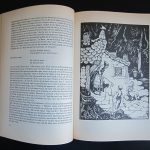
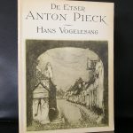
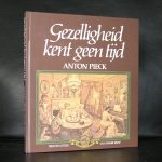
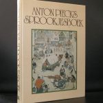
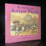
Anton Pieck, perhaps the best known illustrator in the Netherlands was responsible for the artistic creations in the very first Efteling amusement park. The Fairy Ttale forest was executed after the designs and illustrations by Anton Pieck and he stayed partly responsible for all the extensions of the forest and the new attractions until the late Seventies. Pieck his career is one of many disciplines. He foremost was a book illustrator, but later his illustrations were used in greeting and birthday cards. What people do not know is that he was also a gifted graphic artist and painter. Personally i do not think he was the best from his generation. I prefer the simplicity of Rie Cramer with her thick outlines, but i fully understand why Pieck is so popular. His scenes are scenes from a long forgotten world, but a world which is still associated with the country side i the Netherlands. There are still a few places which look like true Pieck villages like Doesburg/ Deventer, but his illustrations stand for a long forgotten world and scenes like in his illustrations are nowhere to be found anymore.
For those seeking the atmosphere and possibly some nice merchandise. Visit the official Anton Pieck Museum in Hattem.
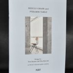
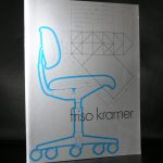
A year ago i devoted a blog to Friso Kramer and his designs. Todays blog is on just one obeject by Friso Kramer….the RESULT chair. a design icon and one of the great dutch designs from last century. This chair was made for a very long time by Ahrend and designed while he was working for this company in the 50’s. Production was ended some 10 years ago, but now a danish company together with Ahrend has given a new life to this design with a reedition of this magnificent and versatile chair. This made me once again realize the importance of Ahrend and specially the work that Friso Kramer has done for them. the Result chair and the Pyramid table by Wim Rietveld are both classics, but there is no doubt that they will fit in any contemporary interior, because both these designs are time less. www.ftn-books.com has added a nice title on both these designs.
One of the first artist from Den Haag that i met and still admire is Christie van der Haak. A few years ago , in 2015 she won deservedly the Ouborgprijs and since her name has become even more famous in the art world. Just take a look at her great site and judge for your self
http://www.christievanderhaak.nl
Discover why her art is appreciated by so many in the art world. The patterns she “invents” and the layers she uses to make her compositions look very classic like patterns from the old days, but put them in a different surroundings, they become great new works of art.
I remember that one of her first exhibitions was the one in the van Abbemuseum curated by Rudi Fuchs, where she presented Madonna paintings. Paintings with layer over layer . patterns overpainted the typical classic madonna .
Later she presented her paintings in the Lakenhal and the Gemeentemuseum where the late Henk Overduin was an admirer and the one who initiated an exhibition with her.
www.ftn-books.com has the Ouborg and van Abbemuseum publications available
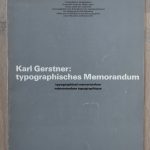
A Book market visit yesterday….. and some lucky finds. There is of course the very rare Karl Gerstner: Typographisches Memorandum which i found in very good condition. The copy will be available from today at www.ftn-books.com
I believe that this is the only copy currently on the market
Here are the pictures of this excellent and rare publication by Karl Gerstner.
The other books were perhaps less spectacular and not as rare as the Gerstner book, but it struck me that some great typographical designs were made by the end of sixties and in the early seventies and these are no exception. Please take a look at the photograph and see the covers by some lesser known designers like Philip Luidl, Wim Strijbosch, Hans Barvelink, Louis Emmerik and Siegfried Odermatt. Not the household names you encounter frequently in this blog and not as rare as the Gerstner publications i now have in stock, but great quality designers who made some outstanding covers/books.
Until the end of the month there is a special discount on the Gerstner publications i have in stock. Use GERSTNER10 to receive a 10% discount on the Gerstner publications. Valid until the 31st of March.
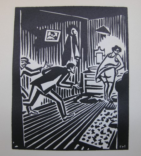
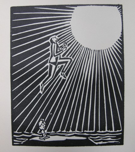
Above this line you will find the logo of FTN-books. It has been my trusted logo for over 15 years now.
The logo comes from a story which is told in 63 small woodcutprints . I chose this print because of the subject ( a man holding and reading book in a forrest) and because it is by Frans Masereel. I love Masereel…not only his technique but also he was one of the first who told a complete story, like a comic, by putting is sequence approximately 100 woodcuts after each other. Published in a smaller sized pocket book size these stories were highly portable and could be “read” within 10 minutes….but this was not the end of the story, because when you study the woodcuts within the publication you will discover different layers within the woodcuts. Masereel was a craftsman pur sang, but he could also tell stories with pictures a great artist of whom there are several publications available at www.ftn-books.com
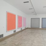
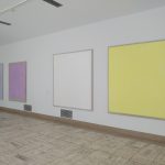
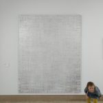
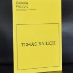
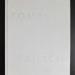
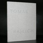
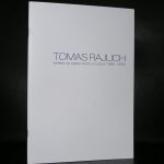
Last Sunday me and Linda visited the Tomas Rajlich exhibition in the Boijmans van Beuningen museum in Rotterdam. I had to see it , because i am a long time admirer of the works by Rajlich. Fundamental paintings almost like Minimal art , Rajlich stayed loyal to his monochrome paintings, with or without a grid with or without a very precise space of 5 cm. in between the lines just paint. I admire his gold paintings with the pencil grids, but his grids can appear in very different ways. white lines, black lines, pencil or painted with the fingers or the entire hand. The ones in the Boijmans have a vertical grid which is applied with some sort of comb and like the smaller sketches/drawings in the adjacent room, glitter is applied on the surface which gives an extra dimension. Still the execution of the paintings is almost the same like some 30 years ago.
Look at the details of one of his gold paintings and the much more recent red painting. At the bottom of the painting it looks like paint is dripping from the canvas. as if all sites matter except the bottom. Rajlich is for my personally one of the most fascinating artist whom i have met and his art is timelesss. I am glad this show is organized with a great and impressive overview of some of his best recent paintings ( 2003) which he has lent on an extended loan to the Boijmans van Beuningen.
www.ftn-books.com has some nice and rare Tomas Rajlich publications available
Here is the text Boijmans published on its site:
Painting was declared dead in the early 1970s. Tomas Rajlich (1940) opposed this notion and revived painting by making the act of painting itself the subject of his canvases. In 1975 he was one of the most important exponents of Fundamental painting: a collective term for works in which idea and materials are inseparable. Rajlich still considers himself a Fundamental painter and has continued to develop as such to the present day.
The grids that were so characteristic of Rajlich’s early works seem to have disappeared from his recent monochrome canvases. The grid has become simply one of the elements, like the paint, glitter and linen that Rajlich uses to build up his extravagant paintings.
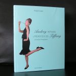
This morning i learned that one of the great fashion designers died. At the time i was working at the Haags Gemeentemuseum, the curator Ietse Mey, organized an exhibition of the fashion by de Givenchy worn by Audrey Hepburn and to enhance the exhibition a film festival was organized at the Filmmuseum with fashion worn by Audrey Hepburn in the movies. At the occasion of the opening i saw both celebrities and it struck me, that even as mrs. Hepburn was already ill at that time, she looked radiant and beautiful. The show was a huge success and one of the first in a long line of fashion exhibitions which were held at the museum. The catalogue is of course completely sold out , but sometimes you will encounter a copy on the book markets. If you find one….do not hesitate to buy it, because it is rare. An edition of only 1000 copies means that it was sold out almost instantly and it was never reprinted.
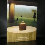
Blouin has done an excellent biography on de Givenchy. Here is the text of it and if you are looking for more de Givenchy, Hepburn, LVMH /Louis Vuitton publications check www.ftn-books.com
Tributes continue to come in to Hubert de Givenchy, the French couturier whose elegance defined the 1950s and 1960s and the style of Jackie Kennedy, Audrey Hepburn and more. Givenchy died at the age of age 91 in his sleep on Saturday; his death was announced by his namesake fashion house. During his lifetime, he had received the Chevalier de la Légion d’Honneur in 1983, and a lifetime achievement award from the Council of Fashion Designers of America in 1995.
Givenchy was born in 1927 to a religious aristocratic family. He learned the couture “métier” from working for Jacques Fath, Robert Piguet, Lucien Lelong, and Elsa Schiaparelli, before founding his own namesake label. Givenchy would later establish his Parisian atelier across the street from Cristóbal Balenciaga, who was his dear friend and his longtime role model. He was also influenced by Madame Grès and Christian Dior, and inspired by artists. He notably created taffeta evening coats and robes du soir in homage to Joan Miró during the 1970s.
His first collection was presented in February 1952; it featured modern separates, providing more affordable and versatile options than the haute couture looks that were standard in the French fashion world in the middle of the 20th century. Nonetheless, Givenchy also made opulent and heavily embellished garments (with pearls, feathers, and ribbons), impeccable cocktail ensembles, and elegant accessories, notably sumptuous hats. He was known for dressing a wealthy, stylish clientele: Jacqueline Kennedy was a longtime client, as was Grace Kelly and the Duchess of Windsor.
The darling of the Givenchy fashion narrative, however, was Audrey Hepburn. They met when a mutual friend told the designer that Miss Hepburn was keen to be introduced, and Givenchy assumed the lady in question was Katherine Hepburn. Their friendship blossomed despite the misunderstanding, and Givenchy ended up making costumes for Audrey Hepburn’s then-upcoming film, ”Sabrina” (1954)—as well as “Funny Face” (1957), “Breakfast at Tiffany’s” (1961), “Charade” (1963), and “How To Steal a Million” (1966). While Givenchy and Hepburn created many iconic sartorial moments on film, perhaps none rivaled the glamorous wardrobe of Holly Golightly, the onscreen heroine of “Breakfast at Tiffany’s,” who walked down Fifth Avenue wearing dark sunglasses, pearls, evening gloves, and a black Givenchy column dress. (In 2006, the dress was sold at a charity auction at Christie’s in London for six figures).
Givenchy was also associated with various successful perfumes: from the fruity and feminine L’Interdit (created in 1957 for Hepburn) to the heavily floral Amariage (created in 1991).
Givenchy sold his fashion house to the LVMH Group in 1988 and retired after his collection in July 1995. John Galliano succeeded him; less than two years later, he in turn was succeeded by Alexander McQueen, then Julien Macdonald. Riccardo Tisci held the reigns from 2005 until 2017, much to the original designer’s displeasure. Currently, Clare Waight Keller is the label’s Artistic Director.
In March 2016, the fashion house created an archival department to conserve and promote all garments and accessories dating from the original designer’s tenure, from 1952 to 1995. Just last year, the Museum of Lace and Fashion in Calais in northern France celebrated Givenchy’s work and presented 80 beautiful looks and accessories that spanned his career.
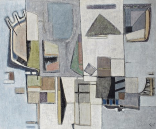
Since the early eighties i admire Geer van Velde. When i first entered our offices at the Gemeentemuseum, there was original art on the wall . Chosen by employees of the Gemeentemuseum the painting on the wall of our offices was an original large painting by Geer van Velde.
Geer van Velde was Bram van Velde’s younger brother they differ 3 years in age but their art differs even far more. Both influenced by fellow artists also living in Paris, Geer became known for his paintings winning Prizes and being admitted into the Salon des Independants . He is considered to be a member of the Ecole de Paris. The works by Geer van Velde are highly recognizable being abstract but still showing some realism in them. The use of color?? subdued not the bright colors his brother is known for. They come from the same nest but their works could not be more different .
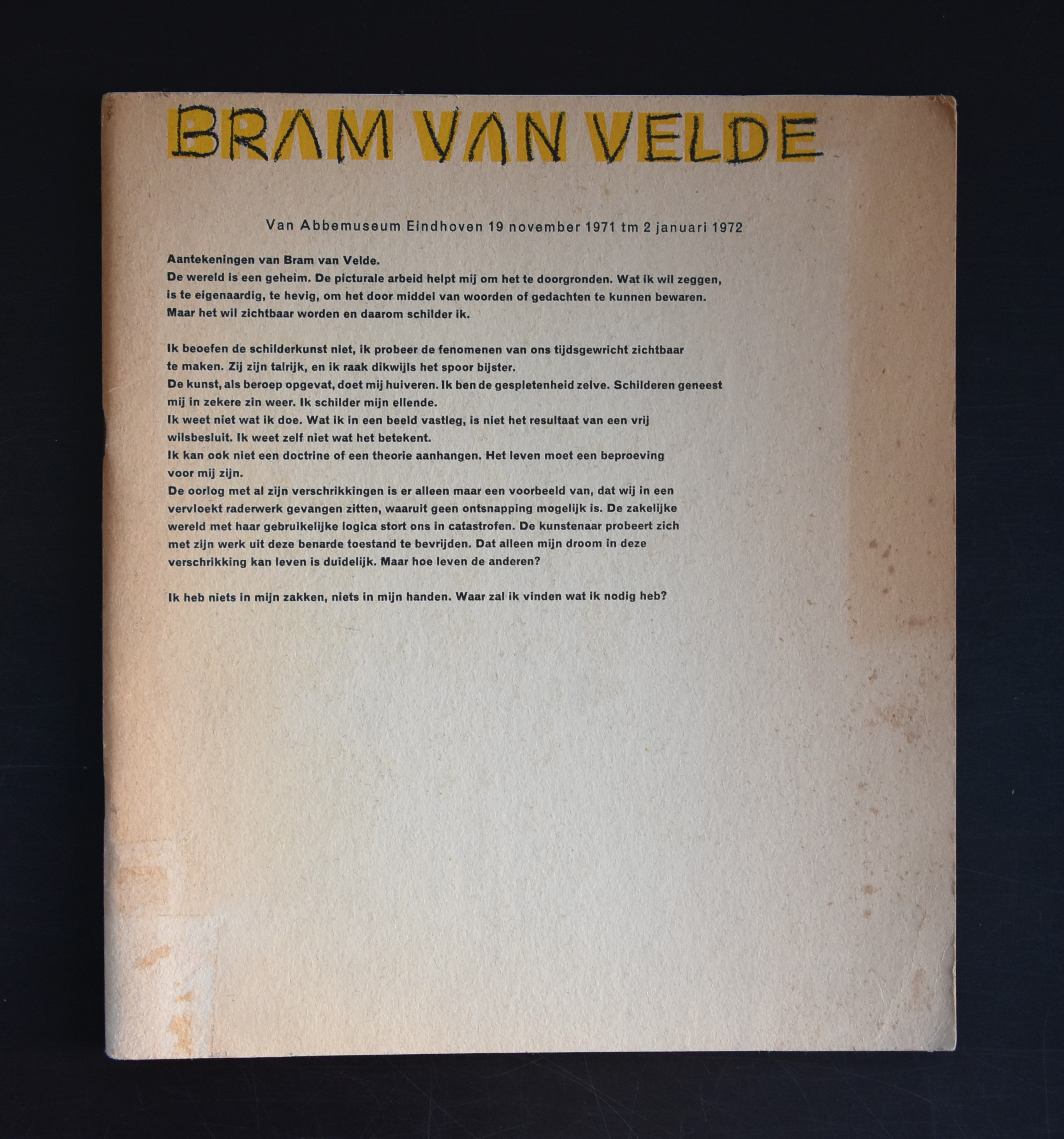
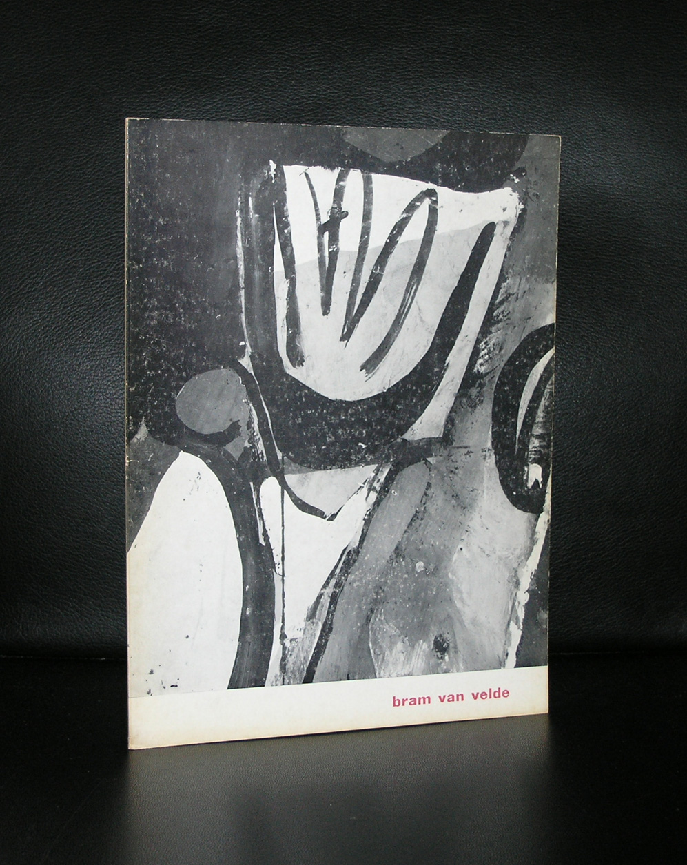
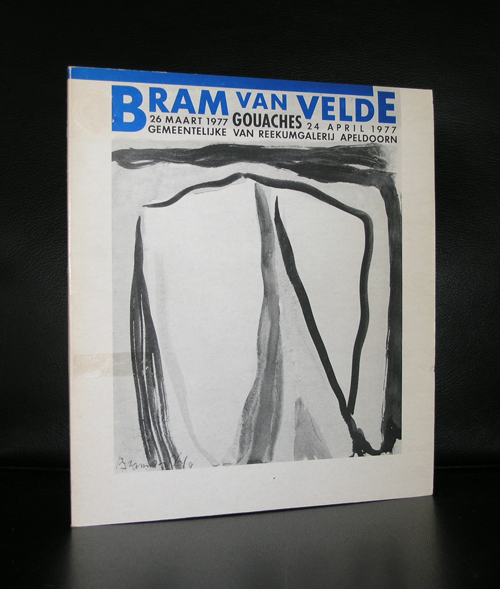
Where Geer was known and admired is his early years, the case with Bram was totally different. It is now since 30 years that the works by Bram are more admired. They are “classic” made in the 50’s , 60’s and 70’s, but study them closely and you will sense that they belong in the present. These are bold and highly sensitive paintings. Both these van Velde brothers have their qualities, but maybe, in the long run, i prefer Geer.
There are Geer van Velde publications available at www.ftn-books.com
Artist/ Author: Oliver Boberg
Title : Memorial
Publisher: Oliver Boberg
Measurements: Frame measures 51 x 42 cm. original C print is 35 x 25 cm.
Condition: mint
signed by Oliver Boberg in pen and numbered 14/20 from an edition of 20