Posted on Leave a comment

Felix Labisse (1905-1982)

Schermafbeelding 2018-08-31 om 17.08.22

Felix Labisse, is for me one of the great surrealist painters from last century and i have a life long admiration for the artist and his works.

It must have been around 1970 that i visited in the company of my parents Paris. I started to grow an interest in art and limited editions because i had a membership with ARTA . a small gallery with a subscription program to buy at membership prices graphic art. My entire collection at that moment well below 5 lithographs.

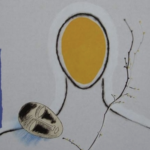
Paris it was and beside the scenic neighbourhoods , museums and tourist attractions we went to shop at “galerie Lafayette”. We took the escalator and on the top floor …there it was . a true ART gallery and the first piece on show was this lithograph in a signed edition.

Schermafbeelding 2018-08-31 om 17.07.31

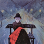
I was so impressed with the lithograph that i borrowed the money with my father to buy it and since it has been in my collection. I still love the beauty of the typical Labisse female figures. It is not on the wall anymore, but is still very much appreciated as a wonderful piece of art that i cherish for being a Labisse and for being one of the first pieces of art that i ever bought.

www.ftn-books.com has some nice Labisse publications available

btw. The beautiful portrait of Labisse sitting is by Brassai


Posted on Leave a comment

Nicolas de Stael (1914-1955)

Schermafbeelding 2018-09-02 om 10.49.45

Another artists artist is Nicolas de Stael. You can find some of his works in french museum and possibly there are some works in the Netherlands in collections, but the main part of his paintings that are in public collections can be found in French museum, because in France de Stael is known.  Undeservedly de Stael has not become the great name in art he deserves to be. He should be known worldwide , because his abstract art is a highly personal voyage through the landscape of Modern Art. In his short life he experimented with lyrical geometric abstract forms , using less prominent colors than many of his contemporaries.

Every decade there is another large retrospective exhibition in which is tried to explain the importance of de Stael, but so far without success. Still it is neccessary that curators from all over the world present again and again this groundbreaking atist until the greater public becomes familiar with his kind of forms , shiftings and paintings and starts to appreciate this great artist. Preferably not in a way that in every household a reproduction is hung on the wall because it is fashionable to have a “DE STAEL’ on your wall, but in a way that a large public can grow accustomed  to and appreciate this great artist. to start….

www.ftn-books.com has some great titles available

Posted on Leave a comment

Bob Bonies (1937)

Schermafbeelding 2018-09-02 om 10.10.41

For me the only true “Hard edge” artist in the Netherlands is Bob Bonies, however Michiel Morel refers to the art of Bob Bonies as a rearrangement of FORMS AND COLORS.

I read his excellent article and it is unfortunate that it is only available in dutch, but for those who understand the language here is the link :

Bonies: Ordening van vorm en kleur (periode  1964 – 1968) (3)

As you can read in the article . Bonies stayed true to his art of rearranging , shifting and placing forms and colors in a new context and one of the earliest silkscreen that was published in a larger edition was the one he made for the Stedelijk Museum catalogue VORMEN VAN DE KLEUR

in which his contribution stands out together with the one Ellsworth Kelly made for the same publication. This Wim Crouwel designed publication is available at www.ftn-books.com

left Bonies and right Kelly

I have a lifetime admiration for Bob Bonies. He was one of the first artists i personally met at the Gemeentemuseum and a few years ago i bought a small collection of his publications from another bookdealer who had bought them from a Bonies collector and within one of the publications i found the birth card of his son Jiri. Even this card shows the quality of his works. The card is for sale too together with many other Bonies publications.


Posted on Leave a comment

The artists in the world ……

Schermafbeelding 2018-09-02 om 10.22.02

The artists in the world …a never ending art trip

https://www.artistintheworld.com

Above the site location which contains over 4000 photographs now of visited artist all over the world. All photographed in their studios with their back to the camera and link(s) to their internet pages. A fascinating story and one that i visited frequently because of the blogs i am writing. Many of these artist are known to me too. Some of them i visited myself in their studios, but many of them are represented in my inventory at www.ftn-books.com

Schermafbeelding 2018-09-02 om 10.23.08

Posted on Leave a comment

Walter Gramatte (1897-1927) a German expressionist rediscovered.

Schermafbeelding 2018-08-31 om 16.41.11

Totally original…that is what i think of Walter Gramatte. His style is as recognizable as some of his contemporaries. Schiele, Klimt and and Klee are recognized within a split second and Gramatte is one of these artist who’s works are recognized as soon as you encounter and see them.

Since two decades there has been a new a renewed appreciation for his works, but publications on Gramatte are still rarities. Nevertheless www.ftn-books.com has a few titles in its inventory.

Walter Gramatté was born in 1897 in Berlin and died in 1929 in Hamburg.

Gramatté had a very short (15 years) career but a very productive one – paintings, drawings and prints with subjects of figures, portraits, still life’s, landscapes and book illustrations.

He fought in the First World War and was disillusioned as a result.  Like many artists of his generation his works depicted the individual and existential states of being. (Gramatté book, Kirchner museum). He was married to the Russian composer Sonia Fridman-Gramatté.

Posted on Leave a comment

Hendrik Jan Wolter (1873-1952)

Schermafbeelding 2018-08-31 om 16.24.34

Hendrik Jan Wolter is not on show in many Museum collections, however his works appear frequently at auctions in the Netherlands. It took at least 20 years of auctioning, but now his works fetch average to good prices ( 1000-5000 euro) and deservedly so, because according to many his impressionist works belong to the best impressionist works made in the Netherlands in the 20th century. he knew Theo van Rijsselberghe, Seurat and Signac and was greatly influencedx by all 3 without becoming a pointilist “pur sang” his works are more a cross between the pointillists and impressionists meeting with Matisse.

Here are some examples of his works:

Schermafbeelding 2018-08-31 om 16.30.36

Boats in sorts and kinds were his passion, because on the majority of his paintings you will encounter boats. A fascinating artist who becomes increasingly important in the Netherlands. www.ftn-books.com has some nice Hendrik Jan Wolter publications available.

Posted on Leave a comment

Henri Laurens (1885-1954)

Schermafbeelding 2018-08-27 om 13.42.52

A long time i thought Laurens was not that important for Modern Art, but since i have seen his exhibition at the Museum Beelden aan Zee  ( catalogue available at www.ftn-books.com), I changed my ideas about his work. At first i thought him to be heavily inspired by Picasso, but in this show i discovered he really has a personal approach to art and a “signature” of his own.

left Picasso and right Laurens

He was a French sculptor best known for his Cubist collages, sculptures of nudes, and busts. The curving forms and simplified features of his oeuvre are reminiscent of ancient greek sculptures, though he also drew influence from his friendships with contemporary artists Georges Braque, Amedeo Modigiliani, Juan Gris, and Pablo Picasso. Born on February 18, 1885 in Paris, France, Laurens first worked as a stonemason before taking drawings classes and developing a strong interest in the works of Auguste Rodin. From 1914–1915 and extending until after the First World War, Laurens experimented with still lives and various new media, using wood and iron and eventually graduating to terracotta and bronze. He then went on to participate in the Venice Biennales of 1948 and 1950, and had a retrospective at the Musée National d’Art Moderne in Paris in 1951.

Posted on Leave a comment

the very best the book on Robert Mapplethorpe

Schermafbeelding 2018-08-27 om 12.47.16

A few weeks ago i posted a photograph of some books i bought for my inventory. Among them a book on Robert Mapplethorpe which was published on the occasion of his 2016 traveling exhibition. I have the german version in front of me and after studying , reading and admiring the very large and thick publication in the last few weeks, there is only one conclusion to be made.

THIS IS BY FAR THE VERY BEST PUBLICATION ON ROBERT MAPPLETHORPE EVER

This needs some explaining.It is not only a very large publication, which is beautifully printed and designed, but the book shows all the subjects for which Mapplethorpe has become famous, but not only that ..more important it includes studies , studio settings and much more so it gives an almost complete impression of Mapplethorpe as a person, photographer, friend and artist.

The book is in the german version available at www.ftn-books.com

MAPPLETHORPE schirmer

Posted on Leave a comment

Jean Bilquin (1938)

Schermafbeelding 2018-08-26 om 12.12.27

I do not know what to say. Is Henk Visch the dutch equivalent of Jean Bilquin or is it the other way around? Certain is that both artists are inspired by the same objects and surroundings.

Another influence must have been the sculptures by Brancusi because a returning object is the portrait sculpture Brancusi has made in several versions.

But there is much more to discover in the works by Jean Bilquin. When you leaf through the catalogue which was published on the occasion of the Kunsthal exhibition ( 2008 ). You really feel that you are discovering an artist. An artist who is inspired by nature and people. Both subjects combining in a very personal kind of art on larger sized canvasses. This is the kind of work which always attracts me and which i want to discover further after i have visited the exhibition. The catalogue ( available at www.ftn-boooks.com) shows exactly why these works have a rare quality. The catalogue has several fold out pages which make the scale of these large paintings somewhat visible.