Posted on Leave a comment

(Reinier) Lucassen (1939)

Schermafbeelding 2018-02-04 om 10.10.03

Possibly the best known member of the NEW FIGURATION mouvement in the Netherlands is Lucassen. If i must describe his art, it is a mix between geometric colorfield and daily household objects like screens, plants and kitchenware, add some comics into it , stirr it and you have an early Lucassen painting .

Schermafbeelding 2018-02-04 om 10.19.47

Later he developed this style into a very authentic and recognizable personal style. Making abstract compositions with shapes, numbers and letters. These paintings are intuitive compositions combining , more or less at random elements from his direct surroundings, but these can not be recognized as such. The compositions, titles, execution are like small poems executed on canvas.

www.ftn-books.com, has a large selection of Lucassen titles including the catalogues he made for his galerie Espace exhibitions.


Posted on Leave a comment

Janusz Haka (1951)

Schermafbeelding 2018-03-27 om 14.32.15

I first heard of Janusz Haka when i received an invitation in 1980 by the Jurka gallery in Amsterdam. They held an exhibition with the polish artist Janusz Haka. Since the list of his exhibitions is a very very long one and because of his subjects his art was appreciated in many places all over the world. I would say that his art has influences of Walasse Ting and Leroy Neiman, but Haka is as original as the ones just mentioned. His style is recognizable and his paintings have in most cases an erotic element but never offend. His paintings are appreciated by both men and women and because of the many colorful elements these are joyful accessible paintings. FTN art is now selling one of these majestic large oils on paper. It is the one which was modelled after “l’origine du monde” by Manet.

Schermafbeelding 2018-03-27 om 12.24.37


A beautiful original oil painting , signed and dated 1980 in pencil and a great early Janusz Haka to collect.

Posted on Leave a comment

Vojta Dukat ( 1947)

Schermafbeelding 2018-03-25 om 12.20.20

Living in Den Haag and winner of the prestigious Ouborg price in 2001, i always have admired Vojta Dukat, original in his approach to his subject and for me one of the very best black and white photographers of his generation. Intimate portraits of people, perfect use of the light.

He makes photographs as if they were paintings. Classical, recognizable  situations are transformed into brilliant photographs. Because of his connection with Den Haag, the Gemeentemuseum was fortunate to have the show on the occasion of the Ouborgprijs and this is where i first encountered his photographs. Since i have been following his career. The book published on the occasion of the Ouborgprijs is a true classic and www.ftn-books.com is fortunate to have this for sale. I found a small youtube item on the book which gives a great impression of it.

https://youtu.be/fD6PBKFlERI

dukat

Posted on Leave a comment

Arie van Geest (1948)

Schermafbeelding 2018-03-25 om 12.13.21

Without realizing i have collected a beautiful small collection with works by Arie van Geest. Born in Maasland he stayed in the region and had several studios in Rotterdam. The friendship with Pat Andrea shows in his early works which were a little surreal, but in the mid eighties he changed in the approach of his painting. His works became abstract with realistic elements and that is the time i met Arie and bought my first drawing. Together with Mariette Josephus Jitta, as the curator in charge, he made the Tableau Mourant exhibition in which 98 watercolors were shown. This series was later bought by the van Gogh Museum. For the exhibition in the Gemeentemuseum 2 editions were made. One “ordinary edition” designed by Paul Stoute and the other a linnen bound one, with a drawing/watercolor by van Geest.

The style changed dramatically and personally i prefer this “new” Arie van Geest above his more realistic style. He stayed loyal to this new found abstract style for almost 20 years and changed again to a more a realistic way of painting in 2002. All three periods are important, but when you look at the museums that bought Arie van Geest ( Gemeentemuseum, Stedelijk Museum, Boymans van Beuningen ) , They all made their acquisitions in the abstract period, except for the Athens Museum which made purchases from his most recent period. Arie van Geest was represented by Delta Gallery. He now has frequent shows with Livingstone gallery.  I have decided to sell part of my Arie van Geest works, so please have a look at FTN art and for the book related material visit www.ftn-books.com

Posted on Leave a comment

Lucian Freud “Momart edition”, 2003

Each year, for over 30 years, an artist, with whom Momart has an established relationship, has been invited to design a limited Christmas card edition for Momart’s clients. Since then they have been lucky to collaborate on this project with many of the top British and international artists including Lucian Freud, David Hockney, Gary Hume, Sarah Lucas, Tracey Emin and Damien Hirst and especially the Freud edition has rose to mythic proportions. A printed card which was designed by the artist himself and making this one of the last works of art in edition Freud has made before he died in 2011.

The card is now sought over by collectors and Freud enthousiasts worldwide and www.ftn-books.com has one for sale.

OLYMPUS DIGITAL CAMERA

Encore c1949
Print
20 x 24cm
Consists of a reproduction of an original sketch by Lucian Freud mounted on folded buff card stock and contained in buff envelope.
MOMART Christmas Edition
The entire MOMART Christmas Greeting series is now in the permanent collection of the Victoria and Albert Museum, The Tate and several other international museums.

The card comes together with all the original Momart packaging material.

Posted on Leave a comment

Larry Bell (1939)

Schermafbeelding 2018-03-19 om 11.42.47

The last day in this cycle of blogs on Forgotten artists. The 5th blog is devoted to Larry Bell. I was in doubt if he really is forgotten, but concluded that at least in Europe he is forgotten. Where he had an initial important exhibition in the Stedelijk Museum in 1968, for which Wim Crouwel designed the catalogue his name never showed up again in the Netherlands for participating in an exhibition ……but on the other side of the ocean it was different and his fame rose in the US from the early Seventies until now. The cubes he has made are magical and are a long time element in his oeuvre.  This is what he says on his site on his Cubes.

OLYMPUS DIGITAL CAMERA

CUBES

Larry Bell became interested in glass in the early 1960s. As a medium, it had three properties that interested: it could transmit, absorb and reflect light, and with specific treatment, it could do all three at the same time. He found the cube to be an ideal form with which to investigate the phenomena of light on surface. The first cubes were made using household mirrors from which he would scratch away parts of the reflective material. Later he discovered a plating process that would make the glass reflective on both sides. With the early cubes, he incorporated geometric imagery, including the ellipse, adding visual complexity and depth to the simple forms. Eventually he eliminated the imagery. With a technology that deposited exquisitely thin films of various metallic and non-metallic substances to the glass. The resulting visual spectrum of colors is in fact light reflected in different wavelengths off the surface of the glass. Bell has continued to revisit the cubes throughout his career.

To end : there is a discount code on every purchase of 10% for the readers of this blog.

use: forgotten10    and you will receive the discount on your order/ valid until the 30th of June 2018

Posted on Leave a comment

Pieter Laurens Mol / Cervo Pendulum

Schermafbeelding 2018-06-06 om 10.41.49

Sometimes you know a book exists, never seen it, but from stories heard and publications read there is only one conclusion…it must be out there…somewhere.

Cervo Pendulum by Pieter Laurens Mol is such a publication. I learned the book was printed by Rosbeek. At the times i visited this printer in the late Nineties i had never seen a copy. All the times i visited book fairs, markets etc….no copy found. But now finally after over 24 years  i have a copy at www.ftn-books.com available.

mol cervo a

This book is rare, that is for certain, but it is also important. It is one of those little artists books which is worth collecting. Printed by Rosbeek and published on the occasion of the opening of the new medical faculty building of the University of Utrecht. Edition is said to be 250 copies only and of these few will have survived. Text is in dutch and in english, which makes this important book accessible to english collectors too.  An absolute “must have” for the Pieter Laurens Mol collector and it is not very likely that it will show up again in the coming years.

Posted on Leave a comment

The three Henk Peeters …Nul/Zero editions

Schermafbeelding 2018-06-03 om 13.48.29

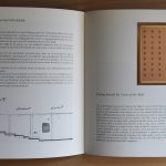
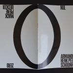
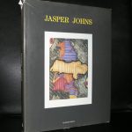
Yes, it took a period of over 50 years for Peeters to become the household name in Zero art as he is now. Shortly before his death in 2013  there was a retrospective exhibition at the Gemeentemuseum Den Haag. At that occasion the famous Nul/Zero catalogue from 1963 was published as a facsimile. The original catlogue is an extremely hard find these days and when you encounte a copy. The condition in most of the cases is not what you had hoped for. At one time www.ftn-books.com had the the original, the facsimile and the multiple signed Peeters edition available, but that was a long time ago. All sold out at record prices, but now i am lucky to have bought the best copy i have ever owned. The condition is MINT_ and it is now available at www.ftn-books.com.

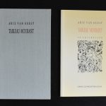
Here are the images of the originalNul/Zero book now available  condition is MINT-

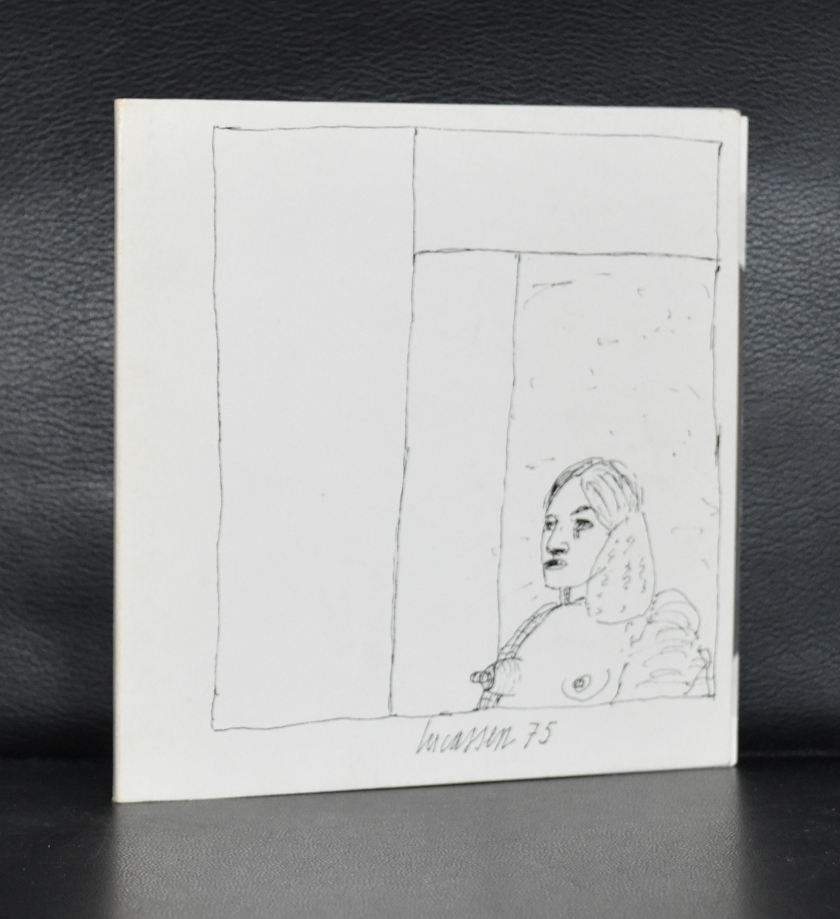
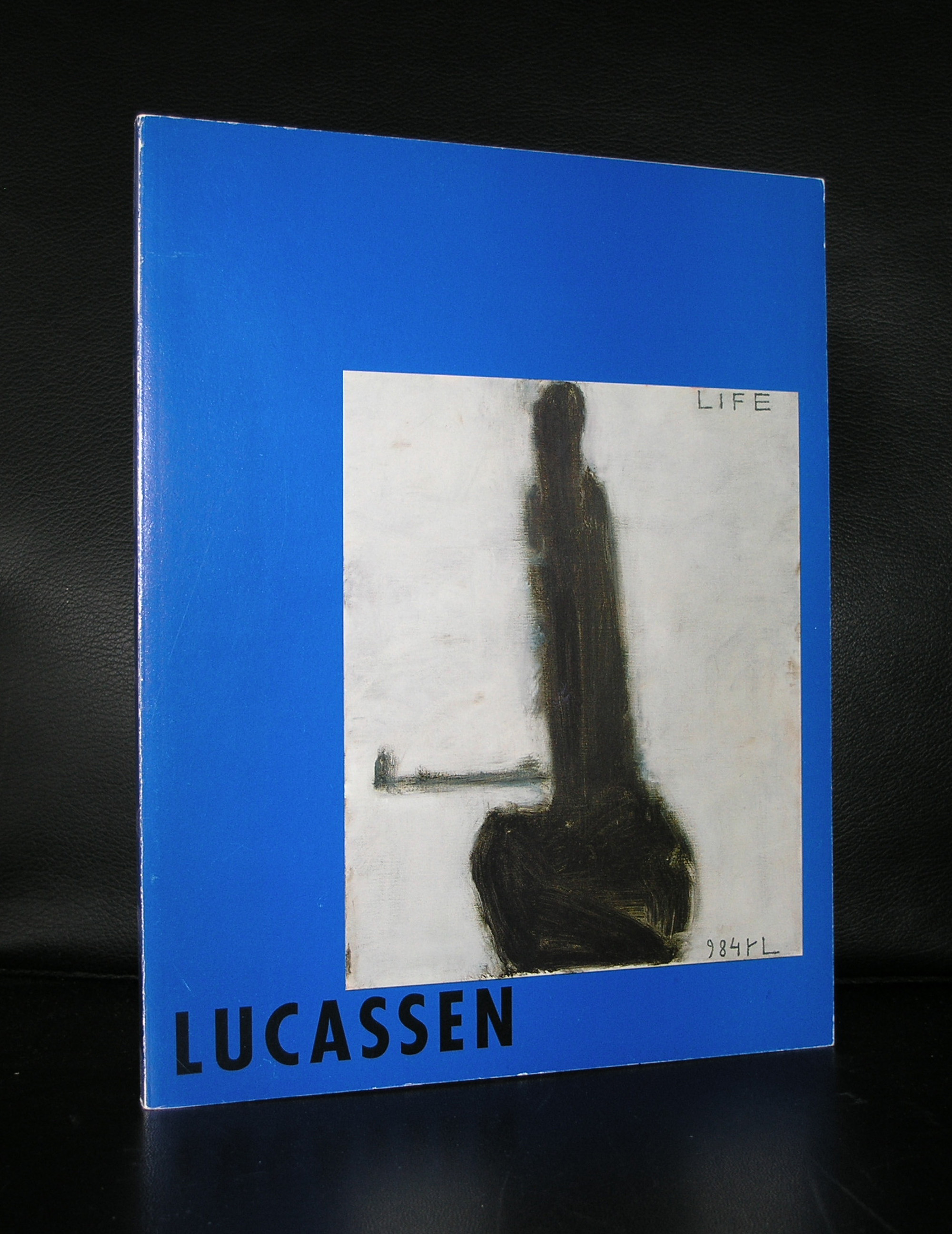
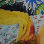
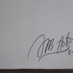
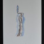
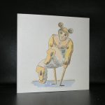
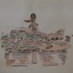
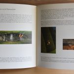
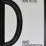
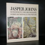
and these are my pictures from the multiple by Peeters published on the occasion of his Retrospektive:


For those interested in Peeters history read here the text the Gemeentemuseum published at the occasion of the Henk Peeters Retrospective:

10 September 2011 till 12 February 2012

HENK PEETERS

‘The world is going to change radically.’ Henk Peeters (b. The Hague, 1925) said so more than once. The statement was an expression of his deep desire for a Communist society. It was not to be, but Peeters remained an idealist. Together with Armando and Jan Schoonhoven, he founded the Nul group – the Dutch arm of the international ZERO movement (including artists like Piero Manzoni en Lucio Fontana), with which he maintained close contacts. Their art was all about eliminating the artist’s personal style and elevating everyday life to art through the use of ordinary materials. Peeters used cotton wool, feather and hair in his artworks and even ‘drew’ and ‘painted’ with smoke and fire. This autumn, the Gemeentemuseum’s Willem Cordia Room welcomes the first ever one-man show of Henk Peeters’ work from the 1960s. A major installation involving bags of water will be recreated especially for the occasion. It was originally on show at the successful international ZERO-0-NUL exhibition held at the Gemeentemuseum in 1964.

Peeters was a spider in the web of the international ZERO movement of the 1960s and it was thanks to his efforts that the big Zero/Nul exhibition was held in the Netherlands (partly at the Gemeentemuseum in the The Hague, the city where the Nul group enjoyed its heyday). He disseminated and published Nul and ZERO manifestos and even today is an important source of information for researchers and writers concerned with the history of ZERO and Nul.

Peeters elevates everyday life to art; he believes in the synthesis between the two and wants to make art accessible to everyone. This was also the ideal of the Nul movement; Armando used ordinary gloss paint and Schoonhoven cheap extra-thick wall paint as part of the effort to undermine the elevated status of the artwork. Peeters also used materials that needed no personal handling; he used cotton wool, feathers, hair, smoke and fire to create works that may not exhibit the personality of the artist in the handling of their materials, but are nevertheless capable of conveying great sensitivity through their texture and relief.

A deep-rooted democratic principle underlies Peeters’ art, choice of materials and personal philosophy. The socialist ideals inculcated in him during his childhood are a major motivation for all his activities – of which there have been many. In addition to being an artist, Peeters has also been at various times a museum education officer, an art school teacher, a typographer, a creative arts therapist, a curator, an organizer, an activist, a television-maker and an advisor to public institutions.

The exhibition is realized in close cooperation with the ZERO foundation, Düsseldorf.

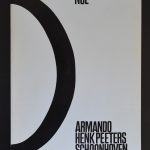
To mark the occasion of the forthcoming exhibition, the catalogue of the Haags Gemeentemuseum’s 1964 exhibition Zero (Mack/Piene/Uecker) – Nul (Schoonhoven/Armando/Henk Peeters) is to be republished as multiple.

Posted on Leave a comment

Salvatore Scarpitta (1919-2007)


Schermafbeelding 2018-03-18 om 11.26.28

Lets start a five day blog session with forgotten artists and here is the first to appear in this FTN blog.

An American artist with an Italian background, but born , raised and died in New York. In between he moved to California and studied art in Rome. I tried to figure out the italian influence in his works, but can only see his American roots. If  ever there is an influence it probably is the American Pop Art scene that influenced him. What struck me in his life that he was a passionate racing driver and at one time even had his own racing team. His life and progression in art develop a little like the Italian multi talented artist Carlo Mollino, who was also a passionate racing driver, but where Mollino convinces with his aesthetics, Scarpitta is a far more robust and less subtile artist. Still his works stand out from his contemporaries with the frequent use of wood, steel and bandaged objects.

Schermafbeelding 2018-03-18 om 11.27.08

He fascinates…and deserves to be known by far more people . www.ftn-books.com has a few titles on Scarpitta available.

scarpitta

You want to learn the story of Salvatore Scarpitta as a racing driver? you will find it over here:

https://www.classicdriver.com/en/article/classic-life/monuments-man-dirt-track-racer-tale-salvatore-scarpitta


Posted on Leave a comment

Jasper Johns (1930)

Schermafbeelding 2018-03-13 om 12.11.16

Another great artist who surfaced in the Sixties was Jasper Johns. Starting his career at the end of the Fifties , he soon became one of the best known and expensive artists from his generation. At one time one of his flag paintings was the first to fetch an incredible 10 Million dollars at auction, making it the most expensive painting by a living artist.

Schermafbeelding 2018-03-13 om 12.23.30

Now we are accustomed to these crazy prices collectors are paying for art, but at that time is was unbelievable that a living artist could fetch such a price. Because of his popularity Johns soon had an exhibitions in the Netherlands at the Stedelijk Museum Amsterdam. A special print exhibition and this exhibition was for me personally the perfect one.

OLYMPUS DIGITAL CAMERA

It was one of the first exhibitions i ever visited in the Stedelijk. I had an interest in graphic art and , young as i was,  a rookie in the world of art, i had no idea of prices. I thought i could afford a small print. But no way, these were far too expensive for a young starting collector. What remains?   … i still have the catalogue for sale at www.ftn-books.com and cherish it together with my personal copy. Book design was done by Wim Crouwel and it is available at www.ftn-books.com together with other Jasper Johns titles.