I am always on the look out and searching for the best catalogues that are published by rhe Stedelijk Museum Amsterdam. The best catalogues were published in the 50’s and 60’s and designed by Willem Sandberg and Wim Crouwel and i am proud to say that i have managed to colelct a wonderful collection of their catalogues and possibly one of the largest collections available on the internet. Many of thier publications are sold and collected all over the world and because of that i sell these catalogues to many collectors. The 3 titles i present in this blog weere sold out during the last 6 months, but….. i was lucky to find these with a colleague and now i have them again in my inventory. Just search for them at www.ftn-books.com .
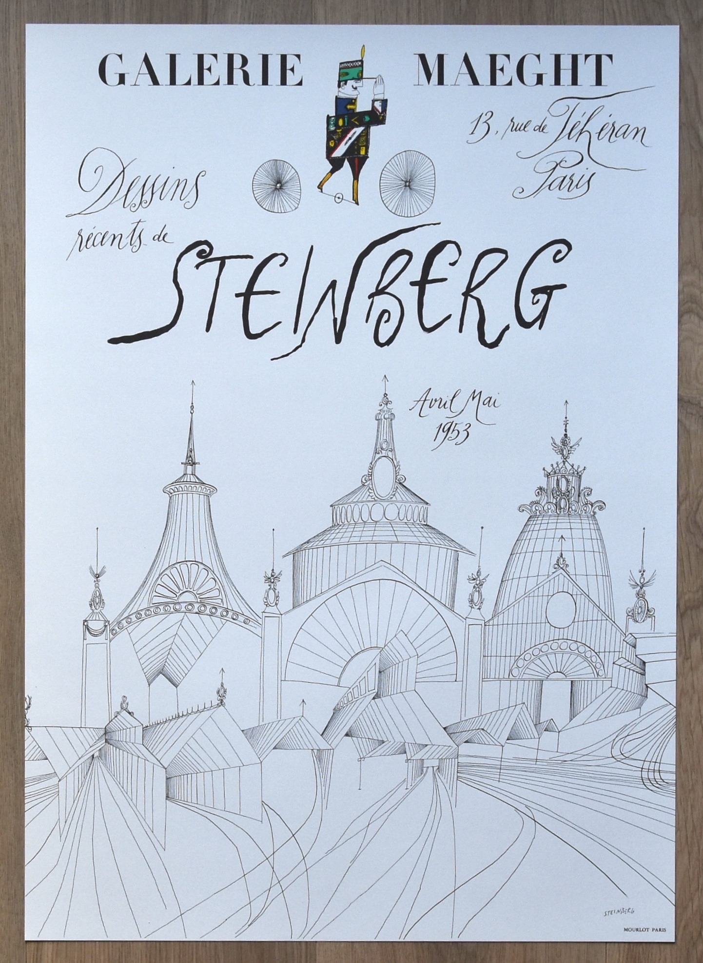
They are expensive catalogues , but take my word these will become impossible to find in a few years and when they come on the market they will be even more expensive. The power of these titles is that they are more like works of art. The Arp (1960) has woodcut printing on the outside and inside and the Soto cover is a kinetic object because of the thread on the outside (1969). The Steinberg….yes one of the first publications with fold out pages (1953).
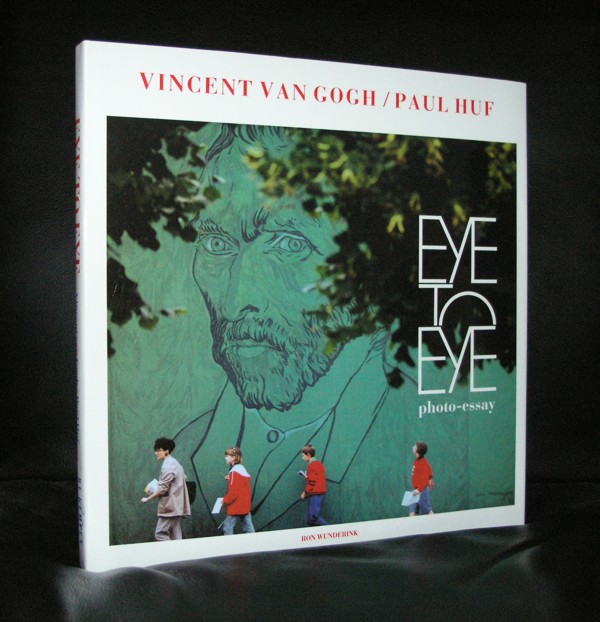
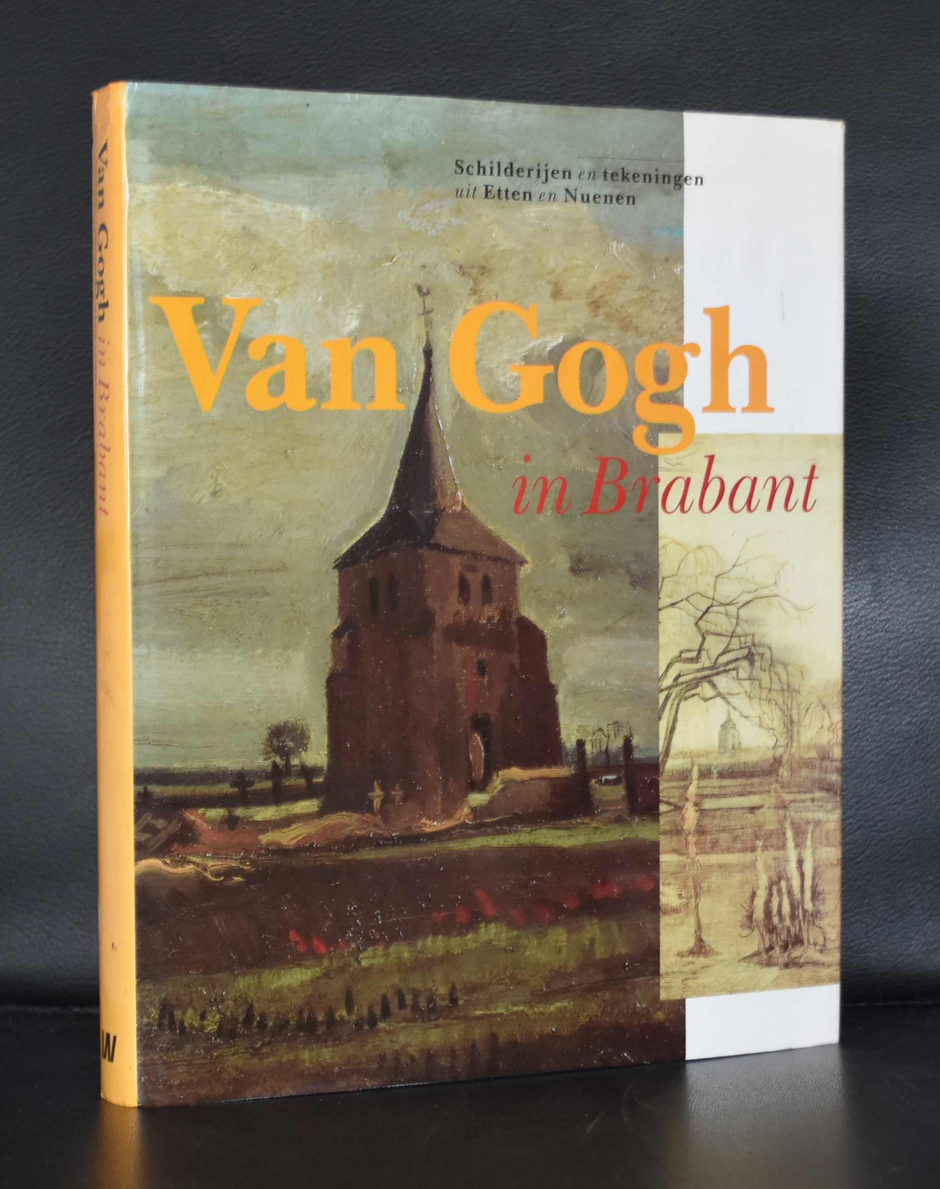
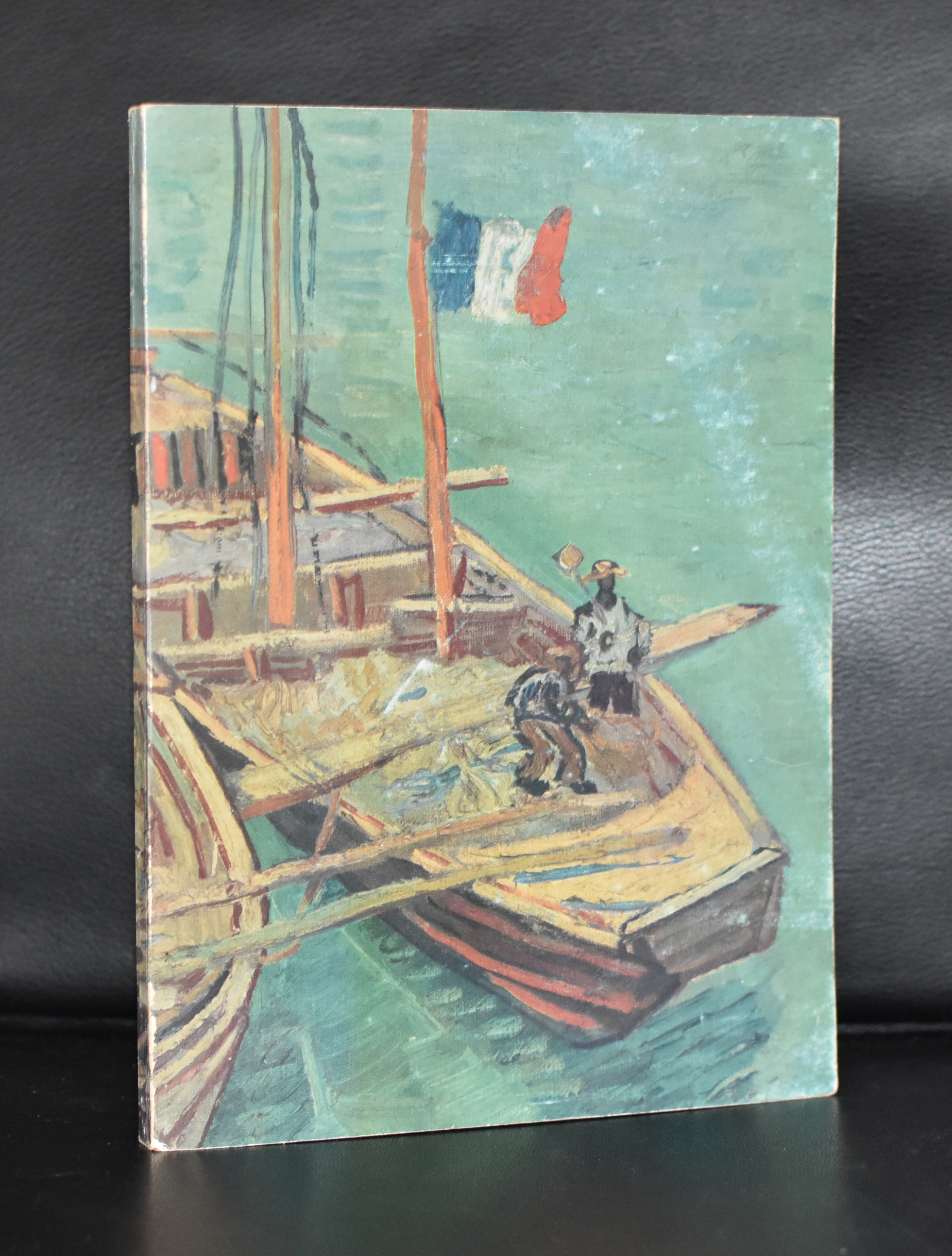
Yesterday it was announded and confirmed that a newly discovered van Gogh drawing from the Fentener van Vlissingen collection is an authentic van Gogh. In such a case i really wonder if the drawing is considered important because as the vanGogh museum says …it is a missing link…or is it beautiful and valuable. Valuable it certainly is now with its authentication, but beautiful? i do not think so…. it is a study and beside the depicted windmills i do not find it appealing at all. For instance compare the studies of Jongkind, his contemporary artist which all shine in these little formats. A new van Gogh discovered is nice, but the way it now is presented as one of the art discoveries of this decade is undeserved. Here is the article from the van Gogh Museum on this sketch and for really great books on Van Gogh please visit www.ftn-books.com
AMSTERDAM — The Van Gogh Museum here on Tuesday announced the discovery of a previously unknown drawing by Vincent van Gogh, which the museum said was completed about a month after the Dutch post-Impressionist artist arrived in Paris in 1886. The museum’s researchers studied the style and history of “The Hill of Montmartre with Stone Quarry,” dated March 1886, and found documents they said confirm that it is a lost van Gogh.
“It’s a big day today,” said Teio Meedendorp, a senior researcher at the Van Gogh Museum who studied the subject, style, technique, materials and provenance of the drawing, and found the relevant documentary evidence to support the attribution.
The museum owns the largest collection of van Gogh’s works anywhere in the world, including more than half of the artist’s drawn oeuvre — approximately 500 drawings as well as his sketchbooks.
“It’s a nice robust drawing by Vincent and he captured the hill of Montmartre very well,” Mr. Meedendorp said.
Mr. Meedendorp said that the drawing is particularly interesting because it is more in keeping with van Gogh’s earlier style than his later work when he lived in Paris. He added that the drawing shows that van Gogh’s work evolved during his crucial years in the French capital from a formal style that he learned at the art academy in Antwerp just before arriving in Paris, and became increasingly experimental.
“It’s a kind of stylistic missing link between his Belgium and Paris time,” said Fred Leeman, an independent van Gogh expert and curator of exhibitions by the artist, who is a consultant to the Van Vlissingen Foundation, which currently owns the drawing.
The last time a new van Gogh drawing was discovered was in 2012. A year later, a new van Gogh painting, “Sunset at Montmajour” (1888), was also found. But these findings are relatively rare. Since the publication of the complete catalog of van Gogh’s works in 1970, another nine drawings and seven paintings have been added, Mr. Meedendorp said.
When it came to the Van Gogh Museum for research in 2012, the drawing was owned by an American private collector whose Dutch relatives had purchased the work from a gallery in the Netherlands in 1917, Mr. Meedendorp explained. But the museum did not publicize the finding at the time, at the request of the previous owner.
Aside from Mr. Leeman, no other experts outside the museum have yet seen the drawing.
Research by the Van Gogh Museum in Amsterdam, the world’s leading expertise center on the artist, found that “The Hill of Montmartre with Stone Quarry” came into the hands of van Gogh’s sister-in-law, Johanna van Gogh-Bonger, a meticulous keeper of van Gogh’s materials, who numbered it “123” in her inventory.
Mr. Meedendorf said that when he took the drawing out of its frame, he found the telltale number, “123,” written on the back.
The discovery of “The Hill of Montmartre with Stone Quarry” led the Van Gogh Museum to reconsider another drawing that it had in its collection, which had been part of the original donation from the van Gogh family heirs. That drawing, titled “The Hill of Montmartre,” also completed in 1886, is drawn from a very similar perspective of the Parisian hilltop.
This drawing was originally thought to be by van Gogh, but in 2001, it was questioned because it was so dissimilar to work from his Paris period, and then discredited.
“Now that you have a set of two, it’s clear that it was a style he maintained during the first part of his time in Paris,” said Mr. Leeman.
By comparing these two drawings side-by-side, researchers realized that the works were incredibly similar, and both were attributed to van Gogh.
“It’s the same materials, the same paper, it’s quite clear that these were both done by the same hand at almost the same time,” said Mr. Meedendorp.
“One thing led to another,” he added. “If this was a van Gogh drawing then the other one had to be one as well.”
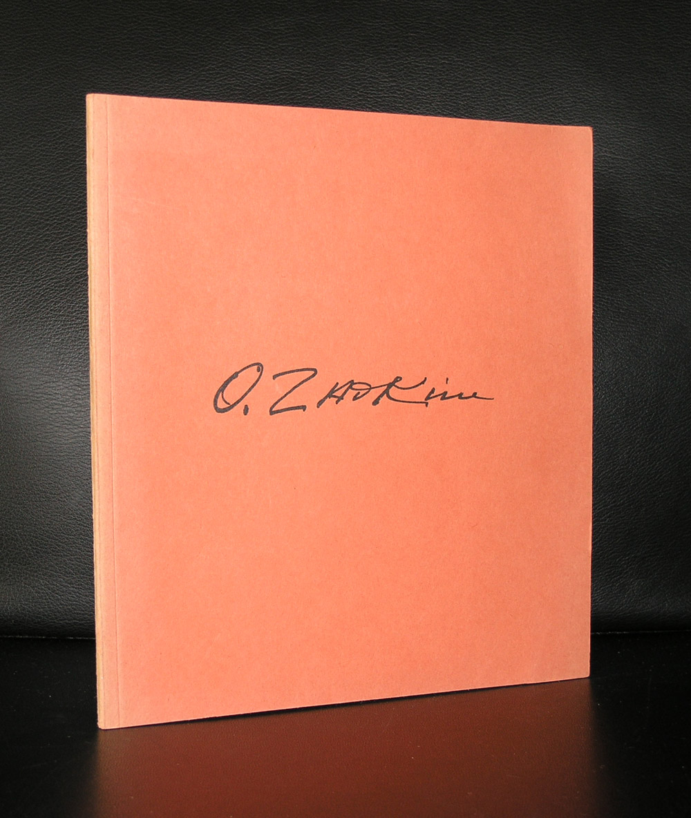
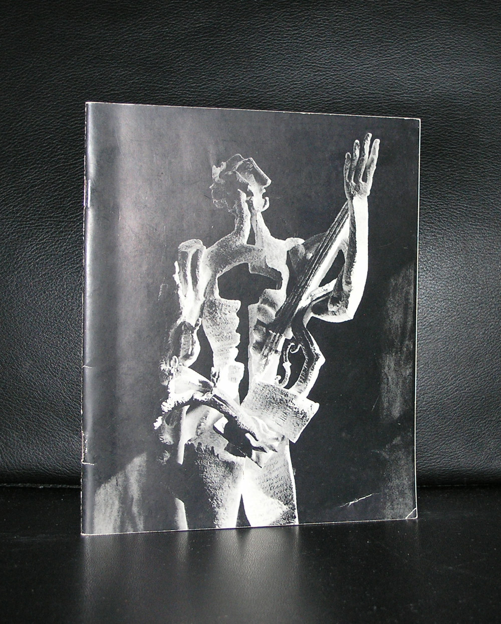
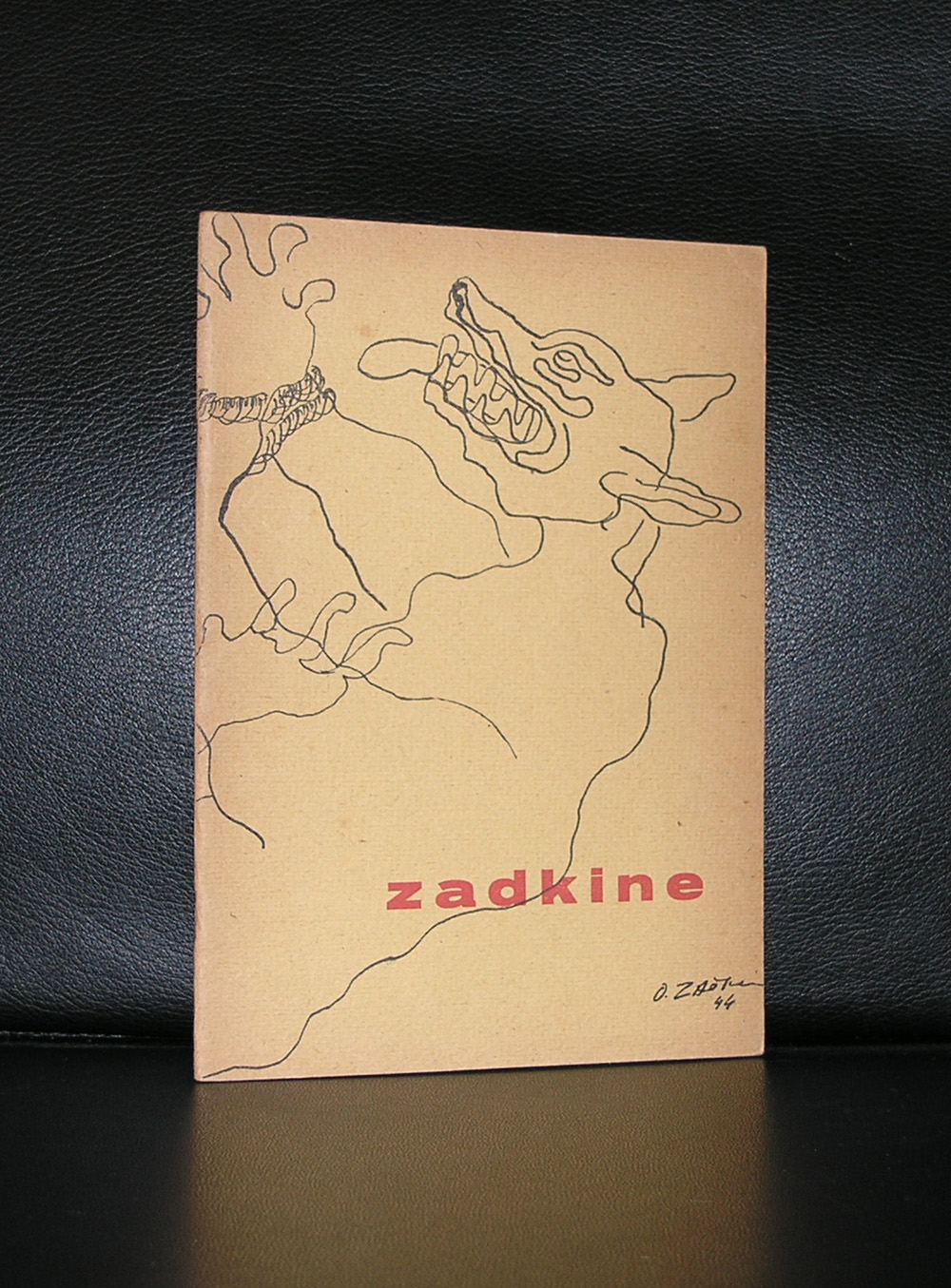
Ossip Zadkine is perhaps one of the most famous artists in the Netherlands without people knowing him by name. Zadkine made the sculpture ” DE VERWOESTE STAD” which symbolizes the destruction of the heart of Rotterdam after the bombardment of it in the early stages of WWII ( 14 mei, 1940) .
The sculpture was revealed in 1953 and financed by DE BIJENKORF on the condition that it always must be on the same spot within the centre. The human figure has a hole where the heart should be making it the perfect image for a destroyed city centre.
Since the revealing of this statue Ossip Zadkine received on several occasions exhibitions of his works in the large museums in the Netherlands , but for many his claim to fame here is this ” DE VERWOESTE STAD”
There are some nice publications on Zadkine available at www.ftn-books.com
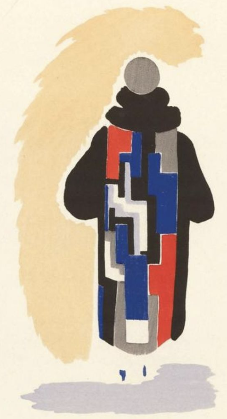
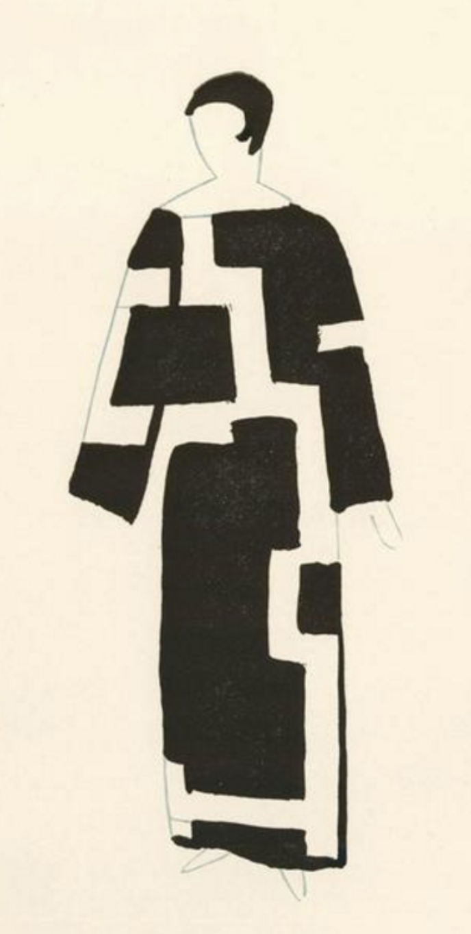
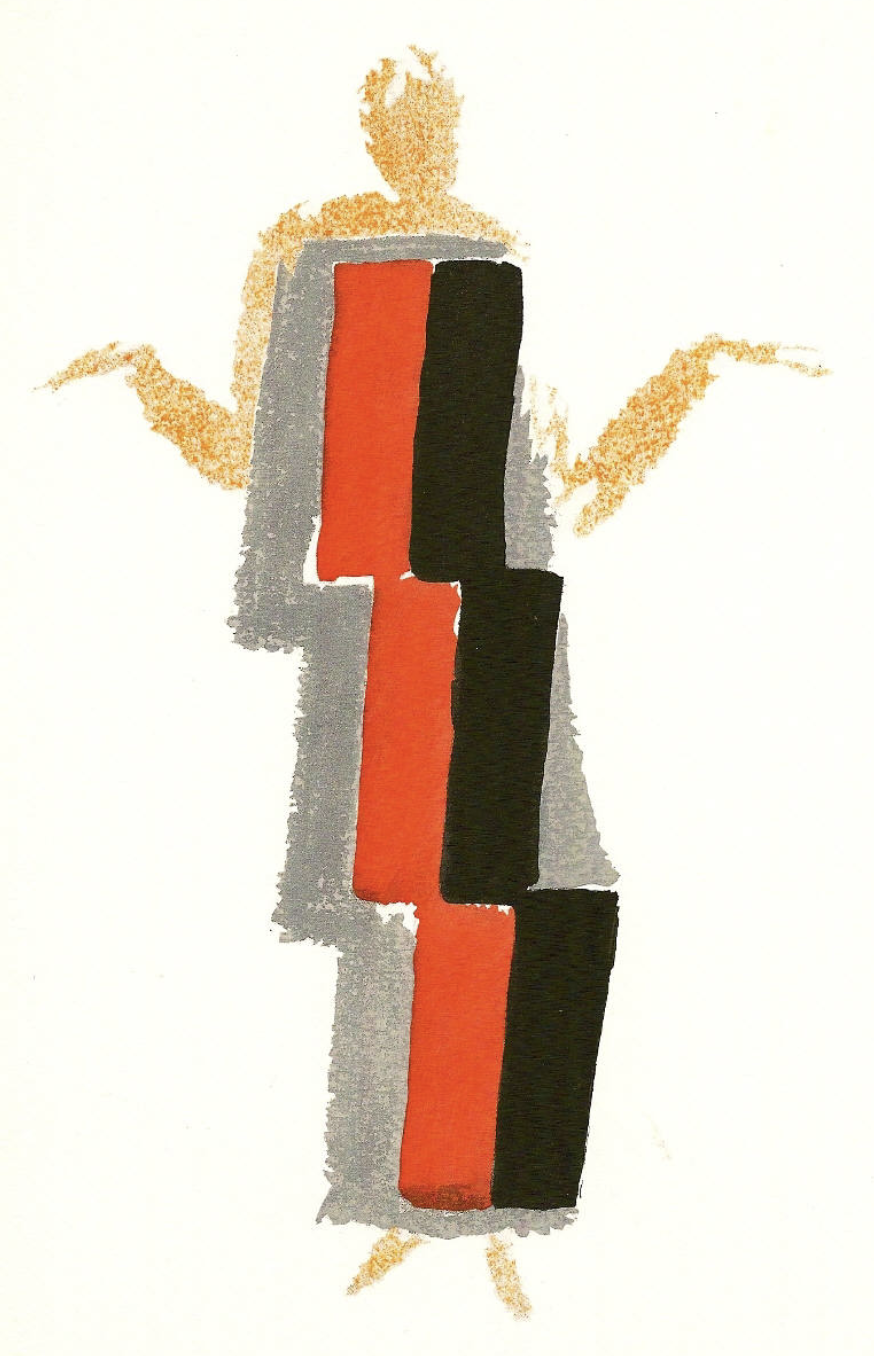
If ever there was one artist who raised the bar of the art of the small /pochoir print to tremendous proportions it is Sonia Delaunay. Delaunay had her peak during the Art-Deco period and it shows. Here is just a selection of Delaunay prints found on Google .
Her use of colors, patterns is typical for Delaunay and her art has proven to be timeless and typical Avant Garde for the time she was most productive. The same as Mondrian, she used primary colors, but in a much more free way of making her compositions. Where her husband Robert Delaunay was influenced by cubism and made colorful cubist interpretations of reality, Sonia stayed true to her abstract compositions with just one side step into the world of fashion for which she made colorful costume and fashion designs.
For me the first pochoir print i ever saw was the cover of the Stedelijk Museum catalogue for the Sonia Delaunay exhibition in 1958. Willem Sandberg did the design of the catalogue, but what makes this catalogue so special is of course the original pochoir print by Sonia Delaunay on the cover.
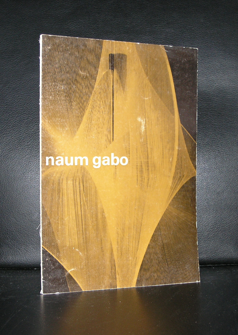
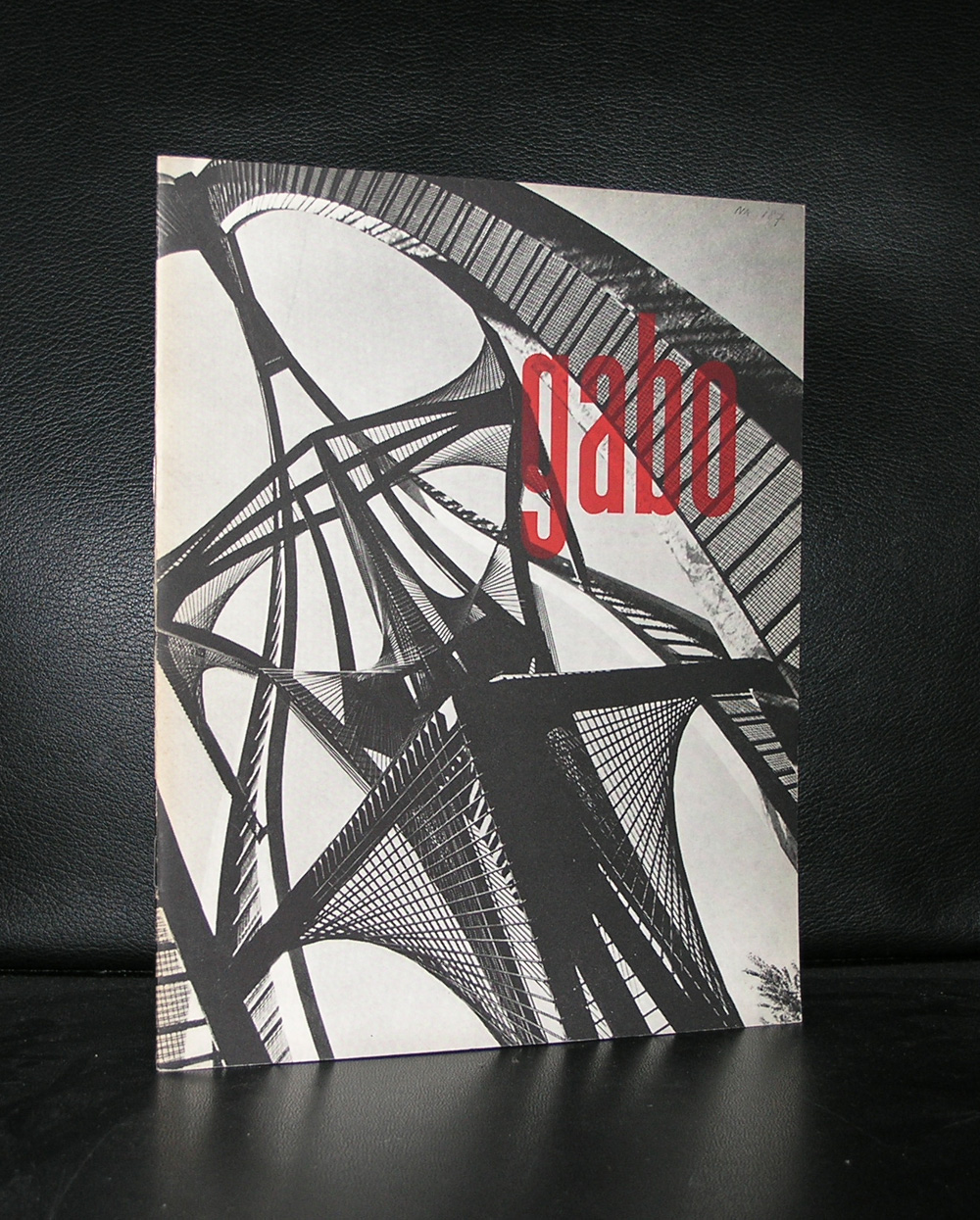
De Bijenkorf building in Rotterdam is one of the iconic buildings in this city. After the bombardment which destructed its complete city centre in WWII, the city rebuild its centre with help of contractors and world famous architects. Among them Marcel Breuer who designed the Bijenkorf building and had a sculpture by Naum Gabo placed before the building. The sculpture has become possibly even more famous than the building by Breuer and was recently cleaned and restored and now has back its original splendor.
Here is a short biography which can be found at the Tate site
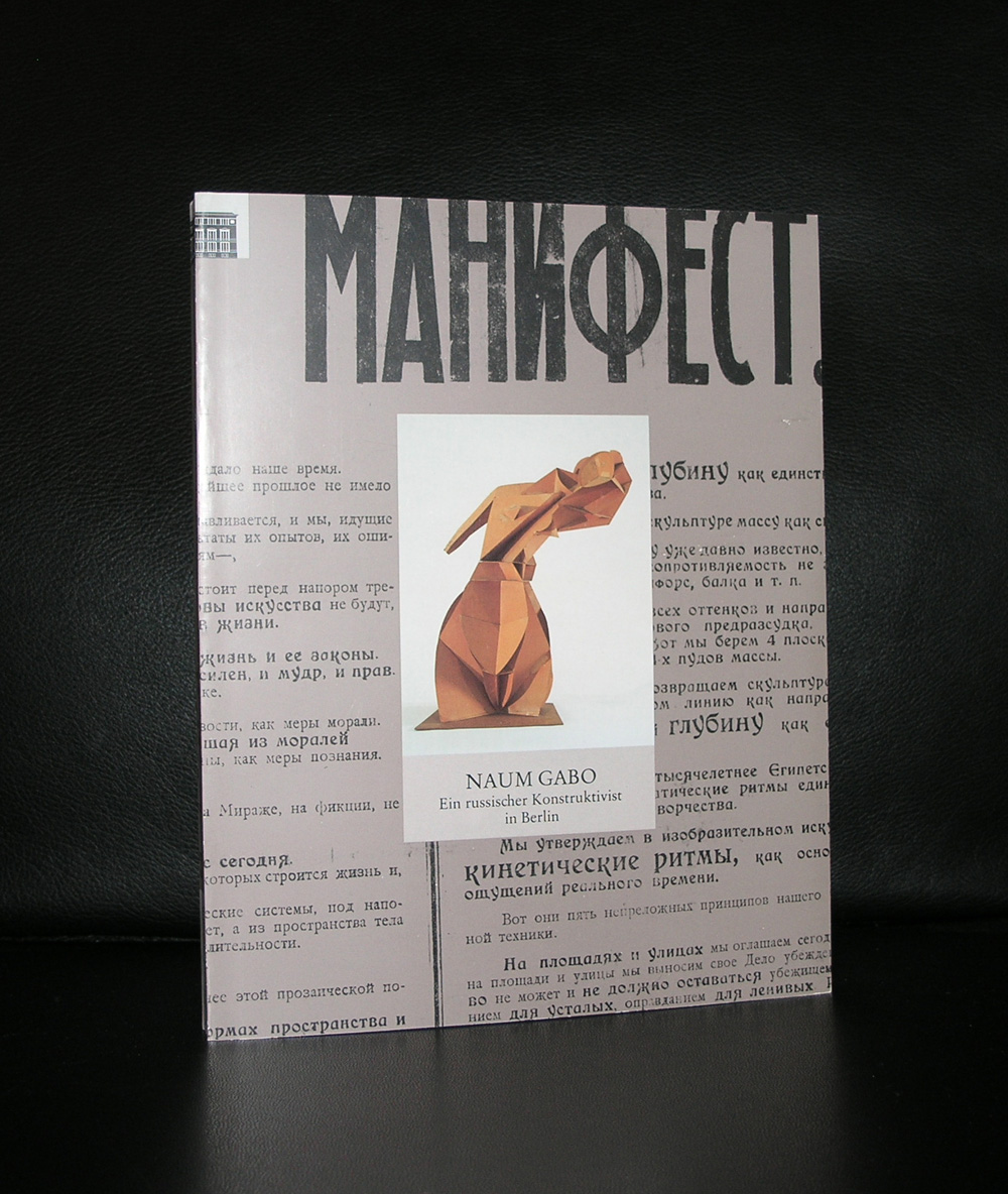
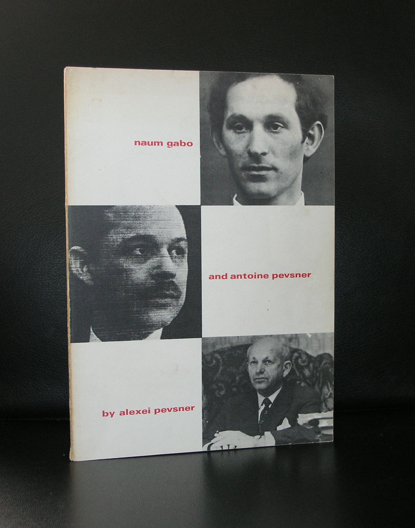
Naum Gabo 1890-1977.Constructive sculptor and painter. Born in Briansk in Russia, named Naum Pevsner; younger brother of the sculptor Antoine Pevsner. Entered Munich University in 1910, studying first medicine, then the natural sciences; also attended art history lectures by Wölfflin. Transferred in 1912 to an engineering school in Munich. Met Kandinsky and in 1913-14 joined his brother Antoine (then a painter) in Paris. After the outbreak of war moved first to Copenhagen, then Oslo; began to make constructions in 1915 under the name Naum Gabo. 1917-22 in Moscow with Pevsner, Tatlin, Kandinsky and Malevich; wrote and issued jointly with Pevsner in 1920 a Realistic Manifesto proclaiming the tenets of pure Constructivism. Lived 1922-32 in Berlin in contact with the artists of the de Stijl group and the Bauhaus. First one-man exhibition with Pevsner at the Galerie Percier, Paris, 1924. With Pevsner, designed the set and costumes for Diaghilev’s ballet La Chatte 1926. 1932-5 in Paris, a member of Abstraction-Creation; 1935-46 in England, first in London, then from 1939 at Carbis Bay in Cornwall. Edited Circle jointly with J.L. Martin and Ben Nicholson in 1937. Moved in 1946 to the USA and settled in 1953 at Middlebury, Connecticut; became a US citizen in 1952. Professor at the Graduate School of Architecture at Harvard University 1953-4. From 1950 onwards carried out several large sculpture commissions, including a sculpture for the Bijenkorf store in Rotterdam 1955-7. Created Hon. KBE 1971. Died at Waterbury, Connecticut.
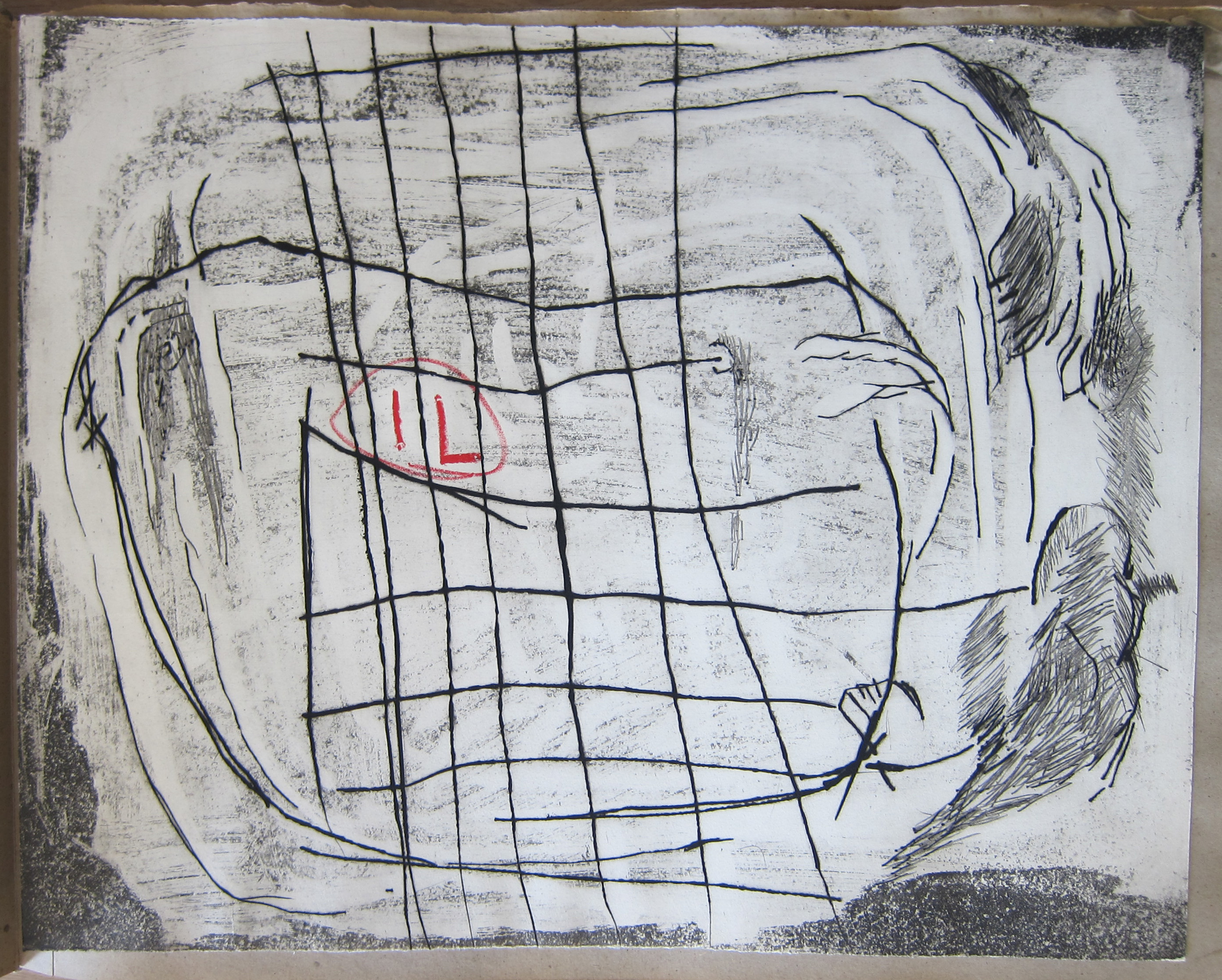
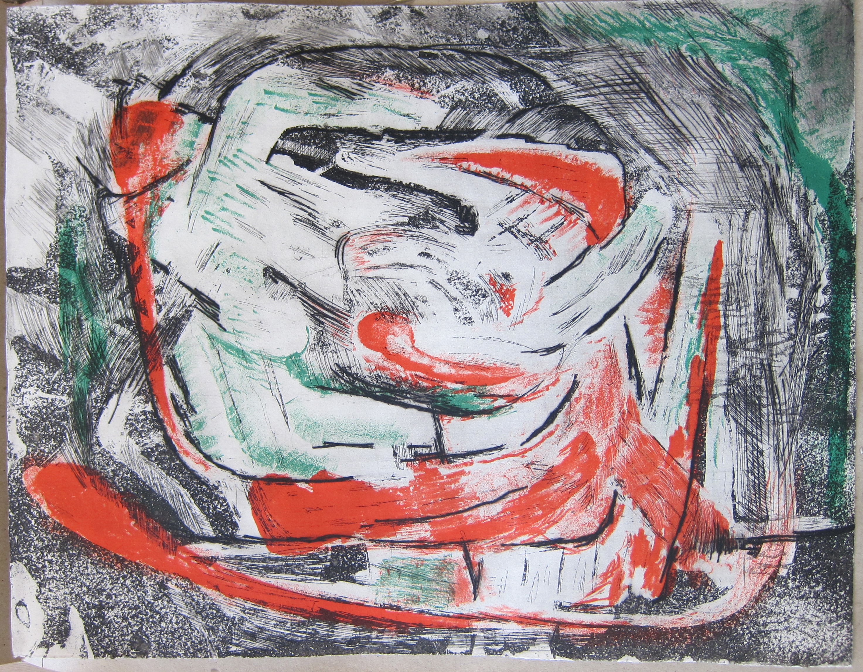
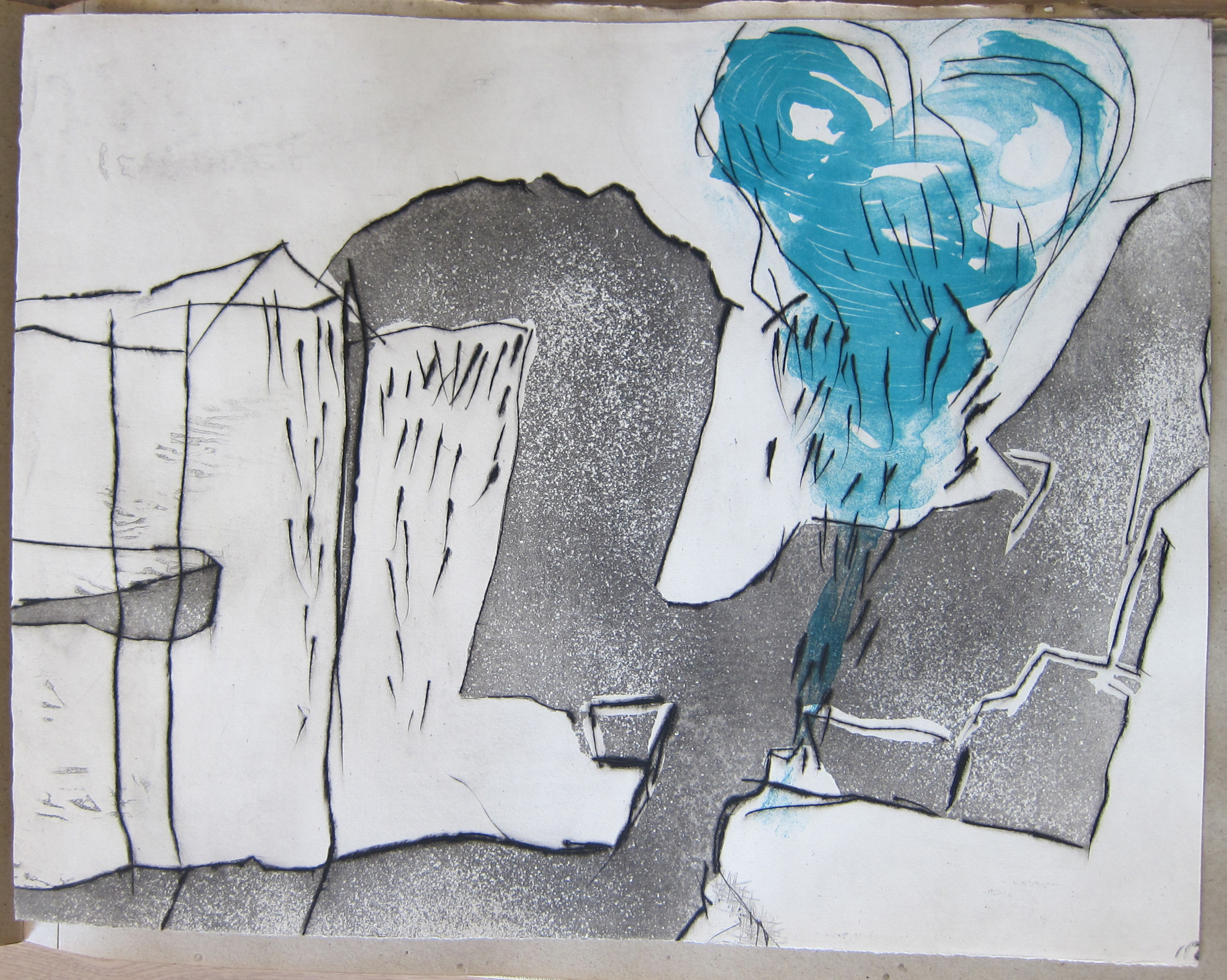
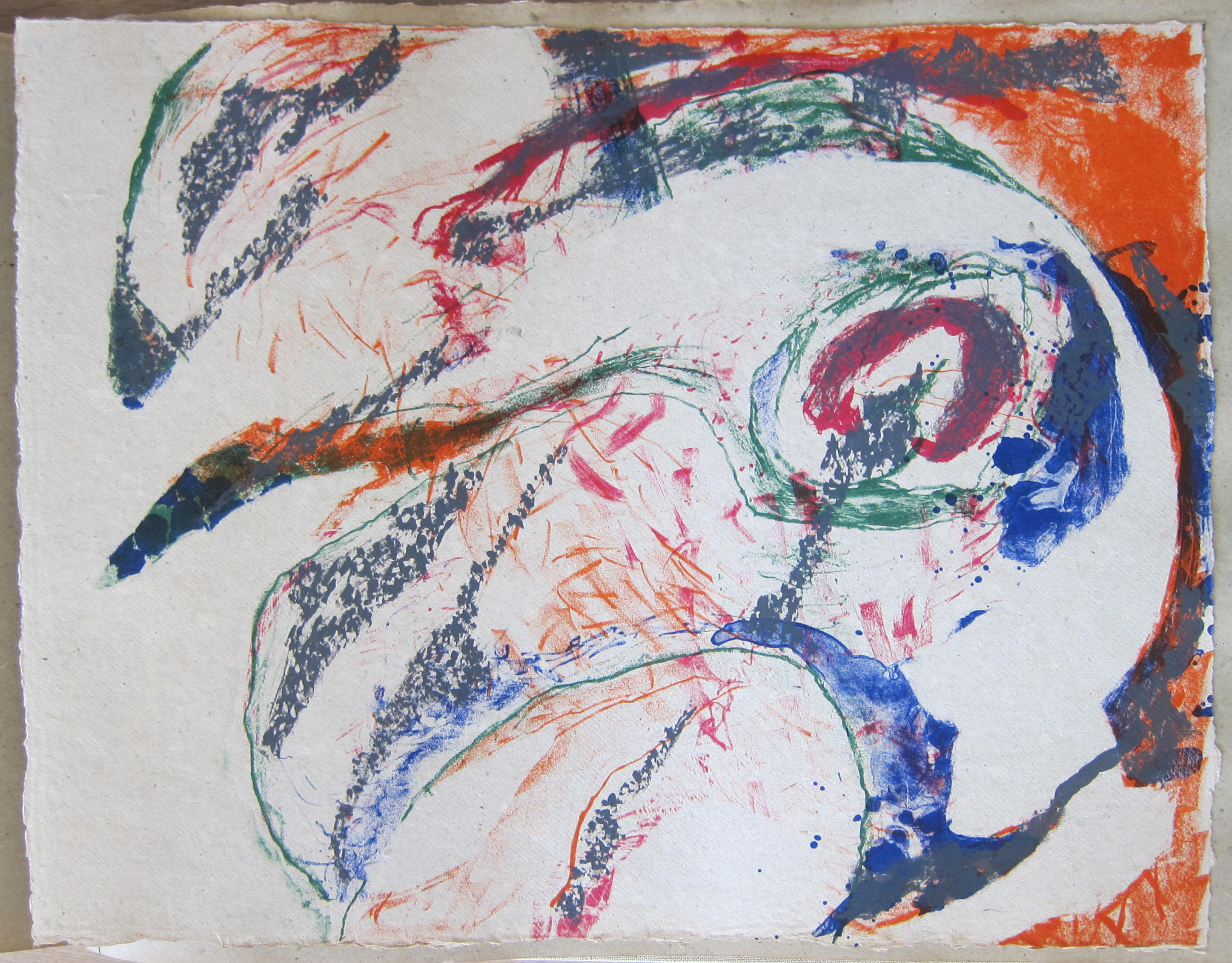
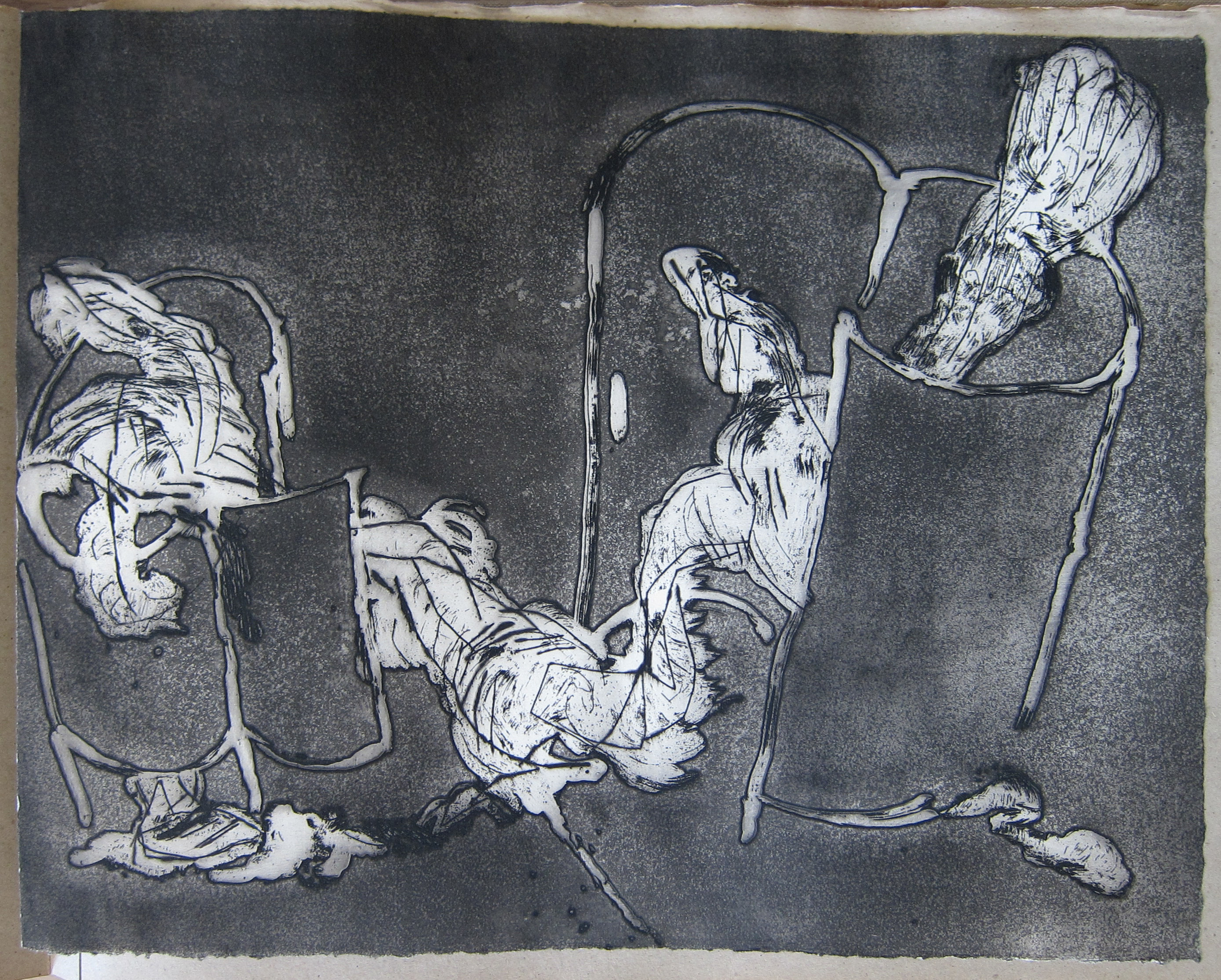
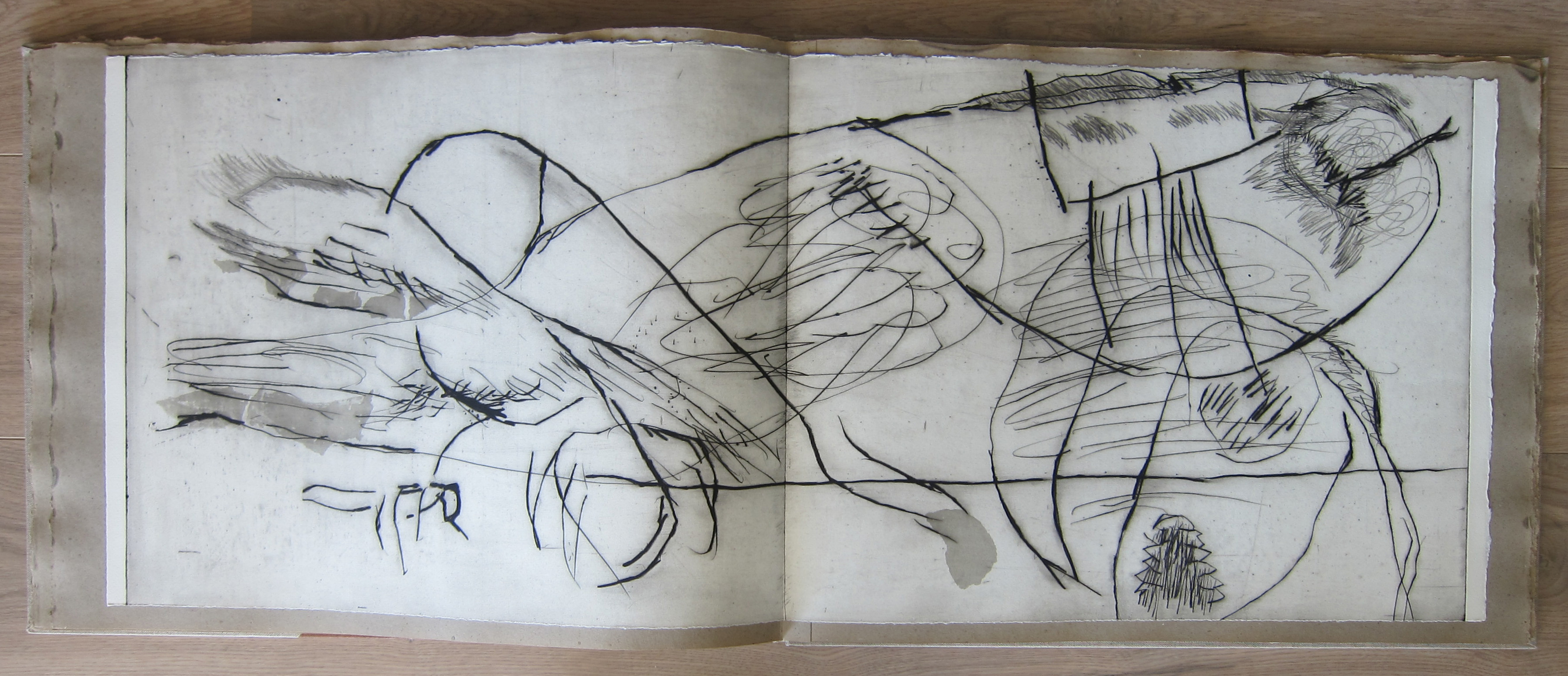
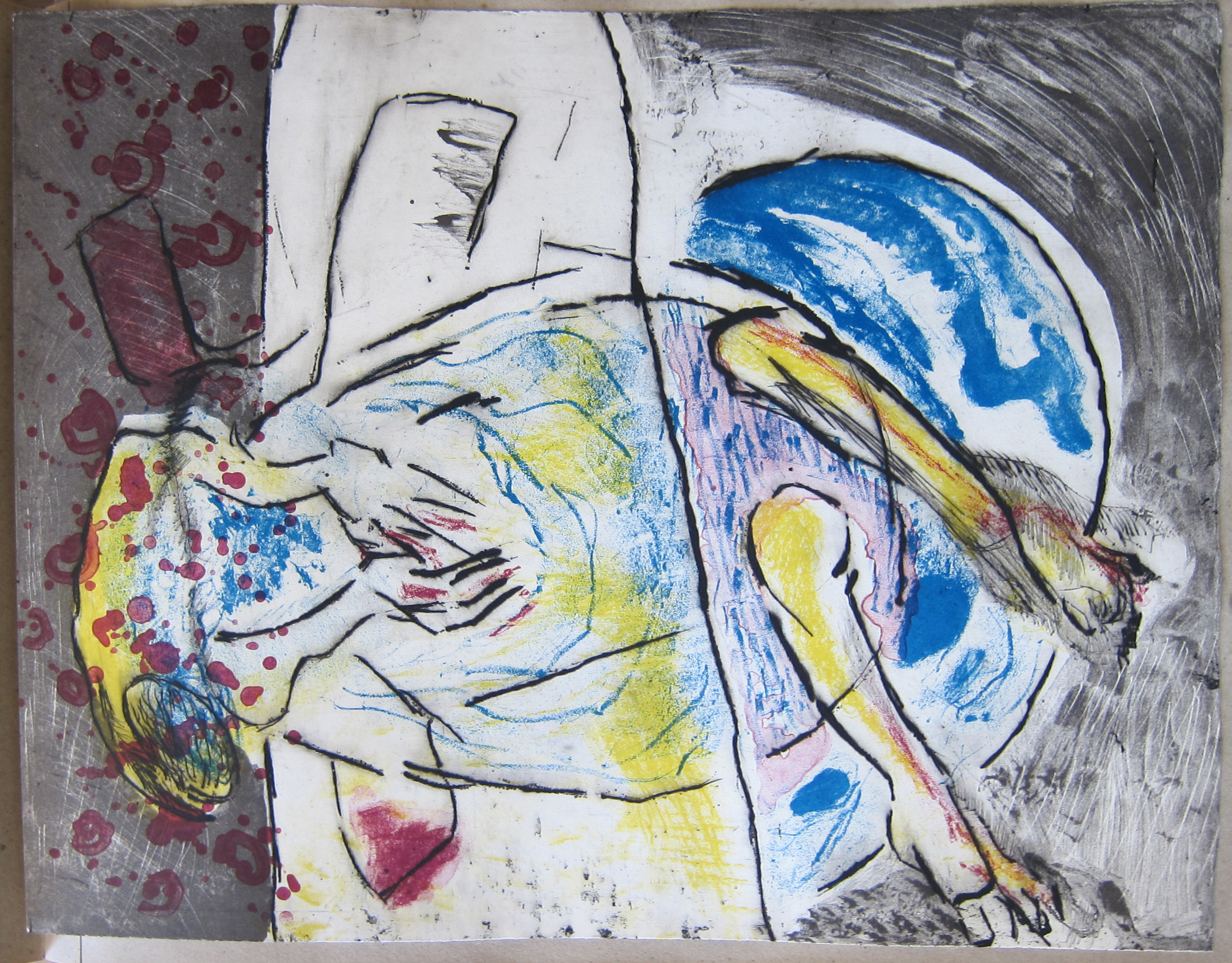
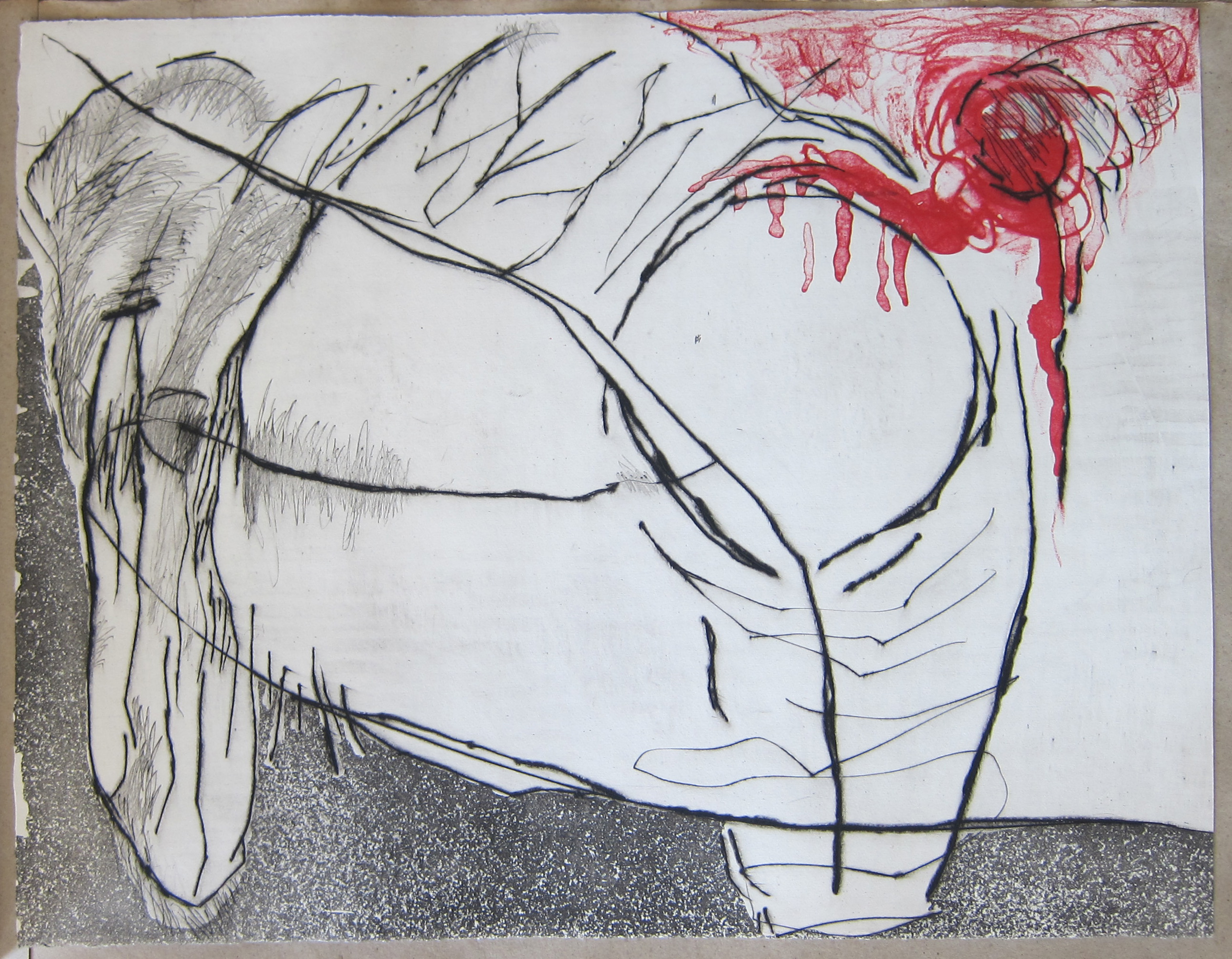
One of the most impressive publications i have in my inventory at www.ftn-books.com is a book in a limited edition of only 75 copies . Book design by Willem Sandberg and filled with 12 etchings ( signed/numbered ) by Wessel Couzijn.
The book was published in 1966, when abstract expressionism was at its height. Great quality etchings by Couzijn who beside a painter/ graphic artist was one of the most gifted sculptors from his generation. A multi talented artist which was recognized by Sandberg who admired him and gave him many times a platform to show his latest art in the Stedelijk Museum. This publication “iI” is rarely offered therefore i am proud to show in this blog the complete set of etchings from this rare and extremely important publication. Enjoy!
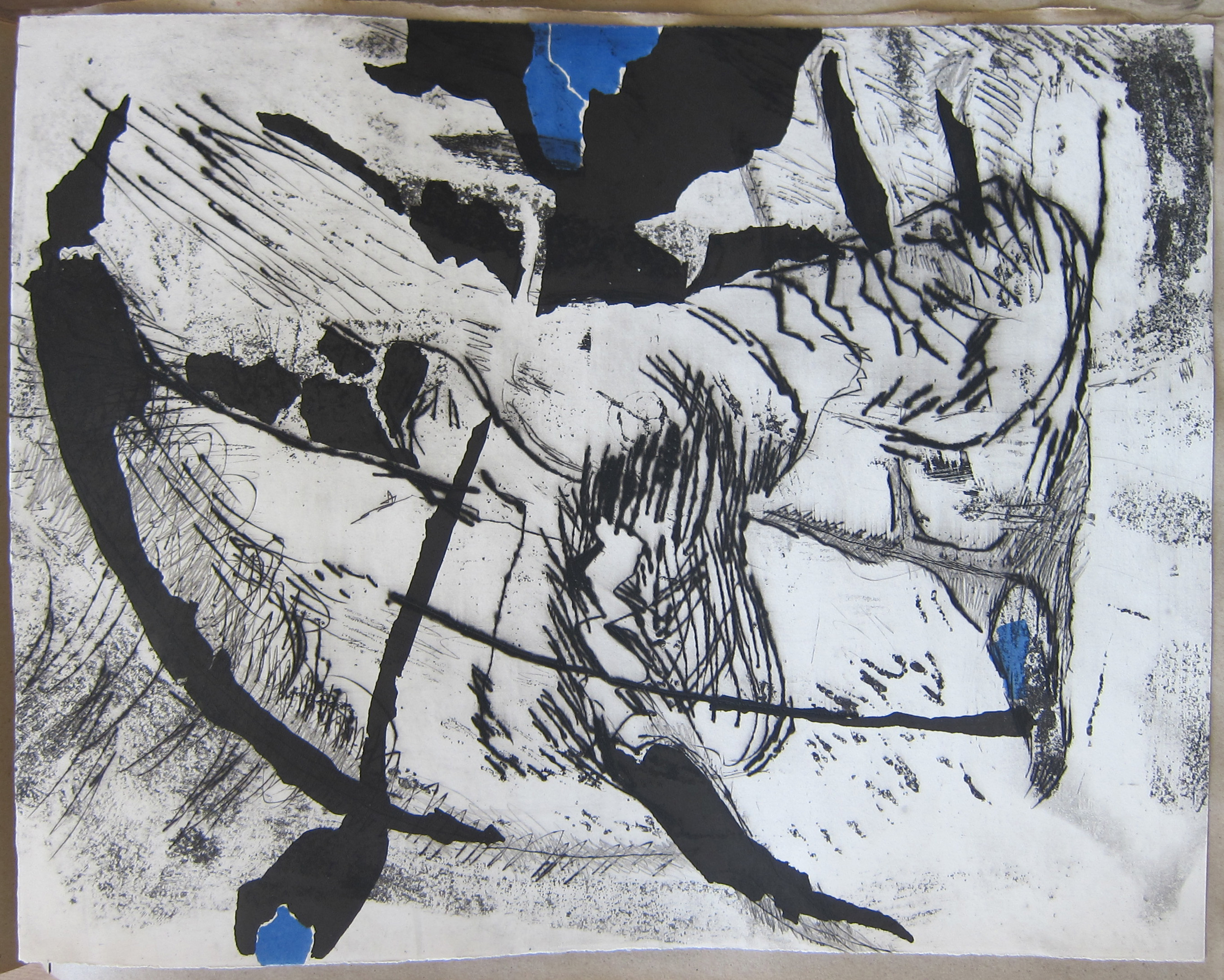
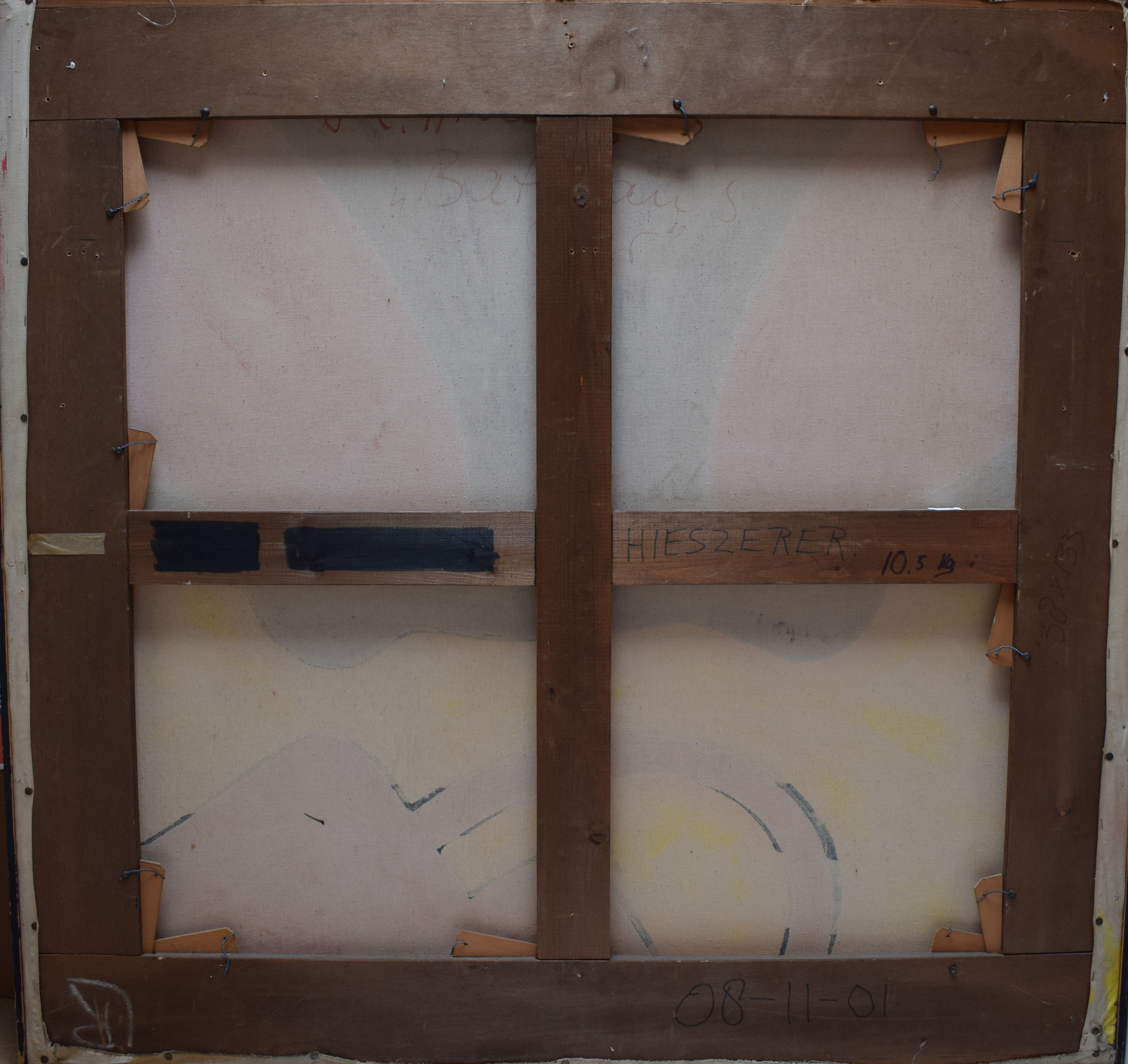
One of last weeks blogs was on the Pop Art scene in Europe and there is one German artist who must be mentioned, because he was one of the most important Pop Art artists in Germany…his name Dieter Hiesserer and because he also held exhibitions in Amsterdam his works were known by dutch collectors and included in one of the most iconic company collections in the world. Hiesserer’s works were included in the Peter Stuyvesant collection. In the tobacco factory of Peter Stuyvesant, the employees were confronted with really great modern art. In many cases , large sized paintings which were bought for the Peter Stuyvesant collection. Willem Sandberg was one of the directors who advised the company and by the end of the sixties several paintings by Hiesserer were added to the collection. Among them “Batman’s car”. It is about 10 years ago that this collection was sold at auction by Sotheby’s Amsterdam and later by AAG after Sotheby’s left from Amsterdam. It was a 3 part auction and because of the size of the paintings and an economic crisis it was hard to sell some of these important paintings for reasonable prices. The lots were all sold without a reserve price. I was behind my computer following this auction on line , when this great painting , “Batman’s Car” was on the block and bidding stopped at euro 200,–. I could not believe my eyes and i made the following bid……… and became the final bidder for this great Pop Art painting. Batman’s Car has been in our collection for almost 10 years , but now it is time to part from it. I do not have the place anymore to present it properly. Therefore it is now for sale and should you be interested…do not hesitate to contact me. Price on Application.
A Stedelijk Museum publication from 1938. Publishing date well before WWII and extremely rare. One of the first publications containing an article by Piet Mondriaan ( Mondrian) and it is more than likely the only one on the market at this moment. What makes this publication valuable is not only its rarity , but also the art historical value of the articles by Mondriaan, Kandinsky and Gorin. You can find this publication at www.ftn-books.com.
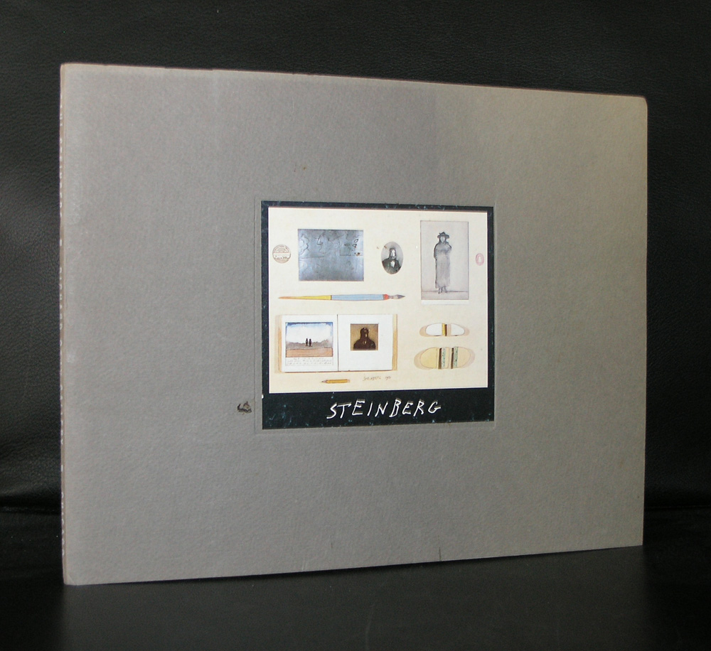
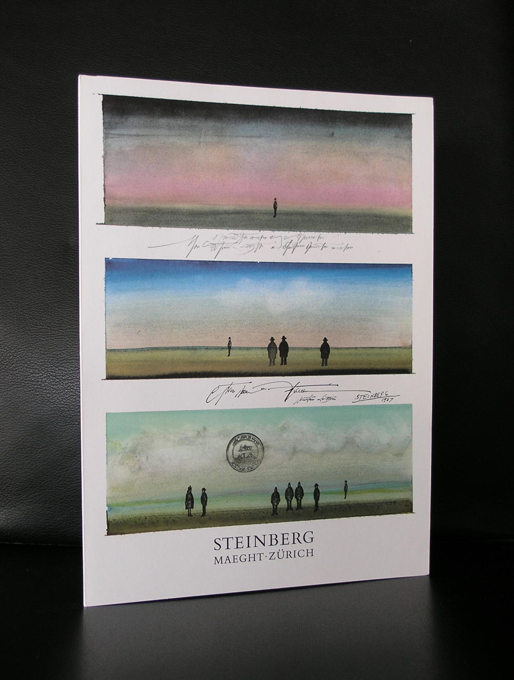
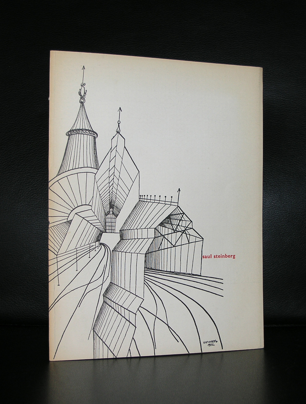
What have the Maeght foundation , Museum Boymans van Beuningen and the Stedelijk Museum in common? They all three organized exhibitions with Saul Steinberg. This is what i thought of before i started to look at information on the internet and found the foundation of Saul Steinberg / saulsteinbergfoundation.org. This site starts with giving an overview on his life , but soon you discover that this is one of the great sites on art on the internet totally dedicated to Saul Steinberg. Try it and if interested in the artist you soon will loose yourself completely and spent a long time on this site discovering why Saul Steinberg was important. Here is the short intro from the Steinberg foundation on the artist and please do not forget that www.ftn-books.com has some nice publications available.
Famed worldwide for giving graphic definition to the postwar age, Saul Steinberg (1914-1999) had one of the most remarkable careers in American art. While renowned for the covers and drawings that appeared in The New Yorker for nearly six decades, he was equally acclaimed for the drawings, paintings, prints, collages, and sculptures he exhibited internationally in galleries and museums.
Steinberg crafted a rich and ever-evolving idiom that found full expression through these parallel yet integrated careers. Such many-leveled art, however, resists conventional critical categories. “I don’t quite belong to the art, cartoon or magazine world, so the art world doesn’t quite know where to place me,” he said. 1 He was a modernist without portfolio, constantly crossing boundaries into uncharted visual territory. In subject matter and styles, he made no distinction between high and low art, which he freely conflated in an oeuvre that is stylistically diverse yet consistent in depth and visual imagination.
I knew that i was right when i noticed about a year ago that it was a real pitty that the Velum by Keith Haring was removed by the Stedelijk Museum, but now i got notified that it is back. From this day you can marvel at this extremely large Keith Haring and wonder why it has been away such a long time. The velum by Keith Haring…… it is back !
For some excellent Keith Haring publications visit www.ftn-books.com
Artist/ Author: Oliver Boberg
Title : Memorial
Publisher: Oliver Boberg
Measurements: Frame measures 51 x 42 cm. original C print is 35 x 25 cm.
Condition: mint
signed by Oliver Boberg in pen and numbered 14/20 from an edition of 20


 A Stedelijk Museum publication from 1938. Publishing date well before WWII and extremely rare. One of the first publications containing an article by Piet Mondriaan ( Mondrian) and it is more than likely the only one on the market at this moment. What makes this publication valuable is not only its rarity , but also the art historical value of the articles by Mondriaan, Kandinsky and Gorin. You can find this publication at www.ftn-books.com.