Posted on Leave a comment

Sandberg design of GKF de Hand en machine

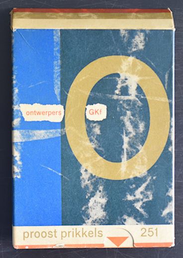
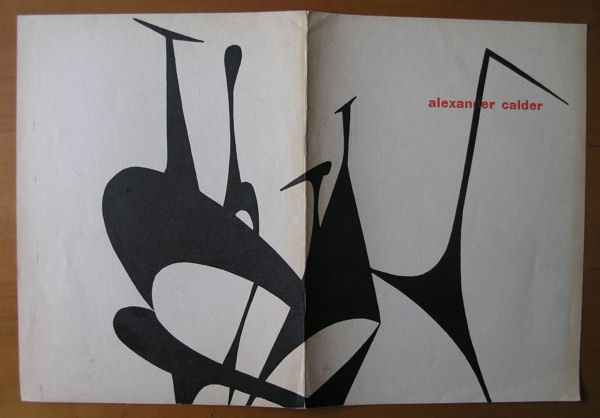
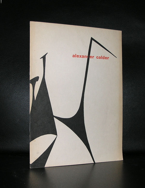
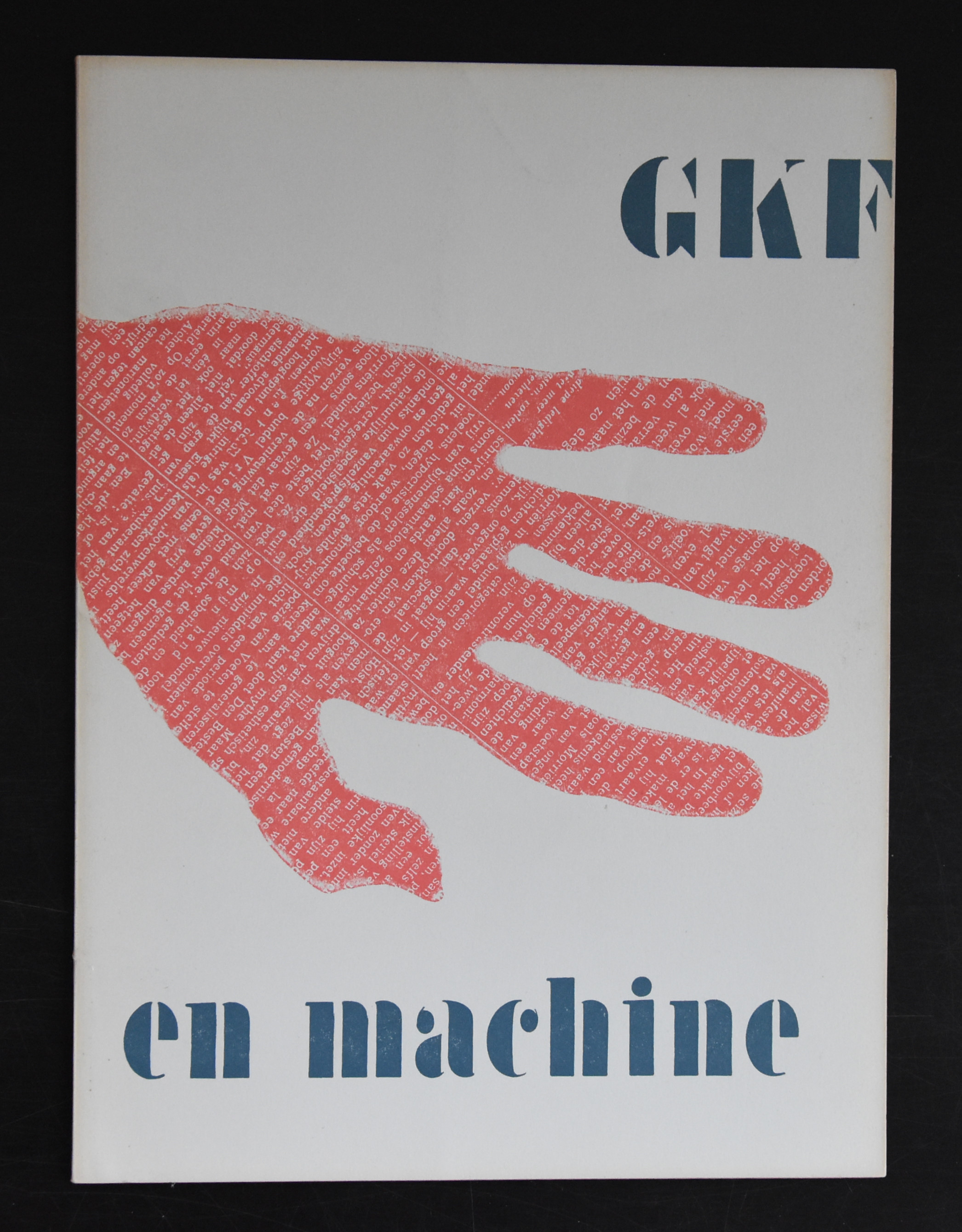
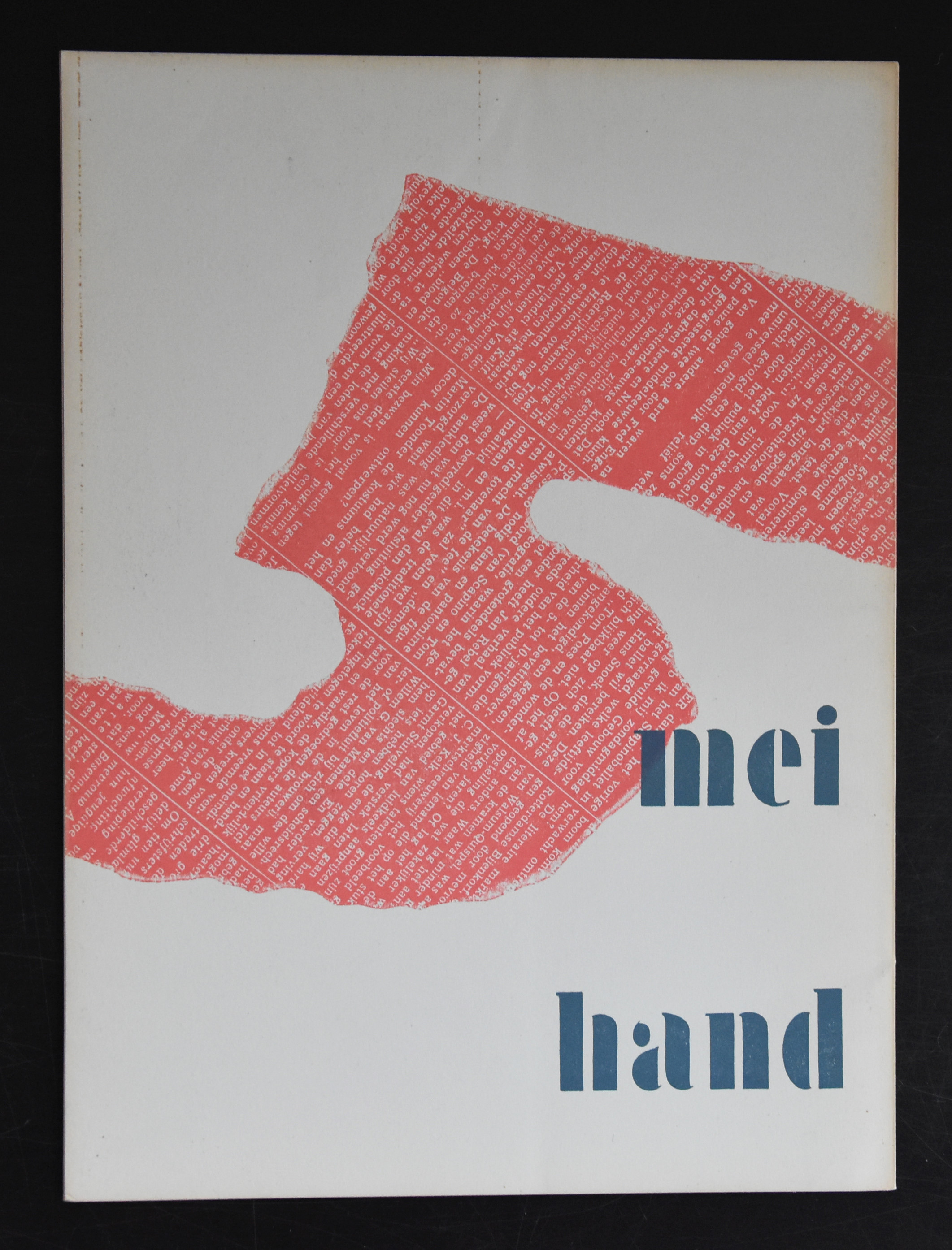
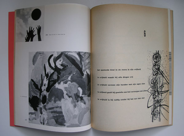
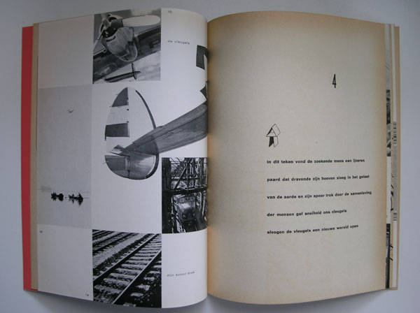
After WWII the 5th of May became a day of remembrance and celebration of the Liberation of the Netherlands. Every year on the 5th of May in those days a special exhibition was held which was accompanied by a special catalogue. Key elements in the cover were always the colours red , white and blue. The colors of the dutch national flag. Personally i think the HND EN MACHINE from 1957 is the very best of these publications. It has everything.  A typical Sandberg design. the use of multiple sorts of paper , great printing quality and a spectacular cover, making this for me personally the best in the series.


Posted on Leave a comment

Jean Gorin (1899-1981) and Wim Crouwel

Schermafbeelding 2017-12-19 om 11.29.02

Jean Gorin , a typical 50’s /60’s artist has stayed a little obscure outside France, but this is undeserved. His art is influenced by Piet Mondrian and Constructivism , but has developed into an art typical of Jean Gorin.

Schermafbeelding 2017-12-19 om 11.40.27

This was recognized by Willem Sandberg who gave Gorin a solo presentation in the Stedelijk Museum Amsterdam in 1967. Here it is getting more interesting from my point of view, because together with this exhibition one of the very very best Wim Crouwel designed catalogues ever was published. The catalogue typically Crouwel sized was partly printed in black and the other part of the text on the cover executed in embossed printing. Together with the design of the catalogue itself it has become an exquisite artist book on Jean Gorin which is still available at www.ftn-books.com


Posted on Leave a comment

Philip Guston (1913-1980)


Schermafbeelding 2018-02-03 om 14.19.31
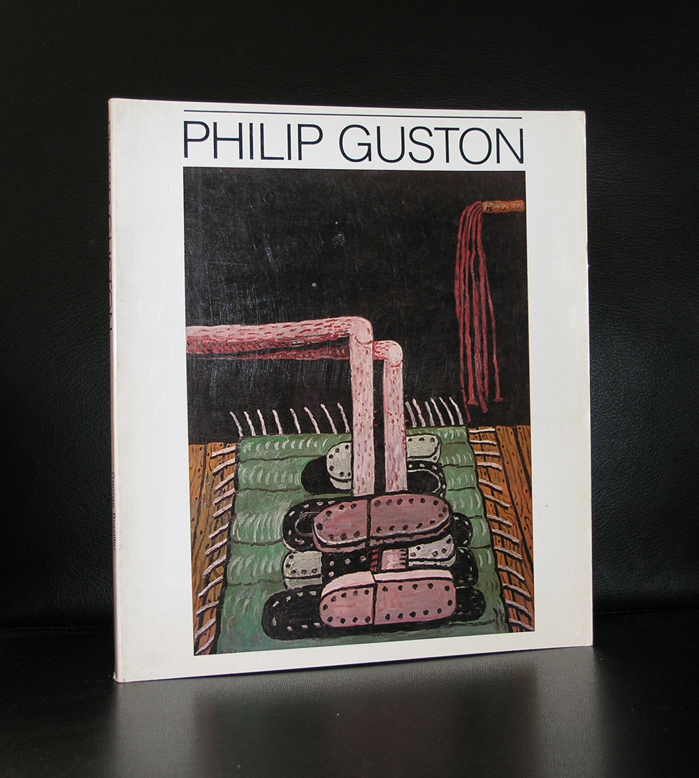
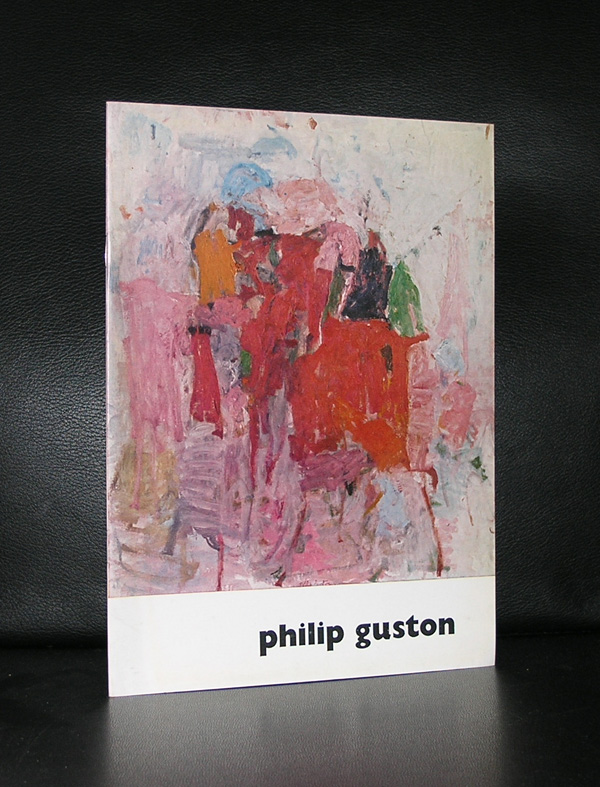
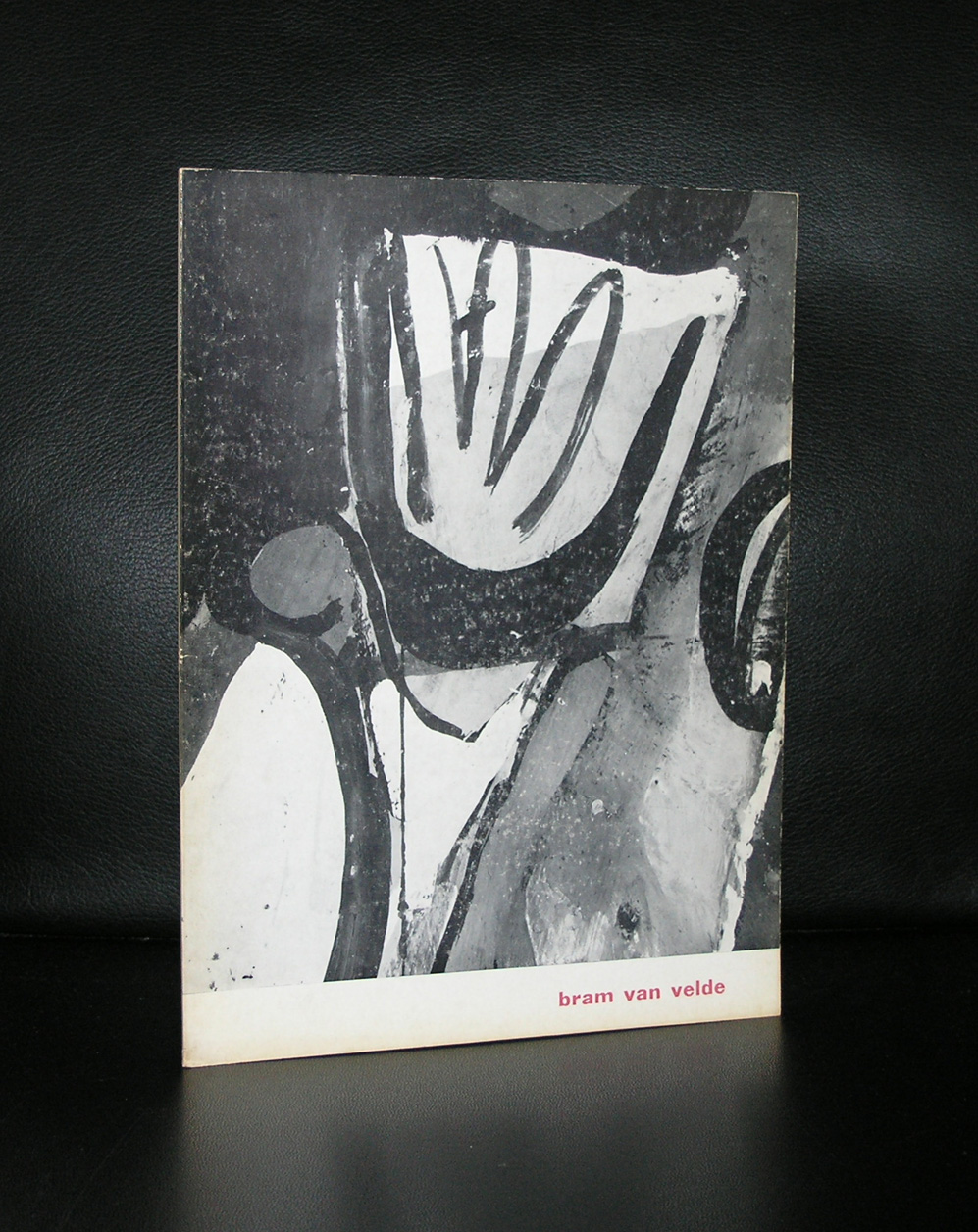
I once read a story of a collector who had sold over half of his collection to finally buy his ideal “dream” painting. It was a painting by Philip Guston. I knew some of his works because i had some books in my inventory of www.ftn-books.com, including the Sandberg designed stedelijk

Stedelijk Museum catalogue, but could not understand why one wants to trade in half of a collection, collected over decades, for a Philip Guston.

Schermafbeelding 2018-02-03 om 14.19.12

I finally had a chance to see some of these painting a few years ago and i must say i was impressed by them. Personally i would not sell half of my collection, but these works have a strange appeal. A little like the Dubuffet paintings. They are ugly but bold and they represent another world.  A world which can only exist in the artist mind.

Posted on Leave a comment

Geer van Velde (1898-1977)

Schermafbeelding 2018-01-30 om 10.48.57

Since the early eighties i admire Geer van Velde. When i first entered our offices at the Gemeentemuseum, there was original art on the wall . Chosen by employees of the Gemeentemuseum the painting on the wall of our offices was an original large painting by Geer van Velde.

Geer van Velde was Bram van Velde’s younger brother they differ 3 years in age but their art differs even far more. Both influenced by fellow artists also living in Paris, Geer became known for his paintings winning Prizes and being admitted into the Salon des Independants . He is considered to be a member of the Ecole de Paris. The works by Geer van Velde are highly recognizable being abstract but still showing some realism in them. The use of color??  subdued not the bright colors his brother is known for. They come from the same nest but their works could not be more different .

Where Geer was known  and admired is his early years, the case with Bram was totally different. It is now since 30 years that the works by Bram are more admired. They are “classic”  made in the 50’s , 60’s and 70’s, but study them closely and you will sense that they belong in the present. These are bold and highly sensitive paintings. Both these van Velde brothers have their qualities, but maybe, in the long run, i prefer Geer.

There are Geer van Velde publications available at www.ftn-books.com

OLYMPUS DIGITAL CAMERA


Posted on Leave a comment

Ernst van Leyden (1892-1962) … a forgotten painter

Schermafbeelding 2018-01-27 om 15.23.33

Undeservedly forgotten by most and rarely presented nowadays in exhibitions and gallery presentations. The story of van Leyden is that he fortunately had a loyal group of admirers and collectors, but after trying to give him back his popularity with an exhibition around 2008, it is again complete silence.

Schermafbeelding 2018-01-27 om 15.31.48

Van Leyden was an extremely productive and versatile artist, hugely inspired by his numerous travels: his use of warm colors, striking compositions, and strong rendition – whether figurative or abstract – of people, animals, objects and landscapes made him a thoroughly appreciated artist within a circle of peers and friends to which Picasso, Salvador Dali and Willem de Kooning belonged as well.

It just took a look at a recently acquired catalogue on van Leyden from 1964 and it oozes with quality.  Rotella, Villegle and others using the art of collage must have been inspired by van Leyden. Who dares …who presents this great artist again and gives him the stage in Modern Art he deserves to have?

www.ftn-books.com has the Stedelijk Museum and galerie Anderson -Meyer catalogues available for sale.

Posted on Leave a comment

Aristide Maillol (1861-1944)


Schermafbeelding 2018-01-26 om 14.33.52

If ever i had to chose two great sculptors from France , for me personally it would be Camille Claudel and Aristide Maillol. Rodin is a great sculptor , but i find his sculptures/statues to classic. He is a craftsman but for me he lacks the personal touch that i encounter with Maillol and Claudel. I have been admiring daily for 25 years a great statue by Maillol which is in the collection of the Gemeentemuseum Den Haag and i found it never boring.

Schermafbeelding 2018-01-26 om 14.34.24

This is the reason that i am always on the look out for publications on Maillol and finally i found another great one at our local bookmarket . It is the spectacular Paul Rosenberg catalogue for his sales exhibition of sculptures by Maillol from 1958. It is now available at www.ftn-books.com together with excellent Sandberg designed catalogue from the 1962 exhibition which was held at the Stedelijk Museum.

Posted on Leave a comment

Proost Prikkels 251 / Ontwerpers GKf

For those working in the printing business, these Proost Prikkels are possible known publications. for the others ….most people do not know them. Proost Prikkels are the publicity prestigious prints by Proost & Brandt paper. There are over 400 of these publications. They appeared irregularly ( between 1936 and the mid eighties), but were always of the highest quality and in most cases related to paper, design and typography. www.ftn-books.com has acquired over 100 numbers of these prestigious publications. Most of them were published between 1960 and 1980. Please mail me the numbers you are looking for and perhaps i have it available among the numbers i acquired. Here are some examples of these Proost Prikkels. the no. 251 is a jubilee publication ( no. 250 was skipped) and contains notecards of 79 dutch designers.

Posted on Leave a comment

Alexander Calder Stedelijk Museum catalogues by Sandberg

There are 3 Calder catalogues published by the Stedelijk Museum ( 1947,1959 and 1969). 2 of them are available through www.ftn-books.com. The first 2 were designed by Willem Sandberg and the last one by Wim Crouwel. Many colelctors like the 1959 catalogue , this because of the bald design and great prints on the cover, but for me the 1949 is the best, much more subtle and a catalogue that shows the design path Sandberg is going to take. Choice of paper, typography and illustrations make this the perfect early Sandberg publication.


Posted on Leave a comment

Benno Wissing (1923-2008)

Schermafbeelding 2018-01-11 om 14.42.10

In the dutch museum and art scene there are some classical partnerships regarding the design of museumpublications. There are Willem Sandberg and Wim Crouwel who bot worked in different decades for the Stedelijk Museum. There is again Wim Crouwel and Walter Nikkels who worked for the van Abbemuseum. There are Donald Janssen and Gracia Lebbink who had their designs published by the Gemeentemuseum Den Haag and there is Benno Wissing ( one of the founders of Total Designs) who worked almost exclusively for the Boymans Van Beuningen Museum Rotterdam during 3 decades.

Bernard (Benno) Wissing was a Dutch designer, painter, graphic artist and architect. He trained as a painter at the Art Academy in Rotterdam.

Schermafbeelding 2018-01-11 om 14.51.56

He began his career in 1949 as a designer for the Museum Boijmans in Rotterdam under VP Ebbinge Wubbe. He designed catalogs and posters and established exhibitions. He was one of the founders of Total Design which he worked from 1964 to 1972.

Benno Wissing is for me one of the greatest names in dutch design, but still stands in the shadow of Crouwel and Sandberg. Undeservedly, because his designs are true ” classics”. Just search for Wissing at www.ftn-books.com and find some excellent examples of his truly great designs.

Posted on Leave a comment

Dick Elffers (1910-1990)

Schermafbeelding 2018-01-03 om 17.10.05

Dick Elffers is one of the great dutch designers from last century. If you compare his works , they best can be compared with the designs by Willem Sandberg. Colorful designs and sometimes they look torn figures like the ones Sandberg uses. If ever there is a combination which is known outside the Netherlands it is the designs he made for the HOLLAND FESTIVAL.

These posters are highly recognizable as Elffers designs and are among the best that are published in the Netherlands in the last century. Perhaps not as well know as Sandberg and Crouwel, but certainly very important as a designer and quintessential for the ducth design mouvement that followed the 50’s from last century.

Of course www.ftn-books.com has some great Dick Elffers titles in its inventory