Posted on Leave a comment

Oval paintings …. rarely seen

Schermafbeelding 2018-01-28 om 10.02.16

The Oval shape is the less common shape among constructivist, but is was at one time used by some great names in art. Piet Mondriaan used it and also Roy Lichtenstein was a fan and used the shape in his Mirror paintings. Put them beside each other and you will notice similarities between the two. Not only the shape , but also how the space is filled with the composition. I noticed this because a few weeks ago i went to an auction viewing and found the drawings by Henk de Looper for auction. All oval shaped and they really fascinated me.


Here is some information on this forgotten artist who deserves better and is represented by gallery PHOEBUS in Rotterdam.

https://www.phoebus.nl/KUNSTENAAR/Henk.de.Looper

Posted on Leave a comment

Andre Volten (1925-2002)

Schermafbeelding 2018-01-19 om 14.44.57

Andre Volten is arguably the greatest sculptor form the second half of last century in the Netherlands. Educated in Amsterdam he soon became friends with contemporary artists like Ongenae. AAfter his arrival in Amsterdam he founded the LIGA NIEUWE BEELDEN and developed his art into a very personal form of abstract expressionism. Because he was at one time employed as a welder, steel and other metals were like wax in his hands and he could bend and transform them into the sculptures he wanted to make from the available materials. The result …. some magnificent large sculptures in public places. Sometimes they are hidden , but in many cases they are in the open. Just look at these 2 examples and find many more in classic publications on this artist at www.ftn-books.com. Among them iconic Wim Crouwel designed in brown and black cover . One of my personal favorites.

For more information on Volten please look at the www.andrevolten.nl site for information on the Volten foundation

Posted on Leave a comment

Kees van Bohemen (1928-1985)

Schermafbeelding 2017-11-30 om 14.19.05

Yesterday i mentioned the POSTHOORNGROEP and one of its members was Kees van Bohemen.

I remember that at one time, me and my parents visited a restaurant next door to the Haagse Kunstkring on the Denneweg in Den Haag and my mother told me that at the bar was a famous The Hague artist….Kees van Bohemen. I only knew his name from the paintings i had seen at the Gemeentemuseum, but possibly this was the first time i saw a true artist/painter in the “wild”. I remember he was drinking a beer and never left the bar during our meal. Many years later we met again in the Gemeentemuseum and at that occasion van Bohemen was offering his publications and some prints to be sold at the museumstore of the Gemeentemuseum. We took some of them in consignation and since i have been following his career. Making exhibitions at Pulchri, Kunstkring and Delta gallery it always struck me that his style was typical sixties and highly recognizable. Nowadays you encounter his works at the less prestigious auctions ( Venduehuis and AAG) but this does not mean they are not to be admired, they may not be in a price bracket of the Warhol’s and Basquiat’s, but that is not what art is about. The art of van Bohemen is admirable and deserves to be collected and shown in museums and fortunately many do admire his works. Here are the publications available at www.ftn-books.com

Posted on Leave a comment

David Levinthal (1949) and Henk Tas ( 1948)

Schermafbeelding 2017-11-29 om 14.07.09

For me David Levinthal is the US equivalent of Henk Tas in the Netherlands. Age difference is only 1 year and both have developed their photography into a form of staged photography where both use little ( plastic) figurines to populate their photographs. Where Levinthal uses baseball , barbie and military figures, Tas uses animals and female figures in a setting strongly influenced by music. http://www.henktas.nl/home.php?kid=1

If you read the text on Wikipedia on Levinthal you realize that these photographs are not made in an easy way. Setting, staging and lightning all need to be perfect for a good photograph.Here is part of what Wikipedia says about Levinthal

His work is included in the permanent public collections of the Art Institute of Chicago, the Centre Pompidou in Paris, the Corcoran Gallery of Art in Washington, D.C., the Los Angeles County Museum of Art, the Metropolitan Museum of Art, the Museum of Modern Art,[2] and the Whitney Museum of American Art in New York City. He has had solo exhibitions in New York City, Los Angeles, and Portland, Oregon.

Levinthal has produced a diverse oeuvre, utilizing primarily large-format Polaroid photography. His works touch upon many aspects of American culture, from Barbie to baseball to X-rated dolls. He uses small toys and props with dramatic lighting to construct mini environments of subject matters varying from war scenes to voyeurism to racial and political references to American pop culture.

He creates miniature scenarios using shoeboxes, cardboard, and foam core to make miniature offices, hotel rooms, pool halls, foyers and narrow corridors. These shadowy and dark scenes expose the secrecy and intimacy of small spaces. Levinthal is particularly interested in exploring the different emotions that each scene produces, such as reactions to an office corridor in contrast to those to a hospital or a private bedroom. Indeed, there is an inherently voyeuristic aspect to these early works.

Schermafbeelding 2017-11-29 om 14.12.14

I love both artists and can offer a nice original by Henk Tas in a private sale. For the books on these artists visit www.ftn-books.com where there is the best book on Tas available and the highly collectable Smithsonian catalogue on Levinthal’s photographs.


Posted on Leave a comment

Ossip Zadkine (1890-1967)

Schermafbeelding 2017-11-14 om 13.27.26

Ossip Zadkine is perhaps one of the most famous artists in the Netherlands without people knowing him by name. Zadkine made the sculpture ” DE VERWOESTE STAD” which symbolizes the destruction of the heart of Rotterdam after the bombardment of it in the early stages of WWII ( 14 mei, 1940) .

Schermafbeelding 2017-11-14 om 13.27.57

The sculpture was revealed in 1953 and financed by DE BIJENKORF on the condition that it always must be on the same spot within the centre. The human figure has a hole where the heart should be making it the perfect image for a destroyed city centre.

Since the revealing of this statue  Ossip Zadkine received on several occasions exhibitions of his works in the large museums in the Netherlands , but for many his claim to fame here is this ” DE VERWOESTE STAD”

There are some nice publications on Zadkine available at www.ftn-books.com

Posted on Leave a comment

The ultimate Christmas Tree by Paul McCarthy

For those of you that are interested in the news start reading the Guardian , a truly excellent newspaper and one that has a great perspective on modern art. Because i was looking for a special Christmas Tree i found this one by Paul McCarthy on the place Vendome /Paris .

Schermafbeelding 2017-11-17 om 14.51.22

An inflatable work of art resembling a large green tree. His work is not unfamiliar with us dutch , because in Rotterdam there is statue of a Gnome holding a giant butt plug and it is somewhat similar to the one presented in Paris. The difference is of course the figure holding the plug which is only present in the permanent statue presented in Rotterdam.

Schermafbeelding 2017-11-17 om 14.44.42

Because Christmas is near and you probably have some spare time please bookmark this page:

https://www.theguardian.com/artanddesign/jonathanjonesblog/2014/oct/20/paul-mccarthy-paris-tree-sculpture-butt-plug-controversy

and start reading the great article on Paul McCarthy in the Guardian.

Merry Christmas


Posted on Leave a comment

Naum Gabo (1890-1977)….and the Bijenkorf / Rotterdam

Schermafbeelding 2017-10-10 om 13.41.49

De Bijenkorf building in Rotterdam is one of the iconic buildings in this city. After the bombardment which destructed its complete city centre in WWII, the city rebuild its centre with help of contractors and world famous architects. Among them Marcel Breuer who designed the Bijenkorf building and had a sculpture by Naum Gabo placed before the building. The sculpture has become possibly even more famous than the building by Breuer and was recently cleaned and restored and now has back its original splendor.

Schermafbeelding 2017-10-10 om 13.52.25


Here is a short biography which can be found at the Tate site

Naum Gabo 1890-1977.Constructive sculptor and painter. Born in Briansk in Russia, named Naum Pevsner; younger brother of the sculptor Antoine Pevsner. Entered Munich University in 1910, studying first medicine, then the natural sciences; also attended art history lectures by Wölfflin. Transferred in 1912 to an engineering school in Munich. Met Kandinsky and in 1913-14 joined his brother Antoine (then a painter) in Paris. After the outbreak of war moved first to Copenhagen, then Oslo; began to make constructions in 1915 under the name Naum Gabo. 1917-22 in Moscow with Pevsner, Tatlin, Kandinsky and Malevich; wrote and issued jointly with Pevsner in 1920 a Realistic Manifesto proclaiming the tenets of pure Constructivism. Lived 1922-32 in Berlin in contact with the artists of the de Stijl group and the Bauhaus. First one-man exhibition with Pevsner at the Galerie Percier, Paris, 1924. With Pevsner, designed the set and costumes for Diaghilev’s ballet La Chatte 1926. 1932-5 in Paris, a member of Abstraction-Creation; 1935-46 in England, first in London, then from 1939 at Carbis Bay in Cornwall. Edited Circle jointly with J.L. Martin and Ben Nicholson in 1937. Moved in 1946 to the USA and settled in 1953 at Middlebury, Connecticut; became a US citizen in 1952. Professor at the Graduate School of Architecture at Harvard University 1953-4. From 1950 onwards carried out several large sculpture commissions, including a sculpture for the Bijenkorf store in Rotterdam 1955-7. Created Hon. KBE 1971. Died at Waterbury, Connecticut.

www.ftn-books.com has some Naum Gabo titles available.


Posted on Leave a comment

Otto Egberts… SCHAAMSTREKEN vol. 4

Schermafbeelding 2017-10-28 om 14.14.14

Here is the fourth and final volume within the series Schaamstreken by Otto Egberts. And again totally different. Shadows of animal figures are combined with geometrical compositions making it completely different from the other volumes. Beautifully executed small paintings on Danish and German maps this time. Because of the thick paper used for these maps these paintings feel like real paintings , bound again in goat leather. This series has been a joy to photograph and in my opinion one of the best artist books series by a contemporary artist. Let me know what you think about it.

measures : 39,5 x 10,9 cm.

contains : 28 pages plus goat leather cover

contains : 11 “paintingss” on old geographical maps spread over 2 pages and 2 paintings on  a singular page

signed and dated, 2000 by Otto Egberts at the end page in pencil.

schaam 4 a.JPG

schaam 4 b.JPG

schaam 4 c.JPG

schaam 4 d.JPG

schaam 4 e.JPG

schaam 4 f.JPG

schaam 4 g.JPG

schaam 4 h.JPG

schaam 4 i.JPG

schaam 4 j.JPG

schaam 4 k.JPG

schaam 4 l.JPG

schaam 4 n.JPG

schaam 4 m.JPG

schaam 4 o.JPG

schaam 4 p.JPG

schaam 4 q.JPG

Posted on Leave a comment

Otto Egberts .. SCHAAMSTREKEN vol. 2

Schermafbeelding 2017-10-28 om 14.13.39

Here is the second volume within the series Schaamstreken by Otto Egberts. At first glance this looks the least spectacular, but study it closely and you see that each page is worked over. Erased inks, sandpapered surfaces, folds and stamped “vervallen” (dilapidated). These were original maps too and i found some names which make it look like these come from the German Dutch Wadden region.

measures : 39,5 x 10,9 cm.

contains : 38 pages plus goat leather cover

contains : 32 “drawings” on old geographical maps

signed and dated, 2000 by Otto Egberts at the end page in pencil

schaam 2 a

schaam 2 b

schaam 2 z

schaam 2 c

schaam 2 d

schaam 2 e

schaam 2 f

schaam 2 g

schaam 2 h

schaam 2 i

schaam 2 j

schaam 2 k

schaam 2 l

schaam 2 m

schaam 2 n

schaam 2 o

schaam 2 p

schaam 2 q

schaam 2 r

schaam 2 s

schaam 2 t

Posted on Leave a comment

Fiona Rae (1963)

Schermafbeelding 2017-09-07 om 14.00.40

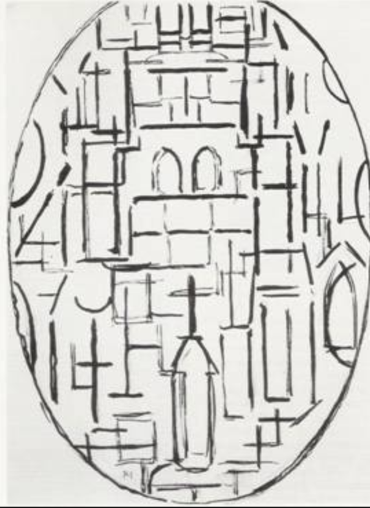
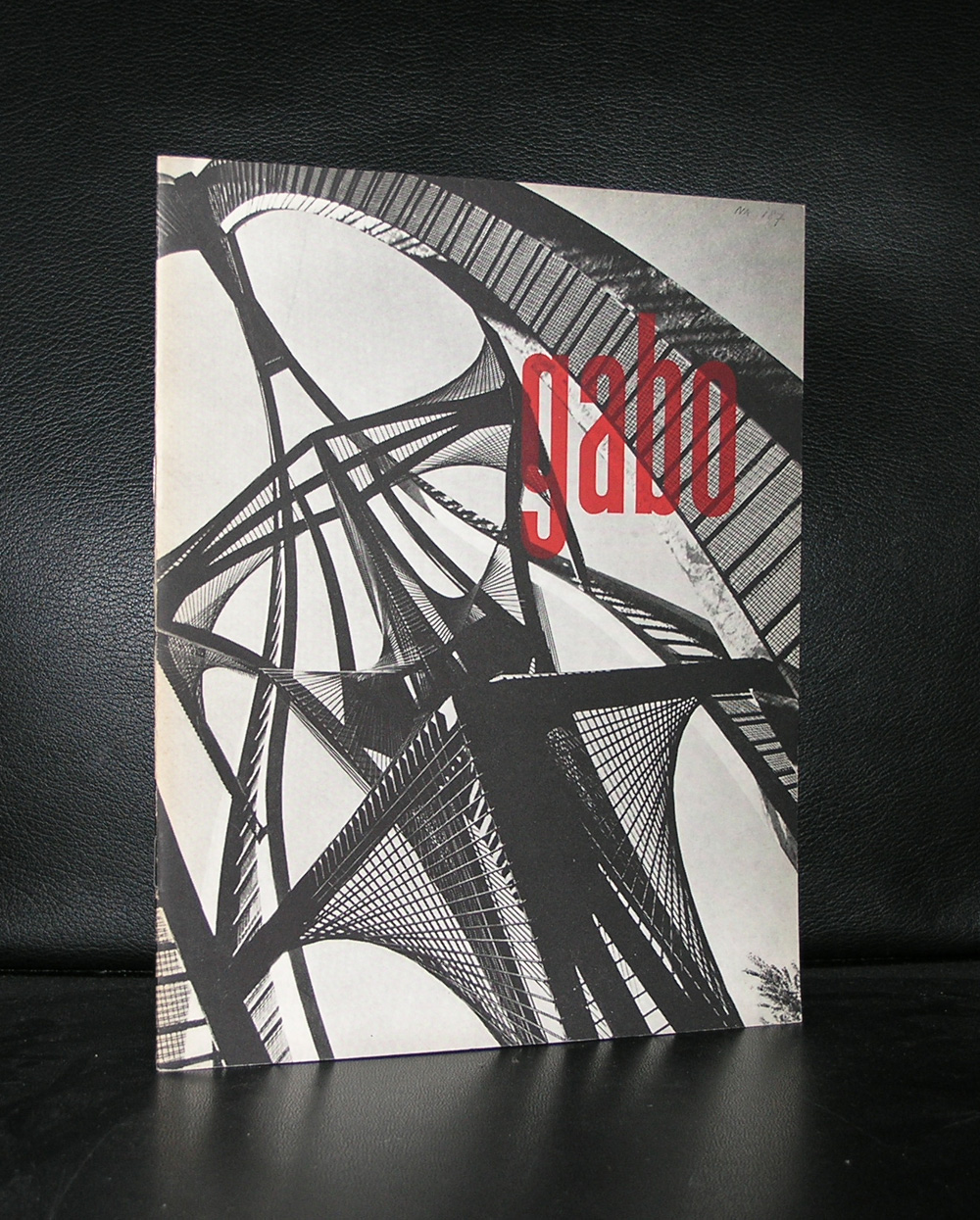
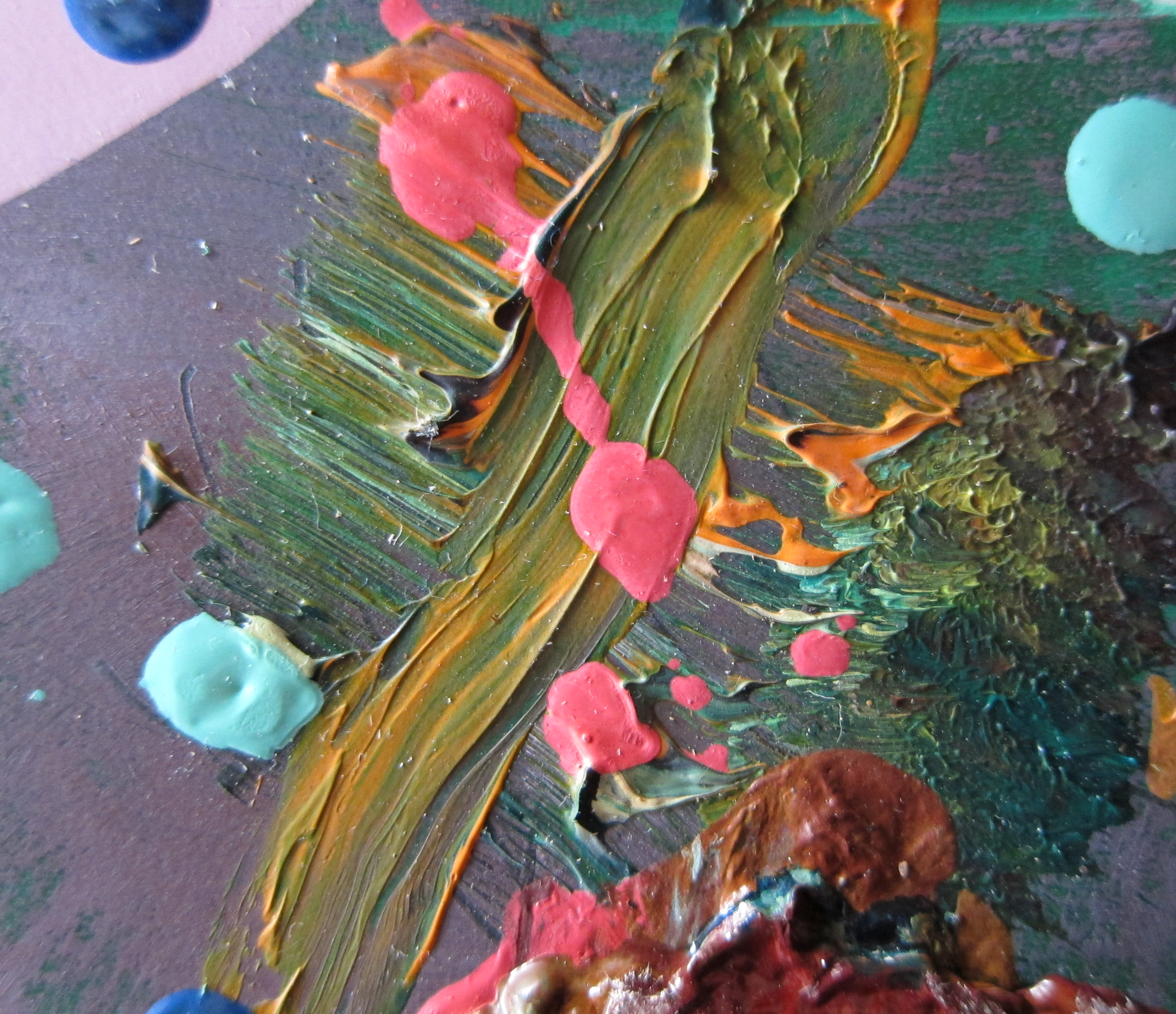
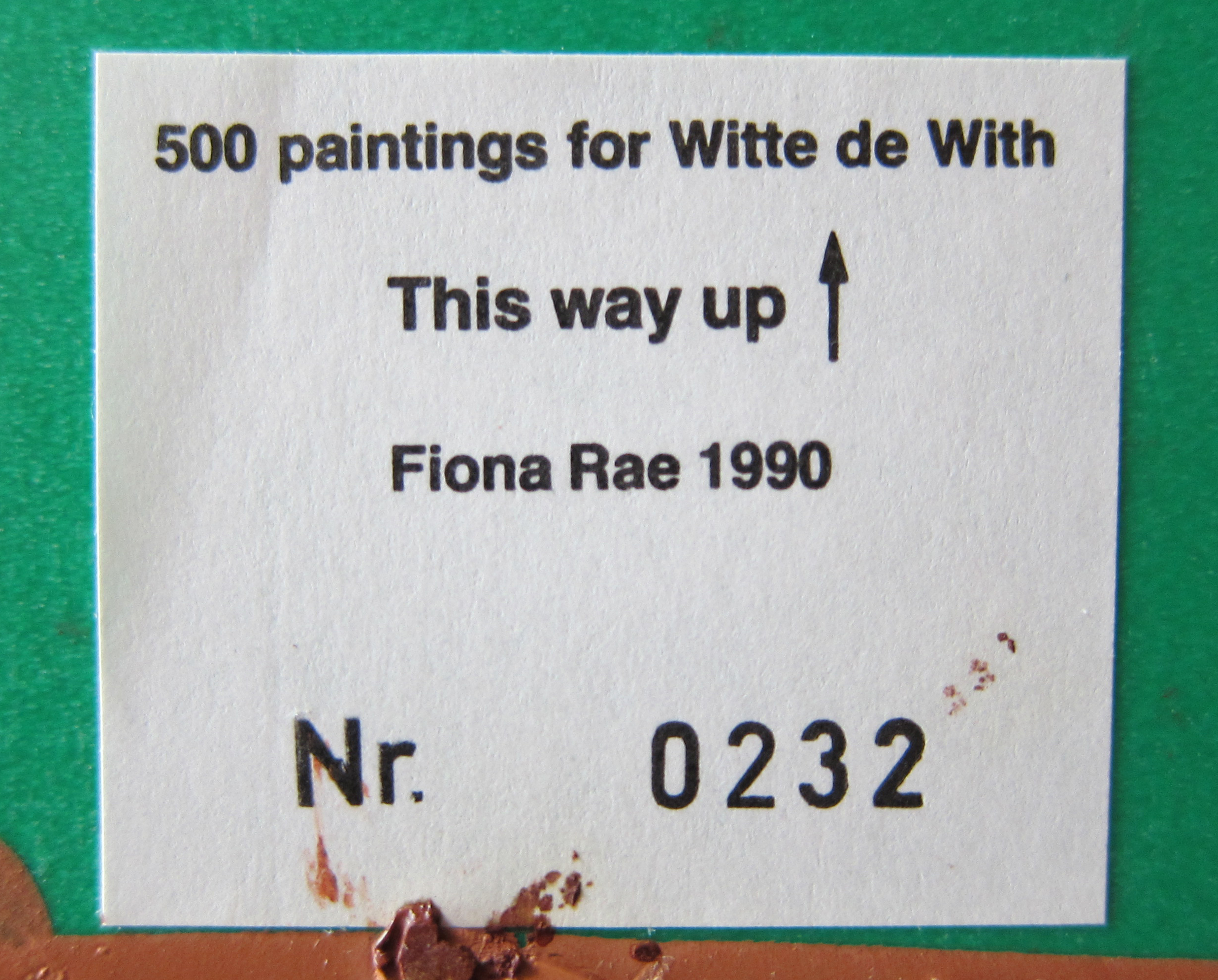
I never had heard of Fiona Rae until i purchased the excellent Voorwerk box published by Witte de With in which there was a contribution by Fiona Rae. Rae  ( born in Hong Kong) added to this Voorwerk box a small unique painting , making this box one of the most sought after art publications from the last 30 years. These boxes were published in an edition of only 500 copies by Witte de With in the very beginning of its existence. Chris Dercon was the responsible curator, who later would become the director of the Boijmans van Beuningen. An article on Blouin triggered this blog on Rae since an exhibition in Lugano was recently opened. Here follows the Blouin artice and of course for the unique Fiona Rae painting visit this link at www.ftn-books.com:

https://ftn-books.com/products/fiona-rae-original-painting-from-500-paintings-for-witte-de-with-mint

use the code: fionaftn  and receive a USD 95.00 discount on this purchase.

valid until the 31st of december/ only 1 work available.

rae jan aa

Buchmann gallery in Switzerland presents British painter Fiona Rae’s paintings for the first time in Buchhmann Lugano.

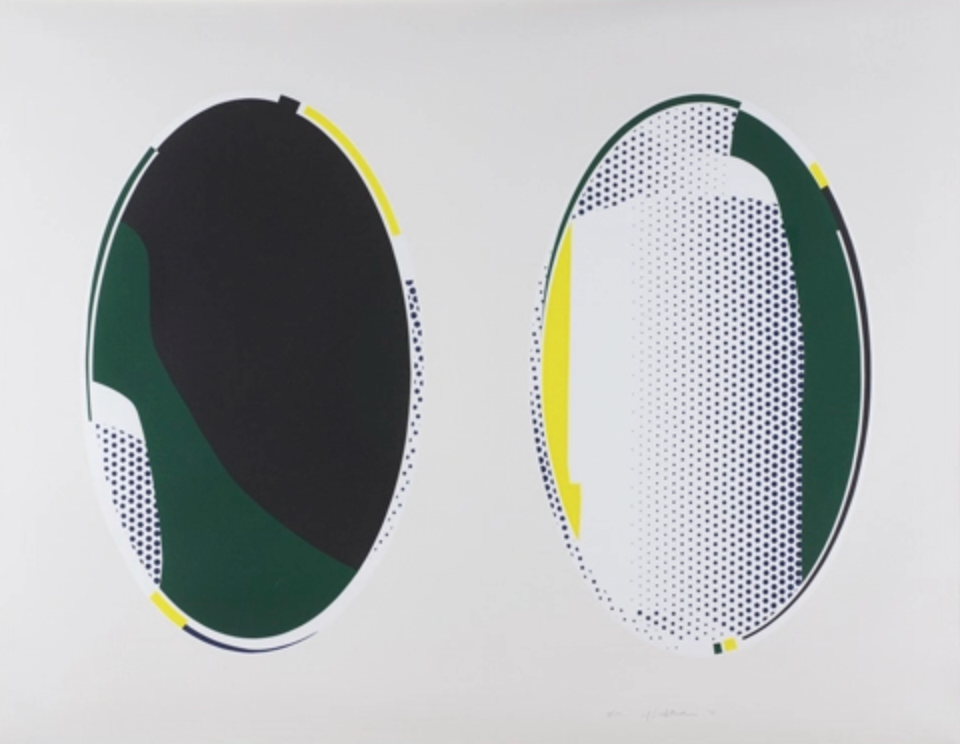
The paintings featured in the exhibition are part of the most recent works by the British artist. The works begun in 2014 and are comprised of a number of charcoal drawings. Initially, the series started out as grayscale works and relied upon its fluidic flow of the brush in a calligraphic style, completely omitting the colors. The largest of the painting, thus, is limited to a size which she can completely control from a single standpoint; and can through her brush freely to cover the entire canvas with a single brush stroke.  It’s the magic of the art of calligraphy that makes the canvas as well as the drawings free flowing but with an intense precision and even discipline.

The large work upon canvas, the painting named “Figure 2a” introduces color on the foreground upon a grayscale backdrop.  This approach literally highlights the figure in contrast with the backdrop and creates a new concentration and dynamism in the constellation of figure and ground, surface and line. This approach has been further explored through her smaller drawings and paintings on paper as well, like the paintings “Figment 2u,” “Figment 3b” and “Figment 3c.” For the title of her painting, Rae uses a taxonomic system: Figure 1a, Figure 1b, etc. In this way, she creates a distance between the painting and the title, enabling the viewer to concentrate on contemplating the pure painting. Still, Fiona Rae’s signature remains clearly recognizable in these new works, evidence of the many visual codes and tropes she has developed and made her own over the years.

These new paintings make clear what Fiona Rae means when she says: “I see these paintings as suggesting the presence of a figure, whilst simultaneously insisting on its absence; the paintings remain abstract. I want the urgency of paint marks and gestures made only by the hand; the need to make a mark that goes back thousands of years.”

The exhibition is on view through November 25, 2017 at Buchmann Gallery, Buchmann Lugano Via della Posta no. 2, CH-6900 Lugano.