Posted on Leave a comment

Peter Stämpfli (1937)

Schermafbeelding 2021-08-13 om 13.49.05

The reason for this blog is that i lately found sand deiscovered some interesting Pop Art artists in Germany and Switzerland and Peter Stämpfli is one of them.

Schermafbeelding 2021-08-13 om 13.55.03

Born July 3, 1937 in Deisswil, Switzerland Stämpfli is a Swiss painter of the Pop Art movement. A major figure in 20th century painting, Peter Stämpfli has always scrutinized everyday life: our environment, our objects, our gestures. However, far from being satisfied with the simple appearance, his work has endeavored to reveal the depth and the strength that it contains. From 1963, the artist devotes himself to a work of inventory of all the repetitive details of everyday life, which he methodically fixes on a white background. The artist isolates, from 1969 until today, the pattern of the tire, emblematic of our industrial society; it quickly becomes his favorite theme and offers countless variations. Interview with an artist who appropriates his entourage in amazing simplicity to invent his own icons… an absolutely Pop art.

www, ftn.books.com has added a Centre Georges Pompidou title recently. It is the book published on the occasion of the 1981 Paris exhibition in the Pompidou museum.

stampfli a

Posted on Leave a comment

Marc Bijl (1970)

Schermafbeelding 2020-07-31 om 15.20.04

The most informative text on Marc Bijl i encountered on Wikipedia, but on a personal note, i agree with every element of this text. Marc Bijl stands for art on the borders of society in which gothic and punk are combined with Pop Culture…. I love it.

From 1992 until 1997 Marc Bijl studied at the Royal Academy of Art & Design in ‘sHertogenbosch. In 1996 he studied for a year at Glasgow School of Art. In his early work, Marc Bijl reacted to global themes and to popular fascination with symbols of political power, globalization of the economy, religion and nationalism. This resulted in interventions in public space, videos, sculptures and installations that underscored or undermined world views. Bijl endeavours to expose superficialities and myths via his work. Bijl switches in his work between political activity and street culture as he does between the media of image, text and music. He exposes the superficialities, icons and myths of popular culture in his work to stimulate the spectator to contemplate about moral and ethical issues. The symbol, the logo and the label are his potential targets and his artistic tools. He likes to upset, relocate and re-connote their superficial image and their mythmaking – always aiming at a critical analysis of the social conditions of the society. Bijl employs visual elements borrowed from punk and Gothic subcultures and from anarchism. His early works are representational, cartoon-like and often textual. His recent work is more abstract and minimalistic, exemplifying a shift in approach, by which he pares down different perspectives and methodologies to a new essence. The crux is no longer the ‘symbolism’ but what that symbolism represents and signifies. In these most recent works, Bijl makes clear references to modernist art-historical icons such as Mark Rothko, Mondriaan, De Stijl (Rietveld chair) and more subtle references to Jannis Kounellis and Joseph Beuys. Bijl adapts these classical works to his own corporate style. He seeks a more abstract formal language that is in many respects more ambiguous than his earlier vocabulary.

Bijl undermines systems but at the same time he is depended on these systems. Bijl’s work is often rebellious and tends to the illegality. His work is clearly rooted in street culture and possesses elements of graffiti, performance and installation art.

www.ftn-books.com has some nice Marc Bijl publications available.

marc bijl nai


Posted on Leave a comment

Jacob Zekveld (continued)

Schermafbeelding 2021-06-07 om 10.36.48

Together with Woody van Amen Tajiri and Daan van Golden , i consider Zekveld to be one of the great 4 Pop Art artists in the Netherlands. Zekveld was appreciated by Hans Sonnenberg , gallery owner of galerie delta in Rotetrdam and over the years he stayed loyal to Zekveld. The fame of Zekveld has never taken off, but now that Sixties and Seventies art are making a revival, Zekveld his works surface at auctions and fetch reasonable prices. Still affordable, but definitely on the rise.

www.ftn-books.com has bought a great small collection of Zekveld catalogues that were published for the Delta exhibitions which is now for sale.

Posted on Leave a comment

Posters by Willem Sandberg and Wim Crouwel…part 11

One of the most iconic sets is the catalogue and poster for the 1965 Raysse exhibition. Pure french Pop Art whith a poster that shows the neon elements for which aysse became famous. Both poster and book belong to the best Crouwel has designed in the Sixties for the Stedelijk …..

and this time they have many design elements in common.

Both are available at www.ftn-books.com


Posted on Leave a comment

the Drawings of Roy Lichtenstein (1987)

Schermafbeelding 2020-09-01 om 16.53.02

I like this title. It was published at the end of the EIghties which finally recognized the historical importance of Pop Art in art. before , in th early Sixties pop art exhibitions were held all over the world including many impotant ones exhibitions at the Stedelijk Museum in Amsterdam. Among them a highly important Lichtenstein exhibition, but the difference with the 1987 exhibition at the MOMA museum is that in 1967 in Amsterdam it was NEW and MODERN and in 1987 in New York is was “established” art. A difference of 20 years and now another 33 years later . The quality of the works by Roy Lichtenstein is once again underlined with this exquiste catalogue on his drawings. It shows the metaculous preparation in drawing for all larger works he would create after.

Posted on Leave a comment

Jasper Johns and Robert Rauschenberg (8)

Schermafbeelding 2020-08-31 om 13.57.30

Recognised for developing the first American style to depart from Abstract Expressionism, Jasper Johns and Robert Rauschenberg came together as collaborators and lovers in the mid ’50s. Though the two are widely considered as the founding fathers of the pop art movement, their relationship was ignored due to the rampant homophobia during this time. With many believing the two to be just friends, their intense partnership is often overlooked as being a pivotal factor in their art-making. After a passionate six years, Johns and Rauschenberg broke up. The distraught revolutionaries both left New York City, changed their pictorial styles and cut off all contact with each other for over ten years.    A nice selection of both artists is available at www.ftn-books.com

Posted on Leave a comment

Billy Apple ( Barrie Bates – 1935 )

Schermafbeelding 2020-07-23 om 16.16.36

Billy Apple is considered to be a Pop Art artist, although he side stepped at some occasions his main works are related to the Pop Art movement. Coming from New Zealand but working and living in the US he made a career for himself knowing many of his great contemporaries personally.

Schermafbeelding 2020-07-23 om 16.27.42

Billy Apple (ONZM) is an artist whose work is associated with the New York and British schools of Pop Art in the 1960s and with the Conceptual Art movement in the 1970s. He collaborated with the likes of Andy Warhol and other pop artists. His work is part of the permanent collection of the Museum of New Zealand Te Papa Tongarewa (New Zealand), Auckland Art Gallery / Toi o Tamaki (New Zealand), the Christchurch Art Gallery / Te Puna o Waiwhetu (New Zealand), The University of Auckland (New Zealand) and the SMAK/Stedelijk Museum voor Actuele Kunst (Ghent, Belgium).

Barrie Bates was born in Auckland, New Zealand in 1935. He left secondary school with no qualifications and took a job as an assistant to a paint manufacturer in 1951. Bates attended evening classes at Elam School of Fine Arts, where he met Robert Ellis, a graduate of the Royal College of Art in London.

In 1959 he left New Zealand on a National Art Gallery scholarship. He studied at the Royal College of Art, London, from 1959 until 1962. During his time at the Royal College of Art, Bates met several other artists who went on to become a new generation of pop artists; including David Hockney, Derek Boshier Frank Bowling and Pauline Boty. He exhibited frequently during his time at the College in the Young Contemporaries and Young Commonwealth Artists exhibitions along with Frank Bowling, Jonathan Kingdon, Bill Culbert, Jan Bensemann and Jerry Pethick.

In 1962 Bates conceived Billy Apple: he bleached his hair and eyebrows with Lady Clairol Instant Creme Whip and changed his name to Billy Apple. Apple had his first solo show in 1963 – Apple Sees Red: Live Stills – in London at Victor Musgrave’s Gallery One.

Apple moved to New York in 1964: he progressed his artistic career and also found work in various advertising agencies.

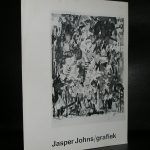
A pivotal event was the 1964 exhibit “The American Supermarket”, a show held in Paul Bianchini’s Upper East Side gallery. The show was presented as a typical small supermarket environment, except that everything in it — the produce, canned goods, meat, posters on the wall, etc. — was created by six prominent pop artists of the time, including Billy Apple, Andy Warhol, Tom Wesselmann, Jasper Johns and others.

Apple was one of the artists who pioneered the use of neon in art works (Apples to Xerox and Neon Rainbows). Other exhibitions and series include Art for Sale, The Given as an Art Political Statement, Transactions, Golden Rectangle, The Art Circuit etc.

In 2008 Apple was the subject of a feature length documentary called “Being Billy Apple”.

www.ftn-books.com has acquired the important UNION JACK poster by Billy Apple he made for his 2009 Witte de With exhibition. Now available at www.ftn-books.com

union witte apple a

Posted on Leave a comment

Hugh Weiss (1927-2007)

Schermafbeelding 2020-03-09 om 16.38.07

The first time i encountered some actual painting by Hugh Weiss, was at the timne the Venduhuis held an auction with works from the estate of Hans Sonnenberg, the former owner of the Delta Gallery in Rotterdam. Sonnenberg had a very personal way of collecting and was not affraid to present young artists like Haring and Basquiat in the Eighties and Schjolte and van Geest in the Eighties/Nineties. In the Sixties he liked a different kind of art and beside some POP ART he presenetd there was this American born artist who he liked very much…..Hugh Weiss

Hugh Weiss was born in Philidelphia in 1925, but practically lived his entire working life in Paris /France. Here he has made a name for himself and from France  a contact with Sonnenberg was established, The result exhibitions at galerie Delta of which one catalogue is available at www.ftn-books.com. It is the 1965 catalogue

weiss delta

The works intrigue, but not so musch as that at timne of the auction i wanted to add one to my collection. I focussed instead on the Arie van Geest paintings and i was successful. Now that i look at them again in the catalogue i think it is a pity that i did not bid, but wh knows perhaps in the future there is another chance.

Schermafbeelding 2020-03-09 om 16.50.40

Posted on Leave a comment

John Wesley (1928)

Schermafbeelding 2020-05-26 om 10.05.02

John Wesley is considered to be a Pop Art artist, however, I am in doubt because many of his qualities are timeless and are much more graphic than the 100% pop art paintings. I knew Wesly from his retrospective at the Stedelijk Museum in 1993, but what I did not realise was that many of his works have an erotic contents. I did a Google search and found many examples of nudity that were presented in great graphic paintings and prints. I am not the only person who thinks about his works in such a way.

Schermafbeelding 2020-05-26 om 09.56.53

John Wesley is a contemporary American painter. Characterized by his uniquely graphic, flattened Pop paintings, Wesley’s work addresses themes of sexuality and erotica through stylized and symmetrically composed images. Rendered in distinctive pink and blue pastel hues, Wesley repeats the same graphic symbolic images in tessellation-like patterns on his large canvases, and regularly employs leitmotifs like pornography and avian fowl—often to humorous effect—throughout his oeuvre. Though his paintings are reminiscent of his contemporary Tom Wesselmann, his personal associations were with peers Dan Flavin and Donald Judd, and he was inspired by both the Minimalist and Surrealist movements. That being said, “I didn’t go out and try to be a Surrealist,” Wesley explained of his ambiguous imagery. “It was just fun doing what I was doing.” Born on November 25, 1928 in Los Angeles, CA, he was a self-taught artist who worked for several years an illustrator for the avian industry. His work has been critically acclaimed throughout his career, and he has been the subject of several retrospectives, notably including at the PS1 Contemporary Art Center in New York in 2000.

The following publications are available at www.ftn-books.com

Posted on Leave a comment

Keiichi Tanaami (1936)

Schermafbeelding 2020-04-20 om 17.16.20

My first impression when i encountered this set of Tanaami posters was that these were original 60’s posters , but no….these are from ca. 2005 and strongly rooted in the Japanese culture of making prints and heavily inspired by Psychedelic Sixties posters

Born in 1936 in Tokyo, Japan, Keiichi Tanaami is an influential pop artist of postwar Japan. Tanaami took a keen interest in drawing at a very young age and often spent time in cartoonist Kazushi Hara’s studio. He studied at Musashino Art University, earning a Special Selection recognition with a major design and illustration group. Since the mid 1960s, he became increasingly interested in psychedelic culture, Acid Music, and Pop Art, in particular Andy Warhol’s work. In 1968, his award-winning antiwar poster “No More War” and his album artwork for the Monkees and Jefferson Airplane became a major impetus for the movement of psychedelic and pop art in Japan. In 1975, he became the first Art Director of Playboy (Japanese Edition), and in 1991 he started to teach at Kyoto University of Art and Design, where he is currently a chairperson of a Faculty of Information Design.
tanaami posters

There is a wonderful site on this artist which reads like a comic book and some outstanding graphic quality and yes i have 2 of his posters now available at www.ftn-books.com

for the site go here: https://mangadejapan.com/articles/detail/1356

Schermafbeelding 2020-04-20 om 17.17.17