Posted on Leave a comment

Pop Art exhibitions in the Low Countries.

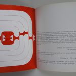
According to my information the first large scale Pop Art exhibitions in the Netherlands took place in 1964. With it was the famous Wim Crouwel designed catalogue published with the upper right corner  “folded”.

OLYMPUS DIGITAL CAMERA

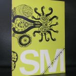
A spectacular cover and an example for many other designers to follow this and being inspired by this cover for the years to come. Since, other exhibition  followed of which many publications are available at www.ftn-books.com. One other has certainly to be mentioned because it followed in the year after the Stedelijk Museum exhibition took place. In this case POP ART was combined with the French/Belgium wave which followed in the steps of Pop Art, Le NOUVEAU REALISME.


pop art belgie

This way the United States Pop Art mouvement was combined with the European Pop Art artist like Martial Raysse.

OLYMPUS DIGITAL CAMERA

Since other Pop Art exhibitions took place all over Europe, but the Netherlands  and Belgium stayed interested in this fascinating art. I remember recent exhibitions in Schiedam, Nijmegen, Kunsthal Rotterdam, Brussels and the Gemeentemuseum Den Haag all being successful, making Pop Art an established art form…Pop Art is here to stay.

Posted on Leave a comment

the galerie Arnaud and Ado ( the artist)

OLYMPUS DIGITAL CAMERA

One of the most intriguing books in my collection of www.ftn-books.com is this precious book Dai DAi Submarine by Ado. I found it years ago and it is for some inexplicable reason still for sale. The design is striking. the contents is typical Pop Art and the design /lay out are one of a kind . A book that should find a nice spot in a Sixties design collection. I have only one available and the condition is excellent. Book published by Galerie Arnaud in 1969 and believed to have an edition of less than 500.


Posted on 2 Comments

Ferdi ( Ferdina Jansen 1927-1969)

Ferdi was the wife of dutch Pop Art painter and sculptor Shinkichi Tajiri and was married to him until her tragic death in 1969. If i look at her work now, the first other artist i think about is Niki de Saint Phalle. I really do not know if they have known each other but it is possible when you look at the time frame, they possibly knew and inspired each other. Ferdi, educated by Ossip Zadkine, used large pieces of cloth and textiles to assemble her figures female form inspired figures for which she has become very well known in the Netherlands. Recently, I think it was 2012 , the Rijksmuseum acquired WOMB TOMB with the help of the heirs of her estate

Schermafbeelding 2018-05-23 om 11.06.30

Her husband Shinkichi Tajiri is nowadays a recognized and settled name and specially known for his large Pop Art sculptures. Ferdi is far less known. Her works appear sometimes at auction but that is it for this moment. It is time that some dutch museum shows new interest in her because her works fascinate and deserve to be known abroad too. The stedelijk Museum published a very nice catalogue with her works which was designed by Wim Crouwel and some 15 years ago another important book was published in which her works were shown together with toise from her husband. Both are available at www.ftn-books.com

Posted on Leave a comment

Allen Jones (1938) is British Pop Art

Schermafbeelding 2018-02-06 om 16.22.03

For me Allen Jones stands for his mannequin like sculptures. Possibly the best known is a woman kneeling on all fours with on her back a glas table surface. The sculpture acting like a salon table. This use of glass and mannequin sculptures is frequently done by Jones. He made several tables and even some chairs out of these mannequins.

This is possibly the most famous part from his oeuvre, but one must not forget his paintings. Highly original Pop Art paintings and well deserving their place among the best Pop Art in the world. Jones his images are influenced by Lindner but they also have some parts of the cheesecake poses of the ones Mel Ramos produced ( tomorrows blog).

www.ftn-books.com has some Jones items available

Posted on Leave a comment

Salvatore Scarpitta (1919-2007)


Schermafbeelding 2018-03-18 om 11.26.28

Lets start a five day blog session with forgotten artists and here is the first to appear in this FTN blog.

An American artist with an Italian background, but born , raised and died in New York. In between he moved to California and studied art in Rome. I tried to figure out the italian influence in his works, but can only see his American roots. If  ever there is an influence it probably is the American Pop Art scene that influenced him. What struck me in his life that he was a passionate racing driver and at one time even had his own racing team. His life and progression in art develop a little like the Italian multi talented artist Carlo Mollino, who was also a passionate racing driver, but where Mollino convinces with his aesthetics, Scarpitta is a far more robust and less subtile artist. Still his works stand out from his contemporaries with the frequent use of wood, steel and bandaged objects.

Schermafbeelding 2018-03-18 om 11.27.08

He fascinates…and deserves to be known by far more people . www.ftn-books.com has a few titles on Scarpitta available.

scarpitta

You want to learn the story of Salvatore Scarpitta as a racing driver? you will find it over here:

https://www.classicdriver.com/en/article/classic-life/monuments-man-dirt-track-racer-tale-salvatore-scarpitta


Posted on Leave a comment

Jasper Johns (1930)

Schermafbeelding 2018-03-13 om 12.11.16

Another great artist who surfaced in the Sixties was Jasper Johns. Starting his career at the end of the Fifties , he soon became one of the best known and expensive artists from his generation. At one time one of his flag paintings was the first to fetch an incredible 10 Million dollars at auction, making it the most expensive painting by a living artist.

Schermafbeelding 2018-03-13 om 12.23.30

Now we are accustomed to these crazy prices collectors are paying for art, but at that time is was unbelievable that a living artist could fetch such a price. Because of his popularity Johns soon had an exhibitions in the Netherlands at the Stedelijk Museum Amsterdam. A special print exhibition and this exhibition was for me personally the perfect one.

OLYMPUS DIGITAL CAMERA

It was one of the first exhibitions i ever visited in the Stedelijk. I had an interest in graphic art and , young as i was,  a rookie in the world of art, i had no idea of prices. I thought i could afford a small print. But no way, these were far too expensive for a young starting collector. What remains?   … i still have the catalogue for sale at www.ftn-books.com and cherish it together with my personal copy. Book design was done by Wim Crouwel and it is available at www.ftn-books.com together with other Jasper Johns titles.

Posted on Leave a comment

Woody van Amen (1936)… dutch Pop Art

Schermafbeelding 2018-03-01 om 14.41.58

Ask me … who is the greatest Pop Art artist in the Netherlands….my answer would be Woody van Amen.

Woody van Amen (Eindhoven, 1936)* studied at the Willem de Kooning Academy in Rotterdam. His fascination for contemporary culture stemmed from the 2 year period he spent in New York from 1961 to 1963, where he met pioneers of the Pop Art movement such as Andy Warhol and Robert Rauschenberg. Woody van Amen states himself on what he encountered there: ‘Pop Art is a purely American phenomenon, based on American advertising. I am concerned with figurativism and new realism. I make things about subjects that intrigue me… everything is usable because everything can become symbolic when taken out of its usual surroundings’.

His contact with artists and his discovery of artist’s cafes, jazz music, junk art and neon light gave him inspiration and informed the themes and methodology of his work. He started to incorporate the logo’s of big Dutch brands and used techniques such as assemblage, in this way developing his own new style.

Foreign countries and cultures have remained an important point of inspiration for Woody van Amen. In the Seventies a trip to South-East Asia lead to many new oriental influences in his work. In 2007 he produced a film, put together with footage he shot during his travels in Vietnam, Burma and Indonesia. Man, religion and the beauty of nature are important themes in this video piece and they recur once again in the exhibition SHAN 2013.

van Amen has won numerous prizes during his art career and his works are important parts of the permanent collection in many museum around the world. Since Pop Art has become important and main stream, the works by van Amen reappeared in presentations and i predict that in a few years his works will be on show permanently.

www. ftn-books.com has some important van Amen publications available.

Posted on Leave a comment

Sixties magazines TIQ versus PLEXUS

The sixties were the years of my teens. And with these years belong some dutch fan music magazines . There was Muziek Express and Tuney Tunes for the young fans, For the somewhat older teens there was HITWEEK( Which later became Aloha)

and then there was finally TIQ…. a a magazine focussing on art, music, fashion, photography and ….”sex”  making this a true Dutch Pop Art magazine .It was a groundbreaking magazine , years ahead of its time. Published as a glossy magazine , but with a contents that was solely focussing on the teens and twens from the sixties.

Unfortunately it was not popular and only 14 of these magazines were published in 1966 and 1967. It disappeared much to soon from the market ,leaving the youth only Hitweek, but in France it was totally different. Of course there were BD’s ( Bandes Dessinees/ Comics) with Pilote as the leading magazine. But is focusses on the very youthful , this was recognized by L.D. publisher who wanted something different and then there suddenly was PLEXUS. No glamour photography but artful photographs by renowned photographers. Paintings by Labisse and Leonor Fini . Painters and artists who did not look away from nudity. Nudity, erotic art, erotic cartoons and short stories were the main ingredienst. Focussing with this contents on a youthful audience. In France this was the equivalent for the TIQ magazine in the Netherlands. A pop Art magazine with only 40 volumes in its publication years. Both nostalgic collectables of which there are now 3 volumes available at www.ftn-books.com

plexus z

Posted on Leave a comment

Mel Ramos ( 1935 )

Schermafbeelding 2018-02-06 om 16.38.57

Mel Ramos made hyperrealistic paintings , but if i had to decide what kind of artist he was , i would rather say he was first and foremost a Pop Art artist.

Ramos is best known for his paintings of superheroes and voluptuous female nudes emerging from cornstalks or Chiquita bananas, popping up from candy wrappers or lounging in martini glasses.

Ramos was among the first wave of Pop Art artists who gained recognition for their art. His art was hidden for a long time for us dutch. No publications were available and the nude paintings/illustrations we had in magazines over here were practically all done by Alberto Vargas, the famous Playboy illustrator, but none by Mel Ramos

Ramos received his first important recognition in the early 1960s; since 1959 he has participated in more than 120 group shows. Along with Roy Lichtenstein and Andy Warhol, he was one of the first artists to do paintings of images from comic books, and works of the three were exhibited together at the Los Angeles County Museum of Art in 1963. Along with Claes Oldenburg, James Rosenquist, Tom Wesselman and Wayne Thiebaud, Ramos produced art works that celebrated aspects of popular culture as represented in mass media. His paintings have been shown in major exhibitions of Pop art in the U.S. and in Europe, and reproduced in books, catalogs, and periodicals throughout the world.

PS. i started to write this blog knowing for sure i had a great publication on Ramos in my stock, but unfortunately it was sold some years ago and it is not available any longer at www.ftn-books.com

Posted on Leave a comment

Then I ducked my Head and the lights went out, and two guns blazed in the Dark……

Schermafbeelding 2018-02-04 om 09.45.35

This brilliant title is given by William N. Copley to a painting he made in 1966. Copley must be one of the wittiest artists.

copley title

He had no trouble at all in finding or coming up with original titles. ( a little like Piet Dirkx/ follow the Piet Dirkx daily at this blog). I love Copley and artists who can come up with original and fun titles for their works. Compare the above and for example” Mount Venus and the Hula-Hula Graces in the Glade” to titles like composition I and composition II. This does not mean that “composition” is a worse painting, but when there is a story in a title it says something about the artist himself. Looking for some more great titles for paintings? visit www.ftn-books.com for other Copley publications.

( and search within my blog to find another blog on Copley)