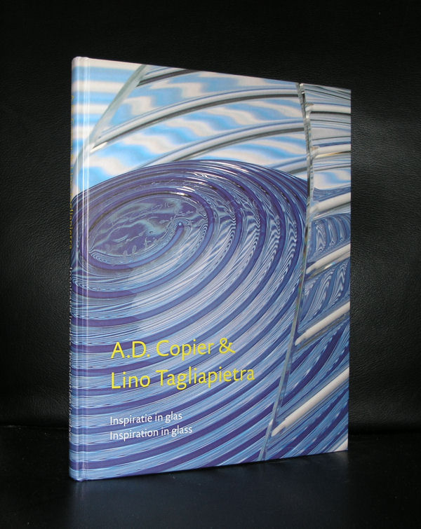
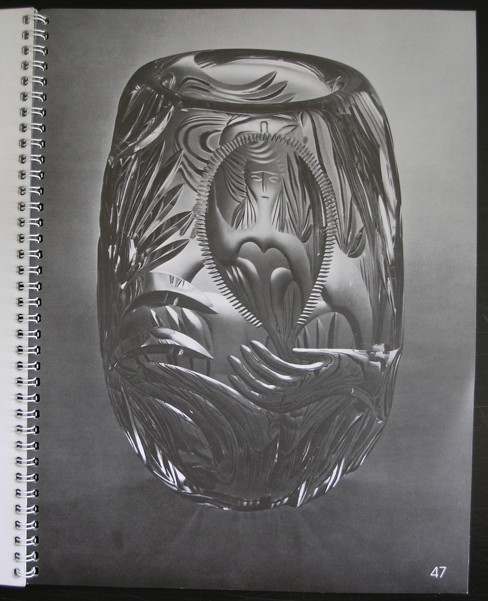
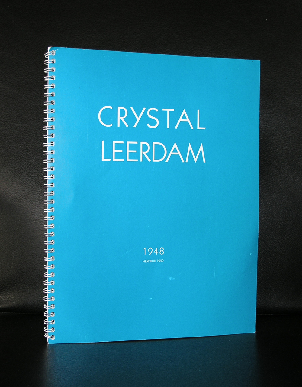
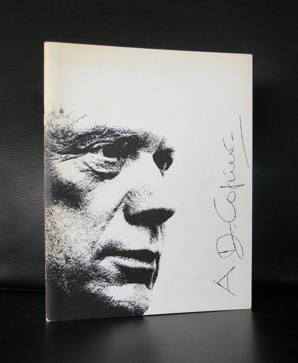
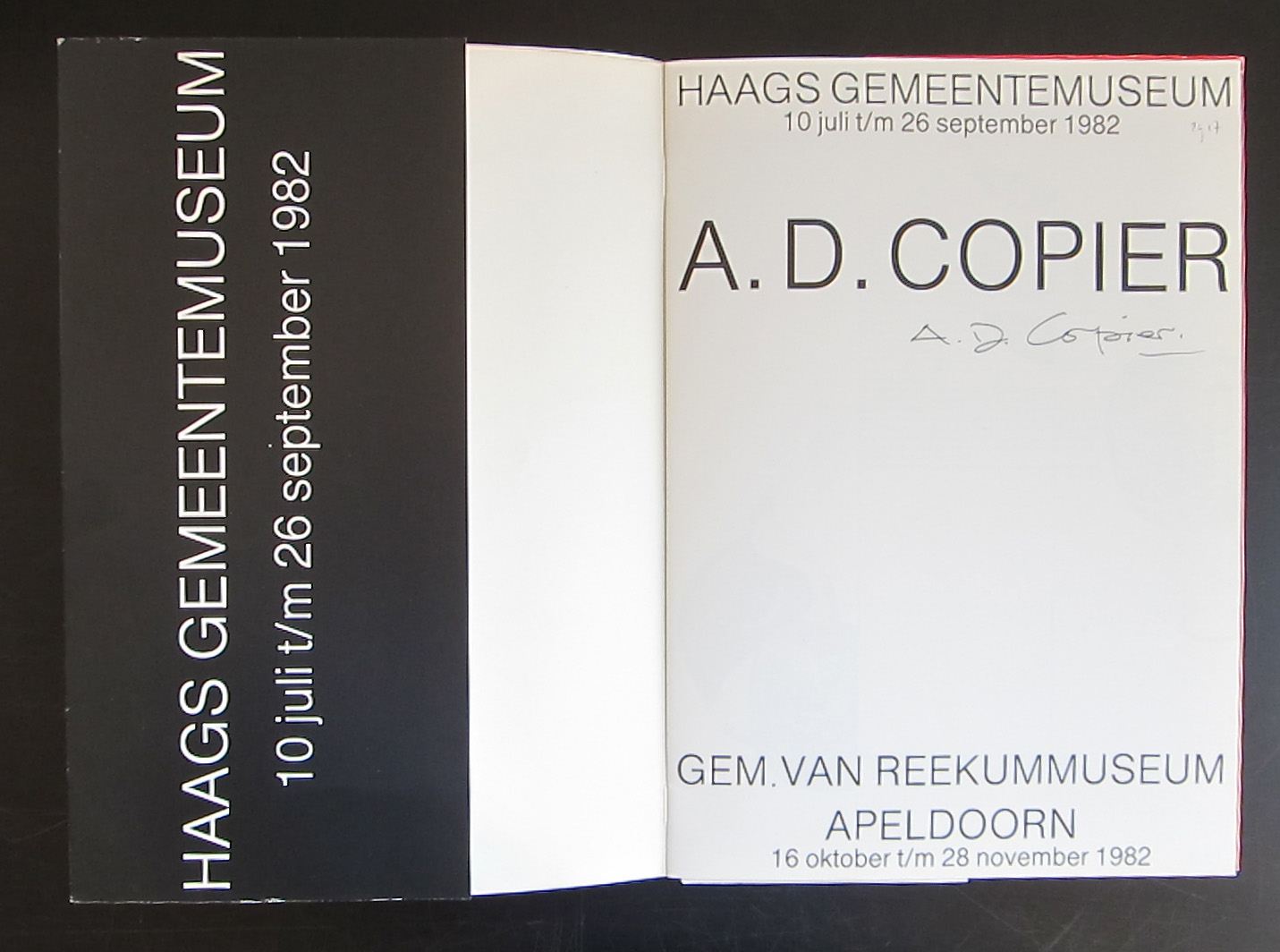
If there is one glas artist you will probably know the name of, or at least who’s work you encountered once in your life time, it must be A.D. Copier. After studying as an apprentice at the workshops of his father at the Leerdam Glas factory and the vakschool voor Typografie in Utrecht, he became practically the sole designer for the factory for a period of almost 40 years. In these years he made many glas related designs, but one stands out…it is the Gilde glas series which is still being made and copied all over the world.
The glas has excellent drinking and tasting qualities holds extremely well in you hand and is one of the icons in dutch design. Since he left the Leerdam factory in 1971 he made unica and glas objects after his own designs .
Andries Dirk Copier is considered as one of the great true talented artists in the world of glas, the difference between him and for example Lino Tagliapietra is that Copier always has the usability and the aesthetics of the object in mind, where as others loose themselves in experiments. www.ftn-books.com has some nice books on Copier in its inventory.
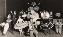
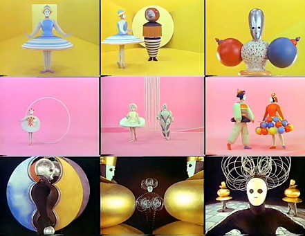
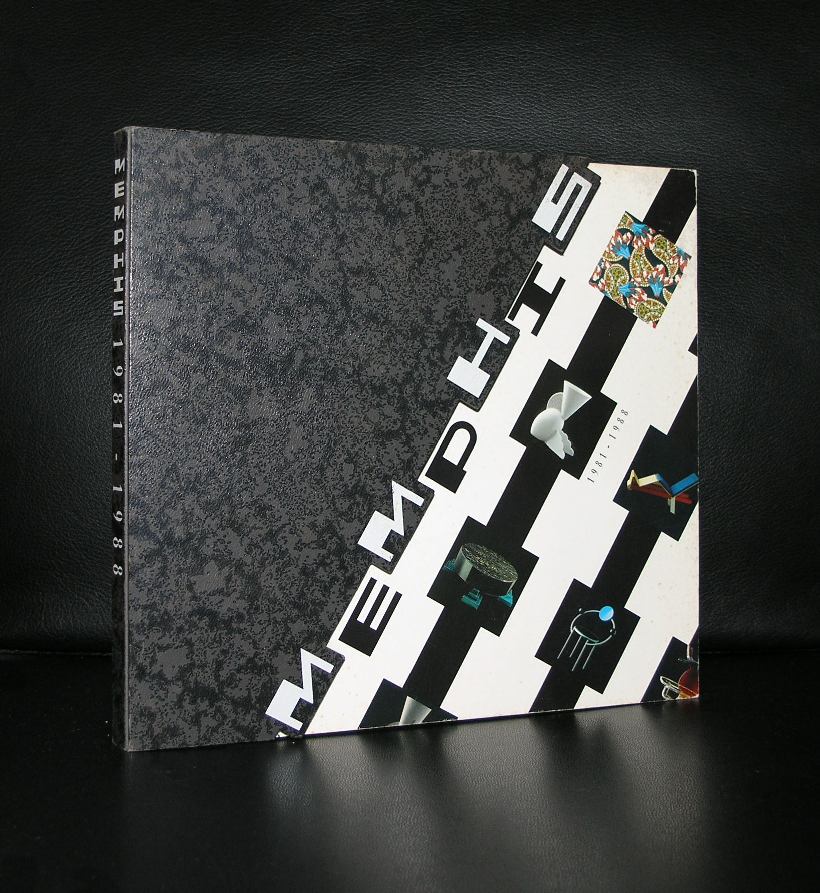
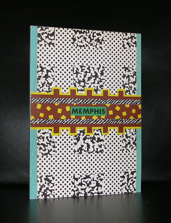
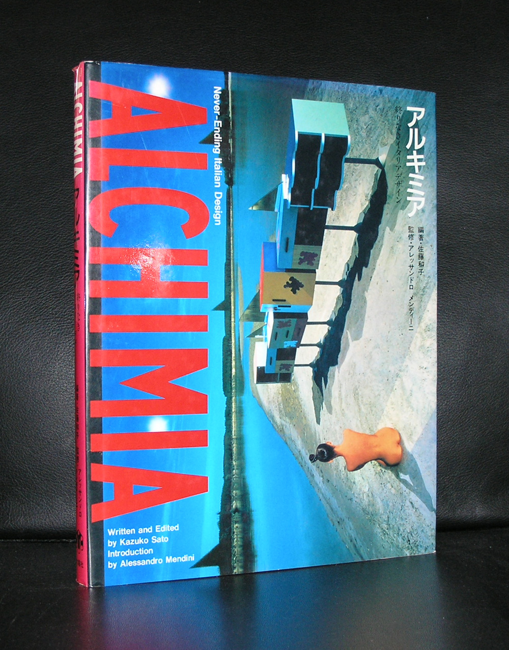
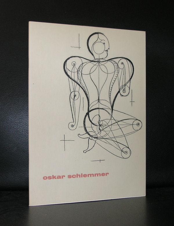
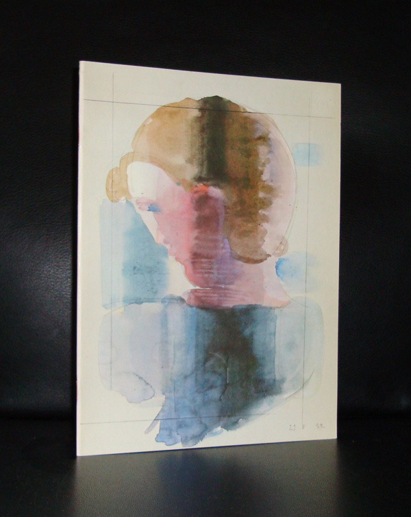
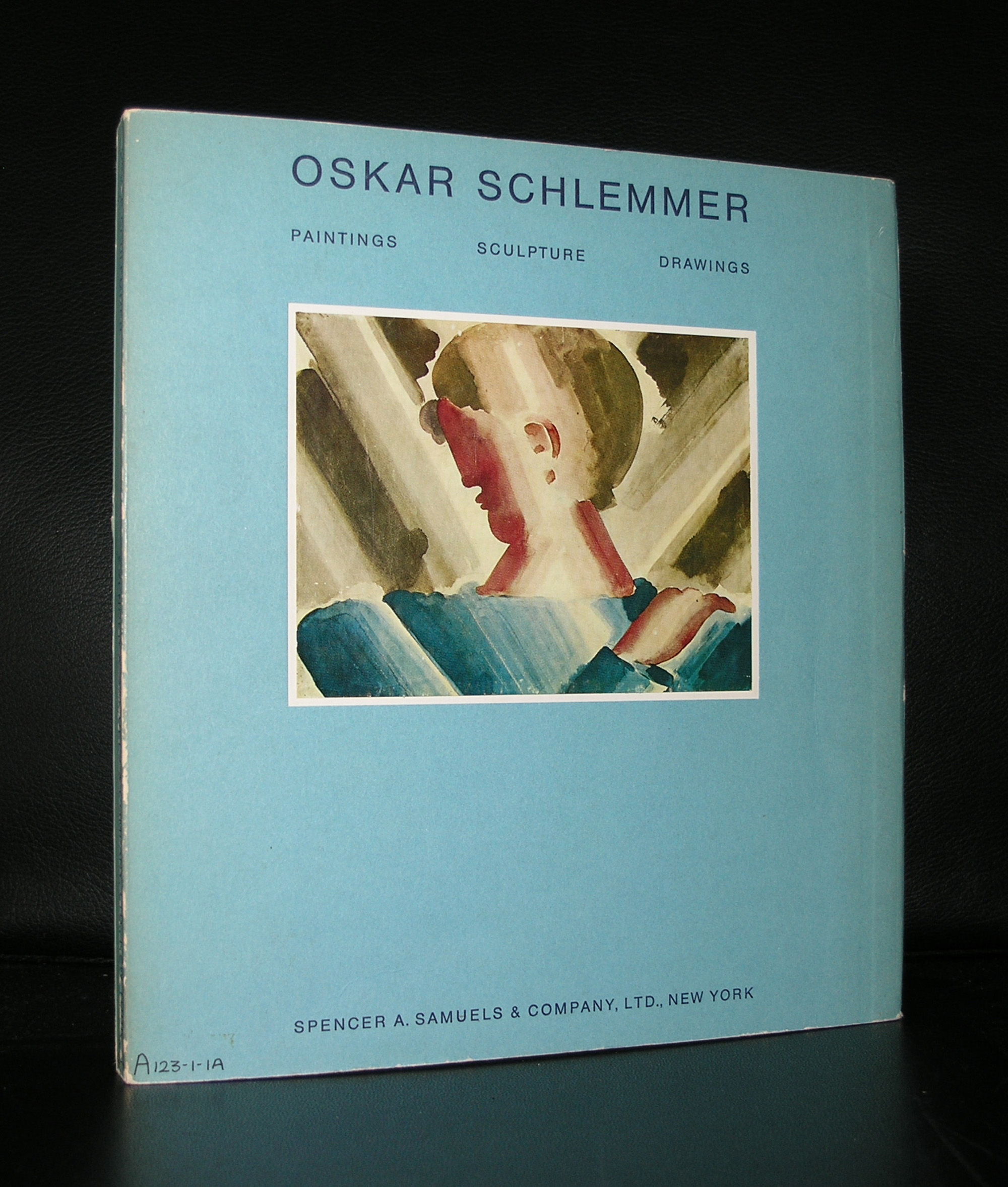
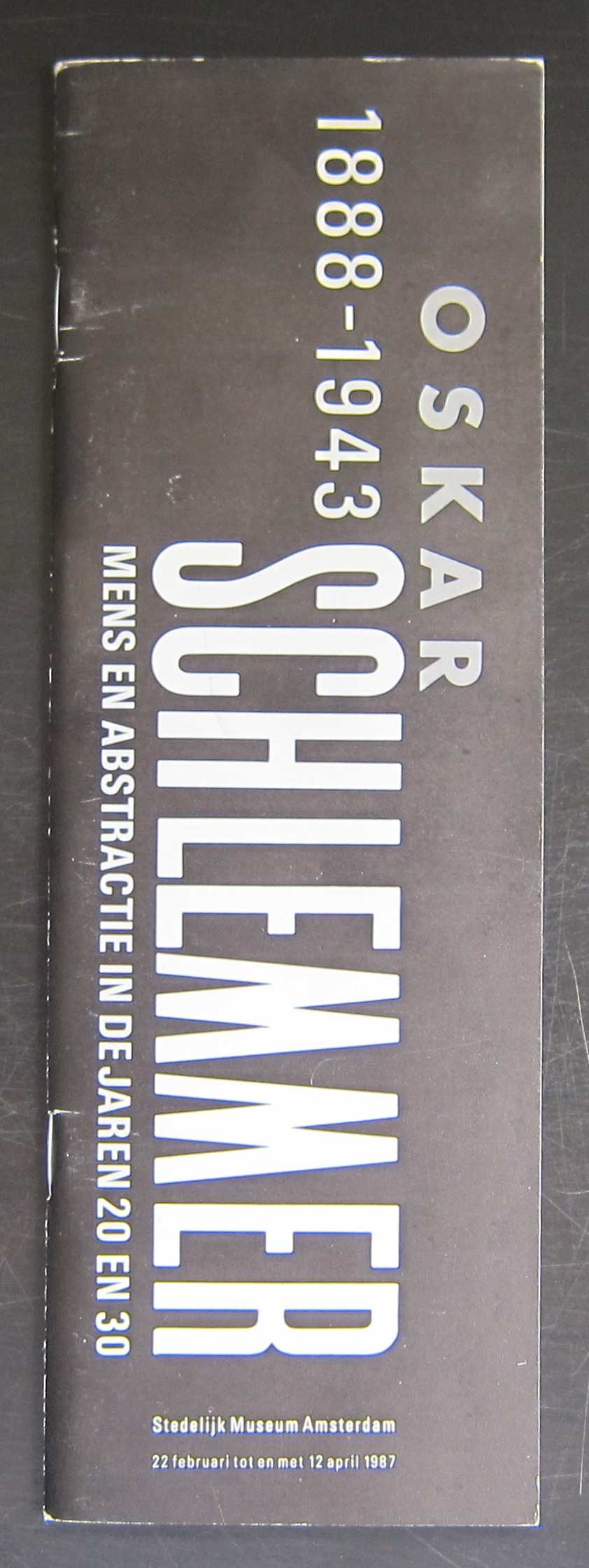
Oskar Schlemmer and the BAUHAUS is the first combination that springs into my mind when i think of this German artist. But Schlemmer is much much more. Cubism, murals and stage design are among the other qualities of Schlemmer. It was in 1987 that the Stedelijk Museum recognized these qualities of Schlemmer and devoted a large exhibition on the artist in which all his qualities were presented in an excellent exhibition. Since this exhibition, many other museum have devoted solo exhibitions to Schlemmer, but the one from the Stedelijk Museum remains one of the very best. One of the second reasons why i devote this blog to Schlemmer, is that for me he was one of the first post-modern artist from the last century. Compare his designs with Alchemia and Memphis designs and you can see for your self the similarities between the two of them. over 60 years apart from each other they look alike and are drawing from the same design ideas. Books are available at www.ftn-books.com
OLYMPUS DIGITAL CAMERA
OLYMPUS DIGITAL CAMERA
OLYMPUS DIGITAL CAMERA
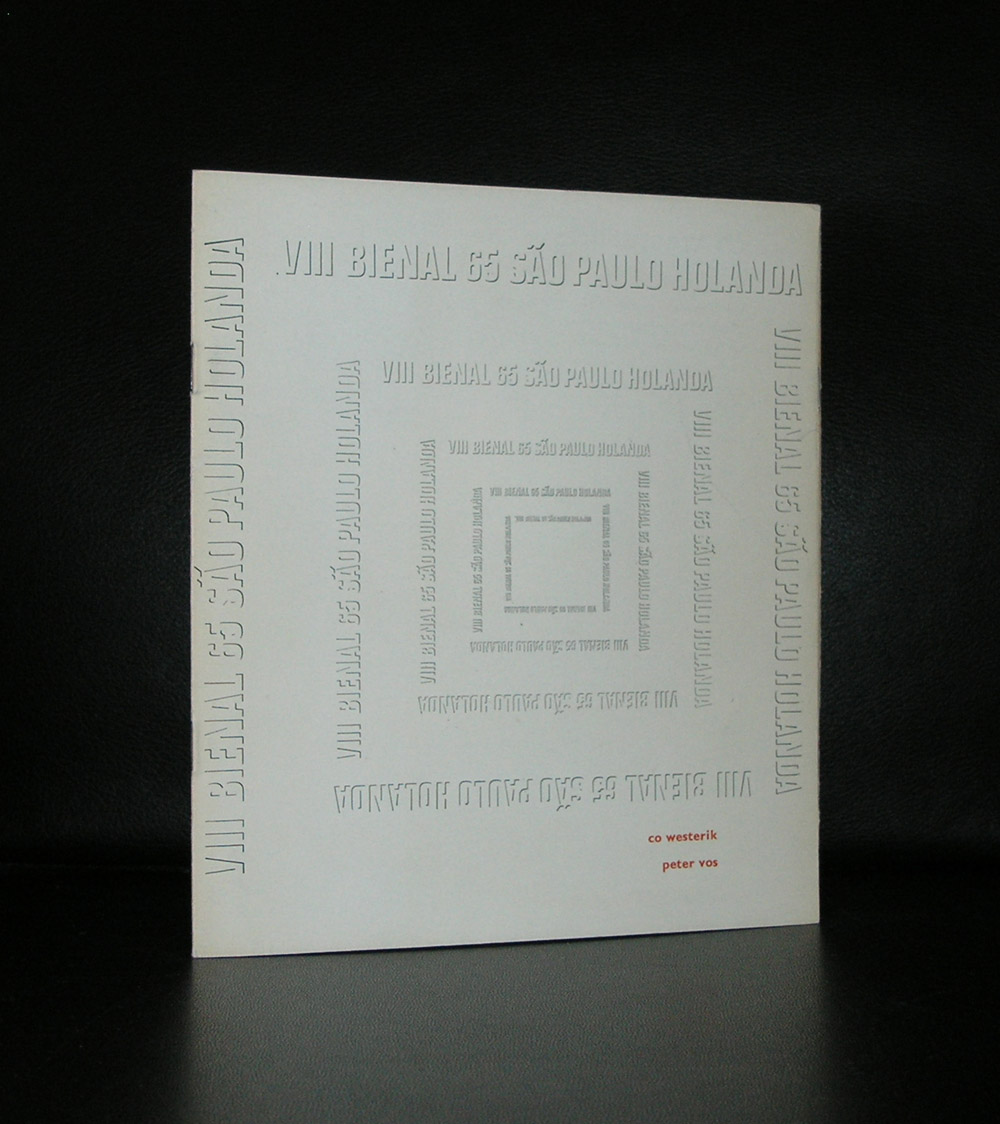
Wim Crouwel designed the Schlemmer catalogue for the Stedelijk Museum and it is one of the very best from the eighties.
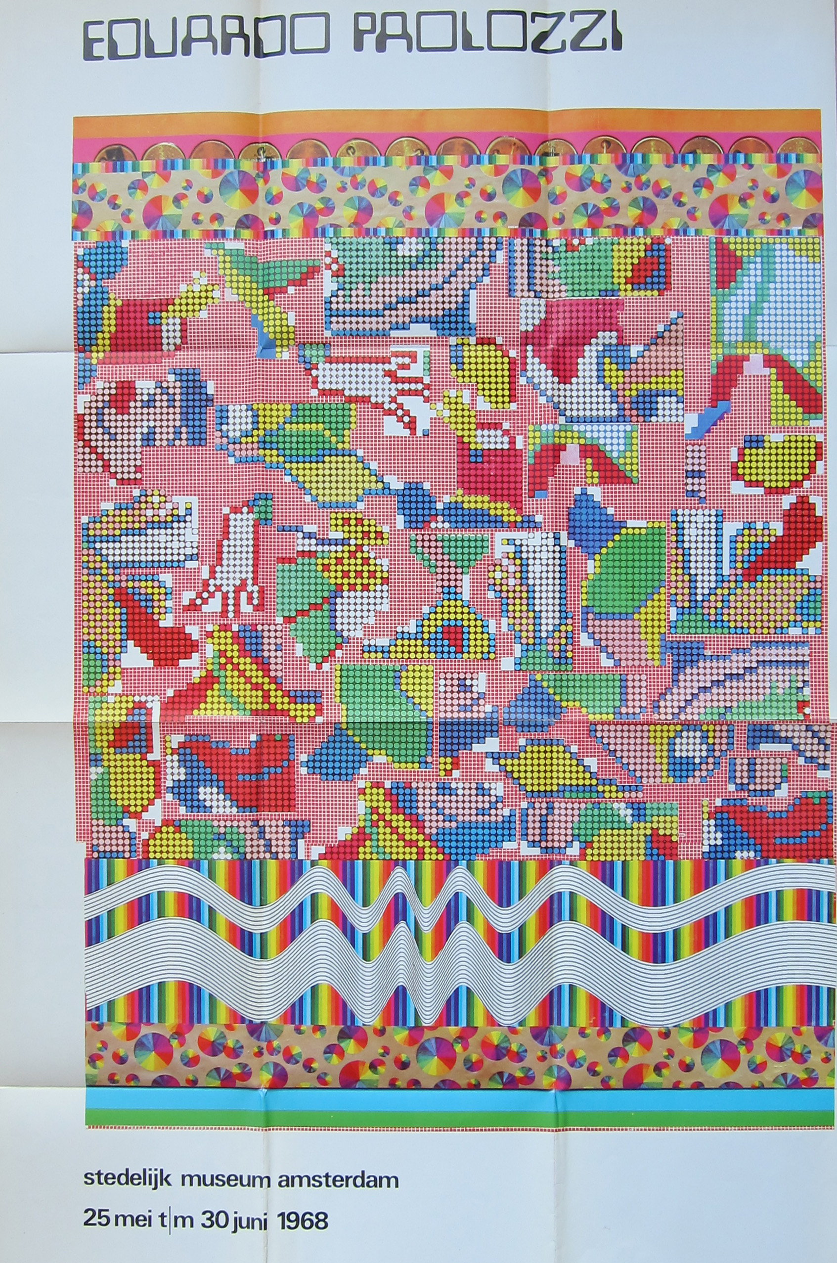
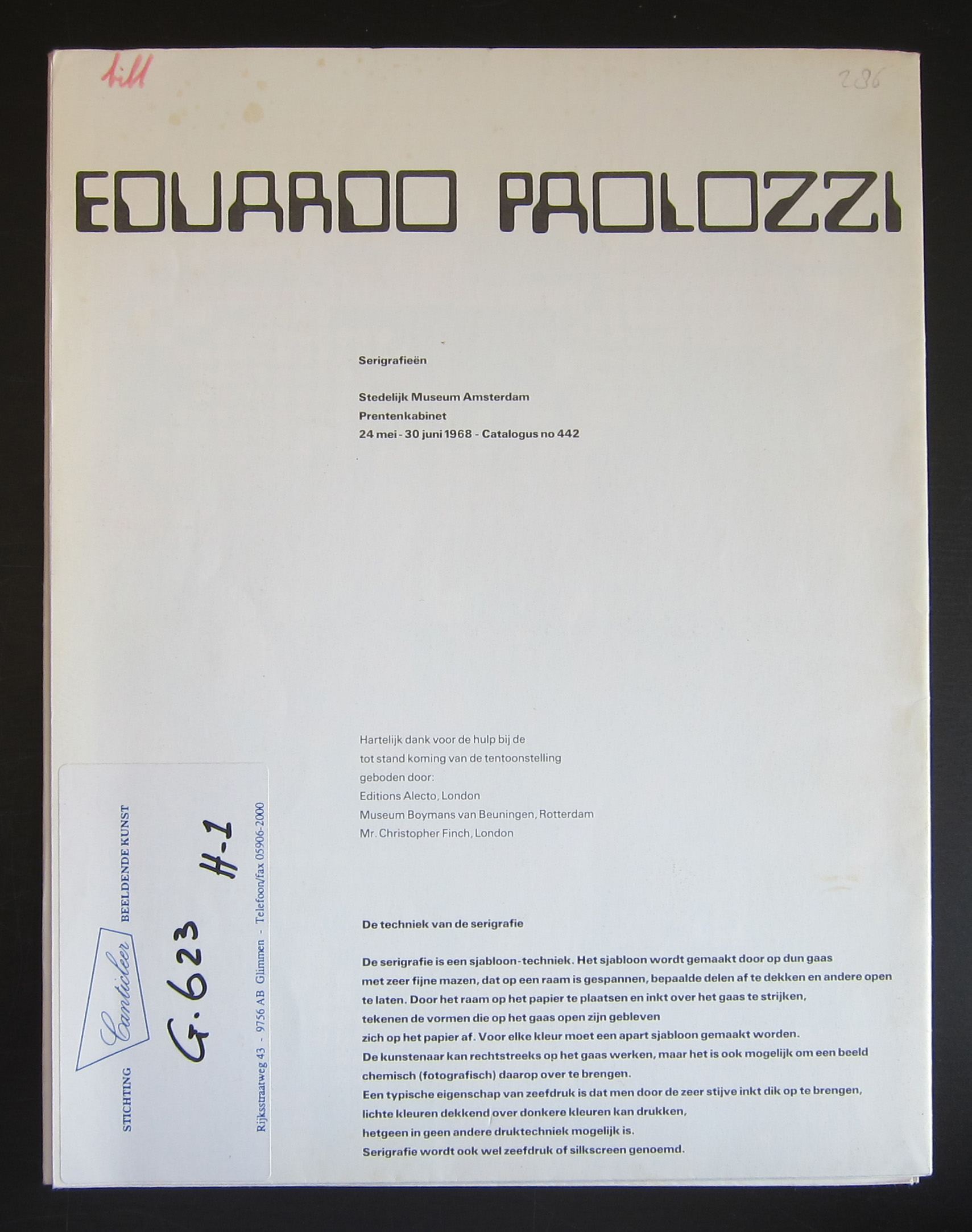
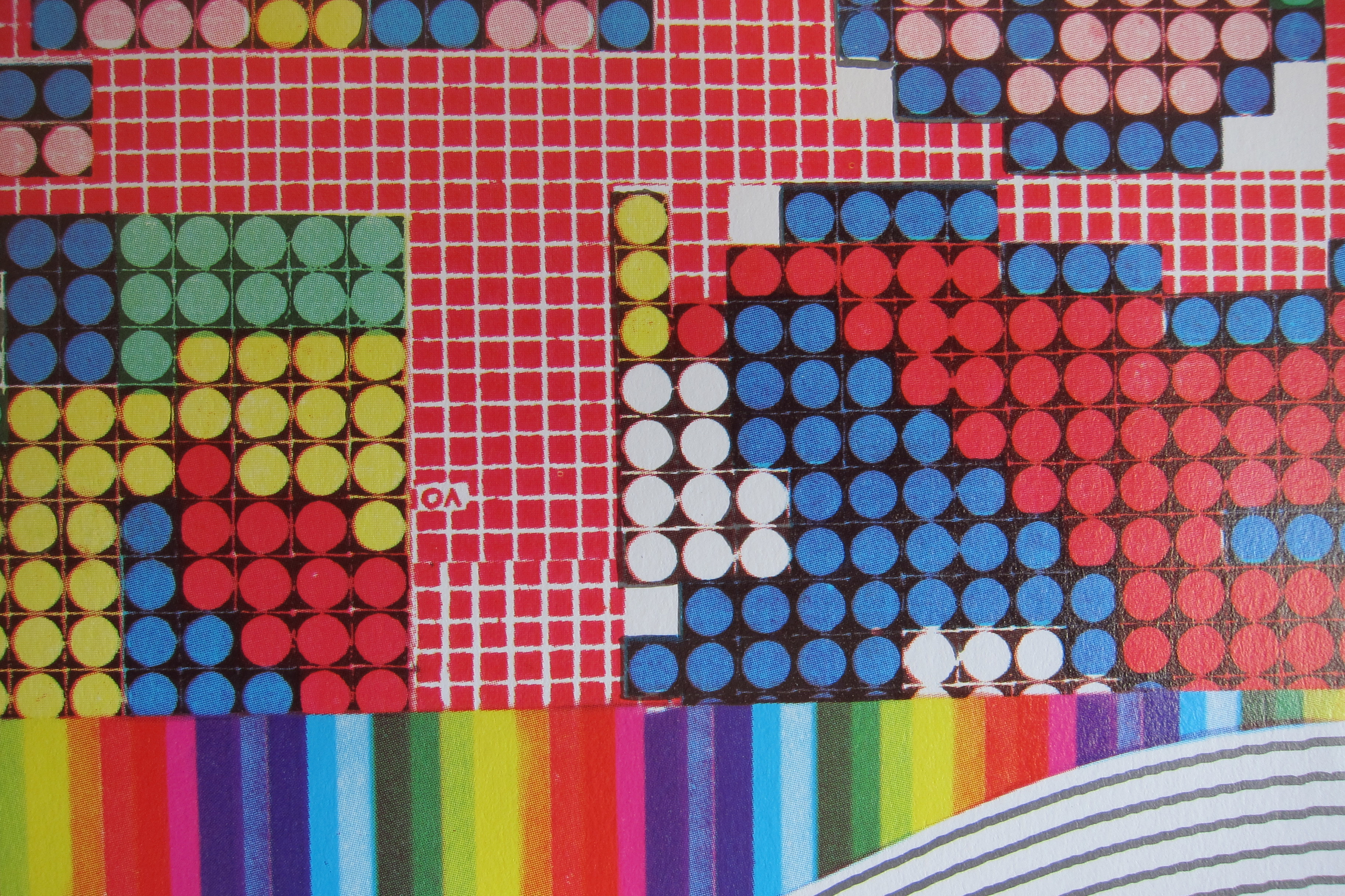
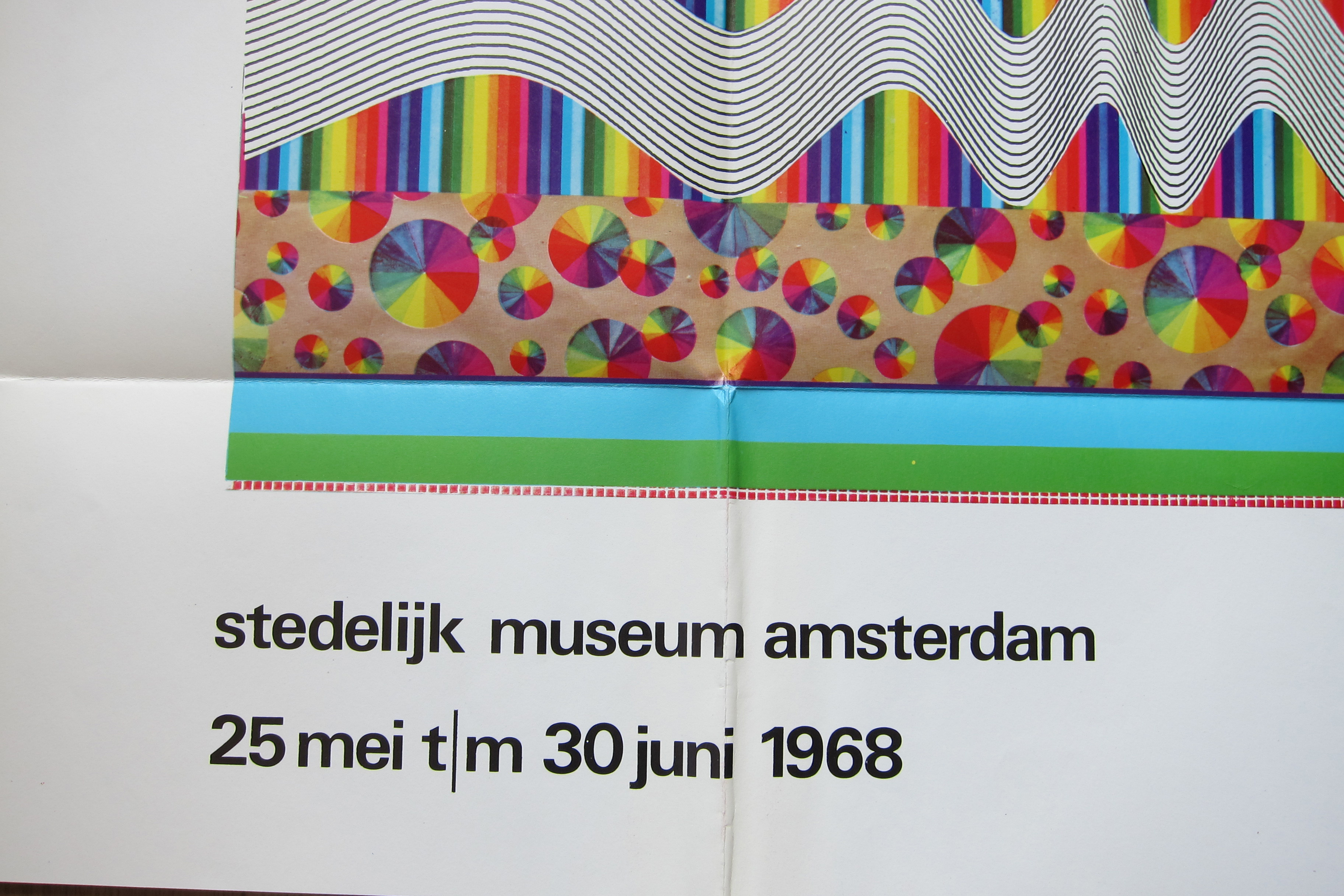
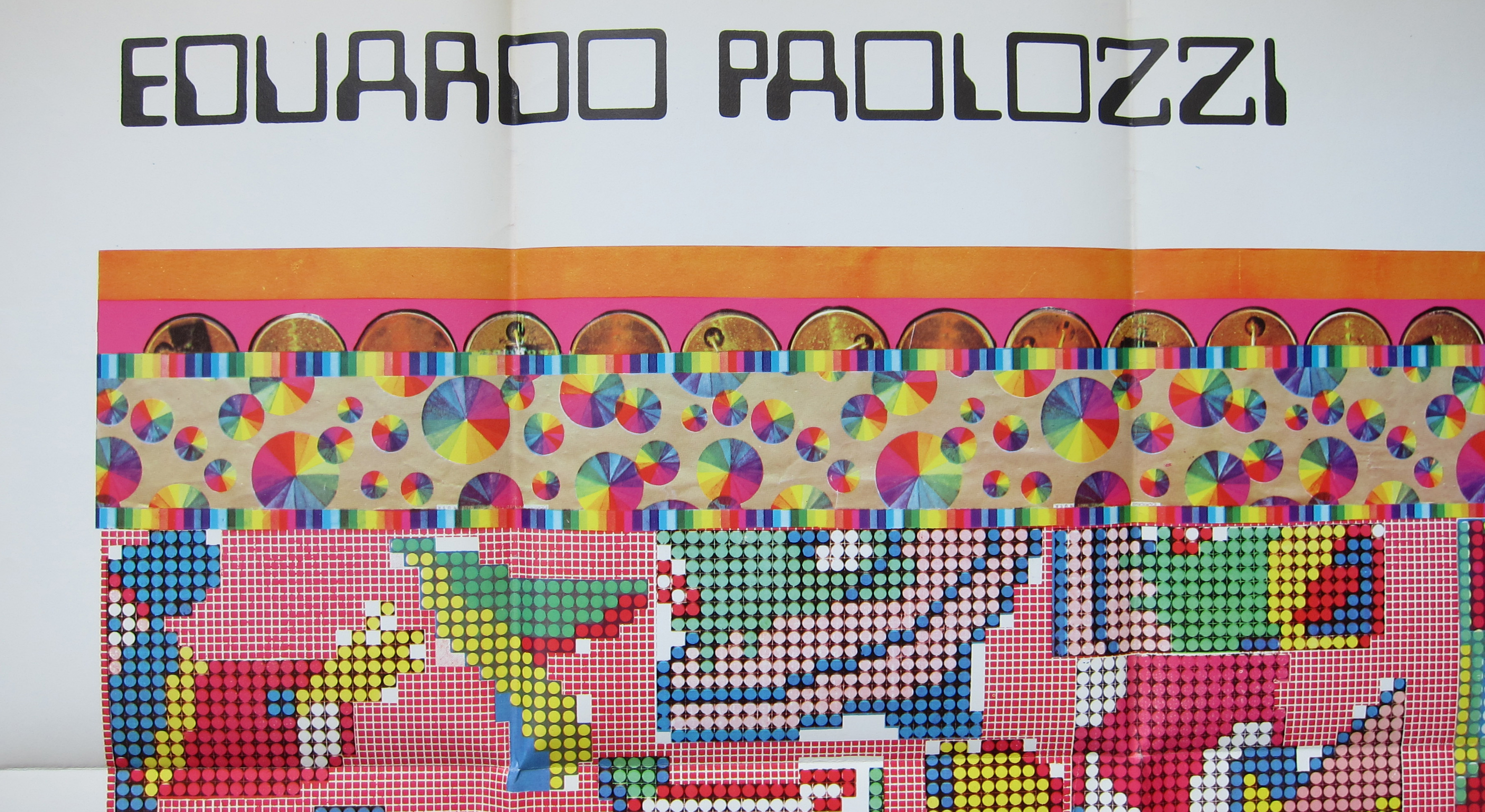
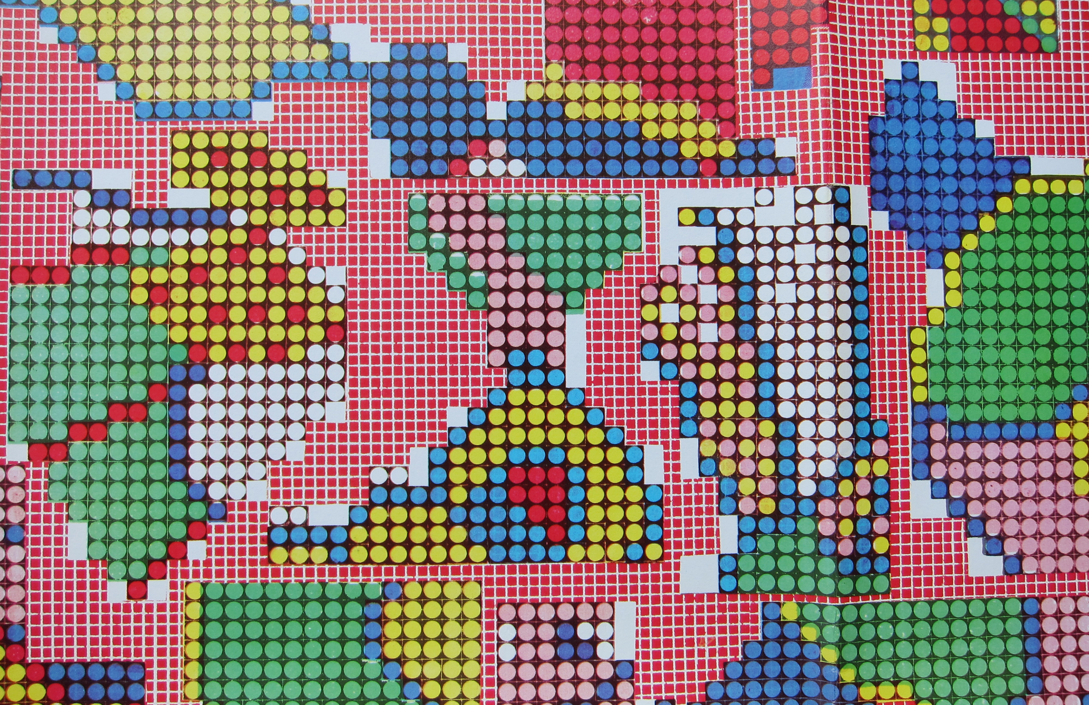
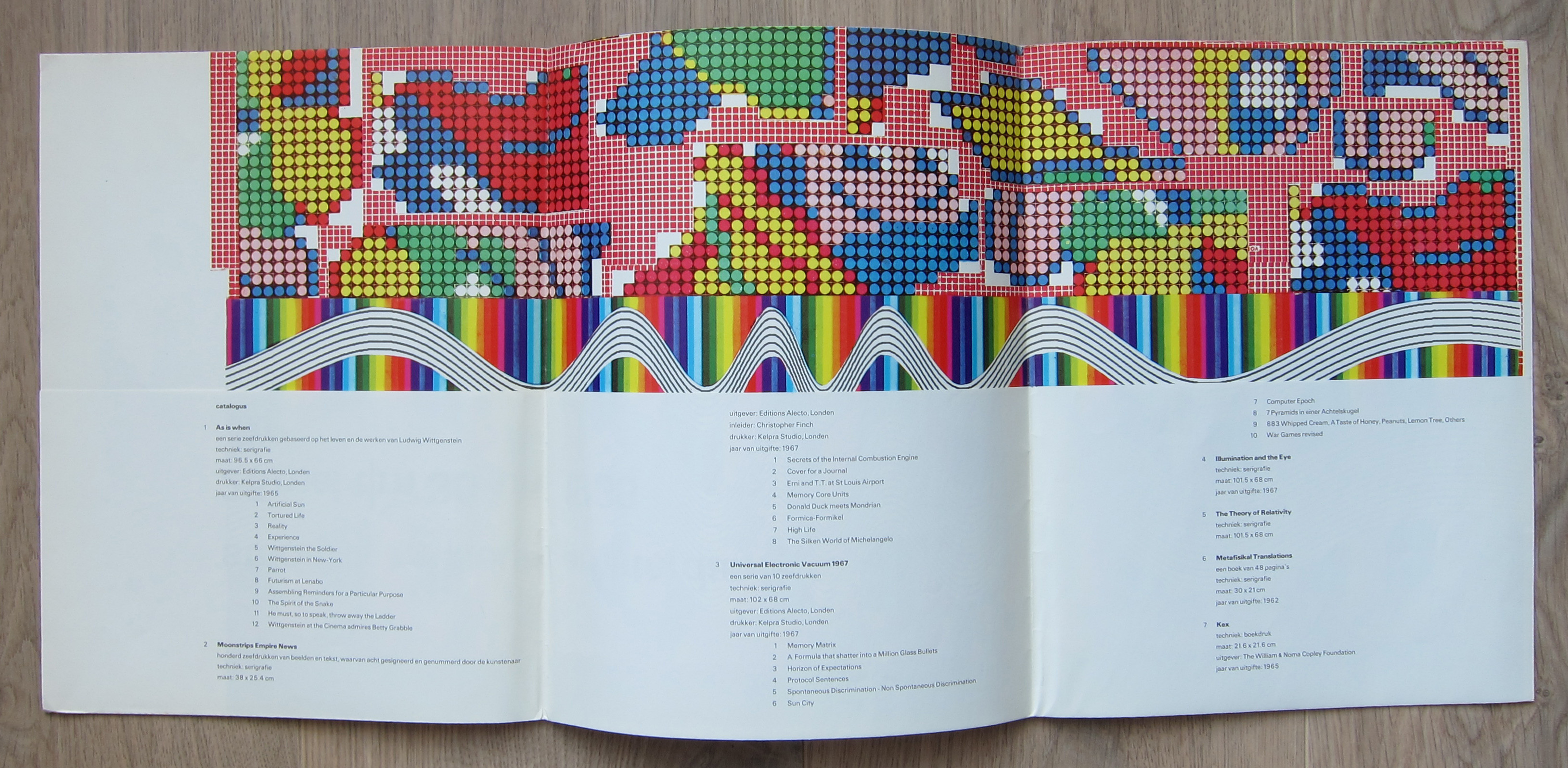
There are multiple reasons to like the publication no 442. of the Stedelijk Museum Amsterdam. Published in 1968 on the occasion of the Eduardo Paolozzi exhibition this is a 100% original work of art . A serigraphie by Paolozzi in his typical Pop Art style. Folded as issued and when folded out an impressive large work of art. Design?….by Wim Crouwel who used the backside of the serigraphie for all the information on Paolozzi. A great Pop Art work of art and available at www.ftn-books.com
One of the greatest book designers recently died. Karl Gerstner died on the 1st day of this New Year.
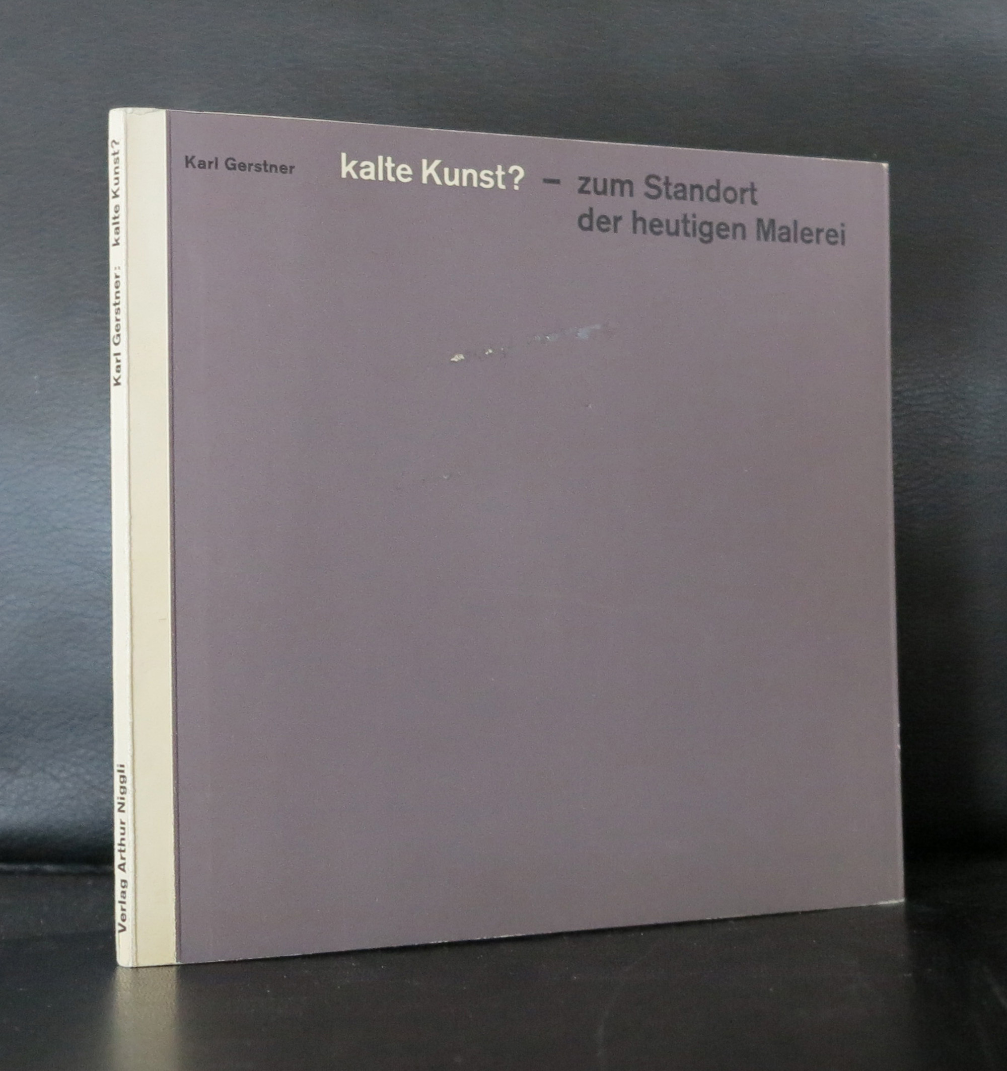
If there was one iconic Swiss book from the late Fifties it is probably Kalte Kunst?
Designed by Karl Gerstner, this book has become an example to many. Look at the early Wim Crouwel designs….influence Gerstner. Benno Wissing…influence Gerstner.
Karl Gerstner is a contemporary designer who’s work is strong and clean, but full of details. Typography and design melt together into a publication which is modern and classic. One of the first of these publications was Kalte Kunst? in which the most modern artist from the fifties were invited to make a contribution, which was placed within the publication. Special prints, silkscreens and litho’s were bound in Kalte Kunst?
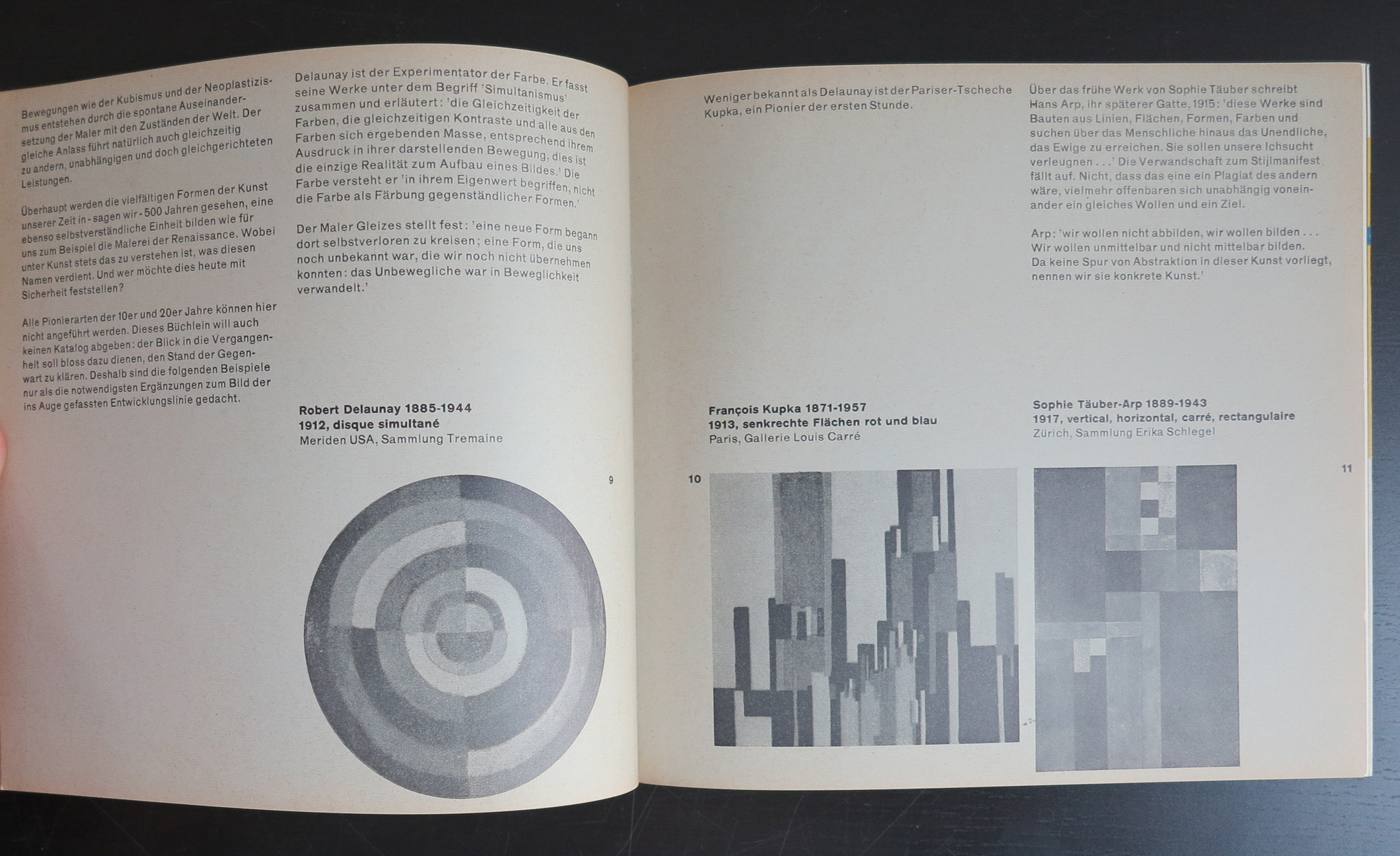
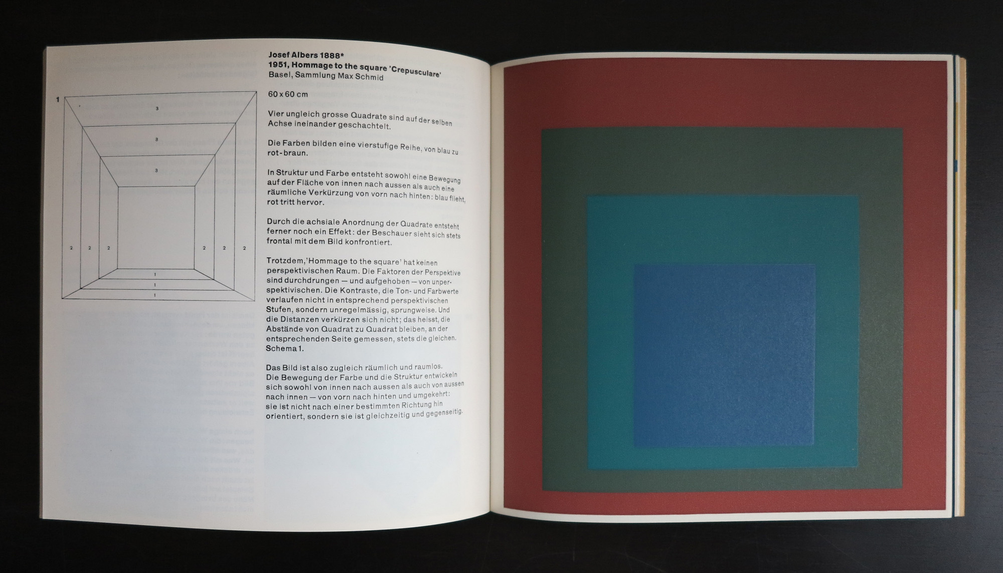
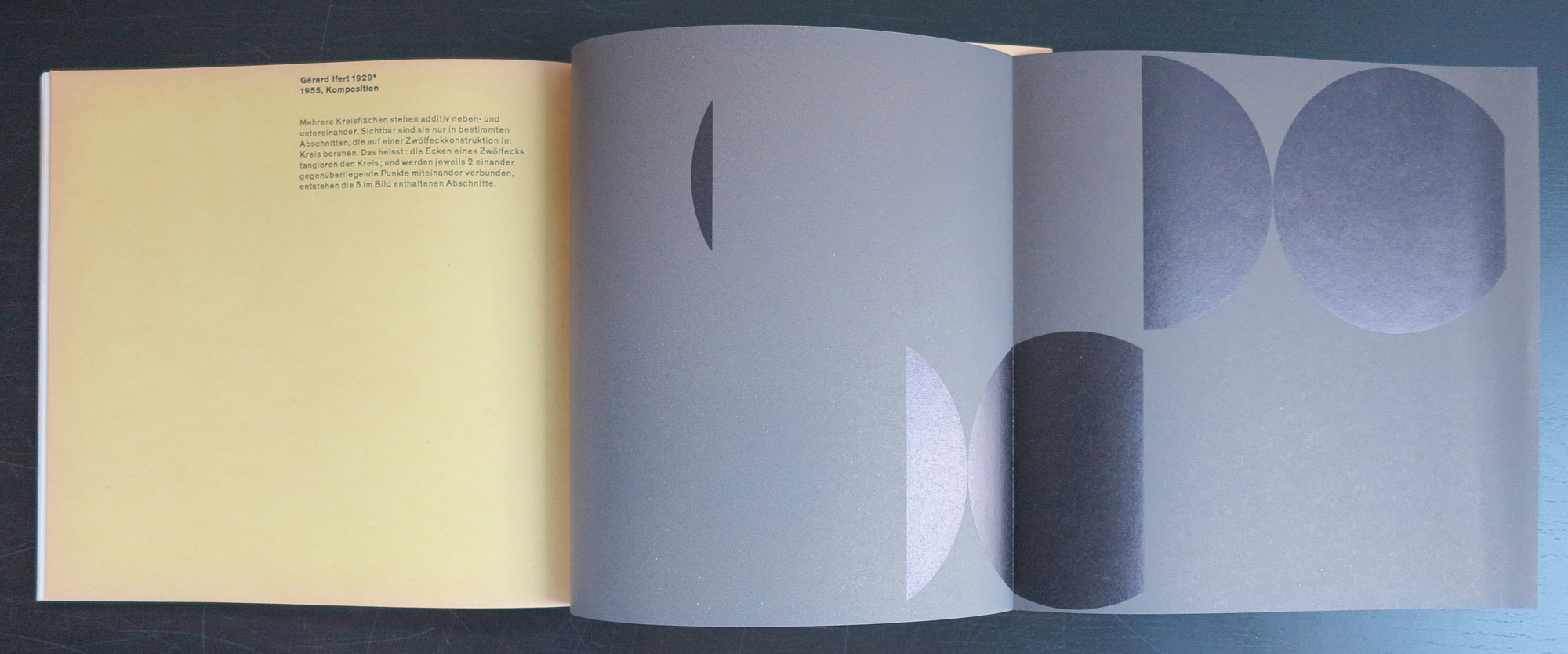
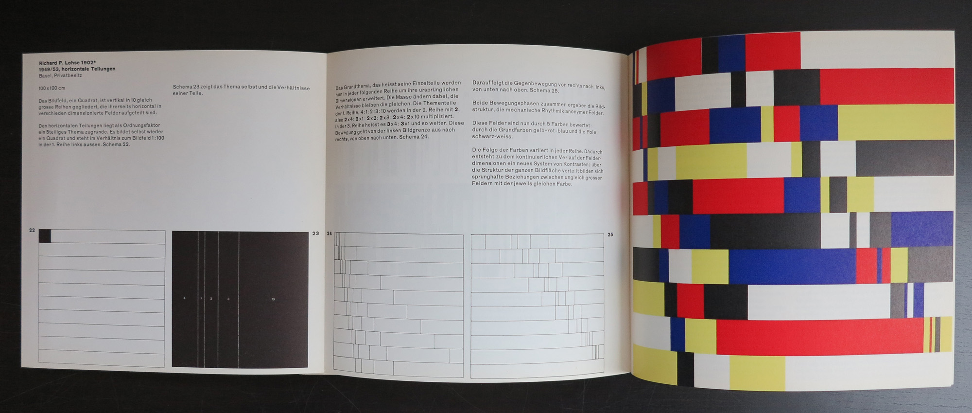
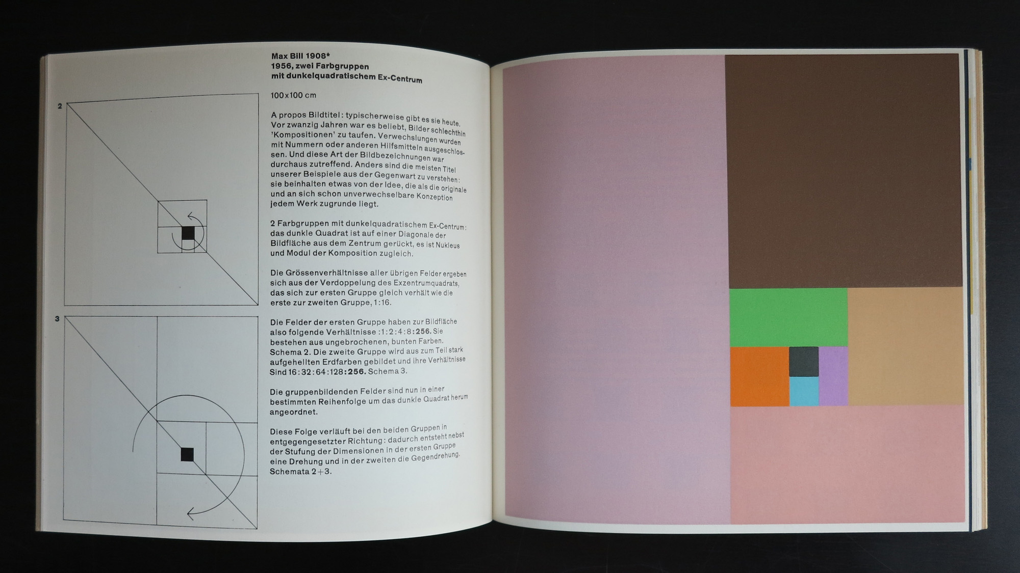
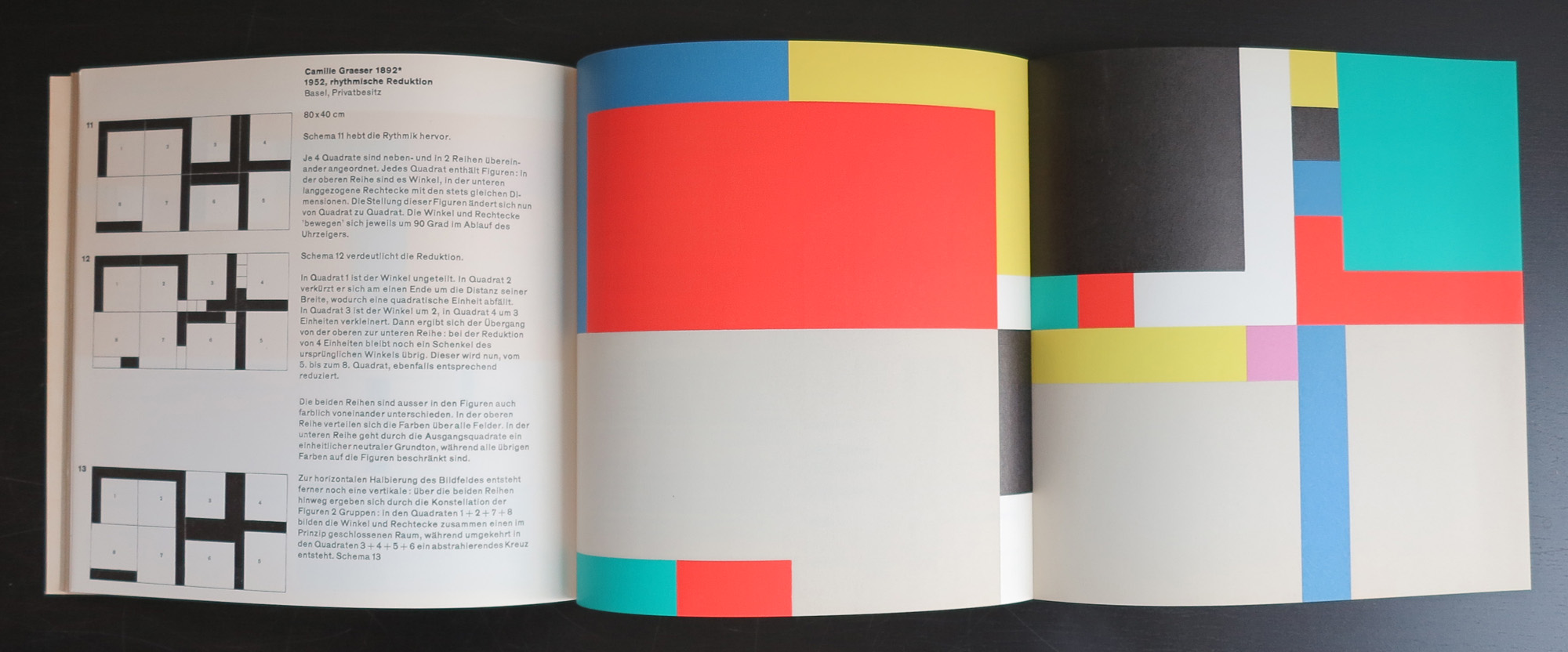
“Kalte Kunst?” (1957, 2 editions, both 1000 copies) was Gerstner’s first authored book where he advocates for a specific form of rational, geometric and mathematical art with examples from Josef Albers, Max Bill, Camille Graeser, Richard P. Lohse, Gerard Ifert, Mary Vieira and Marcel Wyss.
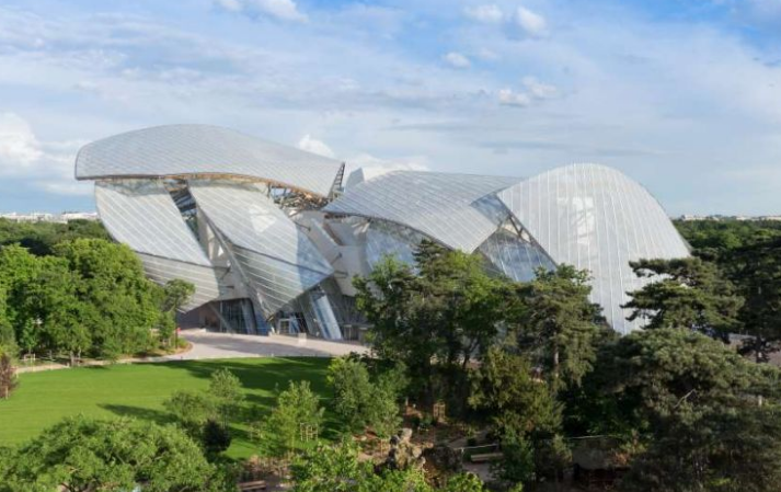
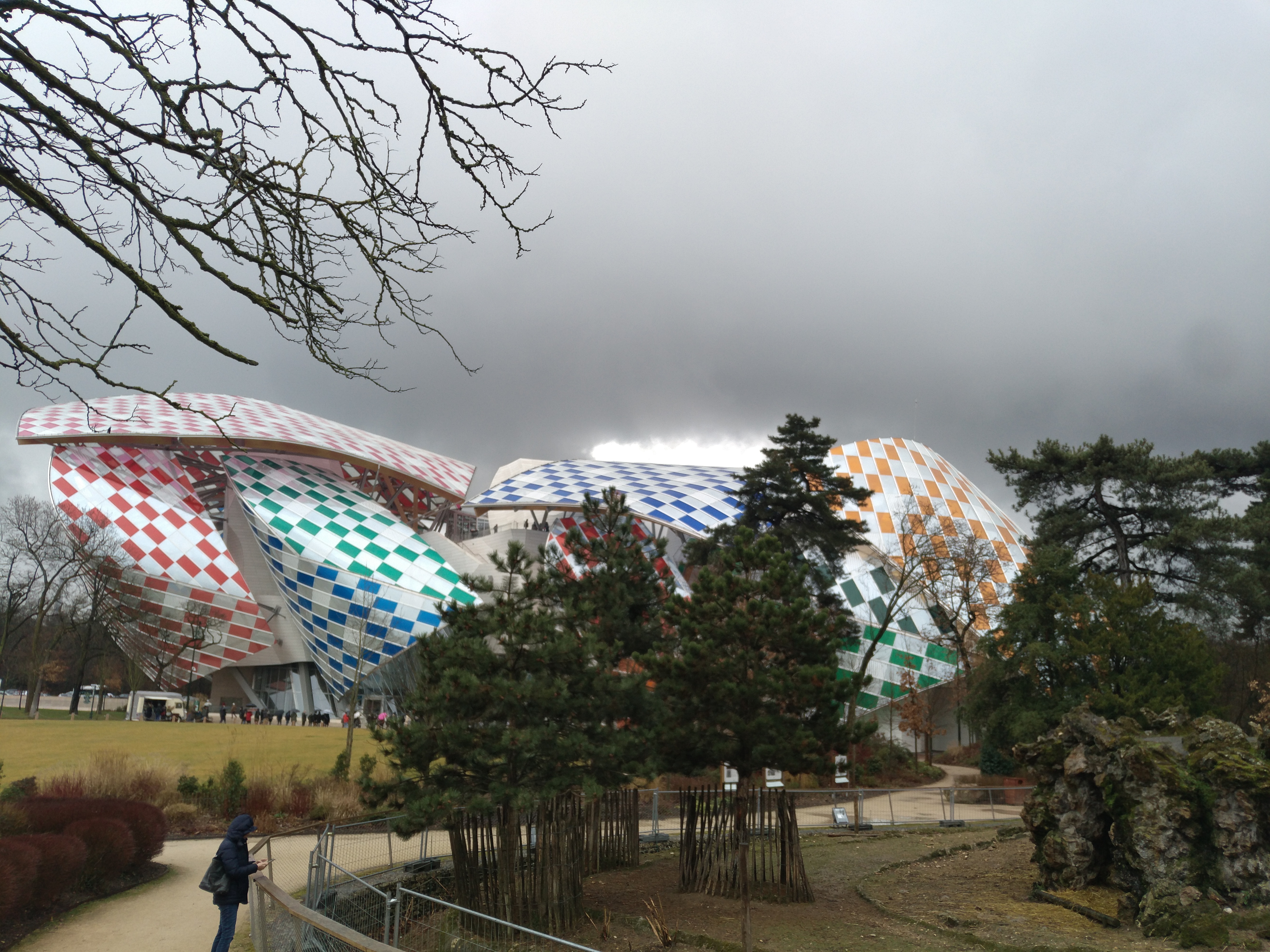
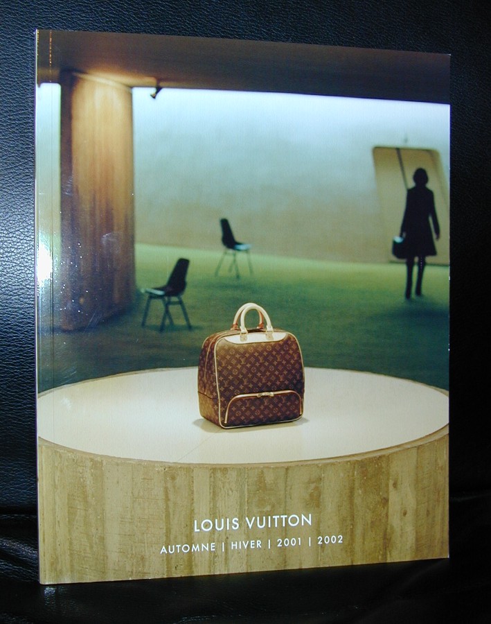
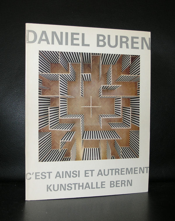
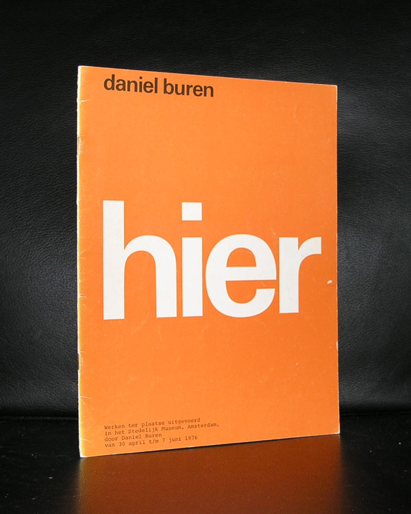
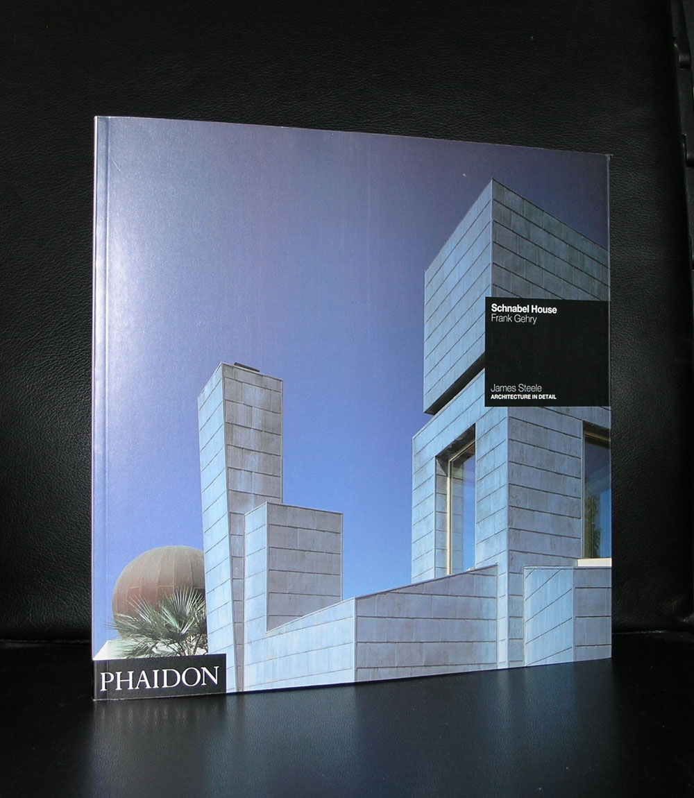
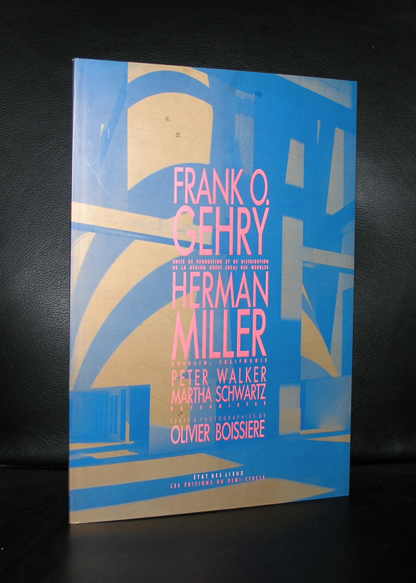
We joined our friends David and Monica this weekend in Paris. Planning this to meet each other half way planet earth took some organization, but it was worth it, because the exhibition of the Sergueï Chtchoukine collection is probably a once in a lifetime opportunity to see all these marvelous paintings in one place. Later i will blog on the exhibition itself, but for now i will focus on the building in which it is presented…the Fondation Louis Vuitton. Starting as a company making high quality bags, travel trunks and accessories out of prepared canvas and leather, the company later became one of the leading companies in the fashion world. Nowadays they are part of the LVMH group. A large holding specializing in luxury goods and one of the wealthiest companies in the world….and that shows, because in the Bois de Boulogne they build a museum which can not be compared with anything i have seen except the other Gehry designed buildings. Guggenheim Bilbao, Vitra in Weil Am Rhein and the Disney Concert Hall in LA), but this one is special….. First of all the layers / shells are all executed in white instead of the aluminium ones in Bilbao and L.A.). constructed and attached to each other with wooden supporting beams and because of the outer layer material, it was possible for Daniel Buren to convert these shells into one of his most complex, impressive and colorful In Situ works ever.
When you walk towards the entrance you get a glimpse of the pattern as it is executed, but when you leave the museum at the other side and walk into the garden, …..get some distance…..there it is …. you see a beautiful building totally covered by a great work of art. I do not know how long the Buren will be visible on the building but as long it is there, try to see it because it is well worth to see this one “live”. Compare it with the Christo In Situ works. Whenever you have seen one there is no photograph which can be compared with seeing the project with your own eyes. The scale in which it is executed makes these works special and so is this Daniel Buren….and Yes the Fondation Louis Vuitton is not the only one who combined these artist together, because books on Vuitton, Gehry and Buren can all be found at www.ftn-books.com
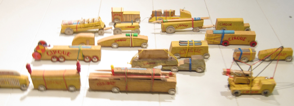
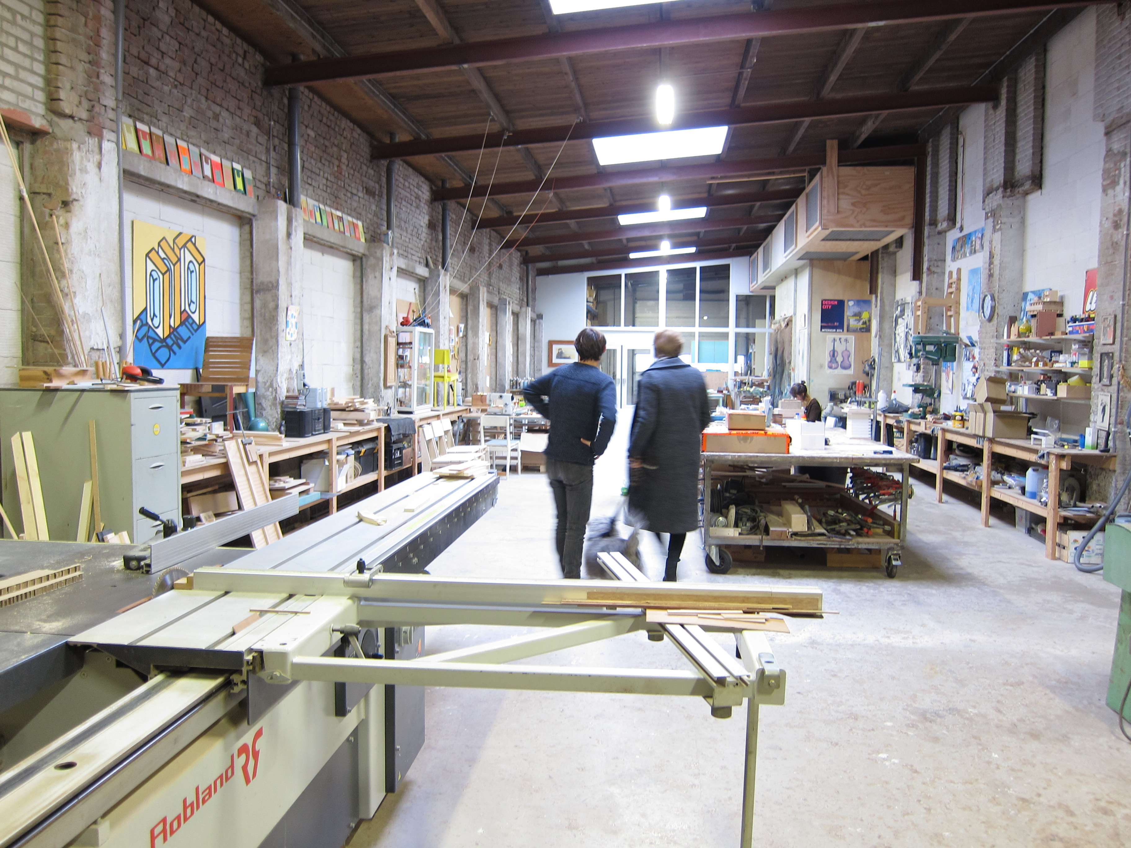
Yesterday….9th of December, 2016…location studio of Floris Hovers in Raamsdonksveer.
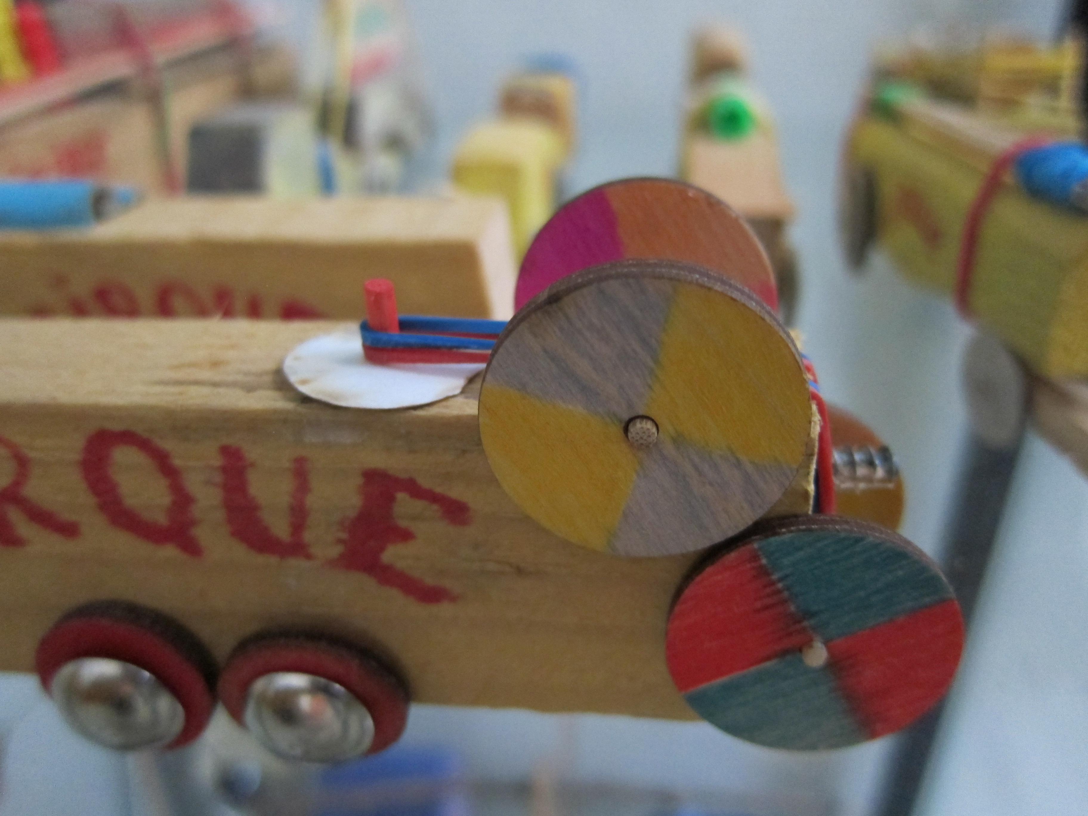
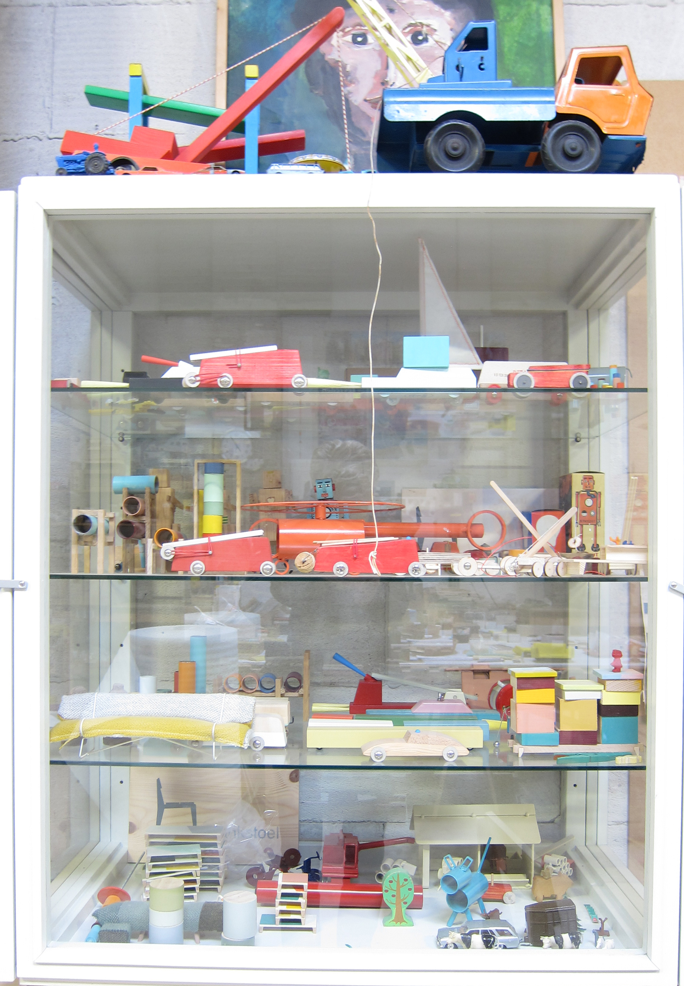
Never met him before, but an instant liking for the person and works of Floris Hovers. when we met each other yesterday . The studio visit was a result of a purchase which we had seen at Art THE HAGUE. The result a beautiful and highly entertaining tableau of Circus wagons.
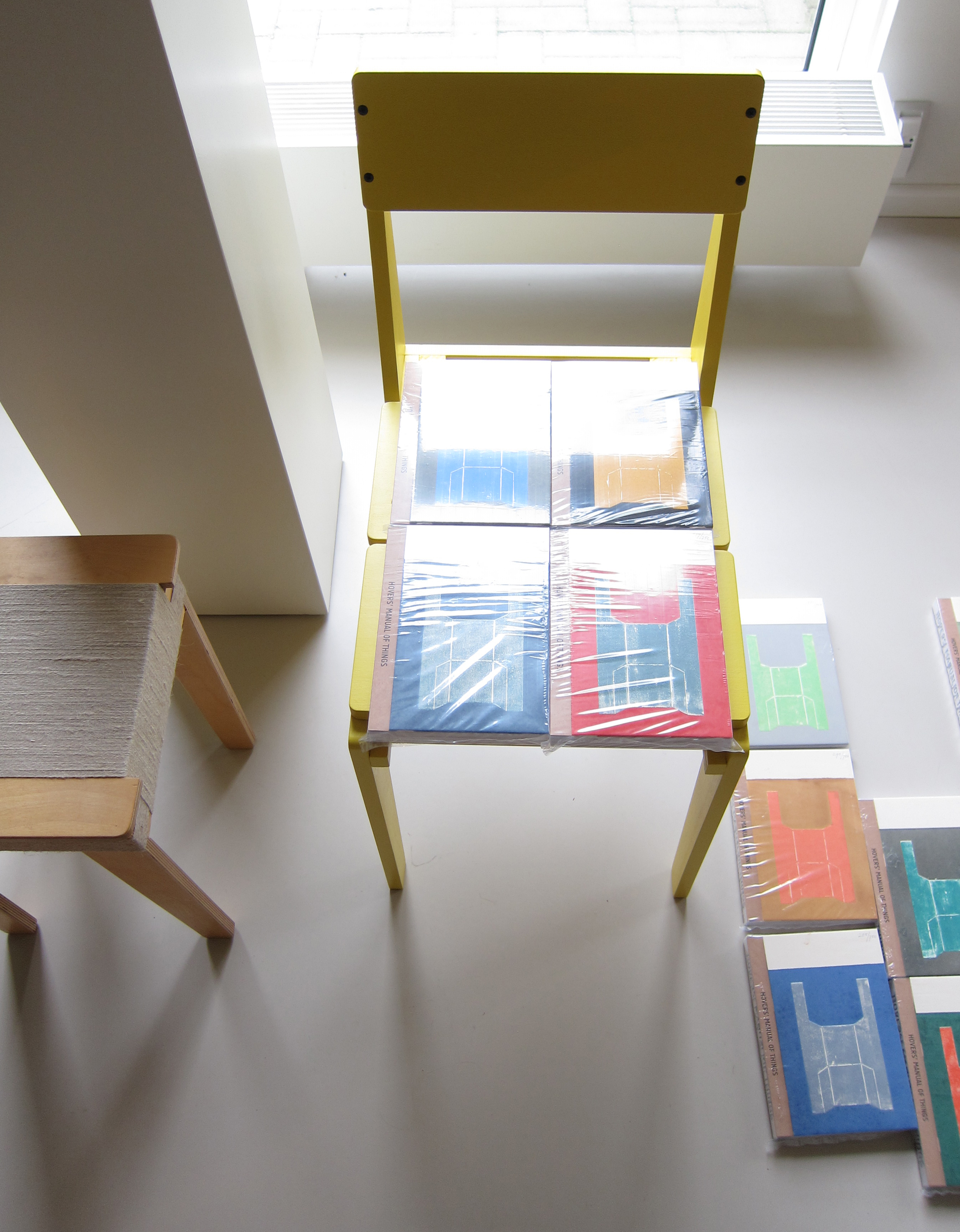
The tableau is featured in the recently published book “Hover’s Manual of Things “which is published in a limited and numbered edition of only 750 copies of which each has a different hand colored cover . Ours is yellow /green on a color of blue, but many others are available at www.florishovers.nl
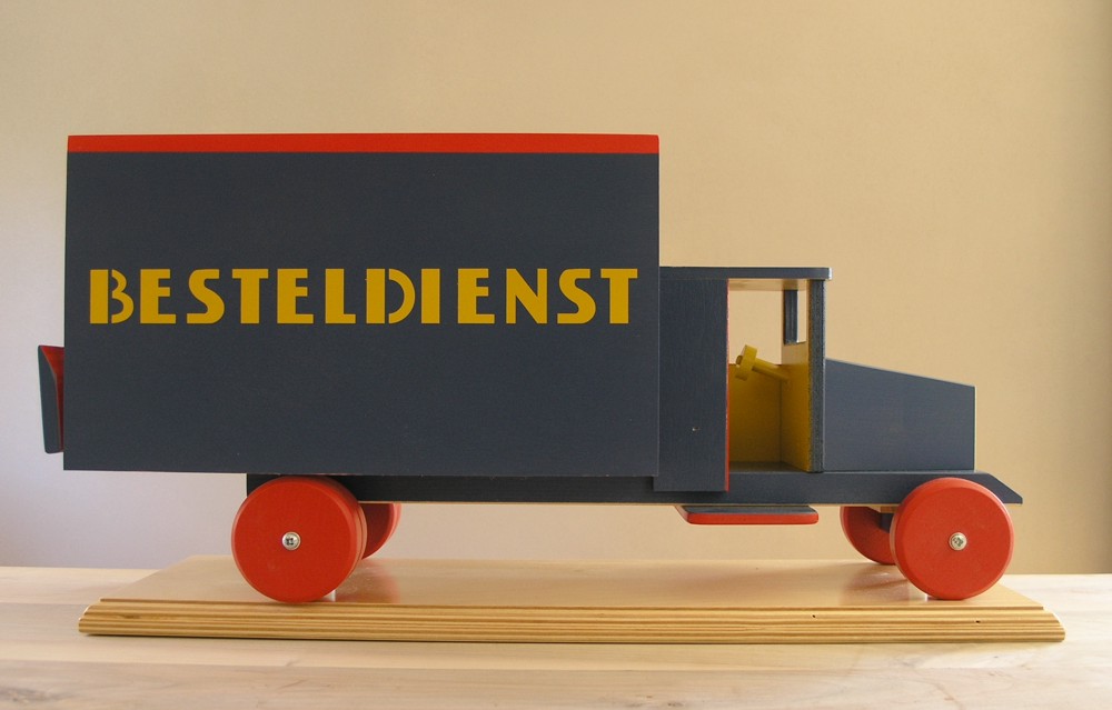
Hovers was educated at the Eindhoven Design Academy, graduated in 2004 and has since been designing and developing furniture, toys and objects. The showroom in Raamsdonksveer gives a great overview of the products he has made during the last decade, but what makes the visit to his studio really special is the workspace behind the office/showroom. A space which has been in his family for generations and in which he creates his projects. His use of color is some kind of special, because in many cases he choses for the subdued colors instead of the bright ones, which results in a typical Hovers color scheme. He has an adult approach to his designs and products and of course the marketing of them, but an imaginative mind to please adults and children alike with his designs. A designer for ages from 8-88. The same approach like Herge who’s “Kuifje naar de Maan” poster is gracing his workspace.
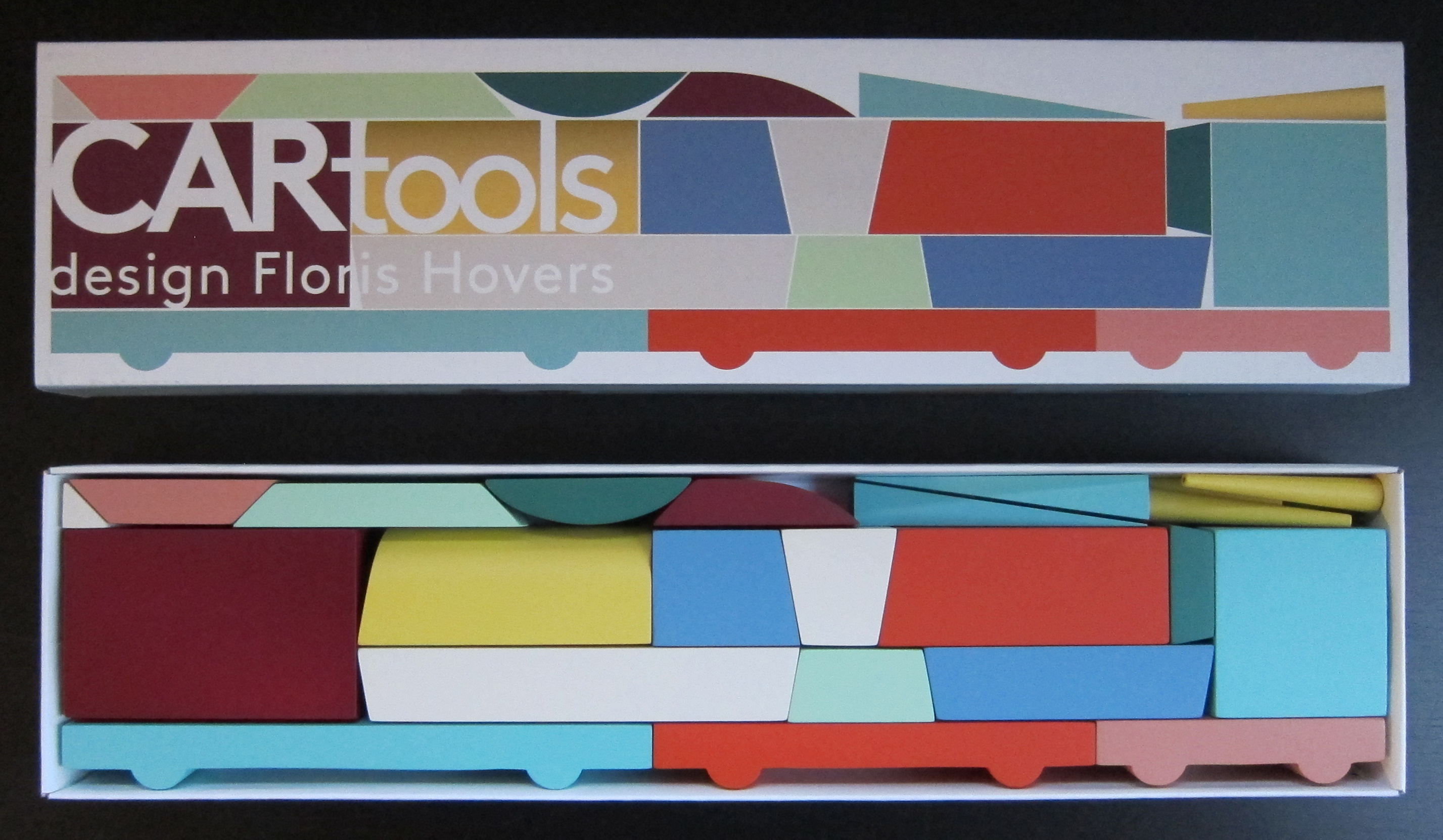
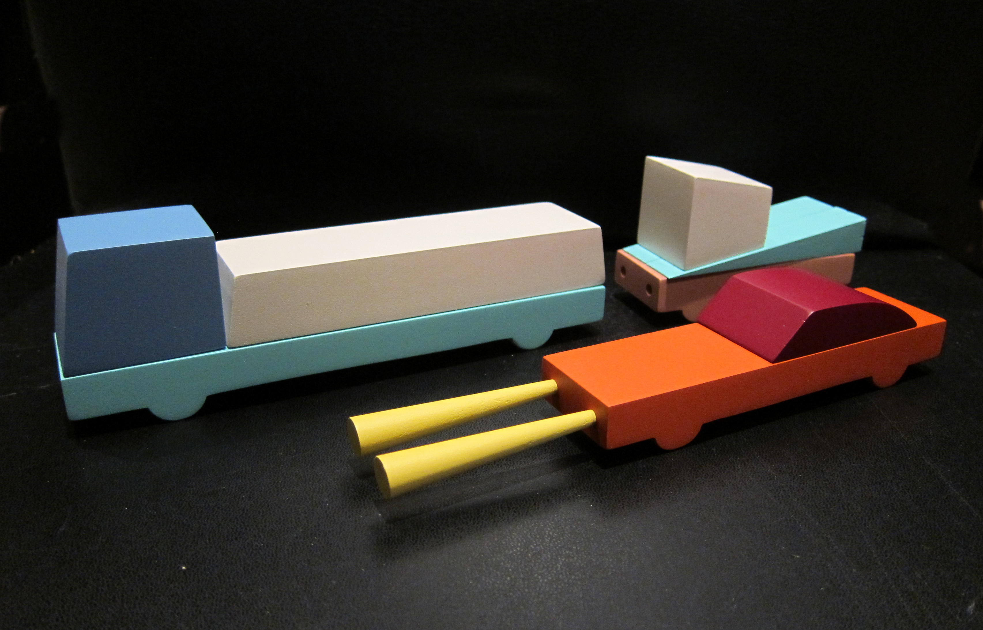
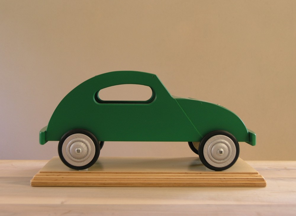
Last but not least…i bought myself a CARtools set and have now played for half an hour with it. You can make numerous cars from it by using the 3 kinds of chassis included and combine them together with the multi colored blocks within the set. A little bit like the Bauhaus ship block set, but as a set i prefer this one. Only one product in my own inventory comes to mind when i see his products. It is the fabulous series of ADO wooden toys. They are as nice as the ones Floris makes.
The products featured in this blog : Hover’s manual of Things (euro 49,50) and CARtools are both available at www.florishovers.nl
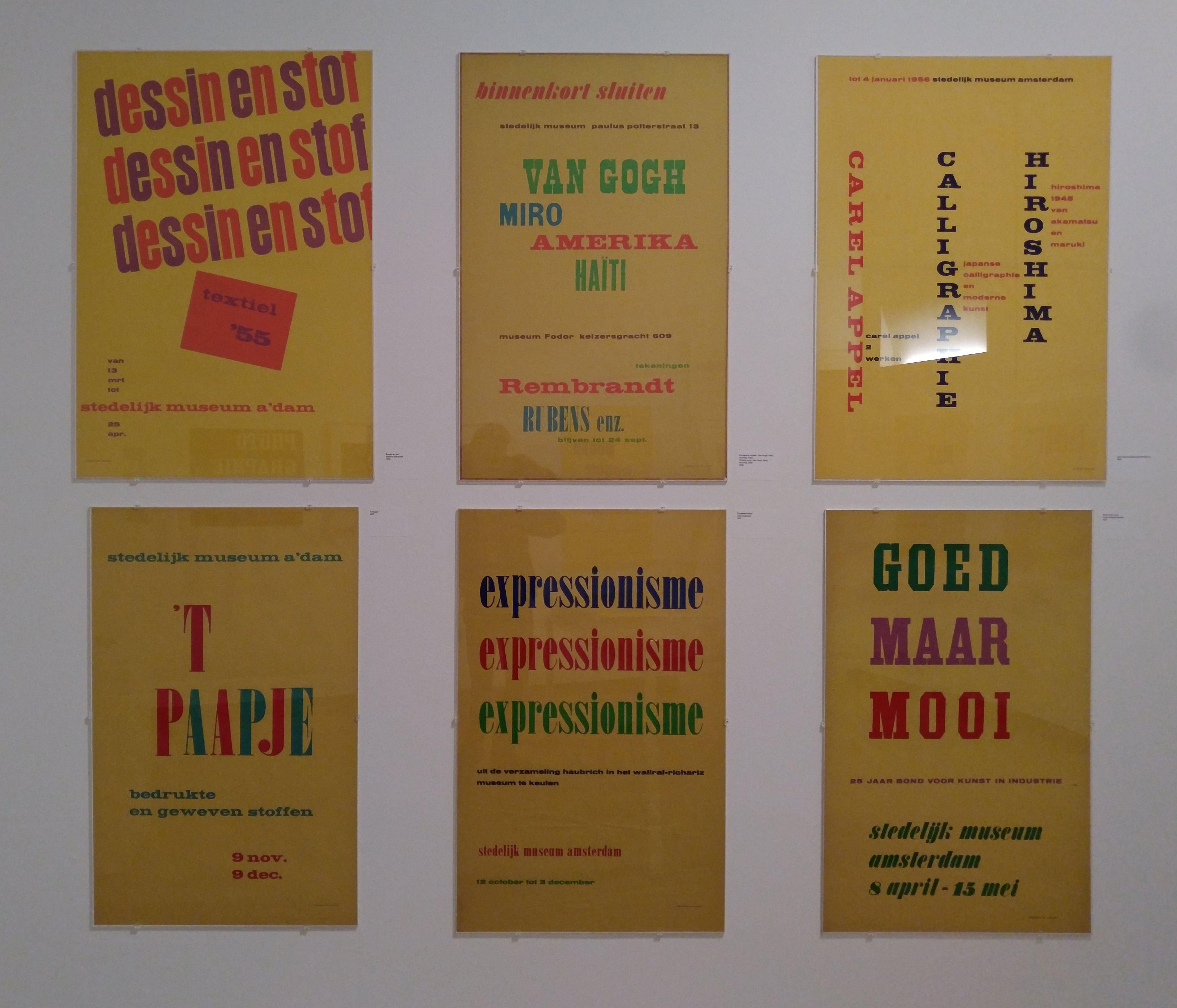
Last Sunday we visited the Stedelijk Museum for the Tinguely exhibition ( see blog in a few days) and the Willem Sandberg exhibition. Sandberg was not only the director for over 2 decades at the Stedelijk ( 1945-1963), but also took care of almost all the design and typography for the Stedelijk Museum Amsterdam, which was made during his years as a director. 5 rooms are filled with a multitude of publications. Mostly for the Stedelijk and some for the Israel museum in Tel Aviv.
What struck me most is that his designs are timeless and still belong to the very best designs that were made in last century. The 3rd room was filled with Stedelijk Museum publications and i was proud to find that 100% of the book publications shown in that room was available at www.ftn-books.com.
This is an exhibition you have to visit when you are a Sandberg admirer and study the publications on show. Beautiful, in many cases handcrafted typography and designs and among the Sandberg designs the very best that were made. It was good to see that so many of these publications still are timeless and of the highest quality and never looked old fashioned. For me Willem Sandberg is still one of the very “greats” in design and typography from the 20th century.
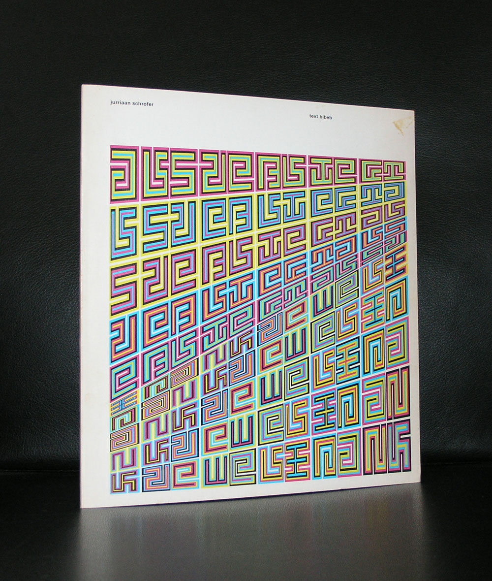
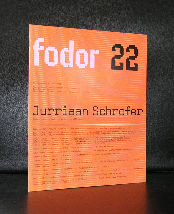
Yesterday we ate with our good friend Annemarie Schrofer and because of the beautiful paintings by her father on the walls, i remembered another member of the Schrofer family ……Jurriaan Schrofer.
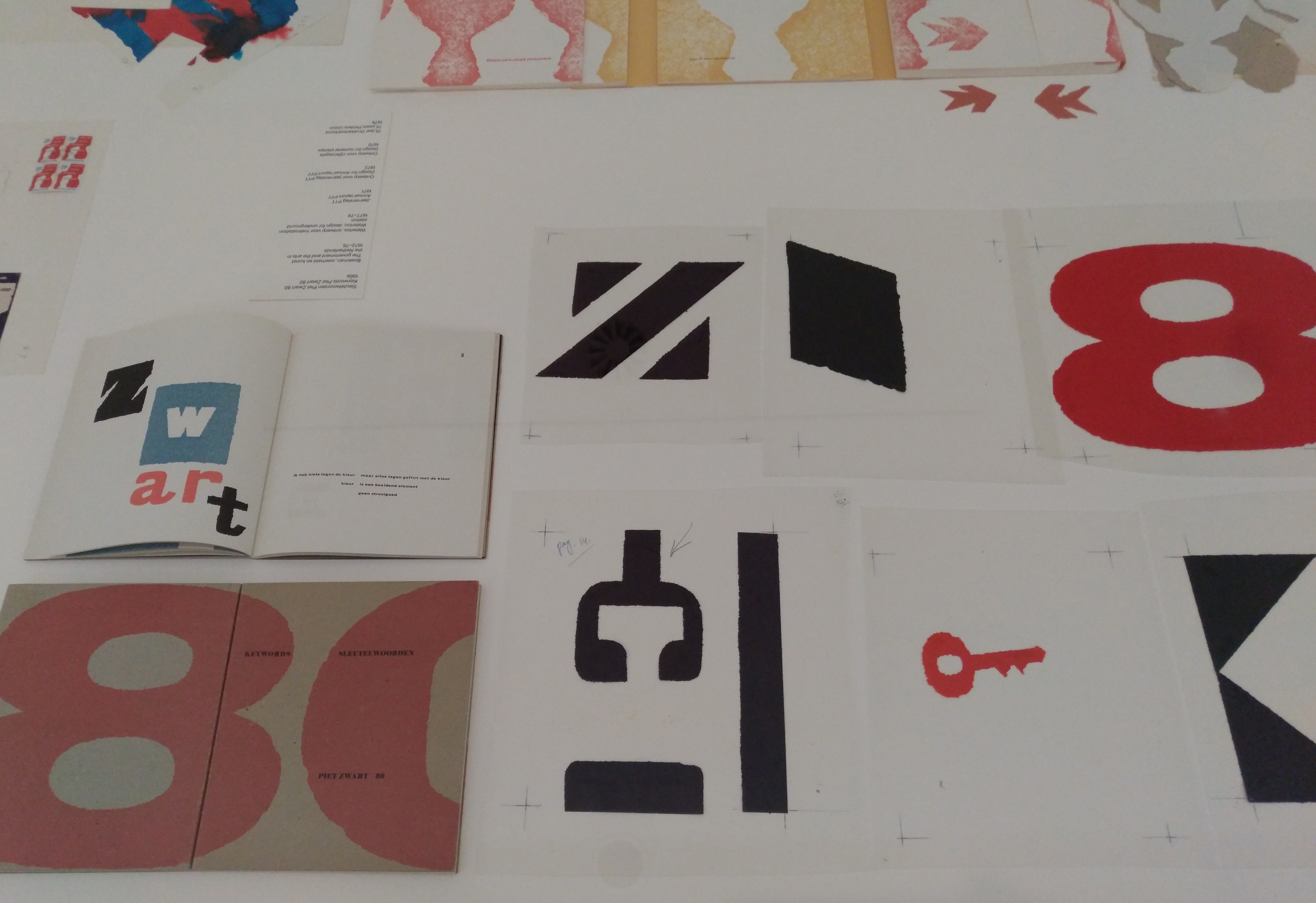
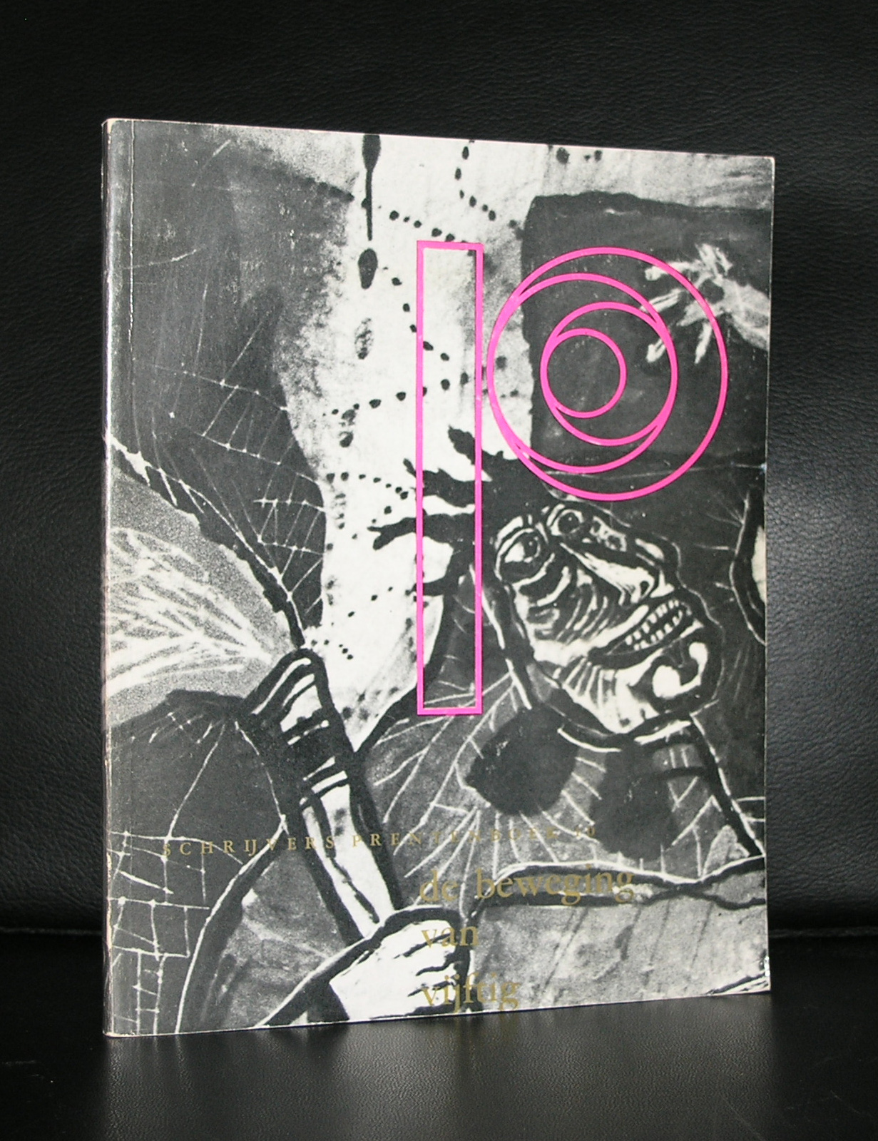
Born in 1926 and also a child of Annemarie’s father Willem Schrofer he would become one of the leading typography and graphic designers in the Netherlands. His works can be considered as “avant garde” design, thinking “out of the box” and soon he would develop his very own style . He originally wanted to become a film director, but ended being the assistant to Dick Elffers. This was the starting point of a splendid career as a graphic designer. For a few years in the seventies he was a member of Total Design, but soon followed again his own path. Highly original and recognizable are his designs. He was commissioned by many dutch important institutions and was appreciated for the designs he made for them, but his true recognition as one of the leading graphic designers from last century is only 25 years old. His works would become internationally known and appreciated. There now is a high interest in his works from leading British Graphic design schools and recently the same interest comes from the US.
Jurriaan Schrofer books can still be picked up at reasonable prices and for those interested in dutch graphic design, the designs by Schrofer are an absolute and quintessential part in the history of Graphic design and not to be missed in any collection. www.ftn-books.com
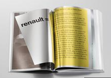
The day before yesterday i read an article about the newly designed book for Renault…design by Irma Boom…and my immediate thought was …how can i get hold of this important title for my private collection. It will be a difficult task , but maybe if i say something nice about the new Renault line of cars , designed by Laurens van den Acker this would help?
I never noticed Renault cars until lately i saw a new design line emerge Captur , Kadgar, Megane and Talisman could all be recognized as Renault’s, but what struck me most is that the design elements designed by van den Acker could be found in each of these models….and honestly these are great looking cars and the Talisman Estate has one of the best designs of the contemporary estate cars available.
Irma Boom translated these new Renault designs into a book worth collecting ( not for sale). The pages resemble paper thin aluminium, the cover can be polished and the design is breath taking.
So which Renault dealer can help me with this important publication and can make me a happy collector? For the one who helps me with this,
i have a nice Irma Boom book available to trade for it.
By the way…i did not know it, but the iconic Renault logo is designed by Victor Vasarely.
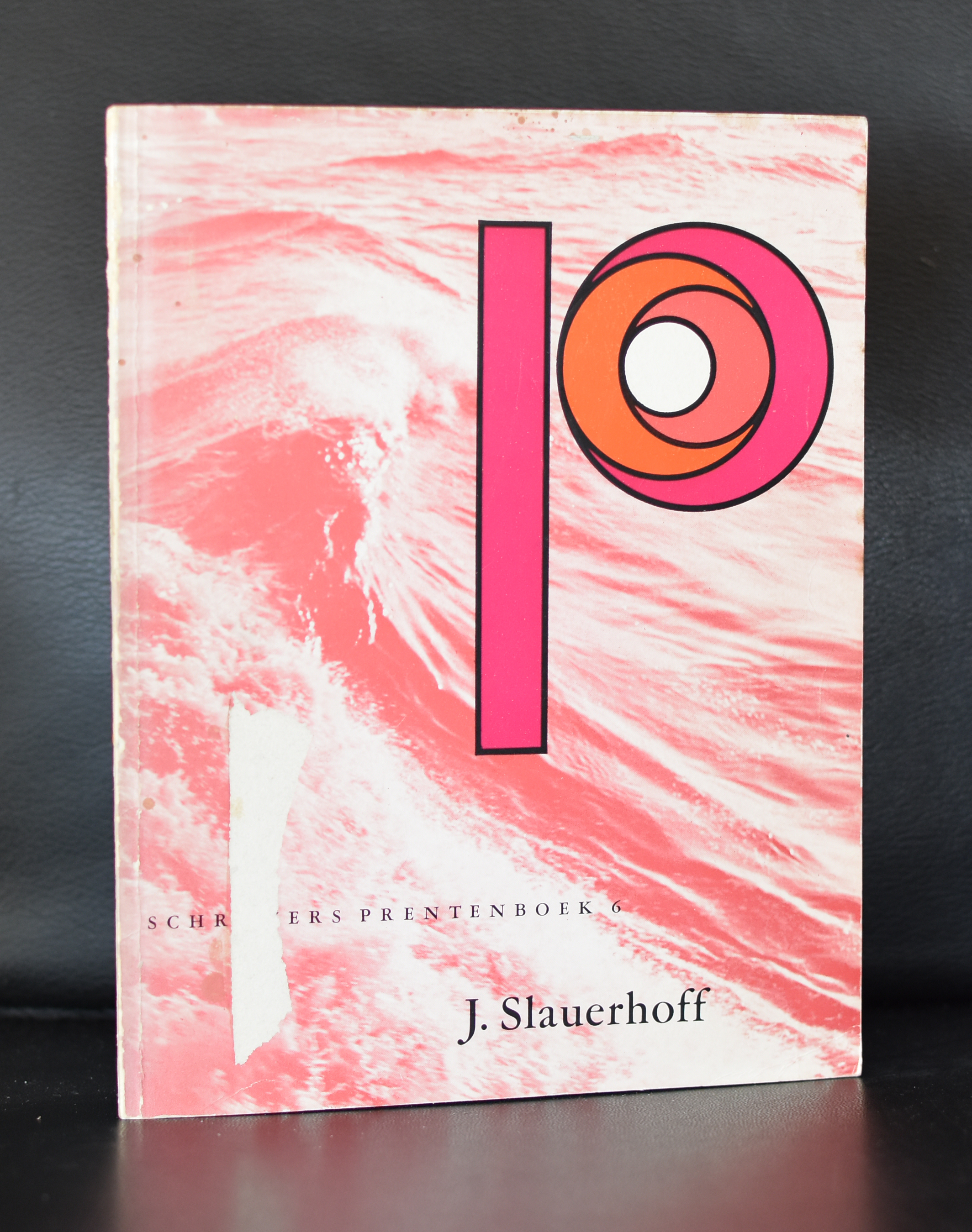
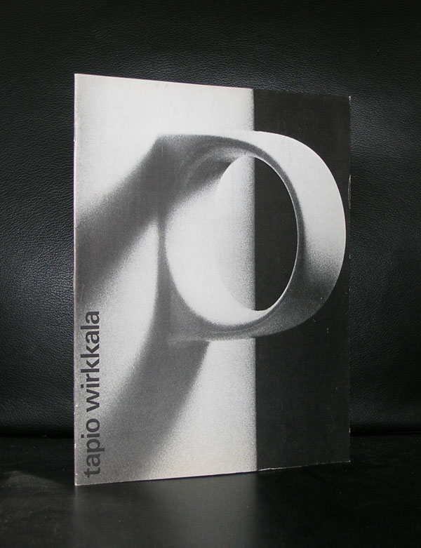
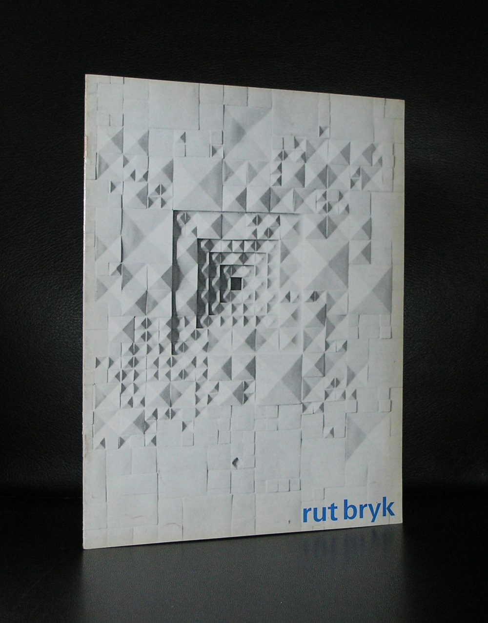
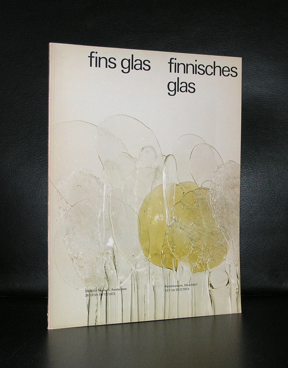
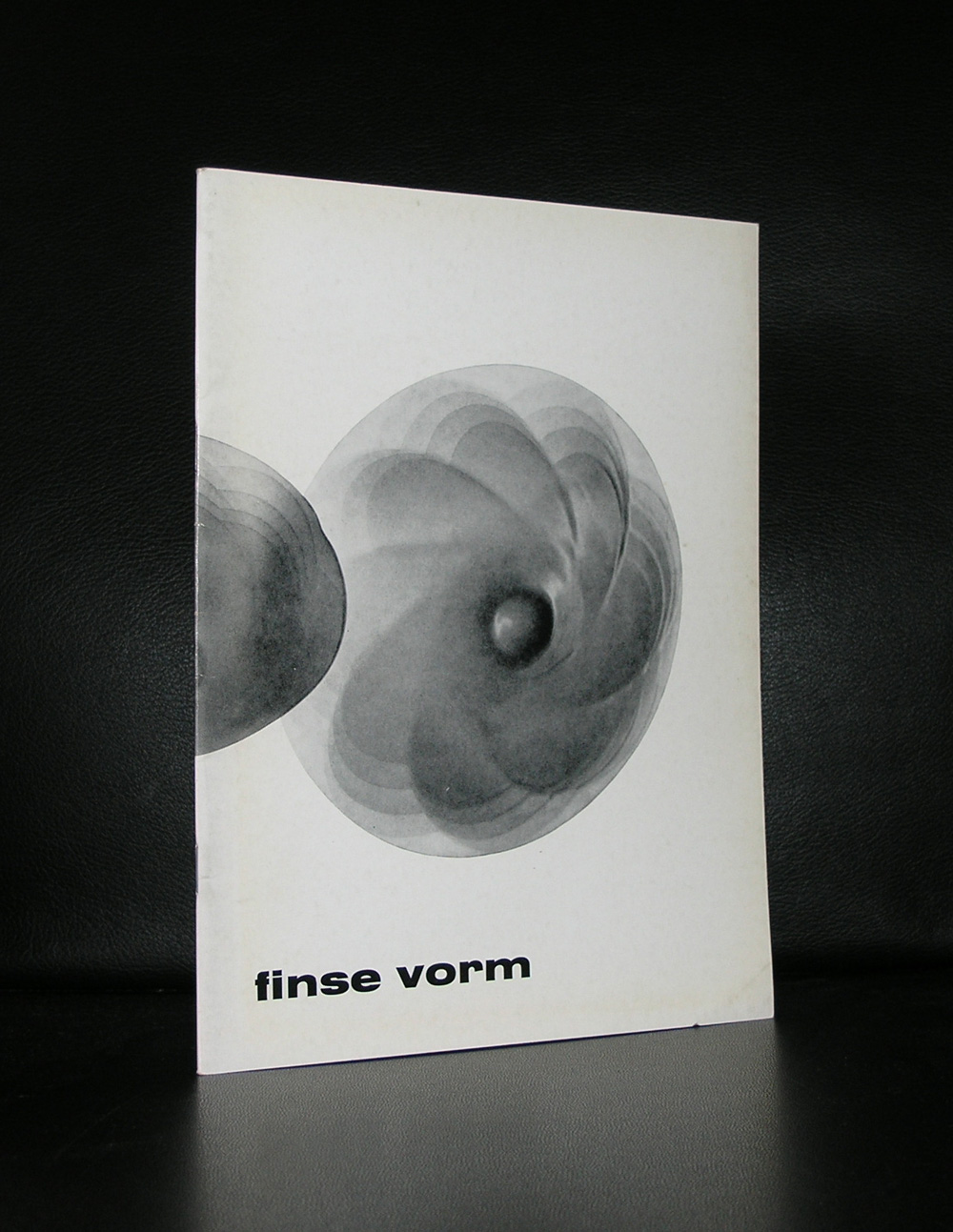
The Finnish master of design and glas has had some great exhibitions in the Netherlands, but the most important one was the one in the Stedelijk Museum ( 1976). The Stedelijk Museum took a special interest in Wirkkala and acquired many beautiful works by him and from his wife Rut Bryk, who also had her exhibition in the Stedelijk Museum (1970) , even before her husband had his. Both their catalogues were designed by Wim Crouwel and both catalogues are collectors items now.
Wirkkala designed many great glas objects for Iitala which are still in production. I wish i had more publications on Wirkkala and his wife, but these are rare. The ones i have are both from the Stedelijk Museum. One is the monography and the other two are on a group exhibitions on Finnish glas and design.
Artist/ Author: Oliver Boberg
Title : Memorial
Publisher: Oliver Boberg
Measurements: Frame measures 51 x 42 cm. original C print is 35 x 25 cm.
Condition: mint
signed by Oliver Boberg in pen and numbered 14/20 from an edition of 20