Posted on Leave a comment

Joost Swarte and Fay Lovsky ….Jopo in Mono


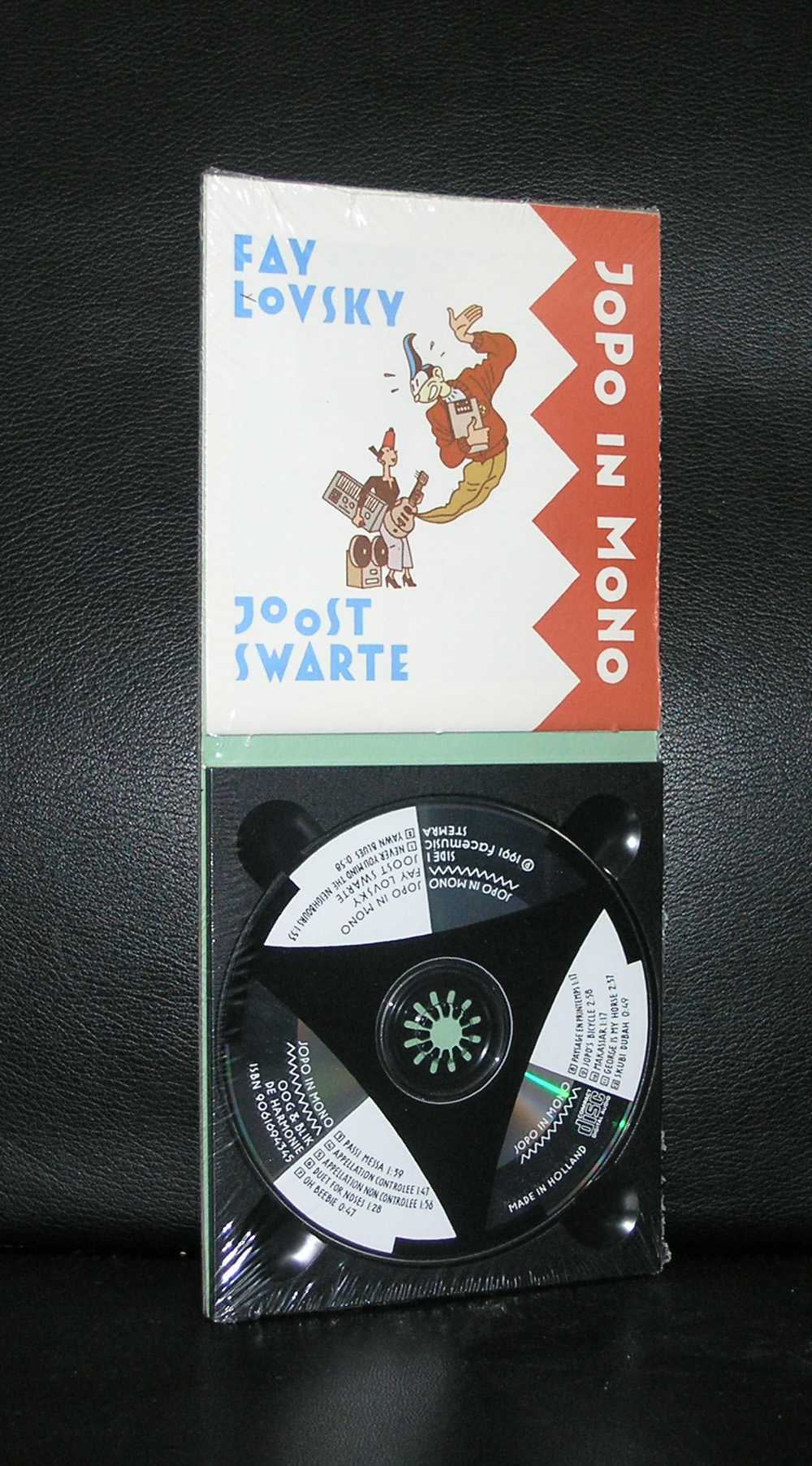
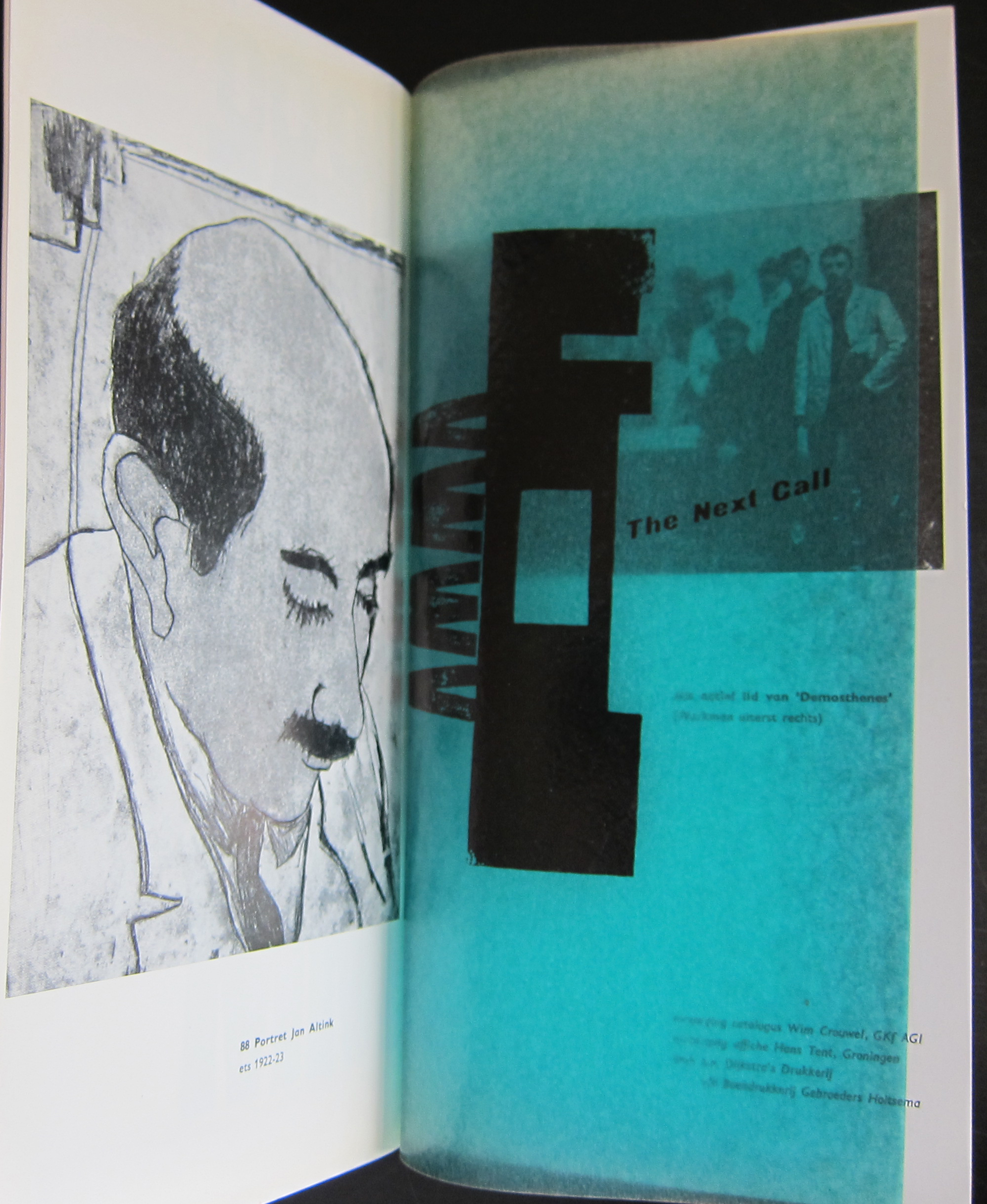
Artist/ Author: Joost Swarte / Fay Lovsky Title : Jopo in Mono Publisher: Oog & Blik / de Harmonie, 1991 Number of pages: booklet contains 16 pages /audio cd by Fay Lovsky contains 12 numbers Text / Language: Measurements: 5.4x 4.9 inches Condition: mint / still sealed extra information on this item: Rare and collectible. Here is a text from a blog on this publication which i found: When putting two completely unique artists out of two different disciplines together in one room, the chance that it might lead to something brilliant is equal to the chance that it won’t work. For these two it turned out to be option one: brilliant. Joost Swarte and Fay Lovsky are the ones we’re talking about. These two (both made in Holland) made their album ‘Jopo In Mono’ back in 1991. It’s based on the story of Joost Swarte’s underground comic-character ‘Jopo de Pojo’, a musically anti-hero, highly underestimated in his own opinion (even the alleycats don’t dig his shit) but always pretty positive in his own misery. Jopo de Pojo leads a life of failure, fun, sex and pretty bad rock and roll. Nevertheless Jopo is a character to love. I bought my first Joost Swarte album somewhere around 1988, it was a collection comics about Jopo and I fell in love with him (Jopo) and his creator’s style immediately. More albums and (signed) silk-screens by Swarte followed and off-course this beautifully designed CD ‘Jopo In Mono’ had to be in my collection too. Nowadays Swarte enjoys an international reputation as a graphic artist as well as a designer on whatever his fancy takes away: creating posters, cartoons, glass windows and stamps, or designing watches, buildings or bookcases. The woman that made the music and wrote the lyrics to make Jopo come alive on CD is Fay Lovsky (born Fay Luyendijk). She is what you could call a ‘do-it-yourself’-artist. Always trying to make music with somewhat exotic instruments such as the theremin, ’singing’ saws or the noseflute (there is a ‘Duet For Noses’ on this Jopo-album!). In the mid-eighties she gained some fame with her music projects ‘La Bande Dessinée’ and with her bigband ‘Magnificent Seven’. But most (Dutch) people probably know her best because of her x-mas evergreen from 1981 ‘Christmas Was A Friend Of Mine‘. Lovsky is very inventive as well with music as with words. She’s responsible for probably one of the shortest and humourous bluessongs ever, ‘Yawn Blues‘ with brilliant lyrics: I woke up this morning, I went back to bed. The one you hear doing Jopo’s yawning is Joost Swarte. Another peak on this album is the song that even made it as the openingstune of a culinair show on French national TV: ‘Appellation Controlée‘ (part of the lyrics: Brown paper bag, au bord de la Seine, Ile de la Cité. Chateau Migraine, when you wake up the next day.). On the album followed by a disturbingly short ‘Appellation Non Controlee’ including hiccups and a watersplash. Did I already mention that Joost Swarte won a prize for the design of this booklet? Well, he did.


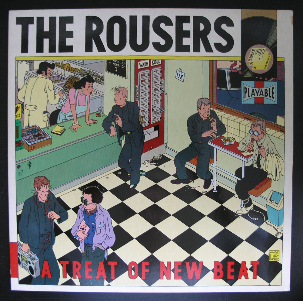
Jopo in Mono and the ROUSERS album are both available at www.ftn-books.com


Posted on Leave a comment

Hochschule für Gestaltung Ulm (1953-1968)

Schermafbeelding 2017-10-02 om 15.00.04

Only 15 years the Hochschule für Gestaltung Ulm was active and it was one of the first institutions in the world where you could fhave an education and follow lectures in design. After the Bauhaus it was the leading centre in the world on design and responsible for many great “timeless” designs of which the Lufthansa corporate design is probably the most best known.

The importance of this educational centre which was co founded by Max Bill and had ao. Johannes Itten ( see blog from a few days ago) as a teacher was recognized by Willem Sandberg who organized an exhibition in 1965 on the “Hochschule für Gestaltung Ulm” and the catalogue which appeared together with this exhibition has become one of the rarest and most collectable Stedelijk Museum catalogues ever. Wim Crouwel designed this catalogue. Oblong format, grey cover, very nice typography ….the catalogue has become a statement for good and simple design, readability and beauty. The designs within the catalogues are beautiful, but the catalogue itself is arguably even better.

This catalogue is available at www.ftn-books.com

OLYMPUS DIGITAL CAMERA

There is a great timeline to discover the Hochschule at :

http://www.hfg-archiv.ulm.de/english/the_hfg_ulm/timeline.html

Posted on Leave a comment

Hendrik Petrus Berlage (1856-1934).. Three buildings

Schermafbeelding 2017-08-31 om 14.44.22

H.P. Berlage is for me personally the architect of the building i entered for nearly 25 years, worked in and have practically known my entire life. Of course this is the Gemeentemuseum Den Haag. Initially people did not like the building at all and thought it a badly designed ” public swimming pool”, but you must visit this building multiple times before it opens its true qualities to you. It really is of a rare quality and can be considered as the last, but also ultimate designed Berlage building in which the extreme details open up when you look long enough. Berlage known for his architecture was also a very gifted furniture and book designer and brought all these qualities together into his buildings. There is so much to be told on Berlage, but the best one can do is visit the buildings which this architect build. Fortunately the very best examples are to be found in places a random tourist is likely to visit when he or she visits the Netherland.

Amsterdam has the Beurs, Otterlo /Kroller Muller museum has the “jachtslot” and of course Den Haag has the Gemeentemuseum. so for you next visit to Holland visit these and start your visit with a Berlage book for sale at www.ftn-books.com

Posted on Leave a comment

Benno Premsela (1920-1997)…dutch design

Schermafbeelding 2017-08-26 om 10.55.30

What is the importance of Benno Premsela? Is it because he was one of the first chairmans of the COC ,….or is it because he was one who represented a generation of dutch designers in the seventies and eighties? The story behind Premsela is not just an ordinary story, because as a jew and homosexual he was despised during and right after the war, submerged during the war and had a rough time right after the war because jews and homosexuals still were not accepted in society.

Raised as a humanist he could not understand the way people thought about the jews and homosexuals. This was one of the reasons he decided to become active in the liberation of the homosexuals and eventually became chairman of the COC. the “Nederlandse Vereniging tot Integratie van Homoseksualiteit COC”. An active chairman, who made his contributions to the liberation of the homosexuals in the Netherlands.

Schermafbeelding 2017-08-26 om 11.09.52

But now i tend to forget that Premsela was also a very gifted designer, who’s designs were executed all over the world and even at one time he had a retrospective in the Stedelijk Museum Amsterdam. This exhibition recognized his qualities as a designer and made his name forever. Benno Premsela was a man to be admired for his ideas and designs. www.ftn-books.com has some nice Premsela designed publications available.


Posted on Leave a comment

Willem Sandberg (1897-1984) typography

It is almost a year since I tipped the readers of my blog to start to collect Willem Sandberg typography. Since, i have found some interesting examples of his excellent typography which i want to present to you. For those of you who are new in reading this blog. Willem Sandberg was a designer /typographer who became director of the Stedelijk Museum Amsterdam for a very long period ( 1945-1963) who designed many of the publications during this period of time and who contacted and presented many of the most famous 20th century artists in the Stedelijk Museum. His publications are characterized by the use of plain ( carton like papers) and the lettering looks random, made out of torn papers. But these are very accurate designs. You can find many sources of information on Sandberg on the internet, but one of the best is still the site of the Stedelijk Museum Amsterdam. ( www.stedelijk.nl ). Now here are some new and old additions to the inventory of www.ftn-books.com


Posted on Leave a comment

Polish art and typography

While leafing through my documents, I noticed some very nice and interesting publications from and on Polish art and typography. These are a combination of Russian and western art and typography, making them stand out and being typical for Poland. It is the same with Japanese typography.

Schermafbeelding 2017-08-13 om 09.53.50

A style of typography of its own , but with influences from western typography and design. But back to Poland. This very unique way of design was recognized by Willem Sandberg, who organized an exhibition on Polish posters. Whenever i visit a  book) market i always pick them up , because of their appearance and some are worth collecting and selling. Take a look at www.ftn-books.com

to find some of these very nice publications.

Posted on Leave a comment

A very special WERKMAN publication (1964) by Wim Crouwel

Schermafbeelding 2017-05-30 om 09.46.52

Because i get notified by Pinterest which items are shared and saved, i found out that this is one of the most appreciated photographs of all publications on www.ftn-books.com

This publication was published on the occasion of the Werkman exhibition in Groningen in 1964 and one of the first designs that Wim Crouwel made for a dutch museum. In this same period he designed the publications for the van Abbemuseum which were followed from the early sixties on by the publications of the Stedelijk Museum. What makes this one special is the condition it is in  and the highly unusual appearance. The use of multi colored papers, its odd size and a cover chosen in relation with the Werkman print which is used as a cover. This publication is the top in dutch lay-out and design and must be considered as one of the very best publications of the sixties. Curious?………take a look at

https://ftn-books.com/products/groninger-museum-dutch-typography-h-n-werkman-wim-crouwel-design-1964-nm

and see for your self the many special qualities of this rare collectable Crouwel item.

werkman crouwel a


Posted on Leave a comment

Roger Bissière, a lyrical abstract painter (1866-1964) in a Wim Crouwel catalogue


Schermafbeelding 2017-05-25 om 09.04.47

A lyrical abstract artist and related to other abstract French painters like Manessier and Bazaine, Admired by Willem Sandberg , Bissiere received his first Stedelijk Museum exhibition in 1958 and in the early sixties another followed , this time with a spectacular catalogue designed by Wim Crouwel and for me this catalogue is the reason to write this blog, because i find this catalogie one of the very best Wim Crouwel ever made.

OLYMPUS DIGITAL CAMERA

Clean, bright with some highly original details, the early smaller size and great typography makes this a Crouwel classic and the art…..well not bad either!

books available at www.ftn-books.com

Posted on Leave a comment

Total Design (1963-2000)

This text was taken from the site ” MEMORY OF THE NETHERLANDS ” and gives an excellent idea what TD was.

The corporation Associatie voor Total Design NV, Total Design for short, was established in 1963. Until then, practically all major design commissions from Dutch clients had been contracted out to foreign agencies. There were no large design agencies in the Netherlands at the time. Total Design was established with a view to filling this unsatisfactory gap.

Total Design’s board of management in 1963; from left to right: Friso Kramer, Dick Schwarz, Benno Wissing, Ben Bos, Paul Schwarz and Wim Crouwel (photography: Jan Versnel)

The founders were Wim Crouwel (graphic design), Friso Kramer (industrial design), Benno Wissing (graphic and spatial design) and Paul and Dick Schwarz (organization and finance). Before long, Ben Bos, an experienced copywriter and designer, joined the team.

This mixed group had such wide ranging experience that it was able to execute complex ‘total’ commissions from a variety of clients in industry, trade and transport, and the government and cultural sectors.

Years of success
The 1960s were the most successful period for Total Design: its staff size increased enormously and the agency managed to hold on to various clients for a long time. Some of them, like Randstad and the Amsterdam Stedelijk Museum, ( of which many books are available at www.ftn-books.com) were extremely loyal to Total Design.

In those years, other important clients were Schiphol airport, De Bijenkorf, Steenkolen Handelsvereeniging (SHV), including its oil division PAM, Stichting Kunst en Handel (Arts And Business Foundation) and the Peter Stuyvesant Collection of paintings; a major commission dating back to that period was the design of the Dutch pavilion for the 1970 Osaka World’s Fair.

Poster ‘Holland Nestival Finale’ for the Holland Festival, 1978 (design by Anthon Beeke, Total Design)

Changes
In the 1970s, Total Design underwent great changes. The agency received mainly graphic commissions and created many house styles.

The composition of the staff changed as well. Some important designers from the very beginning decided to leave the agency. Friso Kramer had left already in 1967; in 1972, Benno Wissing, Anne Stienstra, Hartmut Kowalke and the Schwarz brothers followed. Wim Crouwel, Ben Bos and Hans Wierda became the managers.

The agency’s intricate and obscure management structure was replaced by semi-independent design teams. As a result, a new generation of designers, trained by the agency itself, got a chance to prove themselves.

A period of less cohesive views on design and style dawned. Designers like Jurriaan Schrofer, Anthon Beeke, Paul Mijksenaar and Andrew Fallon introduced a lively and fresh approach to design commissions. Loek van der Sande was taken on as office manager. Work for the Dutch Post Office PTT, the Amsterdam city transport company, the Holland Festival, the Globe Theatre as well as for other clients began in the 1970s.

Total Design experienced many further changes in the 1980s and 1990s. Jelle van der Toorn Vrijthoff joined the management team in 1982. He championed young talent and in particular new techniques. Sometimes his views were diametrically opposed to those of the old guard. Wim Crouwel left Total Design in 1985, Ben Bos followed in 1990. They were the last two designers who had been involved with Total Design from the very beginning.

New orientation
Much had changed, also in the field of design. Total Design no longer had the renown of the early years. Many more design agencies had sprung up in the Netherlands through the years.

In 1988, Hans Brandt began to develop the design agency into a strategic communication agency. In de 1990s, Total Designed shifted from being a classic design agency to becoming an organization that put the emphasis on identity development, corporate branding and reputation management. In 2000, the name Total Design was changed into Total Identity.

An excellent story in the history of Total Design, but to see the true meaning of the TD office you have to experience and see their designs. Beside the Stedelijk Museum publications there are some special Total Design books available at www.ftn-books.com

Posted on Leave a comment

Anton Corbijn (1955)

Schermafbeelding 2017-04-09 om 10.56.49

Rightfully world famous now. An excellent photographer and film maker. I am less enthusiastic about his abilities as a designer, but stil his photographs deserve some extra attention by  this blog on art. Because these are not only great photographs, but they also reflect music and their performers through the last 4 decades. Bowie, Jagger, Cobain, Davis and of course U2, name them all and all of them have been before the lens of Anton Corbijn.

 ( all photographs by Anton Corbijn )

Black and white being his favorite way to portray these great artists. As of late he made some movies during the last decade ( the American and A Most wanted man) However, he made his feature film debut with Control, a film about the life of Joy Division frontman Ian Curtis. It premiered to rave reviews at the Cannes Film Festival on 17 May 2007. Curtis was a personal friend and it shows in the respectful way he portrayed the singer of Joy Divisison. Because his acquired celebrity status as a photographer, Corbijn has had retrospective exhibitions all over the world and 2 years ago there was a large retrospective on Corbijn in the Gemeentemuseum Den Haag. Since a few years Corbijn took up the art of design. Personally i do not think he is a strong designer, but this is my personal opinion on his designs. There is a new logo by the Municipality of DEN HAAG which was designed by Corbijn and judge for your self.

Schermafbeelding 2017-04-09 om 10.56.16

Better focus on his photographs….they are very personal, intriguing portraits and they are great!

for some Corbijn titles visit www.ftn-books.com ( stripping girls is made  together with Marlene Dumas)