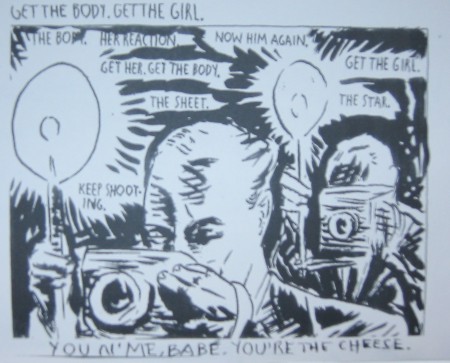
In 2002 Raymond Pettibon made the opening exhibition for the GEM museum. The exhibition was curated by Roel Arkesteijn. Pettibon worked day and night to include over 600 drawings and designs, but he finished in time to make it a memorable exhibition. After the opening he had time to make and finish 3 comic books, which were printed ( copied ) and stapled in house by Chantal Sieuw. These 3 titles are since their publication highly collectable Pettibon books , because the edition was only 100 copies for each title.
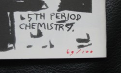
The edition is numbered xx/100
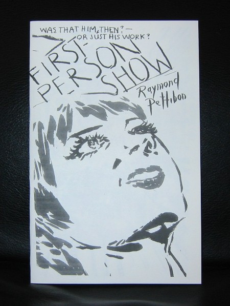
The First Person show is the second Pettibon title to be discussed in this blog.
Artist / Author : Raymond Pettibon
Title : First Person Show
publisher : GEM, 2002
Number of pages : 28
Text language : English
Measurements: 8.7 x 5.6 inches
Condition: MINT
Highly recommended and collectable publication published on the occasion of the 2002 Pettibon opening exhibition of the GEM museum. Edition of only 100 copies. all numbered in red ink.
www.ftn-boooks.com is the only internet store that offeres this rare Pettibon publication


%20and%20new%20building%20designed%20by%20Benthem%20Crouwel%20Architects.%20Photo%20John%20Lewis%20Marshall..jpg?w=325&h=480&mode=max&404=backup)