
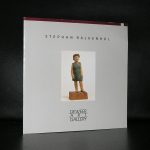
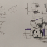
Piet Dirkx cigarbox 715
Piet Dirkx cigarbox 715

Some of the galleries are out there for ages. For example Denise Rene in Paris and Willy Schoots in Antwerp but there is also Deweer gallery who have a presence in the gallery world since 1979. When you visit the gallery it is more like a small sized museum than a typical gallery. A huge surface, situated in an old factory with separate rooms, make it suitable to present a diversified collection. Artists from the gallery range from Jan Fabre to Mark Wallinger. www.ftn-books.com carries some sold out Deweer publications from the last decades.
The Deweer site gives the following information on the history of the gallery:
Deweer Gallery (est. 1979) is a leading second-generation gallery specialized in national and international contemporary art. Gerald and Bart Deweer are its owners and directors. The gallery is located in a building with approximately 1,200 m² of exhibition spaces in the rural town of Otegem, in Belgium. Deweer Gallery, representing more than twenty artists, focuses exclusively on work that evinces a combination of critical and poetic qualities. Well-known for its representation of artists such as Stephan Balkenhol, Jan Fabre, Günther Förg, Ilya and Emilia Kabakov and Panamarenko, the gallery has a reputation for building artists. Deweer Gallery has been working together with these artists for more than two/three decades. The early detection of talent is its trademark. It is evident in, among other things, their current supporting of artists such as Melissa Gordon, George Little, Enrique Marty, Benjamin Moravec, Nasan Tur, Anna Vogel and Andy Wauman.
HISTORY
From father to sons
Mark Deweer’s passion for collecting art led to the creation of Deweer Gallery in 1979. Mark was the driving force and the initiator. His nose for artistic talent and his business acumen, along with the unconditional support of his wife Marleen Deweer, made for an ideal combination that would make the realization of his dream possible.
Raised surrounded by art, their two sons, Gerald and Bart Deweer, know the world of art from within. Gradually, they took over the management of the gallery. Gerald and Bart want the gallery to continue to play a dynamic, ambitious and leading role on the international contemporary art scene. They aim to continue to promote artists on the basis of strong internal/external exhibitions and participations in international art fairs such as Art Cologne (since 1995), ARCO Madrid (since 2001) and recently also miart (Fiera Milano).
Building
Since the middle of the 1980s, Deweer Gallery is located in an unusually spacious building that once housed a small industrial enterprise. In 2011-2012, the spaces of the gallery were thoroughly renovated. Far-reaching architectural interventions were carried out, such as a doubling of the publicly accessible spaces (the lobby and three exhibition rooms) to a total area of approximately 1200m². In September 2012, the new gallery opened with the group exhibition ‘Re-Opening’, which clearly showcased the rejuvenation and renewal of the gallery program.

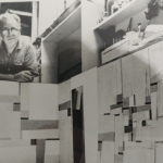
Piet Dirkx cigarbox 714

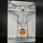
I always stumble upon this artist whenever i am looking for sculpture in the Netherlands in the Eighties. van Bakel is well known here because of his exhibition which were held during his life and shortly after his death in 1984. There even is an excellent website devoted to his life and works : www.gerritvanbakel.nl , but lately not much of his works are on show or included in auctions or at gallery presentations. Possibly this is because collectors keep his work in their collection because it is original, playful and accessible sculpture and the resemblance his works have with the ones by Panamarenko and Beuys. In 1984 , van Bakel was invited to hold a lecture at the university of Twente. Here follows the complete text of the lecture in english. And for the publications on van Bakel. visit www.ftn-books.com
| ELEMENTS OF AN ARTIFICIAL LANDSCAPE | ||
| Lecture by Gerrit van Bakel at the Technical University Twente, 1984
Ladies and gentlemen, I have been invited to make a speech here, but I was originally invited to put on an exhibition as well. Because my work has a somewhat technological character, the assumption was that it would be appropriate to show it in a College of Technology. That is no more than an assumption. I know that in practice it turns out differently, because people with a technological background judge art that has a technological character on the basis of its technological and not its artistic quality. If I were to put on an exhibition of my work in a College of Technology, I would therefore have to take this into consideration. I would have to make a very clear-cut selection of my work to ensure that the possibility of a response of this sort would in any case be eliminated. Quite simply this would have taken up too much of my time. Before I begin I would first like to say something else. When someone makes a speech, it is taken for granted as it were that he must have an answer to certain questions or at any rate to the questions that his listeners have. This is one possibility. Another possibility is that someone who makes a speech has a question that his listeners have an answer to. As far as the first possibility is concerned, that is, whether you have questions that I have an answer to, I should tell you that my answer is 3. In other words, the question that concerns me is enormously complicated. And it is in order to find an answer that I make things and when these things are made they are able to function within the circus of the visual arts. But what comes prior to these things is in a certain sense more important than the things themselves. This means that, because I am concerned with making things when I pose these questions, the questions do not consist of words, but of objects. With how these objects manifest themselves. The origin of these phenomena is to be found in the image, in what I see, in what immediately occurs to me, before I have time to interpret it. To explain to you what occurs to me without interpreting it, I would have to show you what occurs to me. And that cannot be done. Therefore I am obliged to use words to explain what sort of images, what sort of phenomena, what sort of visible things can suddenly be generated in me. What it implies for my faculty of perception and what that in fact means. To begin with I would like to say something about cranes. If we look at a crane from a distance, we see a piece of machinery which can clearly be used to shift a load. That the load can be raised and swung to the left or right. What we see then is that things can as it were be shifted on behalf of our bodies, things that we are not obliged to shift, but which we would also not be able to shift by ourselves. The second element that I want to say something about is Buckminster Fuller. Buckminster Fuller is a man from the USA who has in a certain sense changed our thinking about construction. Not by changing our way of thinking in itself, but by applying another method of calculation to the forms in which it is manifested. Cranes, for example, have specific dimensions and a specific precision. If this precision could be increased by a factor of 10 or a hundred, then the things themselves, the forms that result from this increased precision will have a different appearance. And Buckminster Fuller is a man who thought about this question. In the way that he conceived of technological things, including household articles, things for houses, bathrooms, cars, everything, he applied a method of thinking that was more precise than it had previously been. This meant that these things began to look different. Someone might of course say that that was all very well but the form concepts must also change with them. This is true of course, but these form concepts could only come into being because Buckminster Fuller had applied a new method of calculation. I consider this to be quite remarkable. I understand it, but even so I still think it is … incomprehensible. The fact that it is possible for a phenomenon to change if one makes a different sum. Something very different from this, for instance, is the wood carving on the altar of the church in Xanten. Xanten is a small town on the lower Rhine. In the church there is an altar of hard wood. It is carved with religious scenes, but the work is not in relief. Or rather, they are reliefs but they are carved so deep that they become a sort of sculpture. Something much more modern that also has an influence on the way the world appears is the felt pen. Most of you in the audience, are holding a sort of stick. And if you apply that stick in a regular fashion to a sheet of paper, it produces stripes. From these stripes it is possible for other people to see what is on that piece of paper. This stick is something that is entirely taken for granted. It is possible that it has never occurred to anyone that this thing is an element for conveying knowledge. A small phenomenon that has to do with writing and the registration of thought processes. Where something has in fact disappeared in the tradition of my profession, visual art, that is, is in technique. I mean technique as opposed to technology. (In Dutch the same word, techniek has various meanings, including both technique and technology, but also engineering. Translator’s note.) In any case the visual arts have a very intricate history, and a very complicated sort of craftsmanship of which not much remains. This was due not so much to the fact that this paint existed, as that there were people who used this paint. By this paint I mean factory-made paint ready to use and in a tube- That in fact was done, more or less for the first time, by Vincent van Gogh. Perhaps people will think that Vincent van Gogh was important for another reason. I think in fact that this is the only reason why he was important. That he used paint straight from the tube. And that this was what was behind his craftsmanship, but he did not regard this as important. This can also be seen in his drawings. Although he was certainly able to draw he was not a craftsman in this field. Later when one comes to interpret the phenomenon of the work of Vincent van Gogh, what matters is the way that his gesture and his texture refer to his emotional constitution. And I sometimes even get the feeling that all that remains of the whole history of painting is a gesture like this. Another element, another footnote, is the remarkable fact that at the beginning of this century the need of people to travel, by using a means of conveyance, led to the appearance of automobiles. A sort of horseless carriage initially, that could cover a distance on the road and which could transport people and goods from A to B. In my opinion, the outward form that these cars have taken makes them completely illogical. Specifically because they have an asymmetrical function while they are made symmetrically. In itself this is not so strange, but concurrently with the appearance of symmetrical cars something else occurred. This is the fact that houses that originally had been symmetrical for maybe three thousand years began to become asymmetrical round about 1910. And in fact they are now asymmetrical. I don’t know what this means, but I do know that it has taken place. There is an old painter, Richard Paul Lohse, who makes coloured squares and who argues that symmetry is in any case a monarchist phenomenon. This would perhaps explain why people get so much pleasure out of sitting in their symmetrical cars. Perhaps because it gives them a feeling of royalty. There is something very strange about the functional aspect of technology. I think that it is an illusion to think that engineering and technology produce logical and functional things. Just think of this: a distant land where the population is perhaps poor, with not a great amount of food, and with agricultural methods that are maybe more or less primitive. These people are persuaded in one way or another to grow certain kinds of plants in this distant land. These plants are harvested and transported and end up here in very large chopping machines. This transport and these chopping machines require a considerable amount of technical knowledge: of cutting sharpnesses, of molecule thicknesses and all kinds of other things as well. But in the end the result of a whole process like this is that millions of people in a certain country are trying to give up smoking. Yes… a cigarette as a form is surely an indicator of the absurdity of the world. There is however another function that explains why this happens. This is the need to earn money. I think that in the hierarchy of knowledge and learning a change has taken place. Or that it is possible to detect one. My point of departure is that there was once a time when philosophy for instance was a sort of mother of all forms of knowledge, was the source where everything came from, all knowledge and learning. In my opinion this is in itself not mistaken. It is however at any rate true that this is no longer the case. The situation now is that economics, which in my opinion is not a science, but a way of thinking that admittedly employs scientific methods, plays a more decisive role than does one’s grasp of a subject or any other specific quality. I don’t know if this is also significant, but a number of years ago on the 1000 guilder banknote, the painter Rembrandt was portrayed. And he is now replaced by the philosopher Spinoza. Is this due to the fact that everything that is printed on the money no longer has any meaning? I think that it is something like that. Because on the hundred guilder note there used to be an image of Michiel Adriaanszoon de Ruyter, for whom at least some people felt any respect, and on that note now there is a bird that is almost extinct. As far as that goes my idea might well make sense. There is therefore something illogical in the context within which functionality, and functional technology exist. These are illogical things that are maybe suggested by the existence of money. This is quite simply a fact. Money exists and most people covet it, in order to do things with it. Something else that is very precious is diamonds. Two years ago I saw a photo of an enormous pit. A pit that was at least two kilometres long and perhaps a kilometre deep. In it there were a hundred thousand little stakes and ropes. And in this pit a great number of people were looking for something. It was a photo of a diamond mine in South Africa. I thought that it was so terrifying that so many people had made such a deep pit that I began to ask myself what a diamond really is. Of course I haven’t found the answer. What I did discover is that a little stone like this, a glittering stone which does not however glitter any more than plenty of other stones, does not necessarily mean anything more than just that. In former times it certainly didn’t. A stone like this gives rise to human activities that are at first sight strange. Activities that an economist might describe as having to do with the law of supply and demand. That is all very well but that still doesn’t explain where the demand came from for people to want to possess such a tiny, brilliant and very well worked stone. It is in any case a fact that you can’t do very much with a diamond. Another list that in itself also consists of a list concerns how one generates a comfortable temperature. There is something strange about this. I am alive now and in my life things occur that give me the energy I need to make things. I will give a short account of what has happened. When I was a little boy, we had a stove at home. This was fueled with peat. And there was an oven. This was lighted with a heap of twigs with peat on top. This served both as a means of heating and for cooking at the same time. That is just one illustration. Around 1950 there was another stove in our house. This one didn’t work on peat, nor on twigs; it had to be heted with coal nuggets. And briquettes. In 1955 there was a new stove in the room once again. This was called a ‘solid fuel stove’ and it was heated with anthracite. About 1960 the solid fuel stove had to go. It was replaced by an oil heater. An oil heater, that’s what it was called. Round about 1965 the oil heater also turned out not to work so well and a gas stove had to take its place. And around 1972 almost everyone in Holland had central heating with all its benefits. It was possible to live and work in all the rooms, etc. But in 1973 there was an energy crisis and in 1975 everyone, or at least, very many people, had once more converted those old chimneys where the stove stood and turned them into fireplaces to give a little extra heat. And to save energy. In 1980 for people who found an open hearth like this difficult, a projecting stove has appeared that has in recent years developed into a multiburner in which one can also burn twigs and peat. Whether this is logical or not, I don’t know. But it is definitely what has happened. Something that is in fact logical, is the fact that there are screws. A piece of iron and then another piece or iron that you can wind round each other. And which fit. When you see such a logical little thing with which you can do so many things, you might think that a screw is very old. But that isn’t the case. It is true that screws existed, but the fact that one nut was interchangeable with another, is something that only came about in the 19th century. It is only since the war that there have been two or three systems for how the nuts and the bolts fit. The last thing that I want to talk about is the horizon. If we take a look outside we see at the end of the world that the sky changes into ground. I have spent some time studying how this works. Especially at sunset. You can work out how far away the horizon is but this doesn’t explain how the sun goes down behind it. There is no doubt that the sun does go down. And I can imagine that in earlier times this would be a moment of terror for primitive people. An instinctive moment for which one would need to have extra protection or shelter. What the horizon suggests to me is the idea that we as followers of this primitive way of thinking, as creatures with the faculty of looking, once upon a time came to realize that that same sun also rises. |
||

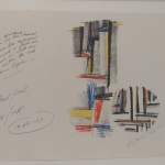
Piet Dirkx cigarbox 713

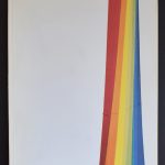
Is art? Yes perhaps it is ….. It is landscape architecture at the largest scale possible.
We noticed from early May the steady progress of the Trace of the high voltage lines between Nieuwe wetering and Rijpwetering. We can follow this progress, because we sail frequently the Ringvaart which is crossed by this Trace of high voltage lines. It is part of the new ring of voltage lines between the largest cities in the Netherlands. They stand like large sculptures in a landscape and are very impressive. Height is on average 55 meters, and they surely can not be missed. You see them from a large distance and they alter the landscape in a unlikely way.
The Netherlands has a long history with these immense masts in the landscape and this was recognized by Arij de Bode who made a beautiful publication on just these large masts which look like large sculptures. The book contains great photography by the best in dutch landscape photography and is available at www.ftn-books.com


Piet Dirkx cigarbox 712

In my last blog on the Haus Konstruktiv i ended with ( to be continued ) and that was not without reason. When i visited this museum in Zurich, I mentioned that i was disappointed but that is only part of the story, because i was also very surprised by an unexpected beautiful reconstruction of the Fritz Glarner office he made for the Rockefellers. They were admirers and according to the thank you note they sent were very happy with the result and…..i can fully understand why. Floor, walls and ceiling are covered with Glarner designs and the large table in the middle with the chairs makes the room complete and one of the most beautiful reconstructions i ver have seen. This room only is worth the visit of the Haus Konstruktiv….don’t miss it when you are in Zurich.


There are some Fritz Glarner publications available at www.ftn-books.com


Piet Dirkx cigarbox 711

Raul Cordero was born in Cuba in 1971 and influenced by the Americam Conceptual artist like Nauman and Baldessari. There are not many Cuban artist that rose to fame in the Western world but Cordero together with Wifredo Lam ( Blog next month) is definitely one of them and of course there is a relation between the Netherlands and Cordero too, because he studied at the Rijksakademie.
The publications are rare and very hard to find , but i was fortunate to find probably the most important book on his works until this date . The book was published on the occasion of the Cordero exhibition held in Salamanca (Spain) on his works from 1996-2002. The book is rare and those booksellers that have a copy ask high prices for it. Check for my price at www.ftn-books.com, where this title is now available too.
His art education started in Havana (Academia San Alejandro and Instituto Superior de Diseño) and as said his influences mix an interest in conceptual American artists such as John Baldessari, Bruce Nauman or Chris Burden -who later informed his conceptual training- together with elements of the 12th century’s Flemish painting tradition, acquired during his postgraduate formation in the Netherlands (Graphic Media Development Centre and Rijksakademie Van Beeldende Kunsten). Cordero has held visiting professorships at the Instituto Superior de Arte (ISA) in Havana, Cuba; The San Francisco Art Institute, California and The Art Academy of Cincinnati, in Ohio, U.S.A.


