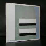
Piet Dirkx cigarbox 774
Piet Dirkx cigarbox 774

Andre Emmerich was an exceptional art dealer. Robert Motherwell introduced Emmerich to “the small group of eccentric painters we now know as the New York Abstract Expressionist School”. During the second half of the 20th century the Emmerich Gallery was located in New York City and since 1959 in the Fuller Building at 41 East 57th Street and in the 1970s also at 420 West Broadway in Manhattan and in Zürich, Switzerland.
The gallery displayed leading artists working in a wide variety of styles including Abstract Expressionism, Op Art, Color field painting, Hard-edge painting, Lyrical Abstraction, Minimal Art, Pop Art and Realism, among other movements. He organized important exhibitions of pre-Columbian art and wrote two acclaimed books, “Art Before Columbus” (1963) and “Sweat of the Sun and Tears of the Moon: Gold and Silver in Pre-Columbian Art” (1965), on the subject.
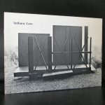
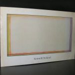
In addition to David Hockney, and John D. Graham the gallery represented many internationally known artists and estates including: Hans Hofmann, Morris Louis, Helen Frankenthaler, Kenneth Noland, Sam Francis, Sir Anthony Caro, Jules Olitski, Jack Bush, John Hoyland, Alexander Liberman, Al Held, Anne Ryan, Miriam Schapiro, Paul Brach, Herbert Ferber, Esteban Vicente, Friedel Dzubas, Neil Williams, Theodoros Stamos, Anne Truitt, Karel Appel, Pierre Alechinsky, Larry Poons, Larry Zox, Dan Christensen, Ronnie Landfield, Stanley Boxer, Pat Lipsky, Robert Natkin, Judy Pfaff, John Harrison Levee, William H. Bailey, Dorothea Rockburne, Nancy Graves, John McLaughlin, Ed Moses, Beverly Pepper, Piero Dorazio, among others.
Between 1982-96, Emmerich ran a 150-acre sculpture park called Top Gallant in Pawling, New York, on his country estate that once was a Quaker farm. There he displayed large-scale works by, among others, Alexander Calder, Beverly Pepper, Bernar Venet, Tony Rosenthal, Isaac Witkin, Mark di Suvero and George Rickey, as well as the work of younger artists like Keith Haring. Many of the above mentioned artists are available with different publications at www.ftn-books.com
, but FTN books also has some specific Emmerich publications available.
In 1996, Sotheby’s bought the Andre Emmerich Gallery, with the aim of handling artists’ estates. One year later the Josef and Anni Albers Foundation, the main beneficiary of the Albers’ estates, did not renew its three-year contract.The gallery was eventually closed by Sotheby’s in 1998.

Piet Dirkx cigarbox 773

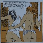
For Paul Cuvelier comics were a necessary way to earn money. His true heart lay in painting and sculpting, especially nudes which showcased his passion for the beauty and anatomy of the human body. Cuvelier’s fine art was characterized by a sensuality which has been described as “slumbering eroticism”. The same can be said about some of his comics. Even the juvenile heroes in his ‘Corentin’ stories are scantily clothed most of the time. The friendship between Corentin and Kim can be interpreted in the same homo-erotic subtext as the companionship between Jacques Martin’s Alix and Enak. His final ‘Line’ story also featured a more sexy presentation of the heroine. The 1973 ‘Corentin’ story ‘Le Royaume des Eaux Noires’ featured much nudity and hinted at a sexual relationship between the protagonist and Zaïla. By then, Cuvelier and Van Hamme had already created their groundbreaking erotic graphic novel ‘Epoxy’ (1968).

Epoxy
‘Epoxy’ was created in the wave of adult-oriented comics, which found its breeding ground in the American underground comix movement. The first generation that grew up with the post-war comics continued to embrace the medium, which opened up new possibilities for creators. Free from the restrictions of working for the children’s press, authors could now aim their work at a mature audience. In Europe, magazines like Pilote and Hara-Kiri were at the vanguard of this new movement. Frenchman Jean-Claude Forest‘s sci-fi heroine ‘Barbarella’ (1962) was the first character that embodied the sexual revolution of the 1960s.
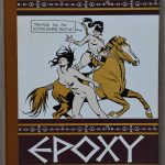
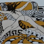
In Belgium, Guy Peellaert had pioneered the comics eroticism with his stories ‘Les Aventures de Jodelle’ (1966) and ‘Pravda, la survireuse’ (1967), while Guido Crepax heralded in the “sexties” in Italy with his ‘Valentina’ (1965). Dutch authors Thé Tjong-Khing and Lo Hartog van Banda released their pop-art inspired graphic novel with the sexy ‘Iris’ in 1968. Cuvelier and Van Hamme’s ‘Epoxy’ fully presented the artist’s qualities for sensual artwork, against a story inspired by Greek mythology. Created in 1967, the album was released by the Paris-based Belgian publisher Eric Losfeld in the revolutionary month of May 1968. It initially didn’t catch much attention, but in later years its historical importance was recognized for being one of the first independent and fully erotic Belgian comics. It has been re-issued in later years by Horus (1977), Marcus (1981), Clue Circle (1985), Éditions Lefrancq (1997) and Le Lombard (2003). German and Scandinavian translations of ‘Epoxy’ were however published without the knowledge and consent of the authors, who consequently never received royalties from these editions.
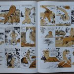
Paul Cuvelier spent the final years of his life in poverty, and in a constant search of artistic fulfillment. A final attempt to pick up ‘Corentin’ was made in cooperation with Jacques Martin, who wrote the script for ‘Corentin et l’Ogre Rouge’ (1973). Cuvelier abandoned the project after the first pages, which were published posthumously in the monography ‘Paul Cuvelier: Corentin et les chemins du merveilleux’ by Philippe Goddin in 1984. Martin later used the plot for the ‘Alix’ story ‘Les Proies du Volcan’ (1978). Jacques Martin also picked Cuvelier as his first choice to draw his historical comics series about French serial killer Gilles de Rais. Cuvelier was however not interested, and was revived by Martin and Jean Pleyers for the series ‘Xan’ (1978, later renamed to ‘Jhen’). Pleyers was Cuvelier’s pupil during his final years. In an interview in L’Est Républicain in 1993, Pleyers recalled squatting with Paul Cuvelier during most of the 1970s, living in “old embassies, surrounded by homosexual drug addicts”. Another assistant of Cuvelier was the Spanish artist Juan Lopez de Uralde, who helped him with the last pages of ‘Corentin et le Prince des Sables’ in the late 1960s. Paul Cuvelier’s final work included some erotic illustrations for Privé magazine in 1975, and the preparations of an exposition with the theme “Fillettes” (“little girls”). The artist however passed away in 1978 in Charleroi at the age of 54 after years of declining health.The extremely large folio edition by Blue Circle is available at www.ftn-books.com

Piet Dirkx cigarbox 772

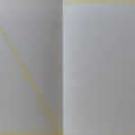
Last week i found at the local bookmarket a special artist book by Hendri van der Putten. The book was made for the exhibition of Hendri in the Apollohuis in 1988.The artist book consists of 16 pages of which 5 are silkscreened with lines across the pages and on the edges…. a very delicate yellow. an exquisite book which is now available at www.ftn-books.com


Piet Dirkx cigarbox 771

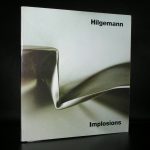
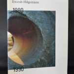
For me Hilgemann was one of the first Zero artists i learned to appreciate, but there is so much more to Hilgemann as an artist. Here is an excellent article i found on Hilgemann at the Borzo site / www.borzo.com
Borzo still sells his works and perhaps now is right the time for Hilgemann.
A child of about six in the war, Ewerdt Hilgemann searches through the rubble of the bombed ruins of his hometown Dortmund for shrapnel. He finds them interesting, exciting too, these sharp-edged metal splinters.
Forty years later, and now an artist, Hilgemann works in the marble quarries of Carrara (1975-1985). A truck transports a perfectly sawn one and a half metre cube of marble that he has carefully polished, to the top and then with a thunderous crash sends it toppling off the steep mountainside. And a marble sphere of a similar size, polished to a perfect sheen, has explosives inserted and is then blown up.
Both conceptual ‘performances’ are recorded on film. The artist creates perfect forms, which are then deformed using forces of nature: a sort of reverse creative process.
Thirty years later, in the summer of 2014, Hilgemann exhibits his Magnum Opus. In response to an invitation from the City of New York he places a series of implosion sculptures on Park Avenue. ‘Dancers’, ‘Triples, ’Flowers’ and ‘Cubes’, six metres high, gleaming in the sun, the deformed surfaces of these Titans of steel distort and reflect the overwhelming architecture of the buildings on each side of Park Avenue.
From his earliest days in a devastated Dortmund to the Park Avenue manifestation in New York, Hilgemann has been consistent in his fascination and his art. In his own words: “To deform a perfect shape without me hammering on it”.
From the start the cube and the square are his best-loved shapes. Hilgemann studies and comes to understand these solid forms. He learns it at the Saarbrucken Art Academy under his tutor Oskar Holweck. (In 1958 Holweck had joined the Zero movement, founded that year by Mack and Piene). Here the young art student Hilgemann learns to respect material and form in their most elementary states. Plasticity is achieved through the effect of light on the surface and the – mathematic – interventions performed thereon by the artist.
In 1970 Hilgemann and his wife Antoinette settle in Gorinchem and here a close friendship develops with Ad Dekkers, Marinus Boezem and herman de vries. In these days Gorinchem is apparently a hotbed for avant-garde art. Irritated – provoked even – by a conservative artistic climate in this small town on the River Merwede, these artists discover common ground for their minimalistic and conceptual ideas.
Their haven at the time is Riekje Swart’s legendary Amsterdam gallery. Hilgemann exhibits his white objects oriented according to mathematical studies here from 1966.
In 1973 the four artist friends – and their partners! – take the initiative for a much discussed and now legendary symposium, whereby the town wants to be a centre for “examining the position of the visual arts in our society”. Fifteen European artists stay together in Gorinchem for six weeks. These include now famous artists such as Kenneth Martin, Morellet, Panamarenko, Pohl, Prantl and Winiarski. Exceptional works of art, lectures and performances fill the town. For Hilgemann ‘Gorinchem’ is an extraordinarily significant period in which his art reaches full maturity and he also establishes his international orientation.
Hilgemann produces his first sculpture created through implosion in 1984 for the exhibition “Beelden aan de Linge” by collector Piet Cleveringa from the neighbouring town of Acquoy. He moves to Amsterdam the same year and from that moment on this visual language of imploded constructions will always typify the art of the ‘air-smith’ Ewerdt Hilgemann.
m has some Hilgemann publications available.

Piet Dirkx cigarbox 770

Just received a message from Giovanni Nicolai, that he will be exhibiting in Milano some of his most recent works together with some fellow artist in the ARTE NON FALSIFICATA exhibition at the SO gallery in Milan. The exhibition will be open until the 17th of November.