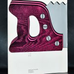
Piet Dirkx cigarbox 844
Piet Dirkx cigarbox 844

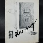
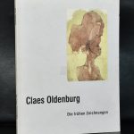
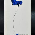
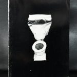
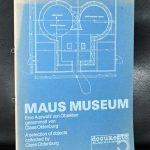
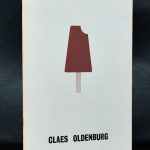
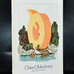
When at auction, i noticed a “lot” with early Oldenburg publications . Most from the sixties an all from renowned galleries like Sonnabend, Sidney Janis and the Margot Leavin gallery. His works do always mean something special to me , because of their scale they instantly impress and make you want to touch these beautiful works. Still the best way to make yourself familiar with these works is to study them out of a book, because of their extremely large size you must travel a lot to get a great overview of the most famous Oldenburg sculptures. It is easier to buy some classic Oldenburg books at www.ftn-books.com
and to make it easier ….use the code : Oldenburg for a 10% discount on all items listed on FTN books this week ( 12/11/18 – 12/18/18)

Piet Dirkx cigarbox 843

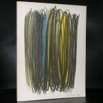
Perhaps he wasn’t the greatest dutch artist that ever lived, but still Veldhoen deserves his place in art history . He was the artist who almost “commercially” destroyed himself, by making his prints available for ALL and in someway inventing the multiple for the masses.
He drew his subjects directly on the plate and made rotaprints from these plates. Used cheap papers and sold these prints, which were not signed nor numbered from a cart run by Robert Jasper Grootveld for the extremely small amount of 3 dutch guilders. It meant that with so many works by Veldhoen on the market, his paintings and drawings were not valued as they should be.

Aat Veldhoen was a well known and colorful figure in the dutch art scene and had a 20 year relationship with Hedy d’Ancona, the former minister of Culture from the Netherlands.

Piet Dirkx cigarbox 842

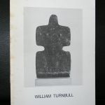
In some ways the stone sculptures of William Turn bull remind of the ones i saw last year by the late Joost Barbiers. Rough pieces of stone, worked over in a way that a different object is created and which blends with its surroundings.


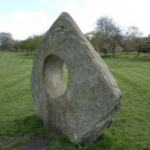
( above right is by Barbiers)
But where Turnbull developed his art into a colorful and sometimes joyful abstract modern art. Barbiers stayed sombre and kept working over the rough pieces of stone. Both i appreciate but in the longterm i would like to have an original Barbiers only for the outside and place it in the garden and let it blend with nature, whereas an original Turnbull would be admired and cherished inside the house and becoming an important part of the collection of Modern Art.
In 1952, he was included in the Young Sculptors exhibition at the Institute of Contemporary Arts (ICA) which had become the focal point for new art in London. Turnbull, along with Paolozzi ( a colleague and fellow art student)and Richard Hamilton and others, became a member of the Independent Group, a splinter group within the ICA which became an important forum for discussion and debate. The Independent Group has been cited as a progenitor of Pop Art, but soon after Turnbull was far from being another British Pop Art artist, going his own way and developing an art and style of his own.
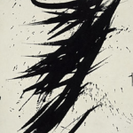
Unknowingly Turnbull must have had a great influence on another dutch painter. Willem Hussem must have been inspired by Turnbull’s paintings since some of his compositions use the same patterns and colors.
and Willem Hussem
There are some nice early William Turnbull publications available at www.ftn-books.com

Piet Dirkx cigarbox 841

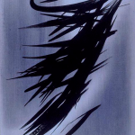
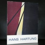
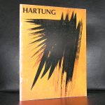
One of the exhibitions i thought to be one of the very best during the time i was working at the Gemeentemuseum Den Haag, was one curated by Franz Kaiser on the abstract artist Hans Hartung . Just one word describes the exhibition….impressive.
It showed that the art Hartung created was not just random, but a well thought over creation of abstract art in which a small sketch was turned into a large painting.
Here is the text on the exhibition:
Hans Hartung (b. Dresden, 1904) was regarded as one of the founding fathers of French Lyric Abstractionism, the European counterpart of American Abstract Expressionism: a term in which the word Expressionism refers to an extremely physical and spontaneous manner of painting. The members of the movement wanted, as it were, to work out their emotions on the canvas without any form of symbolism.
Hartung’s paintings displayed a plain ground covered with rough and apparently spontaneous brushwork, with all the paint spatters and brush marks that go with that way of painting. After his death, therefore, people were astounded when the study of unfinished pictures revealed that his paintings had not in fact been created in a wild and spontaneous way, but by carefully filling in predetermined outlines based in every detail, right down to the smallest flecks of paint, on sketches prepared in advance. This exhibition, which the Gemeentemuseum is holding to mark the hundredth anniversary of Hartung’s birth, reveals an artist who would better be described as a conceptual artist, were it not for the fact that conceptual art did not exist as a movement when he produced his works. In this first Dutch retrospective of Hans Hartung’s work, early drawings are presented next to the equivalent paintings, and early versions alongside later versions. The similarities in terms of motif are astonishing.
More about Hans Hartung: www.fondationhartungbergman.fr
There are some nice publications on Hartung available at www.ftn-books.com


Piet Dirkx cigarbox 840

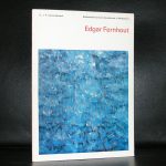
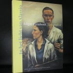
Edgar Fernhout comes from an interesting background. His grandfather was Jan Toorop and his mother Charley Toorop. This meant he was raised among artists and writers. An inspiring surroundings in which art took centre stage. He specially moved to Bergen after the divorce of his mother , where his grandfather has built the house/studio de VLERKEN specially for the family of his daughter to raise her children and create her own works of art. The interesting part of Fernhout for me personally was his transition from realism into abstract art. Fernhout being one of the first in the Netherland together with M0ndrian to discover abstract art as a genre.
the other aspect i like of his history is that when he received his first large museum presentation in the Netherlands at the van Abbemuseum , the catalogue with exhibition was designed by Wim Crouwel. This being one of the first publications he made for a large museum in the Netherlands. This catalogue is of course available at www.ftn-books.com