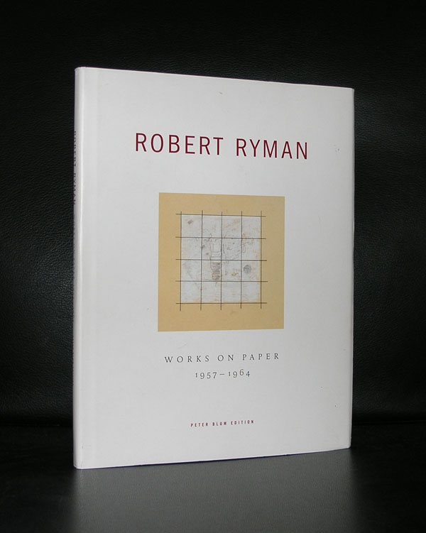
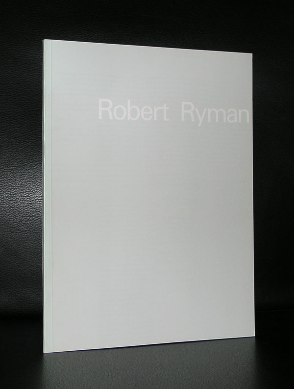
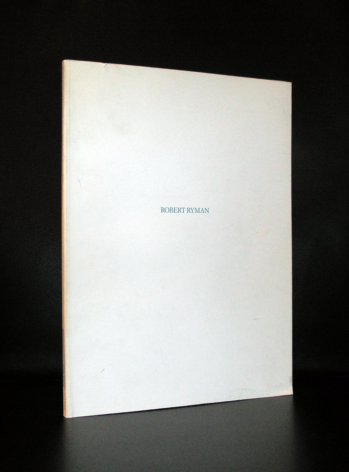
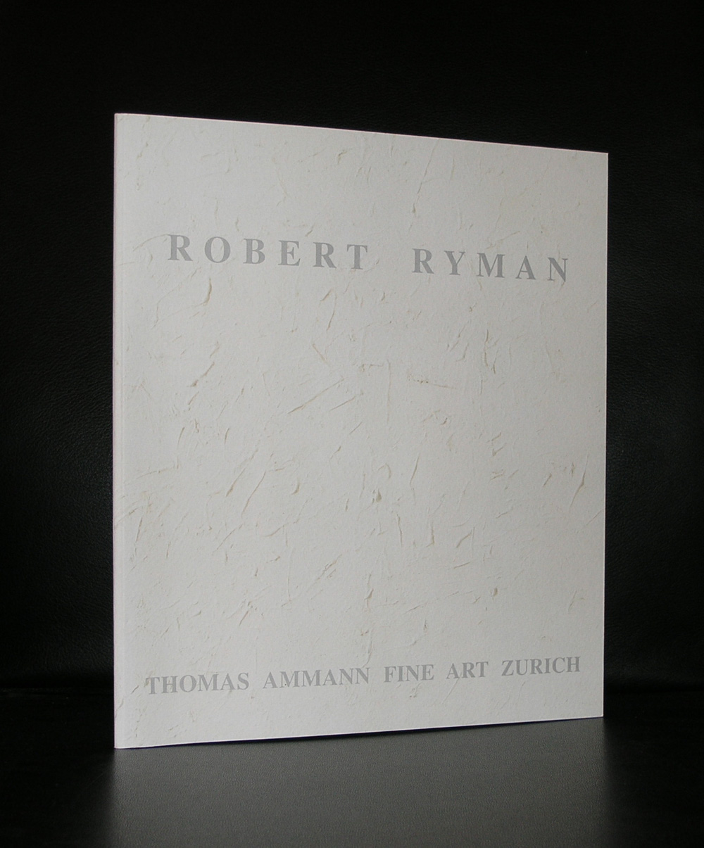
People who follow this blog know of my admiration for Minimal Art and for me Minimal Art includes the work by Robert Ryman. I hesitated to start with this sentence because many believe Robert Ryman is not a Minimal painter but more of a painter who makes monochrome works of art. Still ,when searching on Google for Ryman he is by many categorized as “Minimal”.
Often allied with Minimalist, Conceptual Art, and Monochrome Painting, Robert Ryman has painted works in which theme and medium are one. A majority of his paintings feature only white or off-white paint on square canvases, varying in scale and texture and draw the eye toward the nature of the brush strokes and the depth of paint. To further heighten the effect of subtle variations in technique, Ryman manipulates how each work is hung on the wall, playing with the frames themselves as well as with each painting’s distance from the wall. For example, the eleven-panel Vector (1975/1997) comprises 11 wood units of the same size painted in white and hung equidistant from one another, the empty spaces on the walls between the panels echoing the nuanced texture and forms of the panels themselves. A great painter and one of the last from his generation of Minimal artists. www.ftn-books.com has some nice publications on Ryman available.
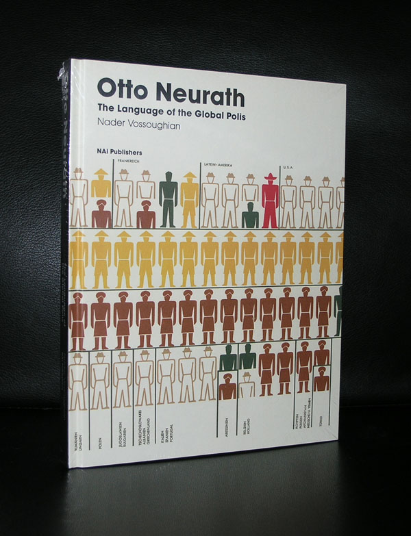
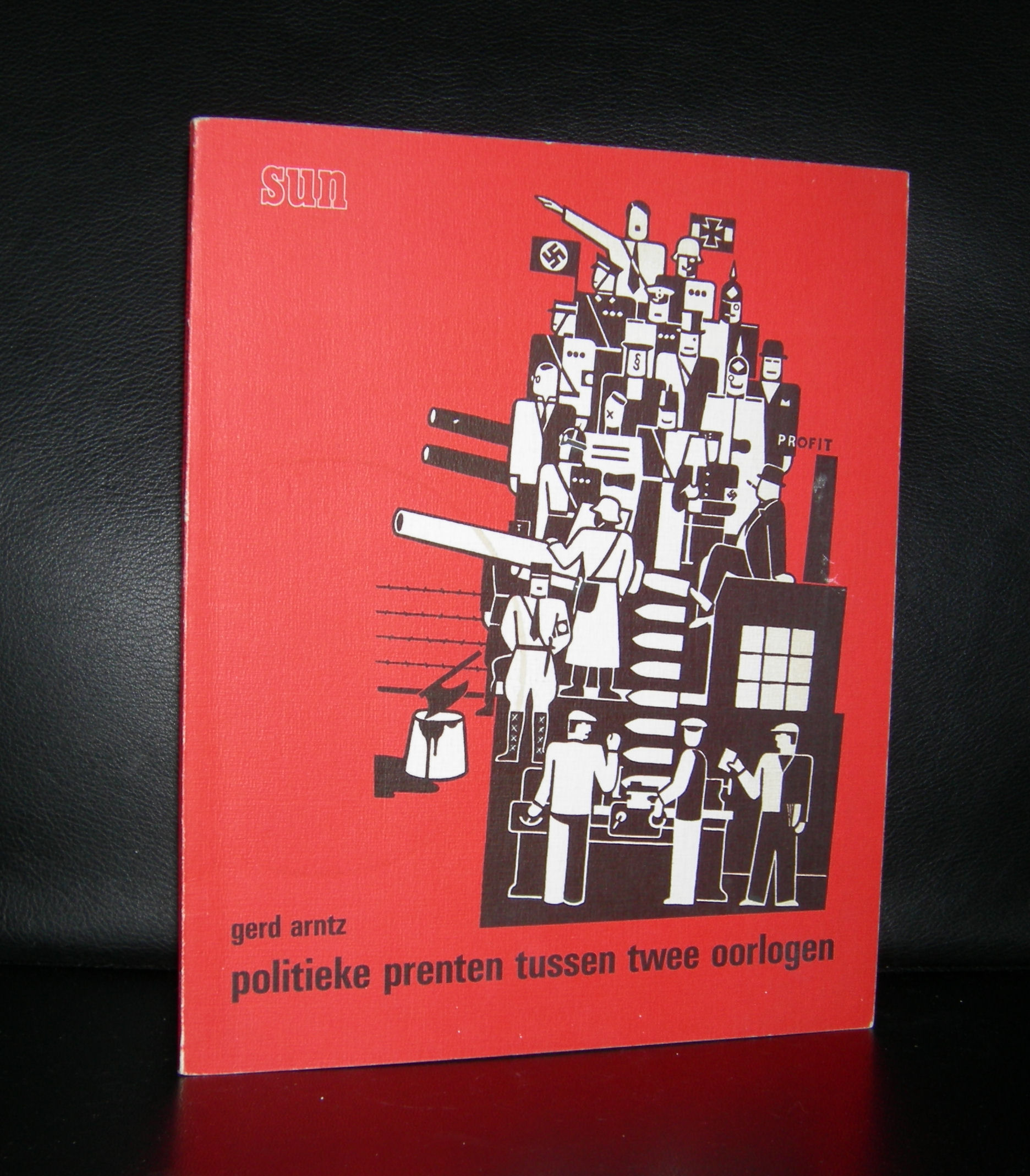
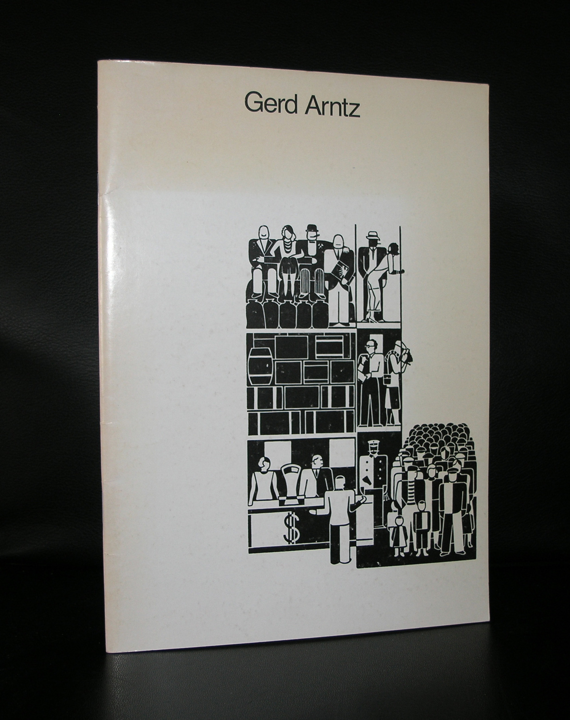
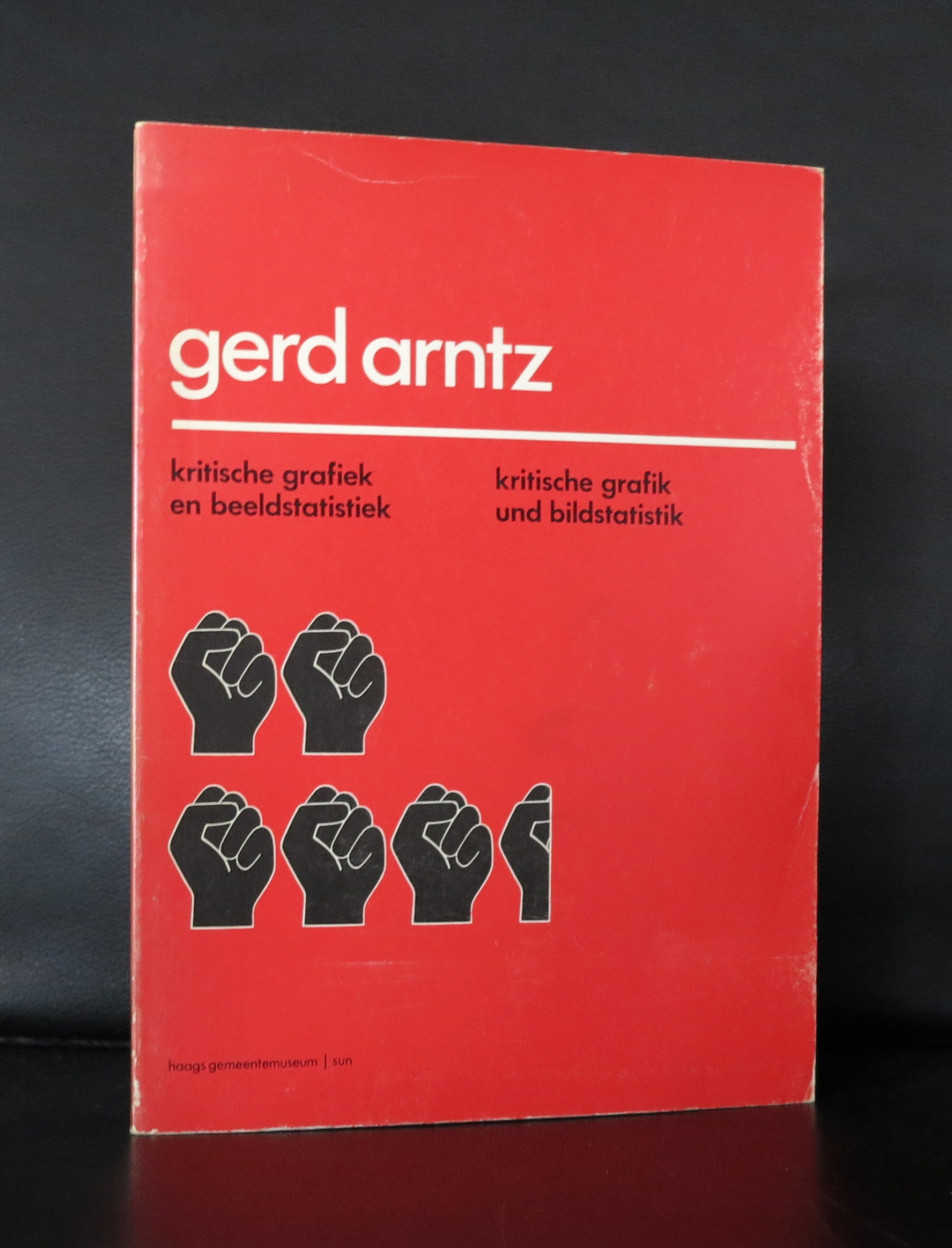
Otto Neurath was the first, but together with Neurath, Arntz is considered to be one of the founders of Isotype. A simple word for ISOTYPE is pictogram and he made over 4000 of them. Gerd Arnyz is even in our days considered to be one of the great inventors of the pictogram. The strength is that one can immediately see the meaning of the picture/pictogram and in relation to numbers and other pictograms.
Picture from www.gerdarntz.org
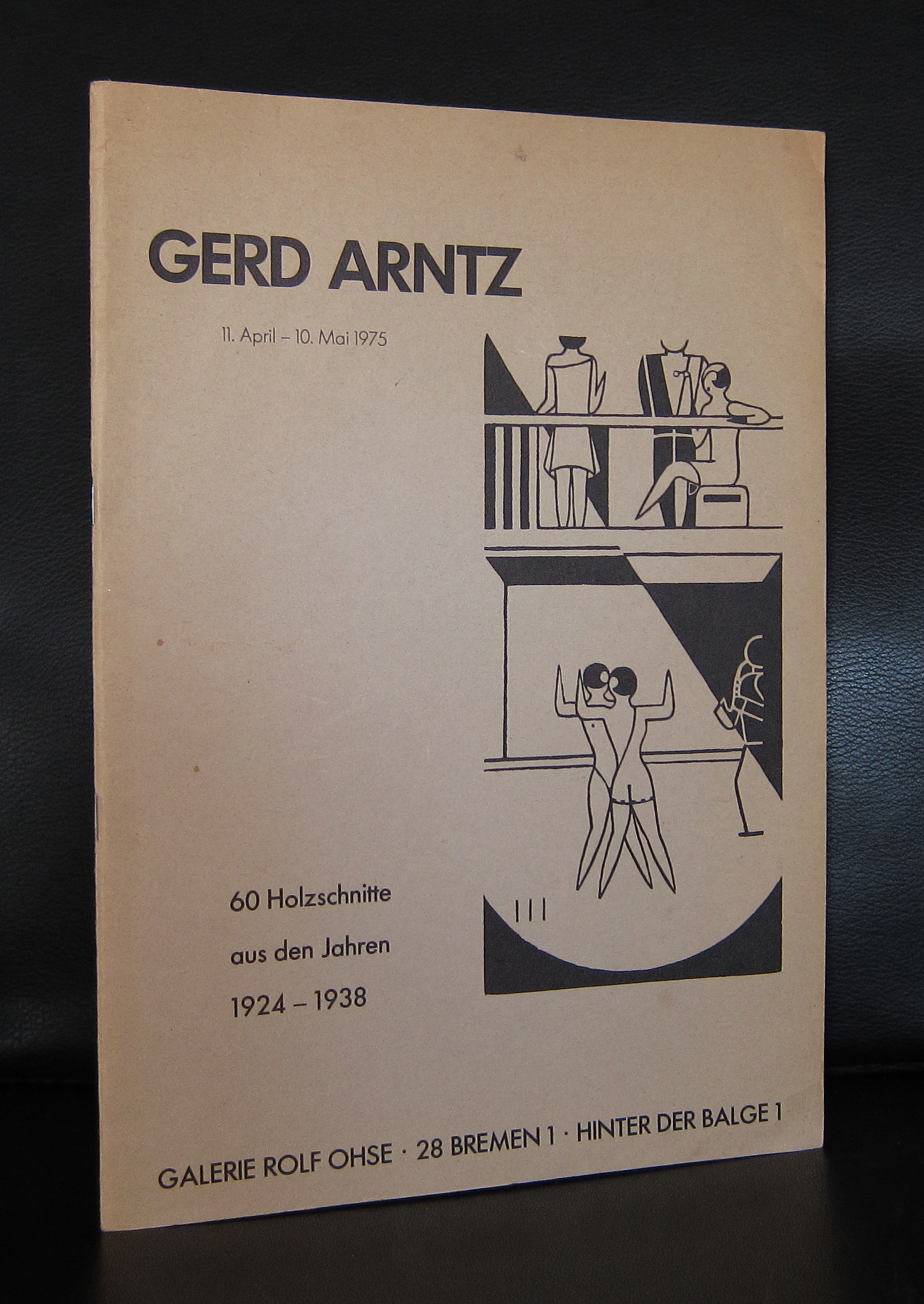
Because he opposed to the Nazi party in Germany and made some political drawings and statements against them, he fled to Den Haag in 1934, where he joined Neurath and Reidemeister. The three of them became extremely productive and it is in the Netherlands that most of his books, pictorial statistics and pictograms were published. Living and working in Den Haag, Arntz was familiar with its museum and for this reason the Haags Gemeentemuseum could acquire a large collection of his works and still on the book markets, when looking thoroughly, you can even find some nice publications, but this is getting harder and harder each year. www.ftn-books.com has some nice publications and the book ZEVEN HOOFDZONDEN in which an original woodcut by Arntz is published together with 6 other originals.
OLYMPUS DIGITAL CAMERA
OLYMPUS DIGITAL CAMERA
OLYMPUS DIGITAL CAMERA
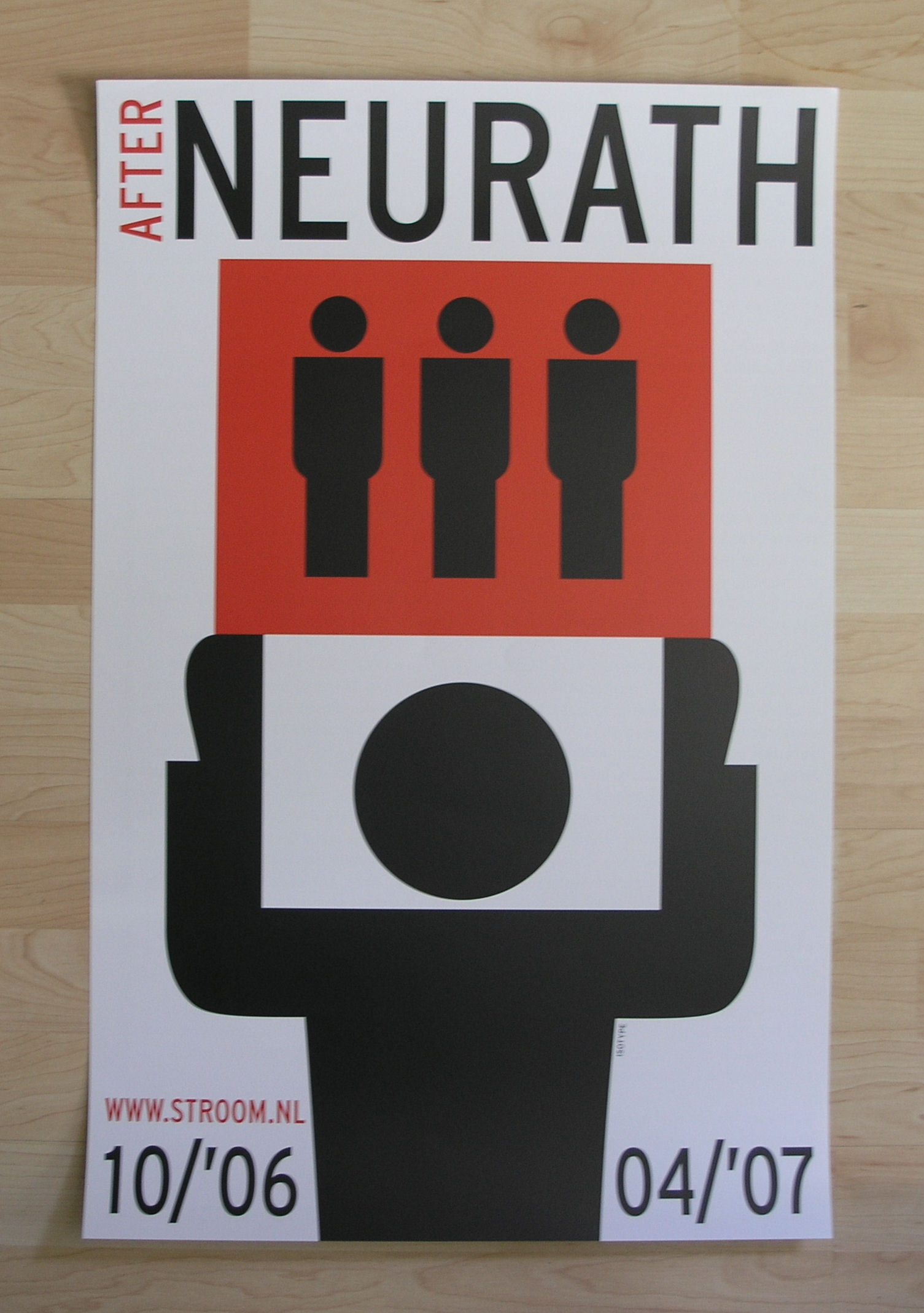
It was about 10 years ago that STROOM had a nice exhibition on Arntz and Neurath and they made a spectacular poster for the exhibition which is also available at www.ftn-books.com
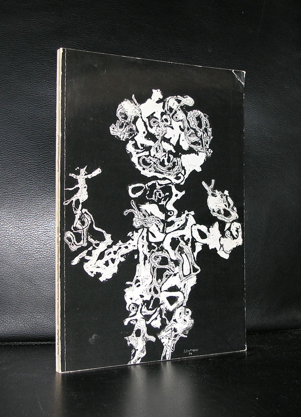
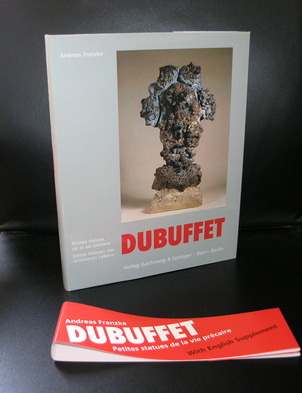
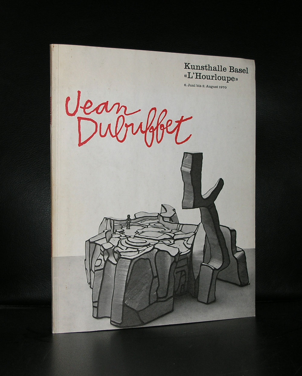
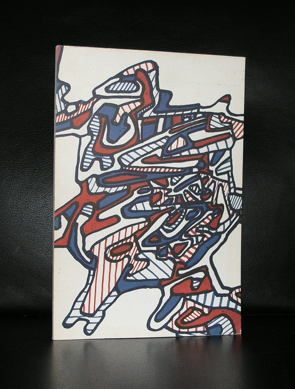
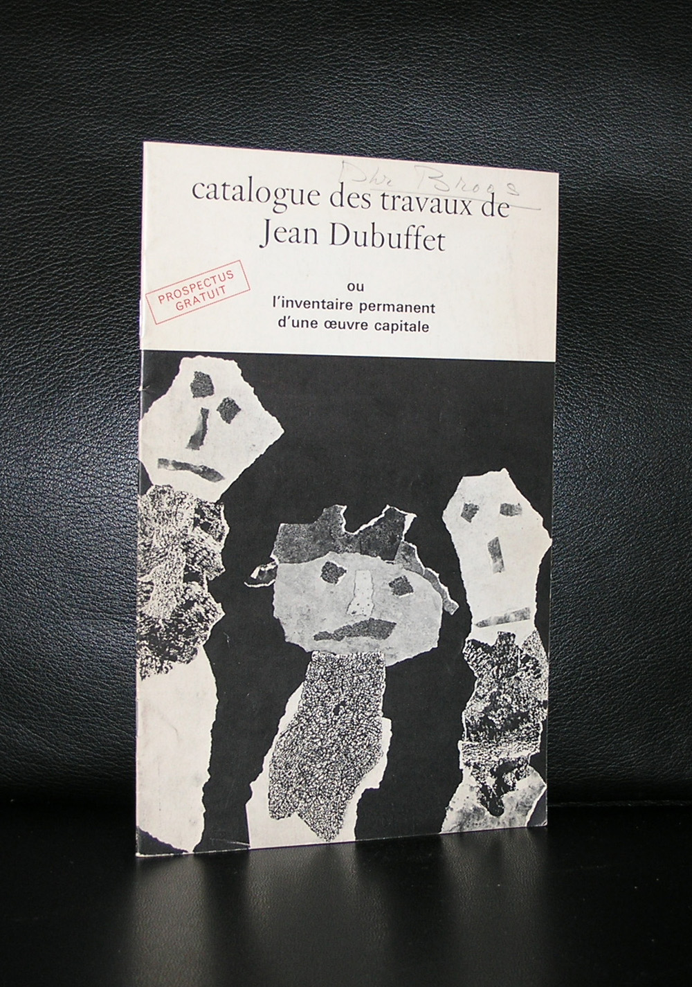
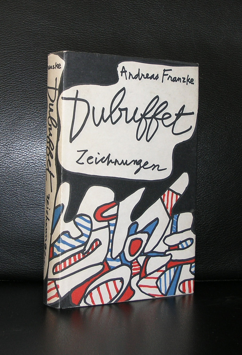
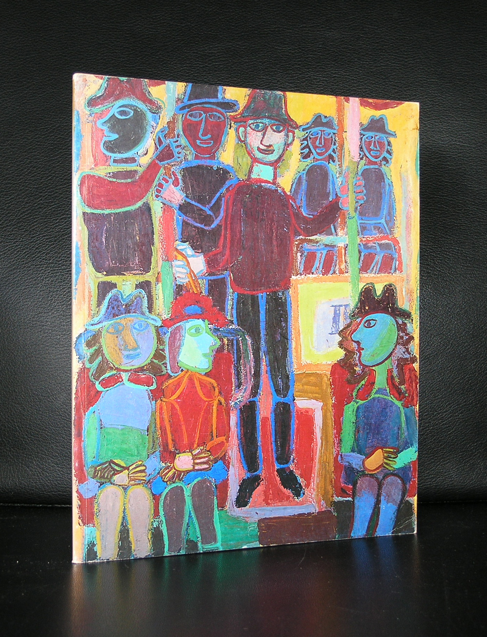
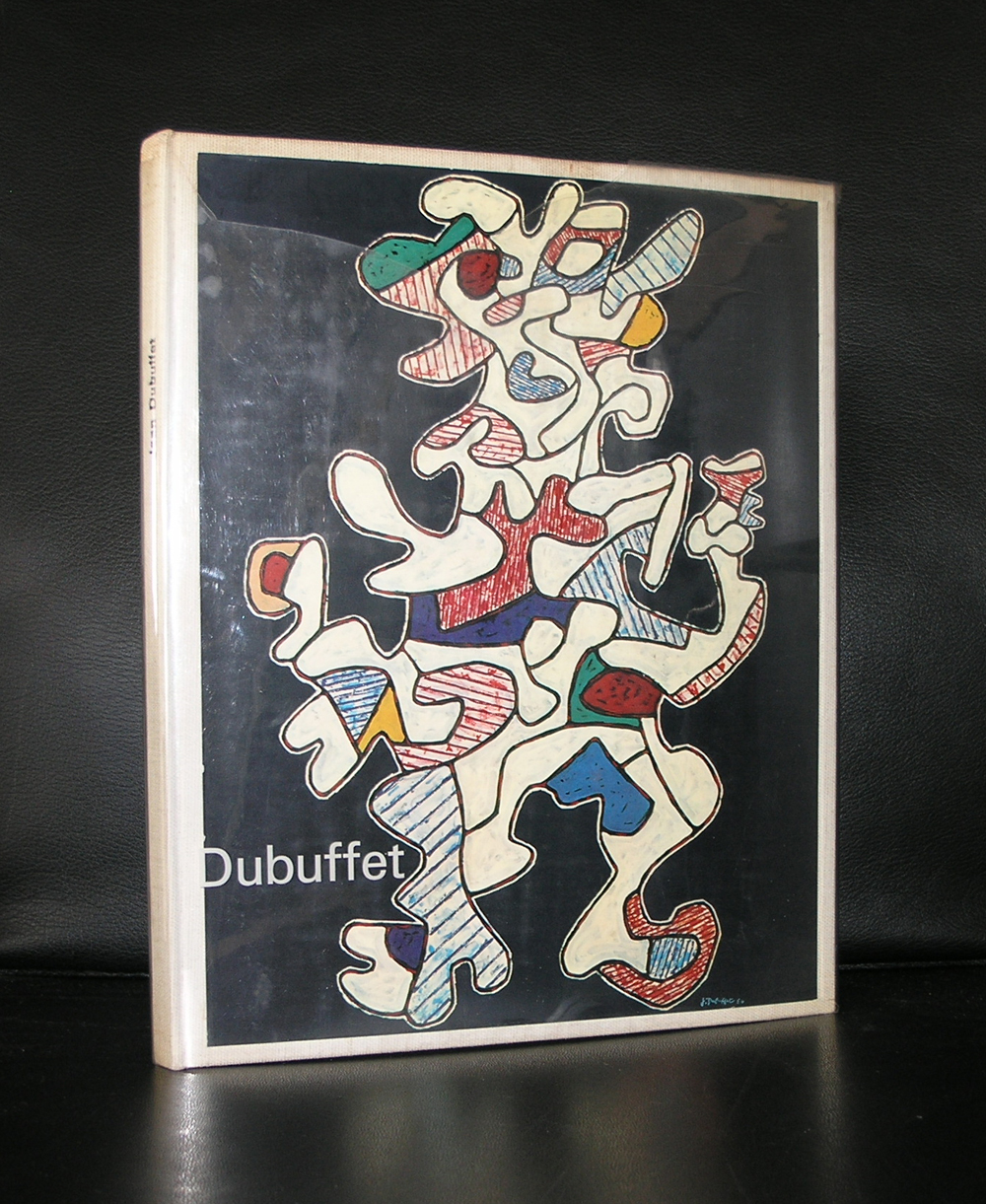
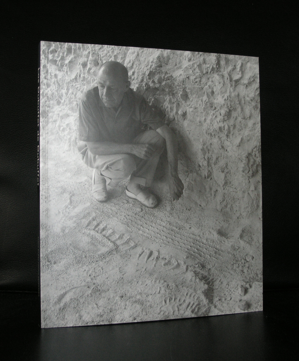
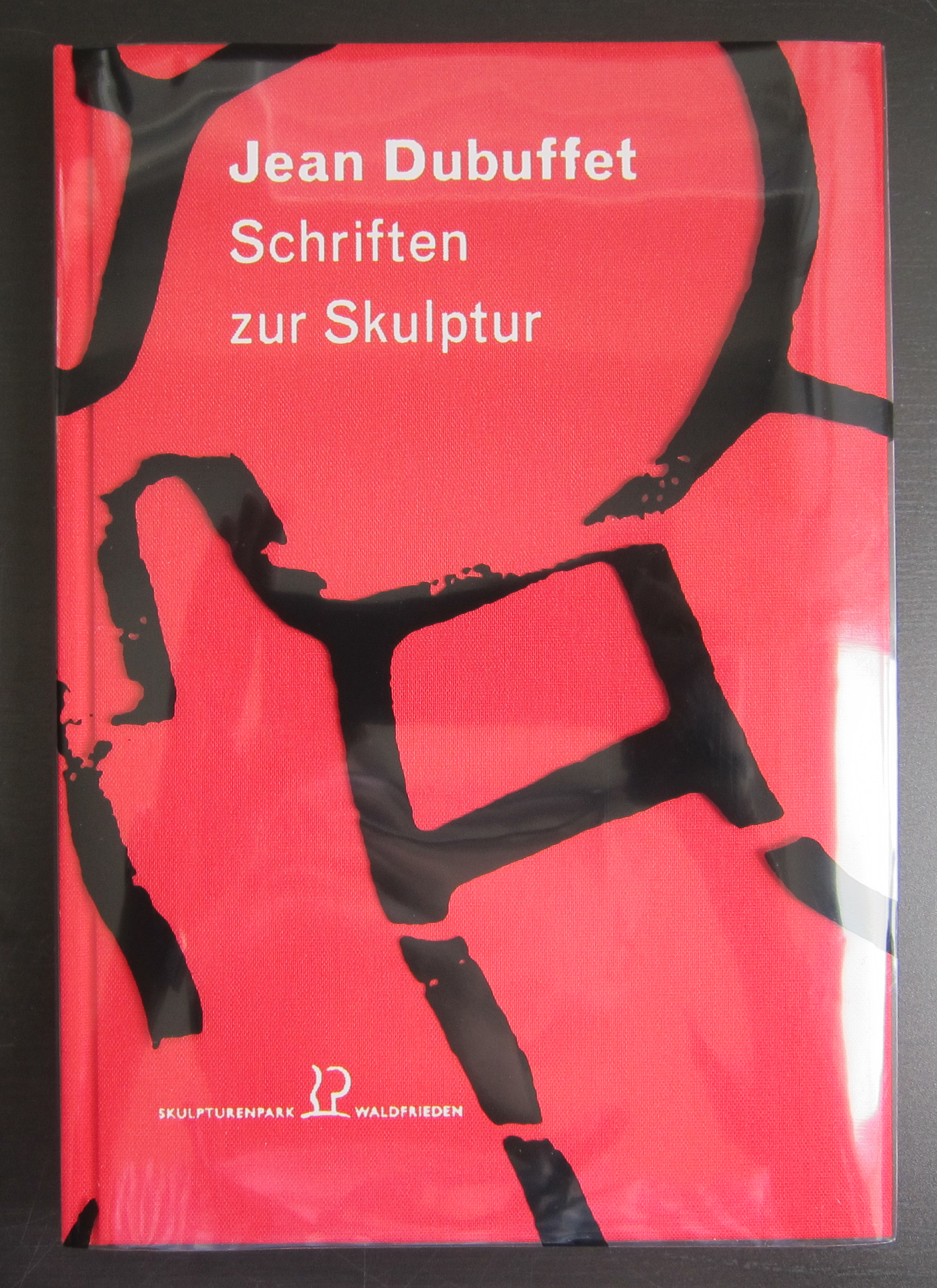
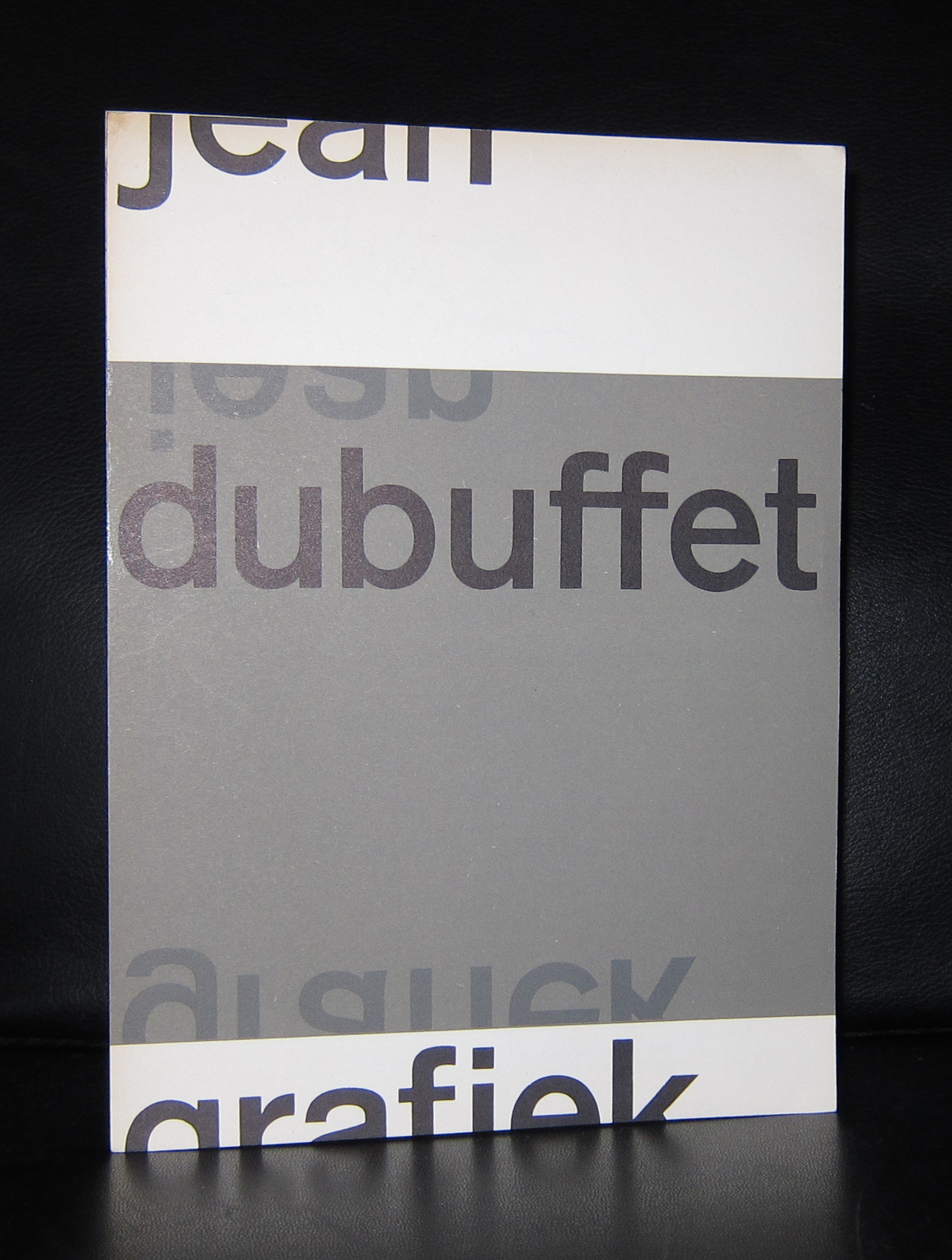
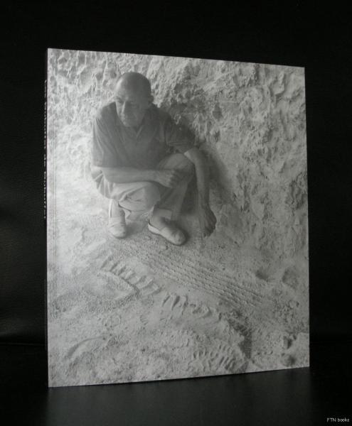
It was early February that we visited Paris and ended our 3 day’s in this city with a visit of the Musee des Arts Decoratifs, Situated next door to the Louvre it is much less known, but the reason to visit was the Bauhaus exhibition which was held over there. However , it was not the Bauhaus exhibition , but de exquisite Dubuffet collection which won me over. Because www.ftn-books.com has a large inventory of Dubuffet publications ( 24 available items) i searched for this blog the internet and found a great short synopsis on this Art Brut artist.
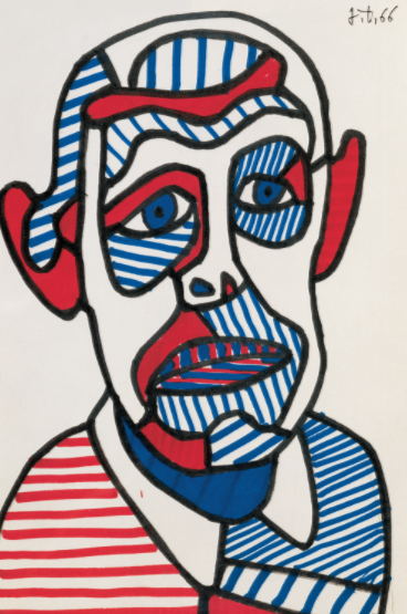
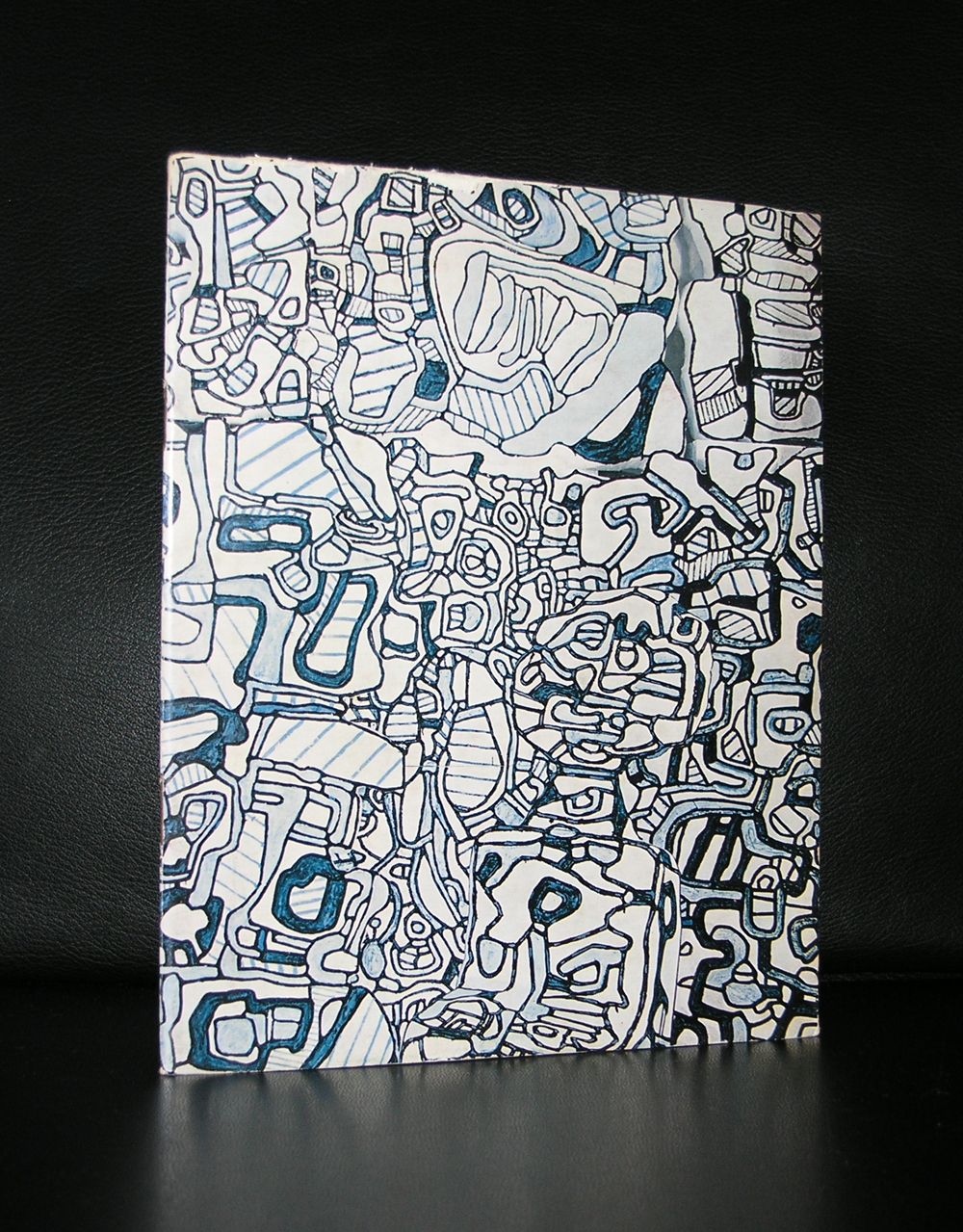
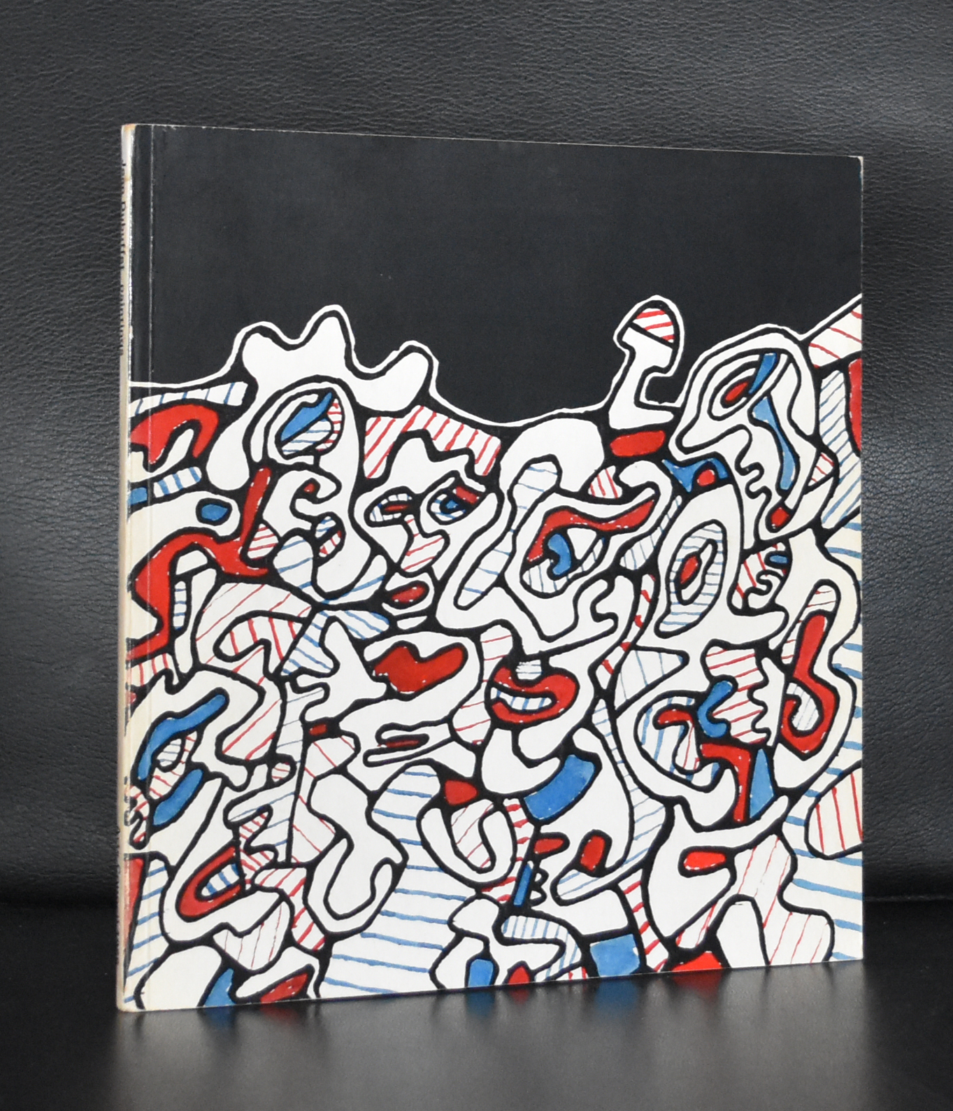
Jean Dubuffet disliked authority from a very early age. He left home at 17, failed to complete his art education, and wavered for many years between painting and working in his father’s wine business. He would later be a successful propagandist, gaining notoriety for his attacks on conformism and mainstream culture, which he described as “asphyxiating.” He was attracted to the art of children and the mentally ill, and did much to promote their work, collecting it and promulgating the notion of Art Brut. His early work was influenced by that of outsiders, but it was also shaped by the interests in materiality that preoccupied many post-war French artists associated with the Art Informel movement. In the early 1960s, he developed a radically new, graphic style, which he called “Hourloupe,” and would deploy it on many important public commissions, but he remains best known for the thick textured and gritty surfaces of his pictures from the 1940s and ’50s.
Key Ideas
Dubuffet was launched to success with a series of exhibitions that opposed the prevailing mood of post-war Paris and consequently sparked enormous scandal. While the public looked for a redemptive art and a restoration of old values, Dubuffet confronted them with childlike images that satirized the conventional genres of high art. And while the public looked for beauty, he gave them pictures with coarse textures and drab colors, which critics likened to dirt and excrement.
The emphasis on texture and materiality in Dubuffet’s paintings might be read as an insistence on the real. In the aftermath of the war, it represented an appeal to acknowledge humanity’s failings and begin again from the ground – literally the soil – up.
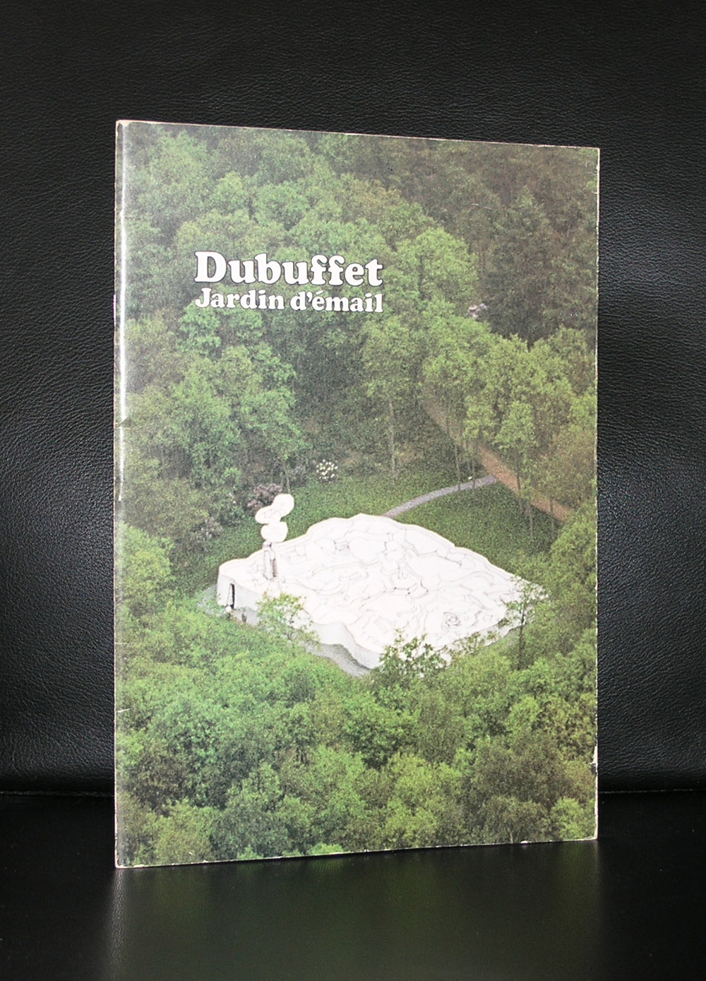
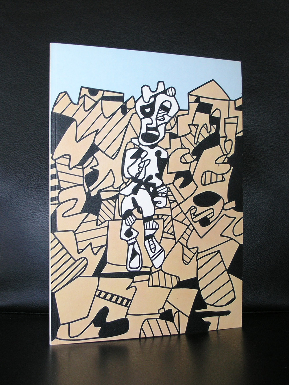
Dubuffet’s Hourloupe style developed from a chance doodle while he was on the telephone. The basis of it was a tangle of clean black lines that forms cells, which are sometimes filled with unmixed color. He believed the style evoked the manner in which objects appear in the mind. This contrast between physical and mental representation later encouraged him to use the approach to create sculpture.
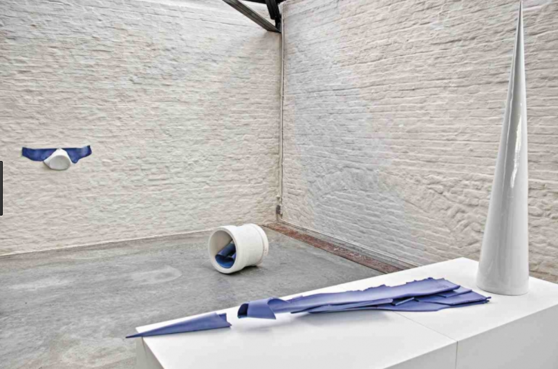
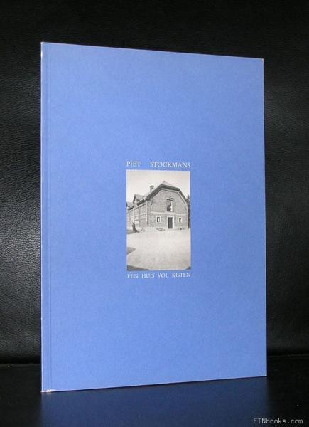
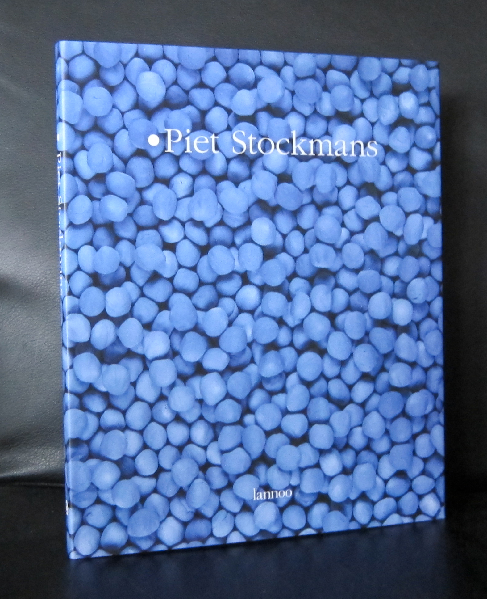
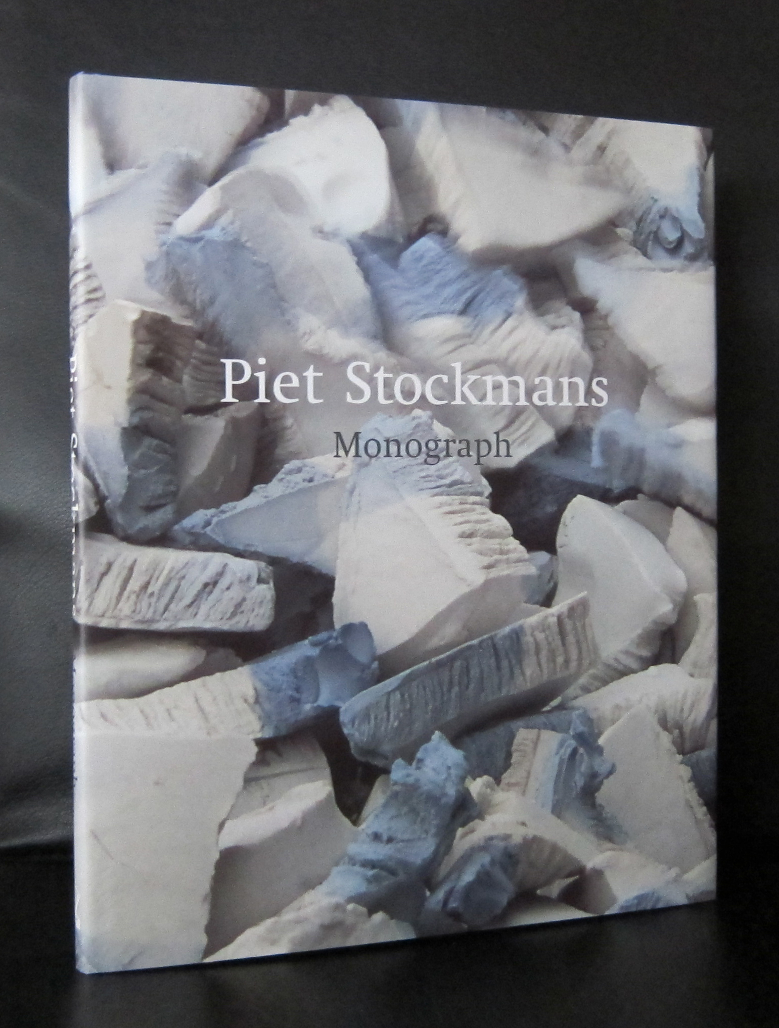
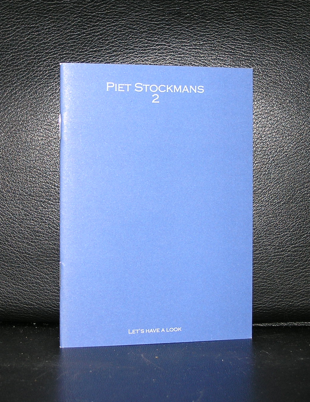
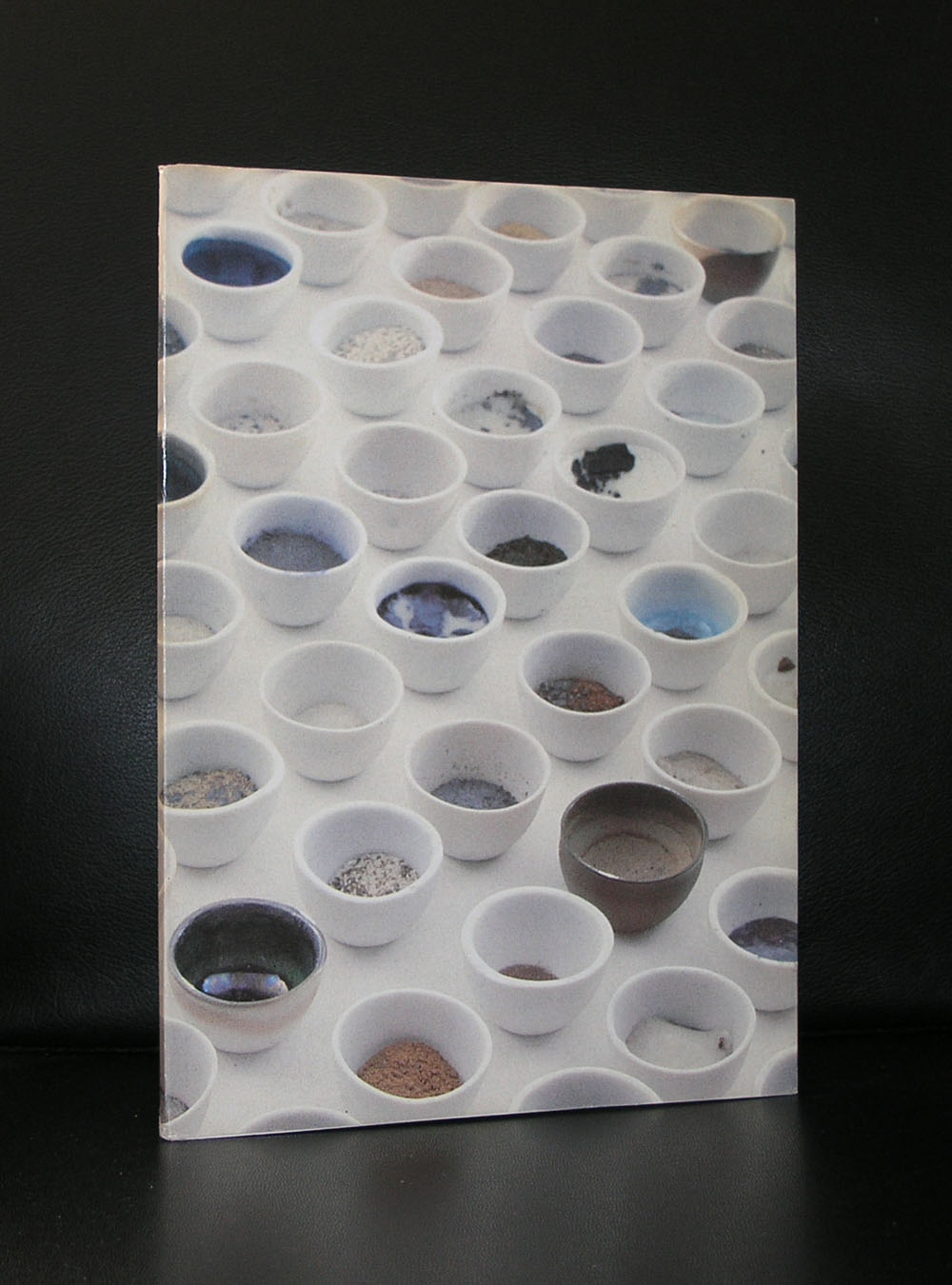
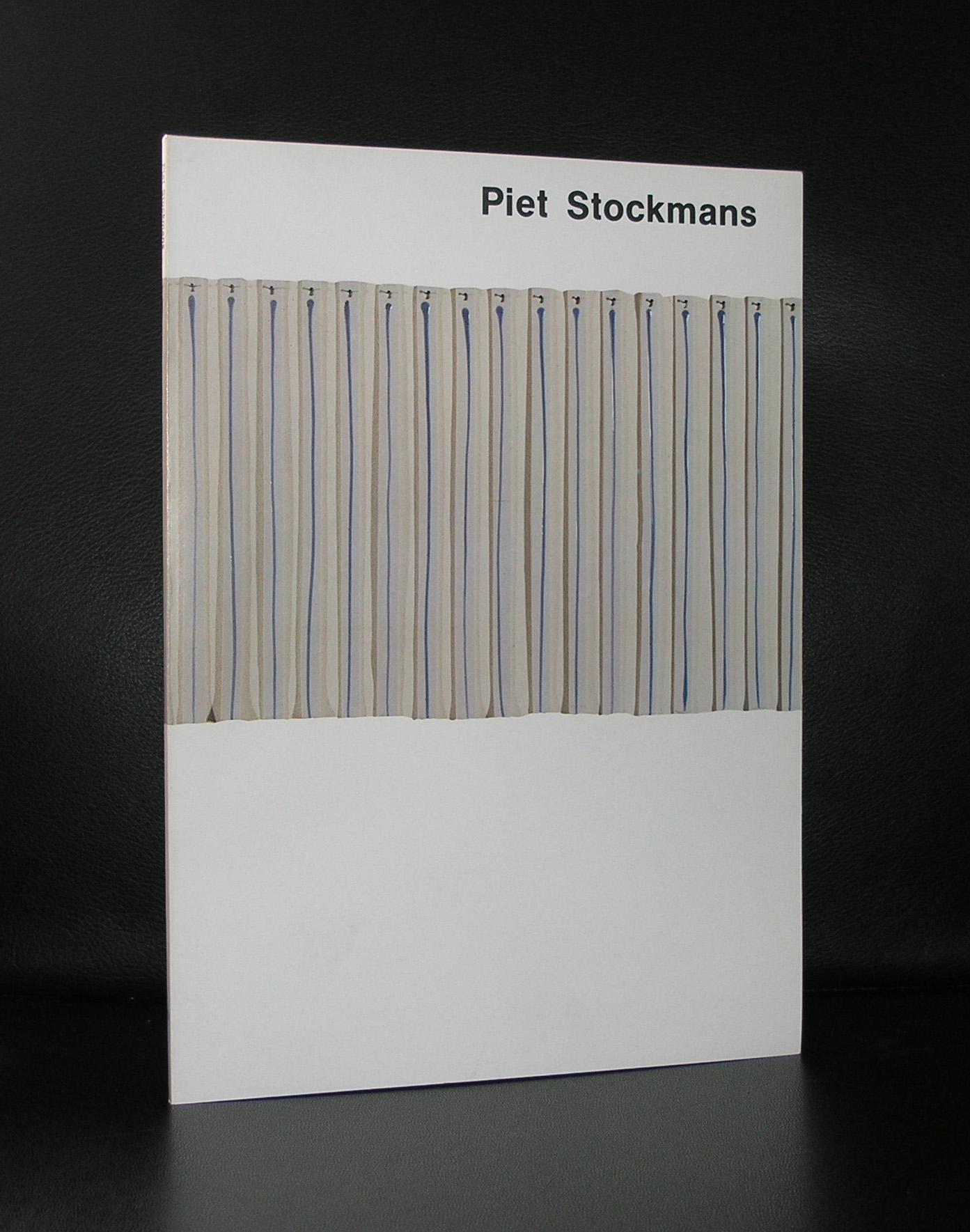
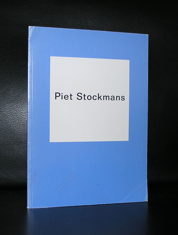
We were only 3 in Den Haag who offered the small studio ceramics by Piet Stockmans and now only one is left ( Toegepaste Kunst/ Valkenbosplein, Den Haag). The shop in the Gemeentemuseum Den Haag, Toegepaste Kunst and Studio 40 sold these little ceramic art objects. White or pale blue they made an everlasting impression when you first see them. Stockmans started his career at Koninklijke Mosa in Maastricht where he worked from 1966 until 1989. After that period he worked for himself and his studio became world famous among ceramic art collectors all over the world and many of them visited his studio in Genk. Stockmans has become a very successful ceramic artist who’s works are sold all over the world, which makes him not only as an artist successful, but also commercially his products are a huge success. One aspect of his designs deserve special attention. He has designed and made porcelain for many of the great chefs in Europe.
Of course www.ftn-books.com has some nice examples of his publications . Browse through them and you will notice that beside his commercial porcelain there are some very nice and breath taken ceramic unique works.
There are many publications of Magnum associated photographers to be found at www.ftn-books.com, but there is one very special one which i would like to emphasize in this blog. There is the publication from 1963. One of the last to be designed by Willem Sandberg and a catalogue for the first of the many MAGNUM exhibitions to be held in the Stedelijk Museum Amsterdam. The SM has a long history with Magnum photography, but this was one of the first to be held in a major museum and because of its design and simplicity it has become a highly desirable and collectable catalogue. The Stedelijk Museum continued to present the Magnum photographers throughout the decades to come , resulting in the 2008 exhibition to commemorate the 60 years of the Magnum agency, but the 1963 is the first and most important one within the series of publications on Magnum and the Stedelijk Museum. Next year the agency will celebrate its 70 years of existence, perhaps a new exhibition in the Stedelijk………..?
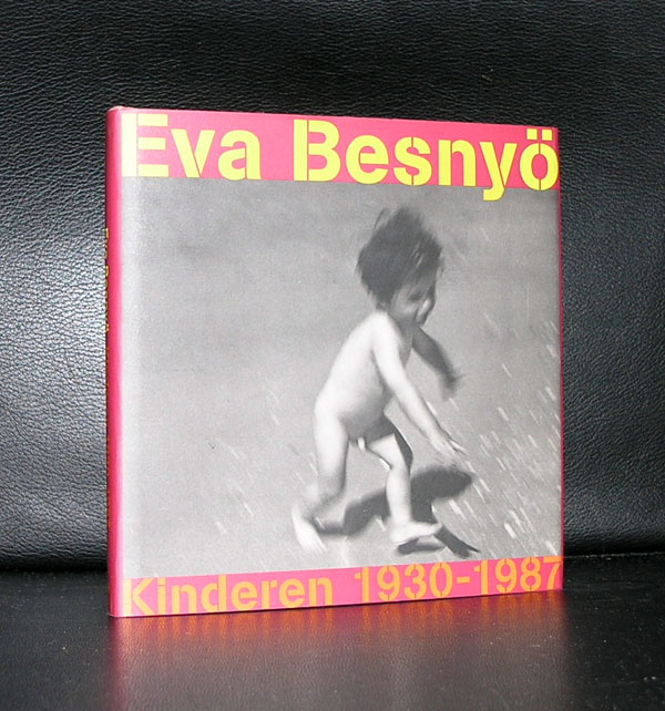
Eva Besnyö has reached a very high age and stayed active in photography for almost her entire life. It was not until her children had left the house, she took up photography again and started to make a name for herself with photographing the feminist movement of ” DOLLE MINA” in the early seventies. This made her quit famous in the Netherlands and with this recognition her older photographs of portraits and architecture were appreciated again too. Since she has had multiple exhibitions in the Netherlands and abroad and is now considered with Oorthuys, Andriesse, Diepraam and van der Elsken to be the photographers that photographed the Netherlands and its society after WWII.
There are some Eva Besnyö publications available at www.ftn-books.com
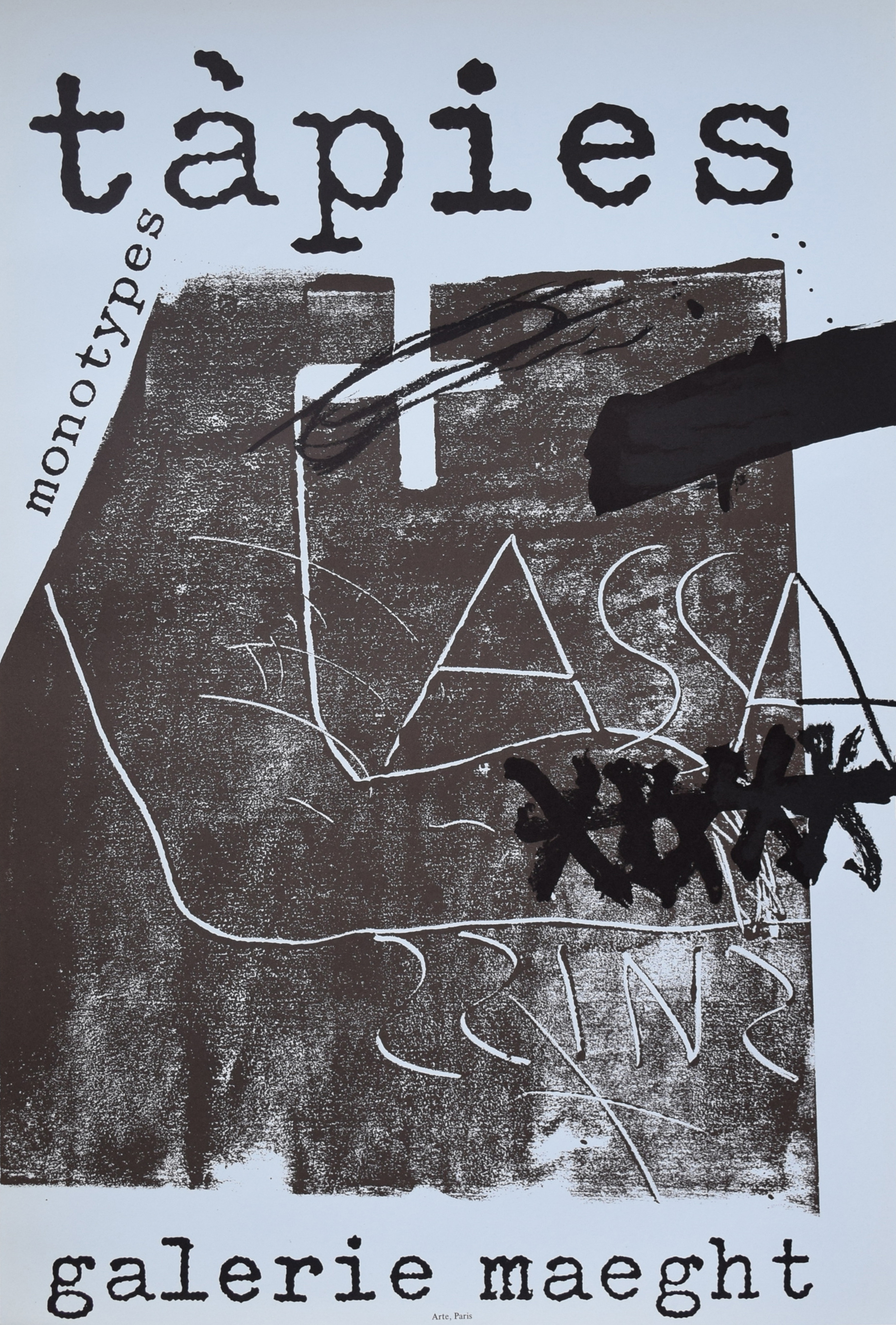
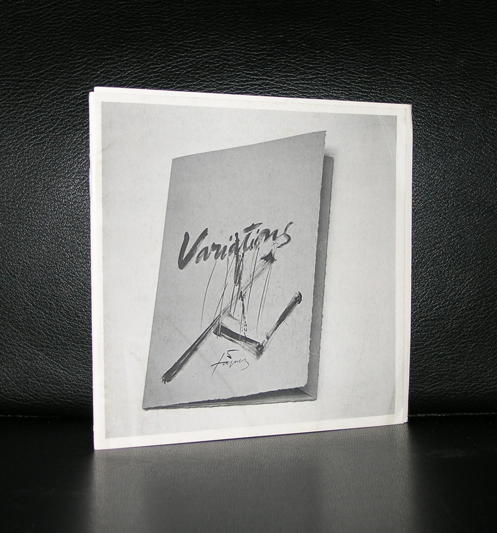
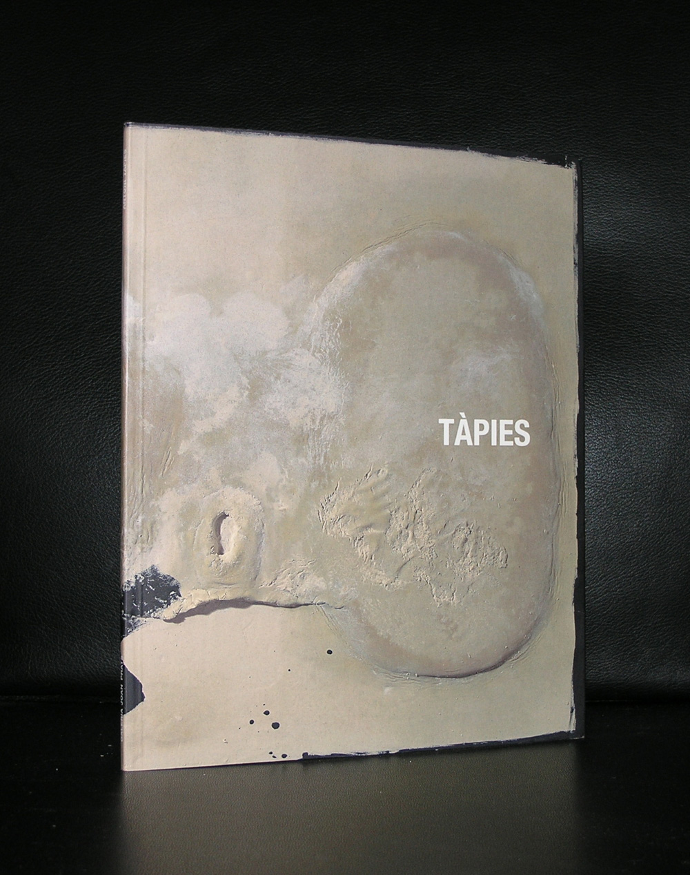
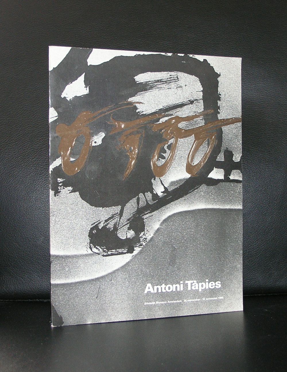
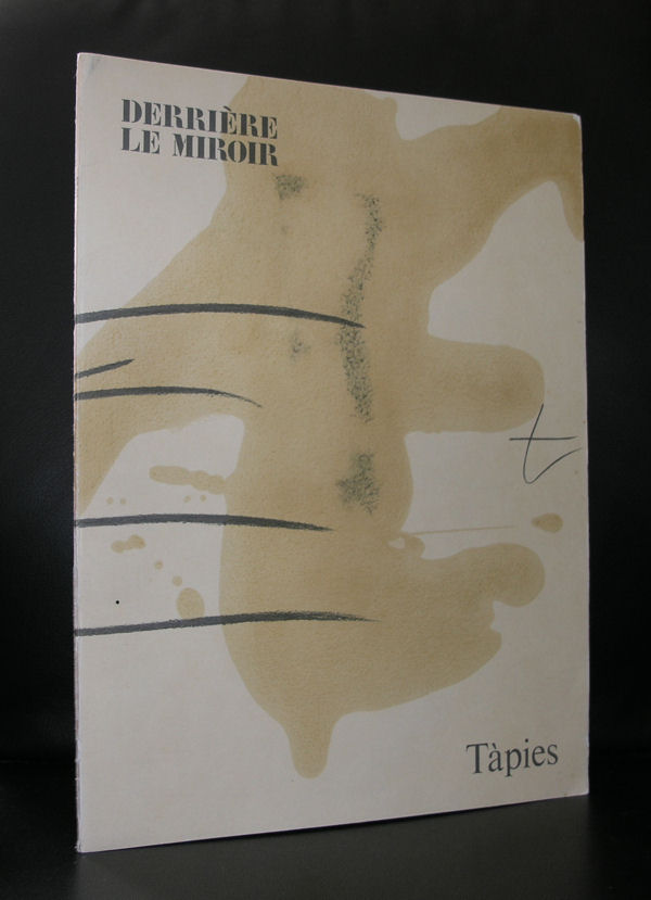
It must have been some 12 years ago that i first visited Barcelona and found myself amazed and surprised by this city full of Gaudi and other modernista marvels, but the best find for me was the discovery and first visit of the Fundacio Antoni Tapies.
The building itself is already worth visiting and the inside is even more spectacular. An old facade houses a very modern museum inside which houses the works donated by Antoni and Theresa Tapies. I loved its collection and it proved to me that Tapies his art is timeless, very spanish and cosmopolitan at the same time. Tapies is possibly , next to Picasso and Dali , the most important spanish name in Modern Art. He often uses large canvasses and on them paints with “earth” colors impressive abstract compositions and uses matter in them.
In these matter paintings , the materials used are no longer simple media used to express an idea; they are the idea itself. That process produces a complete identification between material and form, between concept and language. Those works become opaque surfaces, walls on which the artist writes his graffiti and attaches the forms of objects or people. His identification with the work through his surname (in Catalan Tàpies means “walls”) expresses a more profound desire to break with Western dualism and blend with the material in a continuous formlessness.
Over the post-war years there was a general interest among artists on both sides of the Atlantic in material. Awareness of the atomic bomb and the new scientific discoveries aroused a strong curiosity in science, the new ideas about space-time and substance, while inventions such as the electronic microscope provided a new view of nature.
At the same time, Tàpies had developed an interest in Eastern philosophy, because of its emphasis on material, the identity between man and nature and its denial of the dualism of our society.
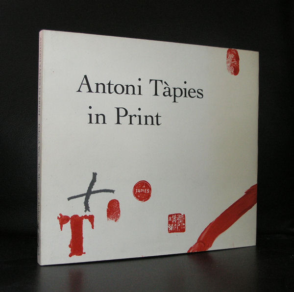
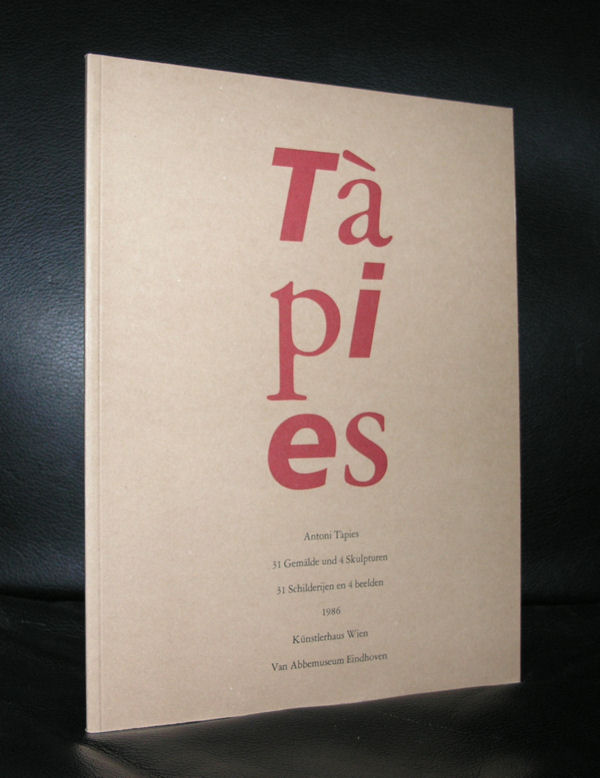
There are some excellent Tapies publications available at www.ftn-books.com
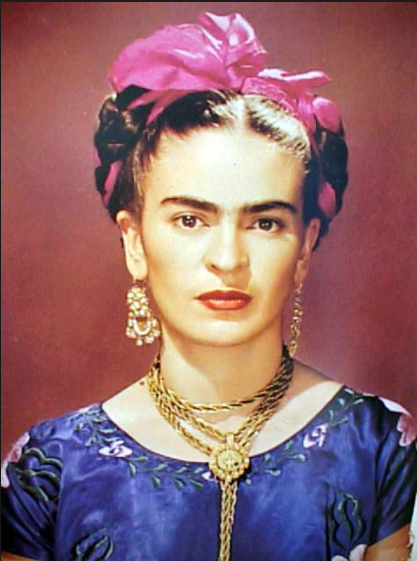
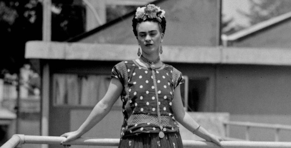
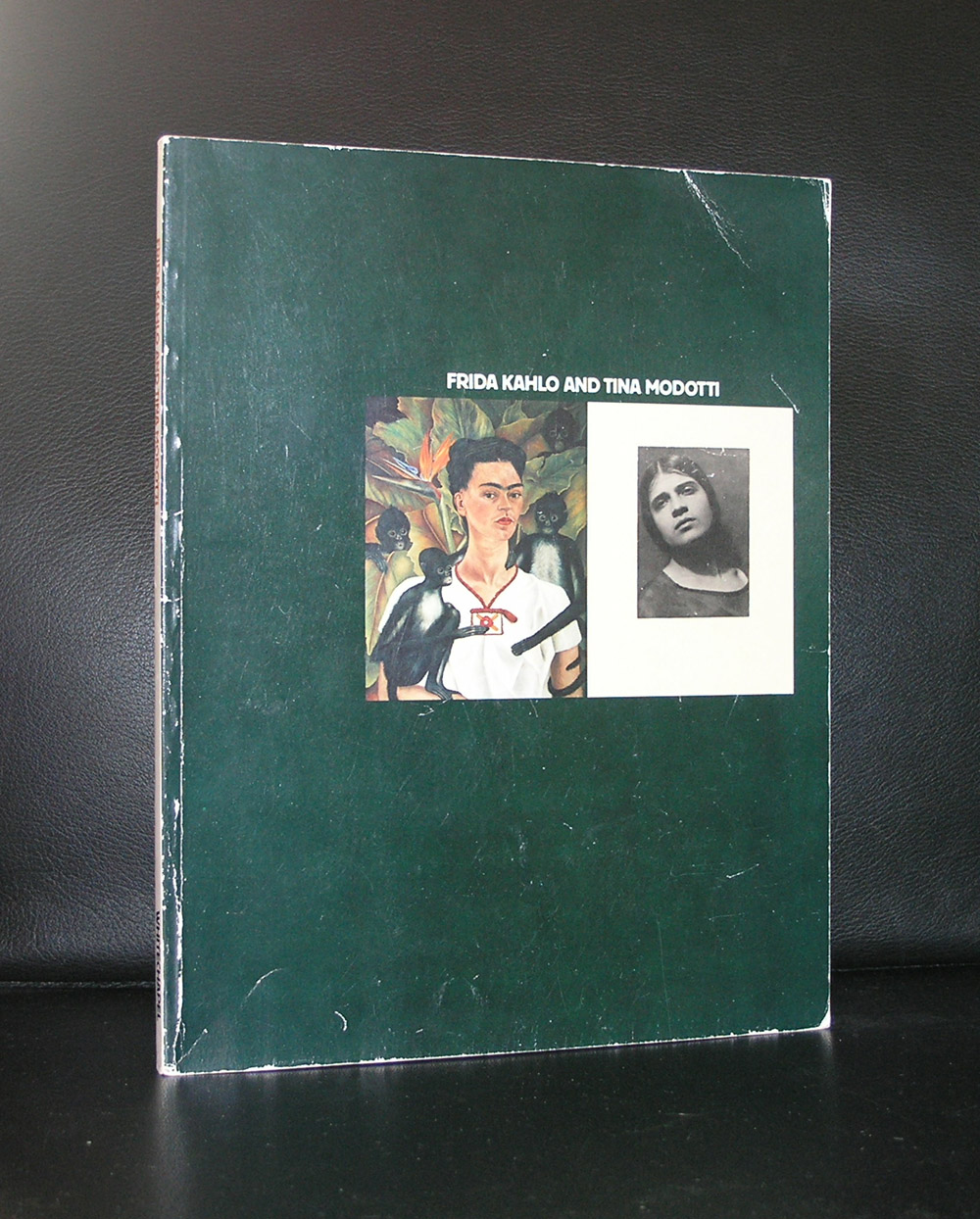
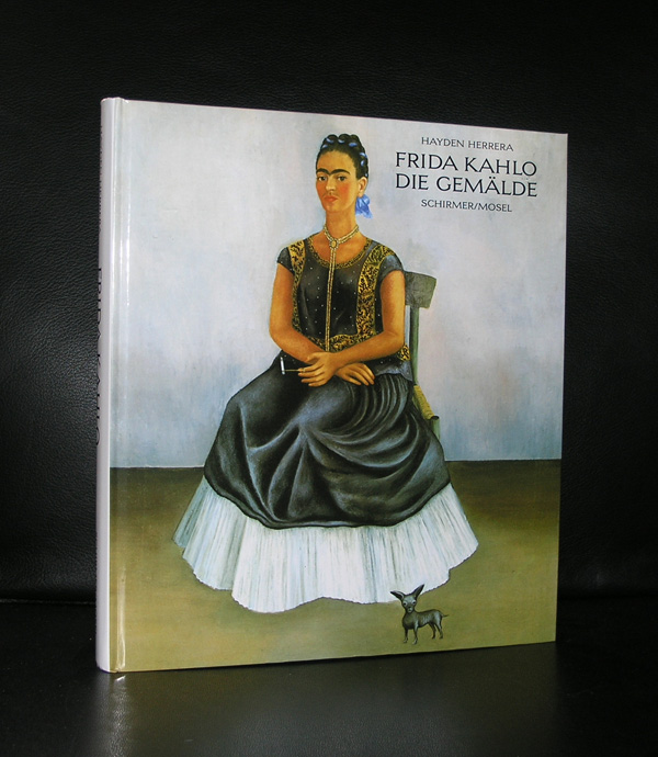
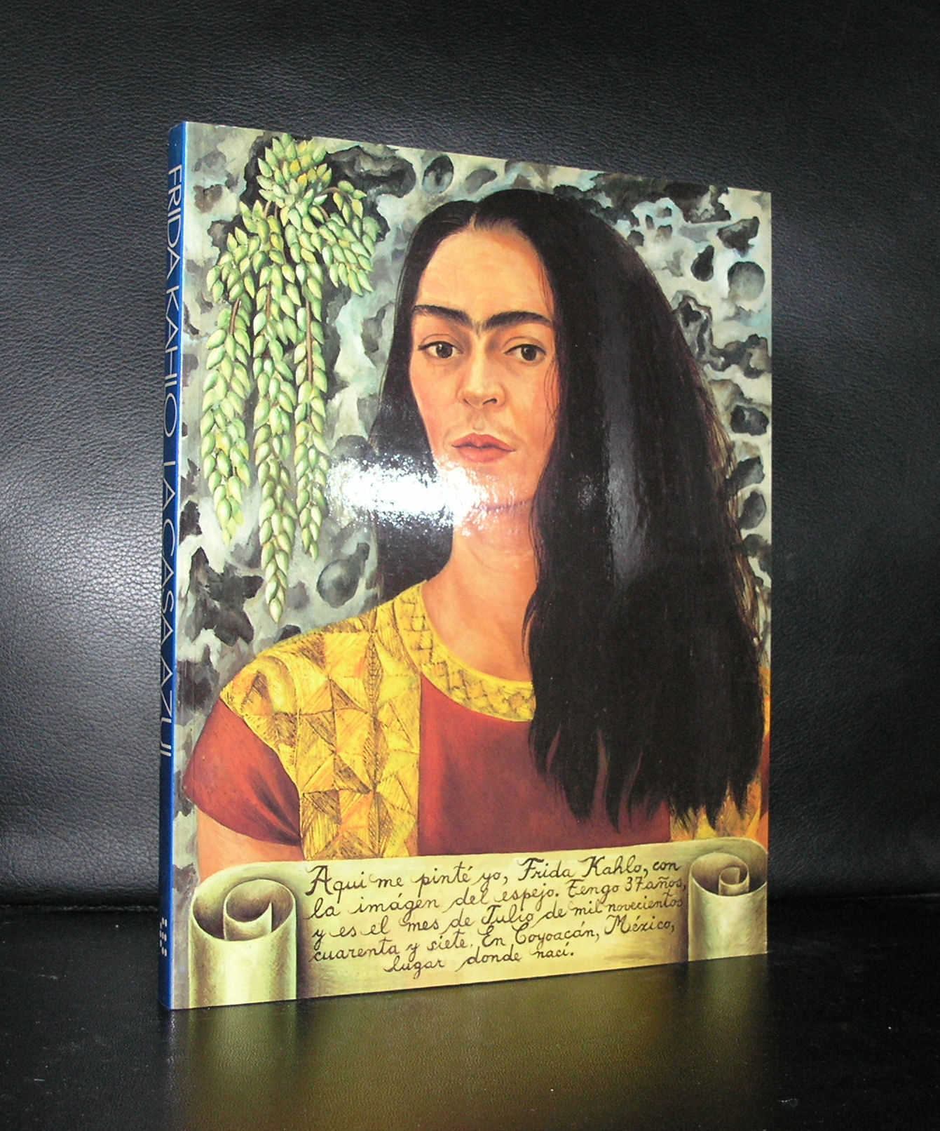
Today a celebration and many congratulations to my wife who has been married for 12,5 years to me. For our honeymoon we travelled to Mexico together with our son Lucas. So for that reason i chose to make a blog on Frida Kahlo, the most famous Mexican artist.
During the time i was working at the Gemeentemuseum Den Haag we had a show on Frida Kahlo in the Museum Paleis Lange Voorhout in 1993. It was by far the best show, with the highest number of visitors, this little museum has ever had. The show lasted only about 70 days but was extended twice because of the high number of visitors. Mainly women attended the exhibitions and i found out that for them Kahlo was a liberated woman who has been a role model for many. What struck me most in her works were the very personal sometimes even surrealist elements in her paintings and where i had imagined large paintings and works of art , these were in many cases small paintings. Still….a terrific exhibition and the last one to have been organized in the Netherlands in the last 25 years. What remains is the catalogue which is a classic among Kahlo collectors and available at www.ftn-books.com. Last but not least…congratulations to my wife Linda. These were 12,5 years filled with love, travels, fun and health…may the next 12,5 years give the same to us….
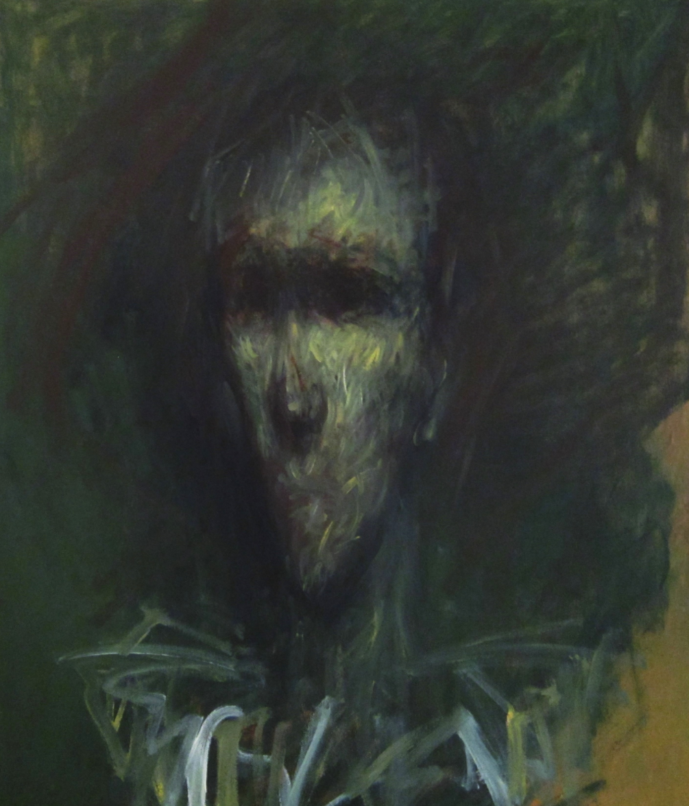
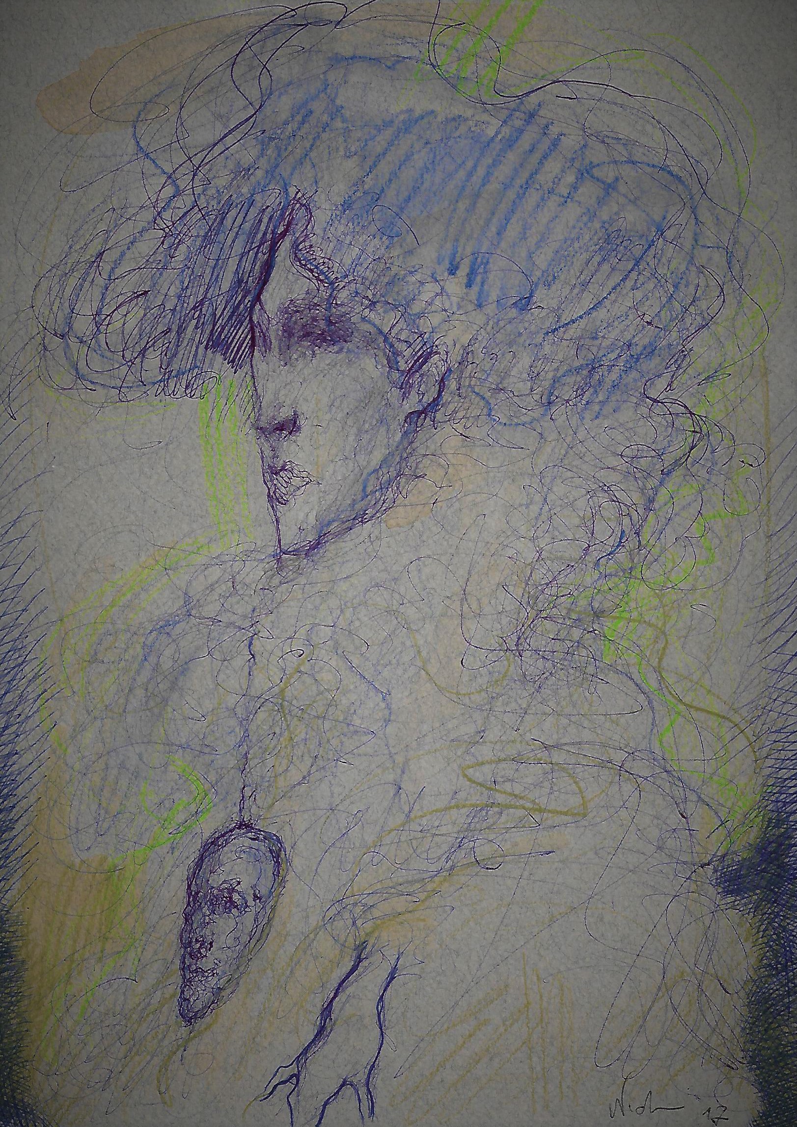
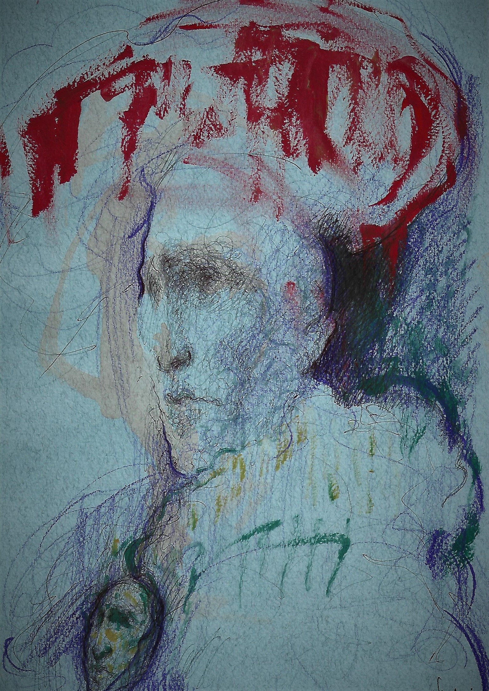
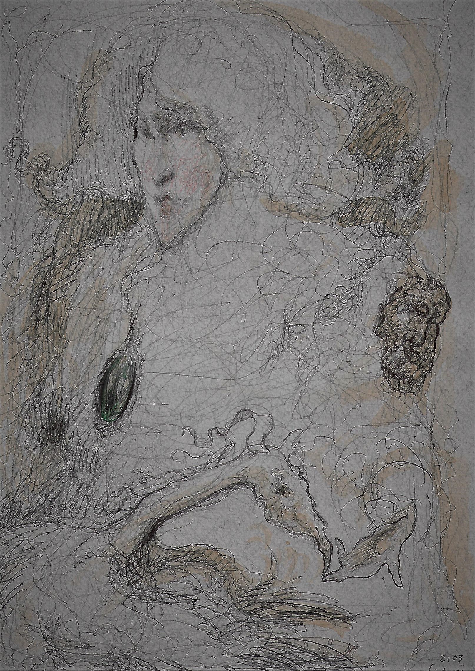
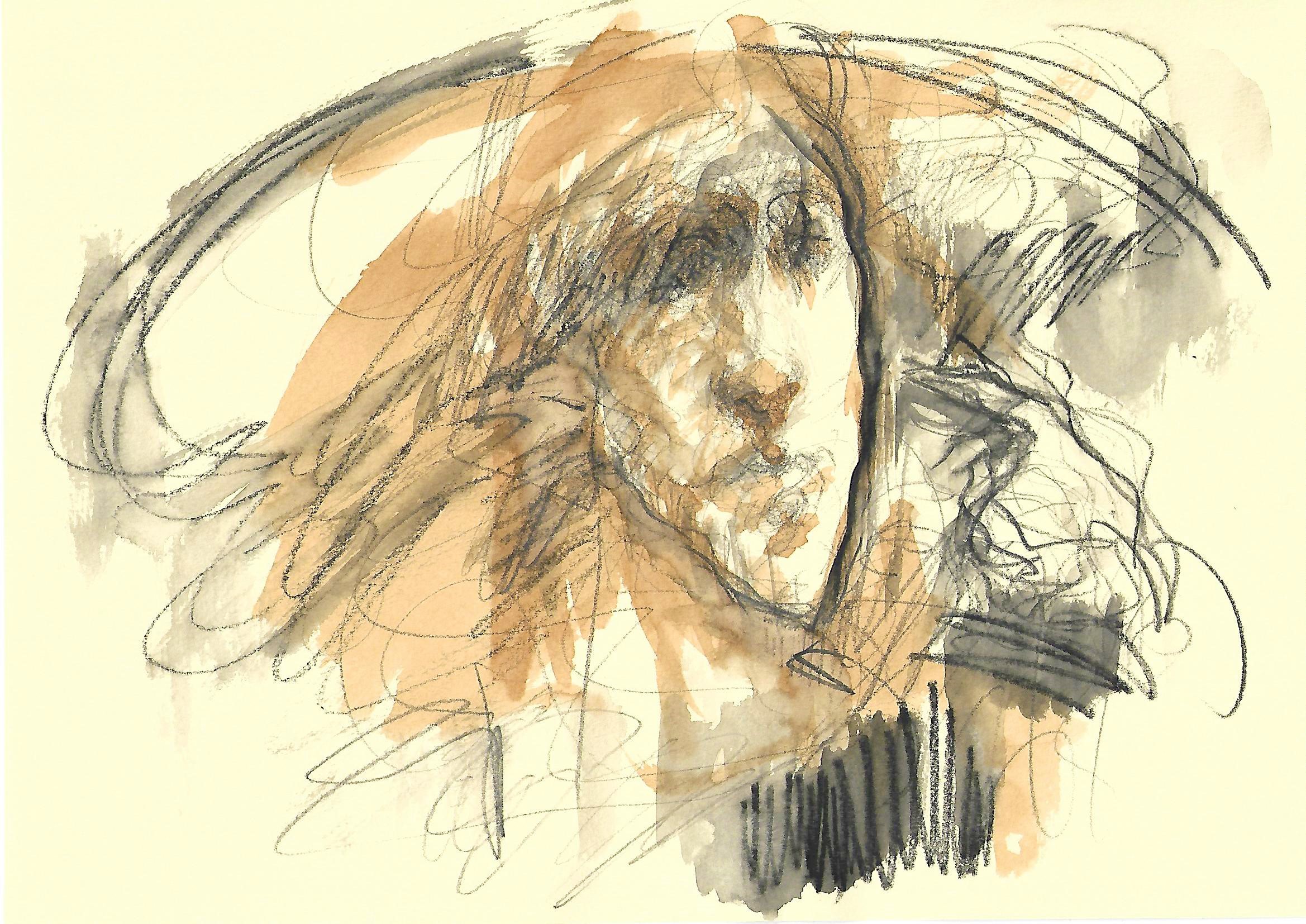
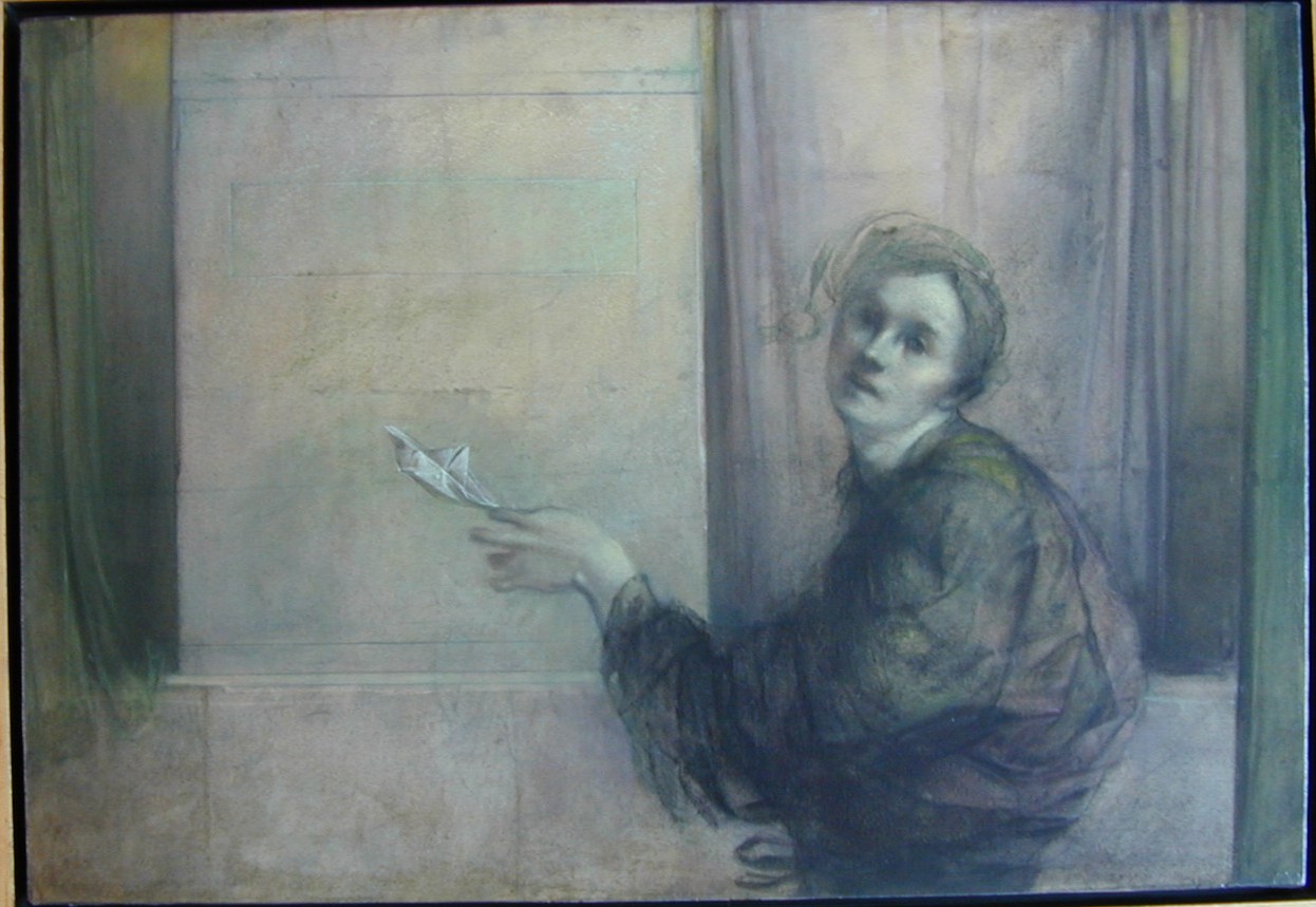
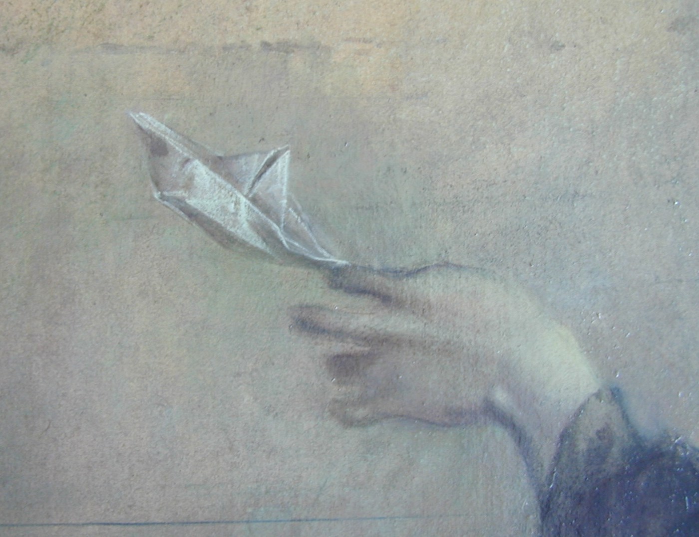
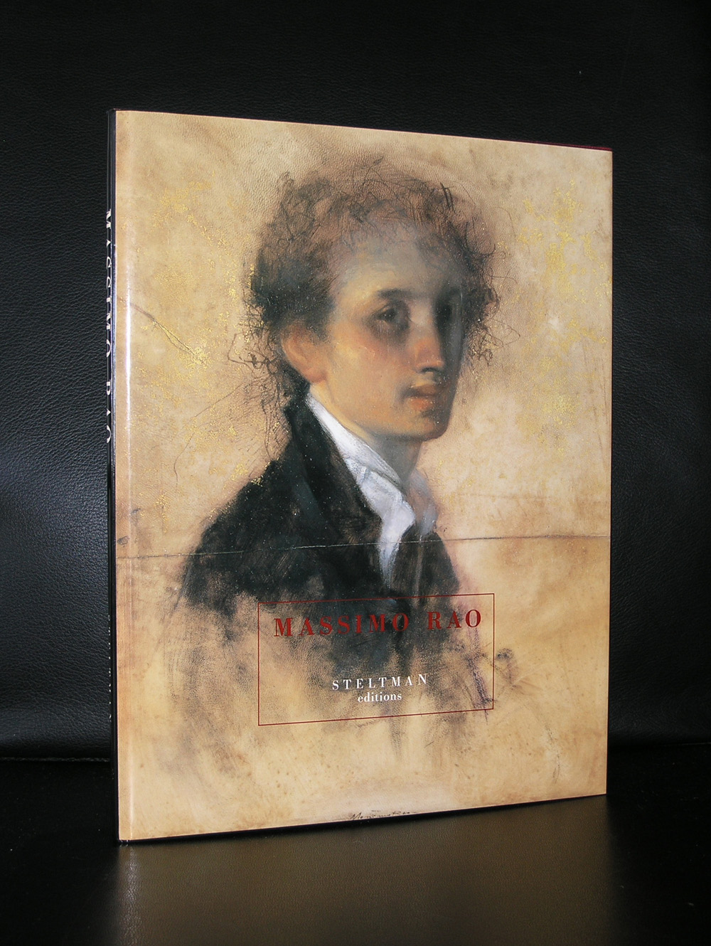
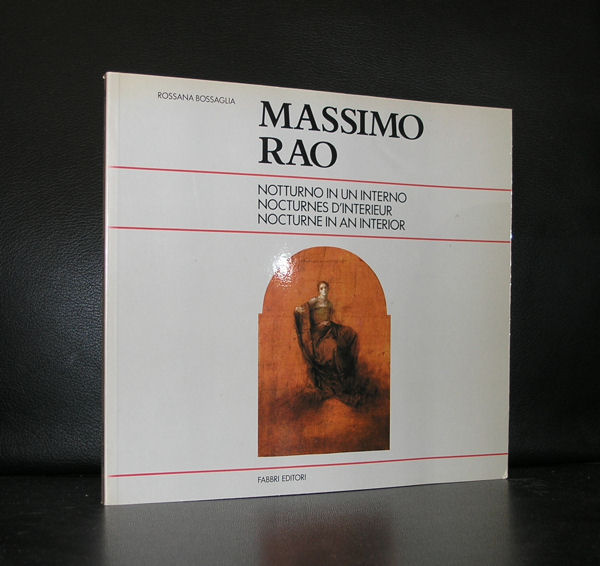
Down under in Italy, in the region of Bari works a young artist by the name of Giovanni Nicolai. I did not know him, never met him, but we recently contacted each other about a purchase. He mailed me that he was a fan of Massimo Rao and because of this fascination was inspired by him which resulted in very personal and somehow typical italian classical portraits. He sent me some examples and i was very much convinced that these works deserve to be known outside Italy too. Therefore this blog with some examples of his works. It is Modern art with some abstraction but also a very classical touch within them.
The small faces of the portraits resemble a little bit the lean figures by Alberto Giacometti, but the atmosphere breathes Massimo Rao.
Not the surrealist setting of Massimo Rao, but recognizable poetic portraits. Very nice to look at and subtil in their execution. If you want more information on Giovanni Nicolai do not hesitate to contact me and i will gladly supply you with his email address. The publications on Massimo Rao are available at www.ftn-books.com
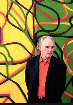
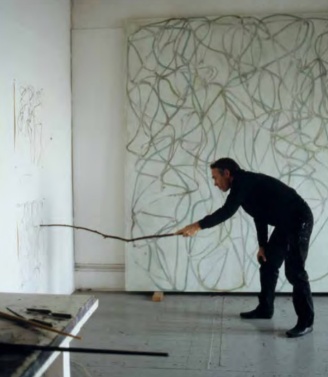
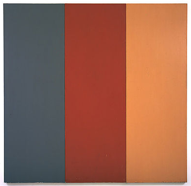
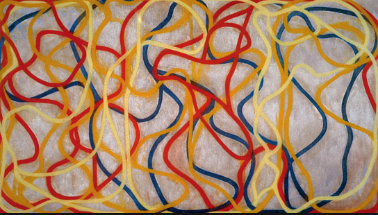
It took some while for me to appreciate Brice Marden, that was because the first works i encountered by him where his monochromatic paintings, which i did not like very much at that time ( now i do!), but influenced by Robert Rauschenberg ( he was his assistant during a couple of years) , multi panelled and more colorful paintings began to emerge from his studio.
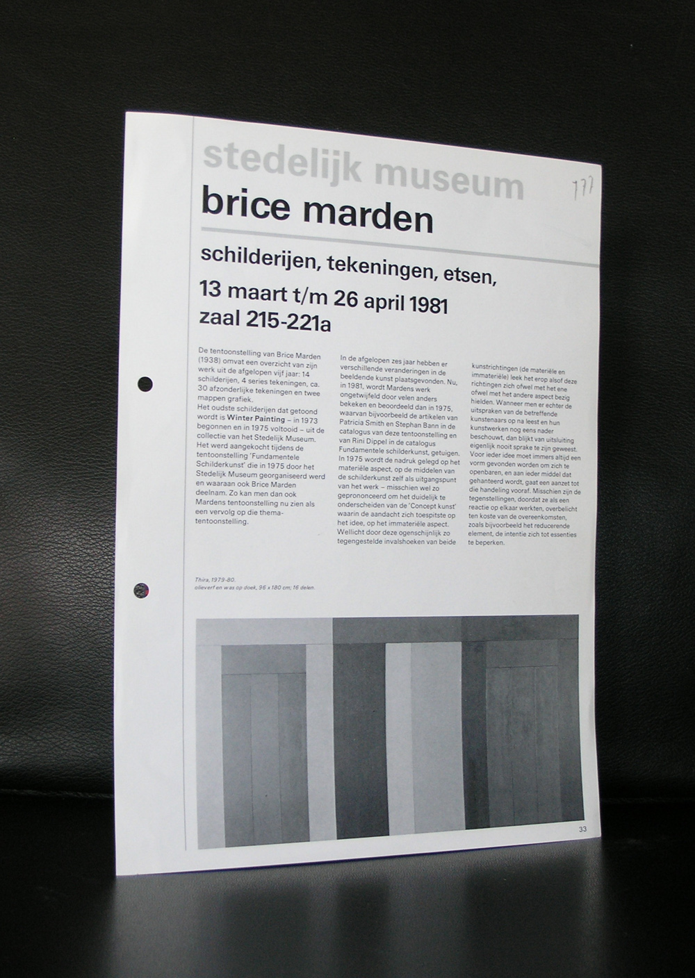
That was the same period i became interested in Brice Marden. There was a nice exhibition in 1981 in the Stedelijk Museum Amsterdam, which Crouwel designed catalogue is now a true collectors item ( available with other Marden publications at www.ftn-books.com ).
The list of collections in which Brice Marden is present is almost endless and contains all major Modern Art Museums in the world. One has to be mentioned, because The MOMA was the first to present a large retrospective on this young artist. It was in 1975 and this early interest resulted in having one of the largest Marden collections in the world.
Artist/ Author: Oliver Boberg
Title : Memorial
Publisher: Oliver Boberg
Measurements: Frame measures 51 x 42 cm. original C print is 35 x 25 cm.
Condition: mint
signed by Oliver Boberg in pen and numbered 14/20 from an edition of 20