Posted on Leave a comment

Alexander Calder (1898-1976)

schermafbeelding-2016-12-22-om-14-56-15

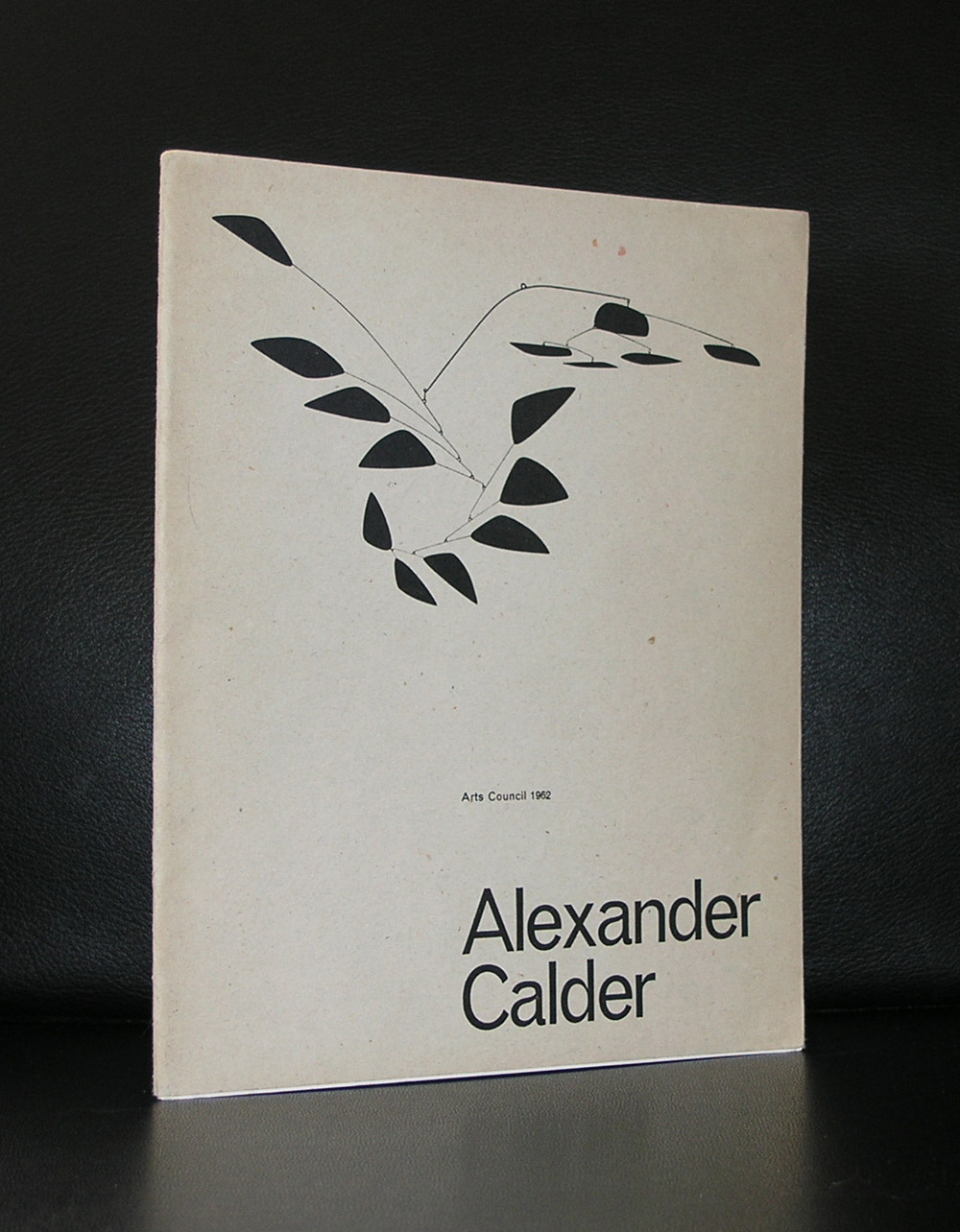
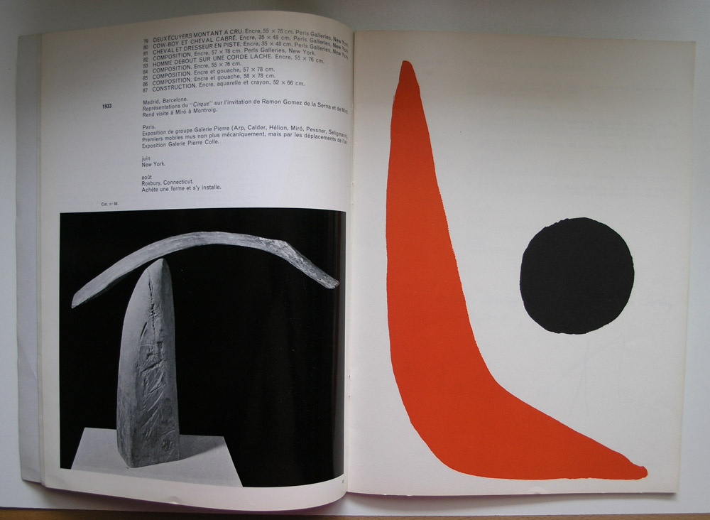
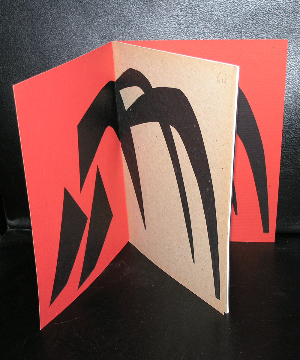
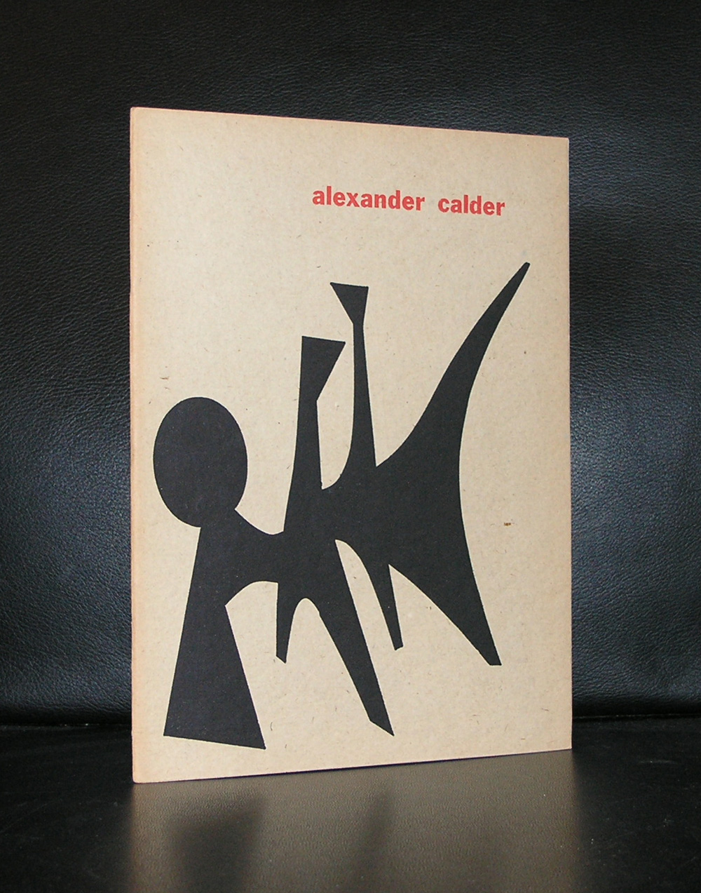
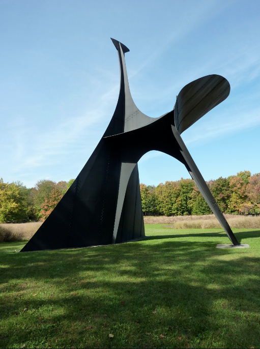
Born in the 19th century . Calder has become for me one of the pioneers in Modern Art. The public knows Calder by name for his mobiles, but for me Calder is the first artist who explored the extreme sizes in sculpture. Later, this was followed by Serra, but Calder must have been one of the very first to make sculptures bigger than a building. A few of these can be found in STORM KING, but these are not the only ones. These very large sculptures are scattered all over the world.

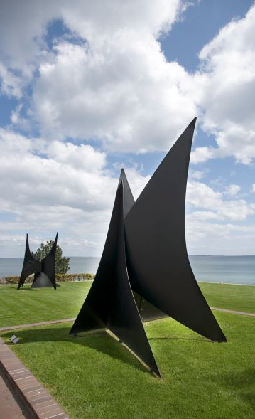
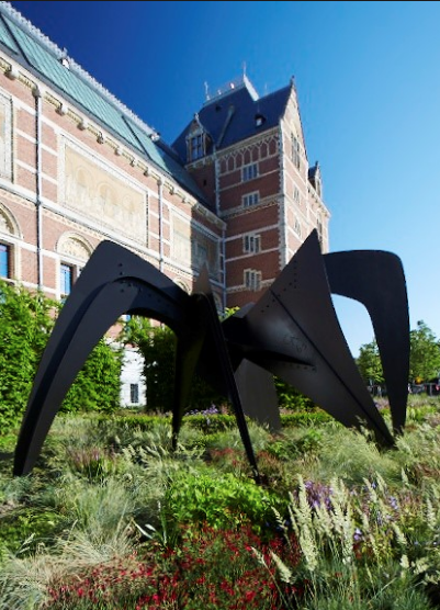
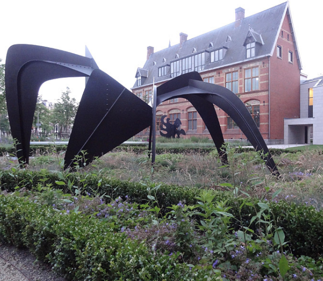
From Denmark to Brazil, the Calder statues are the highlights among other statues in sculpture parks all over the world. It is a pity there is only one large sized Calder in dutch collections. It is the “anteater” from the collection of the Rijksmuseum.

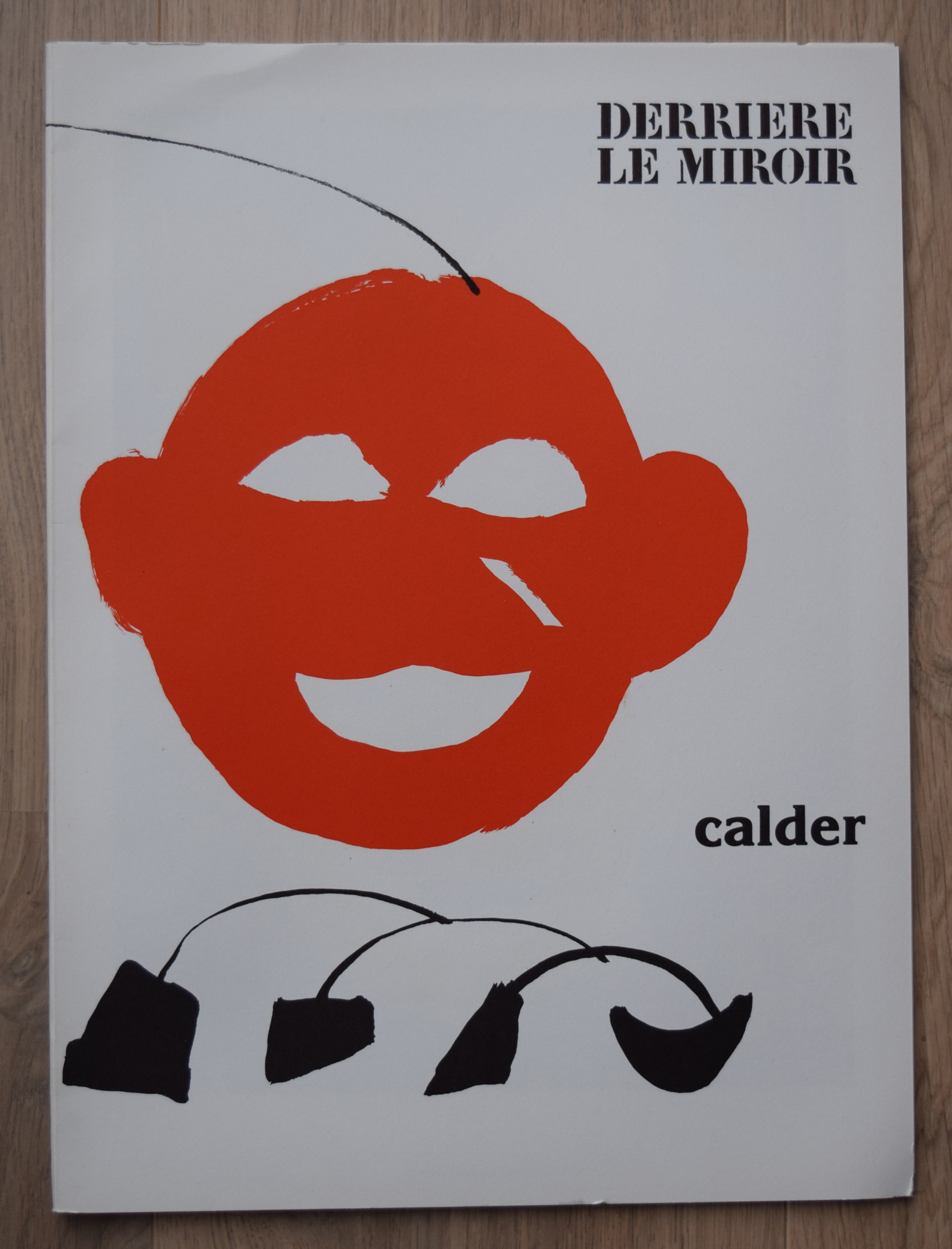
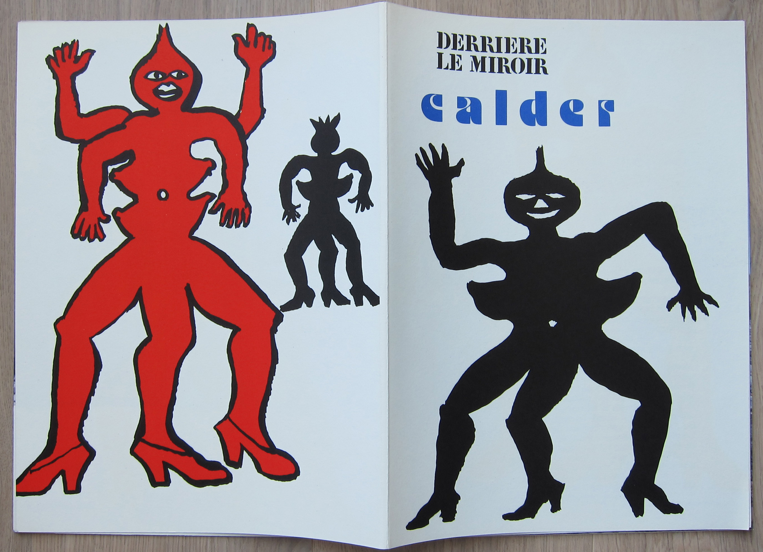
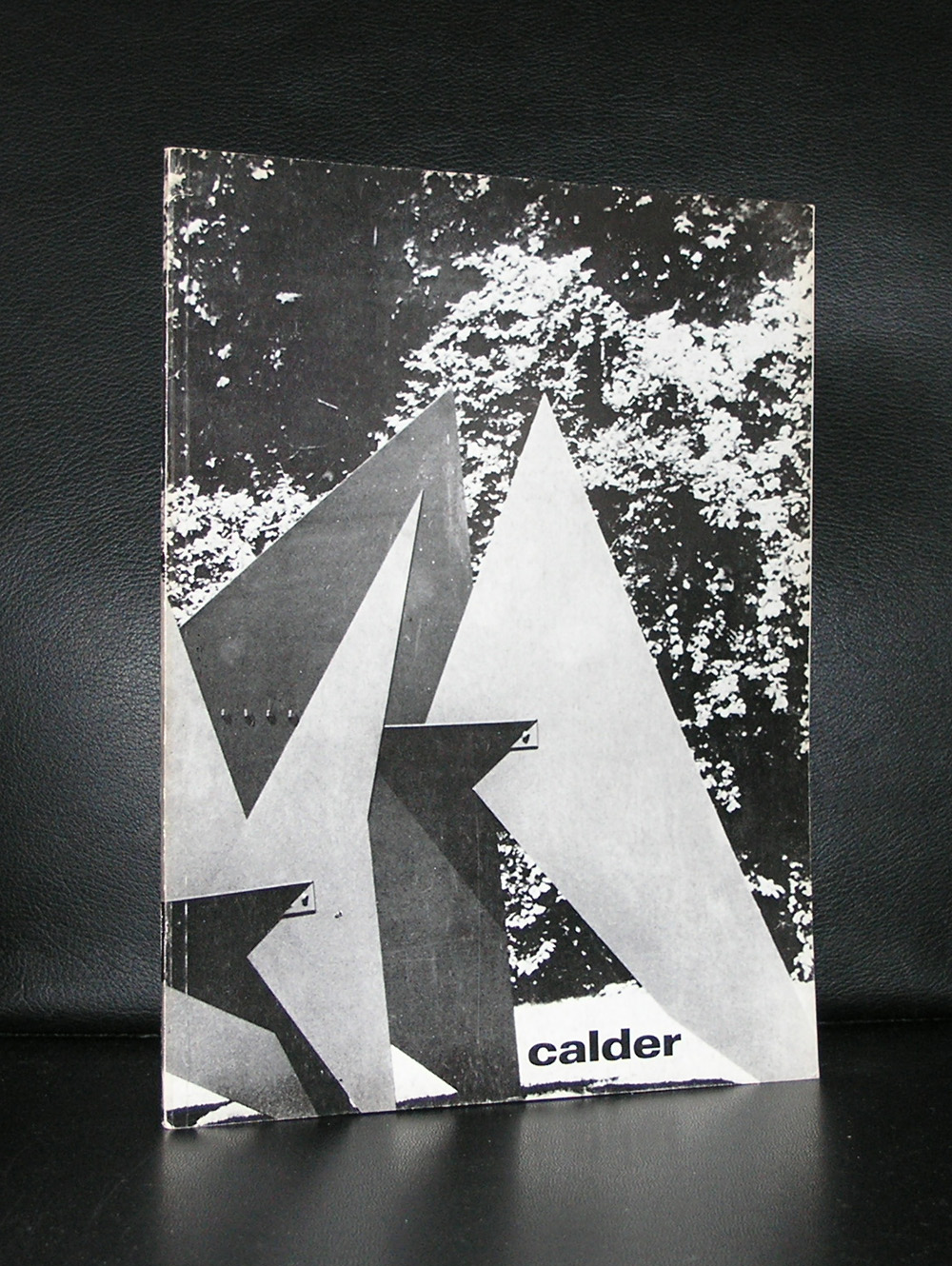
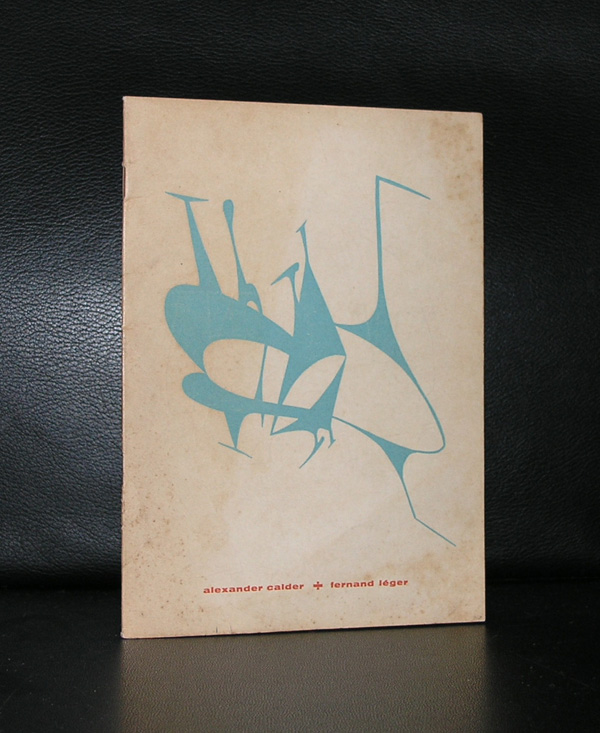
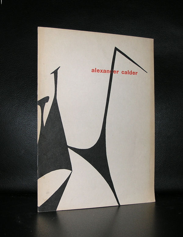
So do not miss them when you are abroad or there is a special exhibition on Calder because they are among the very best in Modern sculpture. I am fortunate to have some great classic Calder publications within the inventory of www.ftn-books.com

Posted on Leave a comment

Karel Appel and the original litho covers

No….this is not a title for a classic Roald Dahl story, but this is reality. Some museums, but specially the Stedelijk Museum Amsterdam, had a policy to make affordable catalogues for their visitors to accompany their exhibitions in the 50’s and 60’s.

Designed by the best in the business ( Willem Sandberg and Wim Crouwel ) they had the task to produce these catalogues at a low price without being cheap looking. They experimented with low cost papers, small editions, number of pages between 24  and 48, most of the time stapled and a scarce use of color. Only one exception was made ….in some cases an original lithograph by the artist was used as a cover. This is why some of these beautiful catalogues are even more desirable…all because of the original lithograph.

Karel Appel was one of those artist who had his peak in the sixties and was able to demand the best possible catalogues with his exhibitions and Sandberg granted this. The Appel catalogues which were published in the late 50’s and early sixties are among the best from the catalogue series of the Stedelijk and should be present in every serious Karel Appel collection.

Just look at this foldout cover and be convinced yourself that this is special.

appel-litho-sm-b

For the readers of this blog…i have two of the above 1965 catalogues available at

www.ftn-books.com

Posted on Leave a comment

Willem Sandberg exhibition at the Stedelijk Museum Amsterdam (until the 8th of January 2017)

schermafbeelding-2016-11-29-om-15-22-28

Last Sunday we visited the Stedelijk Museum for the Tinguely exhibition ( see blog in a few days) and the Willem Sandberg exhibition. Sandberg was not only the director for over 2 decades at the Stedelijk ( 1945-1963), but also took care of almost all the design and typography for the Stedelijk Museum Amsterdam, which was made during his years as a director. 5 rooms are filled with a multitude of publications. Mostly for the Stedelijk and some for the Israel museum in Tel Aviv.

What struck me most is that his designs are timeless and still belong to the very best designs that were made in last century. The 3rd room was filled with Stedelijk Museum publications and i was proud to find that 100% of the book publications shown in that room was available at www.ftn-books.com.

sandberg-tent-a

This is an exhibition you have to visit when you are a Sandberg admirer and study the publications on show. Beautiful, in many cases handcrafted typography and designs and among the Sandberg designs the very best that were made. It was good to see that so many of these publications still are timeless and of the highest quality and never looked old fashioned. For me Willem Sandberg is still one of the very “greats” in design and typography from the 20th century.

Posted on Leave a comment

DYLABY…Raysse+Tinguely+de Saint Phalle+Rauschenberg

DYLABY stands for Dynamisch Labyrint. It was one of the iconic sixties exhibitions (1962) in the Stedelijk Museum Amsterdam . A melting pot of modern art with some of the greatest names. Tinguely, Niki de Saint Phalle, Robert Rauschenberg and Martial Raysse. Planned “chaos”, but once you take a closer look and study the plan which came with the exhibition catalogue, you can clearly see that everything is planned. It now is over fifty years ago, but what still remains is the catalogue…. not only a souvenir, but an important art historic document, because of the event DYLABY was but also for its appearance. A complete inside in the exhibition.

…..and the series of photographs by Ed van der Elsken is one of the best he ever shot.

available at www.ftn-books.com

Artist/ Author: Robert Rauschenberg, Raysse, Niki de Saint Phalle, Daniel Spoerri, Jean Tinguely, Per Olaf Ultvedt Title : DYLABY ( Dynamisch Labyrint ) Publisher: Stedelijk Museum, 1962 Number of pages: 24 pages plus 4 page cover/ foldout page and separate plan of the exhibition Text / Language: dutch and english Measurements: 10.2 x 7.5 inches Condition: near mint extra information on this item: This DYLABY catalogue belongs to the top 3 of most wanted and searched Stedelijk Museum catalogues, but there is more this copy because it still holds the separate plan for the exhibition ( see picture). Catalogue photo’s by Ed van der Elsken which makes it even more special. This same catalogue is now in the permanent exhibition on the works by Jean Tinguely in the Tinguely Museum. Published with no.314

Posted on Leave a comment

Samuel Jessurun de Mesquita teached Maurits Cornelis Escher

Schermafbeelding 2016-08-31 om 09.38.31.png

Did you know that Jessurun de Mesquita was the teacher of M.C. Escher?

Escher developed his woodcutting skills under the supervision of Jessurun de Mesquita. From both sides there was a great admiration and respect for the other and Escher wrote the text on the commemorative exhibition Jessurun de Mesquita and Mendes da Costa received right after WWII in the Stedelijk Museum Amsterdam. An exhibition curated by another “star” from the forties an fifties, Willem Sandberg. Sandberg started right after WWII with this exhibition because he wanted to show the world the great loss of these 2 great jewish artists that did not survive the war. But lets focus on the works by Jessurun de Mesquita. Technically one of the very best at that time and with subjects that stood very nearby daily life and some surrealistic / Sensivistic drawings.

Many animals were depicted because the Artis Zoo was allways nearby and a much appreciated source for all his animal drawings and woodcuts.  Nature, art deco and the best possible technique in the art of the woodcut print resulted in almost all of the cases in the best dutch art prints from that time.

Some excellent publications at www.ftn-books.com and for those reading the blog and want to order the very special Samuel Jessurun de Mesquita by Wassenaar/van Es  from 1928. Use the code JESSURUNes and receive 10% discount on this title. Only 1 available and valid in september 2016.

This title from 1928 is the highlight in the book publications by Jessurun de Mesquita. It contains 2 original woodcuts on the inside and one original on the cover ( owl).

There is one other publication i can recommend and it is the monograph on Jessurun de Mesquita by the late Jonieke van Es, who wrote it and put one of the most complete catalogue Raisone’s together on any artist. This one for Samuel Jessurun de Mesquita is very special indeed.

And finally . for all readers of this blog….I have a nice set of Jessurun de Mesquita available 7 postcards for $15.00 including Worldwide shipping.

wilfried

www.ftn-books.com

jessurun set a

Posted on Leave a comment

M.C. Escher….not only prints

Maurits Cornelis Escher was one of the most gifted pupils of Samuel Jessurun de Mesquita (1868-1944). His teacher died at the end of WWII in a Nazi concentration camp and was commemorated by Escher in a text which was published in a catalogue on the art of Jessurun de Mesquita and Mendes da Costa  ( 1863-1939) who had an exhibition in the Stedelijk Museum Amsterdam right after the war to honor them both.

This is believed to be the first printed text by Escher. The catalogue with this text is still available at www.ftn-books.com

and is one of the first to be published by the Stedelijk Museum Amsterdam after WWII. Since, Escher has had many other publications with text and of course prints , but the text on his former teacher is special and touching. The design of the book is done by Willem Sandberg himself and all these ingredients put together in one publication makes it very special indeed. I very much like the works by Jessurun de Mesquita and admire the artist he was. His woodcuts are fabulous and when you admire the Escher prints, do not forget that perhaps his teacher Jessurun de Mesquita was even a greater artist, but unfortunately has not become as famous as his pupil. ( later this month a blog on Jessurun de Mesquita with a special offer).

wilfried

Posted on Leave a comment

Stedelijk Museum….Over 2500 catalogues available….and discount code.


The Stedelijk Museum Amsterdam published roughly over 1000 catalogues with their exhibitions over the last 70 years. A very large number of publications. Designs were always done by the best . Willem Sandberg, Wim Crouwel, Piet Zwart ao.

These catalogues deserve to be collected. Their appearance, printing, lay out, typography and use of different materials and original art work ( yes, also original silkscreens and lithographs ) used as cover makes them stand out from the others which were made in this period. For instance compare the Stedelijk Museum from the 50’s and 60’s with their german counterparts and you see and appreciate the quality of these publications. Because of Sandberg many great names in art were first presented in the Stedelijk and received their first major publication with the exhibition. Pollock, Rothko, minimal art . You could see them for the first time in the Stedelijk …..that is the first time in Europe.

For the readers of my blog i have made a discount of 10% available that is valid for a week for all your purchases on www.ftn-books.com

use : stedelijk1000 and you will receive 10% on the total of your order.

This is probably the largest collection of Stedelijk Museum Amsterdam catalogues available on the internet and even if you do not order….look at them, because it is a great overview of their publications.

Check these catalogues out and see for yourself why these catalogues are among the best in the art world.


wilfried

www.ftn-books.com

Posted on Leave a comment

Wim Crouwel + Ellsworth Kelly = Vormen van de Kleur

One of the most spectacular publications in the history of the Stedelijk Museum was the VORMEN VAN DE KLEUR catalogue. A cassette containing biographies on all the participating artists ( a.o. Donald Judd ) and 4 original silkscreens . The silkscreens were published in an edition of only 2200 copies and all had the same basic colors (red, white and blue ).

Ellsworth Kelly, William Turnbull, Bob Bonies and K.G. Pfahler were invited to make a contribution for these silkscreens. 4 square large silkscreens were included in this publication. A challenge too for Wim Crouwel who designed a cardboard container/sleeve in which the loose pages on the participating artists were presented and on top of them the 4 original silkscreens.

Crouwel chose a larger size ( 10.2 x 10.2 inches ) than usual for he thought this to be an important publications too……and it was . It is one of the many highlights in the publication history of the Stedelijk Museum Amsterdam and will be a quintessential catalogue to have if you are a serious collector of Stedelijk Museum material or Wim Crouwel publications, but compared to the other beautiful and collectable SM publications this is in my personal top 5.

Only for FTN-books blog readers there is now a discount of $ 50.00 on this item to be had if you order and use the discount code: CrouwKel (there is only 1 copy available)

Catalogue design by Wim Crouwel, NM+ condition for the sleeve ( see picture), all sheets and silkscreens are in MINT- condition. Book measures 10.6 x 10.6 inches, silkscreens measure 10.2 x 10.2 inches. VORMEN VAN DE KLEUR/NEW SHAPES OF COLOUR. With 4 silkscreens in blue and red by Ellsworth Kelly, Bob Bonies, Georg-Karl Pfahler and William Turnbull. Amst., SM, 1966. Orig. wrappers. Illustr. b/w. 27 sheets. – Trends in abstract art of the past 10 years: Josef Albers, Donald Judd, Frank Stella, Vasarely, Max Bill, Peter Struycken a.o. – Silkscreens printed in 2200 copies. – In slipcase/sleeve

wilfried / www.ftn-books.com

Posted on Leave a comment

Al Held … Genesis, 1966 catalogue Stedelijk Museum Amsterdam

Genesis was the quintessential part of the exhibition Al Held held at the Stedelijk Museum in 1966. The catalogue was published with no.394 and the exhibition was from the 25th of March to the 1st of May.

OLYMPUS DIGITAL CAMERA

A very short time, but the exhibition came with everything which makes the publications of the Stedelijk Museum special. Organized and curated by Willem Sandberg, catalogue design by Wim Crouwel and last but not least the contributions by Held himself who designed the cover with flaps and the fold out pages. The result is one of the most striking catalogues the Stedelijk Museum published during the sixties .

www.ftn-books.com