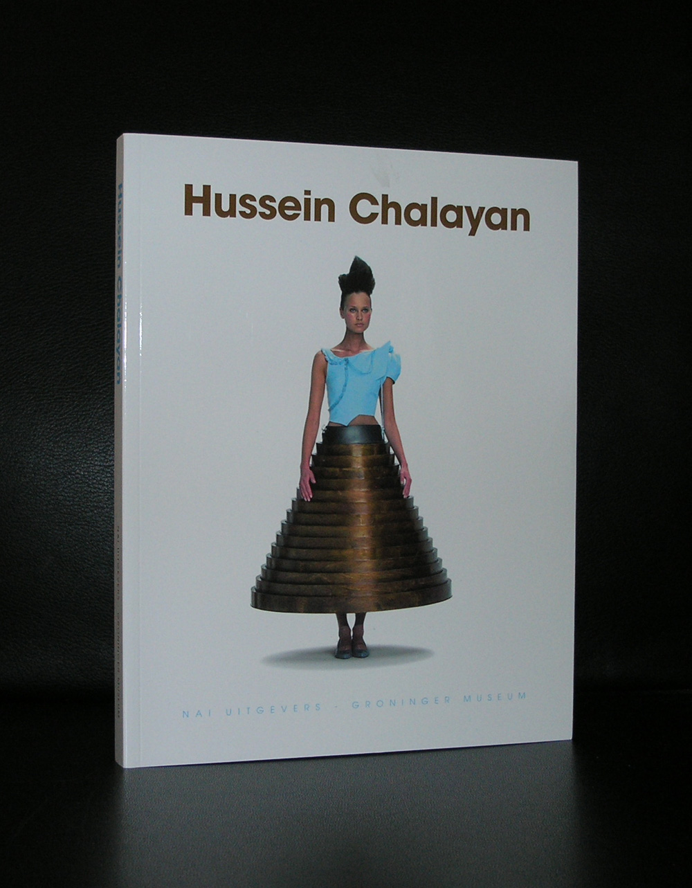
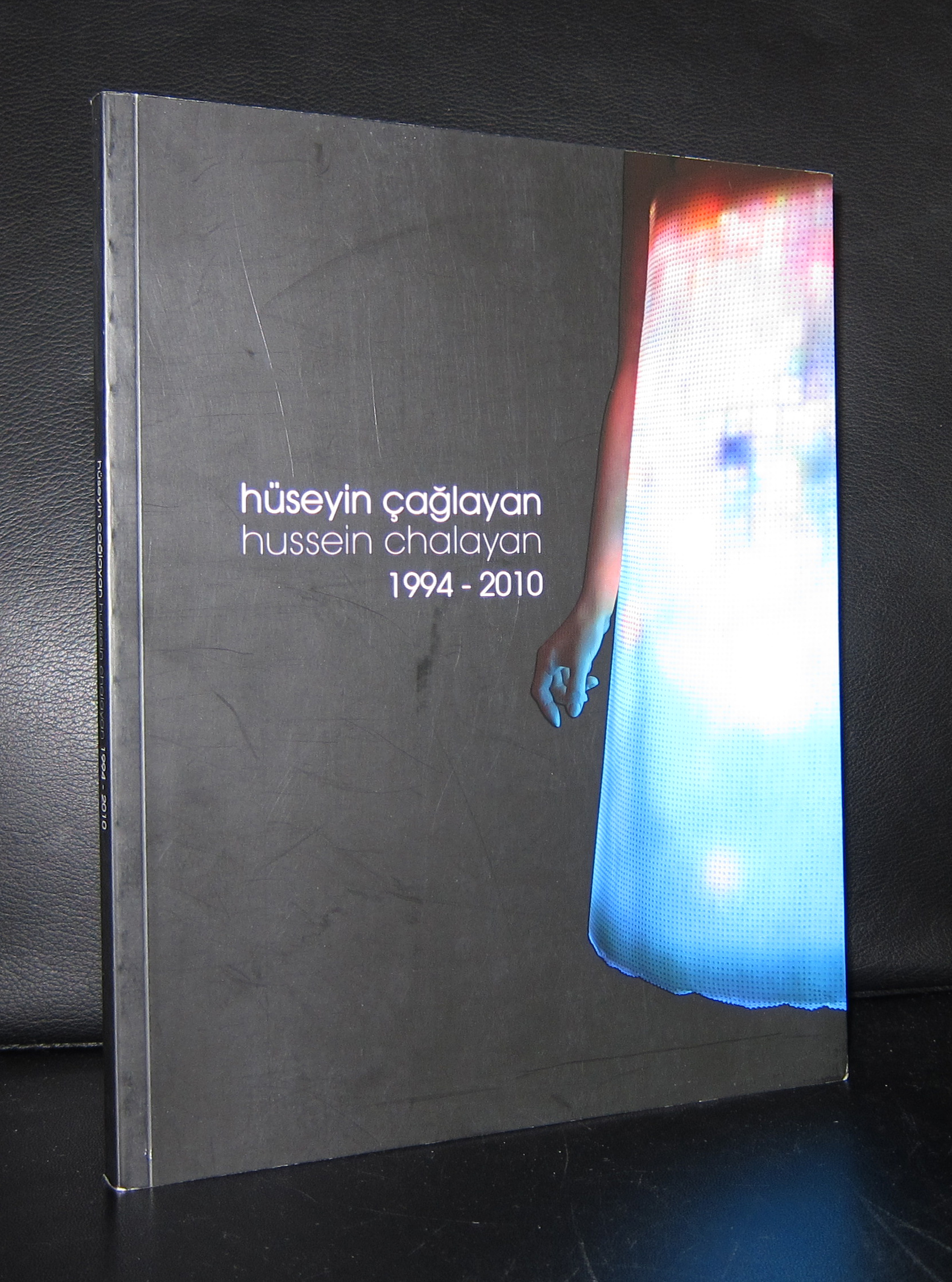
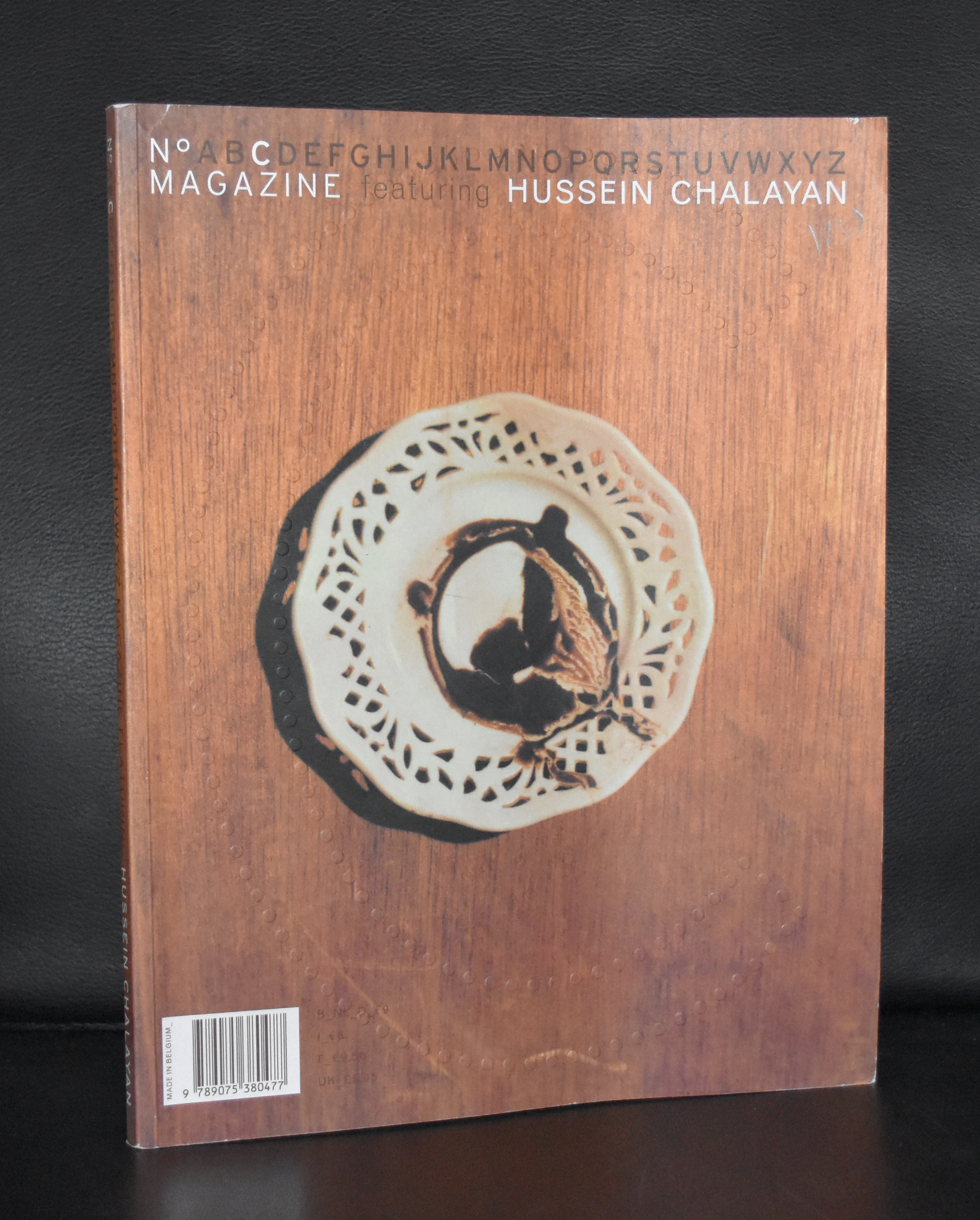
In the 90’s several exhibitions were held in the Gemeentemuseum with some fashion items by Issey Miyake, but after these exhibitions there was a period without any real fashion talents. Exhibitions were held with new aspiring fashion designers but none had the original quality of Miyake until………there was Hussein Chalayan, but this time in a different location..the Groninger Museum.
For me, suddenly he was there and the Groninger Museum made a wonderful exhibition with his designs. I do not follow fashion very much, but for me Chalayan combined fashion with Modern Art and sculpture and the setting in the Groninger Museum ( Mendini architecture) made it very special. According to Vogue he now makes HIGH TECH dresses. His approach to fashion has stayed the same. Explore the boundaries of fashion, ,wearability is of less importance, but originality is what he is looking for ….and finds.
The article on Chalayan in Vogue can be found here:
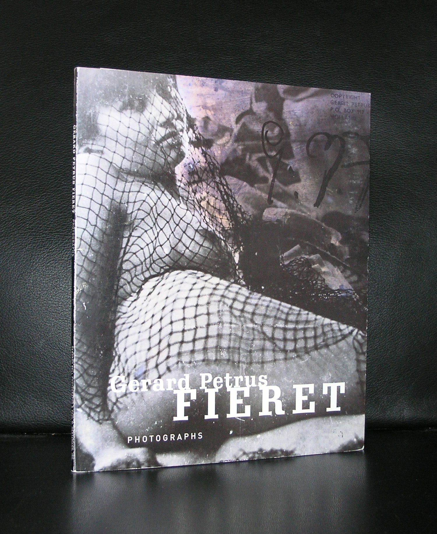
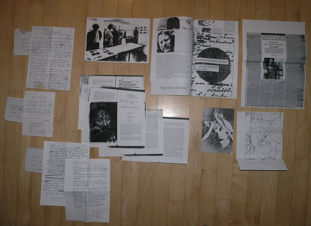
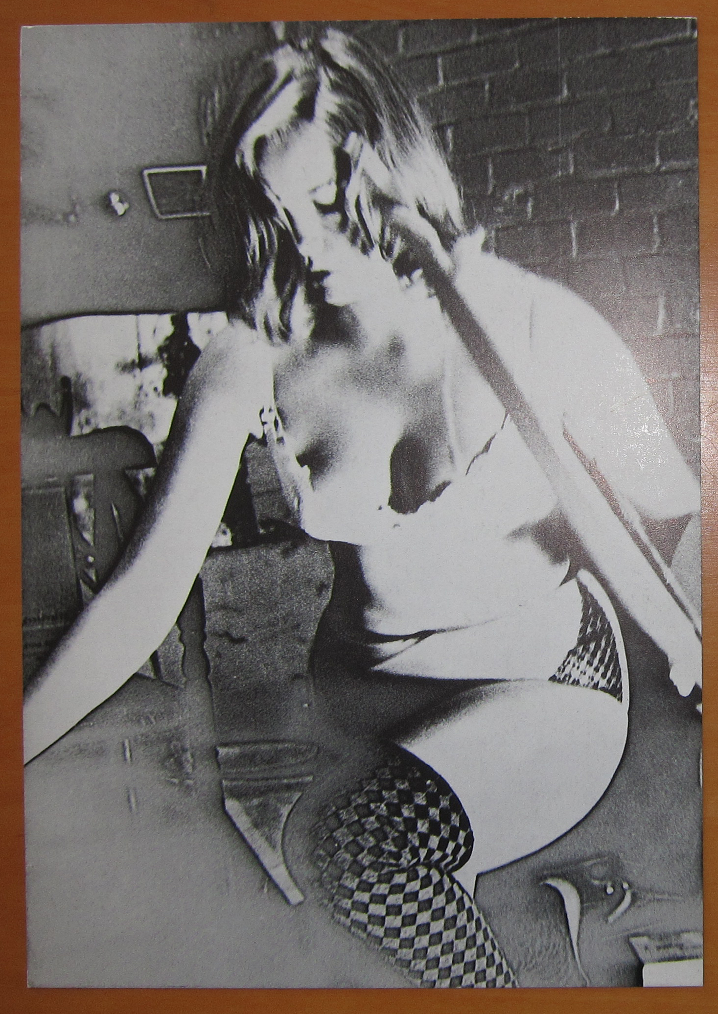
If you ask the many photograph collectors in the Netherlands….who is the most important photographer from the 60’s and 70’s in the Netherlands?…my guess is more than 50% percent will answer…FIERET.
For the last 2 decades in his lifetime, Fieret led a secluded life, out of the way from ordinary people …feeding his pigeons on a daily basis and making drawings…many many drawings. He even locked himself up for almost a month to decorate an entire room within the Gemeentemuseum with his drawings.
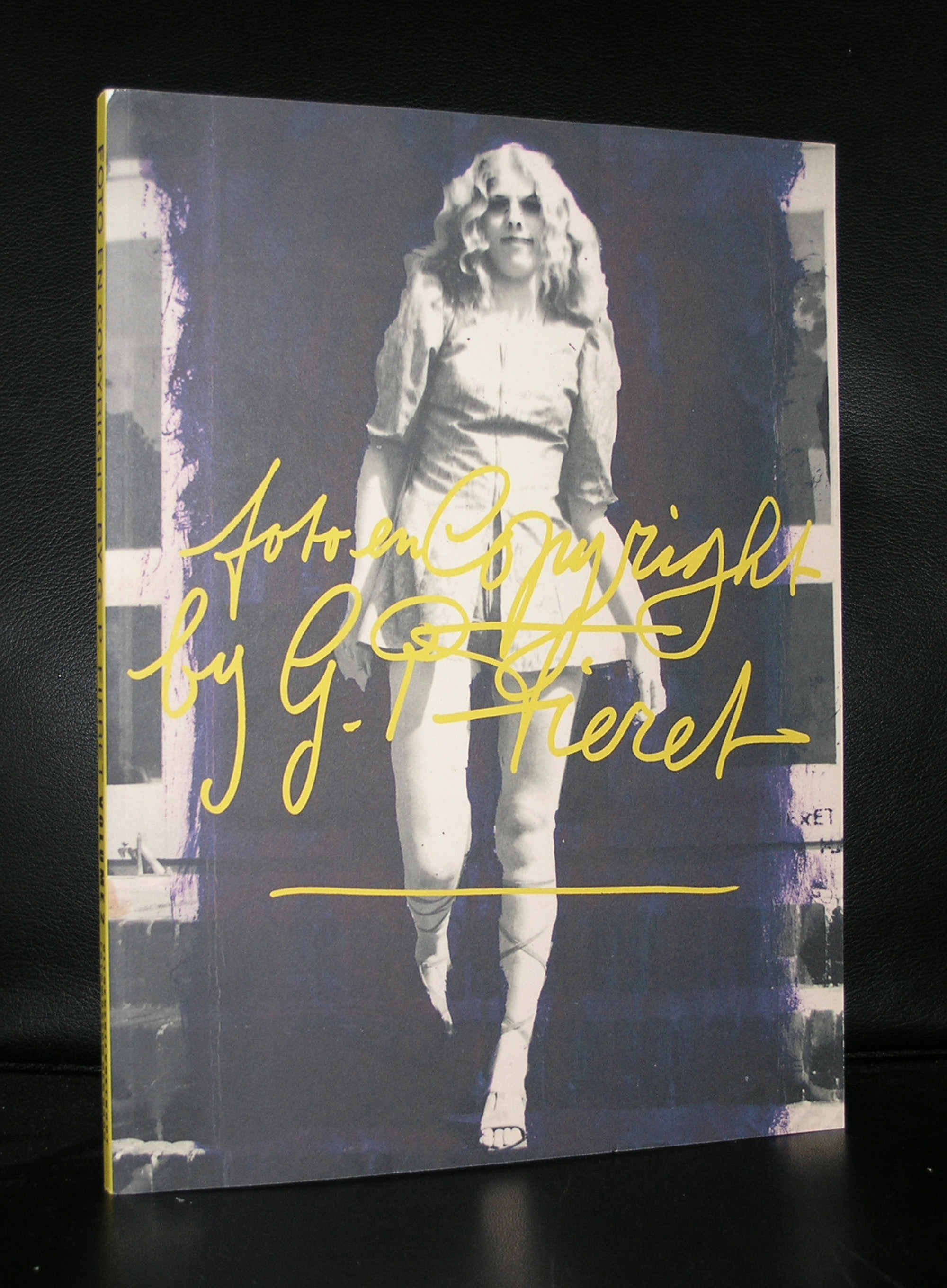
But in the early sixties and seventies his main activity was making photographs. Making them from a very personal perspective and “signing” them with studio stamps all over the photo. Fieret had a keen eye and took his photographs from a different angle and perspective, making them stand out from other photo’s from these decades. Favorite of his were young woman who posed for him and of course many street scenes and thus documenting the sixties in the Netherlands. Since 15 years or so the work of Fieret has been exhibited in other countries outside the Netherlands too. the Deborah Bell gallery showed his works for the first time in the US and this catalogue a.o. is available at www.ftn-books.com
This is what Gaby Wood said about the first time she encountered the photo by Fieret:
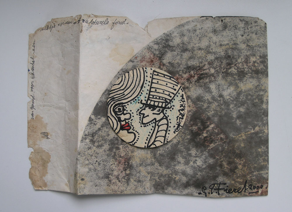
Like most people outside Holland, I had never seen Fieret’s work before, and the Rijksmuseum’s examples are not, it turns out, all that typical. He is best known for his female nudes, but the images I saw were more ethereal. Nevertheless, I was drawn to them immediately: a large, dark print showing a milky-white little girl, blurred almost to the point of abstraction; a faded interior, so fuzzy it bordered on double-exposure; the self-portrait of a bearded man, in a style that looked barely intentional but whose subject seemed full of concentration.
The prints themselves were rough: full-bleed, manhandled and mildewed around the edges; brashly signed in fat-tipped black pen. Some of them had been stamped several times across the front: “Copyright Gerrit Petrus Fieret”, defaced and claimed at the same time. They appeared to have been discarded – not just because of their strange presentation but because they still felt feverish with experiment, as if they were pages torn from a sketchbook, or pictures of memories rather than of actual scenes.
The effect is hard to describe: photography is a realist medium – it’s not supposed to be able to sketch or imagine. But evidently, for a decade beginning in the mid-Sixties, Gerard Fieret’s work did. Looking at it in the museum it was impossible not to wonder: who was this man, and how did his pictures get that way?
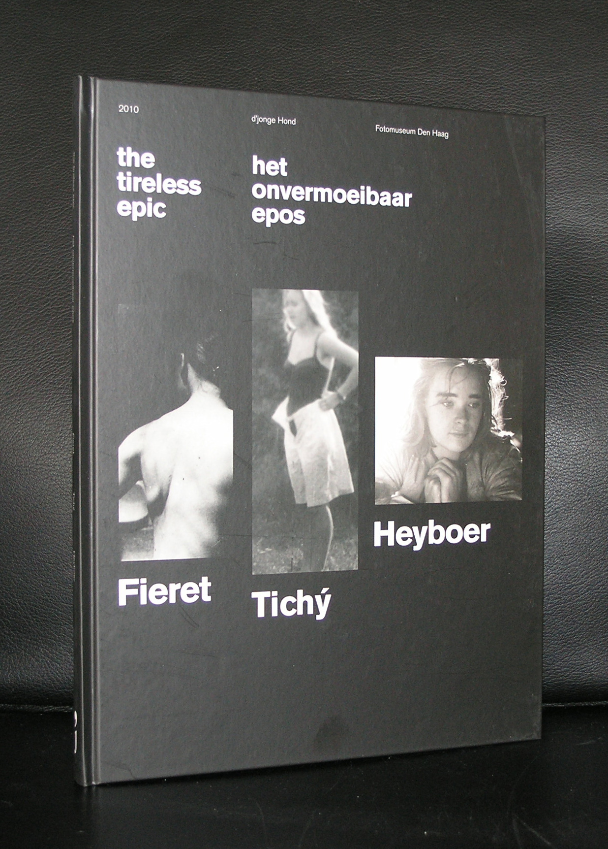
I have heard that in the next few years the collection of photographs by Fieret will be travellng all over the world . If i know of dates and venues i will post them on this site.
My recent visit to Slovania reminded me of our last years visit to Vienna. We collected “Boris” our Irish Glen of Imaal terrier dog with an Austrian breeder and the time we visited her we had a three day chance to visit Vienna with its magnificent Museums.
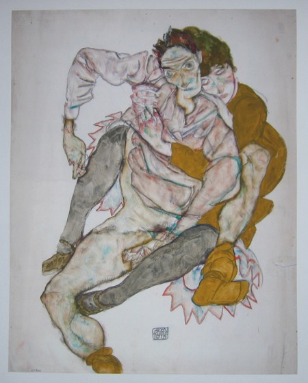
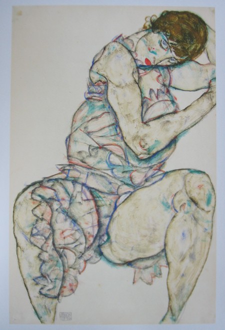
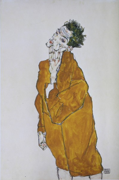
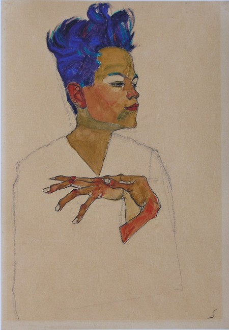
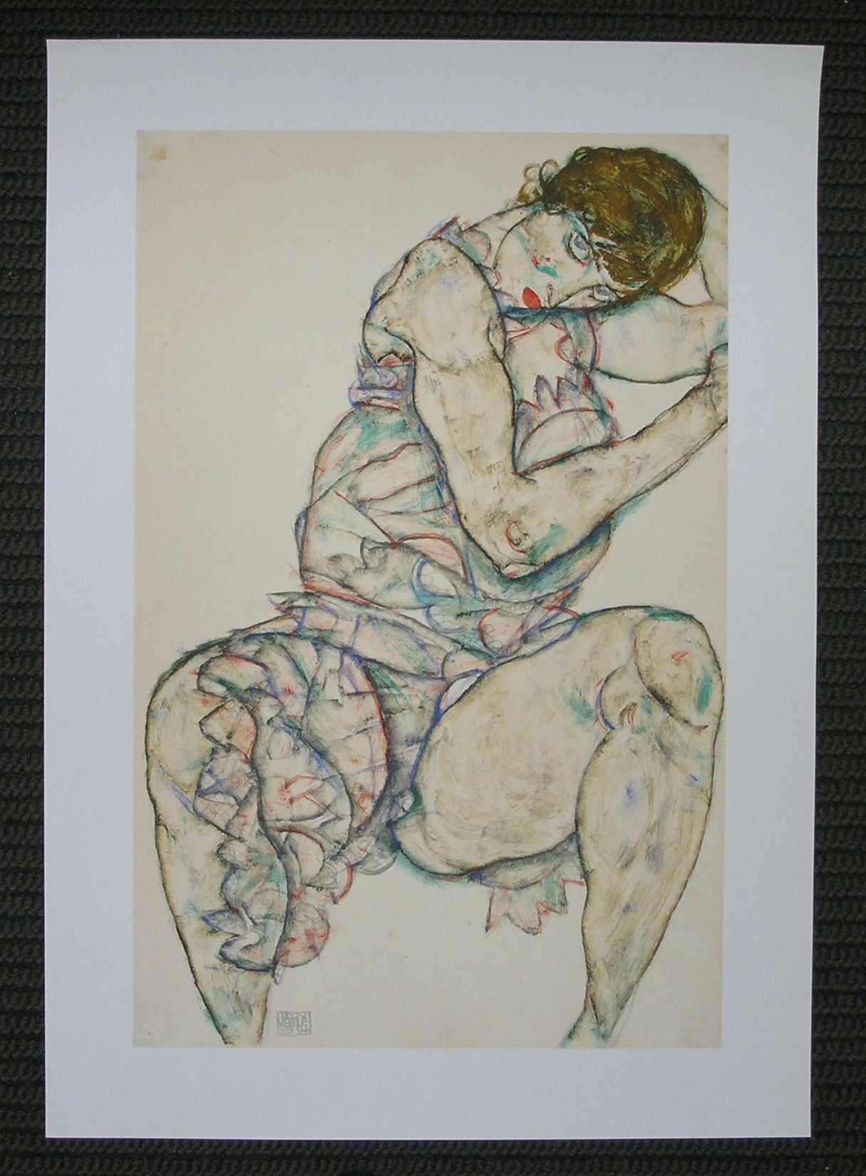
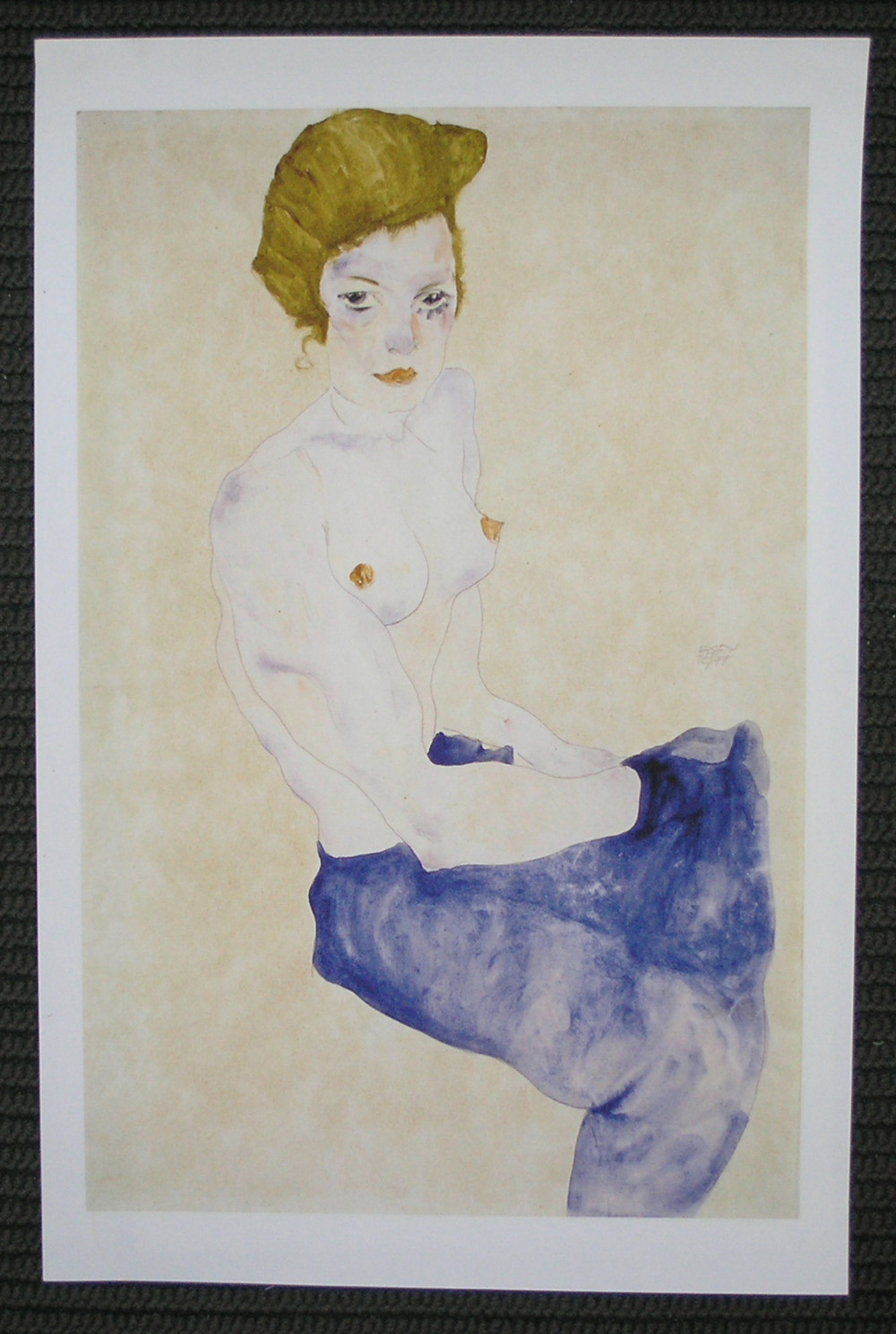
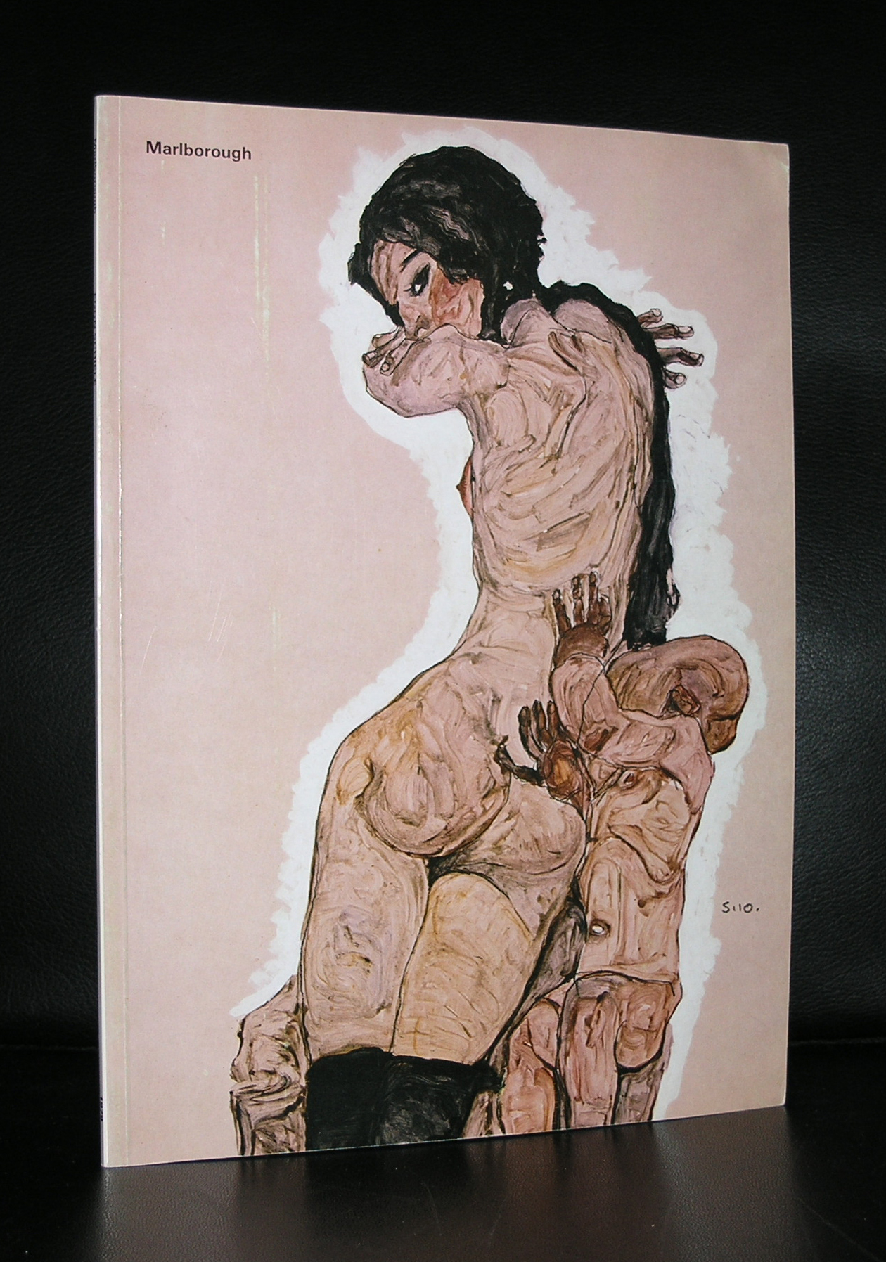
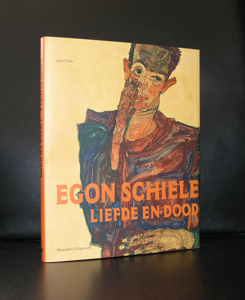
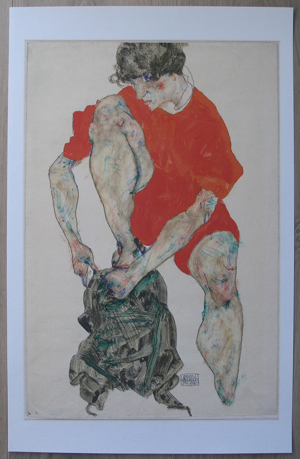
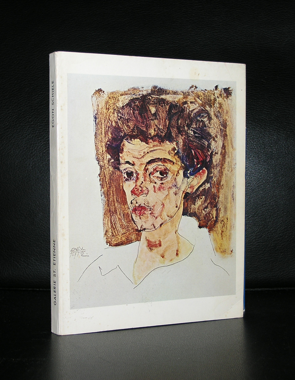
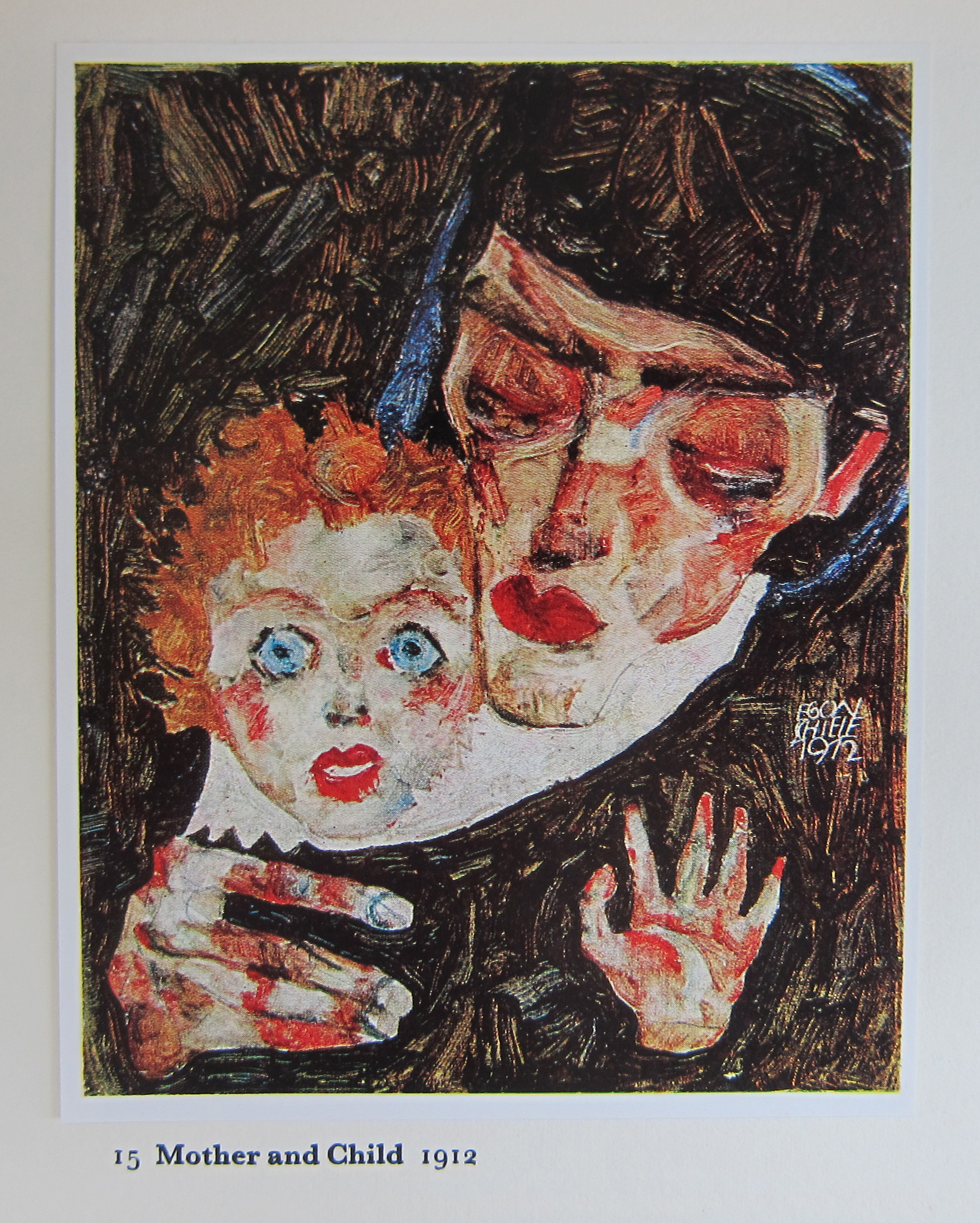
The museum that struck me most was the Leopold museum with probably the largest Egon Schiele collection in the world. I knew the works from Schiele from different other exhibitions. There was this time, some 10 years ago, we encountered a special Schiele exhibition with his works on paper in the Guggenheim/Bilbao museum and of course the Schiele/Klimt exhibition in the Gemeentemuseum Den Haag, during that exhibition i bought some excellent prints 1:1 with the original works . Schiele an artist with a very short life, but with a large production. Within my inventory i have a Marlborough gallery catalogue which shows that some 40 years ago Schiele works were still widely available and at reasonable prices, but in these crazy ART times it is different and Schiele works fetch high prices at auction.
for my blog readers i put together a special set of Postcards containing works by Schiele for only $ 12.00 including worldwide shipping. Please select the 7 postcards Schiele set and use the discount code: schiele12 and have a look at my many other Schiele items i have available at www.ftn-books.com
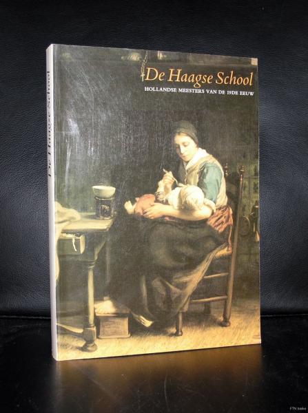
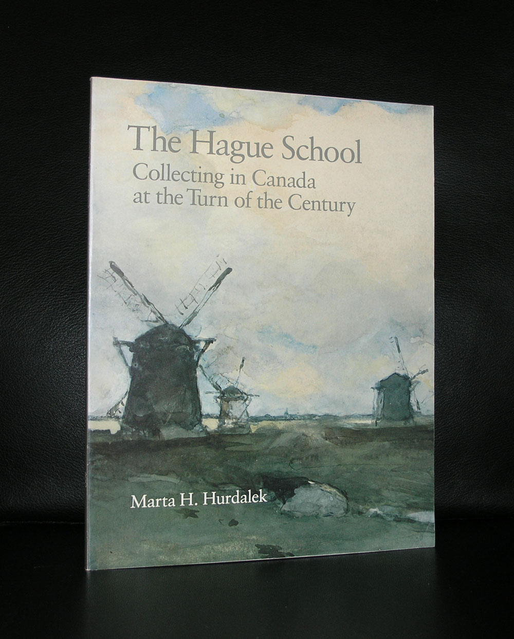
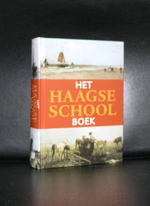
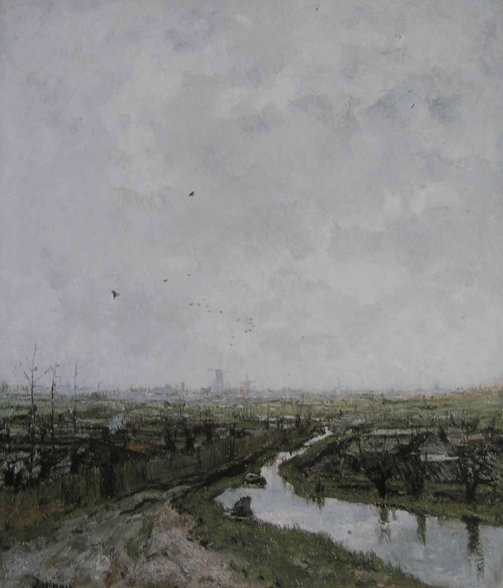
Blue skies with clouds chasing by, Grey Skies, meadows, windmills, ponds, hay stacks. Put this all in a blender and you will have the ingredients of a dutch impressionist or THE HAGUE school painting. The Netherlands was famous for his landscape painting from the 16th century on, but only in the last 150 years the painter approached his subjects and showed in detail what landscape painting was all about. Willem Maris was one of them and together with Weisssenbruch he made some of the best landscape paintings from his time. Beautiful skies and detail , perfect light and in many cases decorated with cows in the meadow. If you want to see the best from the THE HAGUE school painters, buy the books on the DE HAAGSE SCHOOL at www.ftn-books.com and for the best examples from this school visit the Gemeentemuseum Den Haag and the Mesdag museum, both in The Hague.
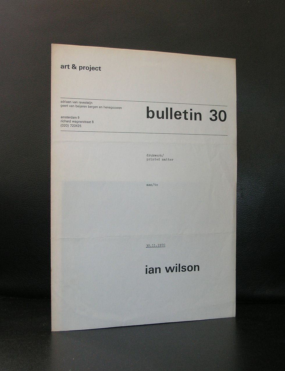
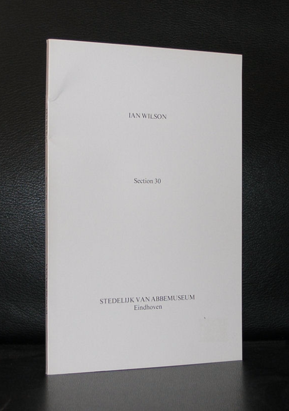
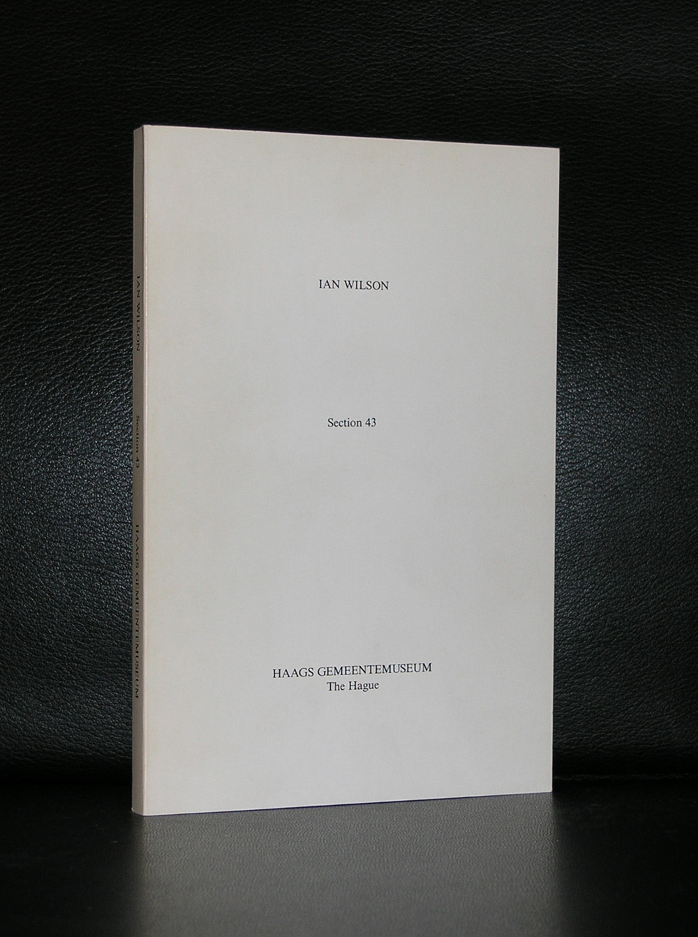
At the time i first laid my hands on a publication by Ian Wilson published in the section series . I really thought …..absolutely crazy….however when you read what the van Abbemuseum writes on the publications of Ian Wilson, you see the logic and when you see the logic you notice that every publication is a work of art by itself. I really do not know how many of these “Section” books were published, but for sure i know of 3 i had in my collection ( 2 i still have). There was the art &project publication. ( only 4 pages, but highly collectable) and the section 30 by the van Abbemuseum and the one i made for the Gemeentemuseum in the time Rudi Fuchs was director of the museum. The section 43 was published in an edition of 500 copies. Only 10 or so were sold and the main part of the edition was destroyed at the time the depots of the museum had to relocate because of the renovation in 1996. So my guess is only about 50 have survived what makes this one of the scarcest Ian Wilson publications. Please look at them at www.ftn-books.com
OLYMPUS DIGITAL CAMERA
OLYMPUS DIGITAL CAMERA
This is what the van Abbemuseum writes about Ian Wilson:
At first, Wilsons artistic explorations took place entirely in the monochrome. He was absorbed by questions relating to perception and painting. This is aptly illustrated by the nameless object of fibreglass and white pigment (1967) recently purchased by the Van Abbemuseum. In it, he created a slight convex curvature atop a circular surface. When hung on the wall at eye level, this ‘disc’ is so subtle that it does not cast any shadows. The fibreglass object presents the perceptive viewer with an ambiguous scene – sometimes it simulates a cavity in the wall, only to pop out of it again a moment later. His last physical objects, ‘Circle on the Floor’ and ‘Circle on the Wall’, were created in early 1968. Almost completely stripped of any material substance, these works are circles consisting only of outlines drawn in chalk and pencil, respectively. Using Wilsons meticulous instructions, the circles can be reproduced for use in any exhibition.
After some time, Wilson realised that it was no longer necessary to create an object in order to realise a concept. Wilson: ‘I found that I could think or say the circle just as well, that I didn’t need to draw it in order to convey the idea I was exploring.’ The movement towards dematerialisation was a widespread tendency among artists in the 1960s. Language predominated as the means of achieving this, and artists employed it in various ways to stimulate a mental process inside the ‘viewer’ of the work.
Wilson exploits the fact that language can be used to conjure up an image or explain a concept. Forming a mental image of a ‘cube’ requires a simple thought process – the concept of ‘infinity’, on the other hand, represents a higher level of linguistic abstraction. In his text entitled ‘Conceptual Art’ (1984), he says: ‘Language is the most formless means of expression. Its capacity to describe concepts without physical or visual references carries us into an advanced state of abstraction.’ In 2002 he explained that ‘by means of language you can grasp the non-visual world.’ By letting go of material objects and continuing his artistic exploration in the realm of the spoken word, he was able to make the transition from visual abstraction to non-visual abstraction.
Initially, Wilsons verbal work was of an informal nature, taking place on the street, at random exhibition openings or in people’s homes. It was in this manner that he presented his work ‘Time’: the word in its spoken form. A deeper discussion on the subject of ‘time’ also emerged. In 1969, Wilson shifted his field of exploration to the medium itself – ‘oral communication as art form’ – and in 1970 was invited to present ‘Oral Communication’ in Europe.
Over the course of the 1970s, his discussions took on a more formal character, and his interests shifted towards ‘The Known and Unknown’, based on Plato’s ‘The Parmenides’. In contrast to a ‘performance’, during a discussion the audience can actively take part in realising the concept of ‘oral communication’. Wilson does not want the discussion to be recorded either on film or audio. He is interested in the concentrated moment in which ideas emerge and are formulated in language. What remains after the discussion is a subjective and unstable thought in the minds of those present. Wilson summarises the core of these discussions in a book series entitled ‘section’.
From 1970 onwards, his discussions were announced using cards, which served as invitations informing the addressee of where Wilson would be and when. Purchases of works were confirmed by a certificate containing a printed and signed declaration by the artist, stating that a discussion had taken place on that date. Wilson had specific ideas concerning the formulation and layout of both the invitation cards and the certificates. These purchase certificates and invitations cards were the only material remnants of the discussion.
In 1986, Wilson stopped holding discussions and concentrated on printed language. From the late 1980s onward, unique series of his artists’ books began to appear, such as ‘The Set of 25 Sections: 90-114, with Absolute Knowledge’ shown here, from 1993. Partially due to renewed interest in Wilson’s spoken works, he started group discussions again in 1999, which to date have focused on the subject of ‘The Absolute’.
In my blog from Sunday you noticed that we visited the Gemeentemuseum Den Haag to have a look at the Riley CURVES exhibition. During this visit we walked the first floor of the museum with part of their permanent collection. Since the Bacon exhibition from 2001 , several painting are “on loan ” from other museums and they have now completed this room with a sculpture on loan from the Hauser & Wirth collection…and placed this in the same room as the Bacon’s….result….one of the most exciting and stunning Museum rooms i have ever seen.
Sometimes there are artists who look like brothers/sisters of each other, same approach to their subjects and this room is an example how closely both these artists are related in their art to each other. Here is the text the Gemeentemuseum published on their site www.gemeentemuseum.nl on Berlinde de Bruyckere.
Belgian artist Berlinde De Bruyckere (b. 1964) creates sculptures that reveal the human body and human life in all its frailty. Her installations of equine and human bodies evoke feelings of love and consolation, but also of terror and violence. The work is both emotionally immersive and provocative, regularly creating controversy. De Brucykere’s bitter-sweet images unite pain and suffering with a strong aesthetic appeal. Her Cripplewood presentation attracted great public attention at the 55th Venice Biennale. The Gemeentemuseum Den Haag acquired her sculpture Into One – Another II, To P.P.P., 2010-2011 in 2011 and is now about to hold a major retrospective of her work, much of it never previously exhibited in the Netherlands.
The human body and its visible suffering is the key theme in De Bruyckere’s whole oeuvre. We are now almost immune to images of suffering; the constant stream of ghastly pictures fed to us by the mass media has seen to that. Berlinde De Bruyckere seeks to restore our sensitivity to the suffering that is a timeless and universal part of the human condition. She makes us stop and look at it but leaves us free to make of her work what we will. In doing so, she unerringly explores the limits of the visual representation of physical and emotional pain.
De Bruyckere constructs her sculptures of wax, resin, rope and worn leather or textile and strings together separate wax casts to create single bodies. She is concerned solely with bodies; faces are concealed behind shocks of hair or cloths; heads are often completely missing. Using special pigments, she transforms wax into pallid skin with vague glimpses of blood, veins and contusions. Red patches and ‘wounds’ give the impression of a tortured body and suggest associations with the religious symbolism surrounding martyrs like St. Sebastian – a figure of great significance to Cripplewood. In addition to these religious elements, classical mythology also has a place in De Bruyckere’s work. Ovid’s Metamorphoses are a constant source of inspiration.
Horses are also an important symbol in her oeuvre, used primarily as a metaphor to express profound human emotions surrounding death and mortality.
In addition to her sculpture, the forthcoming exhibition will also feature drawings and early works in textile. De Bruyckere uses her drawings – often made in a combination of watercolour and gouache on recycled paper or cardboard – as exploratory studies relating to the themes of her sculptures. In this respect, she frequently seeks inspiration in the bodies of dancers. The development of ideas with dancers in the studio is a technique of great importance to her and has resulted in various wax sculptures, as well as a number of different series of drawings. These series are not preparatory studies, but function as works of art in their own right, underlining the themes that together form the leitmotif of her entire oeuvre. De Bruyckere’s sketches, drawings, watercolours and sculptures are all interlinked and together constitute a single ‘body of work’.
De Bruyckere trained at the LUCA School of Arts in Ghent. Her work was first exhibited in the Italian Pavilion at the 2003 Venice Biennale. This led to immediate international recognition and her work has since been acquired by major museums, foundations and private collectors around the world. She returned to Venice in 2013 to represent her own country in the Belgian Pavilion.
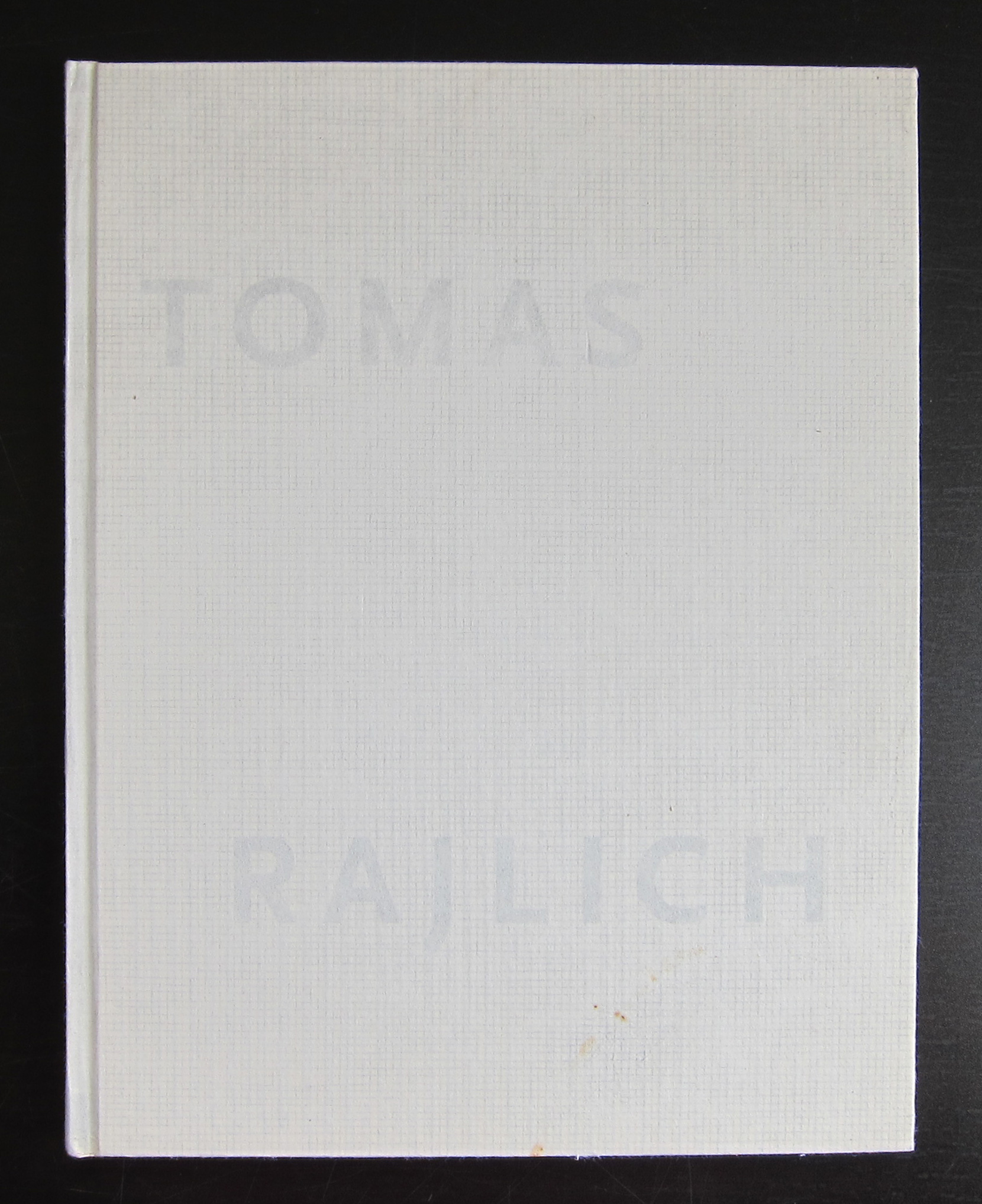
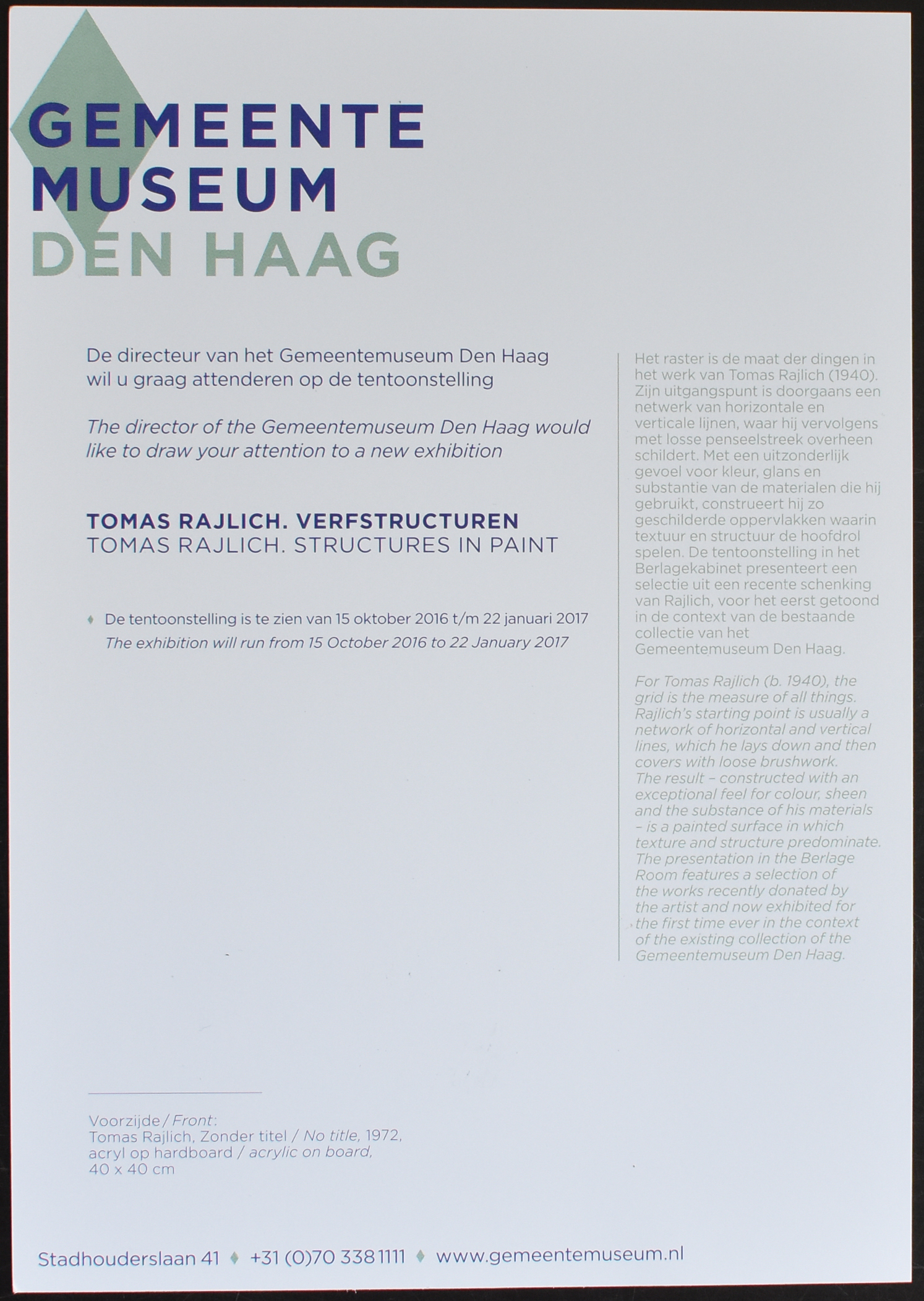
Just a short blog to let you know that a large retrospetcive on Tomas Rajlich will be opened on the 15th of October 2016 which will be on show until 22nd January 2017.
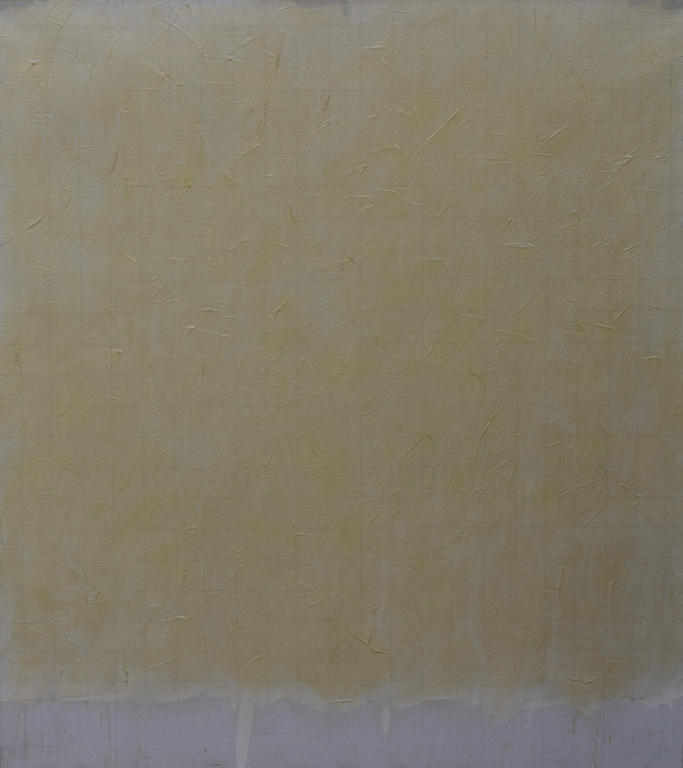
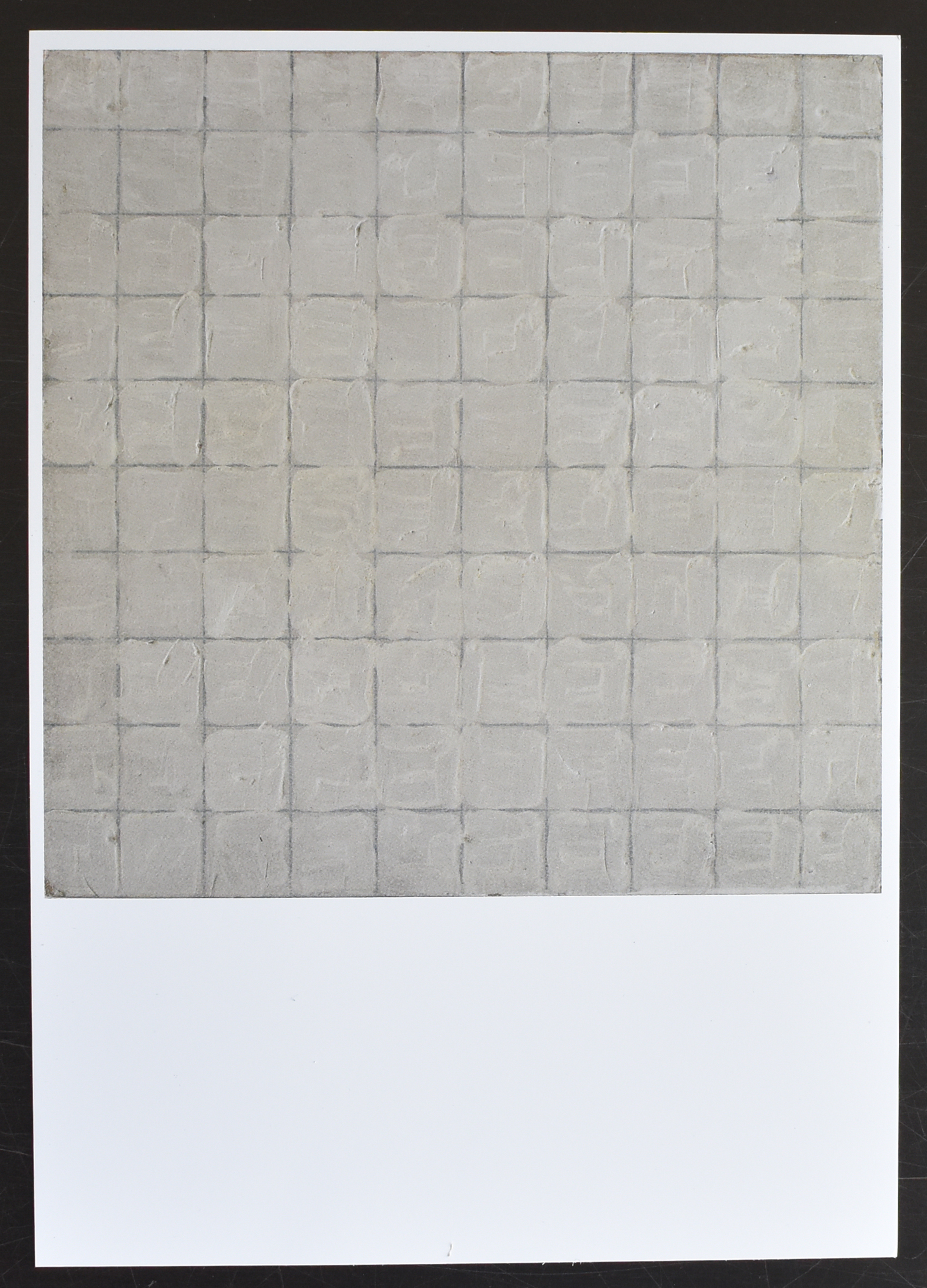
Tomas Rajlich, a minimal painter for whom the grid is the measure of things. Rajlich’s starting point is usually a network of horizontal and vertical lines, which he lays down and then covers them with loose brushwork. The result – constructed with an exceptional feel for colour, sheen and the substance of his materials- is a painted surface in which texture and structure predominate.
The exhibition is made partly with works that Rajlich recently has donated to the collections of the Gemeentemuseum.
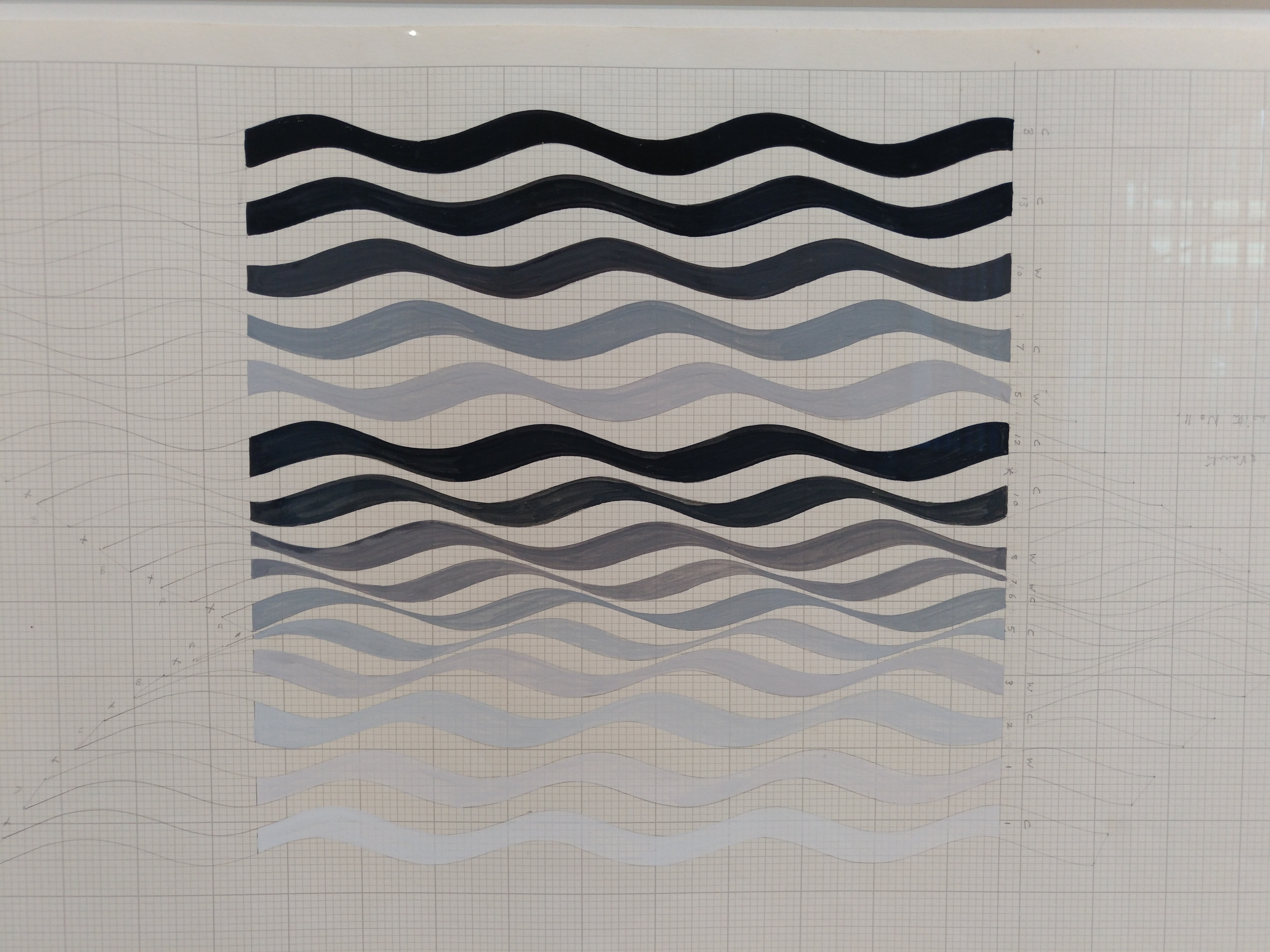
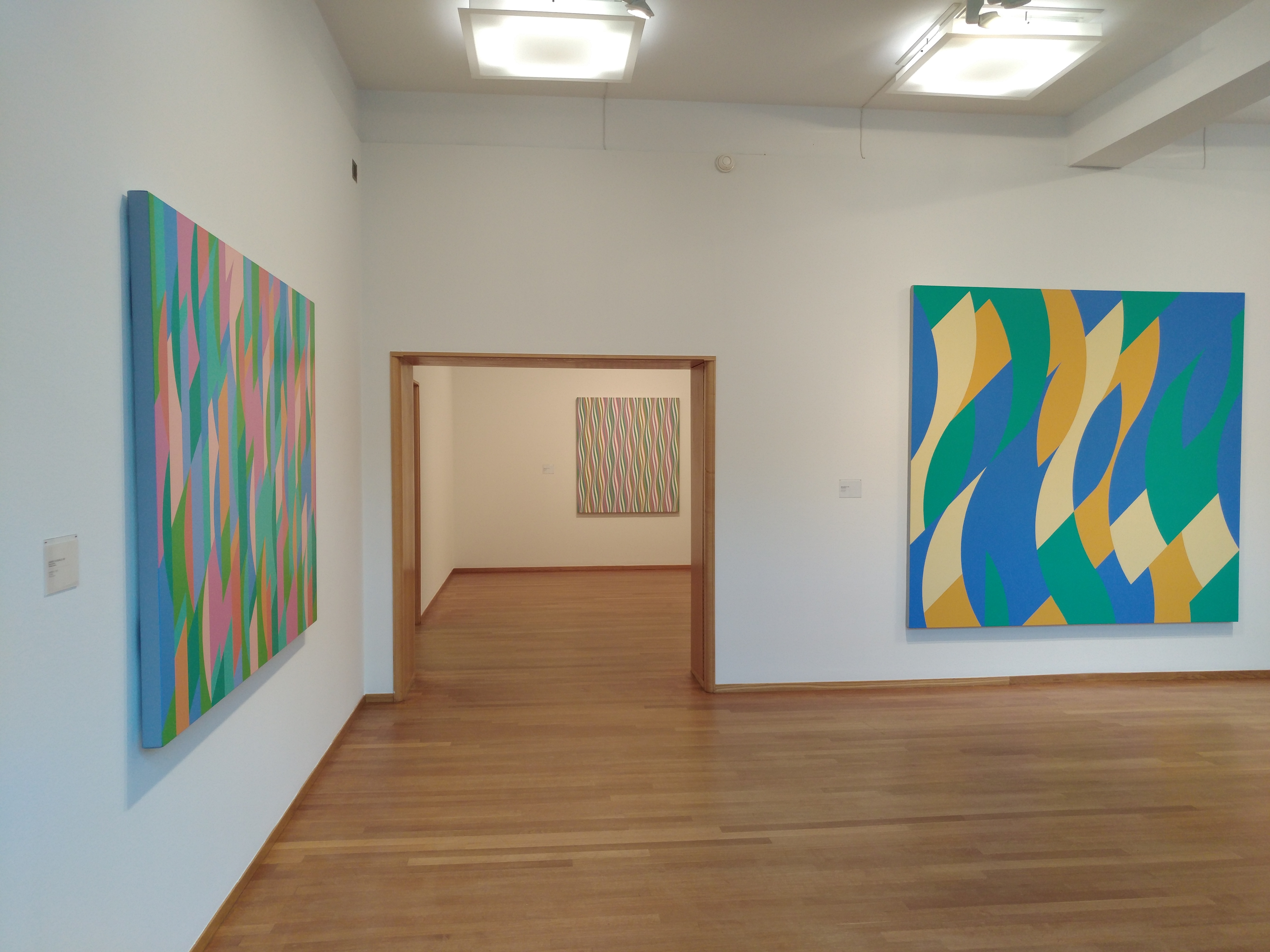
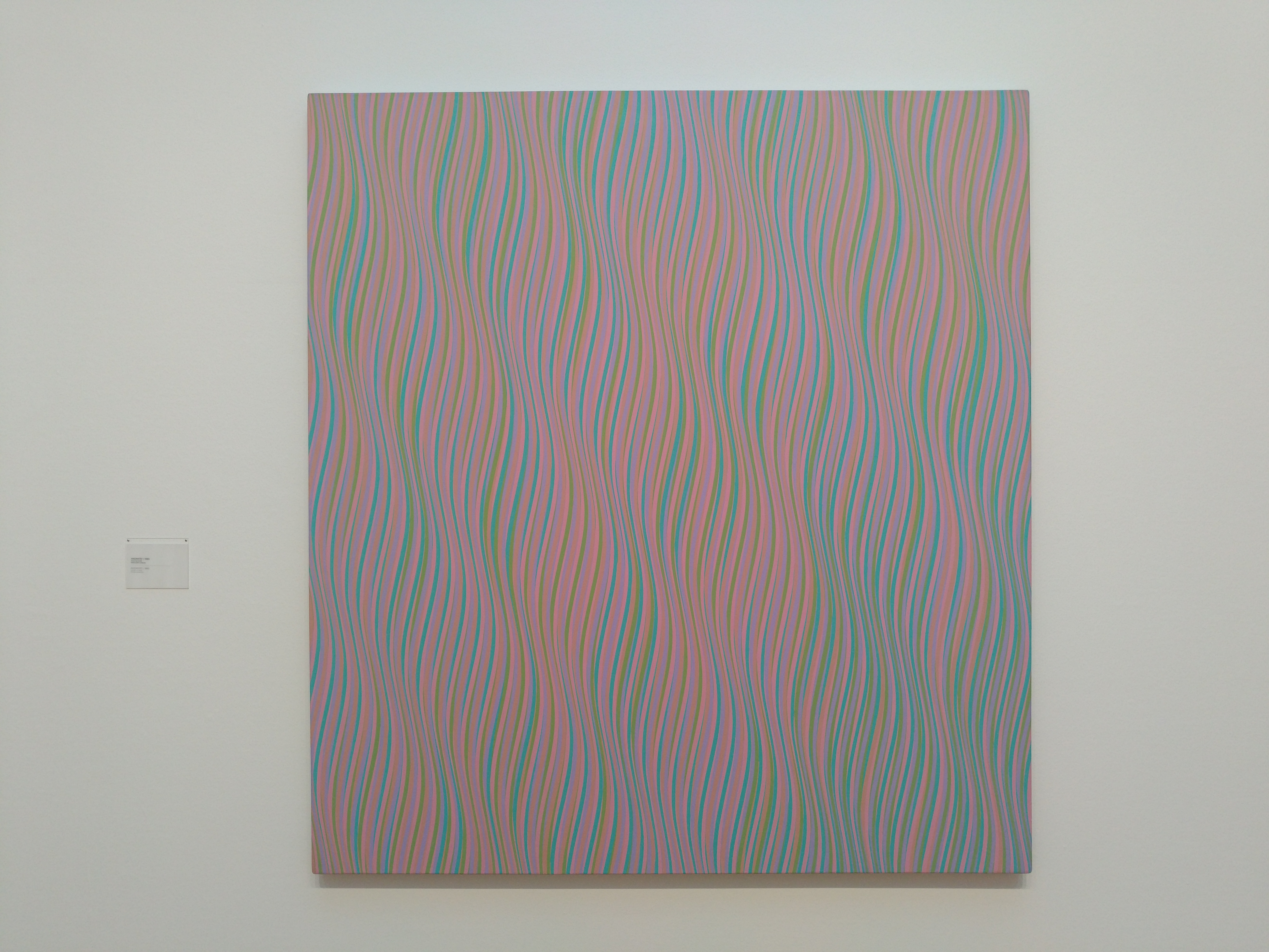
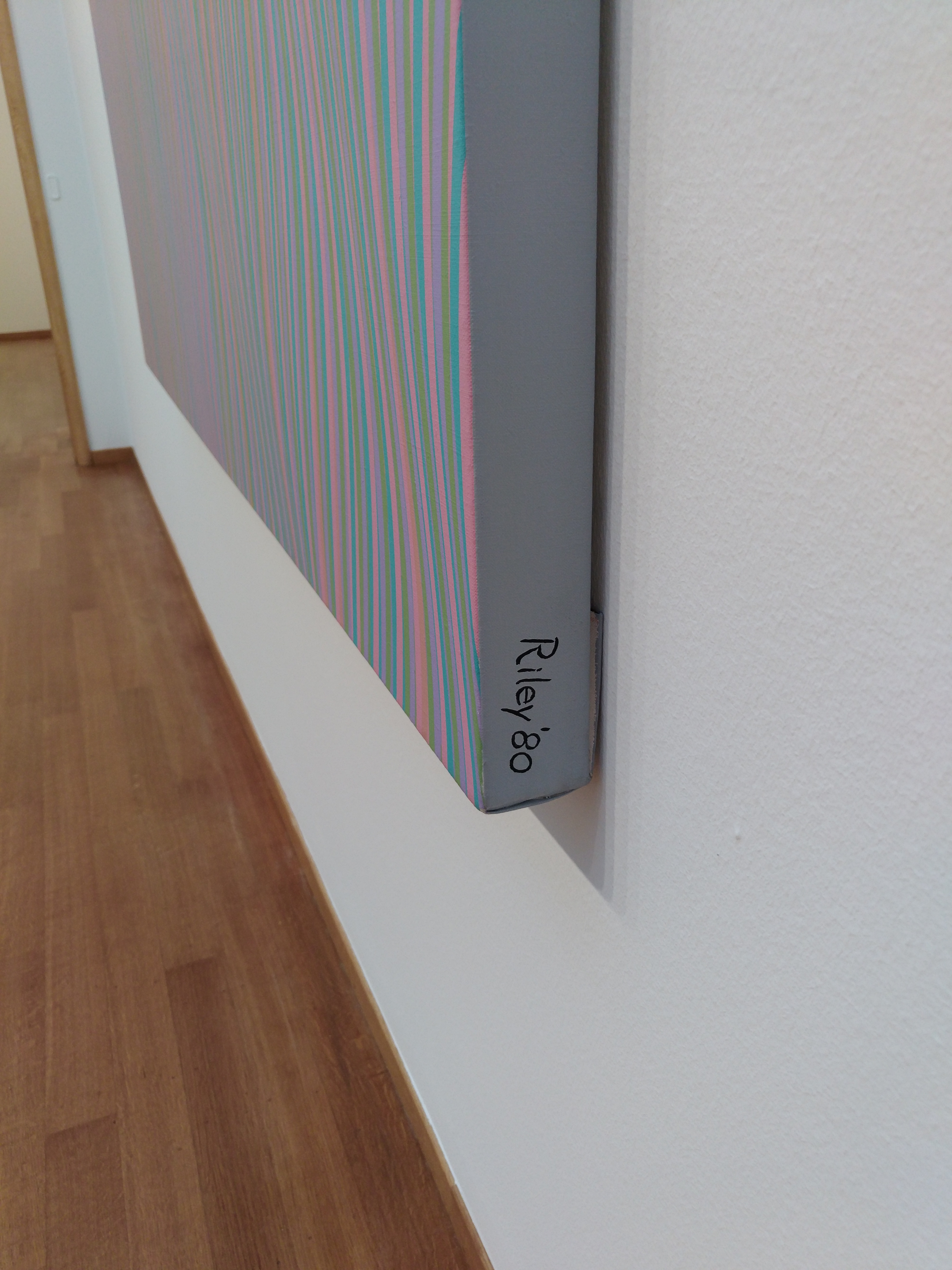
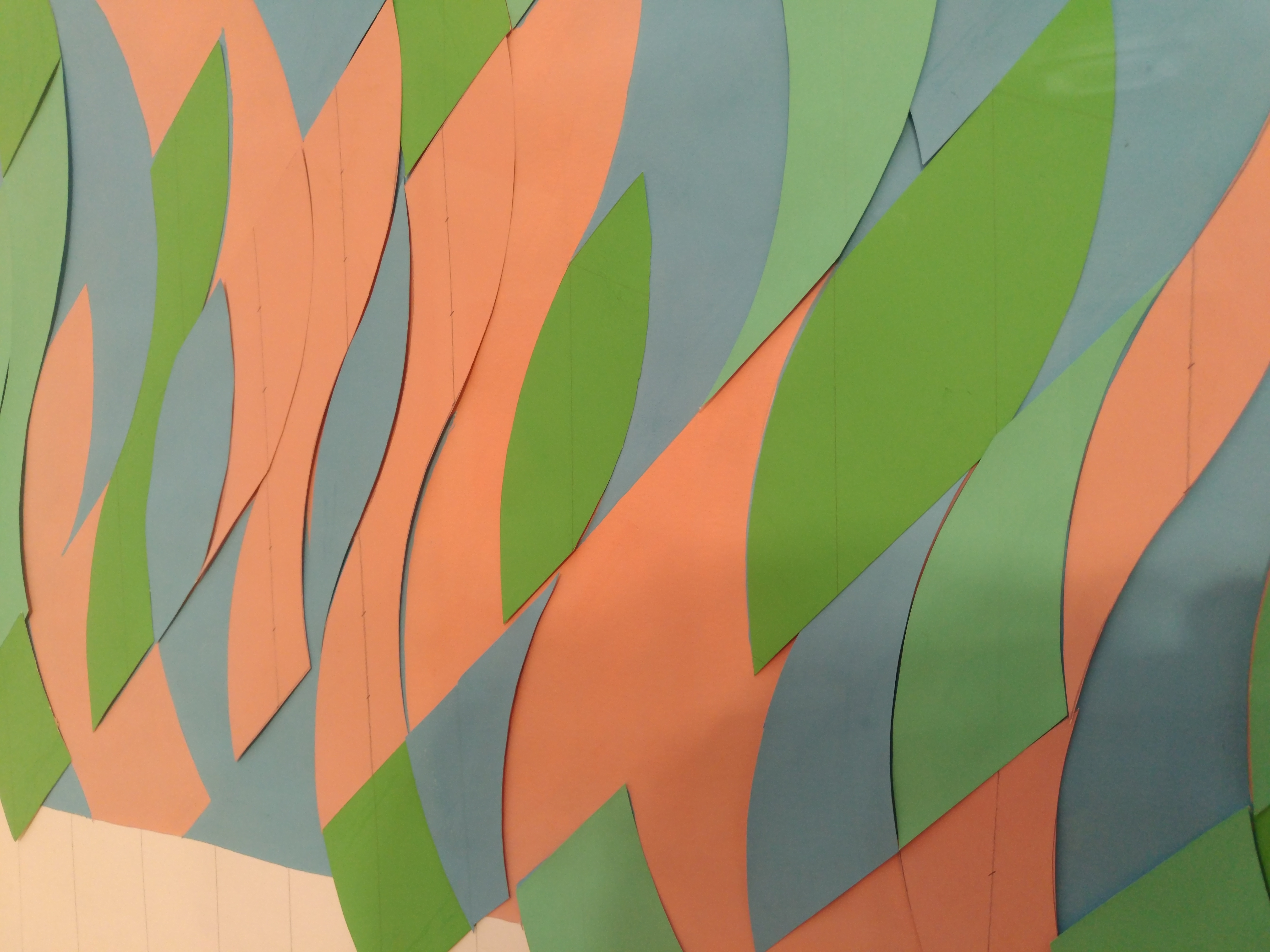
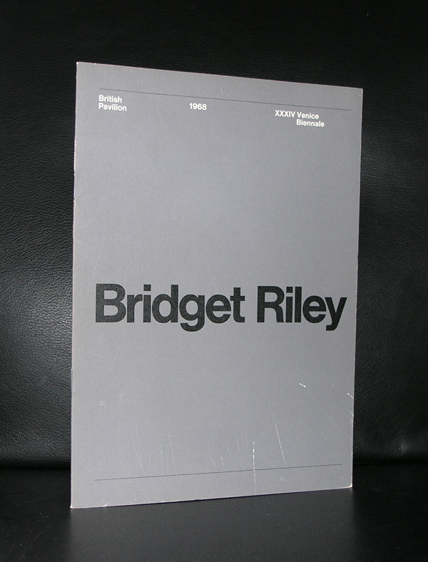
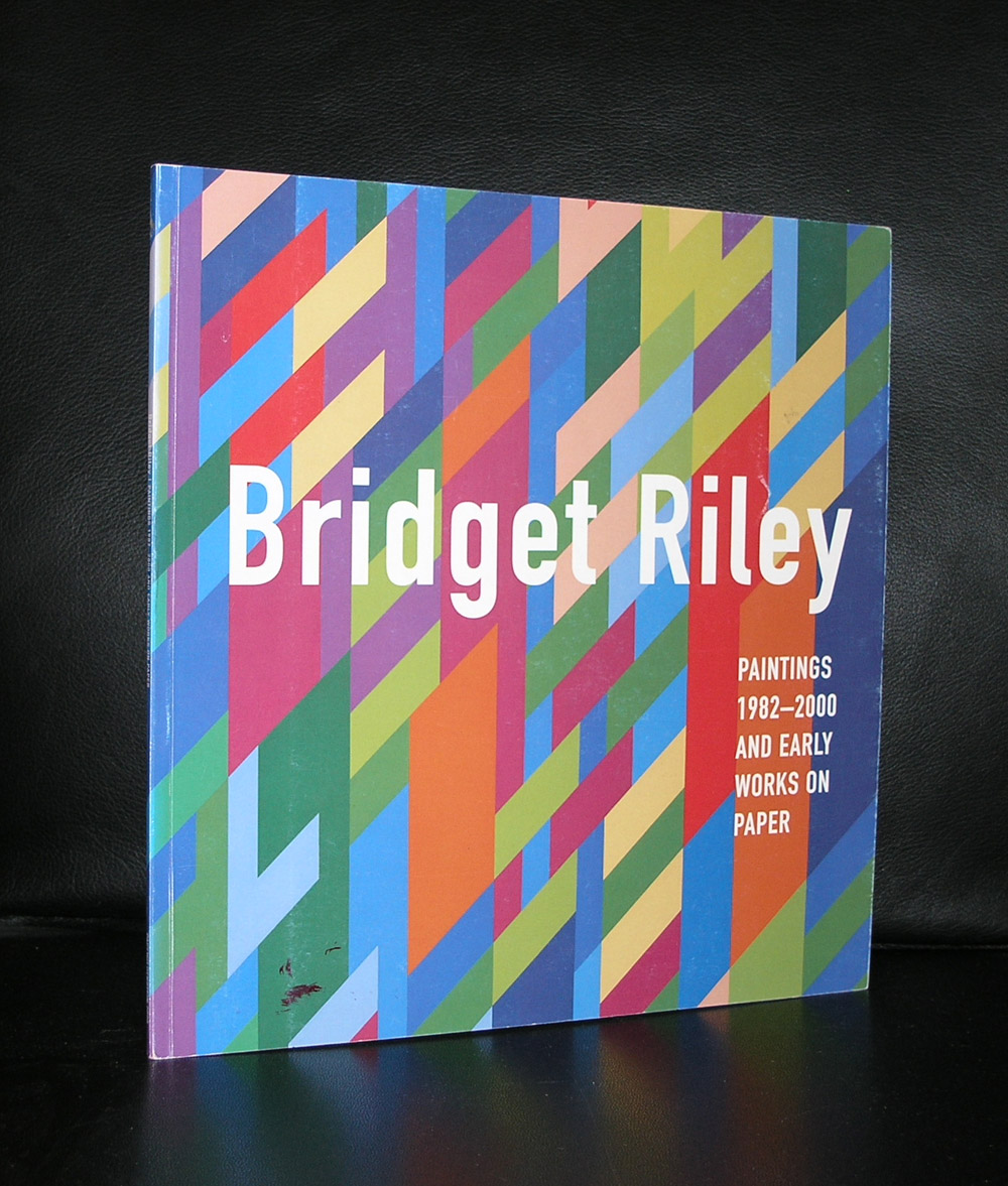
Yesterday we visited the exhibition of Bridget Riley in the Gemeentemuseum Den Haag. ( the exhibition is till open until the 15th of October 2016).
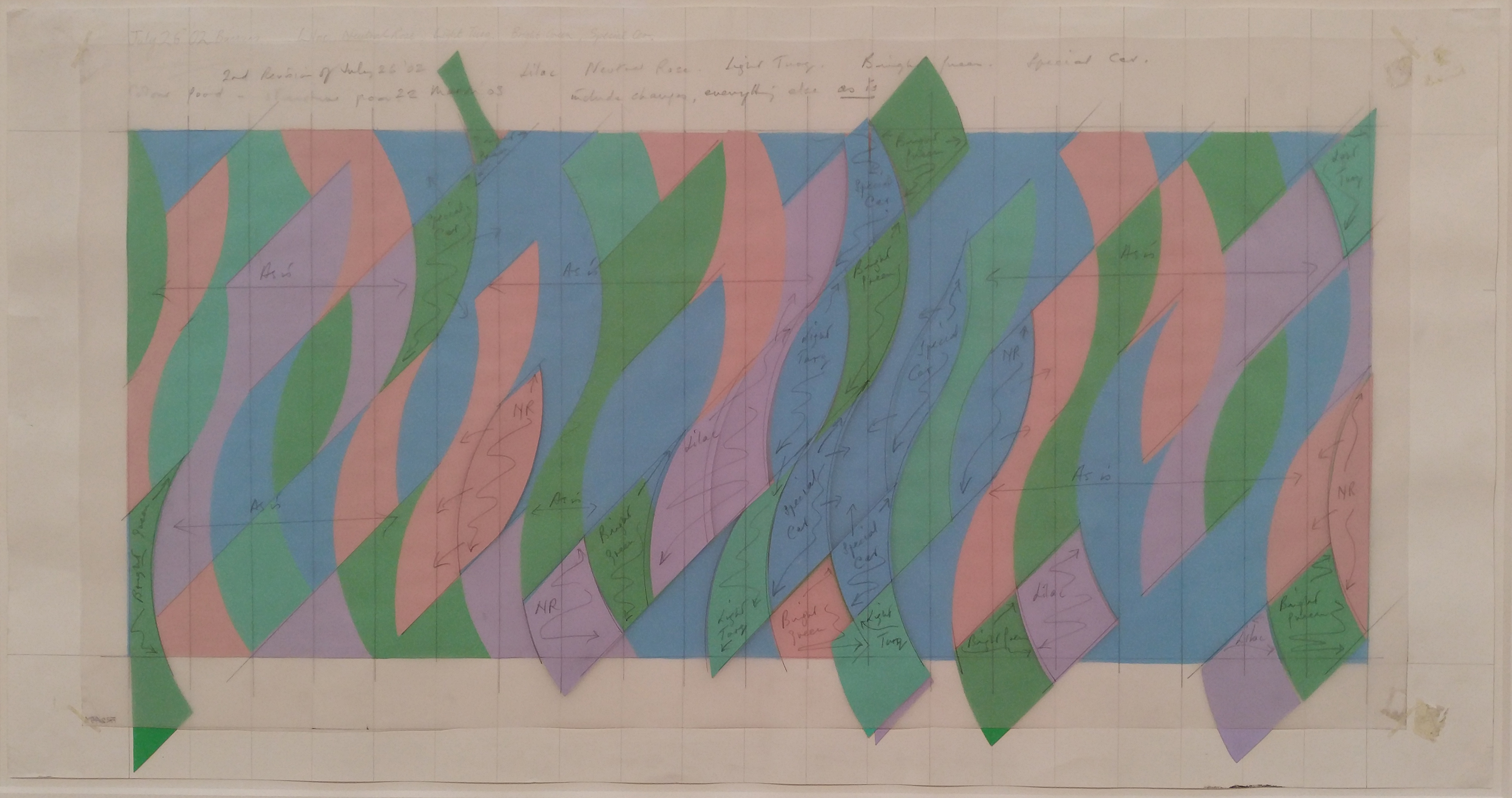
A fascinating show on the Curved paintings she made from the early sixties until 2014. Paintings which are extremely detailed painted and very well thought out. The sketches and colored cardboard models show the way in which Riley makes these projects from idea into a large canvas. Walking through the exhibition ( yes passing these paintings) shows the effect these patterns have on your eyes. Waves and curves begin to dance before your eyes and show that a still painting can have the effect of movement in your perception. Fascinating to discover this Optical illusion and certainly very effective Op Art . Riley stayed true to this way of painting and did not produce many of these paintings over the years. These paintings take a long time to paint, but when they are ready they are all masterpieces.
Her first solo exhibion she had at the Gallery One in London in 1964, after that she was invited for the Biennale in Venice and het break through exhibition ” The Responsive Eye” in the Museum of Modern Art in 1965.
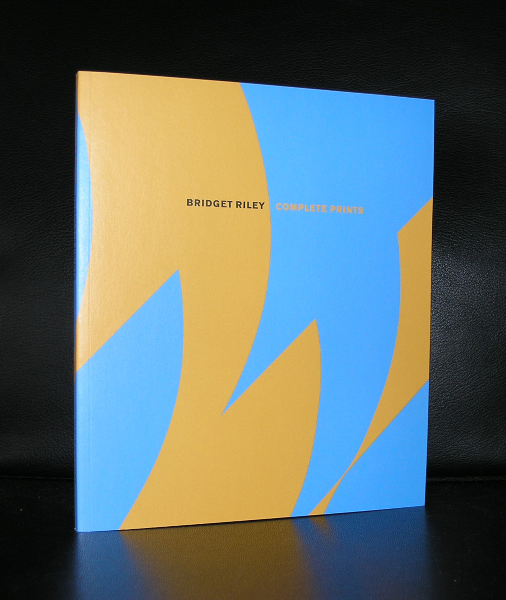
Her works can be found in Modern Art Museums all over the world, but the Tate modern has the largest collection of them.
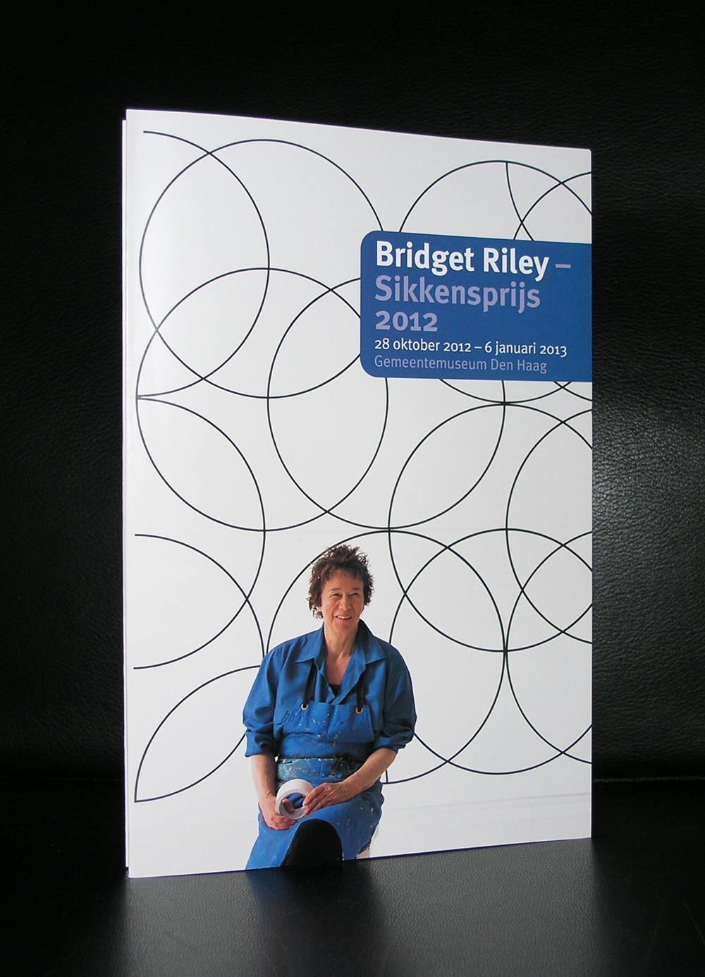
Look at the pictures i took at the exhibition and get an impression how she meticulously prepares each new painting. www.ftn-books.com has some nice early Riley titles available including the leperello which was published on the occasion she received the Sikkensprijs in 1992.
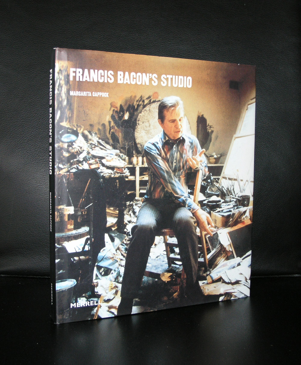
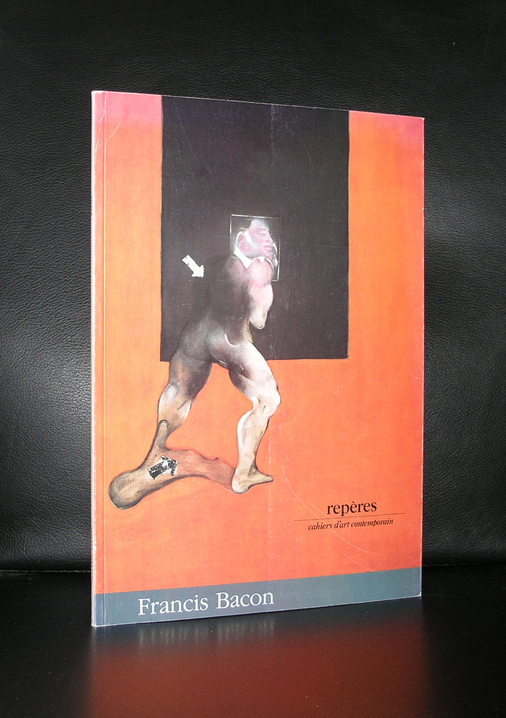
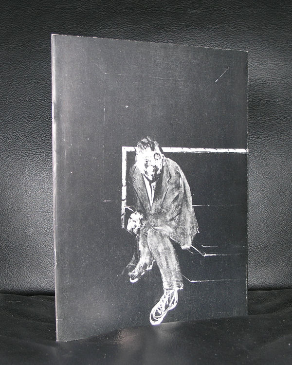
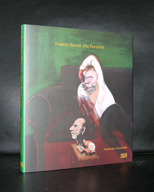
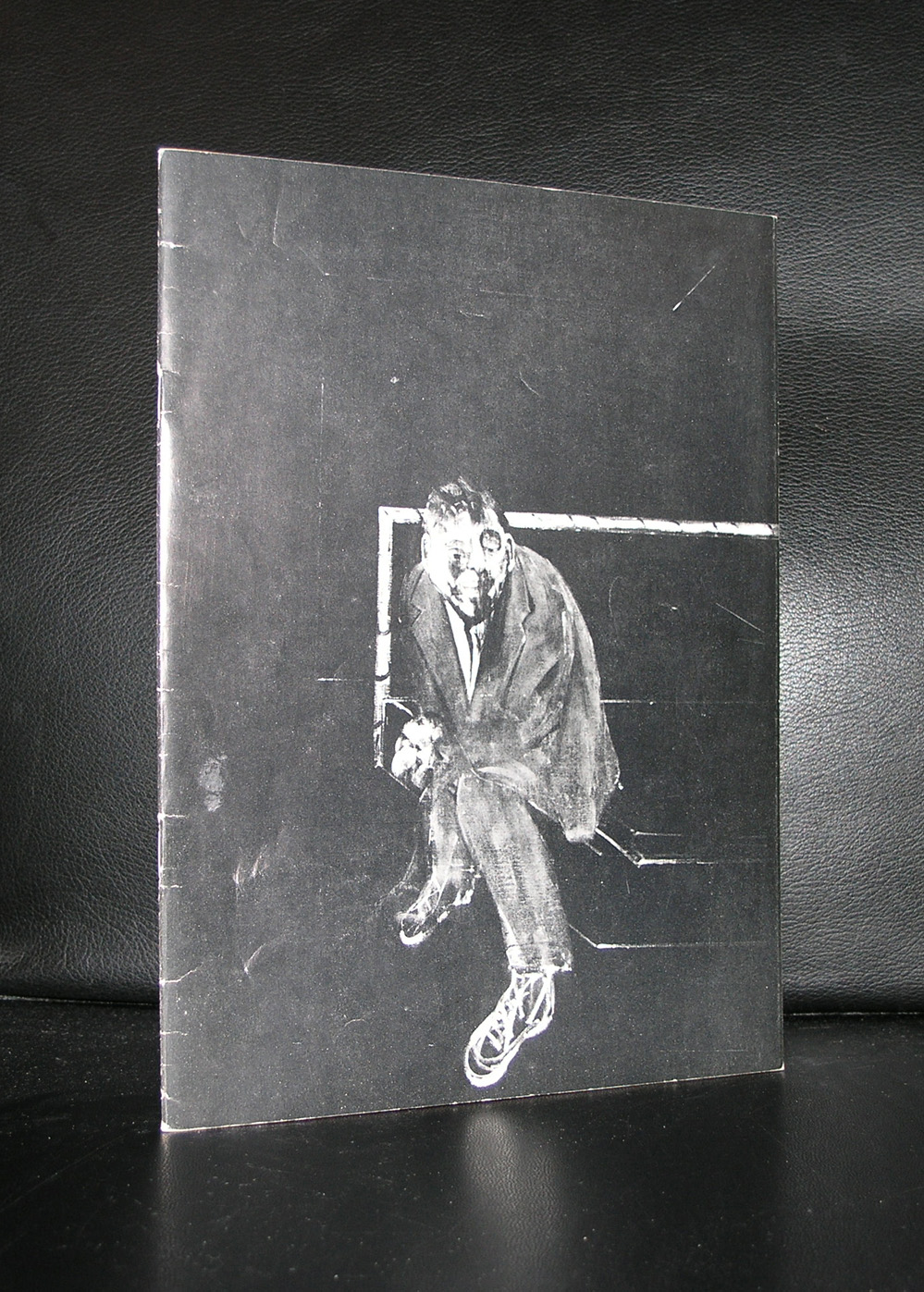
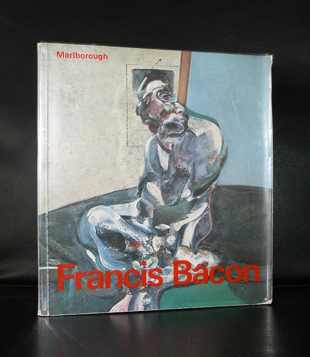
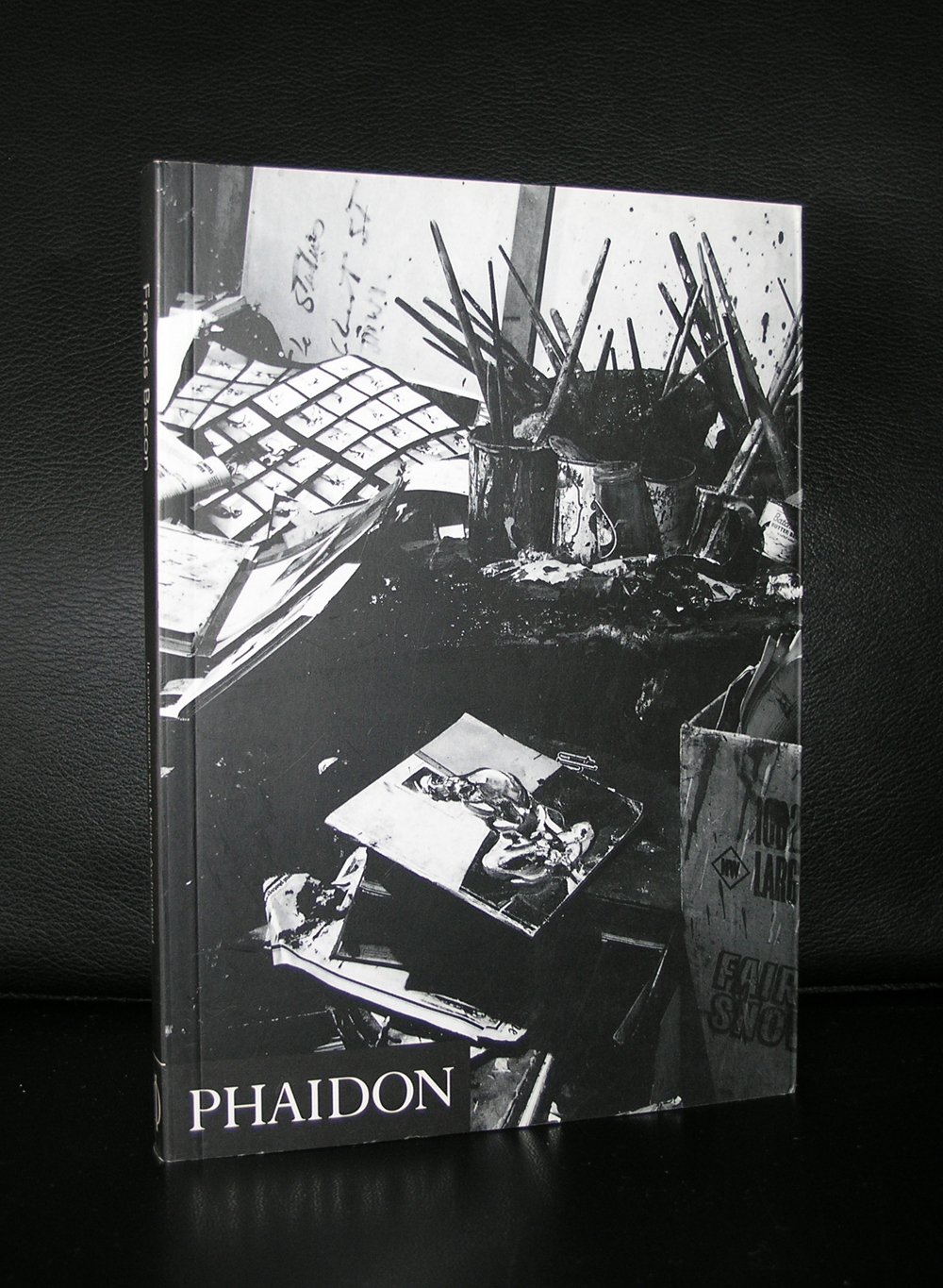
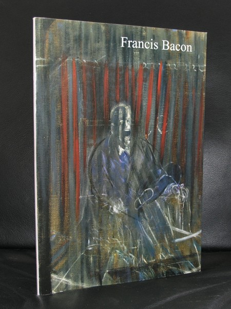
If you ask me which artist was represented with the most beautiful and best catalogues published for every exhibition organized with his works…. the answer is Francis Bacon.
Oversized catalogues with several hundreds of pages, excellent print quality and because of its content in many cases with multiple fold out pages to show Bacon’s Triptych’s in the best possible way outside a museum.
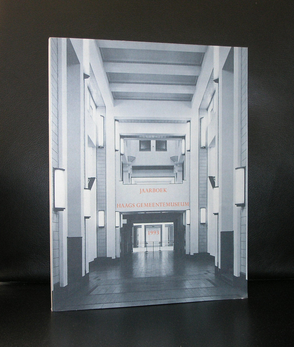
I followed Bacon closely because in 2001 the Gemeentemuseum organized its most expensive and logistically one of the most difficult exhibitions ever ….the one on Francis Bacon. The plan was to print the catalogue in Singapore, but because of a promised book publication to the former director, he decided for a dutch publisher. An initial publication run was set in relation with the expected number of visitors. Soon after opening it proved a wrong estimate, because fortunately, the works by Bacon proved to be far more popular than expected. 3 editions of the catalogue were printed during the exhibition and in total almost 8.00o copies were sold . A huge commercial succes, but even more important a great succes for Bacon as one of the leading modern artists from the 20th century.
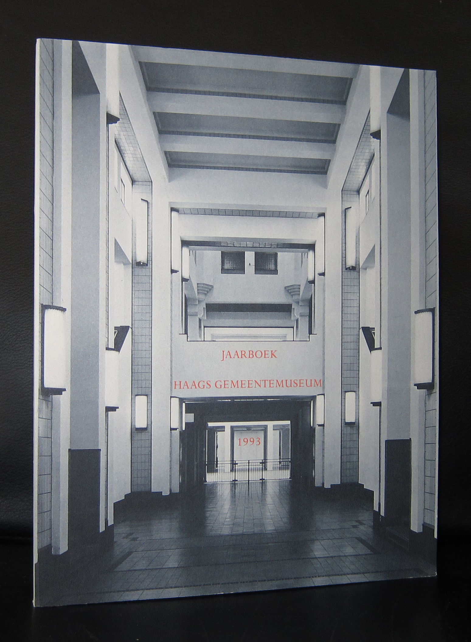
This was one of the last times so many large Bacon paintings ,including many Triptychs, were presented in one Bacon exhibition. The exhibition showed the importance of Bacon and because of this, the Gemeentemuseum got on loan the Bacon which is in the collection of the Museum Boijmans van Beuningen and one from the estate of Francis Bacon. Nowhere in the Netherlands so many Bacon paintings can be seen in one spot and and the sixties acquisition of the PARALYTIC CHILD WALKING ON ALL FOURS proved to be a worthy addition the collection of the Gemeentemuseum. ( in the JAARBOEK a study by Josephus Jitta is published on the “Paralytic child”)
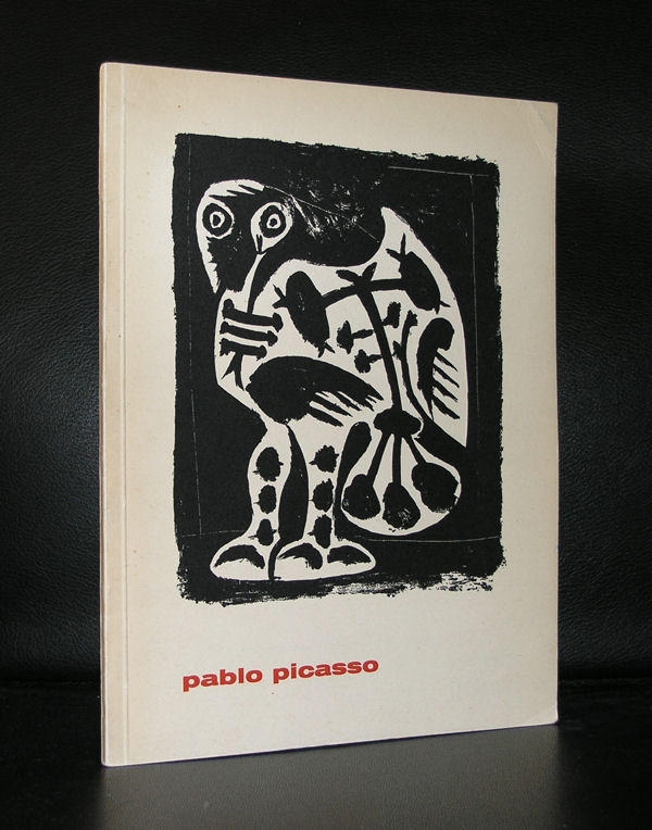
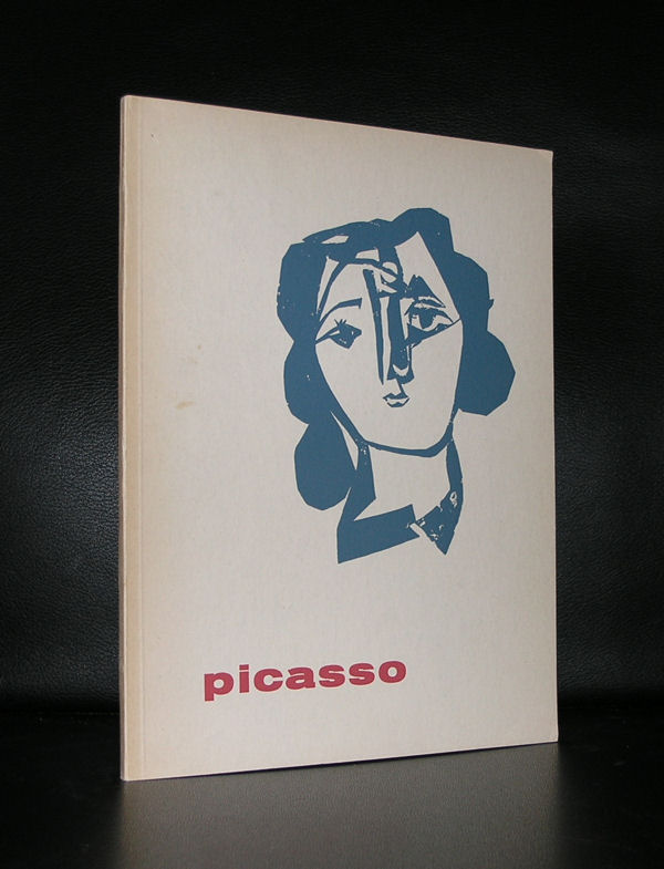
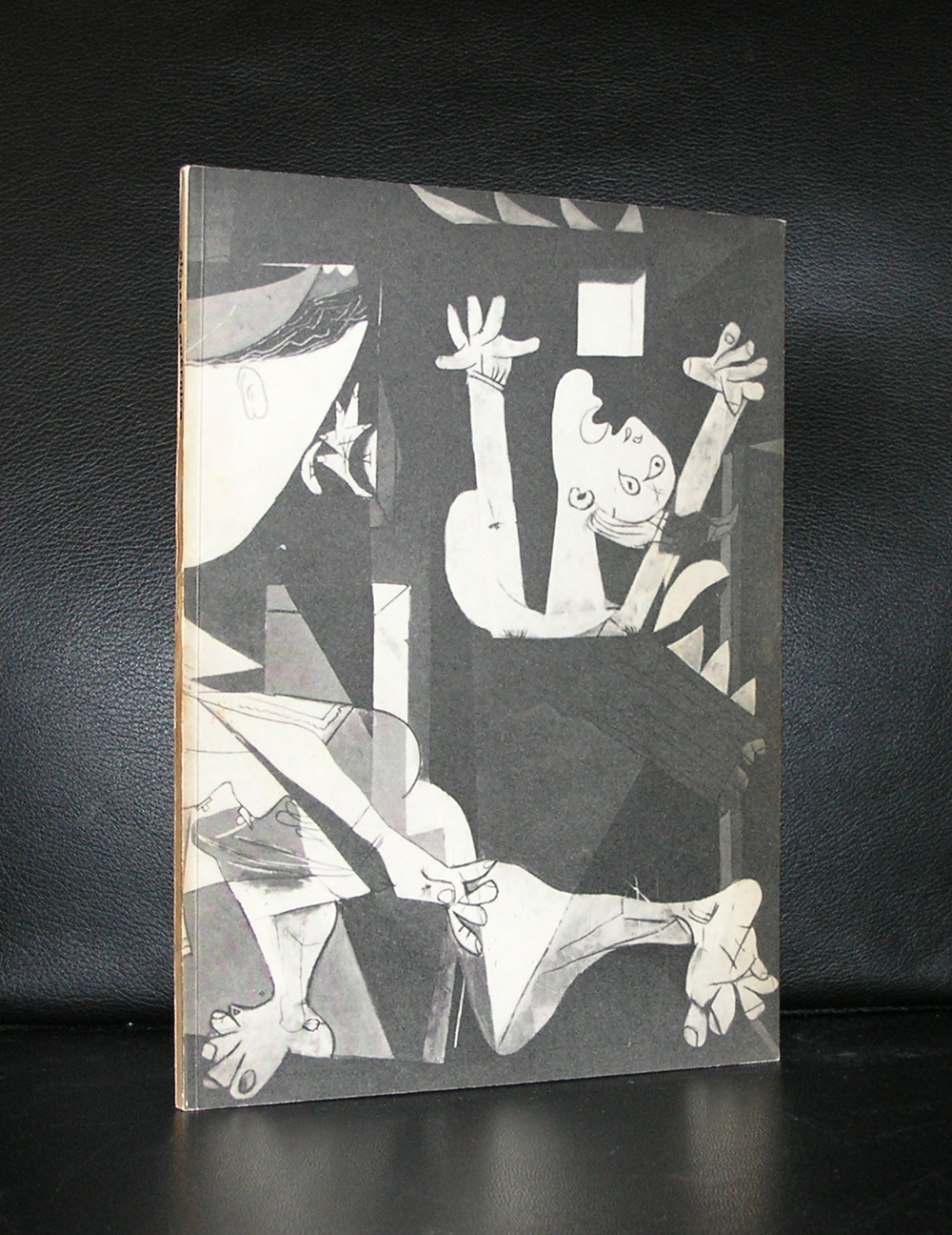
Personally i am not a great fan of Picasso. I understand his importance for Modern Art, but somehow he never appealed to me very much. One exception . In 1937 Picasso painted GUERNICA. The first time i saw this extremely large painting was in 1977 when i visited New York with my father. It was breathtaking!
So much to see in this painting. I shows the city of Guernica while it was bombarded by the Condor legion of the Luftwaffe. Pure panic and chaos on every painted part of the painting. This is a painting you must see in reality, because the sheer size is breathtaking already. It was one memory i brought home with me.
About 12 years ago the Gemeentemuseum Den Haag had the studies for Guernica in a special show and even on these much smaller studies you can see the struggle of the painter and the power of the subject.
A few years ago we went to the Reina Sofia Museum in Madrid and saw this masterpiece again. The same experience…still breathtaking.
When you look at this painting you can see that it has influenced many painters. . For one, there is a dutch painter ” Willy Boers” who borrowed the theme with the horse and made his own version of chaos and despair. The painting is called “La Quintessence” dated 1947/1948, 10 years after Guernicia was painted and is depicted in DOORBRAAK VAN DE MODERNE KUNST IN NEDERLAND. Can you spot the similarities too?
Artist/ Author: Oliver Boberg
Title : Memorial
Publisher: Oliver Boberg
Measurements: Frame measures 51 x 42 cm. original C print is 35 x 25 cm.
Condition: mint
signed by Oliver Boberg in pen and numbered 14/20 from an edition of 20


 Personally i am not a great fan of Picasso. I understand his importance for Modern Art, but somehow he never appealed to me very much. One exception . In 1937 Picasso painted GUERNICA. The first time i saw this extremely large painting was in 1977 when i visited New York with my father. It was breathtaking!