George Hendrik Breitner was born in Rotterdam. From 1876 to 1880, he attended the art academy in The Hague where his exceptional talent was recognized on numerous occasions. From October 1878 to April 1879, he worked as a drawing teacher at the Leiden academy Ars Aemula Naturae. In 1880, he was banned from the Art Academy in The Hague due to misconduct, as he had destroyed the rules of the board.
That same year, he stayed with the garden architect Willem Maris in Loosduinen and became a member of the Pulchri Studio, an important artists’ association in The Hague. Later, he distanced himself from the Hague School and is now widely regarded as an Amsterdam impressionist.
In the period of 1880-1881, he collaborated with Hendrik Mesdag, S. Mesdag-van Houten, Theophile de Bock, and Barend Blommers on the famous Panorama Mesdag. In 1882, he met and worked with Vincent Van Gogh, often sketching together in the poorer neighborhoods of The Hague. Breitner preferred working with models from the working class: laborers, maids, and people from the lower classes. This interest in common people was shared by many artists during that time.
He was associated with the Dutch literary group known as the “Tachtigers” (English translation: “Eighty-ers”). They were proponents of impressionism and naturalism, rejecting romanticism and other painters such as Isaac Israels, Willem Witsen, and poets like Willem Kloos.
Breitner saw himself as “le peintre du peuple”, the painter of the people. He was the quintessential painter of cityscapes: wooden piles in the harbor, demolition works and construction sites in the old center, horse trams on the Dam, or canals in the rain. Amsterdam (1901).
Bob Hanf was born on November 25, 1894 in Amsterdam, where his parents Joseph Hanf and Laura Romberg had settled shortly after their marriage. The Hanf family, assimilated German Jews, originally came from Westphalia. Hanf grew up in an artistic environment, spending most of his holidays in Germany with his uncle Moritz and his wife Rebecca until he was thirty. This couple had extensive connections in circles of intellectuals and artists. Through his regular visits to this artistic family, Hanf was exposed to the most cutting-edge trends in art, literature, and philosophy at a young age. Bob’s mother was skilled in playing the piano, and he received his first violin lessons in the ensemble class taught by George Scager, an alto violist in the Concertgebouw Orchestra.
Bob Hanf was a versatile artist: he drew, painted, wrote, and was also a violinist and composer. However, because his father wanted Bob to succeed him in the chemical company “N.V. Oranje,” he was sent to the Technical University in Delft. There, he first studied chemistry, and later, architecture. During his studies, he drew caricatures of professors and classmates and created a large number of charcoal drawings in an expressionistic style, akin to that of Beckmann and Kirchner. There was also a strong musical culture in Delft; Hanf regularly played alongside composers Harold C. King and Ignace Lilien. In 1919, he co-founded “De Coornschuer,” a warehouse in Delft, where concerts, lectures, and exhibitions were held.
During this period, Hanf came into contact with writers Hendrik Marsman, Jan Spierdijk, and Simon Vestdijk. In his book “Self Portrait of J.F.”, Marsman describes Hanf as follows: “lightly bent over, somewhat weary, collar of his coat turned up, his violin case carefully under his arm, he entered the elongated, low-ceilinged room on Voorstraat, where we were already waiting for him by a glowing stove.” Vestdijk’s book “The Last Chance” (1960) features Hanf under the alias Bob Neumann. Hanf himself wrote two plays, three novels, and several poems, influenced by the anti-bourgeois morality of Wedekind and the surrealist atmosphere and dark worldview of Kafka.
In 1921, Hanf quit studying for good and moved into an attic room in his parents’ house on Willemsparkweg in Amsterdam. It was during this time that he began playing the violin seriously and composing his first works. He took lessons with Louis Zimmerman, the first concertmaster of the Royal Concertgebouw Orchestra. Although he played in a professional orchestra a few times, including the Arnhem Orchestra Association under the direction of Martin Spanjaard, he decided around 1928 not to pursue a professional violin career. Composing suited his contemplative nature better. He wrote various works for violin, several string quartets, songs using texts by Rilke, Kafka, and Goethe, a few orchestral works, and an opera.
His compositions are characterized by a motivic style, which becomes more chromatic over time, but remains within tonality and is more related to the German-Austrian tradition than the French. In his song cycles, Hanf emphasizes the absurdism of the text with a sense of theater. He always manages to create a very unique musical atmosphere with simple means.
In the year 1936, Bob Hanf left his parental abode to occupy a room on Lijnbaansgracht. In the year 1941, he, along with composer Robert de Roos, was awarded second place in a competition organized by the Rotterdam 1939 Foundation. While in hiding in the Suikerhofje on Prinsengracht, he wrote under the pseudonym Christiaan Philippus for the underground Duinrosia Heraut the poem “Reflections on the Dark Side of Life,” the only work of his to be published after the war. On April 23, 1944, he was arrested during a raid by the SD. He was subsequently deported to Auschwitz from Westerbork, where he was killed on September 30, 1944.
www.ftn-books.com has now the most impodstant book on Hanf available.
Just a simple blog on a great artist and his ideas . I admire Martijn Sandberg for his art. Every few month i look at his site and find some new works that fascinate me . Just take a dive into Martijn’s ideas and visit the link below. An internet related project by Martijn Sandberg. An art work he exclusively made available on the internet
Martijn Sandberg ‘Image Messages’The work of Amsterdam based visual artist Martijn Sandberg (1967) constantly explores border areas, such as the tension between text and image, illegible into legible, the private and the public domain. ”I make Image Messages, image is message is image.” The image hides the message. In the cut paintings, such as ‘Sorry No Image Yet’ and ‘Im Westen Nichts Neues’, there is a subtle play between the language of the image and the significance of the image, and this gives rise to questions. Here, even the lack of image seems to be elevated to an image by the artist.
The direct relationship between the image, the material bearing the image and the environment is also expressed in his site-specific works in public space and architecture. As in the ‘De Oude Weg Naar De Nieuwe Tijd’ artwork, integrated as a brick relief in the walls of the gates and the pavement of the Spaarndammerhart building, Amsterdam. Or in the sculpture ‘I Will Survive’ located at the border of a burial ground in Hardenberg, The Netherlands.
BTW. For those interested in the editions by Martijn Sandberg please visit his shop at :
One of the aspects i noticed in the works by Thomas Strutch that this photographer includes in many of his photo’s another art object. Making this part of his own composition. An excellent example is this scene from the Chicago Art institute. Also just do a Google searcjh and notice the family group photographs which include in almost all cases another work of art.
Thomas Struth was born 1954 in Geldern, Germany and currently lives and works in Berlin. He is best known for his genre-defying photographs, though he began originally with painting before he enrolled at the Kunstakademie, Düsseldorf in 1973. Struth has developed his individual photographic practice, often penetrating places of the human imagination in order to scrutinize the landscape of invention, technology, and beyond (as in his recent CERN and Animal images). Celebrated for his diverse body of work—Unconscious Places, Familienleben (Family Life), Museum Photographs, New Pictures from Paradise and Nature & Politics—Struth continues to advance his vocabulary with each new series, while maintaining the same principles core to his practice.
Recent comprehensive exhibitions of Struth’s work include the major touring exhibition Thomas Struth: Nature & Politics exhibited at the Museum Folkwang, Essen, Germany; the Martin-Gropius-Bau, Berlin, Germany, the High Museum, Atlanta, Georgia; the Moody Center for the Arts, Houston, Texas; the St. Louis Museum of Art, Missouri and the MAST Foundation Bolgna, Italy (2016-2019) as well as Figure Ground which opened at the Haus der Kunst, Munich, Germany and traveled to the Guggenheim Museum, Bilbao, Spain (2017-2019).
www.ftn-books.com has the catalogue available which was published for his Stedelijk Museum exhibition.
Koen Wessing was and remains on of the Netherlands most important icons photo journalism. Wessing started as freelance photographer in 1963. In his early years he became renowned for picturing the May protest of 1968 in Paris, the occupation of the Maagdenhuis of the University in Amsterdam in 1969, and later the military coup in Chili in 1973. Later Wessing produced more uniquely powerful work in Ireland, Guinea-Bissau in West Africa, Nicaragua, El Salvador, China and Kosovo.
Seen retrospectively, his work from South America probably received the most attention throughout the years. His images of the 1973 coup in Chile against the progressive government of Salvador Allende, as well the insurrection in Nicaragua and his reportage of the massacre during the funeral of Archbishop Romero in El Salvador, were all striking and alarming. His engaged work in these countries made him an internationally renowned photographer.
Regrettably, Koen Wessing was never able to see the finished exhibition as he passed away in Amsterdam in the morning of February 2, 2011. Until the last moment he had been involved in the preparation of the exhibition. Knowing that the show was going to happen gave him a lot of strength during the last period of his life.
www.ftn-books.com has the Stedelijk Museum catalogue on Koen Wessing now available.
Roger Bissiere held an exhibition in 1958 at the Stedelijk Museum. Catalogue and poster were designed by Willem Sandberg. In 1966 it was again time for Bissiere to show his latest works. This time Wim Crouwel designed both catalogue and poster. With the poster he was inspired by the one Sandberg had designed before. The poster is almost classic Sandberg in its approach. Colors, graphic design. red lettering all strongly influenced by Sandberg. But the catalogue!…there it was ….a typical Crouwel design…., size, binding, colors every aspect oozes Crouwel. Here are both and both are available at www.ftn-books.com.
Readers know and read that i was not very enthousiastic about the presentations of the Stedelijk Museum during our last visits. Very little that was appealing and lacking all the quality the Stedelijk Museum is famous for.
Last week we visited the Stedelijk again and what a difference. This was an excellent presentation/exhibition with all the art the Stedelijk Museum is famous for and with some great additions. the Bruce Nauman exhibition itself was well worth visiting, but what pleased me the most was the way some of the highlights from the collection were put together on show in BASE 1 and BASE 2.
A true feast and the only part i thought was not there was some of the Minimal Art from the collection.
The first picture is the one on the Wim Crouwel publications the Stedelijk commissioned during the Sixties and Seventies. Recognized as top quality design and becominmg more and more important as part of the collection. many of these publications are also available at www.ftn-books.com.
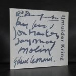
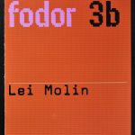
Lei Molin followed in his very own way “the road to abstraction”.
Making black and white landscapes in the early years of his career, painting portraits to make a living, he moved in the mid Sixties to Amsterdam where he made a connection with Pieter Defesche, Jef Diederen en Ger Latster, they were called the ” Amsterdamse Limburgers”, because they all moved from Limburg to Amsterdam. In Amsterdam he was influenced by Cobra and Minimalism, resulting in a style of his own losing the bright colors and presenting his works in a sober black an white. In the early Eighties color returned into his works and the us e of plastic foils made his paintings stand out from the ones of his colleagues.
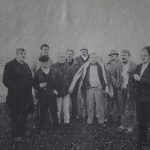
After Amsterdam he movend to Ijmuiden, where he became a member of the Ijmuider kring and got inspired by the harbors of Ijmuiden.
In 1986 he told the interrviewer for a nespaper that he considered his latest works to be the ones of his 40 year career. I have known i could make it, but now i finally i am confident enough to make it. It will not become better, also not worse…this is the result of a lifelong career.
Lothar Baumgarten is one of those artists who’s fame never was never worldwide, but who rightfully deserves to be known and admired by many more. In recent years a new reveived interest grows in his works. Baumgarten, a conceptual artist< has had his exhibitions in the Netherlands at the Stedelijk Museum and Museum de PONT, but these have been some years ago, but lately i see a raised in interest and the works that appear at acution are sold at fair but rising prices. A good work from an edition is sttill to be acquired far below euro 250,–
Baumgarten is an artist to follow, and if you admire his works, like i do, focus on the editions. These are still to be bought at low prices.
If i would make a top 10 of my favorit Stedelijk Museum publications this Jan van Munster publication from 1970 would be ceertainly somewhere in my top 10.
Published in 1970. It is typical Wim Crouwel design, but some details make it exceptional. First there is the use of a viny cover which has a silkscreened print in bright red on cover and backside. The vinyl cover is used as a portfolio for just one 2 page publication. Printed recto/verso and protected by a blank sheet of white paper. This publication is very special and instead of being a full catalogue with the exhibition , this is a true artist publication making this much more valuable for all Stedelijk Museum collectors and Jan van Munster admirers. The Jan van Munster 1970 / Stedelijk Museum by Wim Crouwel publication is now available at www.ftn-books.com
Artist/ Author: Oliver Boberg
Title : Memorial
Publisher: Oliver Boberg
Measurements: Frame measures 51 x 42 cm. original C print is 35 x 25 cm.
Condition: mint
signed by Oliver Boberg in pen and numbered 14/20 from an edition of 20


 has some nice Baumgarten publications available.


