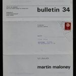
I did not know anything about Maloney and stumbled upon an article by Elena Filipovic and it is a great introduction to this conceptual artist . I recently added the Bulletin 34, from 1971 to my inventory which is now for sale at www.ftn-books.com
The history of art is an ocean with many wrecks . Some floating on the surface, most almost inaccessible submerged on the seabed. As an art historian, you can surf the waves, and pick up the supernatant oeuvres, or you can go deep sea diving in the hope of discovering less known, less obvious artists.
Today you must scrape the bottom to find literature mentioning the name Martin Maloney (1938 – 2003), and even then you will find only loose fragments and faint traces of an oeuvre .
However, this American artist once was amongst the founders of conceptual art. He had close contacts with the, now classical, conceptual artists and took part in a number of key exhibitions in the late sixties and early seventies.
By putting his radical critique in relation to the art world down on paper, Martin Maloney literally wrote himself out of art history.
After dropping out of university, in 1962, Maloney settled as an artist in New York. Initiall he had a special interest in the work of the postwar New York School painters like Ad Reinhardt , Barnett Newman , Mark Rothko and Jackson Pollock, but gradually shifted his attention away from the pictorial to the textual and non-material forms of art which from the mid- sixties began to emerge. He shared a studio with Lawrence Weiner and maintained relations with artists such as Carl Andre, Joseph Kosuth and Dan Graham.
In 1966, Maloney took part in the infamous ’25’ group exhibition, organized by the young art dealer Seth Siegelaub,who was to become the great promoter of conceptual art a few years later.
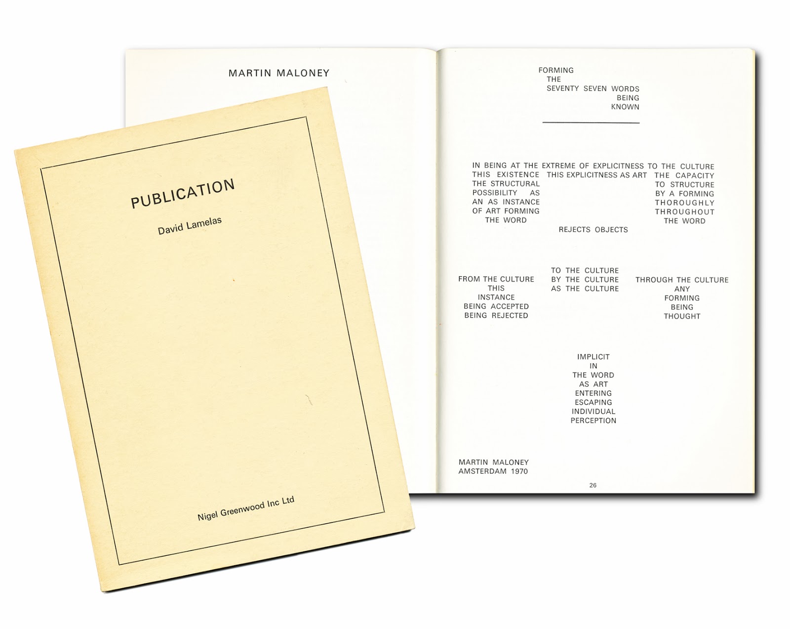
Maloney exhibited at Siegelaub several times and also had shows in several major European galleries. By this time, Maloney was looking for alternatives to the traditional gallery exhibition. In many cases, his solo exhibitions would be accompanied with, or even take the form of an artist’s book. Examples are ‘Interguments’ (1969), ‘Fractionals’ (1970) ‘Reject Objects’ (1971) and ‘Five days and five nights’ (1970). The latter book was published in an edition of 500 copies in the framework of Maloney’s one man show at the MTL gallery in Brussels. Maloney locked himself for five days and five nights in the gallery to work on the resulting booklet of poetic statements. The conventional presentation of objects in a gallery made room for the direct communication of ideas in print .
For his next exhibition at London’s Lisson Gallery (1971), Maloney takes things even a step further. After distributing a poster designed by the artist, Maloney takes residence in the gallery and throughout the whole duration of the event goes into direct confrontation with his audience. The resulting insights and frustrations he wrote in white chalk on the black painted walls of the basement. After a short sojourn in London, Maloney moved to Amsterdam in 1973 and leaves behind the hardcore minimalist concept to include wood sculptures and painted text works. Four years later he returned to New York, to gradually retreat in the privacy of his studio, now serving as a laboratory for numerous installations and presentations.
Maloney occupied a studio in a dilapidated building on the Jordaenskaai 13 .
What remained in the six rooms of Maloney’s Antwerp working and living environment were, in addition to a number of ”language pieces” and works on paper, the results of his latest artistic experiments: minimalist ‘floor pieces’ and corner stacks, composed of pieces of fallen ceiling plaster, wallpaper, fabric scraps, canvas and wooden beams from the solid oak doors in the building.
Johan Pas , Ekeren , January 2004
pace Works”
“To live,” Walter Benjamin once famously wrote, “is to leave traces.” But one could almost say that the recently deceased artist Martin Maloney (1938-2003) lived to efface his. Largely forgotten and omitted from art history, the American artist is all but invisible in institutional collections of the conceptual art he participated in from an early stage.
Thus the title of Maloney’s first posthumous exposition, “Here to Stay”, captures all of the ambiguity of the artist’s oeuvre. The exhibition fills the vast decrepit spaces where the artist lived and worked in solitude for the last 8 years of his life while the Antwerp building was waiting to be demolished.
The works, like the space they occupy, are not there ‘to stay’ at all. Immanent destruction is a ghost that has haunted the building for years. And even though his arrival in this space was relatively recent, Maloney’s works made from the recycling of building detritus have evoked architecture and entropy since the late ‘60s.
He made floor-bound geometric ensembles, each composed of thousands of pieces of any one element: neat piles of fallen ceiling plaster, pyramids of broken bricks, layers of split timber from his studio’s oak doors, or thousands of identical maniacally cut squares of carpet. In his work, the ceiling sat on the floor and wall elements became precarious rubble in the corner. In short, boundaries were elided between architectural elements and sculpture, between object and installation.
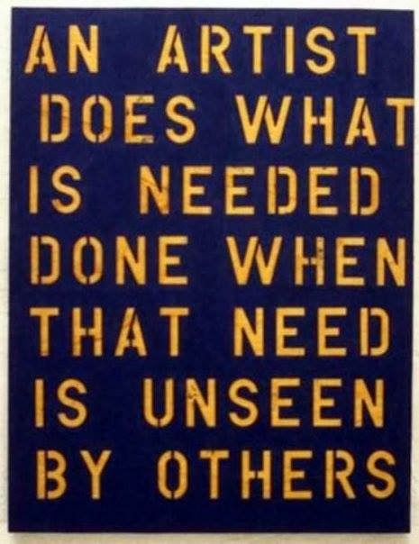
These ensembles made infinitely mutable, fragile works—more often than not with nothing holding the components together. They could change form a hundred times… or simply be swept away. ‘Structure’, ‘edge’, ‘edged’, ‘angle’, ‘cut’, ‘split’, ‘split space’: these words line Maloney’s texts, canvases and painted brick-works. Even a sampling of his exhibition titles, “Up Against the Wall” (at Konrad Fischer, Dusseldorf 1971) or “White Walls are Animals” (at Micheline Szwajcer, Antwerp, 1980), give the sense that the constraints of architecture and space — particularly the exhibition space — were never far from Maloney’s thoughts.
For him, the gallery’s symbolic ‘white walls’ needed to be fought, resisted and shown for what they were. In 1971, he locked himself in the confines of the MTL gallery in Brussels for five days and nights. His solitary act and refusal to allow the gallery space its role in visual presentation was the ‘exhibition’, with only a published version of the texts he wrote during his stay in the gallery as material trace.
For his exhibition at the Lisson Gallery in London that same year, he painted the walls black and wrote lines of conversation and provocation on them during the gallery’s opening hours to incite the visitors who came to communicate with him. Little, if anything, is left of these meetings of the conceptual, the textual and the architectural, and one has the sense that this is somehow as Maloney wanted it.
Maloney was active as a conceptual artist in the ‘60s close to the likes of Lawrence Weiner, Carl Andre, Joseph Kosuth and Dan Graham. He made his material pile sculptures and conceptual projects alongside a vast body of intricately shaped canvases, highly structured language pieces, box sculptures, and painted statements on canvas.

To see some of what remains of this work on exhibit is to feel a ricochet of influences, references, and dialogues (with Weiner and Andre, of course, but also Frank Stella, Robert Smithson, Gordon Matta-Clark, Arte Povera…). Over time, however, he managed to alienate himself from his fellow artists, galleries, collectors, curators and art history alike. With the exhibition’s end, the works on show will travel to museum spaces that share little of the precariousness that make a building in ruin a fitting context for the artist’s complex, volatile work.
The form of the works and their dialogue with space will necessarily change, and Maloney would probably never have accepted such an exhibition at all. As he knew too well, white walls are animals indeed