Posted on Leave a comment

Jan Meijer / Jurriaan Schrofer/ Ed van der Elsken

Schermafbeelding 2021-03-25 om 14.19.12

Another artist i had no memory of. I had heard the name before, but coould not place his works in any context. I must have seen his work at some time, but no recollection at all.

So why this blog on Jan Meijer. The artist is perhaps the least interesting in this blog. Still Meijer’s lyrical abstract works are well worth looking at and deserve much more recognition.

Schermafbeelding 2021-03-25 om 14.25.54

But…..the true reason i write this blog is the Jan Meijer catalogue which was published in 1957 for the Galerie Dina Vierny exhibition. A typical 50’s publication with a colored cover, BUT, what makes it stand out ……..it is designed by Jurriaan Schrofer and photographs by Ed van der Elsken. It is one of those rare occasions that these great Fifties artists come together. Perhaps they needed to make some money, perhaps they were friends and have known each other from their Paris time. I do not know, but ik know that this is an extremely scarce publication, well worth collecting and to dream away and try imagining how life must have been in Paris in the mid Fifties.

the catalogue is available at www.ftn-books.com

Posted on Leave a comment

Martin Gerwers (1963)

Schermafbeelding 2021-03-25 om 14.05.14

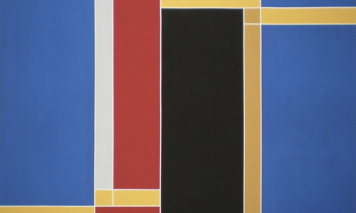
I know the works by Martin Gerwers for some 10 years now. The first time i encountered them was at an exhibition at galerie de Rijk and since i have been following with great interest this German artist. His abstraction leans towards the de Stijl movement , but is so much more fragile and delicate. Thin lines and much “space” make his paintings more like minimal art paintings than DE STIJL. One thing they have in common. It is use of bright colors  for the compositions. Gerwers his works are now financially out of reach for me , but i still admire his works and hopefully one day i encounter a nice small painting at auction. If the price is right i do not hesitate and buy it for my personal collection.

Schermafbeelding 2021-03-25 om 14.04.14

Martin Gerwers, emerged with monumental geometric abstract paintings. He has recently extended his dicipline with 3-dimensional painted objects. Made out of triangular forms from wood they take the shape of dynamic pyramids, which define the surrounding space. His work is in the tradition of Mondrian and the American colourfield painting. Gerwers’ paintings and objects evoke space through big contrasts in light and dark, thin lines and broad planes of color and subtle differences in tone.

Martin Gerwers is born in 1963 in Velen (DE). He lives and works in Düsseldorf. After the Kunstakademie Düsseldorf, where he studied with Jan Dibbets, he exhibited regularly at Konrad Fischer Galerie in Düsseldorf and Galerie Tschudi in Glarus in Switserland. Since 1999 he has been exhibiting at Slewe Gallery. His work has been collected by several private and public institutions such as the Stedelijk Museum Amsterdam.

gerwers


Posted on Leave a comment

Mirjam Hagoort (1961)

Schermafbeelding 2021-03-23 om 16.41.12

I have in my FTN-books collection an CBK Rotterdam catalogue on Mirjam Hagoort, published in the early Nineties it shows the works by Hagoort as a young artist . Big almost geometrical paintings with words and sayings, a bit like Ed Ruscha, but while preparing this blog on Hagoort i noticed a change in her work. Nowadays her drawings are much like Marcel van Eeden his daily drawings. They have the same look and feel.

Schermafbeelding 2021-03-23 om 16.30.11

The paintings however are different. Here she shines with a kind of abstraction that make her early paintings from the Nineties such appealing works of art. With the recent paintings she combines abstraction and architecture into great works of art.

hagoort a

Posted on Leave a comment

Alva (Solomon Siegfried Allweiss) (1901–1973)

ALVA C

Here is an artist i recently discovered. HIs work has the abstract qualities of the best artists from the Fifties and here and there you will find Comic like characters in his drawings and paintings.

Presumably because of the different environments in which Alva lived—Galicia, Berlin, Paris, the Middle East, and eventually London—he was familiar with a wide range of artistic influences and moved easily between different styles. His works include an illustrated and decorated version of the first chapter of Genesis, a series of studies of the Prophets in lithograph, and oil paintings on several subjects from Jewish life in Eastern Europe. Some of his paintings, like the one displayed here, are Symbolist. Characteristic of his style is the use of distinctive brush strokes and an aerial perspective.
Solomon Siegfried Allweiss was born in Berlin in 1901 but grew up until age 10 in Galicia, where he received a strict Jewish education. He studied music in Berlin before switching to art and adopting the pseudonym Alva in 1925. He traveled extensively in the Middle East and spent five years studying art and painting in Paris before he emigrated in 1938 to England, where he spent the remainder of his life. Alva was an occasional contributor of illustrations to Yiddish books published in London, most notably the cover for Y.A. Liski’s volume of proletarian stories, Produktivizatsie (Productivisation), published by Naroditski in 1937.

Posted on Leave a comment

Herzl Emanuel (1914-2002)

Schermafbeelding 2021-03-23 om 15.56.51As a teenager, Herzl Emanuel studied art at the Rochester Memorial Art Gallery in Rochester, New York. Emanuel quithigh school in 1931, and, with the assistance of several patrons who recognized his talent, went to Paris, hoping to study with Emile-Antoine Bourdelle. Although the French master died with Charles Despiau and Fernand Léger and attended lectures given by André Lhote. He was soon joined by Hananiah Harari, then a student at Syracuse University, with whom he shared a studio and later accompanied to Palestine. In Paris, the two young men were intrigued by contemporary art. They felt its validity and power without fully understanding why Picasso, Matisse, and others could so successfully do such violence to the figure.(1) Believing the answer to their questions lay deep in the history of art, Emanuel and Harari spent a year drawing from the collections at the Louvre. Beginning with Hittite and Egyptian art, they worked their way chronologically to the nineteenth century, seeking to understand the structure and logic of the art of the past. In the Louvre, Emanuel says, we learned the grammar of art. We learned its syntax, its alphabet, until contemporary art represented no mystery. We learned its rationale, where it came from, the basic language. We saw its connection with the art of the past.”(2) Although in Paris whenAbstraction-Création wasbeing formed, Emanuel and Harari saw such publications but paid little attention to the theories or the movements germinating around them.

emanuel x


As fascism threatened Europe, Emanuel and Harari left for Palestine where they worked on a kibbutz for over a year. Although the kibbutz regimen left little time for art, the experience enriched them philosophically. After a brief stay in Jerusalem, Emanuel returned to the United States and in 1936 joined the sculpture division of the New York Federal Art Project.(3) During the mid 1930s, Emanuel was sympathetic with leftist political causes. By participating in the WPA, he said, ​we felt we were working directly for society.”

When war came, Emanuel went to work for a shipyard, and afterwards made his living doing display work. Later he worked as an illustrator. During the mid 1950s he taught illustration, sculpture, and a foundation course at the School of Visual Arts in New York. After six years, he gave up his teaching position to return to Europe. In Rome, he set up a studio that he still maintains.

Throughout his career, Emanuel’s art has been centered in a deeply felt humanism. Art for him offers a way to come to terms with the human condition. Though he still finds inspiration in Romanesque and Italian Renaissance art, it was Picasso’s Guernica that had the most dramatic impact in his life. Calling it the most significant work of art of the twentieth century, Emanuel has sought to achieve in his own work a fusion of abstracted form with tragic content that parallels Picasso’s powerful statement. Since the 1930s, his sculpture has evolved from an Analytical Cubist format to an Expressionism in which the human form is distorted to convey the human condition. Yet by intertwining limbs and connecting gazes in multifiguralcompositions, he offers up human relationships as notes of hope that temper the effects of a tragic existence. www.ftn-books.com has the Kuhlik 1972 catalogue now available

Posted on Leave a comment

Henk de Vries (1931-1986)

Schermafbeelding 2021-03-23 om 15.39.13

The french would call it a “petit maitre” a small master and for me this is true. de Vries was never known that much among art lovers, but now that the Fifties and Sixties become “en vogue” he is discovered . His paintings lean towards cubism , but have those typical Fifties colors in them. I first took notice of his paintings when i bought the 1966 Museum van Looy catalogue on de Vries ( now available at ww.ftn-books.com), but the most impressive elements were the typical Sixties invitations that i found within the publication. Great design and highly collectable invitations that are typical for these years.

Posted on Leave a comment

Ugo Dossi (1943)

Schermafbeelding 2021-03-23 om 15.29.10

Ugo Dossi is a 78 year old Post-War artist. Ugo Dossi is a German male artist born in München (DE) in 1943.

Ugo Dossi’s first exhibition was Ugo Dossi at Galleria Schwarz in Milan in 1974, and the most recent exhibition was Petersburger Hängung in progressat Galerie Lisi Hämmerle in Bregenz in 2020.  www.ftn-books.com has now the galleria Schwarz catalogue available.

Ugo Dossi is mostly exhibited in Germany, but also had exhibitions in Austria, Italy and elsewhere. Dossi has 22 solo shows and 73 group shows over the last 46 years (for more information, see biography). Dossi has also been in 24 art fairs and in 5 biennials. The most important show was documenta 8 at Documenta in Kassel in 1987. Other important shows were at Biennale de Paris in Paris and Museum Morsbroich in Leverkusen. Ugo Dossi has been exhibited with Joseph Beuys and Timm Ulrichs. Ugo Dossi’s art is in 11 museum collections, at Kunstmuseum Bonn in Bonn and Städtische Galerie im Lenbachhaus & Kunstbau in Munich among others.

ugo dossi


Posted on Leave a comment

Erik van der Weijde (1977)

Schermafbeelding 2021-03-23 om 15.20.26

In the Netherlands van der Weijde is famous and abroad he is loved by photography collectors because of his bold and ground breaking photography publications and for those looking to start a nice collection of photography books with great design , just look into wat vander Weijde has published. Personally i love his SUBWAY magazine and the Praia book which is now for sale at www.ftn-books.com is outstanding too. Well worth checking out this photographer/publisher from the Netherlands.


.

Posted on Leave a comment

Pablo Picasso and Françoise Gilot

Schermafbeelding 2020-08-26 om 16.44.34

Pablo Picasso’s fascination with the female form spawned from a long line of women he called his muses. Possibly his most reputable muse was his long- term partner, Françoise Gilot, whom he wooed with a bowl of cherries when he spotted her across the restaurant in which they were dining. At the tender age of 21, Gilot was already producing well-respected paintings of her own, although she was still a student at the time. While technically married to another, Picasso carried on a turbulent ten-year affair with Gilot – fathering her two children. The relationship was a nasty one, but the couple inspired each other artistically: Gilot acted as Picasso’s muse for the decade, and Picasso’s work influenced Gilot’s take on cubism.

www.ftn-books.com has many Picasso titles available

Posted on Leave a comment

Jean Widmer (1929)

Schermafbeelding 2020-11-30 om 16.39.42

Yesterdays blog and the acquisition of some former Ben Bos library books on grapphic design inspired me to find some more information on Jean Widmer.

Jean Widmer is an acclaimed Swiss graphic designer too based in France.

From 1946 to 1950 he studied at the Kunstgewerbeschule (School of Arts and Crafts) of Zurich, then directed by the former Bauhaus master Johannes Itten (1888-1967). In 1953 he moved to Paris, where attended lithography courses at the École des Beaux-Arts (School of Fine Arts).

After one-year internship at the Atelier Tolmer, located on the Île Saint-Louis, he was appointed Art Director of SNIP—Société Nouvelle d’Information et de Publicité (New Society of Information and Advertising), holding this charge from 1956 to 1959. He later moved to Galeries Lafayettes, a major department store, substituting Peter Knapp as its Art Director, from 1959 to 1961. At the same time he also worked at Jardin des Modes magazine as art director and photographer, holding the position until 1969. During the 1960s he also travelled in Japan to study ‘shodo,’ Japanese calligraphy, and ‘mon,’ Japanese traditional crests.

In 1969 he opened Visuel Design, focusing on coordinated graphic communication for cultural and public institutions. The same year he was the first designer to develop a corporate identity system for a French cultural institution, developing the graphic communication of the CCI—Centre de Création Industrielle (Center of Industrial Creation).

It was during this period that Widmer developed his own original graphic language, based on synthesis, rigorous geometry, and schematic typography that to this day represents the first and one of the few examples of Modern graphic design in France.

In 1972 he took charge of the first design for the French Highways signage, drawing a beautiful and effective pictogram system. From 1974 to 1977, and again in 1985, he designed the coordinated identity for the Centre Georges Pompidou, formed from the merging of the CCI with other cultural institutions, for which he designed a beautiful and iconic mark that portrays the famous façade of the building.

In 1979 he designed an acclaimed poster for Kieler Woche, the major sailing event in the world that is famous in the world of graphic design for its striking communication. From 1983 to 1987 he worked on the corporate identity design for the prestigious Musée d’Orsay, in collaboration with the prominent graphic designer Bruno Monguzzi.

He continued to focus on corporate graphics for cultural institutions, developing the identity for the Théâtre National de la Colline, and the IMA—Institut du Monde Arab, both in 1987, and the Bibliothèque Nationale de France in 1994. In 1989 he also designed a typefaces, Bi-89, on the occasion of the French Revolution’s bicentennial.

In 1960 he joined the faculty of the ENSAD—École Nationale Supérieure des Arts Décoratifs (School of Decorative Arts), Paris, where he taught until 2000 remodeling the graphic design curriculum, stressing mastery of typography and color as fundamental skills. Since the early 1990s, he also taught at the Atelier National de Recherché Typographique (National Bureau for Typographic Research).

During his career he received important recognitions, including the Toulouse-Lautrec Prize in 1980, the Grand Prix National des Arts Graphiques from the French Ministry of Culture in 1994, and the Distinctive Merit Award from the ADC (Art Directors Club), New York. He was appointed Chevalier of the Ordre des Arts et des Lettres in 1983, Officer of the same order in 1991, and Commandeur in 2001.

The important Centre Georges Pompidou publication is now available at www.ftn-books.com

widmer a