Posted on Leave a comment

Another German Expressionist —–Emil Nolde (1867-1956)

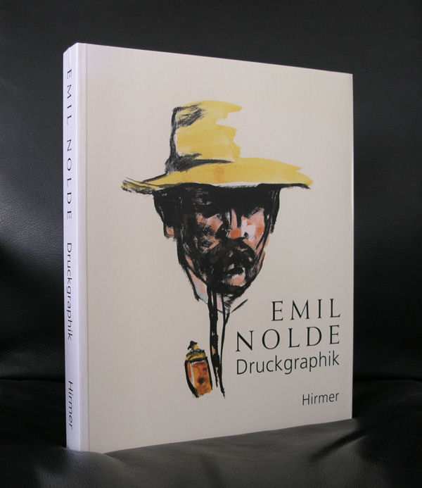
Emil Nolde had a very long life and witnessed many art styles during this life, soaked them up and made a style which is personal and highly recognizable as Emil Nolde. For me it is a something between Kirchner ( see last weeks blogs) and Gauguin. It is  pleasing in its appearance, but the use of primary colors makes it also unreal and typical for the BRUCKE group. Wikipedia mentions his interest in van Gogh …..

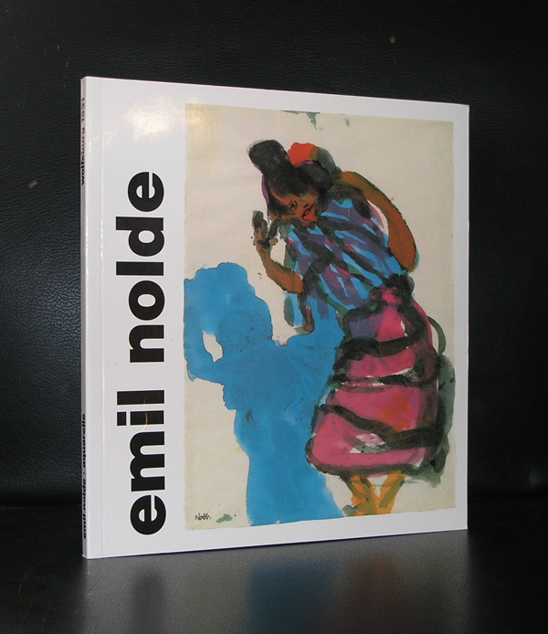
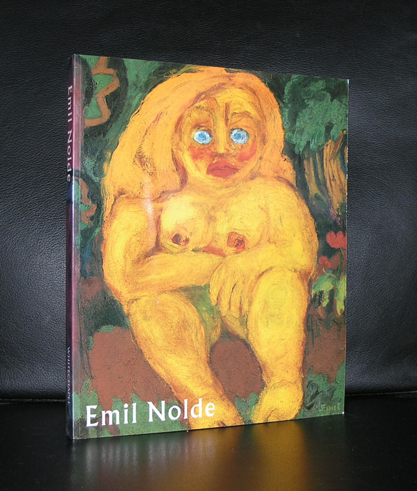
Emil Nolde (born Emil Hansen; 7 August 1867 – 13 April 1956) was a German-Danish painter and printmaker. He was one of the first Expressionists, a member of Die Brücke, and was one of the first oil painting and watercolor painters of the early 20th century to explore color. He is known for his brushwork and expressive choice of colors. Golden yellows and deep reds appear frequently in his work, giving a luminous quality to otherwise somber tones. His watercolors include vivid, brooding storm-scapes and brilliant florals.

Nolde’s intense preoccupation with the subject of flowers reflected his interest in the art of Vincent van Gogh

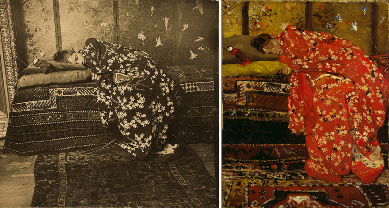
….. but take a look at this Gauguin and you see immediately what a mean.

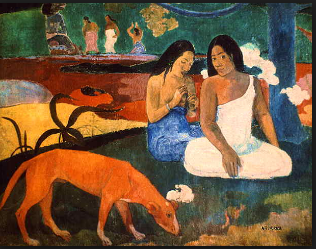
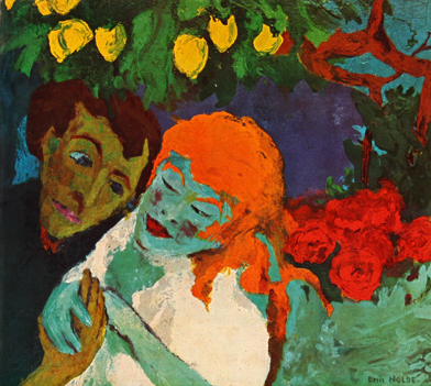
left Gauguin and right Nolde . You can see the similarities in color and even some aspects of the composition look the same. Far fetched?….maybe a little , but for me Nolde stands much closer to Gauguin and even Chagall than to van Gogh.

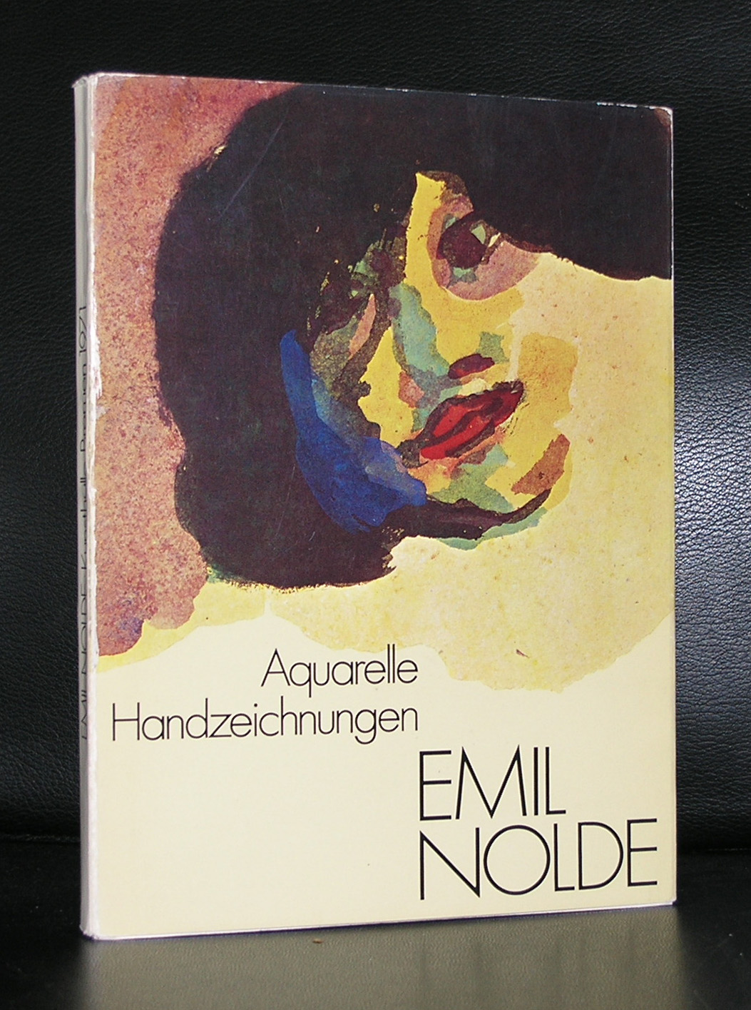
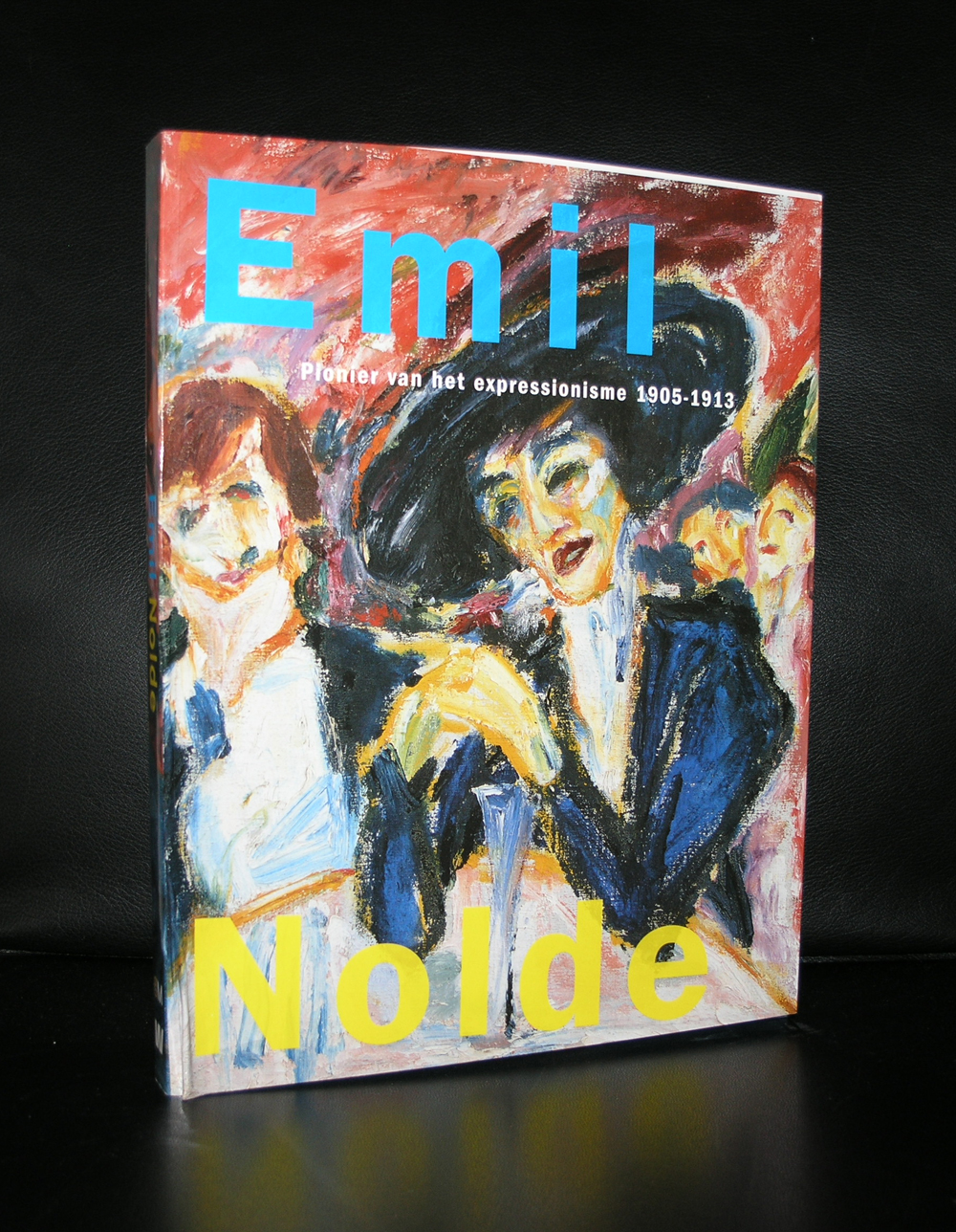
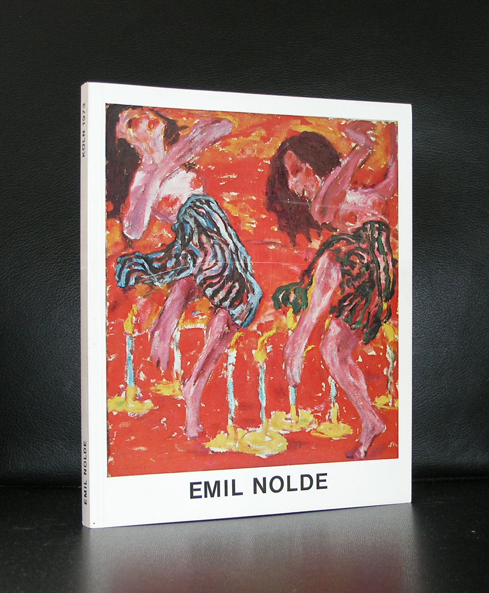
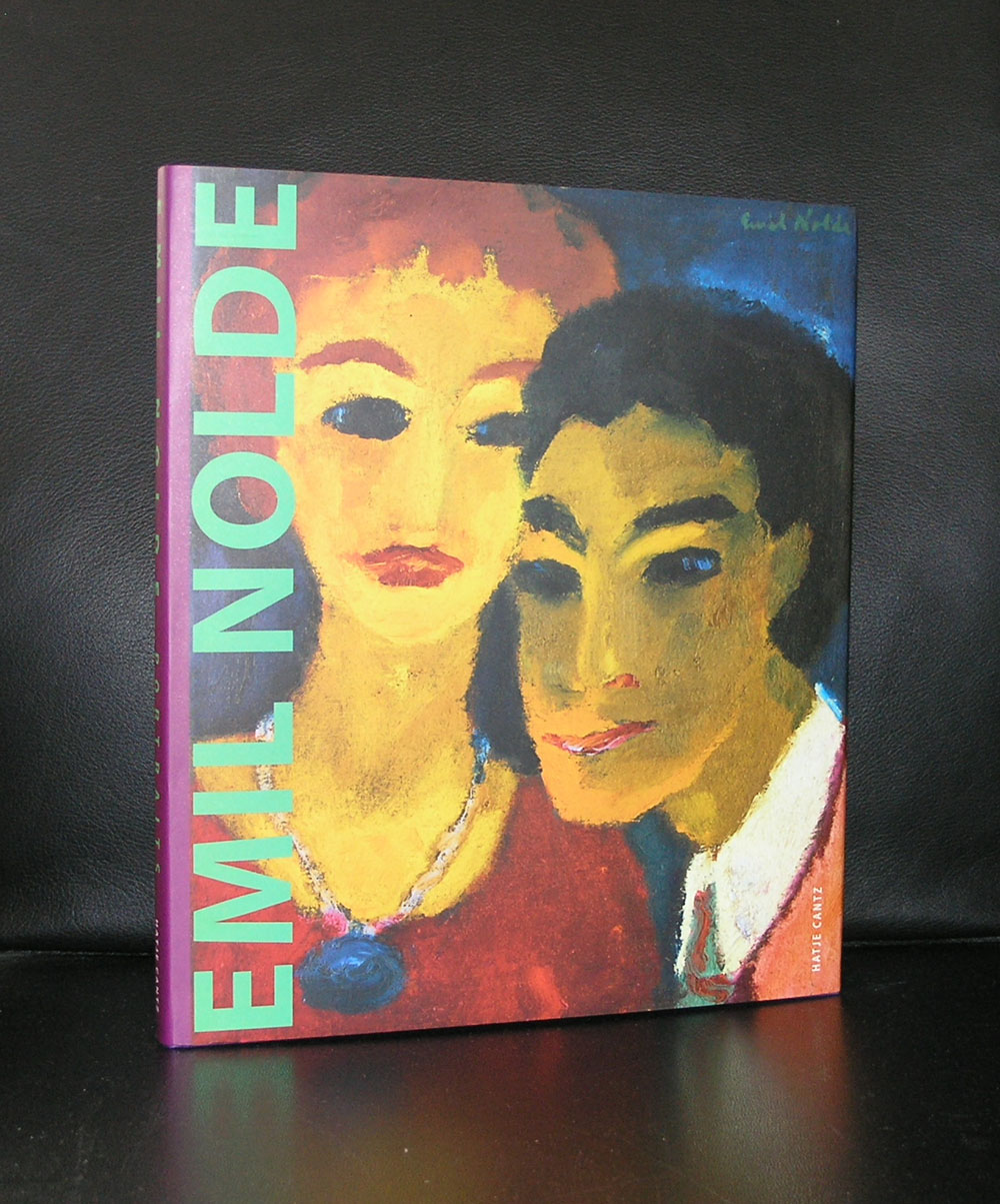
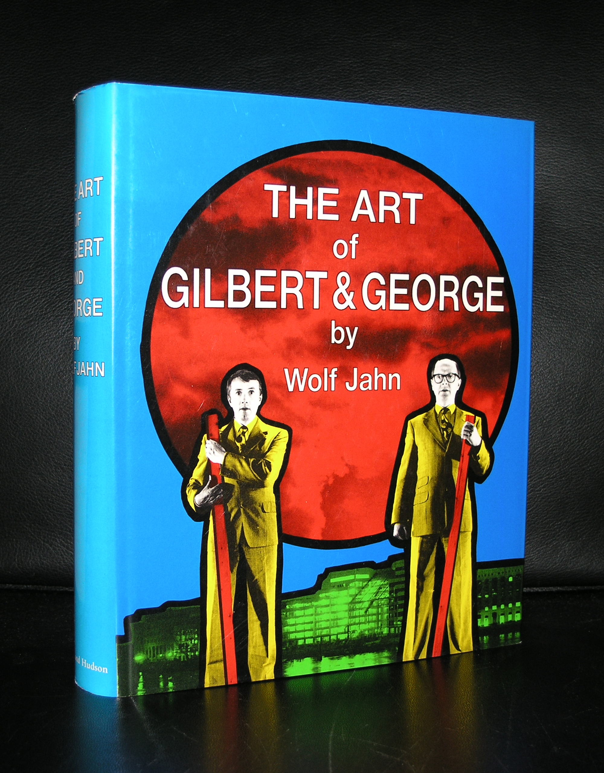
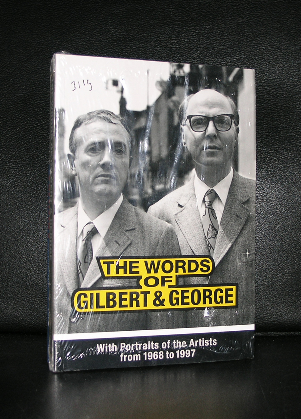
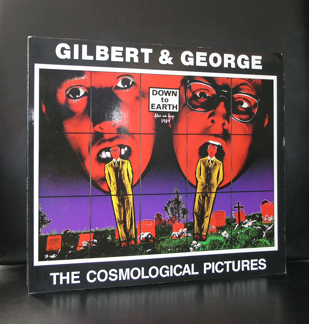
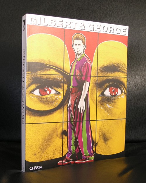
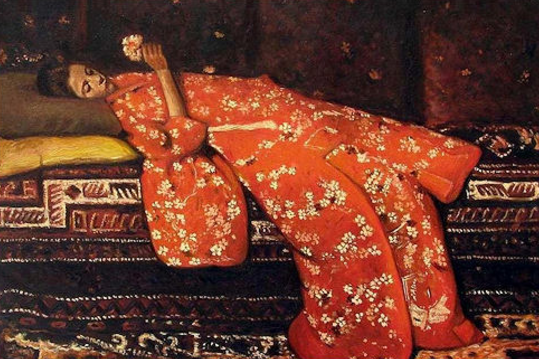
There are Nolde publications available at www.ftn-books.com

Posted on Leave a comment

Ika Huber (1953)

Schermafbeelding 2017-07-24 om 15.38.33

Possibly because of the same age we both have there is an automatic liking i have for the works by Ika Huber. Influenced by many, but still a very personal signature in her compositions which makes them 100% Ika Huber. We must have grown up and liked both the same kind of art and artists, because i recognize within her works many elements of artists i admire, but the best way to describe a painting by Huber is the way the former director of the Gemeentemuseum Den Haag and Stedelijk Museum Amsterdam , Rudi Fuchs did.

The paintings give the overall impression of fragments – meaning that they originate as fragments. At some point came the first touch of paint at a random spot on the canvas as an extension , in a way, of memories of landscapes, buildings, inner courtyards and windows, light as a feather – and so, as such, fragmentary; as fragmented and haphazard as memory itself.

Individual elements assume at times the completeness of a figure or the solidity of a column; straight lines are, however, meticulously avoided. Colours are mostly thin, but applied in delicate layers; the broad brushstrokes remain visible, creating a veiled effect but also one of restless vibration, like warm air over a horizon. In places, too, the paint is sometimes rubbed on dry and brittle, giving it the appearance of chalk. There is so much to see in these paintings if you examine them more carefully: hundreds of details make the picture glow like night.

Straight lines are avoided then, as these tend to trap colours and forms within their rigid framework. But the figments of memory which lead to fragmentary pictures should surely float if anything. This is what makes the drawing in these paintings so remarkable. The forms do indeed have contours but they are very hesitantly, almost unwillingly, suggested.

The forms are intertwined with each other with extraordinary care, as if Ika Huber was reluctant to say what the memory is. She leads the eye towards something else which must be seen, I think, in the same indescribable movement as that of Leonardo da Vinci’s Lady with an Ermine just over 500 years ago.

It is the mysterious and unfathomable that always confronts me in these pictures; in their composition, their details, the resonance and tone of their colours, and in their dreamlike mobility and “Sfumato”. There is a lot here then which does indeed complete the fragments in the pictures – but the question remains: to what extent. 

Rudi Fuchs, Den Haag

There are 2 titles on Ika Huber available at www.ftn-books.com

Posted on Leave a comment

Gilbert & George/ Naked shit paintings

The blog of yesterday reminded me that Piero Manzoni was not the only artist who used faeces as a subject in their art. Gilbert & George is another example who used the subject in a far more explicit way than Manzoni did. With the canned Manzoni multiple it is still uncertain if the contents is the same as the label indicates , however with Gilbert & George it is no question at all, because the pictures show the subjects as they are.

Still the composition and execution are 100% recognizable Gilbert & George, but personally i like the more society and critical related subjects better and far more pleasing to look at, but just to show that many more artists used the subject it is nice to devote a blog on these 2 great artists.


OLYMPUS DIGITAL CAMERA

Books on Gilbert & George are available at www.ftn-books.com

Posted on Leave a comment

Piero Manzoni…artist’s shit (1961)

Schermafbeelding 2017-07-24 om 15.00.57

In May 1961, while he was living in Milan, Piero Manzoni produced ninety cans of Artist’s Shit. Each was numbered on the lid 001 to 090.  A label on each can, printed in Italian, English, French and German, identified the contents as ‘”Artist’s Shit”, contents 30gr net freshly preserved, produced and tinned in May 1961.’ In December 1961 Manzoni wrote in a letter to the artist Ben Vautier: ‘I should like all artists to sell their fingerprints, or else stage competitions to see who can draw the longest line or sell their shit in tins. The fingerprint is the only sign of the personality that can be accepted: if collectors want something intimate, really personal to the artist, there’s the artist’s own shit, that is really his.’ (Letter reprinted in Battino and Palazzoli p.144.)

Schermafbeelding 2017-07-24 om 15.01.55

It is not known exactly how many cans of Artist’s Shit were sold within Manzoni’s lifetime, but a receipt dated 23 August 1962 certifies that Manzoni sold one to Alberto Lùcia for 30 grams of 18-carat gold (reproduced in Battino and Palazzoli p.154). Manzoni’s decision to value his excrement on a par with the price of gold made clear reference to the tradition of the artist as alchemist already forged by Marcel Duchamp and Yves Klein among others. As the artist and critic Jon Thompson has written:

Manzoni’s critical and metaphorical reification of the artist’s body, its processes and products, pointed the way towards an understanding of the persona of the artist and the product of the artist’s body as a consumable object. The Merda d’artista, the artist’s shit, dried naturally and canned ‘with no added preservatives’, was the perfect metaphor for the bodied and disembodied nature of artistic labour: the work of art as fully incorporated raw material, and its violent expulsion as commodity. Manzoni understood the creative act as part of the cycle of consumption: as a constant reprocessing, packaging, marketing, consuming, reprocessing, packaging, ad infinitum. (Piero Manzoni, 1998, p.45)

Artist’s Shit was made at a time when Manzoni was producing a variety of works involving the fetishisation and commodification of his own body substances. These included marking eggs with his thumbprints before eating them, and selling balloons filled with his own breath. Of these works, the cans of Artist’s Shit have become the most notorious, in part because of a lingering uncertainty about whether they do indeed contain Manzoni’s faeces. At times when Manzoni’s reputation has seen the market value of these works increase, such uncertainties have imbued them with an additional level of irony. ( text on this subject comes from the Tate site : http://www.tate.org.uk/art/artworks/manzoni-artists-shit-t07667)

www.ftn-books.com has some nice publications on Manzoni

Posted on Leave a comment

George Hendrik Breitner (1857-1923)

Schermafbeelding 2017-07-18 om 13.41.55

What makes this painter so special for me?… Possibly because he made one of the paintings i truly admired when i was young.

One of the first times i visited the Rijskmuseum and the Stedelijk Museum i encountered this beautiful woman, lying on a couch, wearing nothing but a red japanese kimono. Everything is the paintings was new to me. Dutch impressionism, the loose touch with the brush, the high details and the sensuality in the painting made it beautiful to me. What i did not know at that time, is that Breitner was one of the first to use photography as a start for his paintings and this girl in a red kimono ( name was Geesje Kwak , a famous model at that time) would be painted in many versions and depicted on many paintings. There are “Red Kimono” paintings in the collections of the Rijksmuseum, Stedelijk Museum, Museum Twenthe, Teylers Museum. A few years ago there was this exhibition in the Rijksmuseum on all these versions of the girl in the red kimono. Unfortunately i did not visit it , but i still have some excellent catalogues on Breitner available at www. ftn-books.com and study this wonderful painting.


https://youtu.be/rWwWtKRnFMs

These and other titles on Breitner are available at www. ftn-books.com


Posted on Leave a comment

Guido Lippens (1939).. ever changing style

Schermafbeelding 2017-07-18 om 13.30.12

Guido Lippens has made paintings and drawings in so many styles. Sometimes with a free hand like the drawings by Jan Schoonhoven and other times painted, like a super realistic painting,…. with grids and patterns. Paintings for the art of painting, but without any depth or feeling. Lippens , born in Zeeland is not very known outside this province, but has had his moments and exhibitions during the last 5 decades. He even had one time an exhibition in the Stedelijk Museum Amsterdam, but his most famous one was the one in the Noordbarabants Museum, which catalogue is available at www.ftn-books.com

OLYMPUS DIGITAL CAMERA

Posted on Leave a comment

Japanese posters ( 1977 )…catalogue by Wim Crouwel

The Stedelijk Museum Amsterdam has a history with posters and specially the posters from Japan were presented on multiple occasions within exhibitions on the subject. In 1977 , the “Japanse Poster” exhibition catalogue was designed by Wim Crouwel, who designed a very special catalogue for the exhibition . The catalogue is one of the best from the seventies and instead of the typical Crouwel typography

on the cover there are Japanese letters drawing your attention. Red lettering on a silver background let this one stand out from the rest.

Stedelijk Museum#JAPANSE AFFICHES# Crouwel, 1977, NM

This catalogue was published with number 617 within the series of published Stedelijk Museum catalogues.

Posted on Leave a comment

Charlotte Schleiffert (1967)

Schermafbeelding 2017-07-16 om 10.37.17

For me Charlotte Schleiffert has the same qualities as Jean-Michel Basquiat. She creates a world of Hybrid creatures, part human an part animal, dressed in strange fashion and executed in a very large size. She paints, draws and makes sculptures and with these elements she creates installations. The result …… a typical Schleiffert world made by Charlotte Schleiffert and unique in the world of art. Charlotte Schleiffert is represented by galerie Akinci . / http://www.akinci.nl/schleiffert.html

www.ftn-books.com has 2 titles on Schleiffert available

Within the series of Hollandse Meesters there is a 15 minutes documentary on Charlotte Schleiffert available:

Posted on Leave a comment

Maria Lassnig ( 1919-2014 )

Tate Modern announced her last year show as follows….The first UK retrospective of one of the twentieth century’s most original painters… and she definitely is. The Stedelijk Museum Amsterdam held a retrospective 23 years ago and she proved to be a highly original artist with a completely different approach to her subjects, sometimes very personal, making her own body the subject of a painting. Lassnig made informal paintings, abstract expressionist paintings was educated in and made animation art and showed her paintings during the Documenta which was curated by Rudi Fuchs in Kassel. During his first years of his directorship of the Stedelijk Museum, Fuchs invited her for a large retrospective in 1994 in the Stedelijk. More than 23 years before the Tate the STedelijk Museum recognized her qualities as an artist. Time after time i come to realize that the Stedelijk Museum Amsterdam is possibly the most trend setting museum in the world of Modern Art. The Maria Lassnig catalogue is available at www.ftn-books.com

OLYMPUS DIGITAL CAMERA

Posted on Leave a comment

Pinot Gallizio (1902-1964)

Schermafbeelding 2017-07-14 om 15.00.38
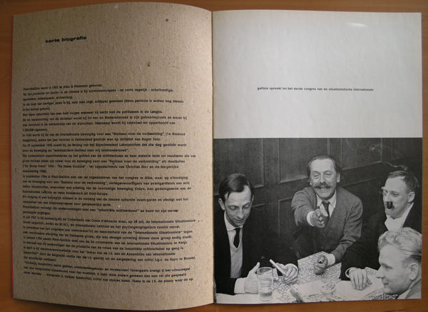
The inventor of industrial painting? i am not sure, but here follows the text i found on Wikipedia on Gallizio after i sought information on him. He is rather obscure and rarely presented in collections , but in the 60’s the Stedelijk Museum held an exhibition and published an extremely nice catalogue on him. But this artist deserves better because for many he was a source of inspiration and a great influence. he was admired by Jorn, Constant and Debord.

https://youtu.be/XD21kq8bz0s

Pinot-Gallizio was born in Alba, Piedmont, where he became an independent Left councilman and a chemist. In 1955, he met Asger Jorn, with whom he co-founded the Experimental Laboratory of the Imaginist Bauhaus in Alba, which was part of the International Movement for an Imaginist Bauhaus, in opposition to the return to productivism by others in the Bauhaus school, in particular Max Bill. It was held in Pinot-Gallizio’s studio, a monastery from the seventeenth century, and was attended by such artists as Enrico Baj who experimented with nuclear painting techniques, Walter Olmo, who experimented with musical interventions, Ettore Sottsass, Elena Verrone, and Piero Simondo.

Pinot-Gallizio drew from his background as a chemist in developing new painting techniques. In 1956 he, along with Jorn, organized the First World Congress of Free Artists, at which a representative from the Lettrist International spoke, foreshadowing the foundation of the Situationist International in 1957 by members of both groups, including Pinot-Gallizio. At this conference the Italian artists withdrew from the Laboratory, and after the formation of the SI only Pinot-Gallizio and his son, Giors Melanotte, remained. He helped to make the SI known in the art world with an exhibition in Paris in 1959

www.ftn-books.com has the Stedelijk Museum publication available