Posted on Leave a comment

Dieter Asmus (1939)

Schermafbeelding 2021-09-10 om 13.38.12

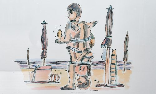
I first noticed Asmus when i was researching Dieter Hiessere , another German Pop Art artist. Dieter Asmus started his career in 1964-1965 when his early realistic paintings were demonstrated to the public for the first time. At the same period, along with his fellows, German painters Peter Nagel, Dietmar Ullrich and Nikolaus Störtenbecker, he founded in 1965 the artistic group dubbed Zebra. Its main goal was to gather all German realist artists.

At the beginning of the 1970s, Asmus got acquainted with an art historian Armin Schreiber whose wife was Brigitte Kronauer, a writer. Three friends established a publishing company which issued the debut Kronauer’s novel illustrated by Asmus.

Since that period, Dieter Asmus exhibited at various prestigious galleries in London, Rome, Copenhagen, Rotterdam and Paris.

Now the artist lives and works in Hamburg, Germany. He creates his artworks in oil using such photography technics as snapshot, color balance and clipping.Dieter Asmus is a prolific artist, one of the key figures in contemporary figurative art whose artistic talent and imagination were marked by many awards and scholarships.So, in 1967, at the beginning of his artistic journey, Asmus became a recipient of three scholarships, those from German Academic Scholarship Foundation, French government and from the German Academic Exchange Service which allowed the artist to go to London. These ones were followed in 1971 by the art scholarship from the Federal Association of German Industries (BDI). Nowadays, Asmus’s artworks are acquired by such prestigious museums and galleries as The Albertina in Vienna, Austria, the National Gallery of Berlin, Staatsgalerie in Stuttgart, Hamburger Kunsthalle and the National Gallery of Modern Art in Rome.

www.ftn-books.com has one Asmus title available ( www.ftn-books.com)

asmus

Posted on 1 Comment

Joachim Brohm (1955)

Schermafbeelding 2021-09-08 om 12.25.02

I never had seen his photographs. The first time was when i encountered work by Brohm at the Josef Albers Museum in Bottrop ( poster available at www,ftn-books.com). I was impressed mand saw similarities with dutch 17th century painter Hendrik Avercamp.

Joachim Brohm was one of the first photographers in Germany to take pictures exclusively in color starting in the late 1970s. “Color lent my pictures credibility in the documentary sense,” he explains, defining at the same time his artistic credo. His approach went against the trend at the time in that it did not exhaust all of the possibilities of color photography: Joachim Brohm challenged omnipresent advertising aesthetics with his photographic naturalism, staged productions with documentation, picture effects with austerity, vibrant, high-contrast colors with his muted tones. As a student, he met with incomprehension from his professors, but photographic role models such as Stephen Shore and Lewis Baltz, who would go on to enjoy world fame, encouraged him to continue on his chosen path. “The Americans presented seemingly trivial scenes, content and context appeared to be missing – many people were unable to make any sense of it.”

Schermafbeelding 2021-09-08 om 12.28.23

Joachim Brohm brought this approach to a higher level: He combined mostly deserted landscape scenes with his interest in social interaction, turning his photographs into small-scale studies of society. They show how people change the landscape – and how the landscape changes people. He took his photographs of the Ruhr region at a time when theme parks and artificial lakes were being built to help cast off the image of a desolate mining region. Joachim Brohm shows this transition from work to leisure which accompanies the transformation from rural to urban from the perspective of a neutral observer. He sends the viewer on a mystery tour: “I wanted to show people in an environment undergoing change: What do they look like, what are they doing, what activities stand out?”

Joachim Brohm reveals structures in the landscape that would otherwise remain hidden. The camera’s elevated position, which is characteristic of many of his photographs, reinforces the impression of photographic surveillance which he himself describes as “all over”. The absence of a clear focus, and a depth of field that covers the entire image, mean that the individual scenes merge to form a situational snapshot. “The whole picture is the motif – the viewer can choose his or her focal point.” In this way, Joachim Brohm draws our attention to the big picture – with an excellent eye for detail.

brohm a


Posted on Leave a comment

Frank van Hemert (continued)…..ZEVEN

zeven cc

Frank van Hemert works in series. Paintings and drawings can have the same title and be totally different from each other in size and composition. However there is one element which is fixed. In the  ZEVEN ( Seven) series its is the sequential numbering of 1,2,3,4,5,6

The Seven is not used, but the ZEVEN title completes this series of numbers. To van Hemert, the number seven is a symbol for the person who has “fulfilled” himself, become a whole person. The fact that the number itself is not included in the image indicated that this stage has not yet been attained; This “not yet” is suggested by the incomplete number sequence.

Because many of these paintings have been painted with the pink/red that has to been proven instable. Many of these paintings have been damaged or at least can not been shown  and stored properly.

This SEVEN series has become of the most iconic and important series by Frank van Hemert and fact is that from these series part of the paintings can be considered to be lost because of the paint van Hemert used. Still some are in excellent condition and  i have been fortunate to buy one of these large paintings which is in excellent condition. It comes the former Buhrmann Ubbens collection and has been preserved in an excellent way and has become now one of the highlights from our collection.

I have tried to find some from examples from the series of ZEVEN paintings and of course i will start with the one from our collection…our own ….ZEVEN

and in the end there are some publications on Frank van Hemert that www.ftn-books.com has available.

zeven hemert


Posted on Leave a comment

Enzo Maiolino (1926-2016)

Schermafbeelding 2021-09-07 om 17.10.36

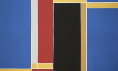
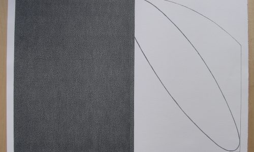
Not much information to be found on this artist. Still he is an established artist influenced by Hard Edge painting but with a much softer , subdued choice of colors he makes compositions that are typical for the Italian Sixties. These paintings are great and timeless and that is the reason why the Josef Albers Museum recognized the qualities of this lesser known artist. His works were presented in combination with the “square” paintinsg by Albers. The result /…… a feast in abstract ( minimal) art.

The Maiolino poster is availabel at www.ftn-books.com

maiolino aa

Posted on 1 Comment

Centraal Museum Utrecht , 1979


Schermafbeelding 2021-08-11 om 15.15.32

It is not the book itself, condition is fair+, but the realisation that all artists included in the book have become highly collectable artist, who’s works you can only acquire at steep prices nowadays. It shows the importance of collecting at an early stage by the museums. It is not difficult to pay millions for a work of art, but when you can see the quality at an early stage you can build a great collection…well done Centraal Museum.

the book is now available at www.ftn-books.com

abstract keus utrecht

Posted on Leave a comment

Helvetica (1957)

Max MIedinger

Here is in short the story on one of the greatest and most popular typefaces from the last 100 years….HELVETICA by Max Miedinger.
Helvetica is one of the most famous and popular typefaces in the world. It lends an air of lucid efficiency to any typographic message with its clean, no-nonsense shapes. The original typeface was called Neue Haas Grotesk, and was designed in 1957 by Max Miedinger for the Haas’sche Schriftgiesserei (Haas Type Foundry) in Switzerland. In 1960 the name was changed to Helvetica (an adaptation of Helvetia”, the Latin name for Switzerland).

Over the years, the original Helvetica family was expanded to include many different weights, but these were not as well coordinated with each other as they might have been. In 1983, D. Stempel AG and Linotype re-designed and digitized Neue Helvetica and updated it into a cohesive font family. At the beginning of the 21st Century, Linotype again released an updated design of Helvetica, the Helvetica World typeface family. This family is much smaller in terms of its number of fonts, but each font makes up for this in terms of language support. Helvetica World supports a number of languages and writing systems from all over the globe.

Helvetica World, an update to the classic Helvetica design using the OpenType font format, contains the following Microsoft code pages:
1252 Latin 1,
1250 Latin 2 Eastern,
1251 Cyrillic,
1253 Greek,
1254 Turk,
1255 Hebrew,
1256 Arabic,
1257 Windows Baltic,
1258 Windows Vietnamese,
as well as a mixture of box drawing element glyphs and mathematical symbols & operators.
In total, each weight of Helvetica World contains 1866 different glyph characters!

Many customers ask us what good non-Latin typefaces can be mixed with Helvetica World. Fortunately, Helvetica World already includes Greek, Cyrillic and a specially-designed Hebrew in its OpenType character set. But Linotype also offers a number of CJK fonts that can be matched with Helvetica World.

Helvetica didn’t start out with that name. The story of Helvetica began in the fall of 1956 in the small Swiss town of Münchenstein. This is where Eduard Hoffmann, managing director of the Haas Type Foundry, commissioned Max Miedinger to draw a typeface that would unseat a popular family offered by one his company’s competitors.

Miedinger, who was an artist and graphic designer before training as a typesetter, came up with a design based on Hoffmann’s instructions, and by the summer or 1957, produced a new sans serif typeface which was given the name “Neue Haas Grotesk.” Simply translated this meant “New Haas Sans Serif.”


The Stempel type foundry, the parent company of Haas, decided to offer the design to its customers in Germany, where Stempel was based. The company, however, felt it would be too difficult to market a new face under another foundry’s name and looked for one that would embody the spirit and heritage of the face. The two companies settled on “Helvetica,” which was a close approximation of “Helvetia,” the Latin name for Switzerland. (“Helvetia” was not chosen because a Swiss sewing machine company and an insurance firm had already taken the name.)

Over the years, the Helvetica family was expanded to encompass an extensive selection of weights and proportions and has been adapted for every typesetting technology.

Helvetica is among the most widely used sans serif typefaces and has been a popular choice for corporate logos, including those for 3M, American Airlines, American Apparel, BMW, Jeep, JCPenney, Lufthansa, Microsoft, Mitsubishi Electric, Orange, Target, Toyota, Panasonic, Motorola, Kawasaki and Verizon Wireless. Apple has incorporated Helvetica in the iOS® platform and the iPod® device. Helvetica is widely used by the U.S. government, most notably on federal income tax forms, and NASA selected the type for the space shuttle orbiters.


One of the greatest books. Published in Japan on the Helvetica is now available at www.ftn-books.com

Posted on 1 Comment

Carlo de Roover (1900-1986)

Schermafbeelding 2021-08-20 om 15.08.09

de Roover is a Belgian artist who moves in his works between realism and abstraction. At one time one encounters a nice nude painting and a few months later  one finds from almost the same year, an abstract painting. For me personally i think his abstract paintings are far more convincing than his realistic ones. It does not mean that his realistic paintings are not good, but i find them  to be “13 in a dozen” and not that attractive. However his abtract art is different and some of his paintings are nice enough to collect.

Carlo de Roover is hardly known outside Belgium , so if yiou are interested in this artit it is best to focus on Belgina collections and auctions. One exception…. www.ftn-books.com has the 1979 ICC catalogue now available.

Posted on 1 Comment

Remo Bianco (1922-1988)

Schermafbeelding 2021-08-17 om 15.35.10

This blog is devoted to the “golden” paintings by Remo Bianco. The studio Delise catalogue , which contains many examples of these golden paintings, is now available at www.ftn-books.com.  The reason is that the paintings remind my of the golden minimal painting by Tomas Rajlich. Different but somehow they have a same approach to the canvas. They devide the canvas into equal parts  and the golden layer is vissible in each adn every square.

The Tableaux Dorés series was executed by Bianco from 1957 as a development from his Collages. They represent one the most well-known cycles of the artist, and also the one that lasted the longest amount of time.

Bianco observed: “In 1957, in Milan, I applied some small sheets of gold leaf to a collage surface, after having painted it as a monochrome. The result was a two colour artwork, like a herald. This experience was probably the most ongoing of my researches. I continued this research for years, sometimes alongside other new Collages and other research”.

The two-colour backgrounds, oil or enamel paint, to which the gold leaf is subsequently applied, often have a white part alongside a red, blue or green surface, as well as other coloured surfaces. There are also some Tableaux Dorés with a monochromatic background or made with straw or fabric. These works stand out because of the light that radiates from the golden “tessera” (squares) the surfaces of which, irregular and frequently appearing veiled by shadows, create a counterpoint to the preciousness and fragility of the material. As expressions of a “contemplative maturity”, the Tableaux Dorés can be interpreted as “a sort of curtain that the artist brings down so that the viewer’s eyes can investigate the surface and beyond it but, at the same time, they shun theatricalism, instead proposing absolute silence” (P. Biscottini 2005).

Tnere are several Bianco publications available at www.ftn-books.com

remo bianco x


Posted on Leave a comment

Another scarce Benno Wissing publication

Schermafbeelding 2021-08-16 om 15.00.59

Blog readers know of the importance of Benno Wissing for dutch typography and design and today i present one of the really scarce publications by Wissing he made for the Museum Boymans van Beuningen in 1951. A smaller sized catalogue which has the typical Wissing qualities of transparent , but personal design by Wissing. It is on the exhibition ” 19e EEUWSE EN MODERNE SCHILDERKUNST UIT HET MUSEUM VAN SCHONE KUNSTEN TE LUIK “. A catlogue which i did not know existed but what appears to appear one of earliest of designs Wissing made for the Museum Boymans van Beuningen in 1951. The condition is still excellent and looking and searching for this publication on the inytern et i did not find another copy for sale….so scarce andf now available at www.ftn-books-com.

kunst luik


Posted on 3 Comments

Paul Blanca (1958-2021)

Paul Blanca

Last Saturday dutch photographer Paul Blaca died. His body was worn out after years of drug and alcohol abuse. Without Blanca dutch photography would have been half as interesting as it is now. He was self taught and discovered and explored portrait photography in a very special and own way, transforming it and perfecting it into his preferred form of photography.

the following text comes from the Paul Blanca site:

Paul Blanca (1958) is a Dutch self-taught photographer who started with a Canon F1 and later switched to a 6×6 cm Haselblad camera. In the 80s he created a series of violent self-portraits inspired by Robert Mapplethorpe (1946 – 1989) and Andres Serrano. Mapplethorpe introduced Blanca into the art world to artists like Grace Jones and Keith Haring stating “Paul Blanca is my only competitor”. Mapplethorpe’s favourite was Blanca’s self-portrait ‘Mother and Son’.

Hans van Maanen and Erwin Olaf call Paul Blanca the photographer of emotion. That ties in with his work. His self-portraits run like a thread through his overall work. For some things you can’t ask a model. For example, to hit a nail through someone’s hand. And like the self-portrait Mickey Mouse. In which a smiling Mickey Mouse is carved into his back with a thumb up.

For his series ‘Par la Pluie des Femmes’ women were captured in tears by thinking of their most traumatic experience. When he lived in Spain for 2 years, he stood with his camera at the front of the Spanish bullfighting arena. This resulted in the portfolio Sangre de Toro (Blood of the Bull): silk-screen prints with Bull’s blood.

In the beginning of the 90s he photographed the facial expression of speedball hookers for the series ‘Wit en Bruin’. Speedball is a very dangerous mixture of cocaine with heroin or morphine and has a substantial risk of overdose.

In the series ‘Deformation’ he was inspired by Rob Leer‘s SM scene. Models mutulated by fishline and hanging in the air, supported by the same fishline. This series was made for Amsterdam International Fashion Week (AIFW), in collaboration with fashion designer Hester Slaman, and exposed in Apart Gallery Amsterdam.

With the series ‘Kristal’ and ‘Mi Matties’ he had a double exhibition at Witzenhausen Gallery in 2008. Kristal is a series about the sweet and the bitter in relation with women. Presented in Witzenhausen Gallery Amsterdam in 2008. Mi Matties (my friends) is a series made in one of the neighborhoods of old Amsterdam. The portraits show young men who are presenting themselves as a group, sort of a gang.

In 2014 he created a self-portrait ‘Mother and Son’, 32 years after the first self-portrait, where he carries his mother, just like he carried her to bed for 4 years because she couldn‘t walk.