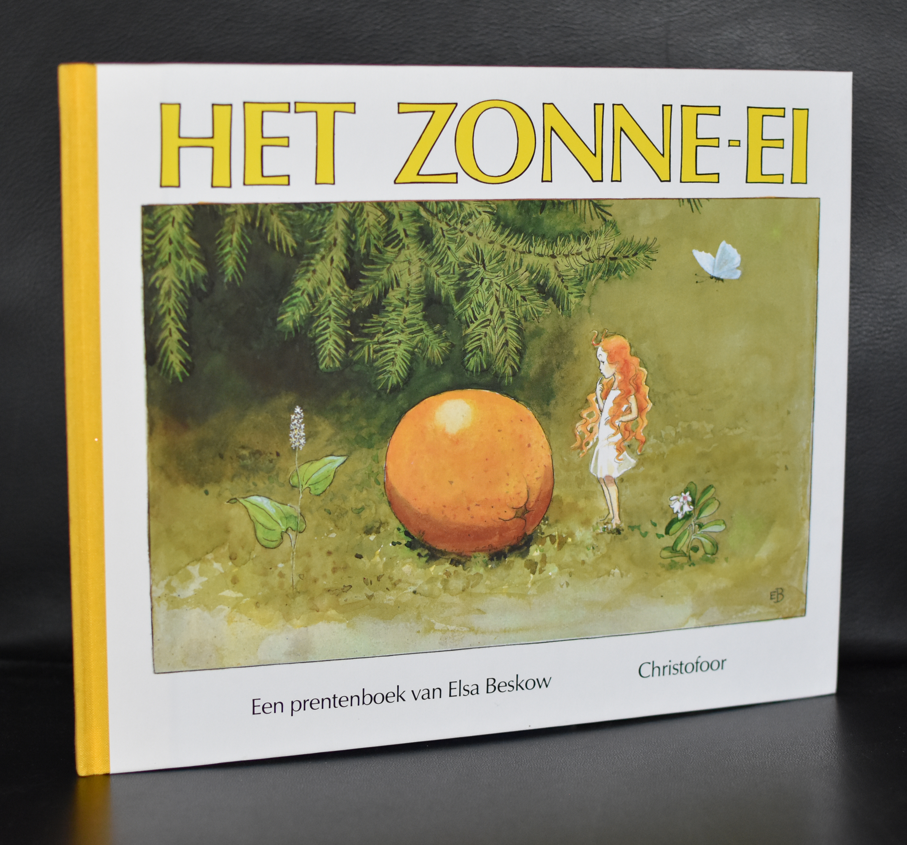
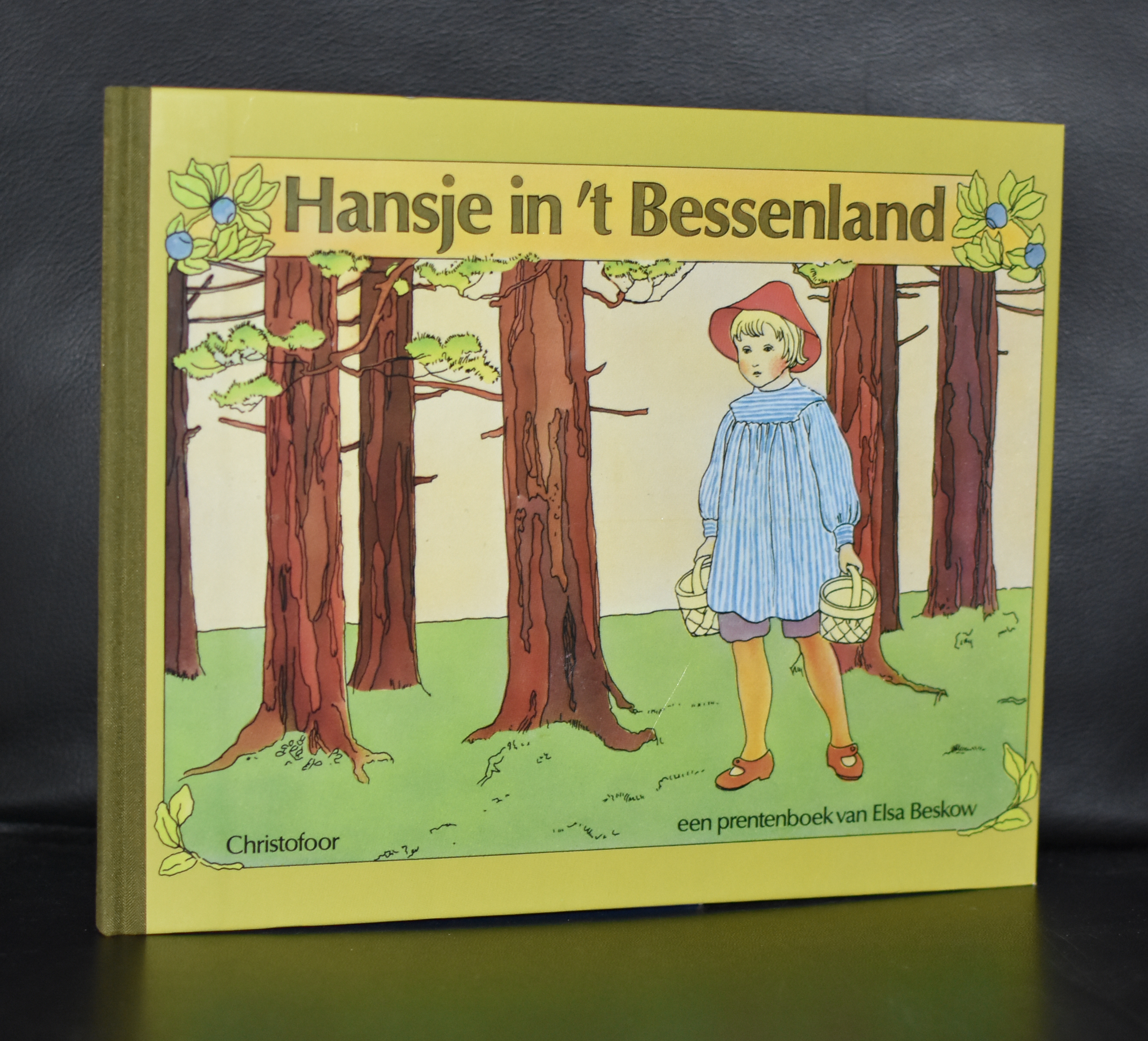
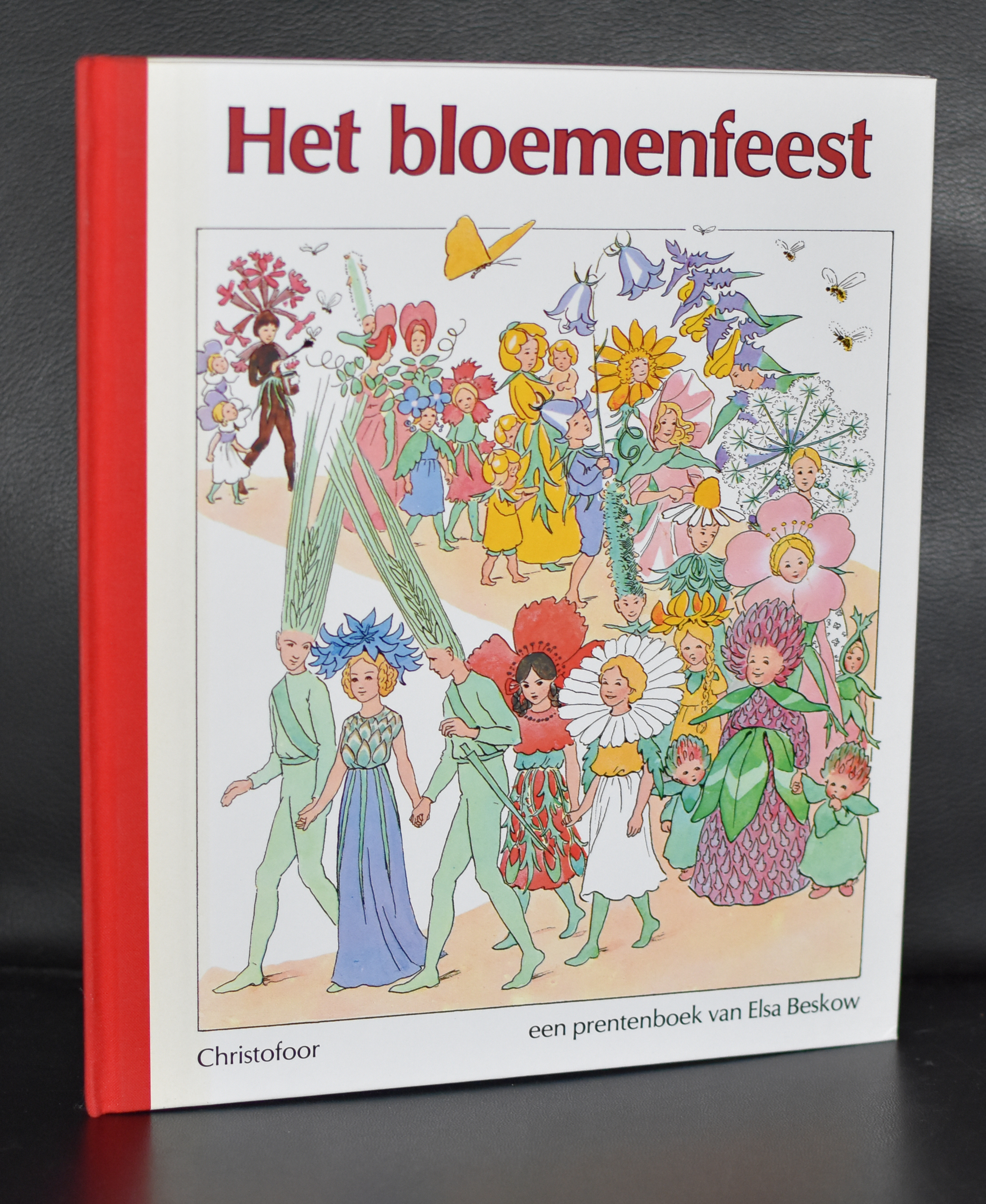
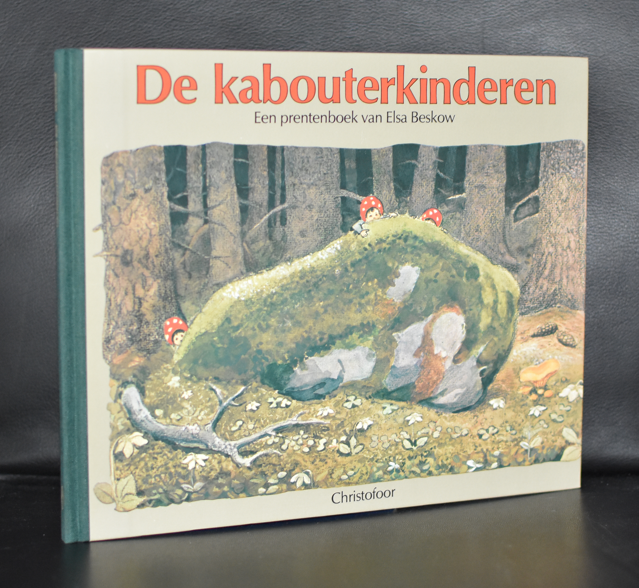
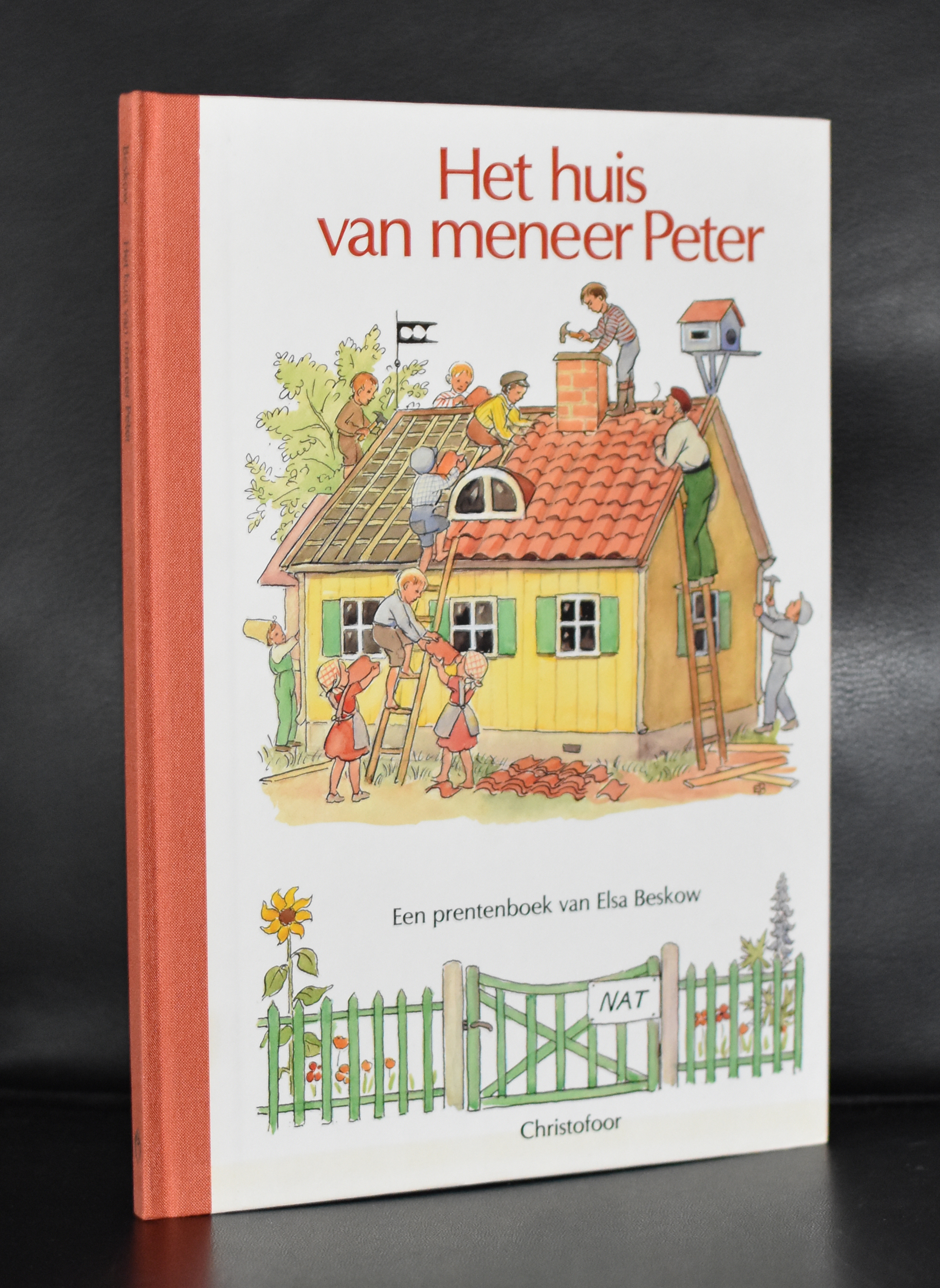
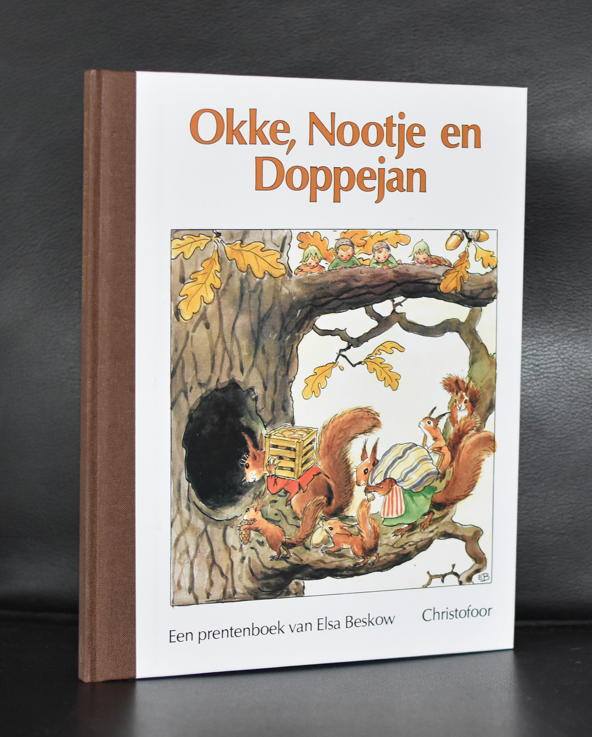
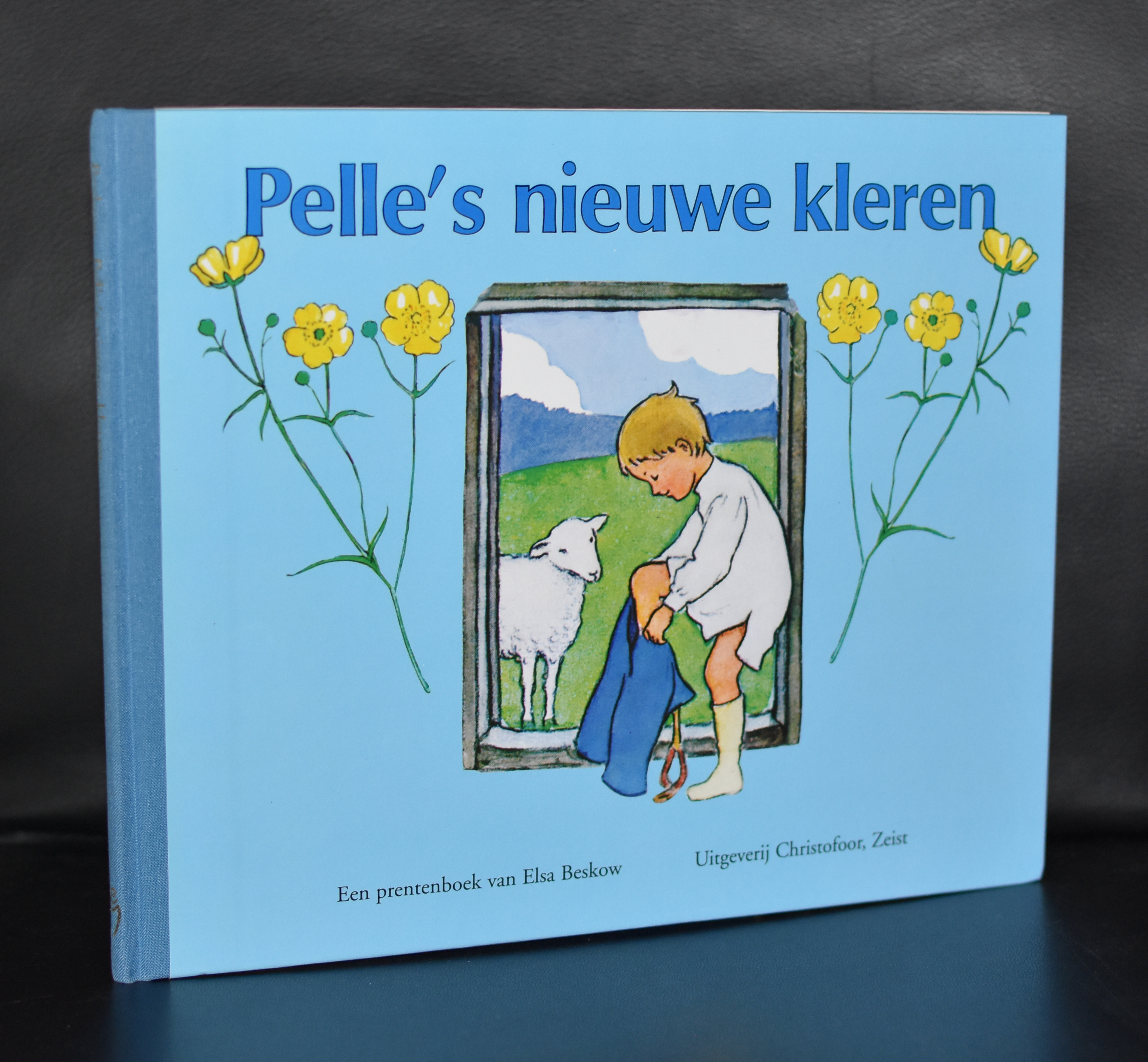
No probably not, but since i have a great personal interest in book illustrations i want to share this with you. Elsa Beskow is one of the greatest illustrators the world has known in the last century. This scandinavian woman ( Norwegian father and Swedish mother ). Has made some of the greatest children’s books ever. Timeless stories with great illustrations and suitable for children of all ages ( 8-88 years as TinTin says). And since it is sometimes hard to find this series of Beskow books . I want you to know that i managed to purchase a nice small library containing 7 of these classic Beskow titles. Enough…. here are the covers…and tomorrow i promise to blog on real art again.
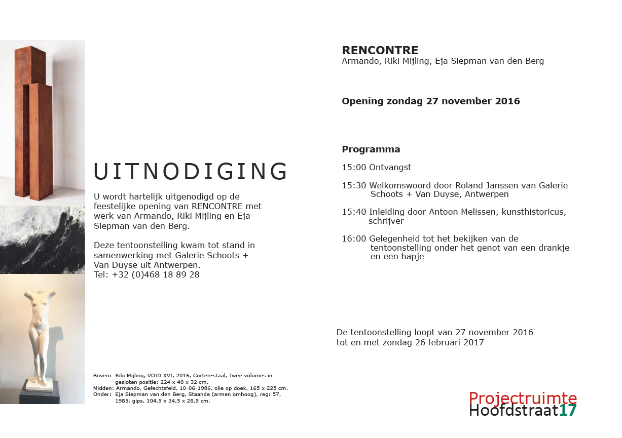
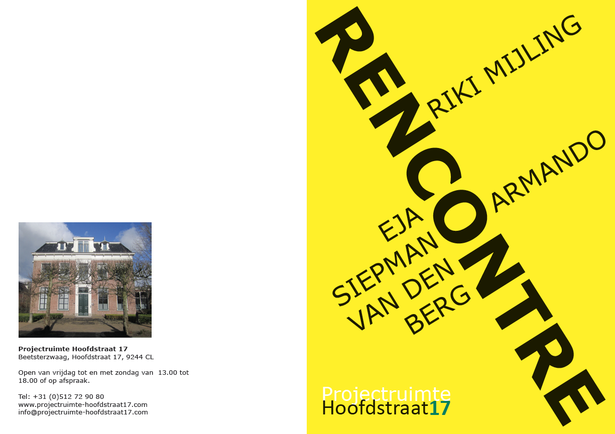
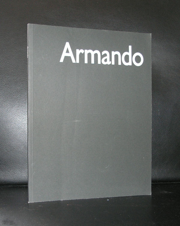
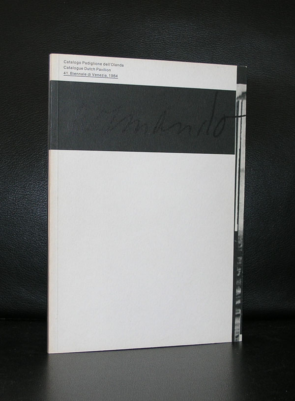
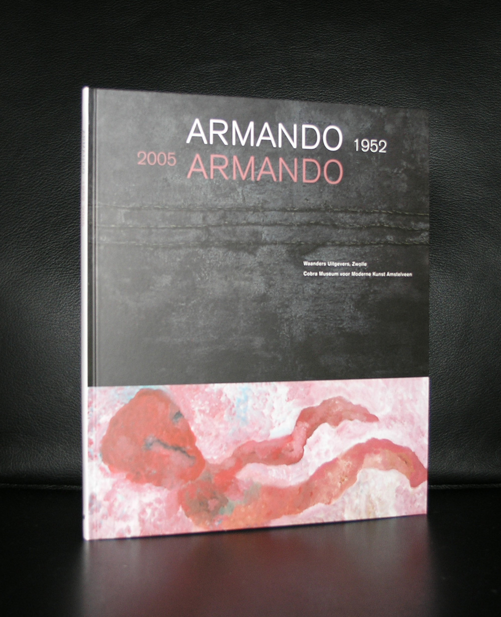
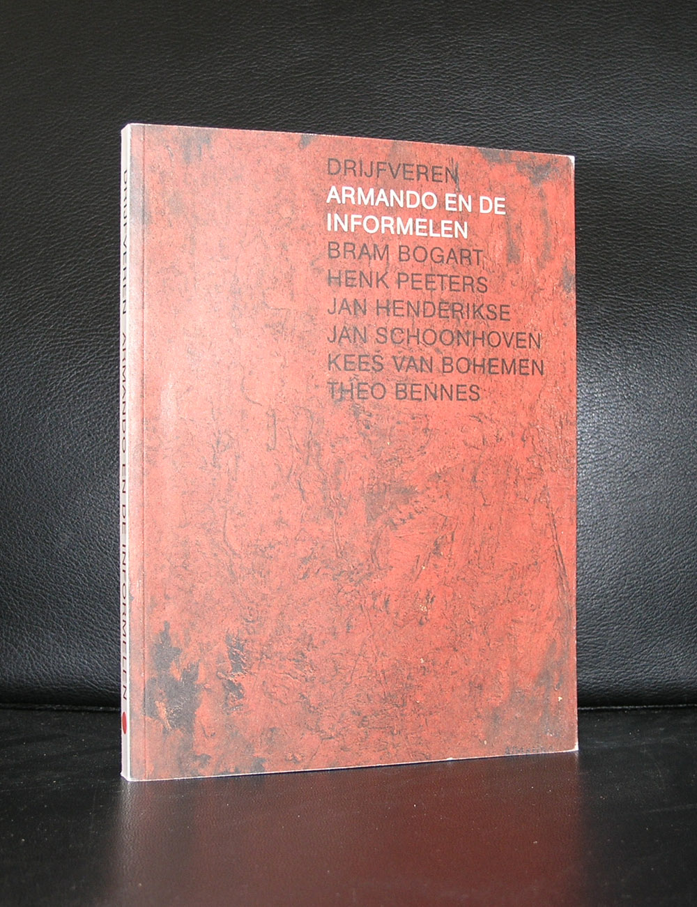
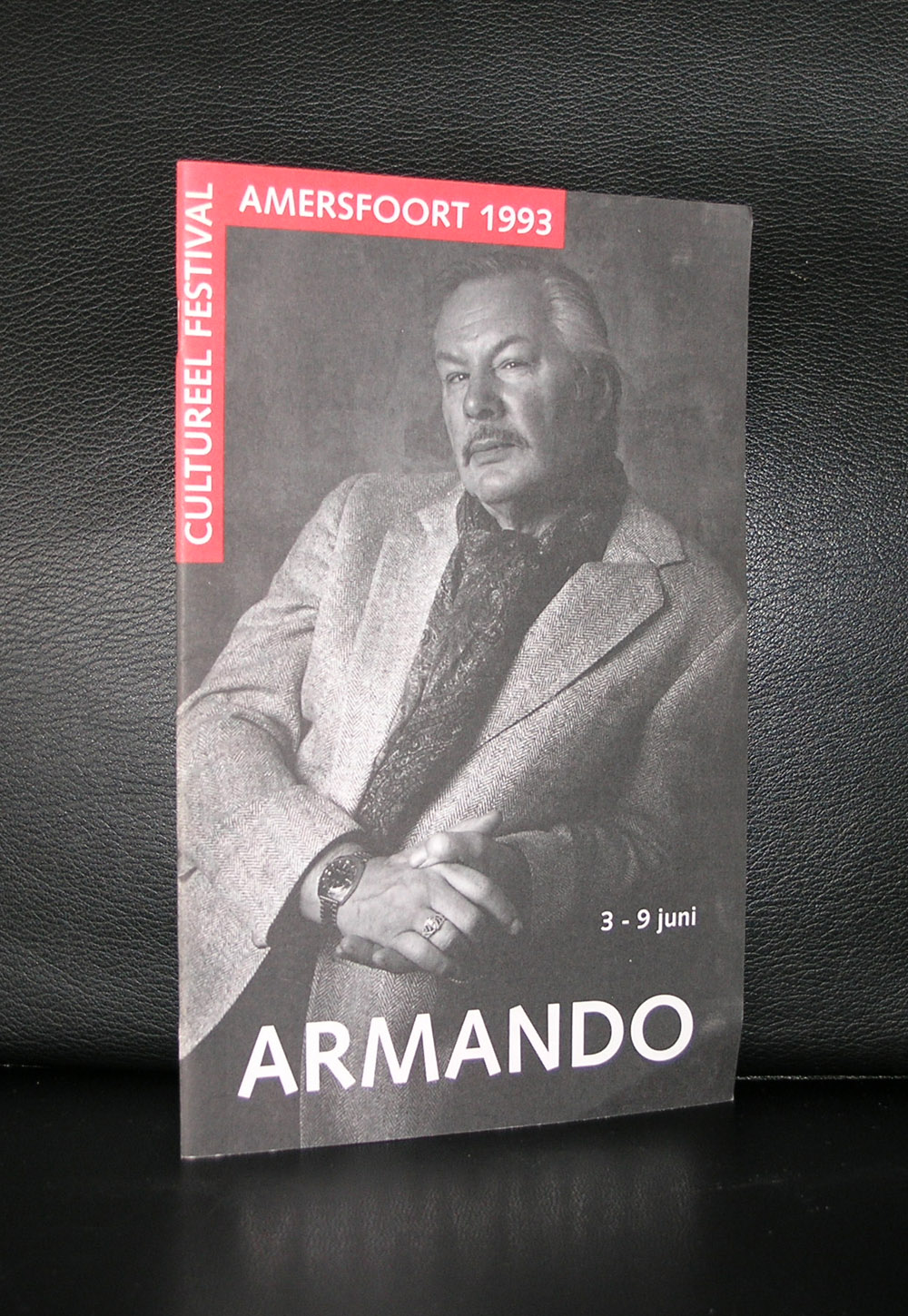
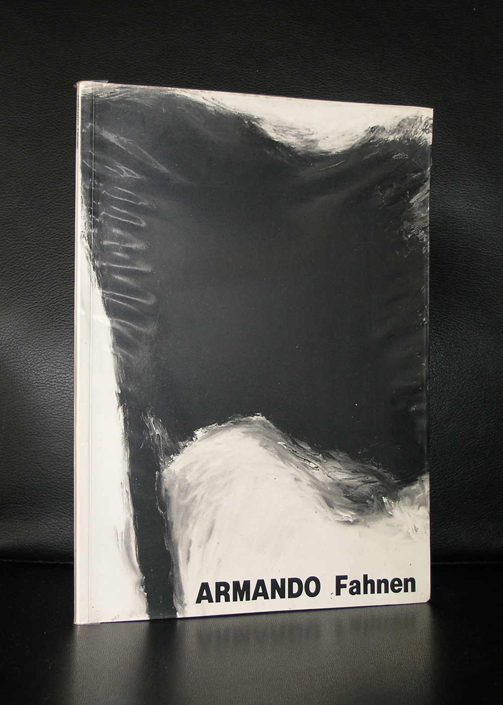
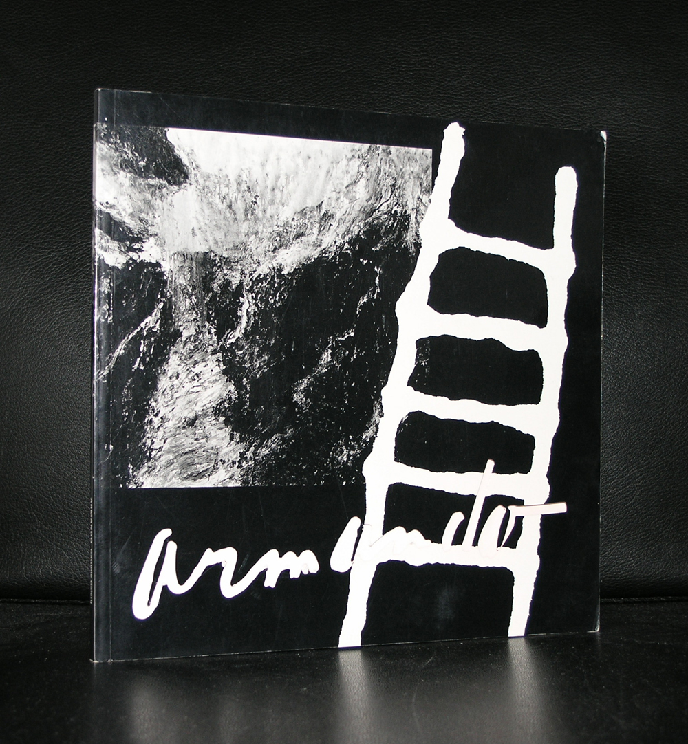
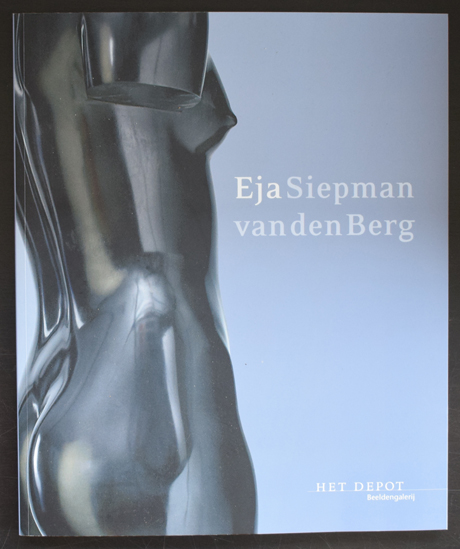
Another and exciting small exhibition to be opened in Projectruimte Hoofdstraat 17 has just been announced . 3 artists will be presented in conjunction which each other. The homebase of Eja Siepman van den Berg gives room to 2 other artists. This time Riki Mijling and Armando will be the guests. Mijling is the least known of these three, but works are present in the most important and prestigious collections, Caldic, DSM , Zadelhoff and the British museum among them. Armando needs no introduction and is known for his participation in the NUL and Informelen mouvements. Personally i think his Berlin years are his strongest period with the beautiful and impressive Fahnen and Tree paintings. And last there are the sculptures by Eja Siepman van den Berg. Each time i visit the Projectruimte Hoofdstraat 17 i notice how excellent they blend with the works by the other artists. An exhibition to visit in the coming months.
Opening on the 27th of November 2016 and closing on Sunday 26th of February 2017.
Willem Mengelberg, conductor of the Amsterdam Concertgebouw Orchestra, was grasped by Mahler’s music when he attended the first performance of his Third Symphony in Krefeld (G) in 1902. Right from that moment, he vigorously took on promoting Mahler’s music, claiming Mahler to be “the Beethoven of his time”. In his persistent efforts to introduce Mahler’s music, Mengelberg gradually acquired an outstanding position both in The Netherlands and in Europe, in this respect leaving behind other contemporary conductors.
Time and again, Mengelberg tried to persuade Mahler to conduct his own works in Amsterdam. This materialized in 1903, 1904, 1906 and 1909. During these visits, the composer was staying with the Mengelbergs at their home. However, because of his numerous engagements elsewhere, Mahler was often compelled to decline Mengelberg’s invitations for conducting.
Mengelberg’s commitment to promote Mahler’s music should not be underestimated. At the time, a substantial part of the public would leave the concert hall to demonstrate their disapproval of Mahler’s music, which was, on top of that, often ridiculed by the critics. Mengelberg was convinced of Mahler’s genius, which inspired him to persist in his dogged endeavours, taking for granted that this implied rowing against the stream . Only after years of sustained perseverance, a ‘Mahler community’ came into existence in The Netherlands, which formed the basis of the unprecedented success of the ‘Mahler Feest’ in 1920, drawing worldwide attention. In the 1920’s, Mengelberg, who had by then also become conductor of the New York Phiharmonic, repeated his efforts to promote Mahler’s music to the American public.
Mengelberg was one of the most important Mahler pioneers who deserves a special place of honour in our remembrance. His tireless efforts to make Mahler’s music better known to a greater public contributed greatly to the international Mahler culture of this era.
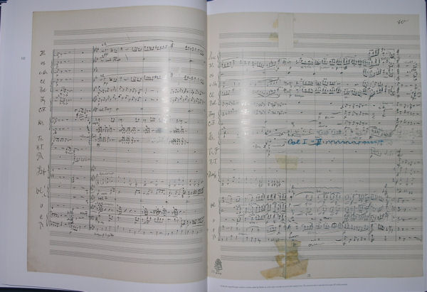
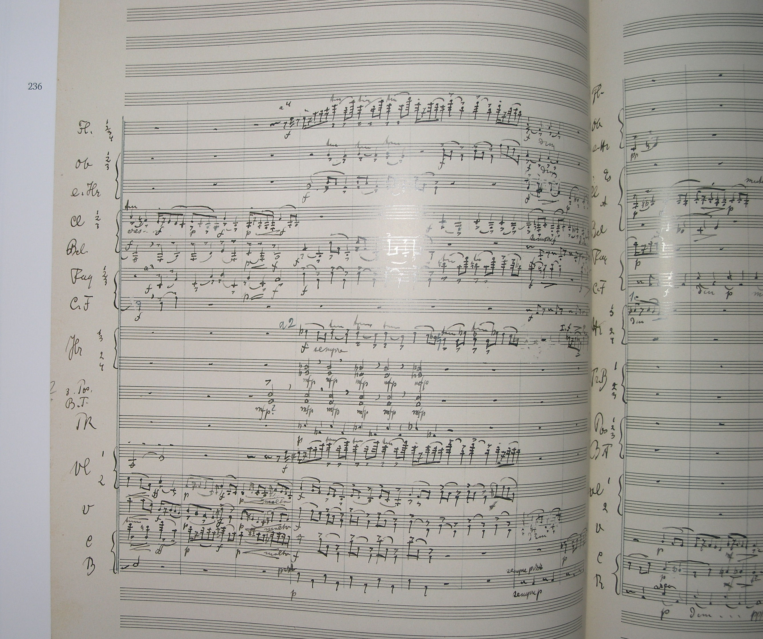
The Willem Mengelberg’s archives in the Netherlands Music Institute contain, amongst other things, his conducting scores, which are characterized by his colourful annotations that clearly indicate his conductors interpretation of the work concerned. In addition, many of these scores also contain instructions and remarks of Mahler himself: tangible and visible evidence of the close ties between Mengelberg and Mahler.
the above text is from willemmengelberg.nl
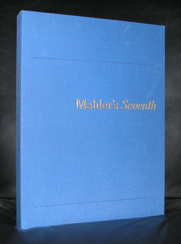
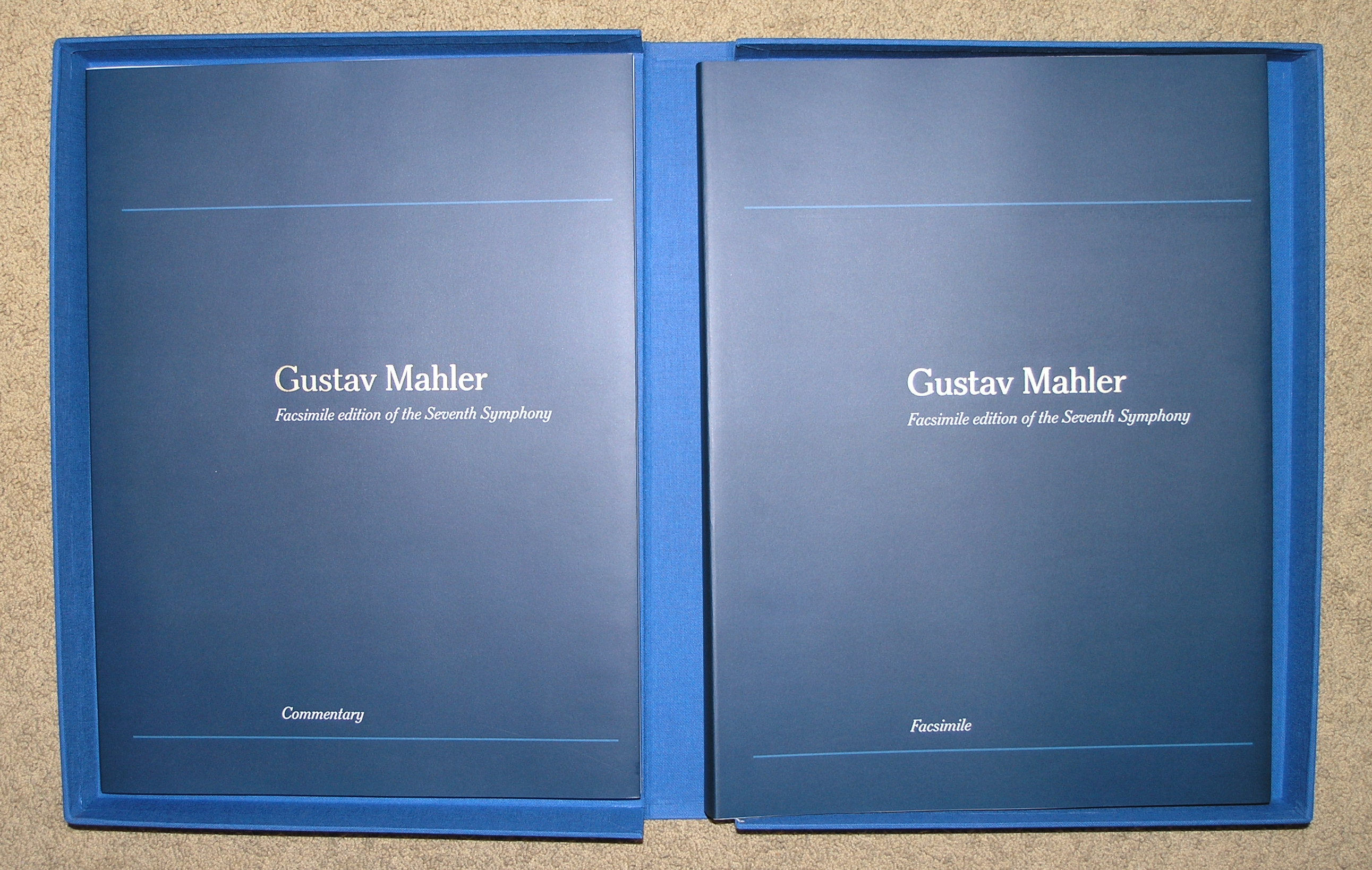
Why this blog on Mengelberg? It was about 20 years ago that well before the “craze” of huge and impressive publications ( Newton, Araki) that this tremendous large publication was published on the occasion of the Mengelberg Festival 1995. It is indeed a huge publication. Weight being well over 5 kg and published in a cardbox blue linnen covered container with a text plublication and in a different volume the musical score by Mengelberg with his annotations . This is the perfect facsimile.
Best of all: designed by one of my heroes ….Wim Crouwel. This is such a publication that will be in demand for a very long time and very hard to find. Now i have two copies available from a remainder stock and both in “new” condition at www.ftn-books.com
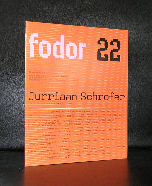
Yesterday we ate with our good friend Annemarie Schrofer and because of the beautiful paintings by her father on the walls, i remembered another member of the Schrofer family ……Jurriaan Schrofer.
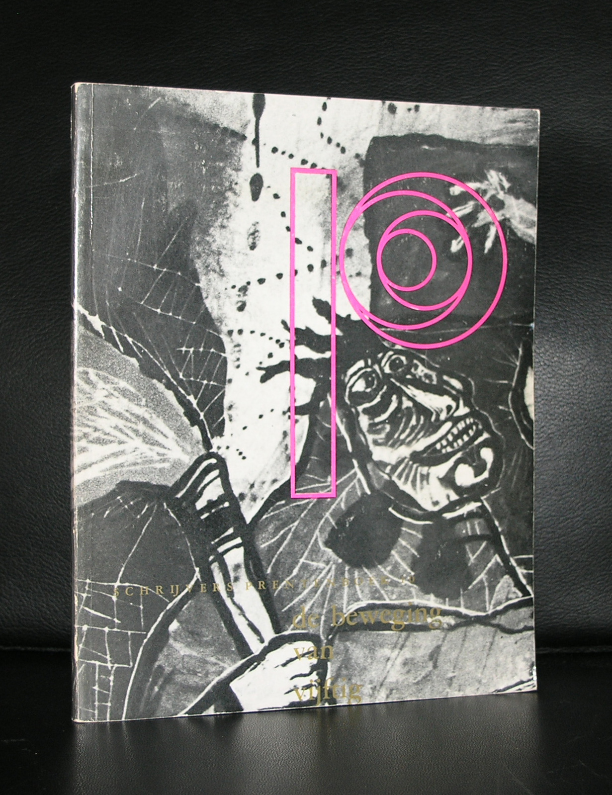
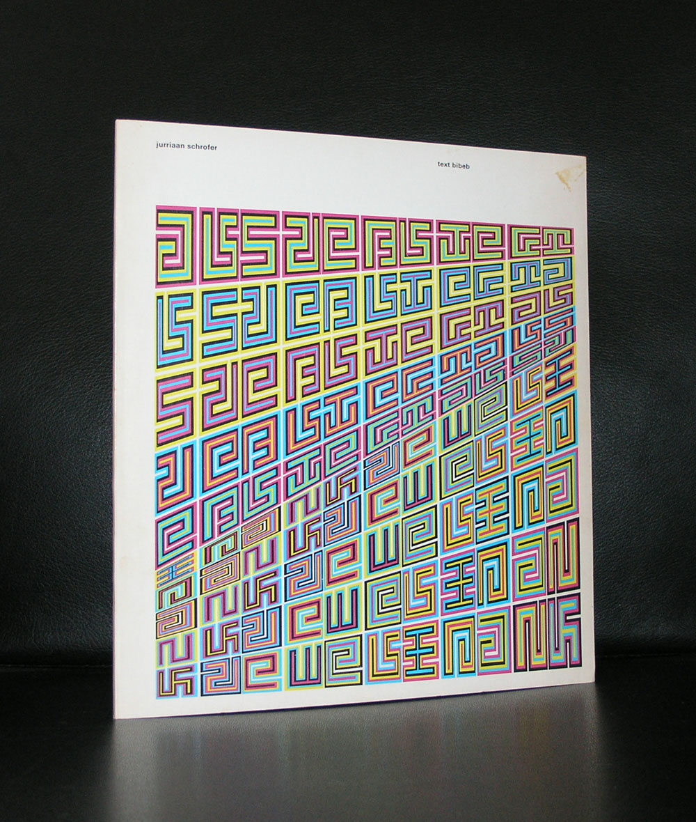
Born in 1926 and also a child of Annemarie’s father Willem Schrofer he would become one of the leading typography and graphic designers in the Netherlands. His works can be considered as “avant garde” design, thinking “out of the box” and soon he would develop his very own style . He originally wanted to become a film director, but ended being the assistant to Dick Elffers. This was the starting point of a splendid career as a graphic designer. For a few years in the seventies he was a member of Total Design, but soon followed again his own path. Highly original and recognizable are his designs. He was commissioned by many dutch important institutions and was appreciated for the designs he made for them, but his true recognition as one of the leading graphic designers from last century is only 25 years old. His works would become internationally known and appreciated. There now is a high interest in his works from leading British Graphic design schools and recently the same interest comes from the US.
Jurriaan Schrofer books can still be picked up at reasonable prices and for those interested in dutch graphic design, the designs by Schrofer are an absolute and quintessential part in the history of Graphic design and not to be missed in any collection. www.ftn-books.com
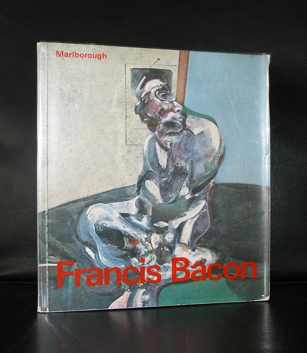
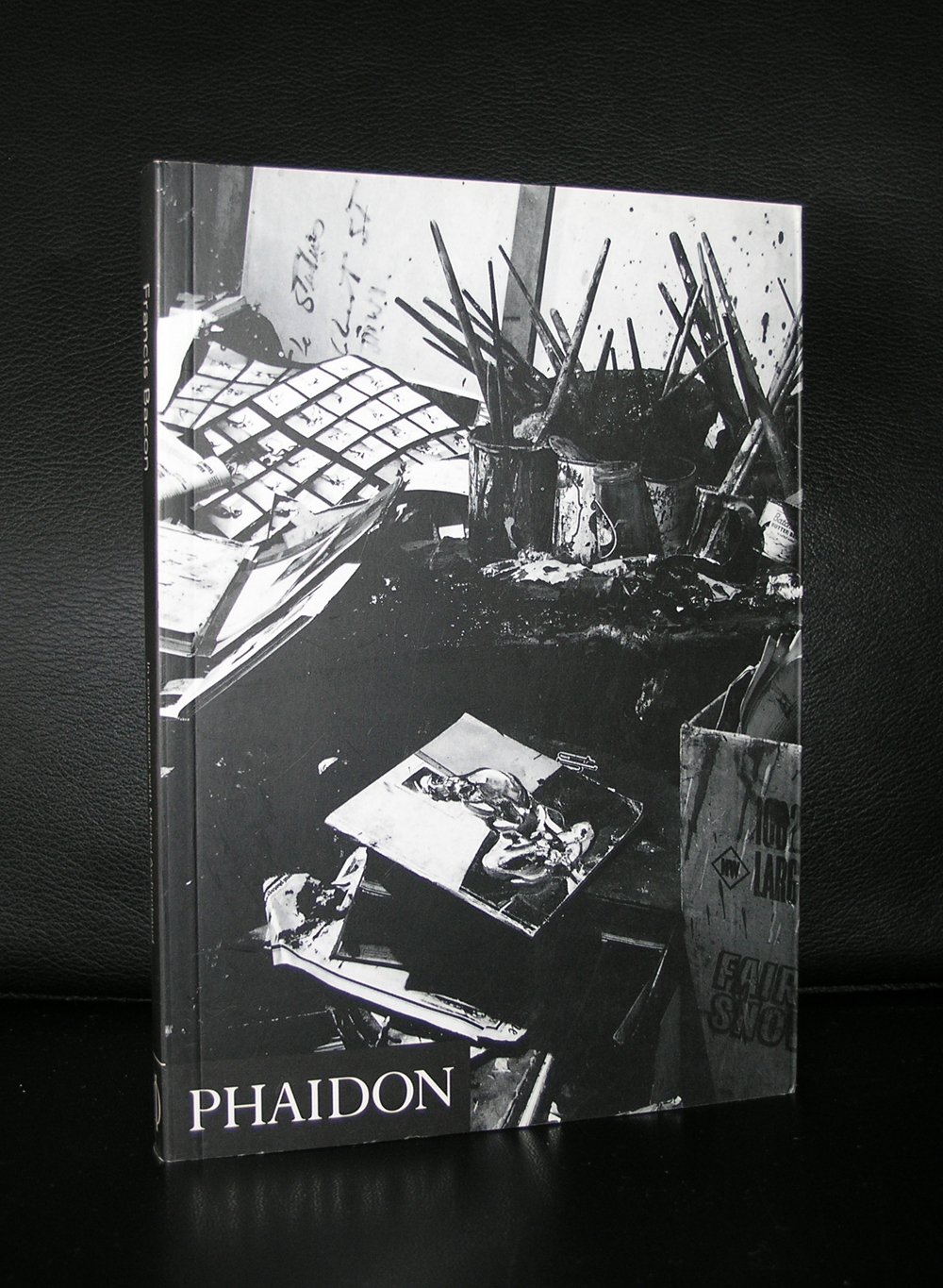
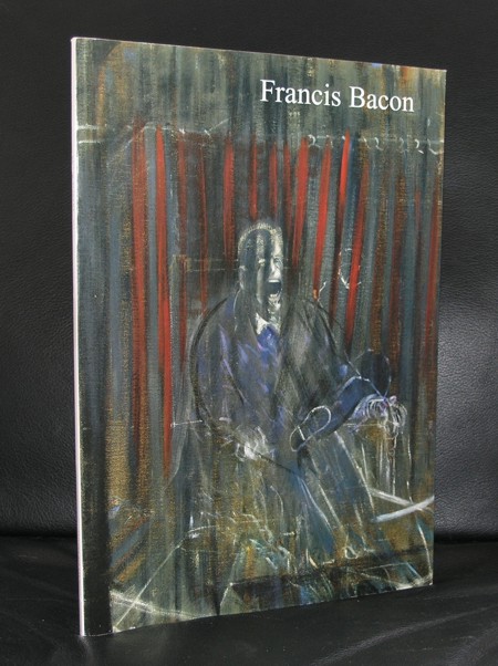
If you ask me which artist was represented with the most beautiful and best catalogues published for every exhibition organized with his works…. the answer is Francis Bacon.
Oversized catalogues with several hundreds of pages, excellent print quality and because of its content in many cases with multiple fold out pages to show Bacon’s Triptych’s in the best possible way outside a museum.
I followed Bacon closely because in 2001 the Gemeentemuseum organized its most expensive and logistically one of the most difficult exhibitions ever ….the one on Francis Bacon. The plan was to print the catalogue in Singapore, but because of a promised book publication to the former director, he decided for a dutch publisher. An initial publication run was set in relation with the expected number of visitors. Soon after opening it proved a wrong estimate, because fortunately, the works by Bacon proved to be far more popular than expected. 3 editions of the catalogue were printed during the exhibition and in total almost 8.00o copies were sold . A huge commercial succes, but even more important a great succes for Bacon as one of the leading modern artists from the 20th century.
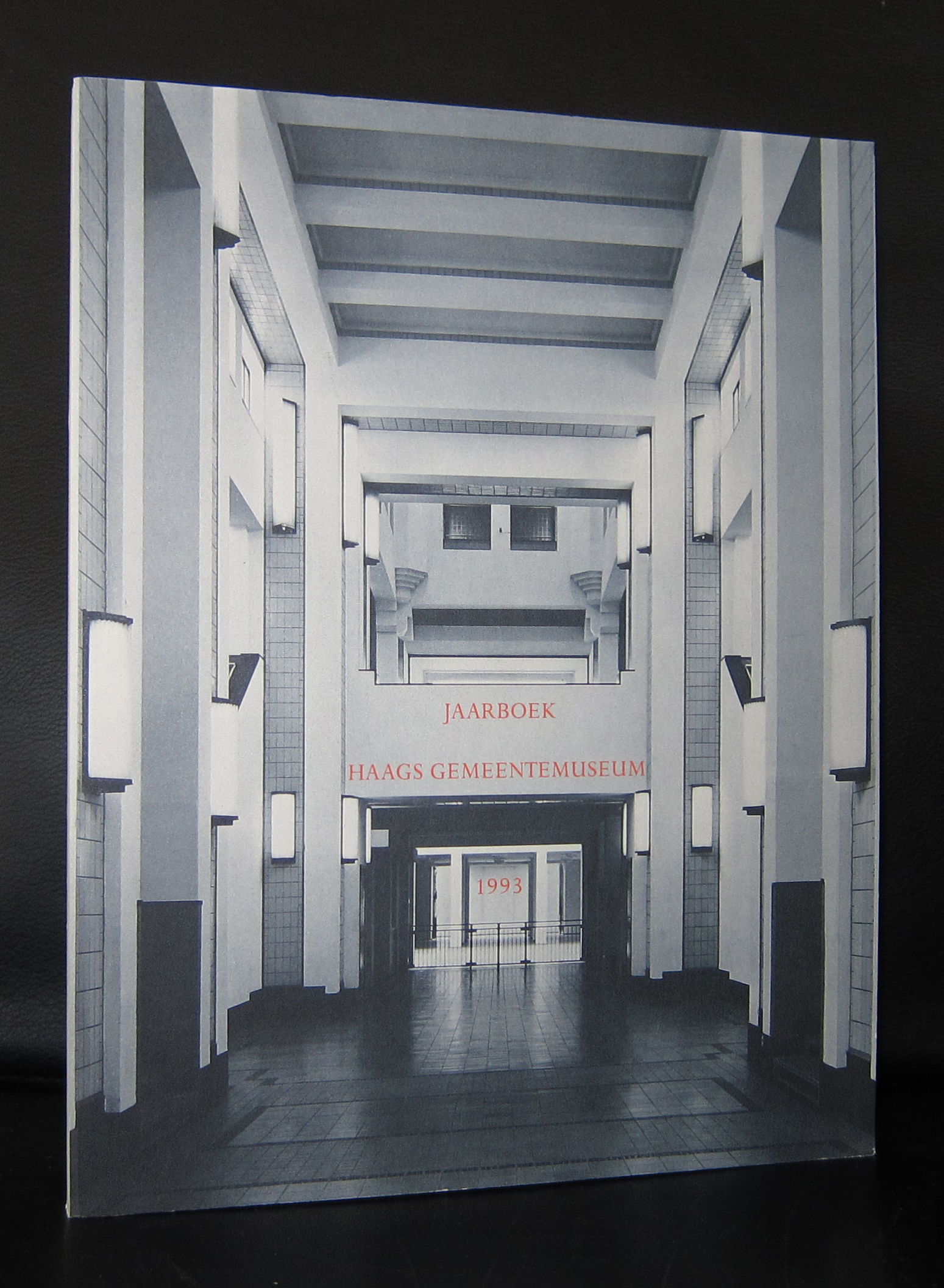
This was one of the last times so many large Bacon paintings ,including many Triptychs, were presented in one Bacon exhibition. The exhibition showed the importance of Bacon and because of this, the Gemeentemuseum got on loan the Bacon which is in the collection of the Museum Boijmans van Beuningen and one from the estate of Francis Bacon. Nowhere in the Netherlands so many Bacon paintings can be seen in one spot and and the sixties acquisition of the PARALYTIC CHILD WALKING ON ALL FOURS proved to be a worthy addition the collection of the Gemeentemuseum. ( in the JAARBOEK a study by Josephus Jitta is published on the “Paralytic child”)
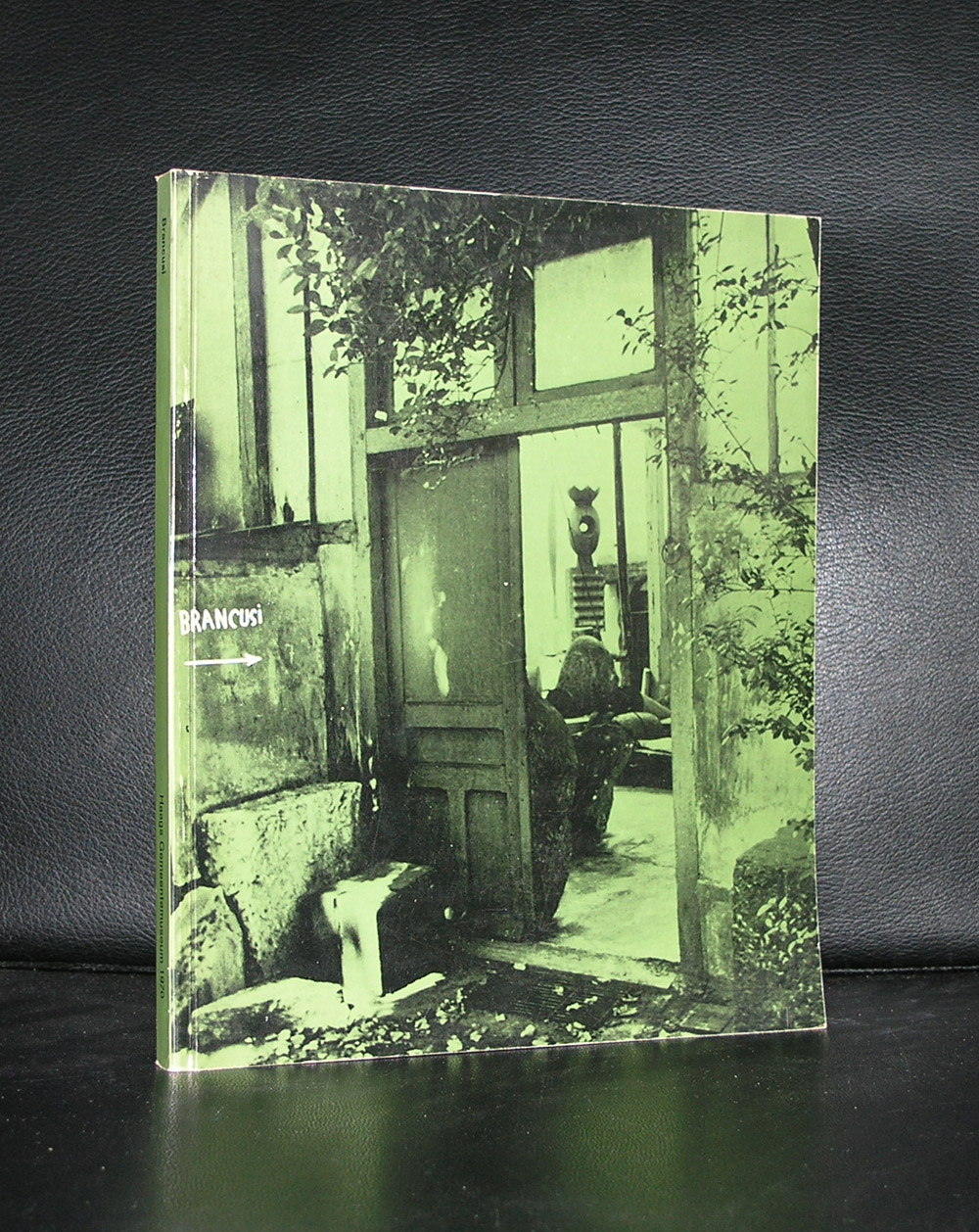
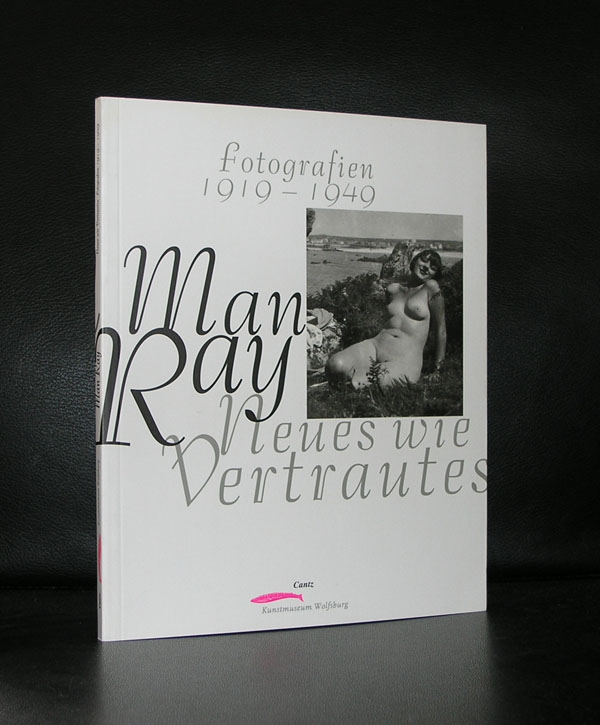
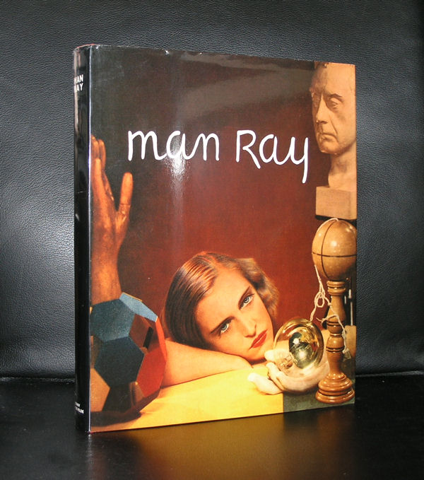
The book i picked is the book published by the Boijmans van Beuningen Museum and it reminded me of the exhibition we visited 2 years ago in which the sculptures by Brancusi were combined with the Man Ray’s the Boijmans had on loan and from their own collection. Impressive exhibition in which the Brancusi’s stole my heart. The setting and the sheer volume of the sculptures made this the best “outside Paris” exhibition on Brancusi i have ever seen. Man Ray and Brancusi both have been presented regularly in the Netherlands during the last 50 years, but there are only a few works in the collections of the Dutch museums. The Kroller Muller has bought one some 20 years ago. A “head”, but this was the last acquisition by a dutch museum .
So the fact that both were combined in the Boijmans van Beuningen museum was a sheer joy. I started with mentioning Man Ray, but ended with Brancusi ….and yes ,this is also how i feel about these artists in my personal ranking….first there is Brancusi and then there is Man Ray.
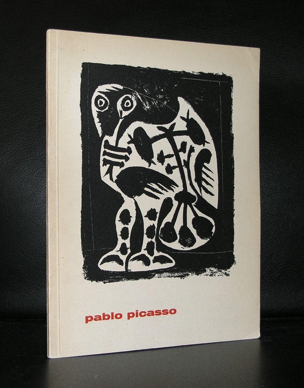
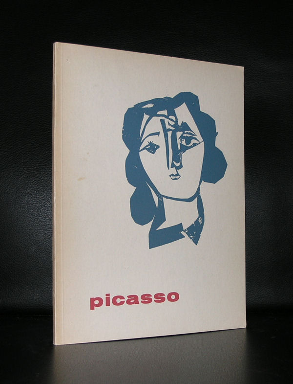
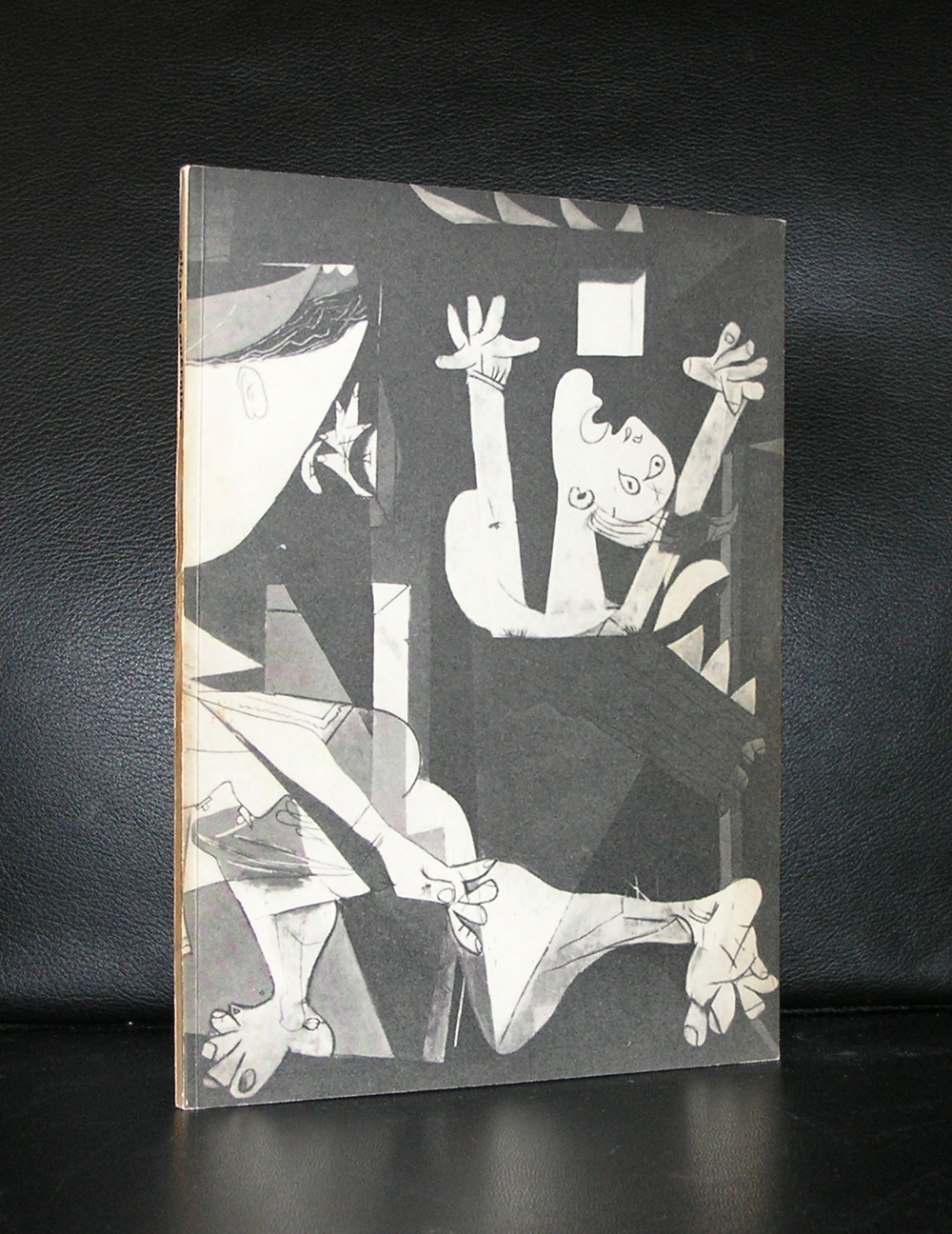
Personally i am not a great fan of Picasso. I understand his importance for Modern Art, but somehow he never appealed to me very much. One exception . In 1937 Picasso painted GUERNICA. The first time i saw this extremely large painting was in 1977 when i visited New York with my father. It was breathtaking!
So much to see in this painting. I shows the city of Guernica while it was bombarded by the Condor legion of the Luftwaffe. Pure panic and chaos on every painted part of the painting. This is a painting you must see in reality, because the sheer size is breathtaking already. It was one memory i brought home with me.
About 12 years ago the Gemeentemuseum Den Haag had the studies for Guernica in a special show and even on these much smaller studies you can see the struggle of the painter and the power of the subject.
A few years ago we went to the Reina Sofia Museum in Madrid and saw this masterpiece again. The same experience…still breathtaking.
When you look at this painting you can see that it has influenced many painters. . For one, there is a dutch painter ” Willy Boers” who borrowed the theme with the horse and made his own version of chaos and despair. The painting is called “La Quintessence” dated 1947/1948, 10 years after Guernicia was painted and is depicted in DOORBRAAK VAN DE MODERNE KUNST IN NEDERLAND. Can you spot the similarities too?
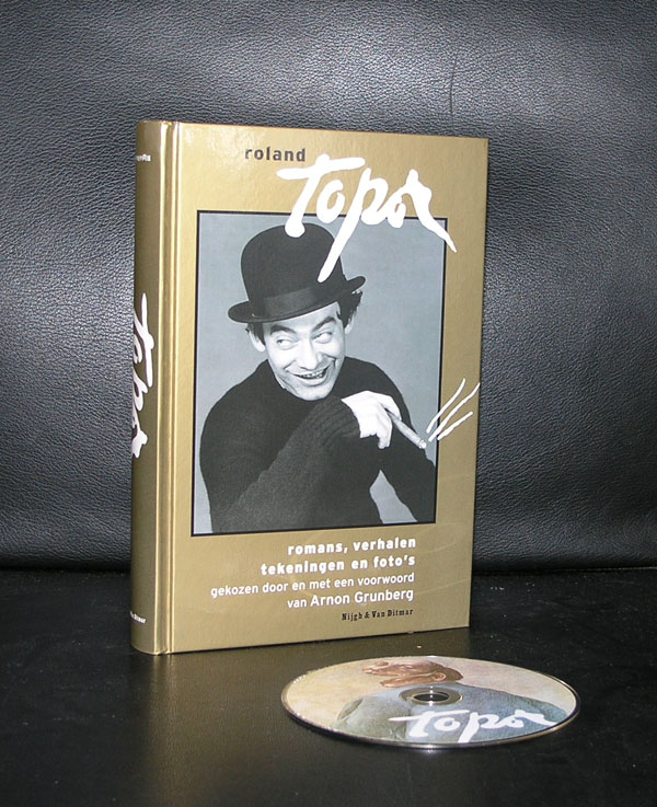
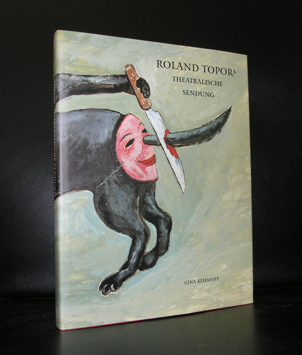
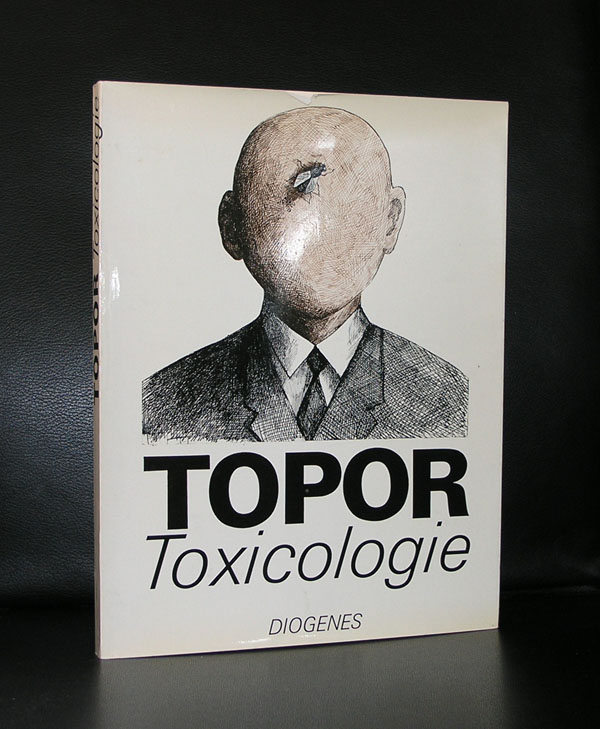
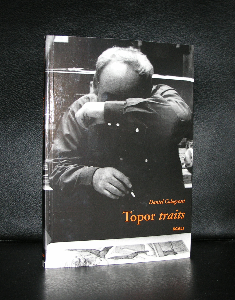
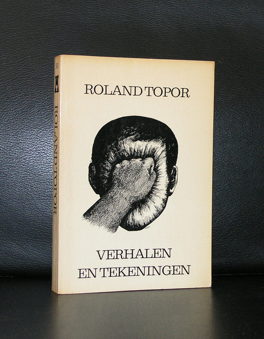
It was about 15 years ago that the Gemeentemuseum Den Haag produced some original Karel Appel lithographs and sold them through galerie Vogtschmidt in Amsterdam. All were sold but none were paid. So after a long time arguing about the payment we decided to go there ourselves and “rescue” what was left. A colleague of mine and i went to Amsterdam and chose some art from the stock of galerie Vogtschmidt and among these items was this Roland Topor drawing which i bought privately in an auction which i organized among the personnel of the Gemeentemuseum . This together with a series of prints was mine. At a fair price, but not as cheap as i hoped for , because others were bidding with me on these items. Now some 15 years later the purchase price is forgotten and what remains is the memory of the auction and the many nice items which were for sale at that time. I wish i had bid on the Henk Peeters set and the light drawing by Roland Topor but you can not have everything. and for the dutch….Martin Bril zei’ Je mist meer dan je meemaakt’
OLYMPUS DIGITAL CAMERA
In the Netherlands many of the (special) publications were published because Topor received a lot of attention by publishers and curators. Because of this, one can regularly find nice publications, but since Fluxus is getting popular every year now, it becomes more and more difficult to find the nice ones
, but please take a look at my inventory at www.ftn-books.com and find the Topor books that i have at the moment.
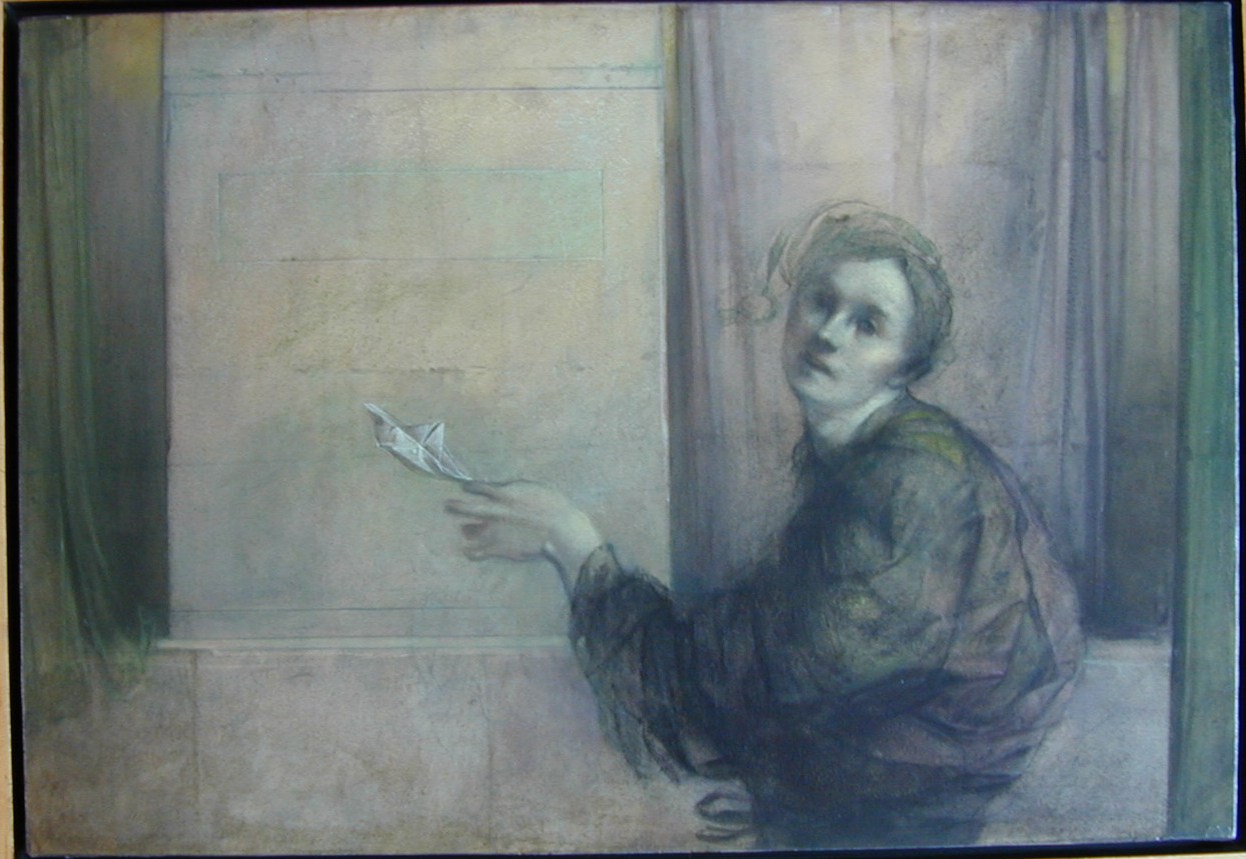
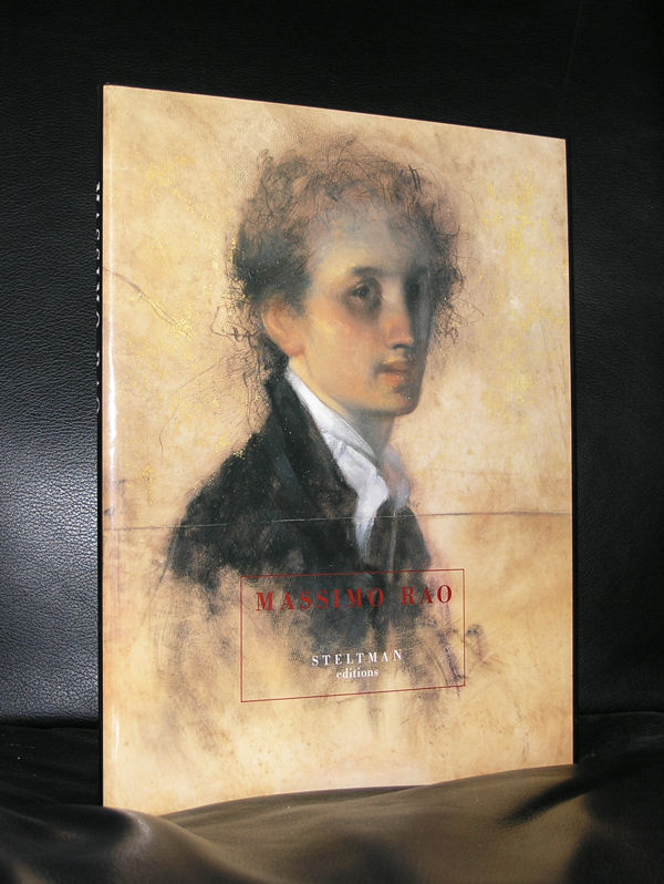
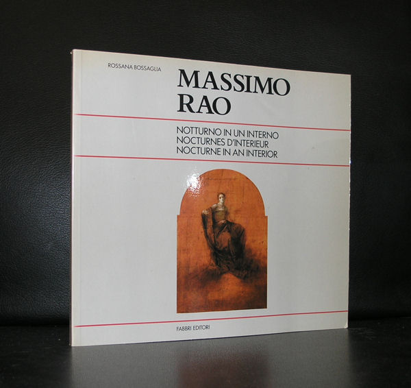
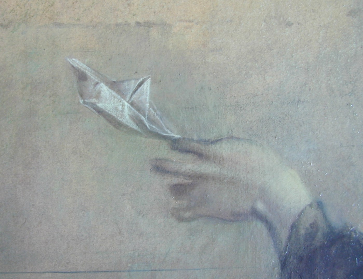
Just a simple title for a blog on a painter who had a very short career, but build a strong following of admirers. It was 2008 that i visited New York and entered the CFM gallery and spoke the owner Neil Zukerman about our art collections. I learned that he had bought the very first Rao i had owned and had traded it in for the much larger IL MARINAIO CHE AVEVA ALL ‘UOVO E OLIO.
The one i originally had in my collection, was still one of the favorite paintings of Mr. Zukerman, but the encounter of this passionate collector and the story on this small Massimo Rao painting i once owned, made the world look so very small. If he still has it….i do not know….., but in the meantime the painting in our collection is depicted in 3 Massimo Rao books and was on show at the Panorama Museum in 2004.
Since it has been quiet around Rao, no special exhibitions….. but a growing following and a special site on the painter who unfortunately died much too young ( 1950-1996), but left us so many great works of art. http://www.massimorao.it/massimo-rao/
The books i have on Rao are growing more popular each year and it looks like most are exported to the US. So my guess is the important collectors are in the US and not in Europe.
Maybe it is an idea to organize a large retrospective in the US?
Prins Hendriklaan 50, 3583 EP Utrecht, the Netherlands
Yes, you still can see and visit this iconic architectural masterpiece which was designed by Gerrit Rietveld at the time he was a “de Stijl” member. Together with Piet Mondriaan and Theo van Doesburg he was was one of the founders of the DE STIJL mouvement in the Netherlands.
Soon Theo van Doesburg dropped out of this mouvement because he found himself restricted by the horizontal and vertical lines the mouvement prescribed. He wanted to use the Diagonal line too, but Rietveld believed in these horizontal and vertical lines and used them together with the primary colors he loved so much and draw with them one of the most beautiful small buildings from the last century. When you visit Utrecht, visit the Schroderhuis too. BTW. the house got its name from the first inhabitant of the house. She commissioned Rietveld to build it for her. Truus Schröder-Schräder lived in it for her entire life.
www.ftn-books.com has some nice books on the Rietveld husi and a kit from which you can rebuild the house yourself in a much smaller scale.
Artist/ Author: Oliver Boberg
Title : Memorial
Publisher: Oliver Boberg
Measurements: Frame measures 51 x 42 cm. original C print is 35 x 25 cm.
Condition: mint
signed by Oliver Boberg in pen and numbered 14/20 from an edition of 20


 Personally i am not a great fan of Picasso. I understand his importance for Modern Art, but somehow he never appealed to me very much. One exception . In 1937 Picasso painted GUERNICA. The first time i saw this extremely large painting was in 1977 when i visited New York with my father. It was breathtaking!