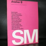
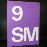
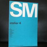
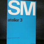
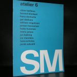
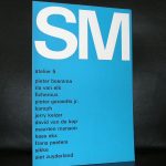
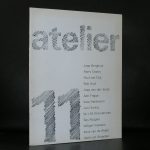
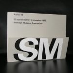
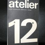
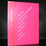
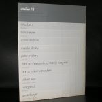
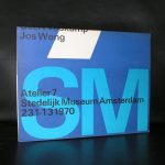
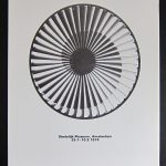
The focus of this blog is on the covers of a very impressive series Wim Crouwel designed for the Stedelijk Museum during a period of roughly 14 years in the Sixties and Seventies ( between 1965 and 1979). This series has the typical Crouwel layout and typography and beside these elements these designs are ” clean” without any frills ….just function. These were done when the Total Design agency had their “GOLDEN YEARS” and Wim Crouwel was one of the most important members of Total Design ( founded in 1963). This is a great series of 16 publications . Some with loose pages in portfolio, others in the shape of posters or just ordinary booklets, but all have the quality design Wim Crouwel stands for. Most of these publications are available at www.ftn-books.com and if your are looking for other Crouwel publications search for them at the same site.
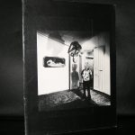
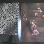
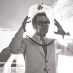
Yesterday, Polish born artist Mark Prent contacted me about the Stedelijk Museum catalogue i have for sale on his exhibition in 1978. A never had studied the catalogue in detail before. But is a “dark’ catalogue which reflects the work of Prent in an excellent way. His works are “dark”
have a look at www.markprent.com and see for yourself what i mean
Mark Prent works consist of life-moulded mixed media, polyester resin and fiberglass casts of human models in sometimes disturbing poses and juxpositions. Mark Prent has consistently maintained throughout the years, that his sculptures and installations do not carry intentional messages. Despite the powerfully grotesque imagery that he has employed, interpretation is left to the viewer. Prent developed his own unique technique of layering to give a heightened realism to his figures; thus giving rise to the label “Extended Realism”. When he later became concerned about the toxicity of polyester resin, he began to experiment with other materials, developing innovative techniques for recreating that trademark quality of virulent realism. This venture into new materials led him in many new directions in his own work and ultimately, to become a technical resource for other artists as well.
Having followed his education in the US and exhibitions in Amsterdam , Berlin and Montreal his works are known all over the world, but because of their “Dark” nature never have become popular.
In 2005 Prent began a new series of video-taped performance pieces in collaboration with videographer/son Jesse Real Prent. In this series, Prent’s own body becomes a living, interacting component of his nightmarish scenarios. He continues to produce new sculptures in his Vermont studio. www.ftn-books.com has the Stedelijk Museum Mark Prent catalogue available.
1 year ago i acquired for my inventory two spectacular multiples. These are not cheap, but since last auctions results of both these artists i am even more convinced that these are not overpriced and will be a great addition to any book collection. These two multiples were published in the seventies by Edizioni Flaviana within their series of Zero artist. Here are the links two both blogs i published on these rare multiples.
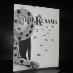
Being one of the first to have participated as a Zero artist Dancing together with Jan Schoonhoven (in the nude)
and after that building an oeuvre on just one pattern…the Polka dot.
i love these artist that stay true to their belief. Kusama is not the only one. Leblanc, Peeters and Schoonhoven ,all from this generation , stayed true to their art ” inventions” developing it into something very perosmnal , recognizable and in many cases a beautiful and impressive work of art.
Kusama participated in the first ZERO/Nul exhibition in the Stedelijk Museum, but beside that she had her Retrospektives held all over the world including the Tate Modern where a large rRetrospektive was held in 2012. Now she has turned into a grand old lady of Contemporary Art and perhaps together with Louise Bourgeois and Georgia O’Keefe she has given a feminine touch to Modern Art. www.ftn-books.com holds some excellent Kusama titles in its inventory.
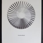
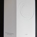
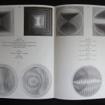
Tomitaro Nachi was one of the first japanese artist ever to have an exhibition in the Stedelijk Museum. Wim Crouwel designed the catalogue for his exhibition and what makes it extra special is that the catalogue included a rare and beautiful multiple. There is wonderful short movie about this artist which was made at the time of his exhibition at the Stedelijk Museum in 1974.
The catalogue shines. It is like a minimal artist book and reflects the spirit of “Zero” and Kinetic art and was forgotten by most until recently it was sold at a local book auction and fetched a steep price of euro 120,– because it had the original multiple included. www.ftn-books.com has both copies available. The one with and the one without the multiple. Both are worth collecting, but as lng as it is there i would chose the one with the multiple included.
The studio of Piet Mondrian were works of art of them selves. They acted like a true work “in situ” where every item had its proper place . Because of this, the studio itself became a work of art. This was recognized by many and one of the greatest photographers from last centur even made a series of photo from the Paris studio. The same with the NY studio which was photographed by Arnold Newman.
Kertesz and Newman , two great photographers who realized that Mondrian was a very special painter and made these photographs with one purpose….. so we could see the extraordinary qualities Mondrian had when he approached a painting or an object.
There is onegreat article on Artsy where the studio’s of Mondrian are described.
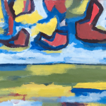
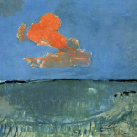
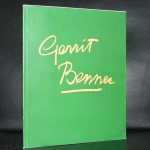
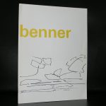
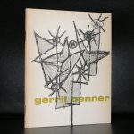
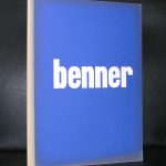
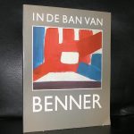
One of my first blogs was devoted to the museum Belvedere where i encountered some wonderful paintings by Gerrit Benner. This blog is solely devoted to Benner because he deserves it. His paintings are among the first abstract paintings which still hold a link with realism in the Netherlands . These paintings are definitely inspired by nature. Skies, meadows and even an abstract cow can be determined in the compositions. Benner is a painter “pur sang” who’s works are rooted in the dutch tradition of abstract paintings. For instance Mondrian used these abstracted landscapes in his own painting from the early 20th century.
on the left a painting by Benner with Red cloud on the right Landscape with Red cloud by Piet Mondriaan
Benner is a great painter who deserves to be known outside the Netherlands and for those visiting the Netherlands. When you visit the Stedelijk, Gemeentemuseum, Belvedere and Museum Twente you surely will encounter a Benner painting in their permanent collections.
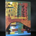
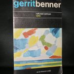
There are some very nice Benner publications available at www.ftn-books.com
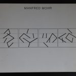
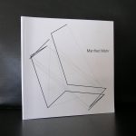
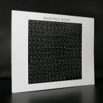
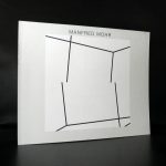
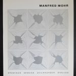
Another discovery from the Josef Albers Museum/Quadrat Bottrop is the artist Manfred MOhf of whom i had not heard until 8 years ago, but who i discovered at the Quadrat Museum, because they had some very nice limited prints available. Later i remembered that he also featured within the Blank Page set which i acquired some 25 years ago for my personal collection.
Mohr is a digital Art pioneer and strangely enough this has no relation at all with his early years as an artist in which he was a jazz musician and action painter. I really love the works by Mohr, because they look simple compositions and almost the same , but when you look at the closely you will notice the difference and subtle changes which result in a completely different composition.
The publications by MOhr have all the same qualities. Oblong sized and showing these little differences in sequence resulting in a different composition. I love these kind of books. Small editions, artist like books, in most cases designed by the artist and really showing what the art is about and www.ftn-books.com has some of these books by Mohr available.
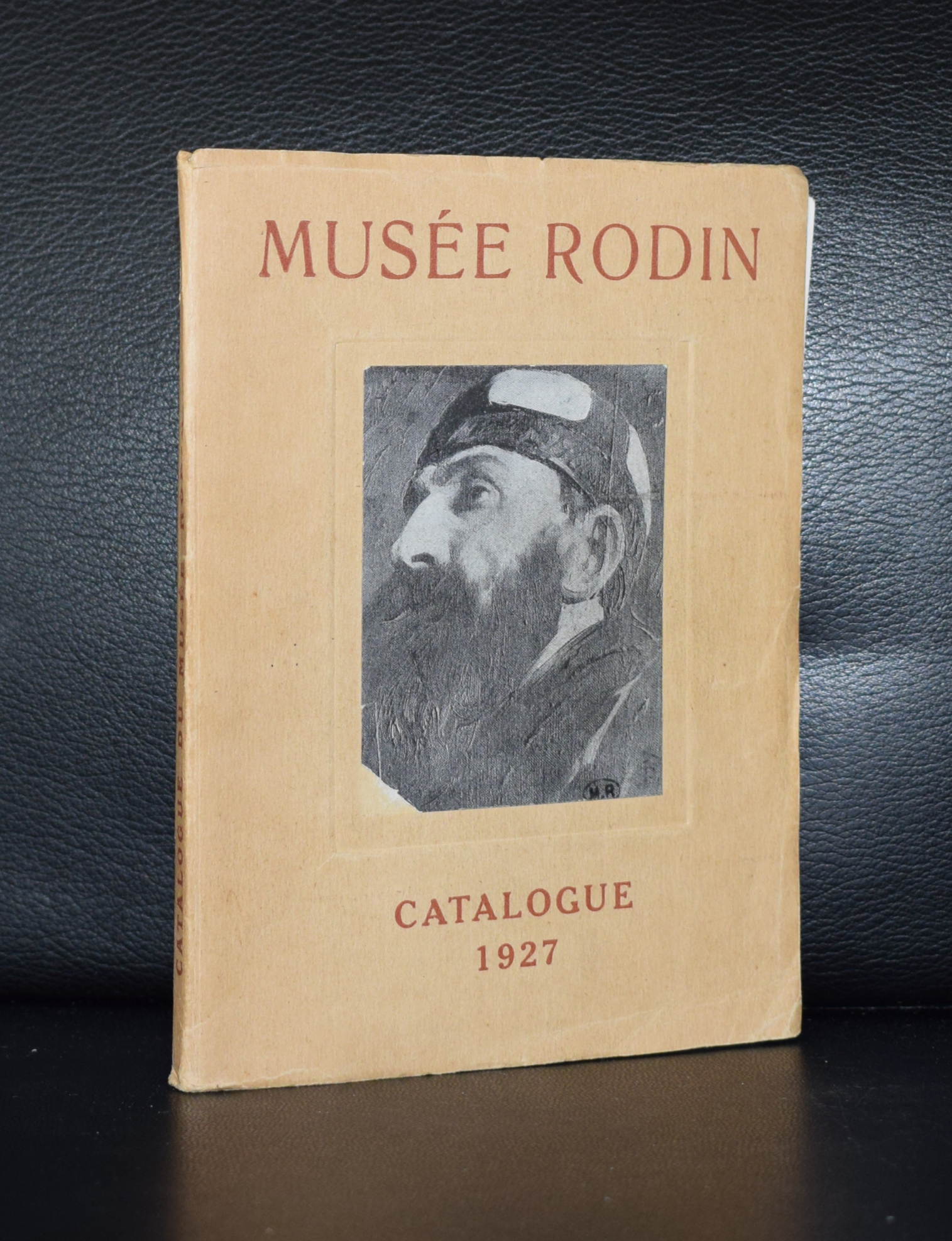
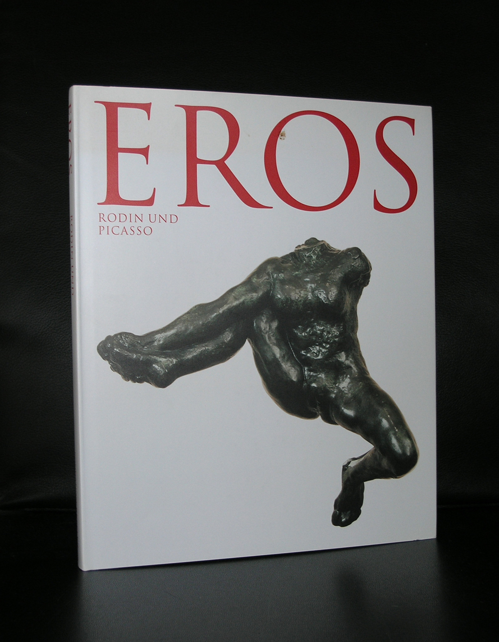
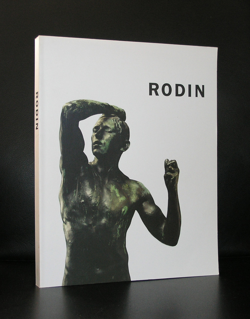
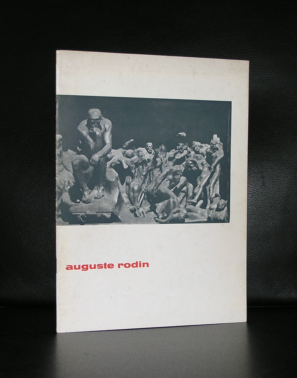
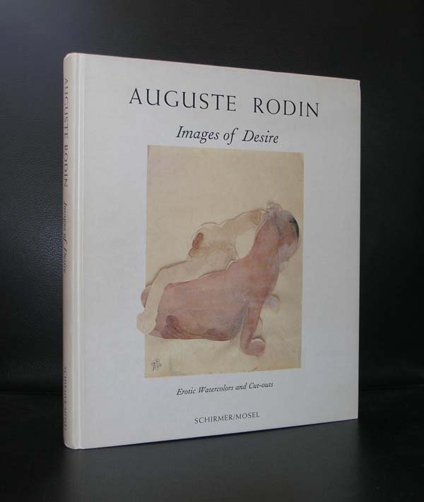
Here si a classic sculptor who paved the way for modern sculpture. You just have to visit the Rodin museum in Paris to find the most beautiful Rodin sculptures all assembled into one place and find the “studies” among them. Look at them closely …travel in time some 50 years ahead and find parts of Henri Moore and Brancusi in them. Rodin was a genius and the dutch are lucky to have some great Rodin sculptures in public collections. There are statues in the Gemeentemuseum Den Haag and the Stedelijk Museum and there are 7 sculptures by Rodin collected by Mr. and Mrs Singer which are frequently on show at the Singer Museum in Laren. The most important one is a smaller sized “THINKER” statue.
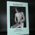
Beside the statues , Rodin made some very impressive (erotic) watercolors. Studies of bodies which also have an abstract quality.
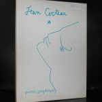
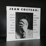
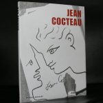
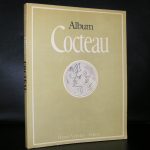
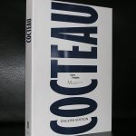
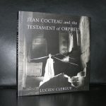
NO doubt in my mind. For me Jean Cocteau was a painter/photographer. Surely he was a multitalented artist, but in his drawings he shines. Personal, bold and typical Cocteau styled. These drawings are timeless and have at one time been published by Taschen in highly affordable, but beautiful executed publication.
But beside this great introduction to his ( erotic) drawings there are many other publications worth collecting on this artist. www.ftn-books.com has some of them available, but it is well worth to search for these small but excellent publications on book markets and at garage sales. Cocteau was a great and original artist.
Artist/ Author: Oliver Boberg
Title : Memorial
Publisher: Oliver Boberg
Measurements: Frame measures 51 x 42 cm. original C print is 35 x 25 cm.
Condition: mint
signed by Oliver Boberg in pen and numbered 14/20 from an edition of 20