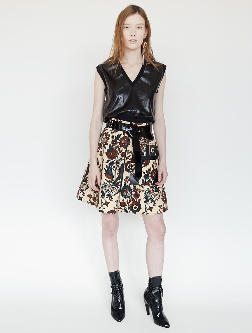
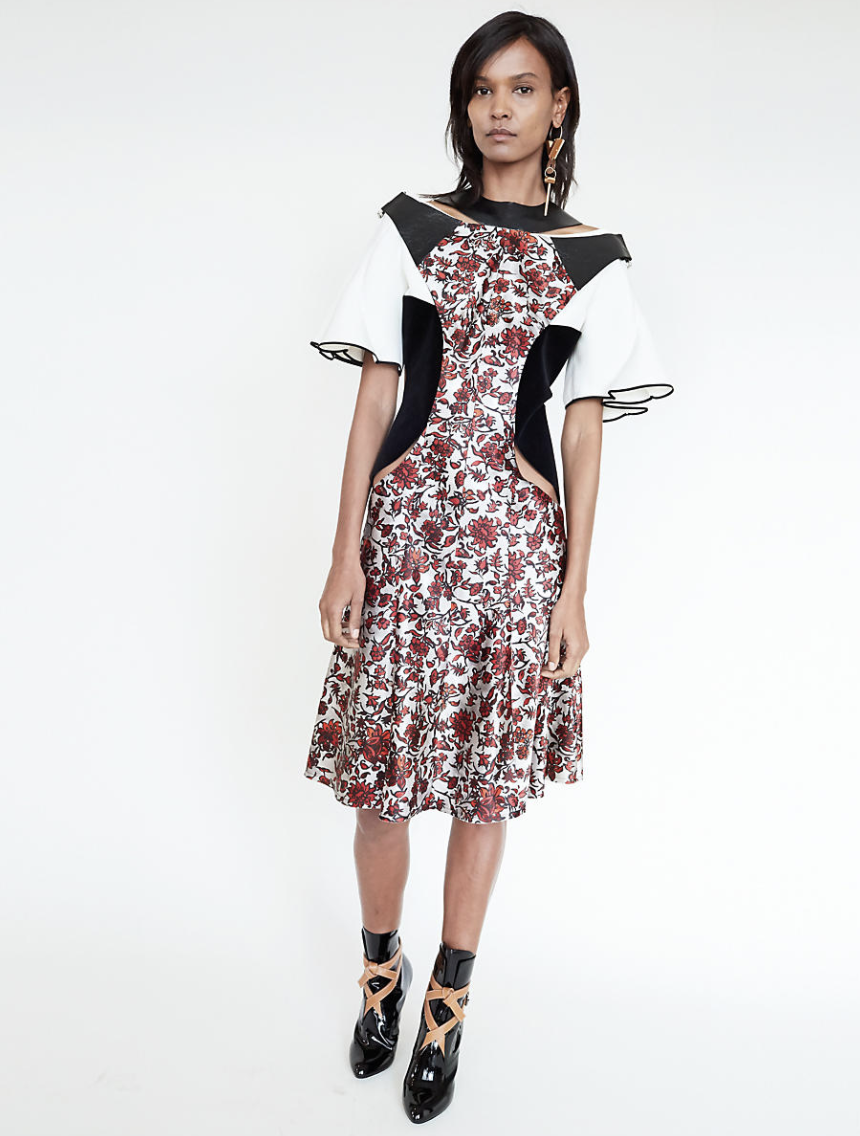
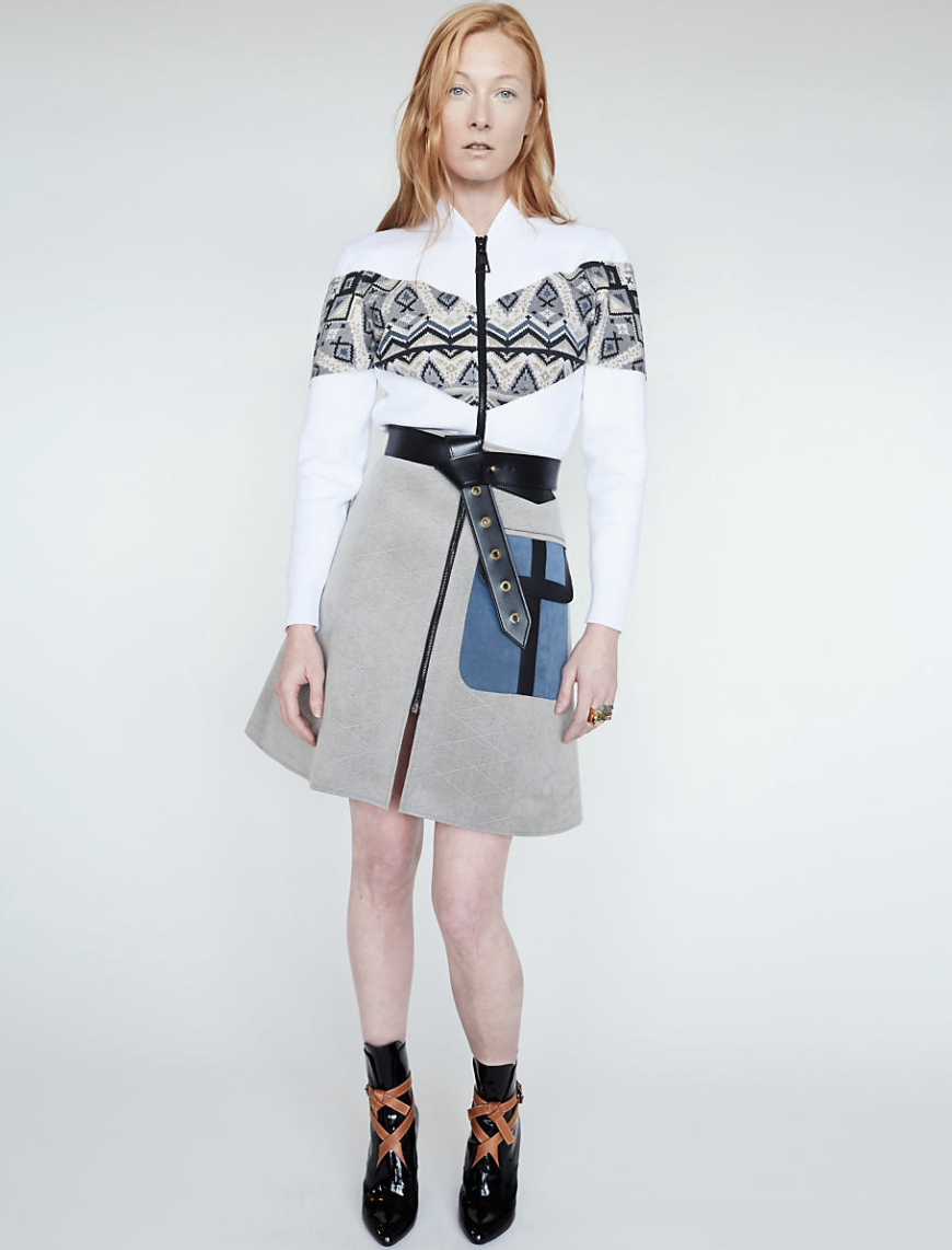
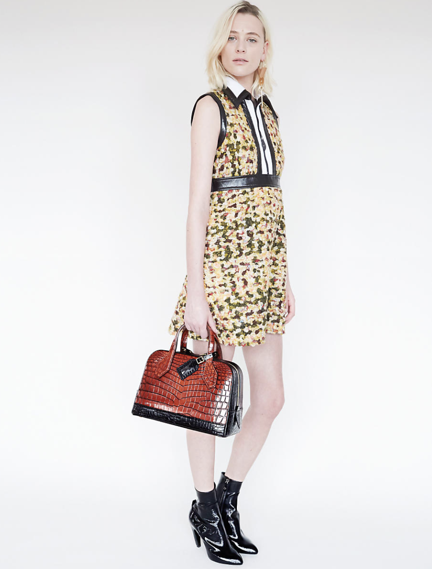
For Nicolas Ghesquiere first Fall 2014 womenswear collection, Louis Vuitton invited German photographer Juergen Teller for a distinctive interpretation of the collection.
Photographed from the House’s Parisian headquarters, with intimate views of the Seine and Eiffel tower, twelve models grace the Fall 2014 women’s collection in edgy attitude.
In this selection, glorious smooth, full-grain leather is contrasted with hybrid materials. Bold, bright colours are juxtaposed with muted halftones. Hand-crafted artisanal techniques are updated with high-tech twist. It was my luck to find a , in pristini/ still sealed condition special edition of this important Louis Vuitton Publication. I did not want to open it, because a collector should want it in this condition, but found some excellent photo’s by Teller on Google to support the quality of this special LOUIS VUITTON edition and perhaps this is the present you are looking for for Christmas.
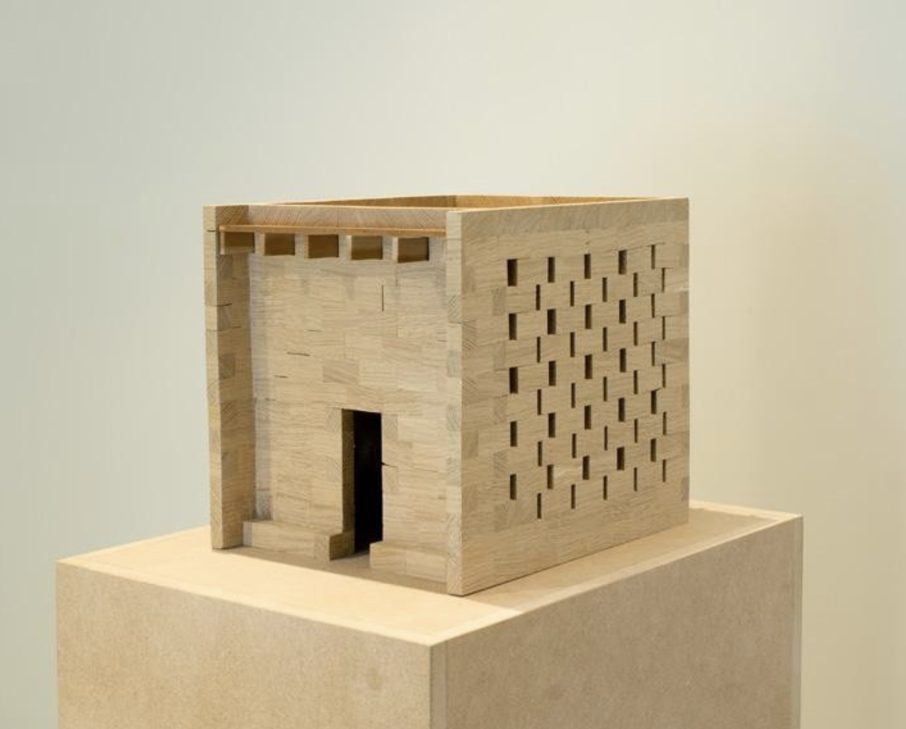
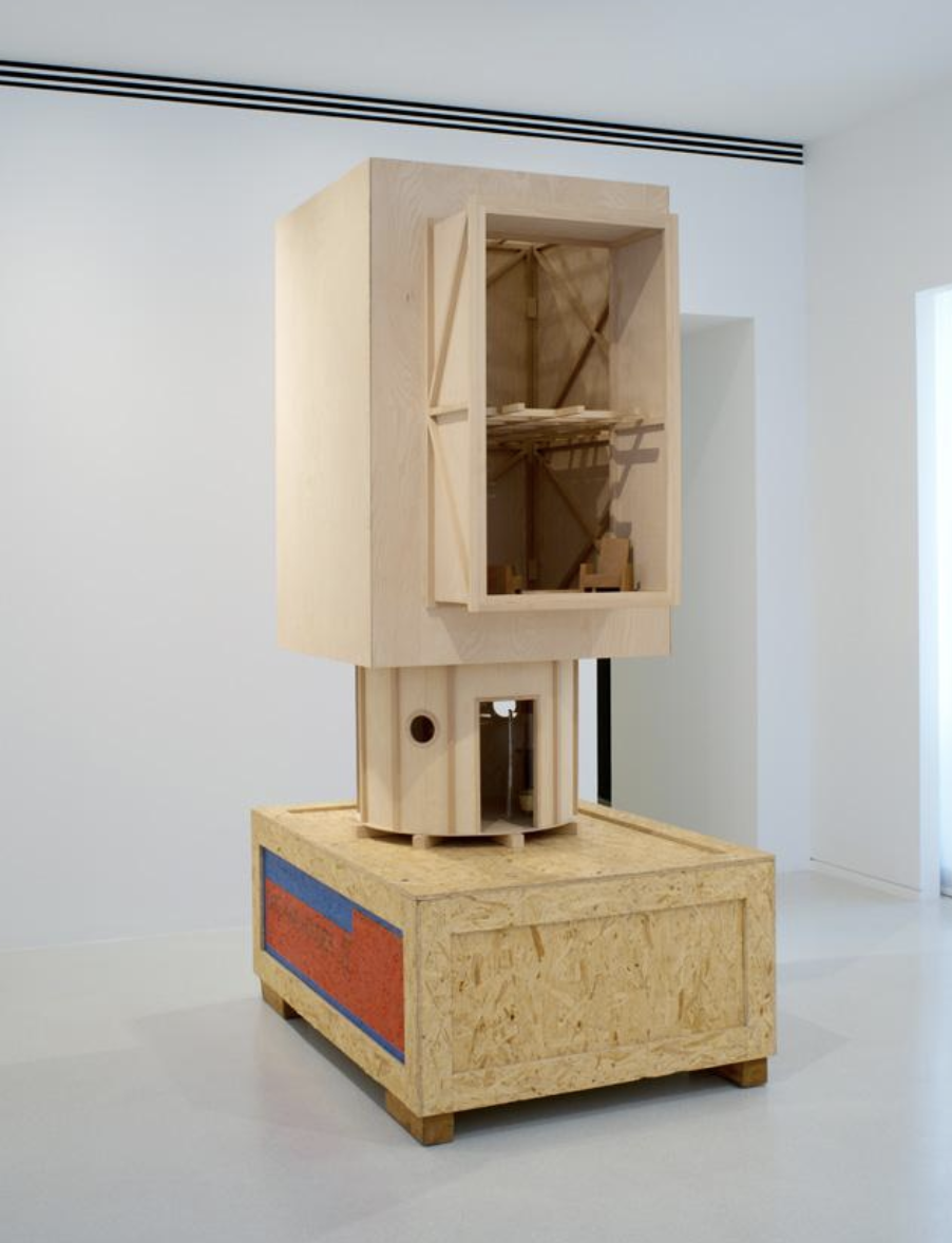
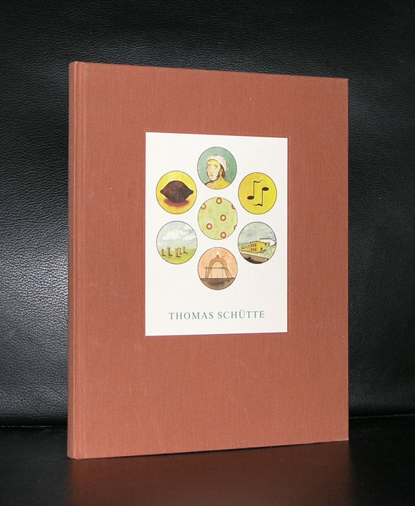
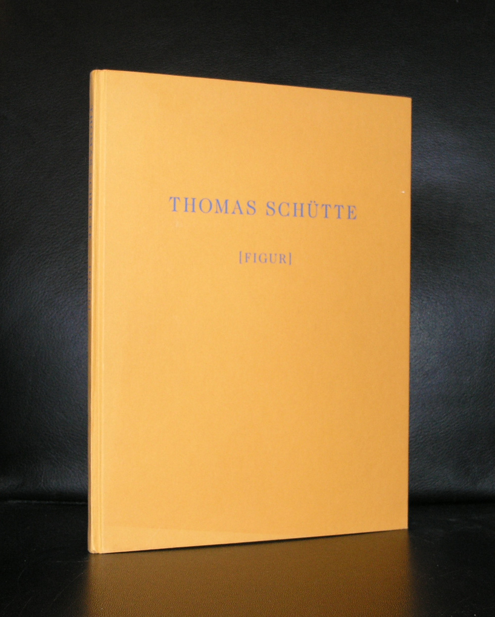
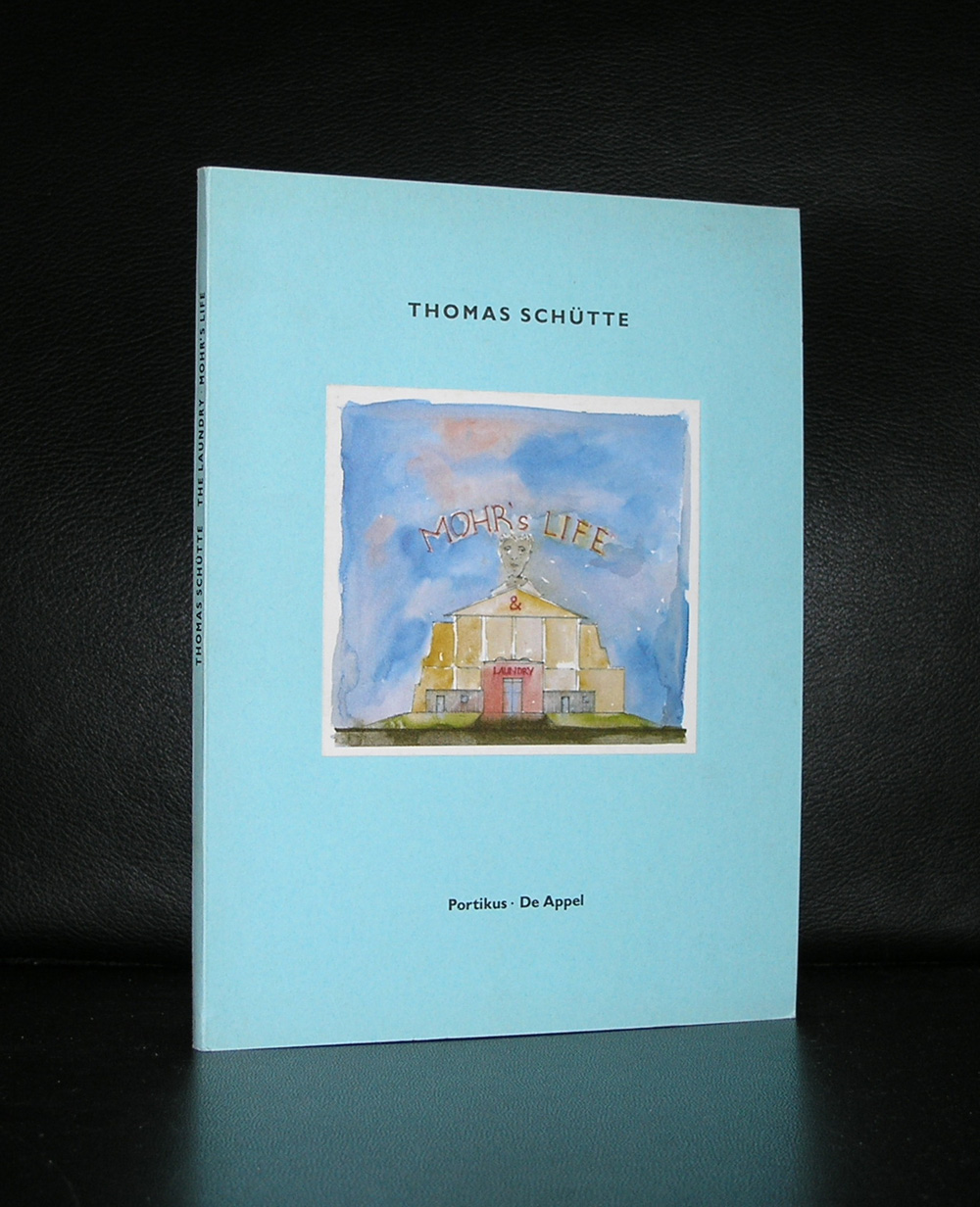
For me there are two personal reasons to love the works by Thomas Schütte. The first reason for me is his architectural art. Always trying to find a different approach to architecture makes his works interesting and in the same category as the architectural works by John Hejduk.
Secondly there is his publications. Meticulously designed books. Published by the best publishers, printed by the best printers and from start to finish typical Thomas Schütte productions. These books are among the best art books published in the last 50 years and i am proud to have some of them in my inventory of www.ftn-books.com
A Stedelijk Museum publication from 1938. Publishing date well before WWII and extremely rare. One of the first publications containing an article by Piet Mondriaan ( Mondrian) and it is more than likely the only one on the market at this moment. What makes this publication valuable is not only its rarity , but also the art historical value of the articles by Mondriaan, Kandinsky and Gorin. You can find this publication at www.ftn-books.com.
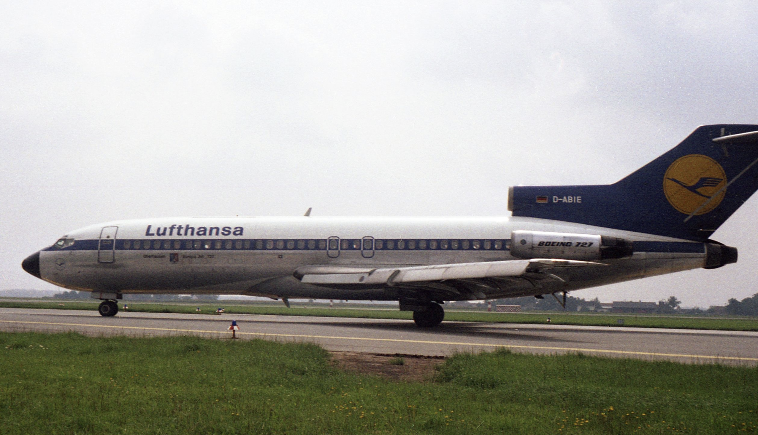
Only 15 years the Hochschule für Gestaltung Ulm was active and it was one of the first institutions in the world where you could fhave an education and follow lectures in design. After the Bauhaus it was the leading centre in the world on design and responsible for many great “timeless” designs of which the Lufthansa corporate design is probably the most best known.
The importance of this educational centre which was co founded by Max Bill and had ao. Johannes Itten ( see blog from a few days ago) as a teacher was recognized by Willem Sandberg who organized an exhibition in 1965 on the “Hochschule für Gestaltung Ulm” and the catalogue which appeared together with this exhibition has become one of the rarest and most collectable Stedelijk Museum catalogues ever. Wim Crouwel designed this catalogue. Oblong format, grey cover, very nice typography ….the catalogue has become a statement for good and simple design, readability and beauty. The designs within the catalogues are beautiful, but the catalogue itself is arguably even better.
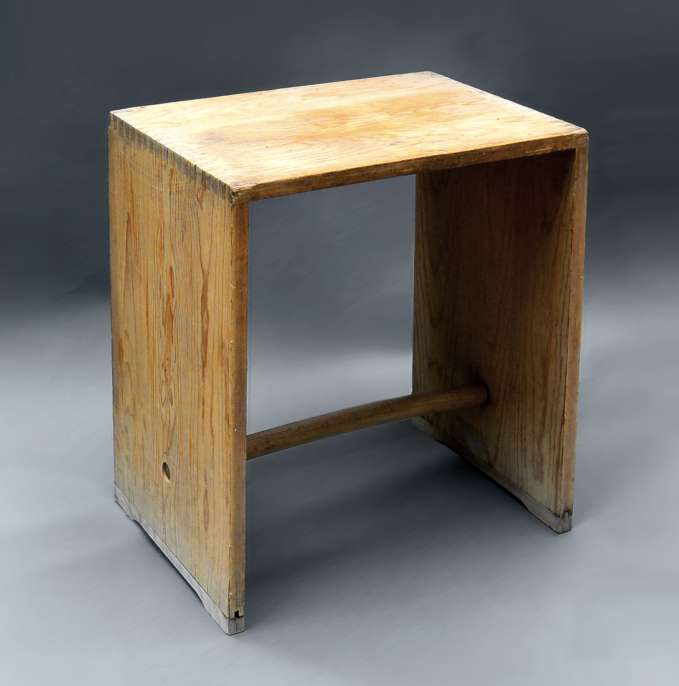
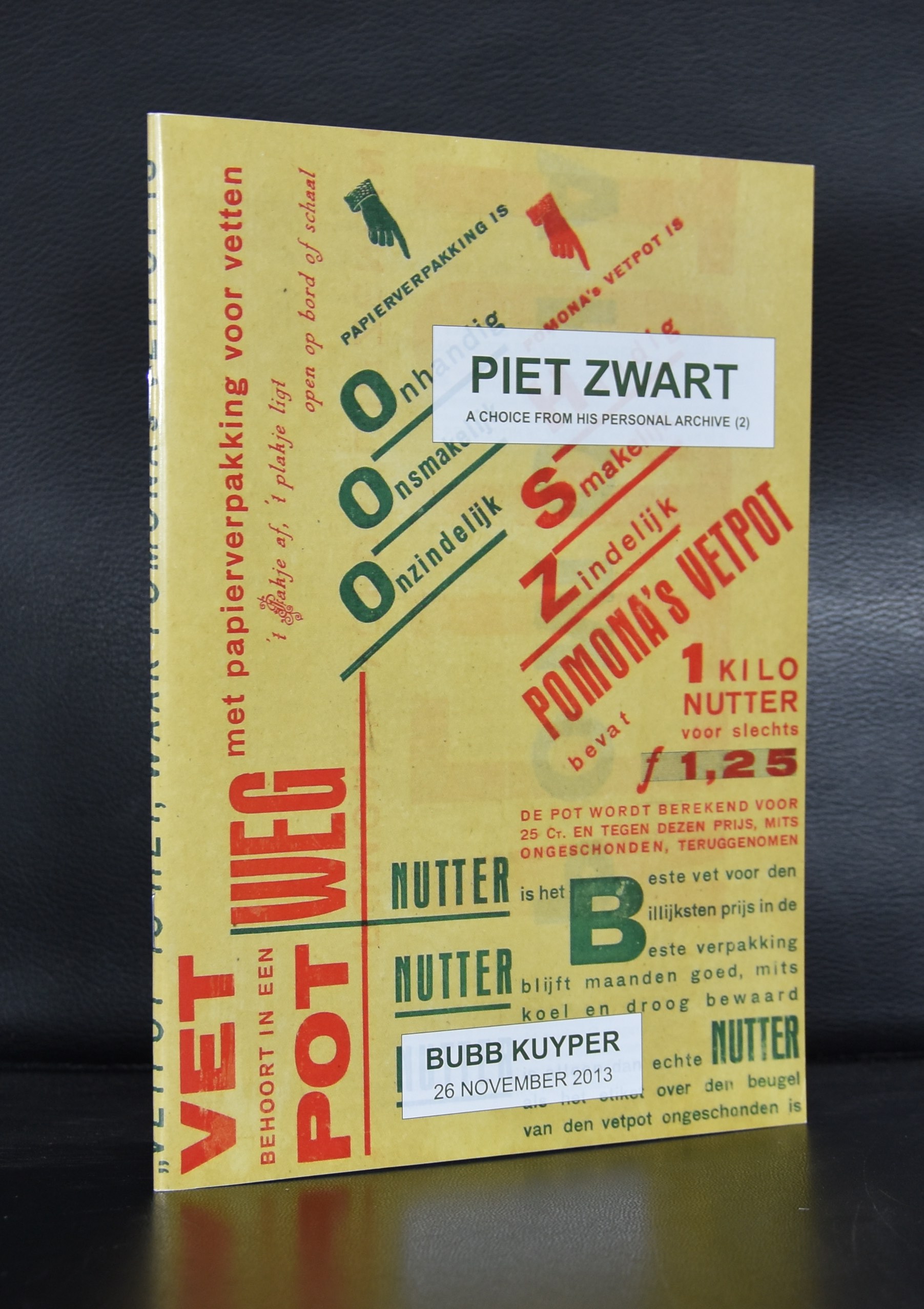
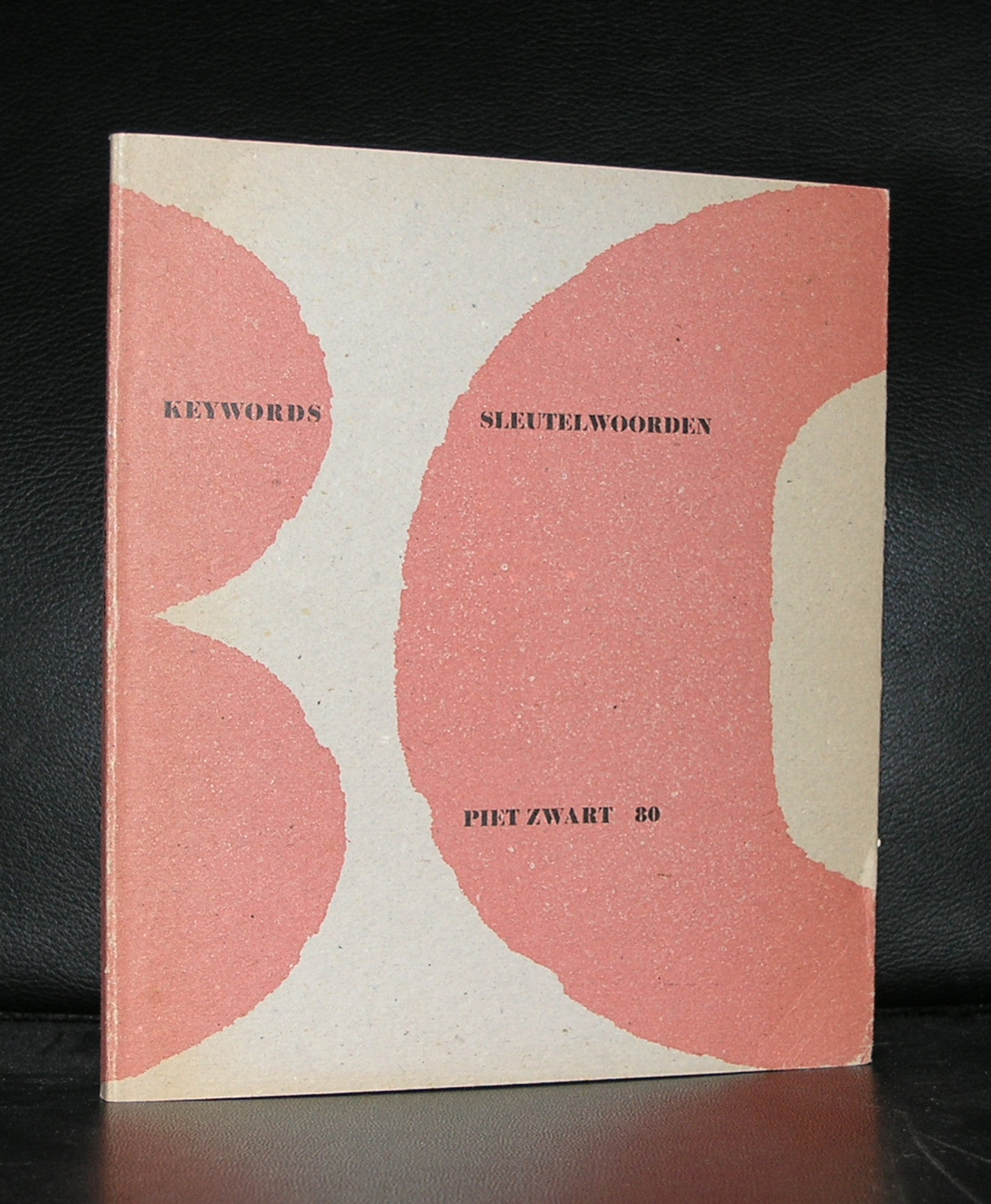
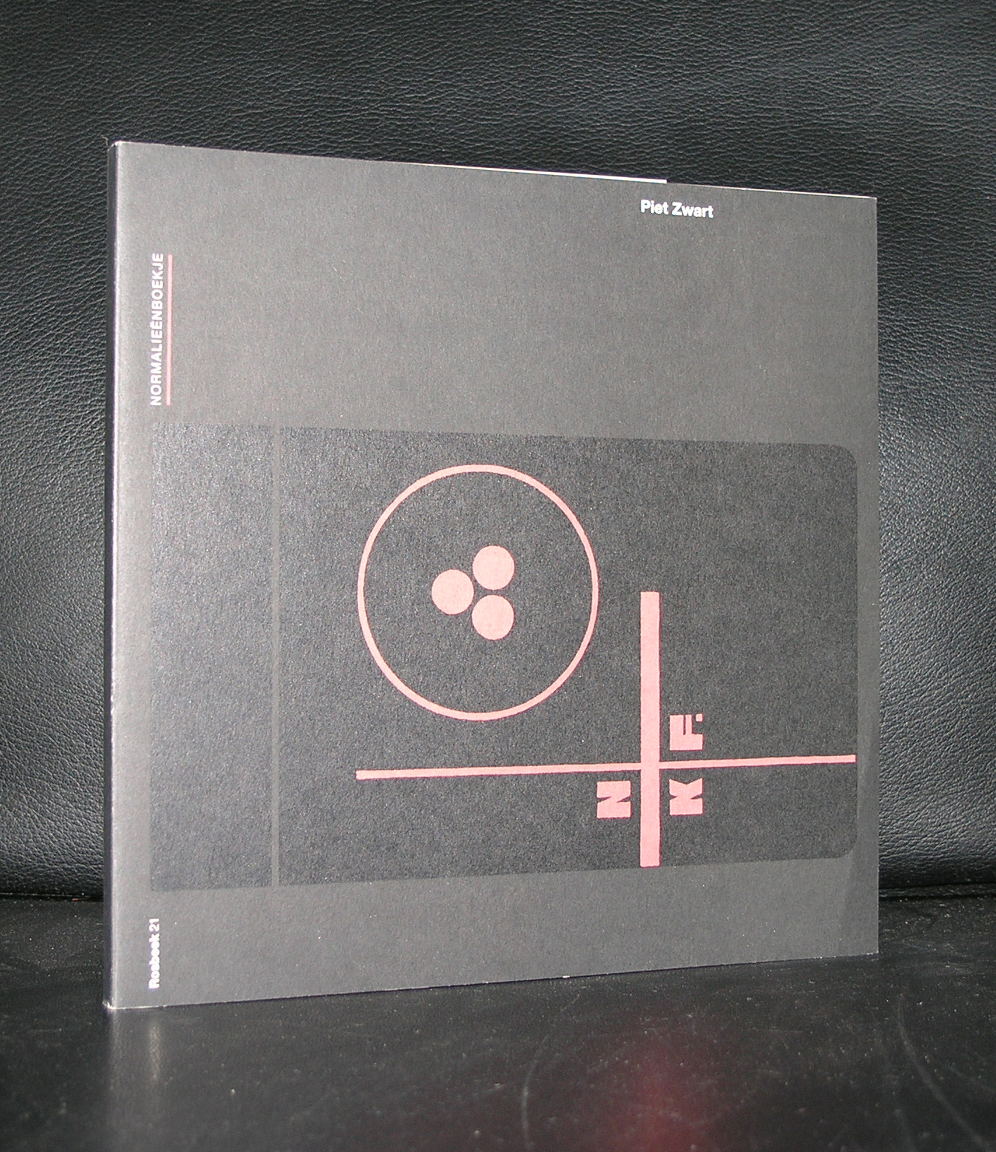
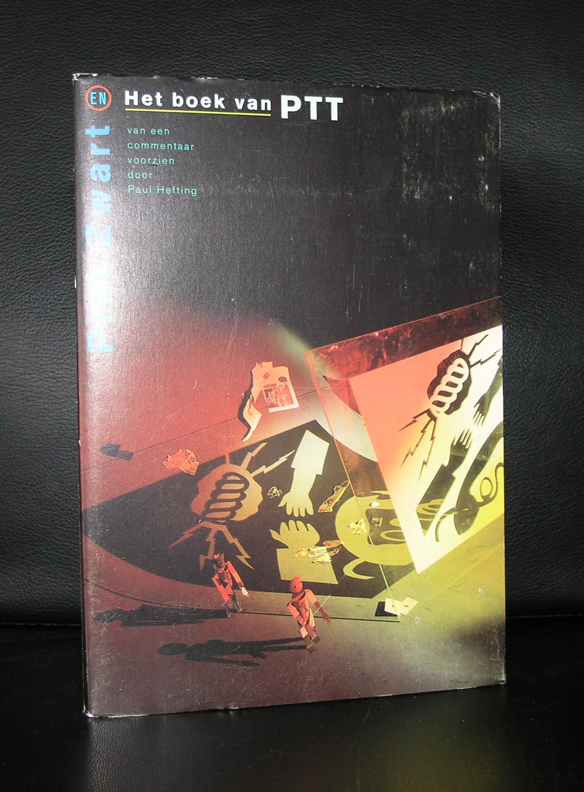
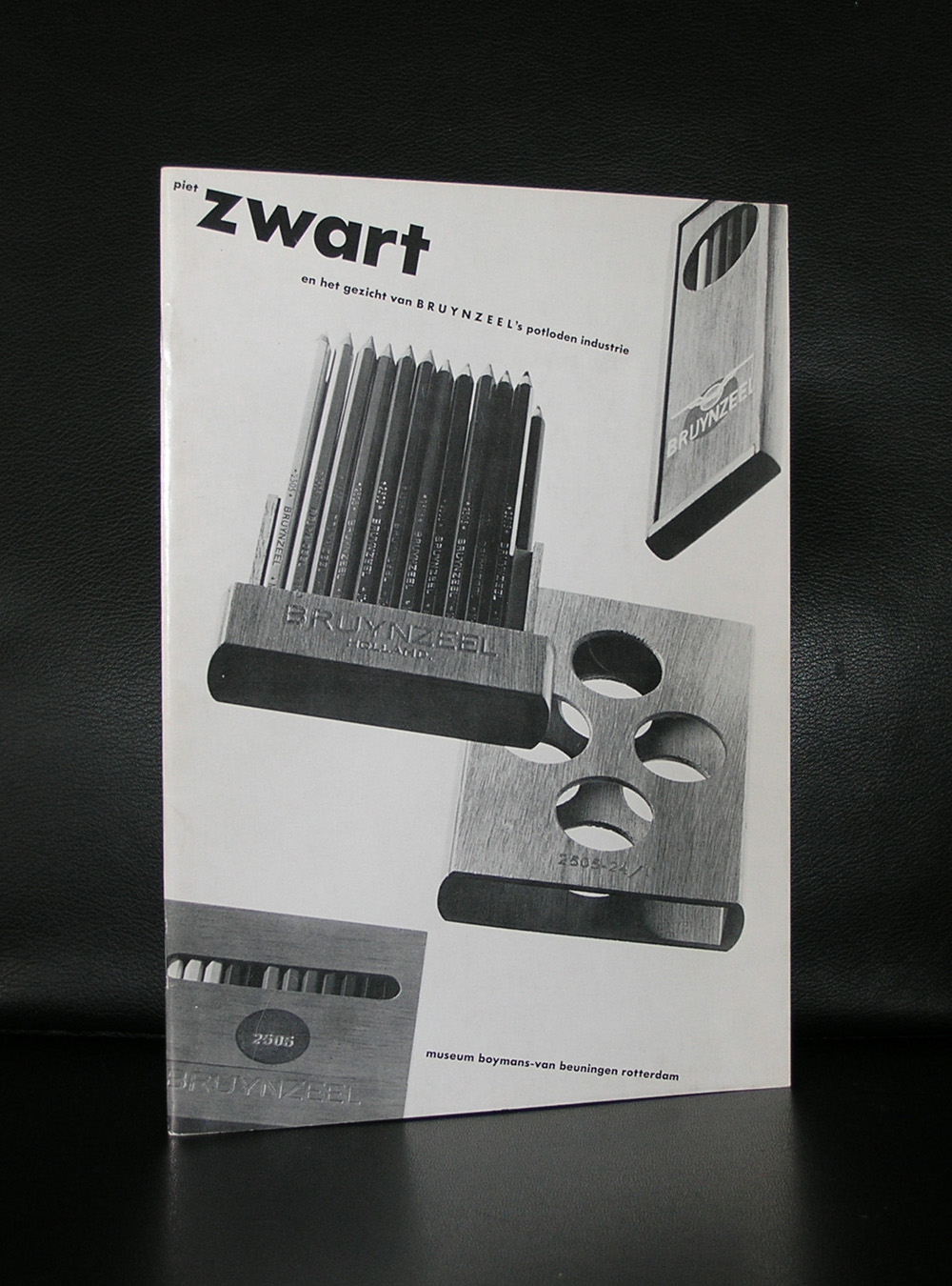
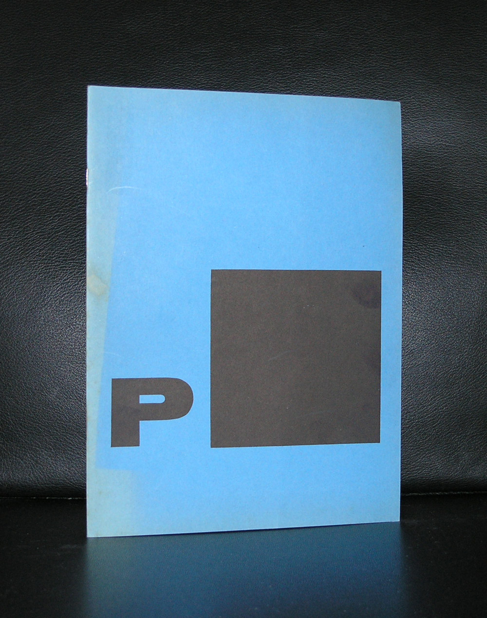
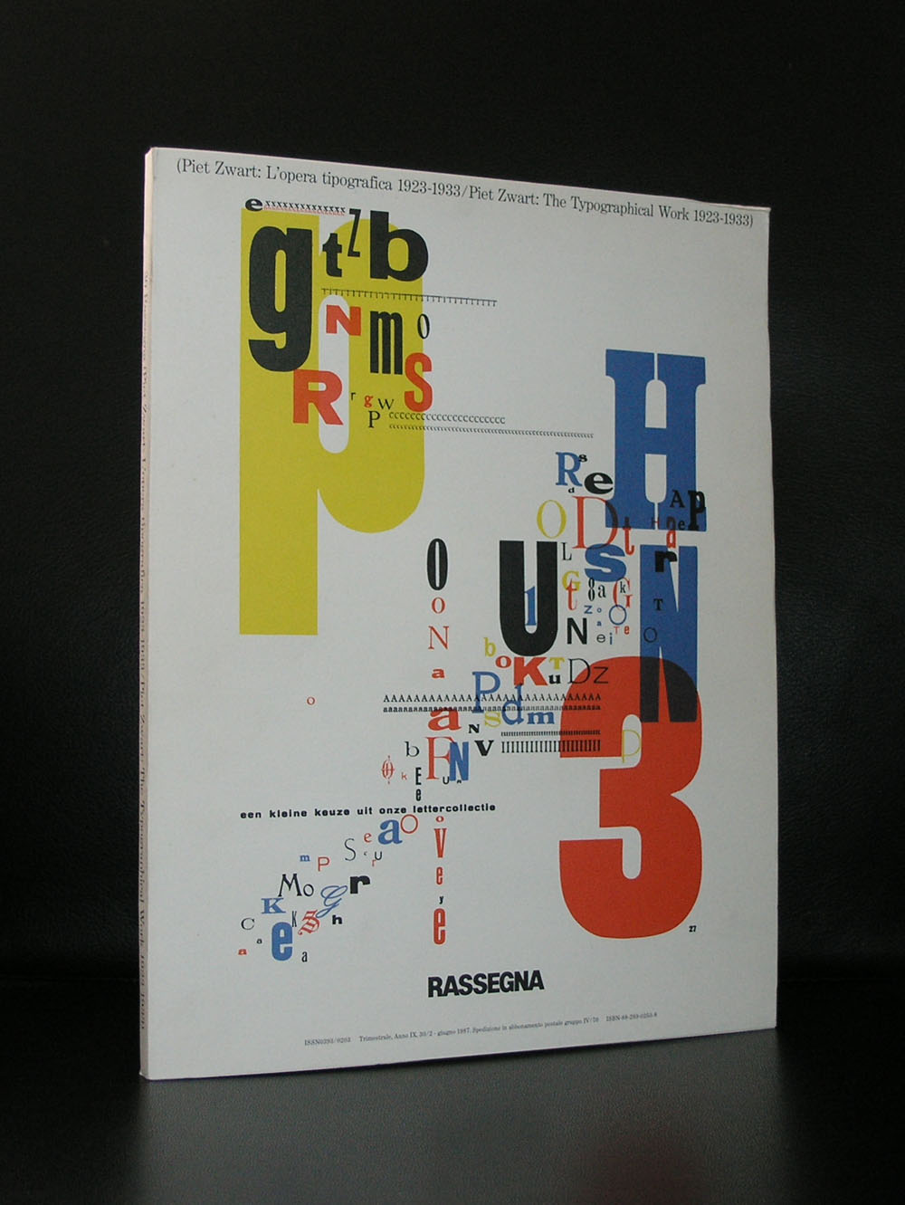
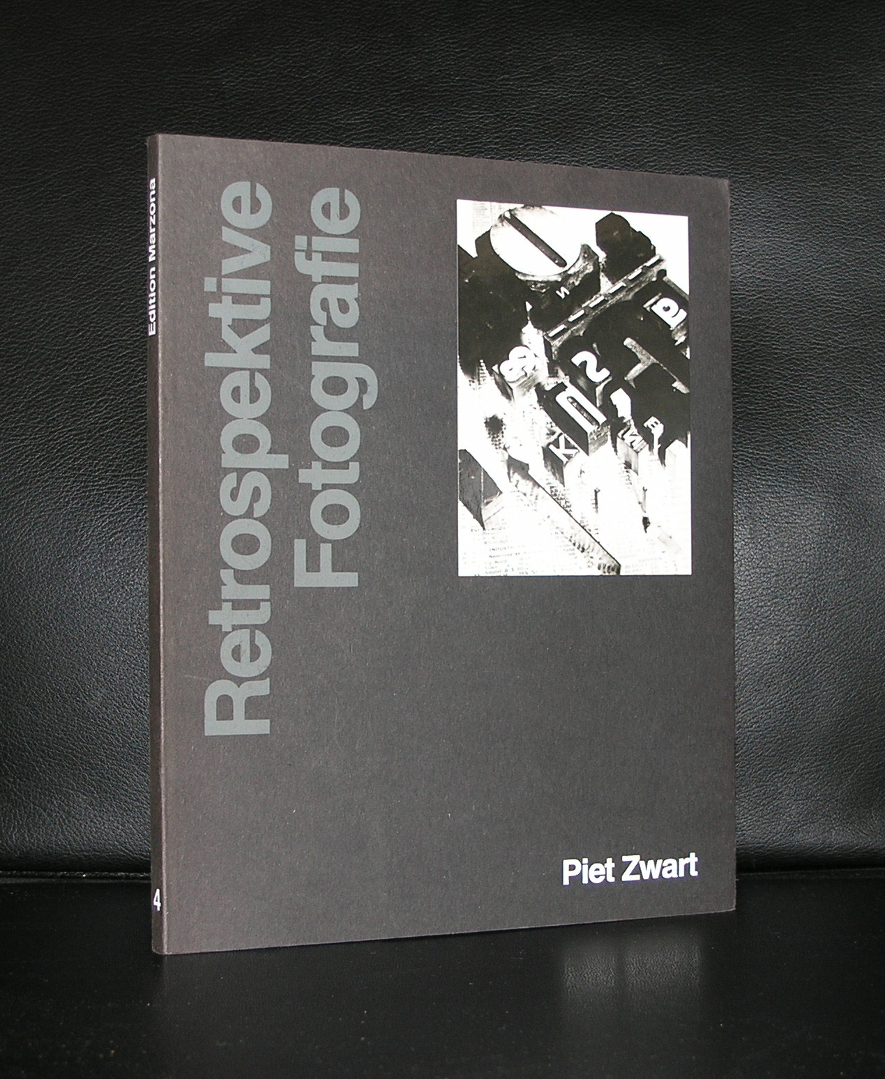
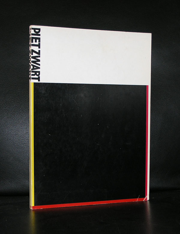
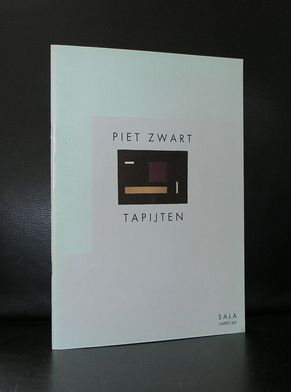
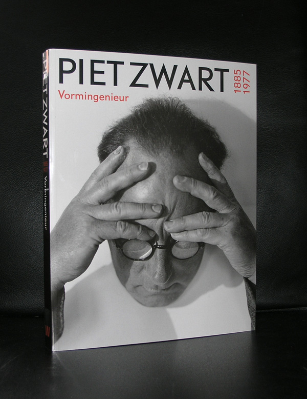
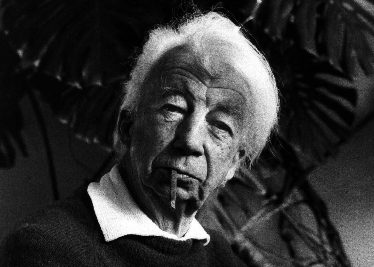
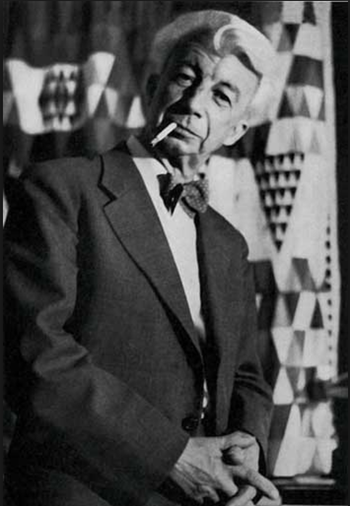
There is so much to be told about Piet Zwart, but a short blog on him can only indicate his importance to the world of design and typography. If ever there was a designer who’s influence is of worldwide importance, it is Piet Zwart. I wish my friend David took care of this blog, because he is far more knowledgable on Zwart than any other person i know of. About 40 years ago, shortly after Piet Zwart died, he received some major exhibitions in the Netherlands. Gemeentemuseum Den Haag, Stedelijk Museum Amsterdam and the Boijmans van Beuningen museum all had their Piet Zwart retrospectives of which the one curated by Flip Bool for the Gemeentemuseum was probably the most important one. There was a long relationship between the Gemeentemuseum and Piet Zwart, which resulted in an extensive gift from the Zwart family and several exhibitions on Piet Zwart and his designs in the Gemeentemuseum of which some publications are still available at www.ftn-books.com. For all collectors of Zwart… i want to inform you that there are some very nice catalogues of Piet Zwart items still available at Bubb Kuyper in Haarlem. Bubb Kuyper held special Piet Zwart auctions during the last 3 years in which they auctioned many rare Piet Zwart items.
One more things on Piet Zwart that you possibly did not know of. Because of the relationship with Piet Zwart , the Gemeentemuseum Den Haag placed a bench in its garden. design?….yes, Piet Zwart and to memorate his 80th Birthday , Willem Sandberg designed a special publication which is also available at ftn-books.
OLYMPUS DIGITAL CAMERA
OLYMPUS DIGITAL CAMERA
OLYMPUS DIGITAL CAMERA
OLYMPUS DIGITAL CAMERA
OLYMPUS DIGITAL CAMERA
OLYMPUS DIGITAL CAMERA
OLYMPUS DIGITAL CAMERA
OLYMPUS DIGITAL CAMERA
OLYMPUS DIGITAL CAMERA
OLYMPUS DIGITAL CAMERA
PS.
I almost forgot. The street lightning in some of the older parts of Den Haag…yes , also Piet Zwart’s design.
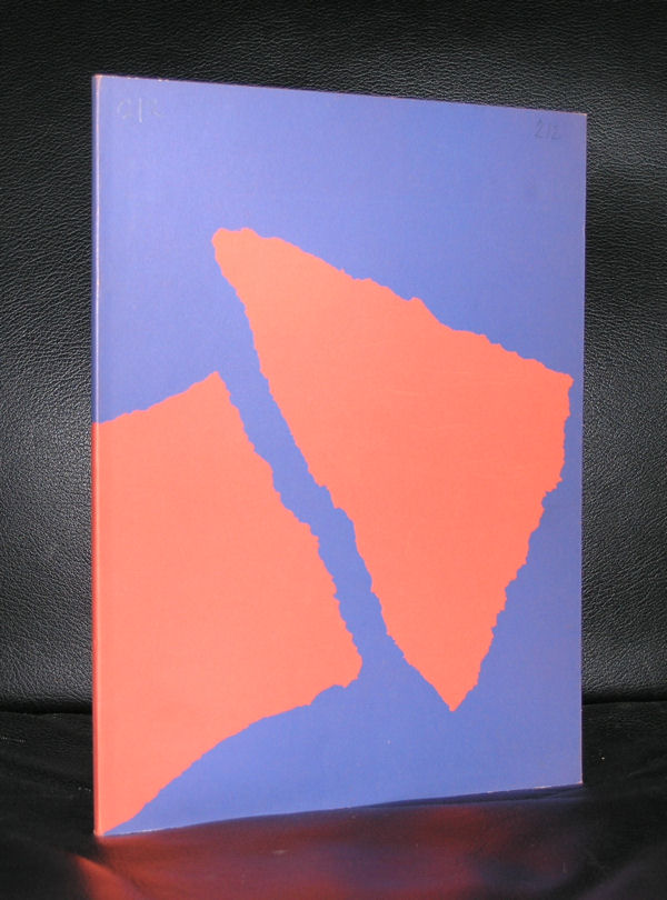
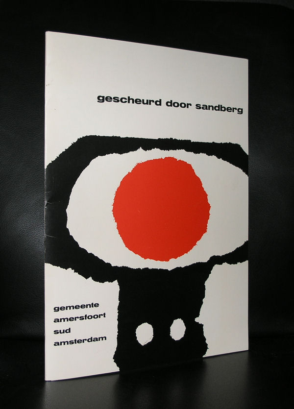
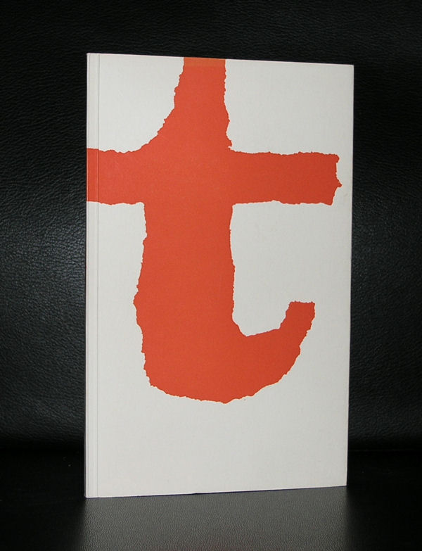
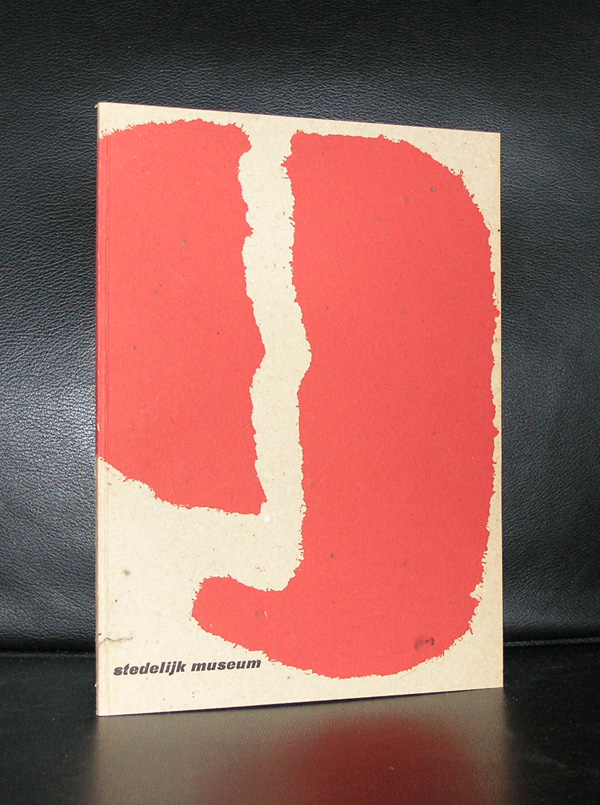
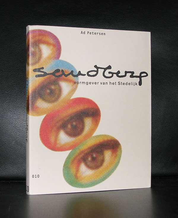
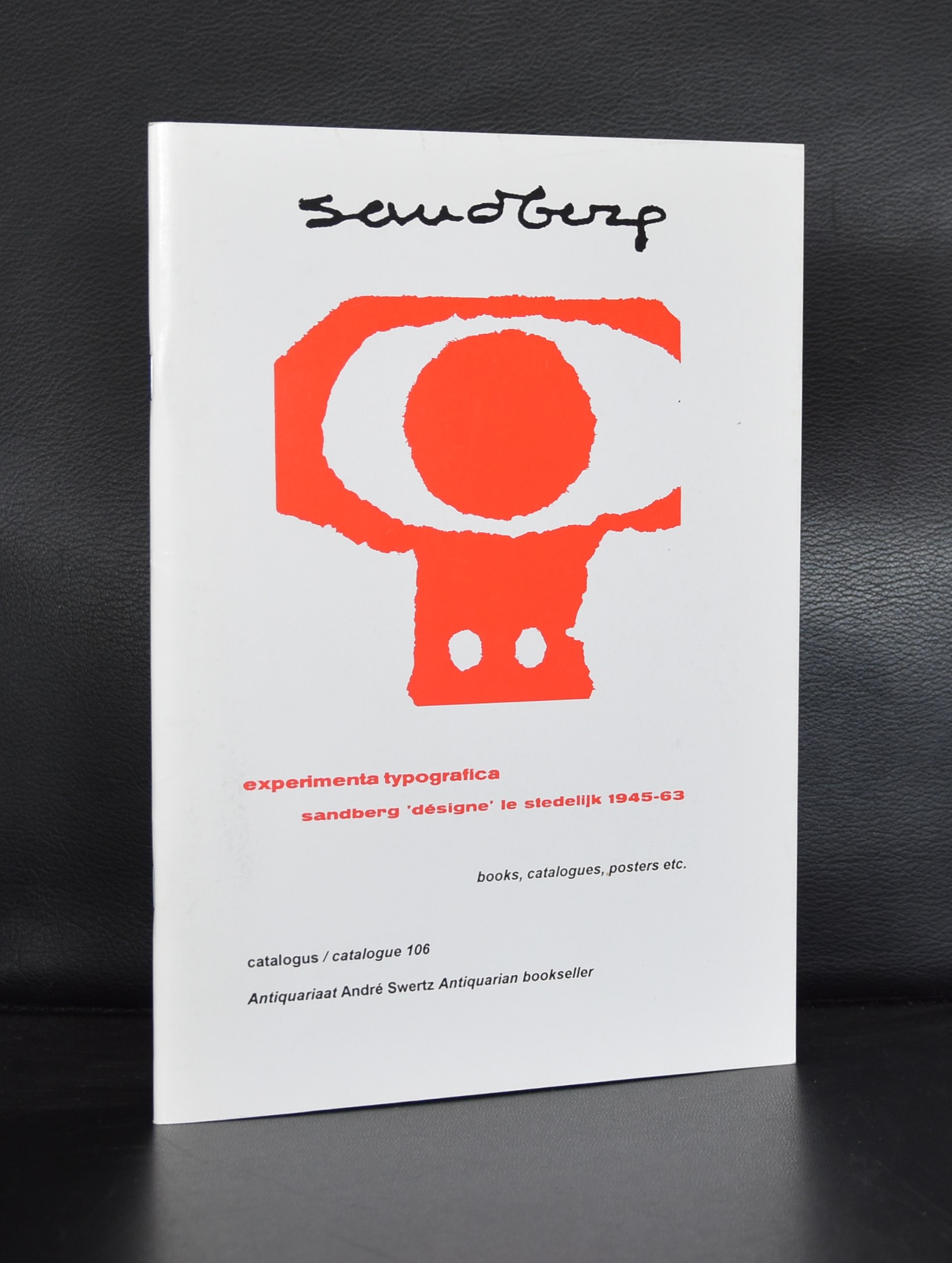
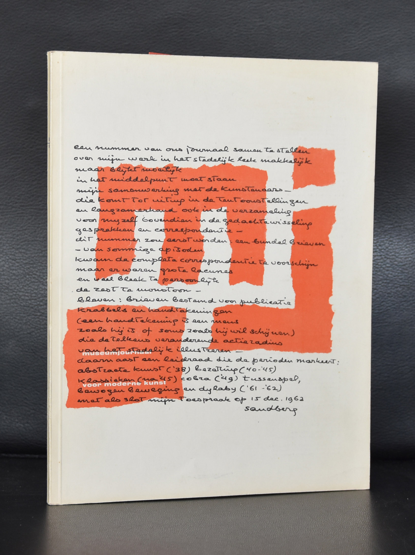
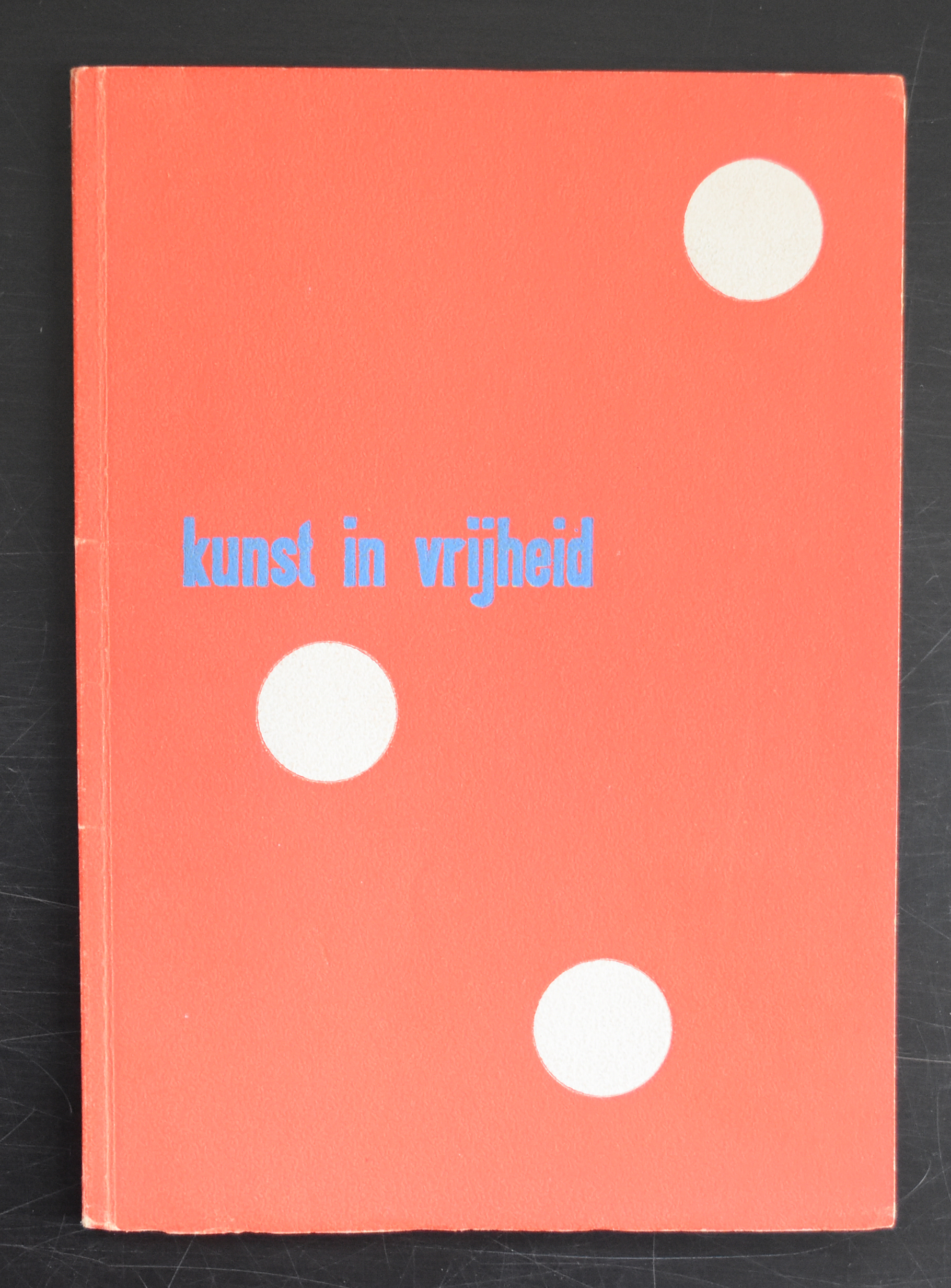
It is almost a year since I tipped the readers of my blog to start to collect Willem Sandberg typography. Since, i have found some interesting examples of his excellent typography which i want to present to you. For those of you who are new in reading this blog. Willem Sandberg was a designer /typographer who became director of the Stedelijk Museum Amsterdam for a very long period ( 1945-1963) who designed many of the publications during this period of time and who contacted and presented many of the most famous 20th century artists in the Stedelijk Museum. His publications are characterized by the use of plain ( carton like papers) and the lettering looks random, made out of torn papers. But these are very accurate designs. You can find many sources of information on Sandberg on the internet, but one of the best is still the site of the Stedelijk Museum Amsterdam. ( www.stedelijk.nl ). Now here are some new and old additions to the inventory of www.ftn-books.com
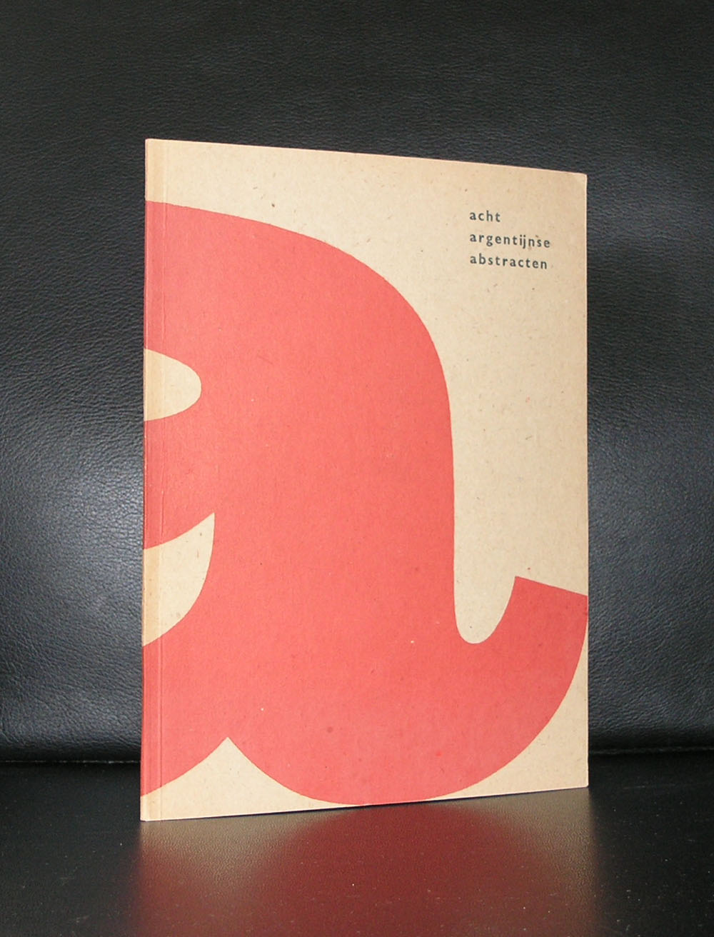
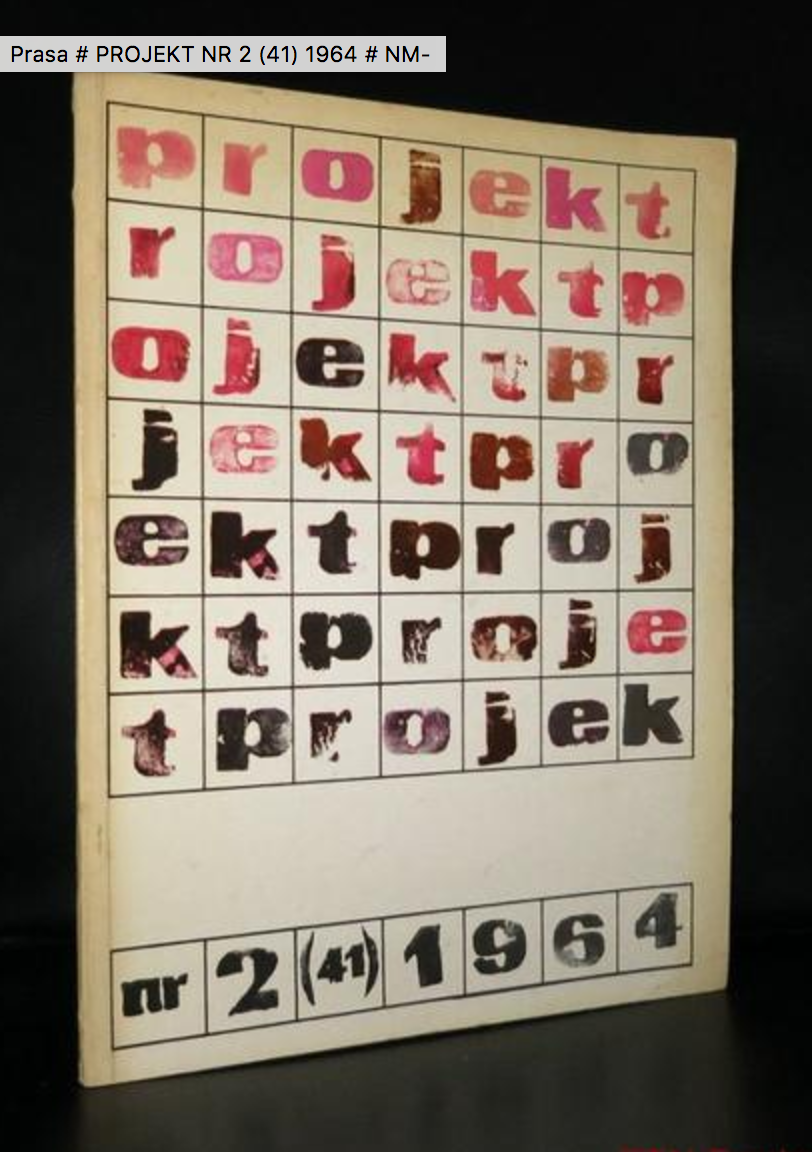
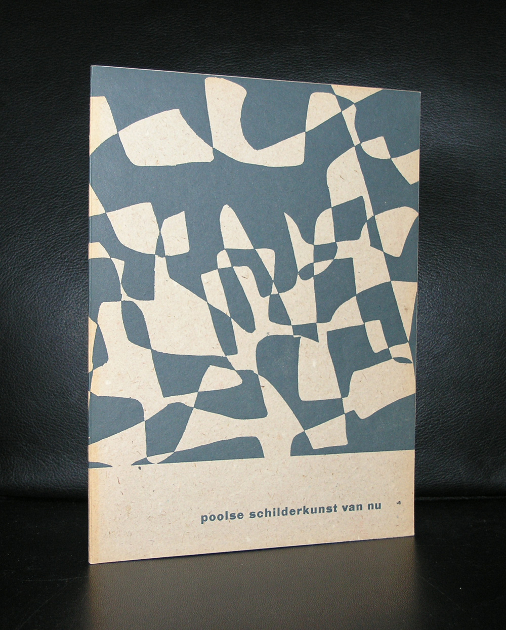
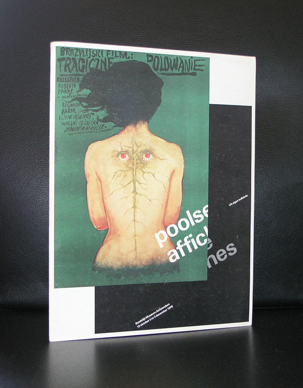
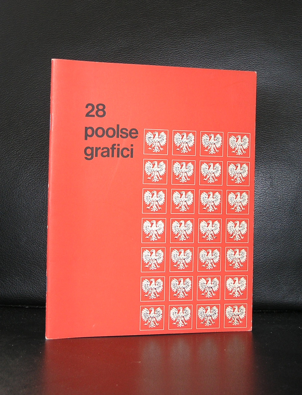
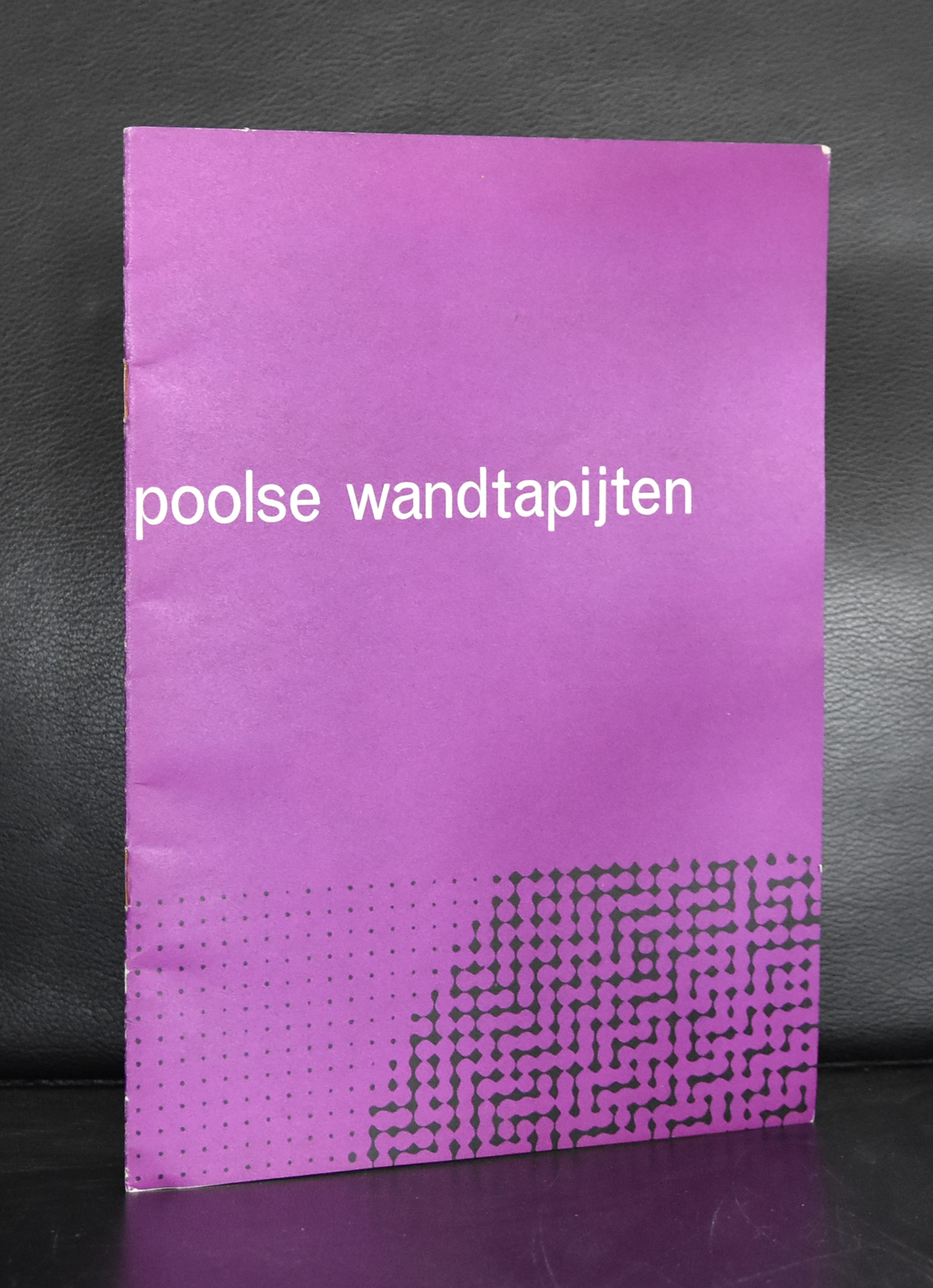
While leafing through my documents, I noticed some very nice and interesting publications from and on Polish art and typography. These are a combination of Russian and western art and typography, making them stand out and being typical for Poland. It is the same with Japanese typography.
A style of typography of its own , but with influences from western typography and design. But back to Poland. This very unique way of design was recognized by Willem Sandberg, who organized an exhibition on Polish posters. Whenever i visit a book) market i always pick them up , because of their appearance and some are worth collecting and selling. Take a look at www.ftn-books.com
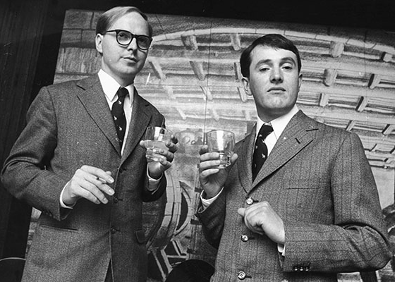
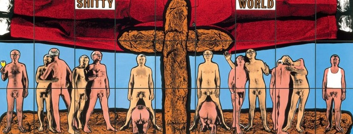
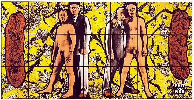
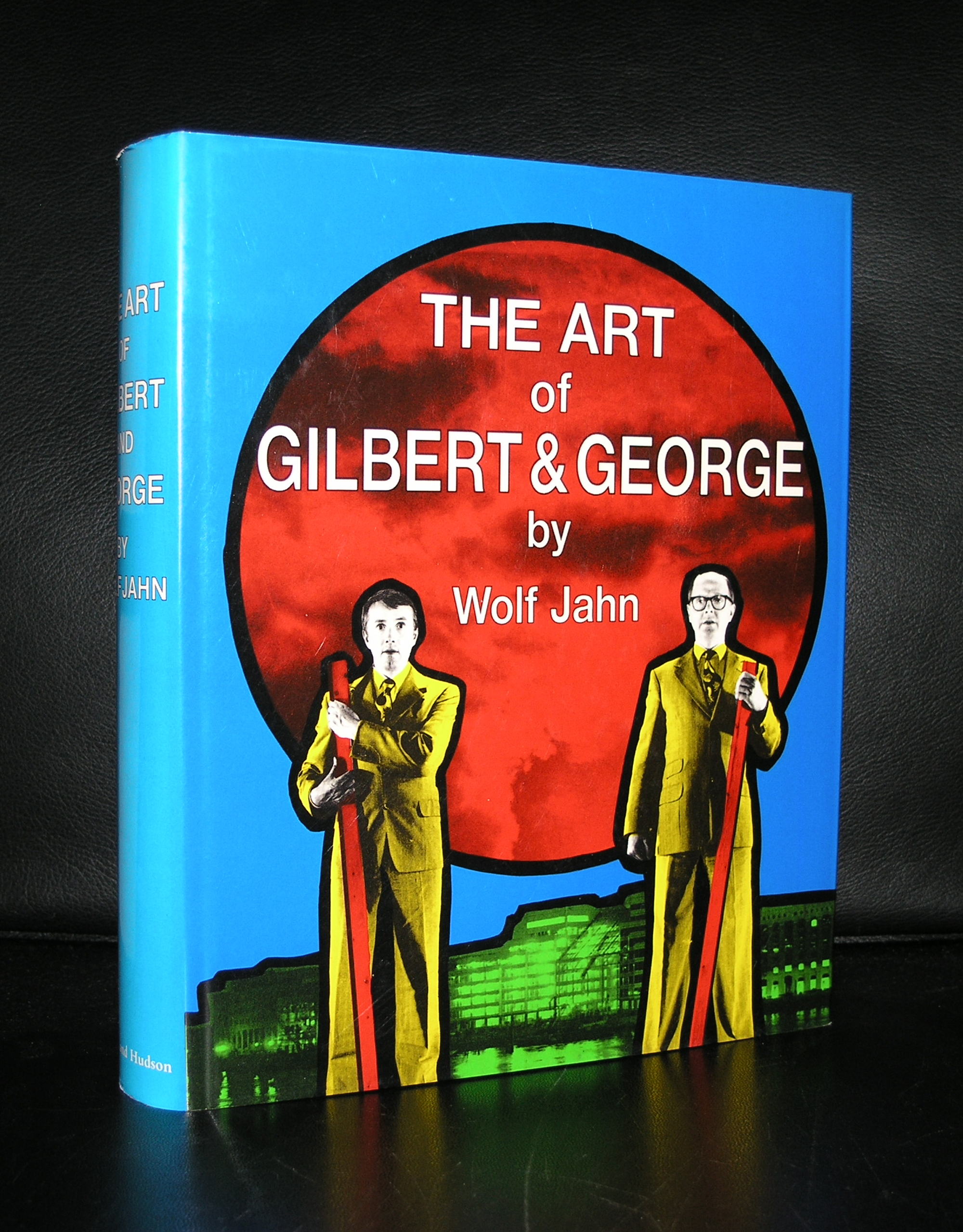
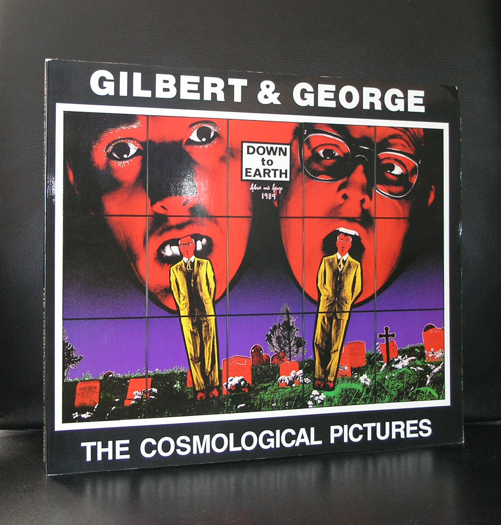
The blog of yesterday reminded me that Piero Manzoni was not the only artist who used faeces as a subject in their art. Gilbert & George is another example who used the subject in a far more explicit way than Manzoni did. With the canned Manzoni multiple it is still uncertain if the contents is the same as the label indicates , however with Gilbert & George it is no question at all, because the pictures show the subjects as they are.
Still the composition and execution are 100% recognizable Gilbert & George, but personally i like the more society and critical related subjects better and far more pleasing to look at, but just to show that many more artists used the subject it is nice to devote a blog on these 2 great artists.
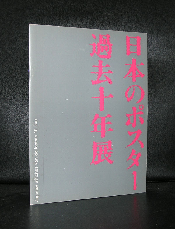
The Stedelijk Museum Amsterdam has a history with posters and specially the posters from Japan were presented on multiple occasions within exhibitions on the subject. In 1977 , the “Japanse Poster” exhibition catalogue was designed by Wim Crouwel, who designed a very special catalogue for the exhibition . The catalogue is one of the best from the seventies and instead of the typical Crouwel typography
OLYMPUS DIGITAL CAMERA
OLYMPUS DIGITAL CAMERA
OLYMPUS DIGITAL CAMERA
on the cover there are Japanese letters drawing your attention. Red lettering on a silver background let this one stand out from the rest.
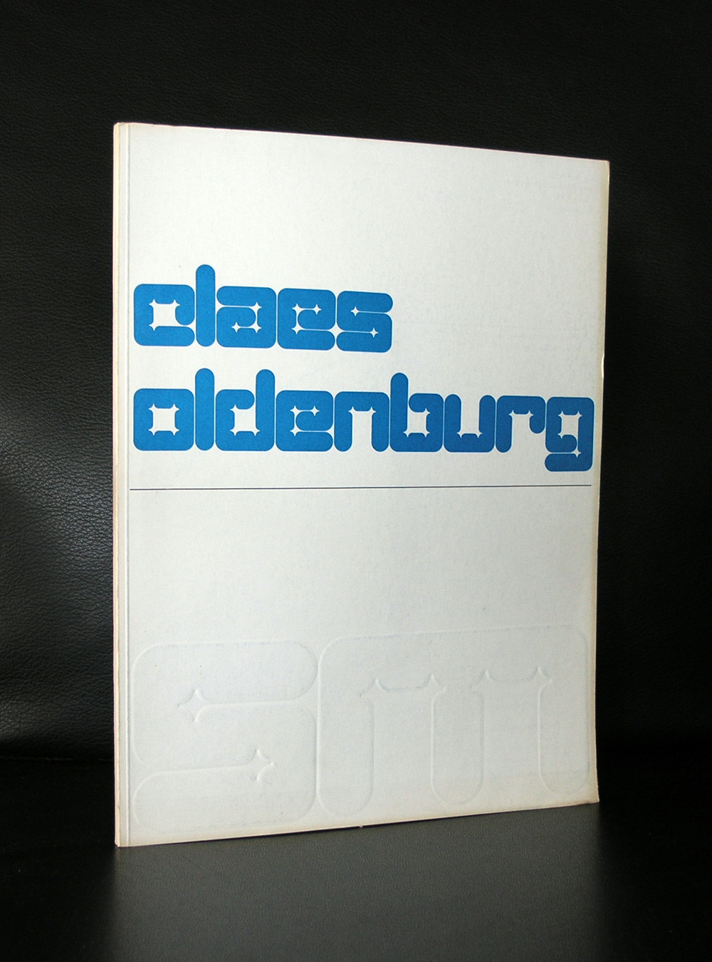
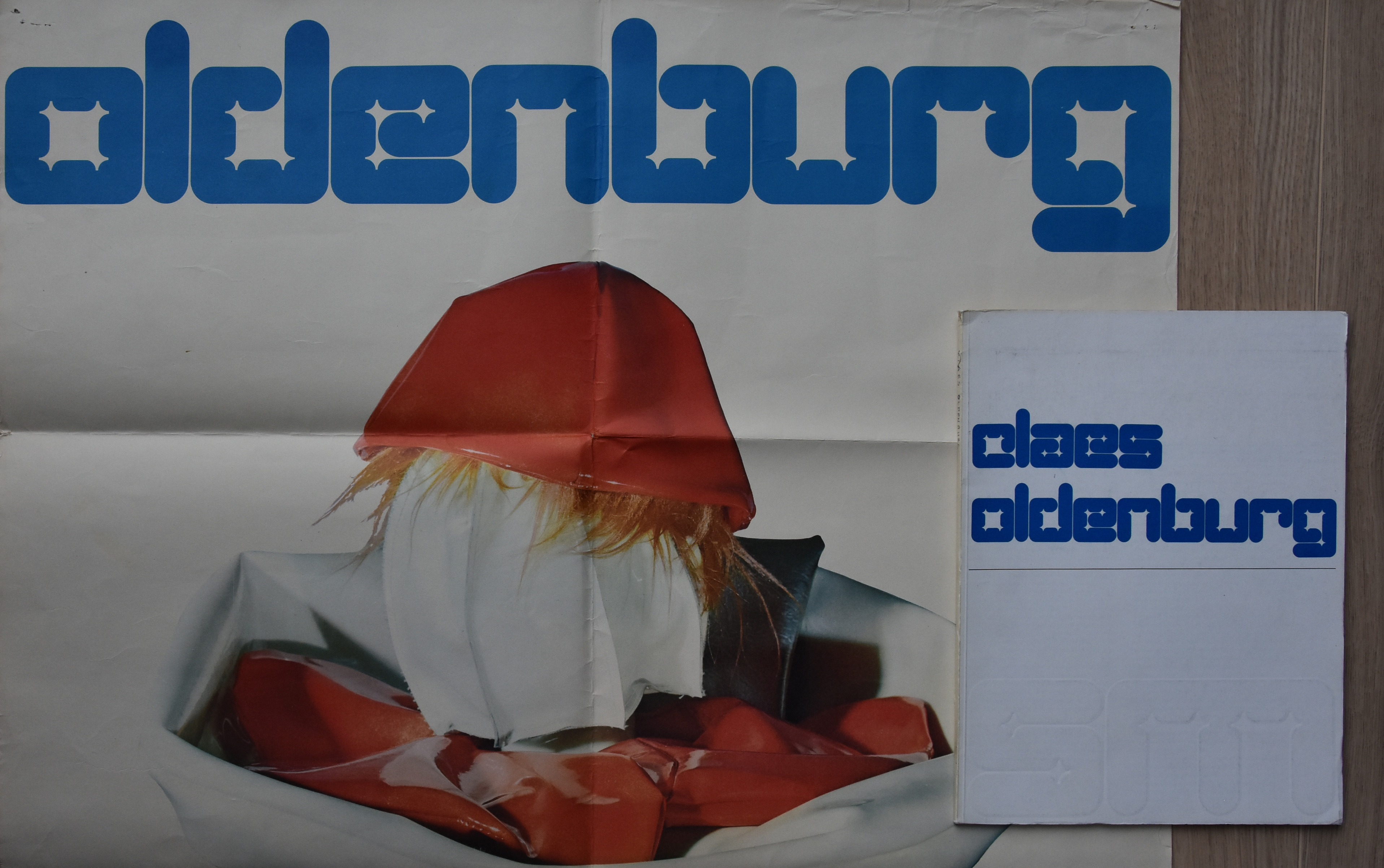
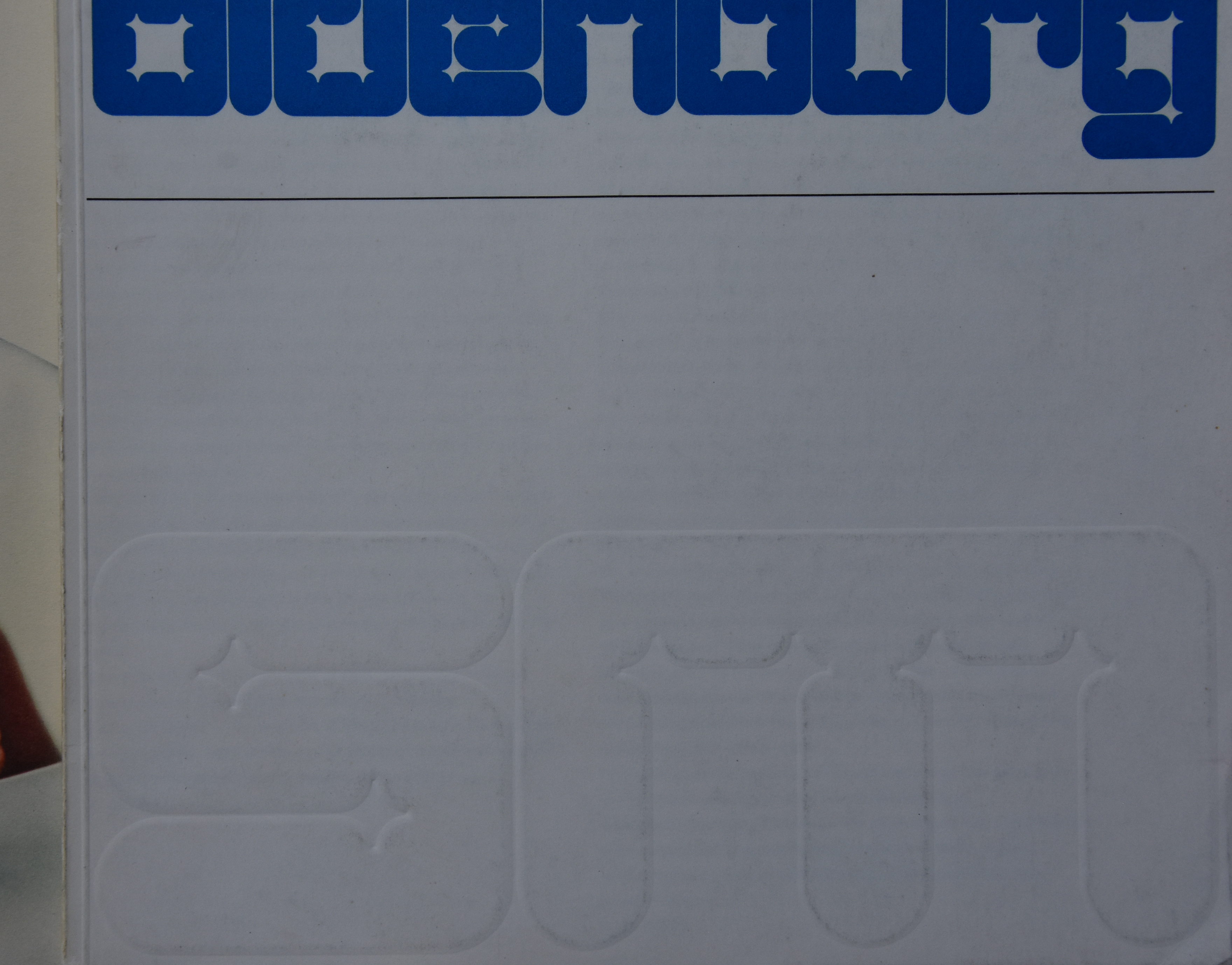
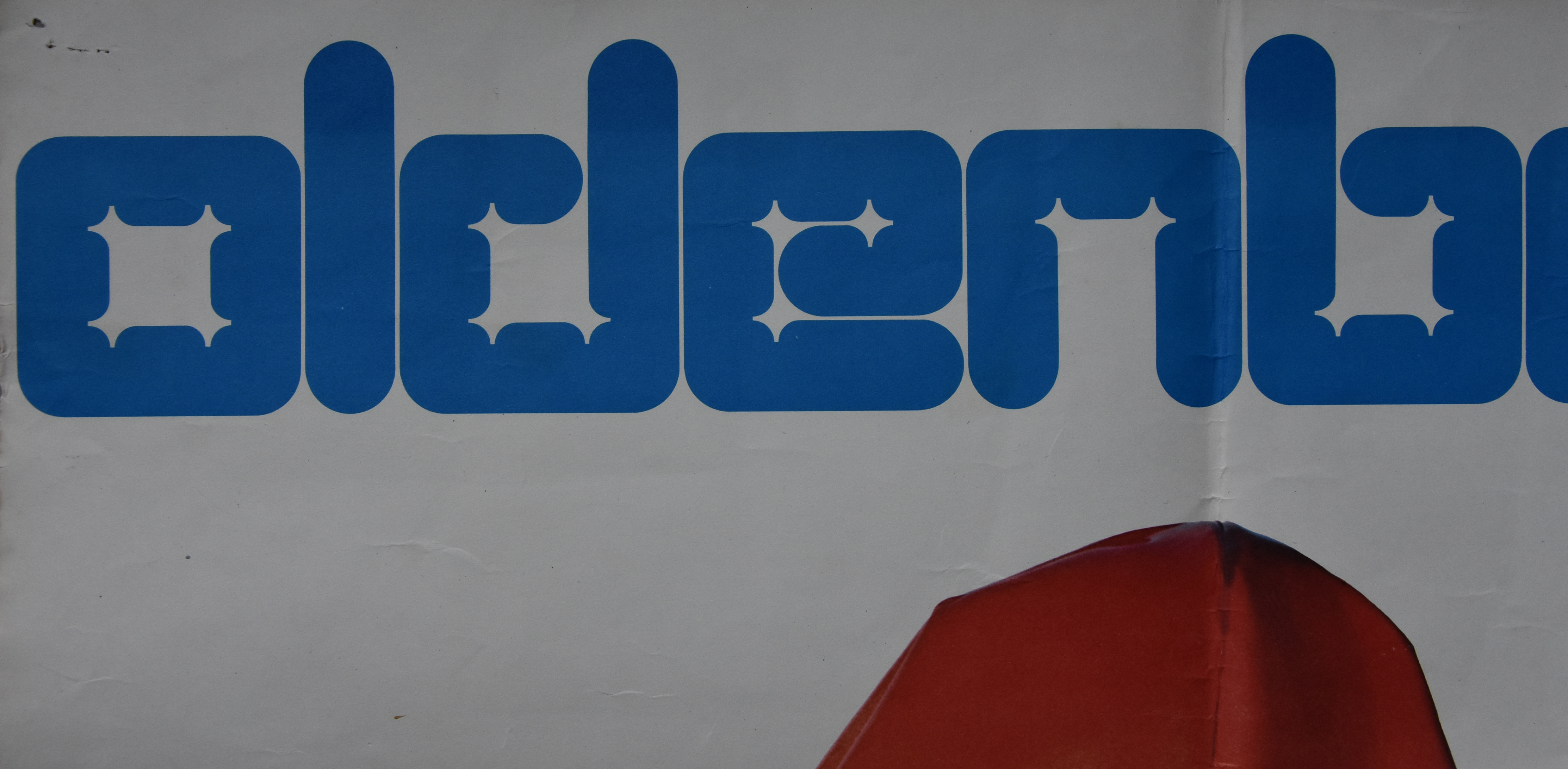
Claes Oldenburg has had 2 solo exhibitions at the Stedelijk Museum Amsterdam. The first in 1970 and the second in 1977. With both exhibitions, catalogues by Wim Crouwel were published , but the one from 1970 has a special lettering by Wim Crouwel. The same letter was used as the one on the poster which was printed in a bold deep blue color. Underneath the title of the catalogue there was in the same letter a blind print of the SM logo. Both items, catalogue and poster are now for sale at www.ftn-books.com. This is a rare opportunity to collectors to add both items to their collections.
Artist/ Author: Oliver Boberg
Title : Memorial
Publisher: Oliver Boberg
Measurements: Frame measures 51 x 42 cm. original C print is 35 x 25 cm.
Condition: mint
signed by Oliver Boberg in pen and numbered 14/20 from an edition of 20


 A Stedelijk Museum publication from 1938. Publishing date well before WWII and extremely rare. One of the first publications containing an article by Piet Mondriaan ( Mondrian) and it is more than likely the only one on the market at this moment. What makes this publication valuable is not only its rarity , but also the art historical value of the articles by Mondriaan, Kandinsky and Gorin. You can find this publication at www.ftn-books.com.