Posted on Leave a comment

Constant Permeke (1886-1952)

Schermafbeelding 2020-01-03 om 15.54.07

Like van Gogh and his fellow country man Josef Cantré, Constant Permeke was fascinated with farmers and workers. Inspired by these men and woman he made some beautiful impressive paintings in a style which was highly original and recognizable. Brown, blacks and some sand colors painted on a canvas made some of the most impressive art from Belgium from the early 20th century.

Beside a gifted painter, he was also an impressive sculptor. Inspired by the same subjects his sculptures seem to be even more abstract thatn his paintings. Of course the sahpe one can recognize but there is also an abstract quality with these sculptures. In the Netherlands not many Permeke art can be seen, but there is a tremendous painting in the collections of the Gemeentemuseum Den Haag (Kunstmuseum) and the Kroller  Muller museum.

Schermafbeelding 2020-01-03 om 16.02.44

The following Permeke titles are available at www.ftn-books.com

Posted on Leave a comment

Menno Bauer (1949)

Schermafbeelding 2019-12-28 om 10.42.54

Here is the text that can be found on the Menno Bauer web site. It explains the works and methods Bauer uses.

Menno Bauer is interested in the movements of dancers. “In my paintings”, says Bauer, ‘I set everything in motion. I want the figures in the painting to dance. I want to show that everything is alive and infused with tension. In fact, I am also dusting off images that already exist. He is not only inspired by Van Maanen’s ballets, but also by famous historic paintings. They too contain scenes into which Bauer breathes new life. His reasoning is simple. In a painting, everything is still, motionless, because it is all painted. Nonetheless, you can in stil the suggestion of motion. The challenge is to make that illusion convincing.
It should be said that Menno Bauer does not work in a realistic style. Against a background of broad planes of colour- an agressive red versus a friendly green -, his figures, loosely contoured in black, dance, walk and fall, imprisoned in a world of their own. Here, just as in a filmclip of Johan Cruyff slowly flying past, its utterly unclear just what these people are doing or where they are.
In Menno Bauer’s eyes, the figures inhabiting the sometimes renowned paintings that he uses as his starting points are the theatrical performers acting out their roles. The undefined space in wich they find themselves is hence their stage, a place that can be altered into all manner of environments by way of changing the decors. The actors that Bauer employs in his paintings are professionals in the art of overstatement. Cheer or drama are applied in thick layers, out to persuade their audience. Moreover, what these characters are acting out is not real. Bauer finds excitement in making use of this exaggeration, these emphatic, acted-out gestures, in order to approach the illusion of real gesture or movement.

bauer zweet


There is one Bauer publication available at www.ftn-books.com

Posted on Leave a comment

Kitaj (1932-2007)

Schermafbeelding 2019-07-11 om 15.53.32

Robert Brooks Kitaj was born in the US but his art is closely related to the British Pop Art. I am writing this blog because i recently acquired a german catalogue on his exhibition at the Kunsthalle Dusseldorf and i was impressed. Later i learned that Kitaj received a lot of criticism on his art as the press slaughtered his exhibition at the Tate gallery in 1994. Her is what i found on Wikipedia

A second retrospective was staged at the Tate Gallery in 1994. Critical reviews in London were almost universally negative. British press savagely attacked the Tate exhibit, calling Kitaj a pretentious poseur who engaged in name dropping. Kitaj took the criticism very personally, declaring that “anti-intellectualism, anti-Americanism, and anti-Semitism” had fueled the vitriol. Despite the bad reviews, the exhibition moved to the Metropolitan Museum of Art in New York and afterwards to the Los Angeles County Museum of Art in 1995. His second wife, Sandra Fisher died from hyperacute haemorrhagic leuco-encephalitis in 1994, shortly after his exhibition at the Tate Gallery had ended. He blamed the British press for her death, stating that “they were aiming for me, but they got her instead.” David Hockney concurred and said that he too believed the London art critics had killed Sandra Fisher.[14] Kitaj returned to the US in 1997 and settled in Los Angeles, near his first son. “When my Wife died”, he wrote to Edward Chaney, “London died for me and I returned home to California to live among sons and grandsons – It was a very good move and now I begin my 3rd and (last?) ACT! hands across The Sea.” Three years later he wrote: “I grow older every day and rather like my hermit life.” The “Tate War” and Sandra’s death became a central themes for his later works: he often depicted himself and his deceased wife as angels. In Los Angeles No. 22 (Painting-Drawing) the beautiful young (and naked) girl records the shadow of her aged lover (on whose lap she sits) in a pose directly taken from the Scots Grand Tourist David Allan’s Origin of Painting. The latter was included by Ernst Gombrich in his 1995 National Gallery exhibition (and catalogue) on Shadows so that Kitaj would have seen it two years before he left England for ever. 

Personally i think the critics are wrong. Kitaj deserves his place among the great European Pop Art artists and the future exhibitions that will include his works will probably prove me right. Some Kitaj catalogues are availableat www.ftn-books.com

Posted on Leave a comment

Joachim Grommek (1957)

Schermafbeelding 2019-12-12 om 14.24.11

Joachim Grommek, Master of Arts of Free Art/ Film at HBK Braunschweig (Professor: Malte Sartorius), Germany, in 1982 has mainly shown in German and European institutions and galleries since 1987, among them important solo shows like “Malerei 300” at the Städtische Galerie Wolfsburg, Wolfsburg, Germany in 2011. His geometric-abstract, illusionary work in perfection lays varies the topic of authentic image and copy like the ancient Trompe-l’œils, always asking for a second look. Grommek’s work though is reflecting art history and prominent artists like Kasimir Malewitsch, Piet Mondrian, Blinky Palermo or Robert Ryman.

grommek voor wordpress

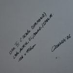
This is how the Taubert gallery describes the works by Joachim Grommek. They have a nice selection in stock. This blog on Grommek is written on the occasion of the purchase for FTN-art of a beautiful impressive diamond shaped work : STAR IV, 2006 (Black Diamond). You really have to study his works from very close up. It appears these are not tapes nor raw chipped wood material, but literally everything….lines , wood, tapes …is painted. Materials used, acrylic paint, lack, wood , special paints…the result a fascinating work of art that impresses with its composition, but in the meantime is a technical painters masterpiece.

The works by Grommek can be found in numerous German museums and ao. the Centraal Museum / Utrecht

here is the text from the book TILT:

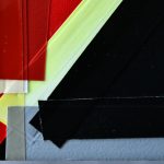
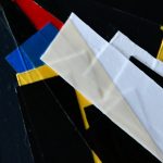
Grommek’s pictures have an extraordinarily immediate visual presence, despite their comparatively small size. Whereas they seem rigorously minimalistic in terms of both areal composition and chromatic clarity, there is still something provisional and unfinished about them. More like tantalising intermediates, they seem to imply that the artist has not yet decided which area should be superimposed on which. Patches of bald fibreboard are visible in places, as are strips of adhesive tape.

But nothing is what it seems in these works. Although Grommek does indeed use standard industrially laminated fibreboard as a ground, the grey-brown speckled areas that the viewer takes for unpainted fibreboard turn out to be no less painted albeit with deceptive verisimi|itude -than all the other areas. Even the brightly coloured transparent »adhesive tape« turns out to be lacquer which, perfectly applied layer upon layer, creates the illusion of overlapping strips of plastic tape. An abstract, »unrepresentational« picture by Grommek, therefore, is actually the result of a highly representational style of painting, with what it represents being its own materiality.

Once the temptation to tear off the strips of non-exlstent adhesive tape has been resisted, the viewer can step back a few paces and in doing so go back to the beginning and to the play of shapes and colours. The tension remains, just as the contradictions between the reality seen, painted and represented remain unresolved.
Posted on Leave a comment

Armando …signed publications

Schermafbeelding 2019-12-05 om 14.25.26

It was a few months ago that i was fortunate to buy a small collection of ARMANDO books. Only 25 cm’s of books, but among the 16 books , 6 were signed by the master himself. Since his death , Armando paintings, drawings and etchings have become highly collectable items and the books are no exception. Publications that are in most cases of a very high quality and the ARMANDO signature makes them even more wanted and collectable. ww.ftn-books.com has them now for sale, so please take a look at them at my site and search for the many Armando items i have for sale.

armando rood a

Posted on Leave a comment

Sergei Lobanov (1887-1943)

Schermafbeelding 2019-12-02 om 14.23.36.png

This is one of those artists that stayed out of sight for me because i never had seen his work in a museum before, but after i found a book ( available at www.ftn-books.com) it became clear to me that his implressionist art is not less than the the works by his french  and european counterparts.

Sergey Ivanovich Lobanov was one of the significant but little known artists of the first half of the 20th century. His fauvist landscapes participated in exhibitions of the Jack of Diamonds in 1910 and 1912. Unfortunately, Sergey Lobanov’s works were hardly displayed hereafter but for few exhibitions in the 1920s.
<divSergey Lobanov studied in art studios of F.I. Rerberg (1906) and I.I. Mashkov (1907), at the Moscow School for Painting, Sculpture and Architecture (1907-1913). As a school student yet, he got interested in the history of fine arts. Sergey Lobanov attended courses on the history of arts at the Moscow Archaeological Institute in 1914.

He became an official of the Museum and Monument Protection Department of the People’s Commissariat for Education in 1918. Sergey Lobanov was seated the custodian of the nationalized collection of S. I. Schukin in 1922. For one and a half decades the artist was the deputy director of the State Museum of New Western Art (later a considerable part of the museum collection was shifted to the Pushkin Museum of Fine Arts and made the basis of the collection of French painting of the second half of the 19th and 20th centuries).

After his short membership in the Artists Association of Revolutionary Russia he was excluded from it as being “alien to ideology of the Association” in 1924 and walked off from any art groups.

lobanov

Posted on Leave a comment

Otmar Alt ( 1940 )

Schermafbeelding 2019-11-26 om 15.07.55

Otmar Alt has become over the years a famous German artist. The reason is that his art is accessibel and in his piantings and prints he depicts a fantasy world which is abstract and populated with figurative creatures. His roots can be found in the colorful world oof Pop Art painting, but over the years he developed a recognizable style of his own. You can not help but admire the commercial quality of his art. A bit the dsame as Corneille in the Netherlands developed his art into a highly commercial form of art. Helped by big companies his art was distributed among many admirers in high editions ( ABN bank ao). In the case of Otmar Alt you can see that his art was distributed among many , because on several occasion he included some nice “signed in print” prints within the books that were published. Onme of these books including the print is now available at www.ftn-books.com.

otmar alt b

Posted on Leave a comment

Franz Eggenschwiller (1930-2000)

Schermafbeelding 2019-11-06 om 15.10.27

Discovering “new” artists is one of the nicer thing of writing a daily blog. And writing a blog on this artist is a pleasurable experience since i like his art .  Mix total astraction wit constructivist art and use very delicate colors and you get an impression of the art Eggenschwiller stands for. Born in 1930 het must have known the abstract painters from his generation, but this does not show. His art is original and although not very well known, deserves to be presented in exhibitions and galeries. This is one of the goals the Eggenschwiller-Wiggli foundation has set for themselves.

Schermafbeelding 2019-11-06 om 15.17.43

Eggenschwillers works must be known with a much larger public than these are known now. Works by Franz Eggenschwiller are present in the Solothurn Museum and www.ftn-books.com has the most important publication on this artist available.

eggenschwiler


Posted on Leave a comment

Wim Oepts (1904-1988)

Schermafbeelding 2019-11-04 om 12.46.55

Wim Oepts , always reminds of the more abstract brother of Vincent van Gogh. The choice of colors even reminds of van Gogh and in many cases his landscapes are the same kind of Landscapes van Gogh preferred to paint. The days that Oepsts started to paint were the same days that van Gogh was finally recognized as being one of the great painters of all time. This meant that Oepts must have known his paintings very well and admired them. This also meant that he never followed the road into abstraction . His paintings were always colorful and the subjects recognizable. Friendly paintings for those who want an ” easy” work of art on the wall. Affordable certainly , artistically important? ….i doubt it.

left Oepts / Right van Gogh


Posted on Leave a comment

the Stuyvesant Foundation

Schermafbeelding 2019-11-01 om 11.41.35

I have a weakness for the Stuyvesant Foundatio. The foundation was founded by Alexander Orlow of Turmac company who had the brilliant idea to bring great art works among his factory workers by placing the art in the middle of the production. This meant that many large sized works were purchased over a period of 30 years. Zero, Cobra en abstract expressionism being the most important among these works.  For most of the collection they had one thing in common. Their size was large and larger, since the works had to be seen by the people who worked a fair distance from them.

The following article appeared in the Telegraph a few days before the first auction was being held. In total there were 3 auctions. Personally i thought the first was exceptional, the second very good and the third was filled with the leftovers. I was lucky to buy one of the best Gerard Verdijk paintings ever in the 2nd auction at AAG. My luck….it is too large for many, so no bids were placed after the initial price set by the auctioneer.

Schermafbeelding 2019-11-01 om 11.44.54

The cream of one of Europe’s most highly regarded corporate art collections is to be dispersed by Sotheby’s next week in spite of efforts by civil authorities and art experts to preserve it and turn it into a museum. Known as the Peter Stuyvesant collection, it originated in the late 1950’s when Alexander Orlow, managing director of Turmac Tobacco, which made the popular Peter Stuyvesant brand of cigarettes in its factory in Zevenaar, Holland, decided his workforce needed something to cheer them up. “However complicated the operations of a machine may look, it soon becomes monotonous to a factory worker,” he said.

His solution was to buy art – preferably big, colourful abstract paintings – and in 1960 commissioned 13 artists from different European countries to make works on the theme of “joie de vivre” to hang in the factory’s production halls. The experiment was so popular that in the following year he invited William Sandberg, formerly the director of Amsterdam’s Stedelijk Museum, to expand the collection. Over the next 50 years, the collection grew under the supervision of a series of former Dutch museum directors.

However, in 2000, Turmac was swallowed up by the British American Tobacco Company (BAT), and the art collection renamed the BAT Artventure collection. But there was not to be much in the way of artistic venture in store. In June of 2006 it was announced that the Zevenaar factory would close with the loss of 570 jobs, so that European production could be concentrated in Germany and Poland. That left over 1,400 works in the art collection valued at some 23 million pounds looking for a new home.

Jan de Ruiter, the mayor of Zevenaar, supported by Martijn Sanders, chairman of the Advisory Committee on the Future of the Stedelijk Museum, looked for a way to buy the collection and keep it locally, possibly as a wing of the museum. But “BAT did not really want to make a deal,” said de Ruiter. It went to Sotheby’s instead.

Sotheby’s has a good track record in handling corporate art collections. Back in 1989 it handled the disposal of the British Rail Pension Fund collection and the $93 million (£62.5 million) Reader’s Digest collection. Since then we’ve seen a series of high profile sales for IBM, the 7-Eleven photo collection, the HSBC collection of 19th century pictures, not to mention a certain £65 million sculpture by Giacometti from the German Commerzbank last month.

The company clearly sets some store by advising corporations on the acquisition and disposal of art, setting up a department just to deal with that in New York 20 years ago, and another in London last year. Saul Ingram, who runs the London department, says most companies sell to buy new work or channel profits into broader cultural activities. The Stuyesant/BAT collection is different because it was site specific, and without the factory and its workers, its purpose has gone.

Its value, though, is still substantial. The 163 works to be sold by Sotheby’s Amsterdam next week are estimated to fetch between £3.6 million and £4.6 million, with further sales planned in the future. Avant garde European groups from the 50s and 60s such as CoBrA, the abstract expressionist group based around Copenhagen, Brussels and Amsterdam, and Zero, the Dusseldorf based group who worked with experimental materials such as fire, nails and papier mache, are to the fore.

The Zero artists, Gunther Uecker and Jan Schoonhoven, who starred at Sotheby’s recent Lenz collection sale last month, are expected to do exceptionally well. A rarity is Lily ou Tony (1965), one of Nicki de St Phalle’s first Nana sculptures that celebrate womanhood. Though fragile, made of tissue and wire mesh, it carries a £180,000 to £270,000 estimate. The most significant example of British art is a 1958 Alan Davie painting that has been undervalued at £27,000 to £36,000.

In addition to the stylish brand name Stuyvesant gave to the world of smoking, it also achieved brand recognition in the art world, especially in Britain, where, during the sixties, the Stuyvesant Foundation sponsored the Whitechapel Gallery’s trendsetting The New Generation exhibition, which included David Hockney and Bridget Riley, and also the talent spotting Young Contemporaries, much of which was immortalised in the Tate Gallery’s Recent British Art show of 1967. The separate collection of British art that was formed by the Stuyvesant Foundation between 1964 and 1967 was eventually sold in the late 1980s and established what were then huge prices for Davie, Riley, and others of that generation. The last sale, held at Bonhams in 1989, was a complete sell out. Next week will see how well the Stuyvesant brand has survived.

www.ftn-books.com has nearly all  dutch publications on the Stuyvesant collection available.