A few weeks ago i decided to sell my pristine copy of the Borek Sipek / Erwin Olaf catalogue they made together with Irma Boom for the STIJL VORMT FUNCTIE exhibition at the Stedelijk Museum in 1991. This is probably one of the catalogues i cherish the most, but since i have decided to sell part of my private library and only keep these books that are related to our personal collection it is now for sale. What struck me most were of course the photographs by Erwin Olaf. These are timeless and highly original in their approach of the subject…..except…. he must have been inspired by at least one painting of the impressionist period. The Eduard Manet / The bar at the Folies Bergere painting is certainly a source of inspiration for the photo het took in the early Nineties. The book is now for sale at www.ftn-books.com
Why another blog on Erwin Olaf? This one is on the occasion of the addition of the book BOREK SIPEK / Glas Design Architectuur in which a series of photographs by Erwin Olaf with works by Sipek is published . Almost the exact series was used before. The series was made on location with gypsies holding glas and design by Sipek and photographed by Erwin Olaf for the Stedelijk Museum exhibition and publication which was designed by Irma Boom ( Book on the left/private collection). The addition to my inventory is the book published by the Drents Museum, which contains 8 color photographs by Erwin Olaf together with the Anton Corbijn cover. This makes the book a true collectors item since these photo’s are among the best Olaf ever made.
When you study both series ( Stedelijk Museum and Drents museum), at first you think the photographs are the same , but study them closely and you will notice some subtil differences. I conclude that Erwin Olaf must have made shortly after each other two series. One in Black and white, the other in color.
Using 2 cameras this must have been technically possible. Just look at the position of the hand of the gypsy boy. The book published for the Drents Museum is now for sale at www.ftn-books.com
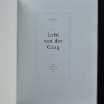
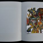
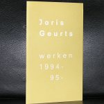
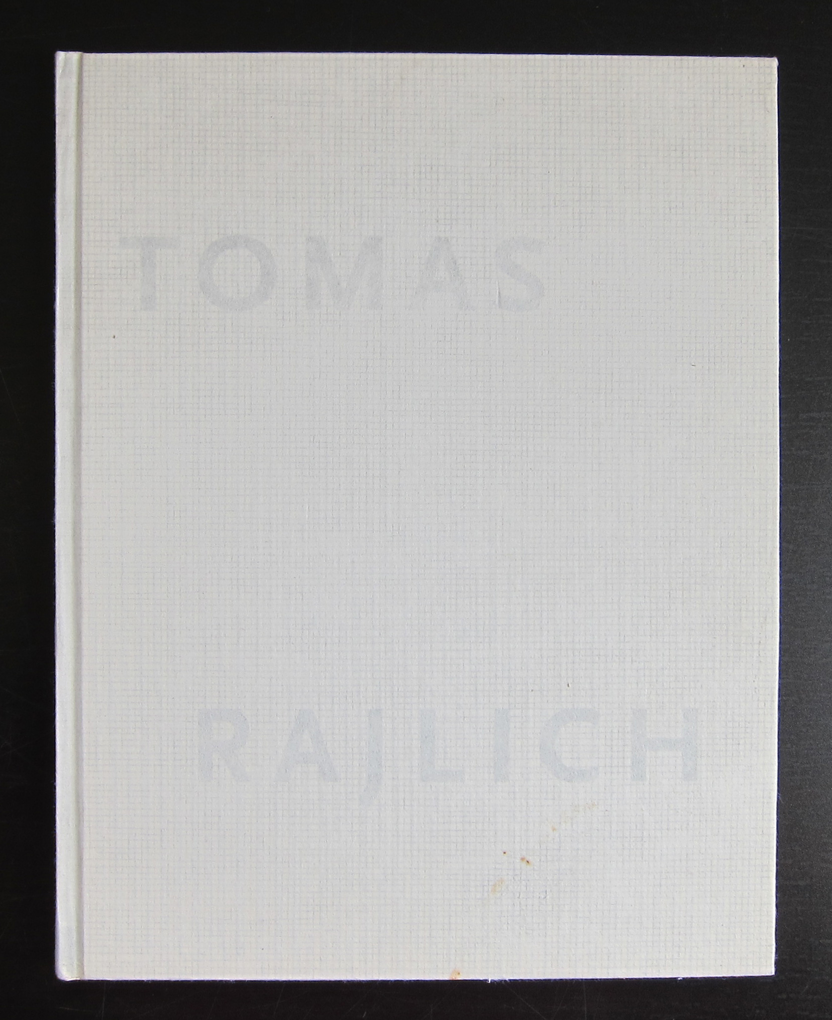
Every year and sometimes every two years, The STROOM agency for contemporary art in Den Haag presents the Ouborgprijs to one of the artists from the DEN HAAG region who has become important for modern art in and outside the Netherlands. The prestigious price is presented together with a publication which is published in a very small edition of 400 to 500 copies of the title to the artist. In the years 1992 (Gerard Petrus Fieret ), 1993 ( Lotti van der Gaag) and 1994 ( Tomas Rajlich) this publication was designed by Irma Boom, making these books outstanding in every way and because of the extremely small edition size , highly collectable items. I do not have the Fieret book, have sold the Rajlich book recently to China, but found the Lotti van der Gaag book and have put it up for sale at www.ftn-books.com
A few years ago there was a special exhibition on Chanel at the Gemeentemuseum Den Haag. On the occasion several items were published. There was a catalogue, a poster and a special cotton bag. The last two items are now available at www.ftn-books.com.
There was also the Irma Boom / Chanel book of which the museumshop had a few copies, but these sold out within a few days even thought their price was HIGH!
OLYMPUS DIGITAL CAMERA
The bag however is the original exhibition bag which was made specially for this occasion. A nice bag with the silhouette of Coco Chanel. A highly collectable item for sale at www.ftn-books.com
Just a little younger than myself, but this is an artist who grows on you. I had the opportunity to follow his works for a long time now. In the early stages of his career at gallery Art & Project and later on at Slewe gallery ( from 1995).
In the beginning his compositions did not attract me at all, but from the mid Nineties on his works develop into something very special. He creates with his composition a universe and builds it with lines, squares, oval shapes and circles making them highly recognizable and personal paintings.
Slewe gallery represents Joris Geurts now for over 2 decades and in this time they commissioned Irma Boom to make a Geurts catalogue which has become one of my favorite Irma Boom catalogues of all time.
OLYMPUS DIGITAL CAMERA
OLYMPUS DIGITAL CAMERA
The catalogue is a typical Boom designed book , but it is not the catalogue which draws your attention, but the paintings depicted within. This period was a highly productive period for Joris Geurts and FTN-art is lucky to have acquired 2 paintings by Geurts from these important years ( POA). The Irma Boom designed catalogue is available at www.ftn-books.com
Here is the text from the Slewe gallery pages
Joris Geurts, born in 1958 in Oss (NL), makes abstract paintings, drawings and prints.They are assiociatively built up, but transparantly layered and traceble. Small squares and dots float on deep blues and greens, giving associations with the kosmos or landscape.
After his study at the AKI in Enschede, Geurts started his career at Art & Project Gallery in Amsterdam in the early eighties. Since 1995 he showed regularly at Slewe Gallery. In 2001 he had a show at Noordbrabants Museum in ’s-Hertogenbosch, on which occasion a catalog had been published Purple Blue and Lemon Yellow, giving an overview of his work, with texts by Bert Jansen and Henk van Woerden. In addition to his painting practice he also works as a composer of music. His works have been collected by several important public collections, such as the Stedelijk Museum Amsterdam, Museum Boijmans van Beuningen, Rotterdam, Rijksmuseum Twenthe, Enschede and the corporate art collections of the AKZO Nobel, ABN AMRO, KPN, Bouwfonds and AEGON.
There are 3 reasons why i like the works by Steven Aalders.
First of all these are contructivist paintings which i think belong to the best produced in the Netherlands these days
Second . One of the best exhibitions held at the Gemeentemuseum Den Haag was the Steven Aalders exhibition held in 2010
Third.. With the exhibition an Irma Boom designed catalogue was sold at the Gemeentemuseum shop and i think this is one of the best Irma Boom ordinary books she has made in the last 10 years. ( This book is available at www.ftn-books.com)
enough reasons to write this blog on Steven Aalders and recommend to follow this artist in the future, because his art is a little different from the other constructivist painter and deserves to be known outside the Netherlands too.
Steven Aalders is well known for his exact painted constructive oil paintings, where he deals with and continues the concept of modernism of Piet Mondrian, De Stijl and American Minimal Art. At his first exhibition in Munich Aalders shows a new body of work on the issue “Red, Yellow and Blue”, where the areas of the color fields follow the “Golden Ration”. An extensive retrospective catalogue was published in 2010 for his solo exhibited at the Gemeentemuseum, Den Haag. Steven Aalders, born in 1959, lives and works in Amsterdam.
Of course , the title of this blog is my way of thinking about Irma Boom, who first made a career with SDU publishers before she started her own office in 1991. But without a doubt she is one of the greatest living graphical designers of the world.
OLYMPUS DIGITAL CAMERA
One of the first who had complete faith in the abilities and quality of Irma Boom was Paul Fentener van Vlissingen who commissioned the SVH jubilee publication of over 2000 pages ….. a classic in book design, finished in 1996 and done in the very special Irma Boom way with no limitations in the execution and with a complete rethinking of the classic book design.
A true DUTCH DESIGN classic which was the starting point of the Irma Boom designs as we know them. Other clients followed . Vitra , Chanel and Ferrari among them, but…..not only the larger companies and brand names wanted to use the design qualities of Irma Boom. There were smaller ones like dutch museums and the Siewe gallery , who presented a solo exhibition of her earlier this year with which they published a special Irma Boom limited edition.
and beside this special exhibition they commissioned some of their gallery publication to mrs Boom. My personal favorite Irma Boom publication is a small book on Tomas Rajlich which was published some 15 year ago and which has all the subtleties of a great book design. Now is the time to start collecting Irma Boom publications…wait another couple of years and none are there to be found. Irma Boom her designs and publications are collected by practically all of the large dutch museums and of course the Museum of Modern Art in New York.
Artist/ Author: Oliver Boberg
Title : Memorial
Publisher: Oliver Boberg
Measurements: Frame measures 51 x 42 cm. original C print is 35 x 25 cm.
Condition: mint
signed by Oliver Boberg in pen and numbered 14/20 from an edition of 20