Piet Dirkx cigarbox 784
Piet Dirkx cigarbox 784
First of all i have to apologize in publishing this blog without commemorating Anthon Beeke who died a few weeks ago and who’ s death i announced on the the 26th of September in a special blog on Beeke. Here is the blog which was prepared some months ago.

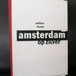
One of the great and now world wide known names in dutch graphic design is Anthon Beeke. Born is 1940 he was of the flower power generation who took over Amsterdam in the late sixties. Free love, drugs and influences from all over the world shaped a generation of designers of which Beeke was one of . Without knowing who the designer is, you immediately recognize his work. Bright colors , details, shocking views or attributes draw you into his designs immediately.
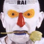
But it is not always his intention to shock, there were occasions that his designs were just functional. For instance his Wanderlieder

designed catalogue for the Stedelijk is only different in size but holds and reads just like a normal book.
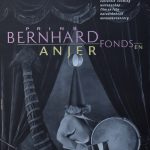
Beeke is one of the great designers in the Netherlands and well worth collecting. www.ftn-books.com has some nice titles by Beeke available including the poster he made with Erwin Olaf for het Anjer Fonds.

Piet Dirkx cigarbox 783

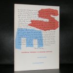
There is a long history between the art of Max Liebermann and the Netherlands, because Liebermann used to work for long periods of time in this country.
From 1874 until 1914 he stayed during the summer period in Holland and painted together with his friend Isaac Israels in Laren, Scheveningen and Noordwijk. This is the reason why so many of great Liebermann paintings can be found in this country. These were given, trade or sold to collectors and friends , building this way the largest collection of Liebermann paintings outside Germany.

It was therefore no problem for the Gemeentemuseum to organize some 40 years ago one of the first retrospektives on Liebermann ( catalogue available at www.ftn-books.com) and because it was so long ago the Gemeentemuseum organized this year another Libermann exhibition with the focus on the dutch paintings he made during the summers he stayed here.

Max Liebermann (1847-1935) enjoyed a special bond with the Netherlands. From the end of the 19th century the German artist would visit Holland every summer. The country inspired his paintings for many years and he established a number of close friendships with artists from the Hague School. Despite these ties, Liebermann’s work is rarely exhibited in the Netherlands, so it is high time for a change!
The Gemeentemuseum is organising a major exhibition on this famous German artist:Max Liebermann – Impressions of summer. Top items from Liebermann’s oeuvre will highlight how he developed from Realist tot Impressionist. The exhibition will also consider his important role in the European art world, and his extraordinary private life.
Between 1870 and 1914 Liebermann spent a number of summers in the Netherlands with his friend Jozef Israels. Together they painted the fashionable lifestyle emerging in that period: outdoor cafés teeming with patrons enjoying the sun, riders and bathers on the beach. By that time Liebermann was a celebrated artist both in his native Germany and abroad, famous for his paintings with ‘sunspots’. In 1920 he was even appointed director of the academy in Berlin, a position he would have to relinquish towards the end of his life, when Hitler came to power. Yet he continued to be a favourite with the public in Germany, even after his death.
Despite the political and social tensions, Liebermann remained a sunny Impressionist in his work, as you will see in this exhibition. Max Liebermann – Impressions of Summer is organised with partner the Liebermann-Villa am Wannsee museum, featuring highlights like Free Hour at the Amsterdam Orphanage (1881-1882) and The Parrot Man (1902), painted at Amsterdam’s Artis zoo. Special detail: Liebermann’s Free Hour at the Amsterdam Orphanage will for the first time be leaving Frankfurt since it gained a permanent home there at the city’s Städel Museum.

Piet Dirkx cigarbox 782

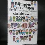
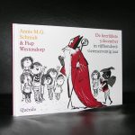
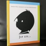
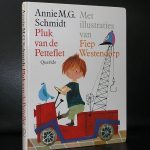
Well, this one is on the border of true art… the illustrations of Fiep Westendorp are highly original and recognizable and they even sell nowadays at art prices, but first and foremost these are great quality book illustrations ( mainly for the ones written by Annie M.G. Schmidt) . Fiep Westendorp is a well established name in the dutch illustrator scene and because many of our generation have read the novels by Annie M.G. they also know the illustrations by Westendorp. Pluk en de Pettefelte, Jip en Janneke and other could not exist without the images created by Fiep Westendorp and she is now collected not only in the Netherlands, but all over the world. Great fun illustrations which deserve a large audience. Some Westendorp titles are available at www.ftn-books.com

Piet Dirkx cigarbox 781

Since ii have sold several Scholte multiples during the last months , i was on the look out for more of these excellent mScholte multiple editions and……found them. I contacted a collector of whom i knew he had sold me several in the past and he could help me with 6 more of these Scholte multiples. All from the” Lucifer in paradise ” edition which was originally sold at the Kruidvat stores in 2007. As far as i know all are unique because every one of them depicts a different kind of set of match boxes. The one on the upper right is not available. It is now part of my personal collection because Donald Duck is an all time favorite of mine. The other 5 are all available at www.ftn-books.com. For more inquiries please mail me at wvdelshout@ziggo.nl


Piet Dirkx cigarbox 780

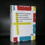
As you can read in the title , Willem Sandberg experimented with typography and designs.
During the occupation by the Germans he published experimental books with his own typography. Mostly a combination of very original and personal lay-out and torn out letters, making these publications unique. Unique because of their chosen size, material, printing ,their design and the very limited numbers in which they were produced.
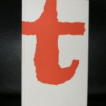
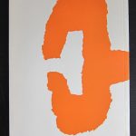
Sandberg produced nineteen pamphlets between December 1943 and April 1945, making a couple of copies of each one, all done by hand. They consisted of twenty to sixty pages of drawings, collages, and texts, which were either written by Sandberg himself or quoted from Confucius, Proudhon, Stendhal, and other favorite writers on themes like love, death, education, architecture, and typography. As Sandberg had no money and materials were scarce in wartime, he improvised by using whatever he could find: scraps of wallpaper, cardboard packaging, tissue paper, and wrapping paper together with photographs, drawings, and symbols torn from magazines for his collages.
The originals are very very rare and exceptionally hard to find. Luckily some of the dutch publishers decided to make some reprints and make them in this way available for other admirers. These reprints are getting more scarce every year now, but www.ftn-books.com still has some available.