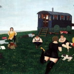
The gallery was founded by Bart van de Ven and Peer Veneman. In the beginning of its existence the gallery revolved around a tight-knit group of artists who worked closely together, both professionally and socially. A group of young Dutch artists in the postmodern 1980s, including Rob Scholte, Henk Visch and Fortuijn O’Brien, were part of the scene around the gallery and they became very well known. At that time, they stood at the center of the Dutch art world.
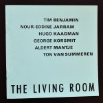
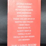
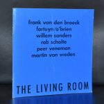
The Living Room was launched in a small third-floor apartment in East Amsterdam in 1981 by art history student Bart van de Ven and artist Peer Veneman. The gallery’s focus was on painting and sculpture, most often from a select group of Dutch artists working in the typically anti-academic, ‘wild’ style of the early 1980s. After moving to Amsterdam’s city centre in 1983, and up until its closure in 1993, the activity of the gallery became increasingly formalised. The gallery’s production of catalogues and its participation in several international art fairs, underlined The Living Room’s professional acclaim and secured their influence well beyond the borders of the Netherlands.
The Living Room is now closed for a very long time, But when you look at their list of exhibitions you realize that here is a “classic” among dutch galleries and their publications are well worth collecting. Some of these are available at www.ftn-books.com