Posted on 9 Comments

Esther Tielemans (1976)

Schermafbeelding 2020-08-03 om 15.14.06

Her first major exhibition was at the Stedelijk Museum, but her best publication by far is the one which was made for her exhibition at the Museum Bommel van Dam in 2011.

(available at www.ftn-books.com) Great publication, designed by Adriaan Mellegers and printed by one of the very best printers in the business, Lecturis. Tielemans works differ in size. From intimate small sculptures to a room filled with installed sculptures altering and reconstructing the room in a fascinating way.

Her work is now part of the exhibition Momentum at the Voorlinden Museum.
Our world is poised on the brink of a tipping point as well. We must make choices regarding climate and migration, issues that are impacting our lives more and more intensely.

Schermafbeelding 2020-08-03 om 15.14.57

Momentum brings together more than thirty works that embody this tension. This selection from our collection unites new and established names working in a wide range of media. Together they offer insights into the personal and collective challenges of our time. With works from artists including Anish Kapoor, Rineke Dijkstra, Jacco Olivier, Esther Tielemans, Ryan Gander, Gabriel Rico and Mona Hatoum.

new scenes

Posted on Leave a comment

Kenny Scharf (1958)

Schermafbeelding 2020-11-19 om 16.26.43

It has been a very long time since i first encountered the works by Kenny Scharf at the Groninger Museum in the early Eighties. During  the famous Grafiti exhibition the works by Scharf were among the ones i admired most. Comic like , huge paintings that impressed, but somehow…. over the years ….did not stick with me.  Last month i encountered a catlogue by the Tony Shafrazi gallery. It was the Scharf 1983 catalogue and i was fascinated again. the same powerful comic like figures , but over the decades they have matured into great timeless art. The catalogue is available at www.ftn-books.com

scharf 1983 a

scharf 1983 c

scharf 1983 d

Here is what Angelica Jardini says on Kenny Scharf and i can fully agree with her.

If you like to have fun, you’re going to like Kenny Scharf.

The American painter sources his fantastical creations from retro cartoons, like The Jetsons and The Flintstones, and popular science fiction. His style is completely unique, and once you know his colorful, animorphic creatures, you’ll see them everywhere.

No, literally. Scharf does tons of murals and public art. This ties in with his manifesto to make art for the people- works that anyone can enjoy, not just stuffy academics or rich collectors. And his vividly playful tableaux live up to his goals.  Whether he’s picking Instagram followers for “Karbombz,” where he spraypaints one of his signature critters on your car for free, or reimagining a picnic table as a psychadelic atomic bomb, Scharf breaks down the elitist barriers of the art world by implementing his vision in lots of places outside the gallery and museum.

And boy is he prolific. He’s collaborated on a collection with fashion designer Jeremy Scott, creates immersive blacklight installations called “cosmic closets” for parties, and even designed this hilarious pool toy

Though a lot of his work references serious subjects like apocalyptic nuclear warfare, he somehow makes it lighthearted. One of his newest series of paintings features shining cartoon donuts, some of which are hurtling through space. Homer Simpson and I were both tickled pink (with sprinkles). 

Scharf hit it big in the 1980’s art scene in a little place called the East Village, in Manhattan. He was friends and roommates with famous street artist Keith Haring, and it’s easy to imagine them tagging up the town, brightening city streets and commuters’ days with their creative graffiti.

Now you’d assume most famous artists with famous friends would let success go to their head, but when we met Scharf at an event he graciously passed the time chatting with us about his life and work. Over ice cream tacos, we learned he likes to ride his bike and that he released his pet turtles to a local turtle sanctuary where he visits them often.

Like his art, the guy makes you smile.

Posted on Leave a comment

Andre Volten ( 1925-2002)


Schermafbeelding 2020-11-18 om 16.53.14.png
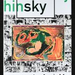
Over the years I have seen many Wim Crouwel designed catalogues. But one is definitely in my personal top 10 of Crowel designed catalogues.

It is the 1966 ANDRÉ VOLTEN catalogue he made for the Voltens Stedelijk Museum exhibition. Just some features of this great catalogue. The size. It has never been better than the size of the catalogues he designed in the early Sixties. The back has that typical Crouwel designed element. The lettering. Just look at the E of Andre. is has a hardly noticable accent aigu making it the perfect É. And than there is this graphical element taken from a Volten sculpture . It is there , but it also underlines is a very subtle way the name of Volten.

Than there is the inside cover. A shiny silver  . Just that one page but a very very powerful elemnt in the catalogue. All pages have a tranquility with lots of space, making the catalogue breath. Photography is top with a brilliant Volten portrait in his studio at work…… a lovely and highly collectable catalogue and still for sale at www.ftn-books.com

OLYMPUS DIGITAL CAMERA

Posted on Leave a comment

Joan Soler (1963)

Schermafbeelding 2020-11-17 om 15.20.34

Born in Mallorca in 1963, Soler was unknown to me until we visited the FUNDACIO PILAR i JOAN MIRO some decade ago and we encountered within this museum teh paintings by Soler. We learned that some time before they had held an exhibition to show the relation between Soler and Piet Mondrian whose works i know very well from my time at the gemeentemsueum Den Haag. I took an interest in this artis and liked the way he uses color with his absytract compositions. Both use geometric forms and lines , but the differnce there is a stronger sense of 3D.

Solor builds his paintings with layer upon layer, realizing this a way a 3D image. Fascinating to see. The catalogue in which Soler travels the road Mondrian took is available at www.ftn-books.com.

soler mondrian

Posted on 1 Comment

Andy Goldsworthy (1956)

Schermafbeelding 2020-08-05 om 15.01.33

Andy Goldsworthy, British sculptor, photographer, environmentalist,  seems like a perfect choice for his personal quest is to be intimate and create with Nature. What flows through him, flows through the landscape and his goal is to feel, experience,  understand,  and then to create with this energy.

In his collaborations with nature, Andy works with whatever comes to hand: twigs, leaves, stones, snow and ice, reeds and thorns, creating site-specific installations, exploring the very essences of these materials.  In his process, he first must become attuned to his environment mentally, physically, and emotionally.  He listens, he observes, and then when he seems to be drawn to the way the materials express themselves he creates.  He takes these very materials and reweaves them back into the environment in a deliberate manner then lets the effects of the natural conditions have their way with them.  For example, near a stream, he sews together leaves with pine needles and allows the current to carry them as if it were a new inhabitant making its way in the flow.  Another example he creates a structure from sandstone or shale at the sea’s edge then observes how the tide interacts with it, carries it away, melts it, or simply flows over it.  In this manner, he is exploring change, transformation, mutability, permeability, the unknown and impermanence.

Schermafbeelding 2020-08-05 om 15.02.29


As an audience, we feel the sense of birth, life and death with great anticipation and curiosity and a sense of triumph.  Andy will photograph his process and this is mainly the only means he has to show that he actually created and collaborated with nature.  There are exceptions such as rock walls he constructs but even they will not stay as he created them.  So, the photographing of his installations tell the story, a small drama as it were.  And he is always uncertain of the exact metamorphoses of his pieces.  On film he captures the infancy stages of creating them, the majestic full bloom of the mature piece, and then the decline and demise that comes with time.

His works of our art are not for eternity, but because he documents them extremely well, video’s and photographs remain and are proof that at one time the work existed and amazed those who saw it in reality. www.ftn-books.com has the much sought Staatsbosbeheer publication for sale.

goldsworthy staats a


Posted on Leave a comment

Michael Raedecker (1963)

Schermafbeelding 2020-08-04 om 16.13.44

Michael Raedecker records the memories held within spaces and objects in his enigmatic and dream-like paintings. Suburban homes, tree houses and empty rooms and vacant chairs, all float in haunting isolation. Muted hues are penetrated with thread and needle where the artist hand-sews forms into textural materiality. Raedecker mines art history and popular culture, sourcing compositions from 17th-century garland paintings, obscure magazines, and film stills.

this filmed portrait on Raedecker is by Franz Weisz

Since the beginning of his career as a painter Raedecker has incorporated embroidery into his works as a visual counterpoint to his washed-out paint application. His elaborate needlework adds linear definition to representational forms and the thread and paint visually mix together in areas of dense detail or abstraction. The absence or suggested loss of human presence invites the viewer to contemplate architecture as a mental or emotional space, where the domestic realm is detached from practical implications, yet deeply personal. Images of flowers, food and textiles with darkly ambiguous titles bring the domestic associations of his stitching into play with his subject matter, and show his interest in the Dutch tradition of still-life and Vanitas paintings. Raedecker’s distinct formal language explores the relationship between the formless, complex nature of our emotions and the vessels we use to contain them.

www.ftn-books.com has some nice Raedecker titles available.

raedecker

Posted on Leave a comment

SPEAK UP!, the Graphic Matters Poster competition 2017

speak up a

These are all examples from an excellent publication i recently aquired. Every poster is so unbelievable powerful and shows that the art of the poster is still very much alive. The SPEAK UP! pblicationis now available at www.ftn-books.com.

speak up b

Posted on Leave a comment

Han Yajuan (1980)

Schermafbeelding 2020-11-15 om 15.09.08

Sorry…..no this is not an Istagram post by a chinese influencer , but the portrait is of Han Yujuan.

韩娅娟
As part of the post-1978 generation, Han Yajuan (born 1980) is concerned with China’s socio-cultural transformations and new materialistic trends. Her works mostly employ a cartoon style based on Japanese anime, and explore the multi-dimensions of women’s lives.

Schermafbeelding 2020-11-15 om 15.13.42

Han Yajuan was born in Qingdao in 1980. She obtained the Bachelor of Fine Art at Oil Painting Department of China Academy of Art, and master’s degree at Central Academy of Fine Arts. She has lectured in the School of Media and Animation of China Academy of Art, and attended short-term study in Royal College of Art in Britain. Now she lives and works in Beijing and Hong Kong. She has held numerous solo exhibitions worldwide, including: China, USA, UK, Japan, Netherlands, Italy, Australia, Spain and Turkey. Her works have also participated in over a hundred national and international group exhibitions, including: “Story about the Orient-Art Invitational Exhibition of Asian Youth” in National Art Museum of China; “Go Figure! Contemporary Chinese Portraiture” at Australia National Portrait Gallery and Sherman Contemporary Art Foundation; “Future Pass” toured in Palazzo Mangilli Valmanara in Venice, Rotterdam Wereldmuseum, National Taiwan Museum of Fine Arts and Today Art Museum in Beijing. Han Yajuan’s work primarily deals with issues of female identity and self-awareness, she was ranked 7th in Reuters’ “The Hot-Young-Artists League Table”, and can be counted amongst some of the worlds’ most prestigious private and institutional art collections, such as The Uli Sigg Collection, CAA, and M+Museum.

www.ftn-books.com has the scarce Yujuan catalogue from her exhibition at Kerseboom Modern art now available.

yajuan a

Posted on Leave a comment

Karen Sargsyan (1973)

Schermafbeelding 2020-08-03 om 14.43.11

First there was this catalogue that struck me. It was the Thieme Art published catalogue from 2008 to commemorate the winning of the Thieme Art price by Sargsyan. The title is THE TOUCHING and the art shown in this publication is totally original, Fragil paper and aluminium sculpturen build with this layers of material into moving figures. Their actions seems to be frozen to be captured by the artist. This is not the kind of art you would present in your living room, but fill a museum with these figures and you will be amazed with every corner you turn and encounter a new composition of almost true life action figures.

Schermafbeelding 2020-08-03 om 14.35.09

Karen Sargsyan’s sculptural installations are made of paper aluminium and refer to the materials’ importance in the history of international communication. His sculptures personally materialize history, characters, events, and nature through this simple material.

sargsyan

Posted on Leave a comment

ART Museum announcements

It has been a long time hobby of mine to collect and take with me the announcements for the planned exhibitions at the museums I visit. In the past 25 years, I have collected some of the most wanted announcements. Among them Basquiat, Erwin Olaf and Niki de Saint Phalle and Jean Tinguely. What makes these folders stand out is that in many cases their design is done by the designer who is also responsible for the exhibition catalogue. It is if you are looking at a miniature version of the exhibition catalogue. www.ftn-books.com has some of the mentioned exhibition folders at this moment available.