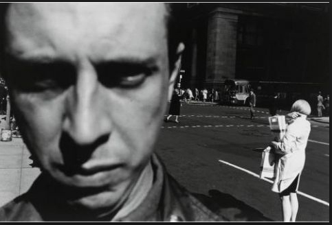
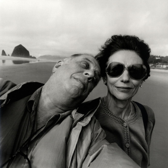
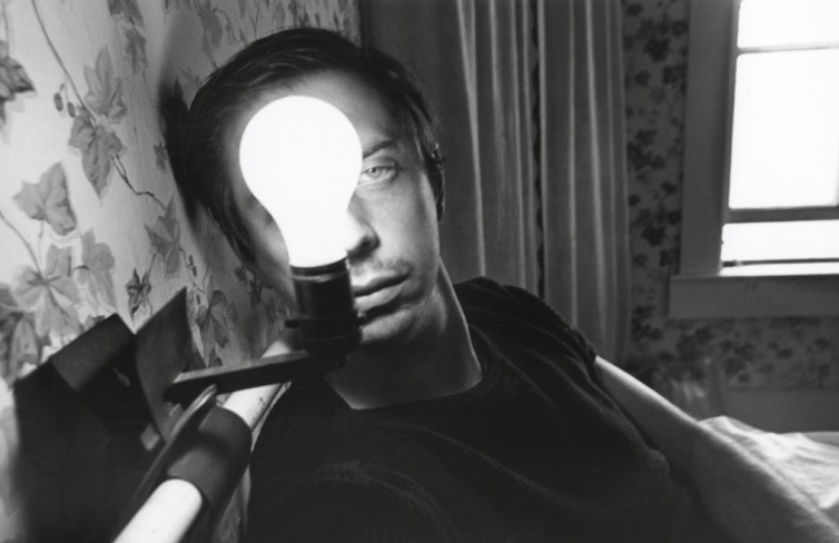
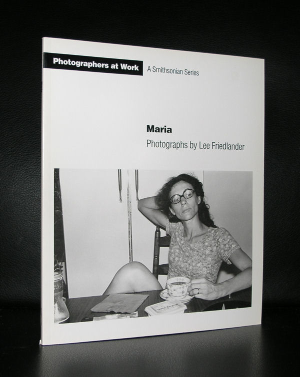
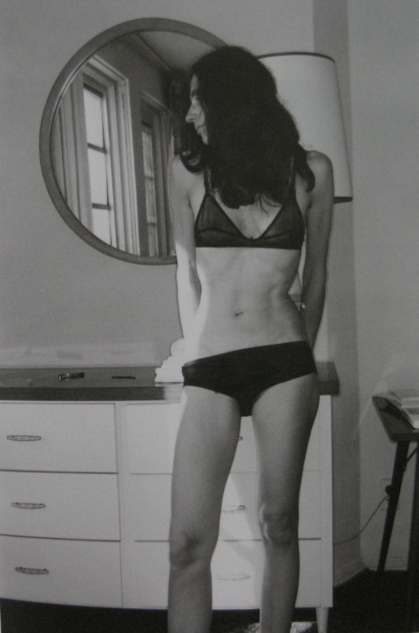
It was 10 years ago that i encountered a remainder stock of books published by the Smithsonian museum. Among them…. one title that immediately caught my interest, because its photographs were by Lee Friedlander. For me personally this is one of the very best photographers from last century and this title particularly was all about his wife MARIA. At the time of publication i did not know of any exhibitions on Friedlander, but i was so happy to have found this little stack of Maria books and the number of them ( over 20 copies), that the first ones i sold way to cheap. Over the years i sold many of them to different locations in the world.
What remains now are only 4 copies of which the last 3 are still for sale. One i will keep for my photo book collection and as a souvenir of the stack of Friedlanders i found, bought and sold.
A future classic and a highly collectable photo book. This book is available at www.ftn-books.com
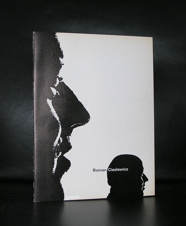
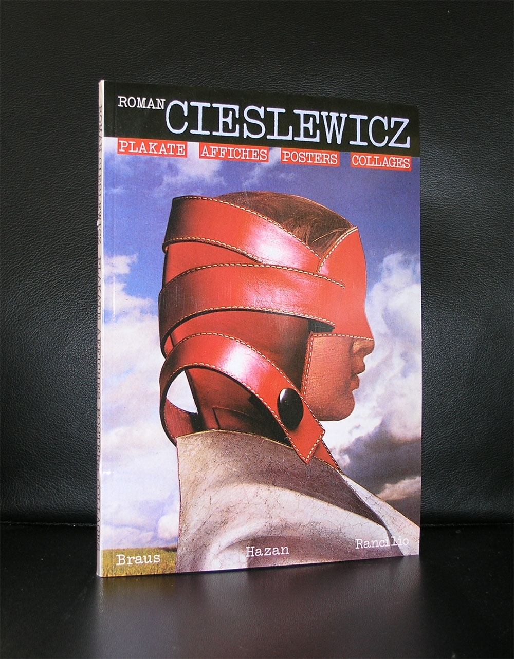
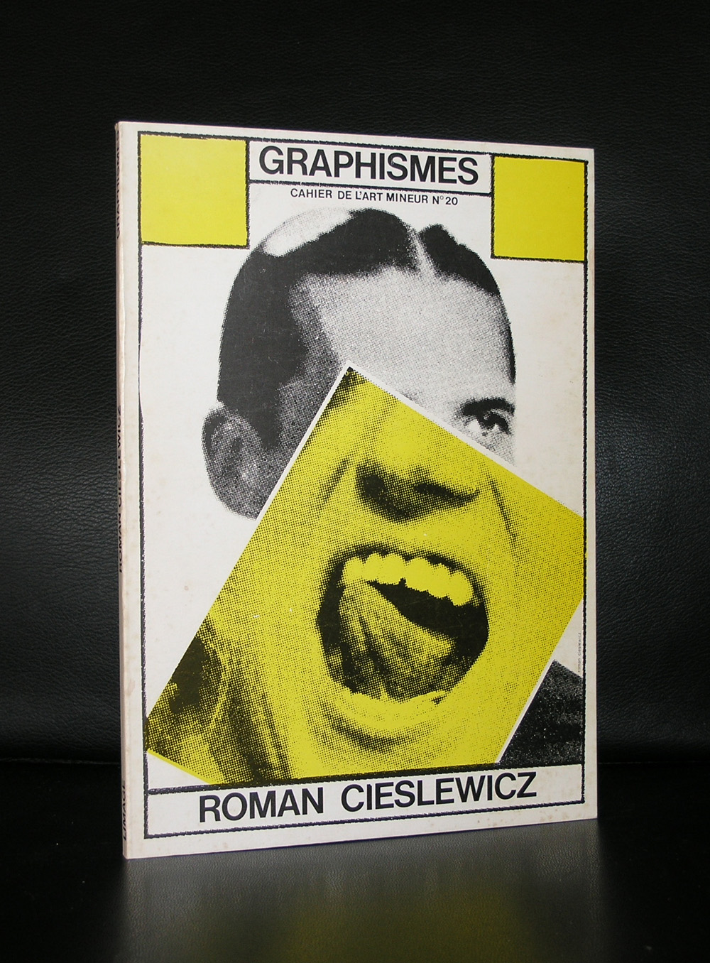
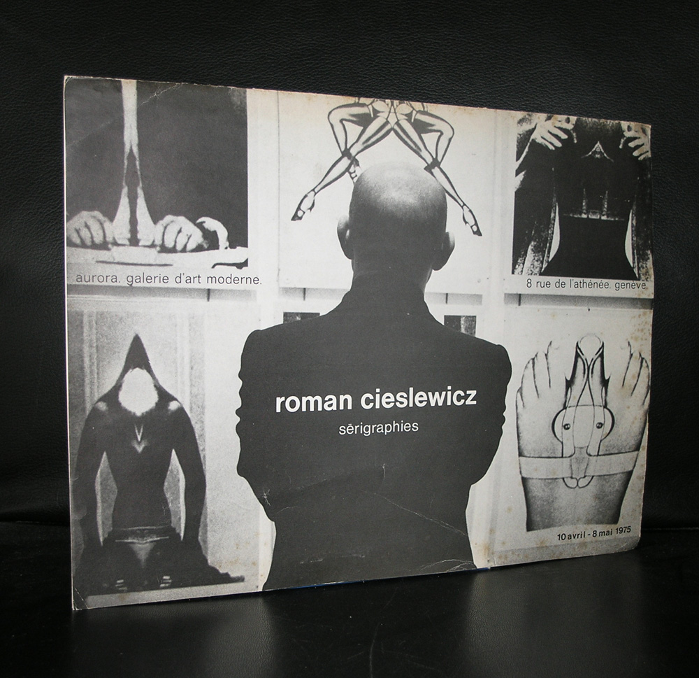
Another great artist who i forgot to mention in my blog on Topor is Roman Cieslewicz. Cieslewicz was a long time friend of Topor , lived in Paris too and rose to fame in the sixties with his graphic design for Vogue and Elle and the posters he designed for several other events.
For the dutch his work was presented for the first time in the Stedelijk Museum in 1973 . An excellent catalogue designed by Wim Crouwel was published on that occasion. The exhibition showed the strength of this artist, because the main part of the exhibition consisted of poster designs he had made in the previous 20 years.
Cieslewicz is one of those rare artist, who in his life was far less appreciated than in these days. Graphic art students from all over the world have inquired about his books in the last few years, which shows to me his star is on the rise and soon the books on Cieslewicz will become rare collectable items.
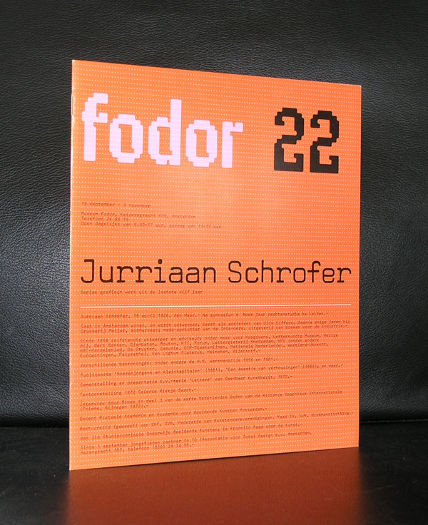
Yesterday we ate with our good friend Annemarie Schrofer and because of the beautiful paintings by her father on the walls, i remembered another member of the Schrofer family ……Jurriaan Schrofer.
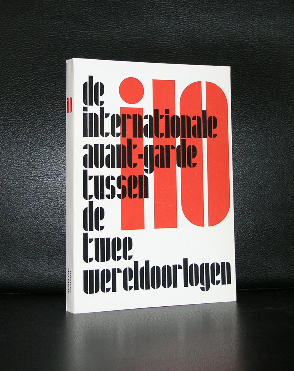
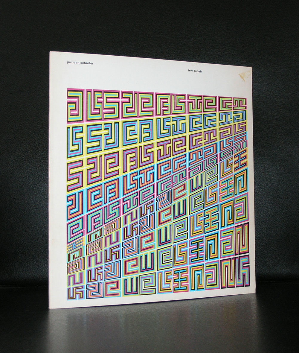
Born in 1926 and also a child of Annemarie’s father Willem Schrofer he would become one of the leading typography and graphic designers in the Netherlands. His works can be considered as “avant garde” design, thinking “out of the box” and soon he would develop his very own style . He originally wanted to become a film director, but ended being the assistant to Dick Elffers. This was the starting point of a splendid career as a graphic designer. For a few years in the seventies he was a member of Total Design, but soon followed again his own path. Highly original and recognizable are his designs. He was commissioned by many dutch important institutions and was appreciated for the designs he made for them, but his true recognition as one of the leading graphic designers from last century is only 25 years old. His works would become internationally known and appreciated. There now is a high interest in his works from leading British Graphic design schools and recently the same interest comes from the US.
Jurriaan Schrofer books can still be picked up at reasonable prices and for those interested in dutch graphic design, the designs by Schrofer are an absolute and quintessential part in the history of Graphic design and not to be missed in any collection. www.ftn-books.com
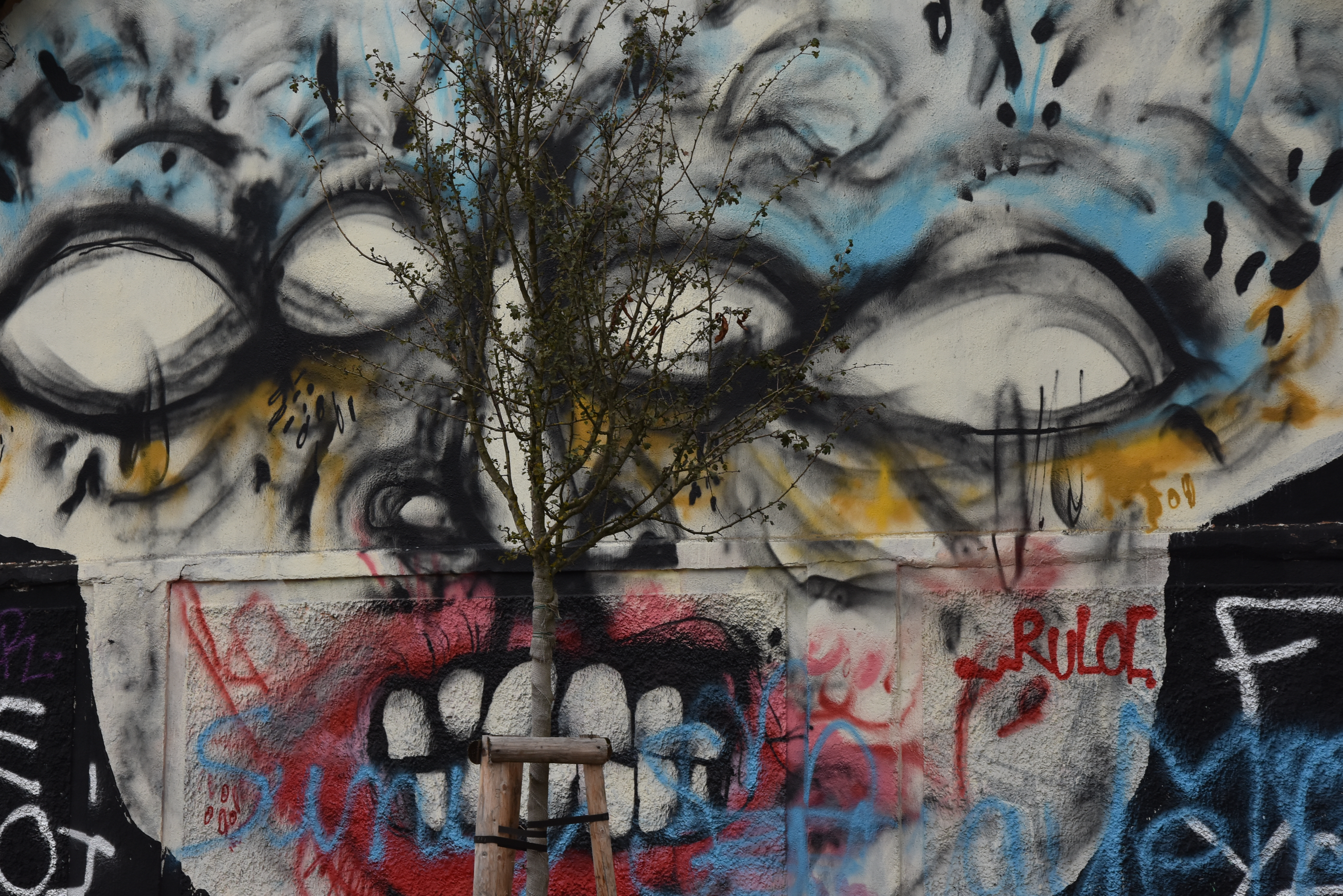
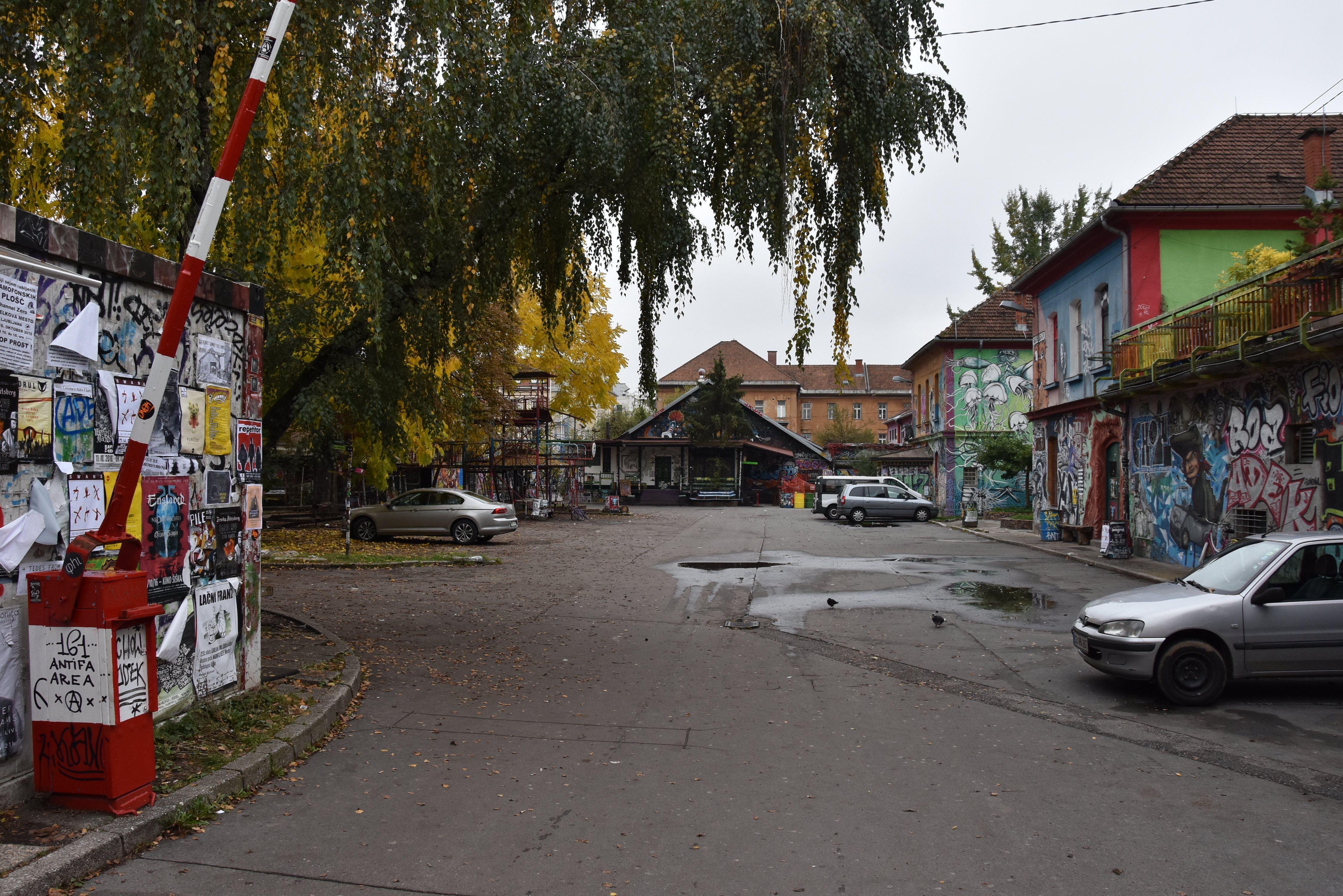
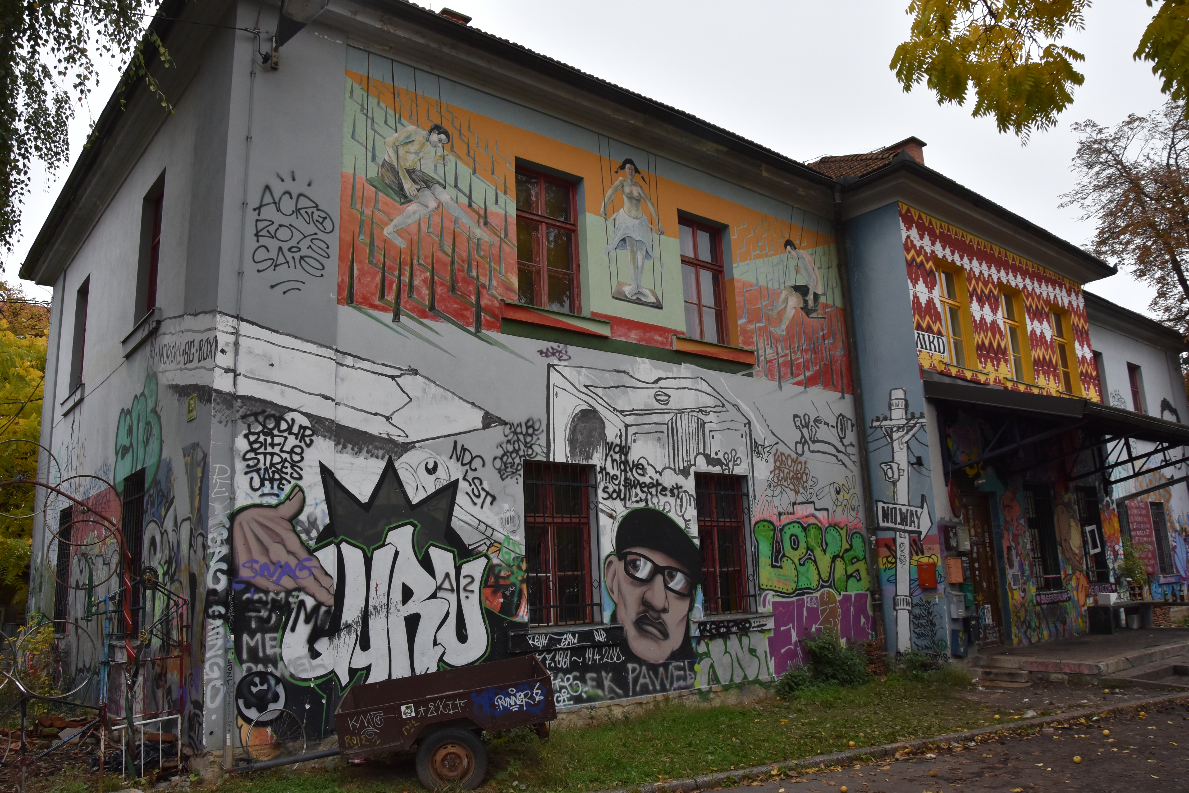
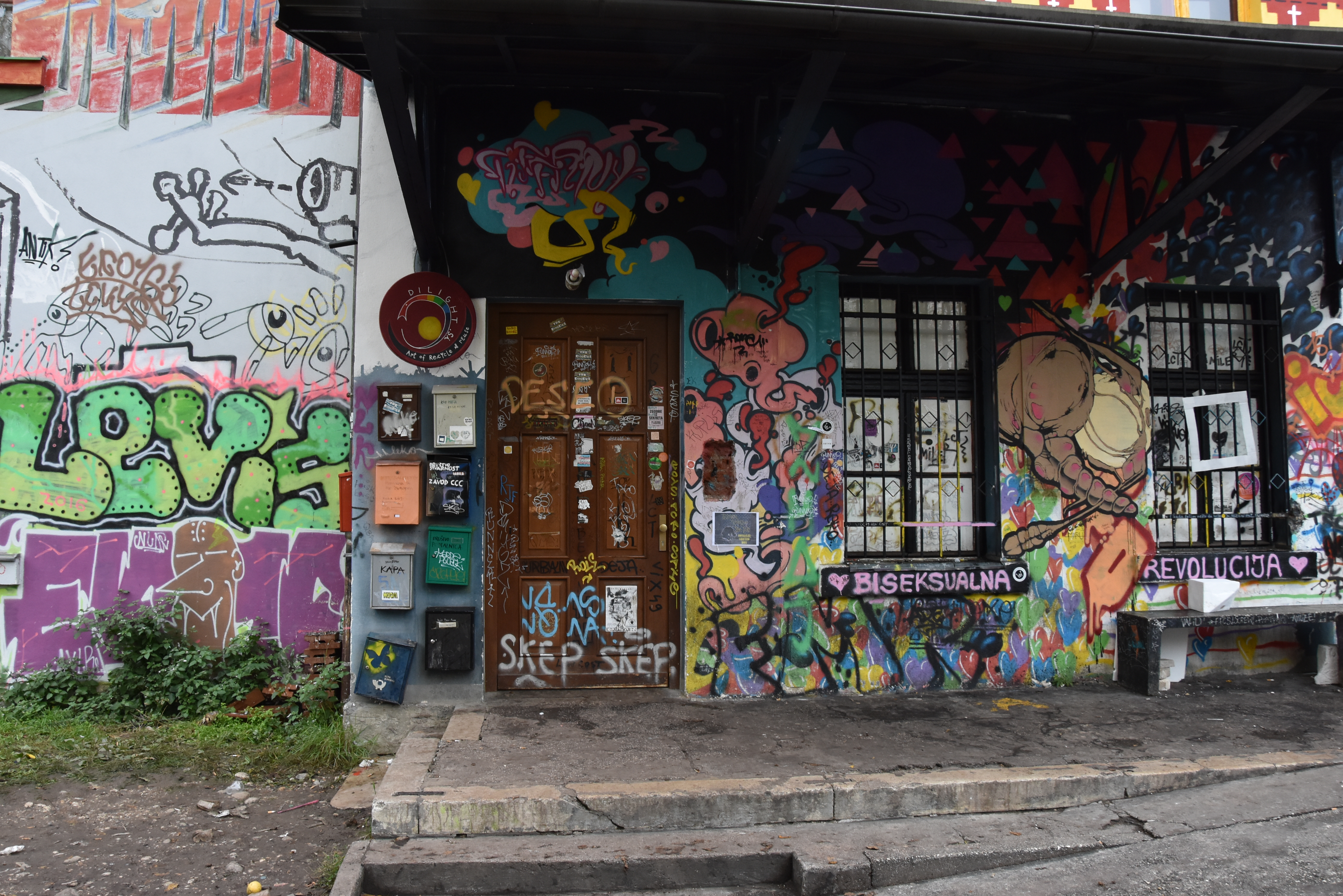
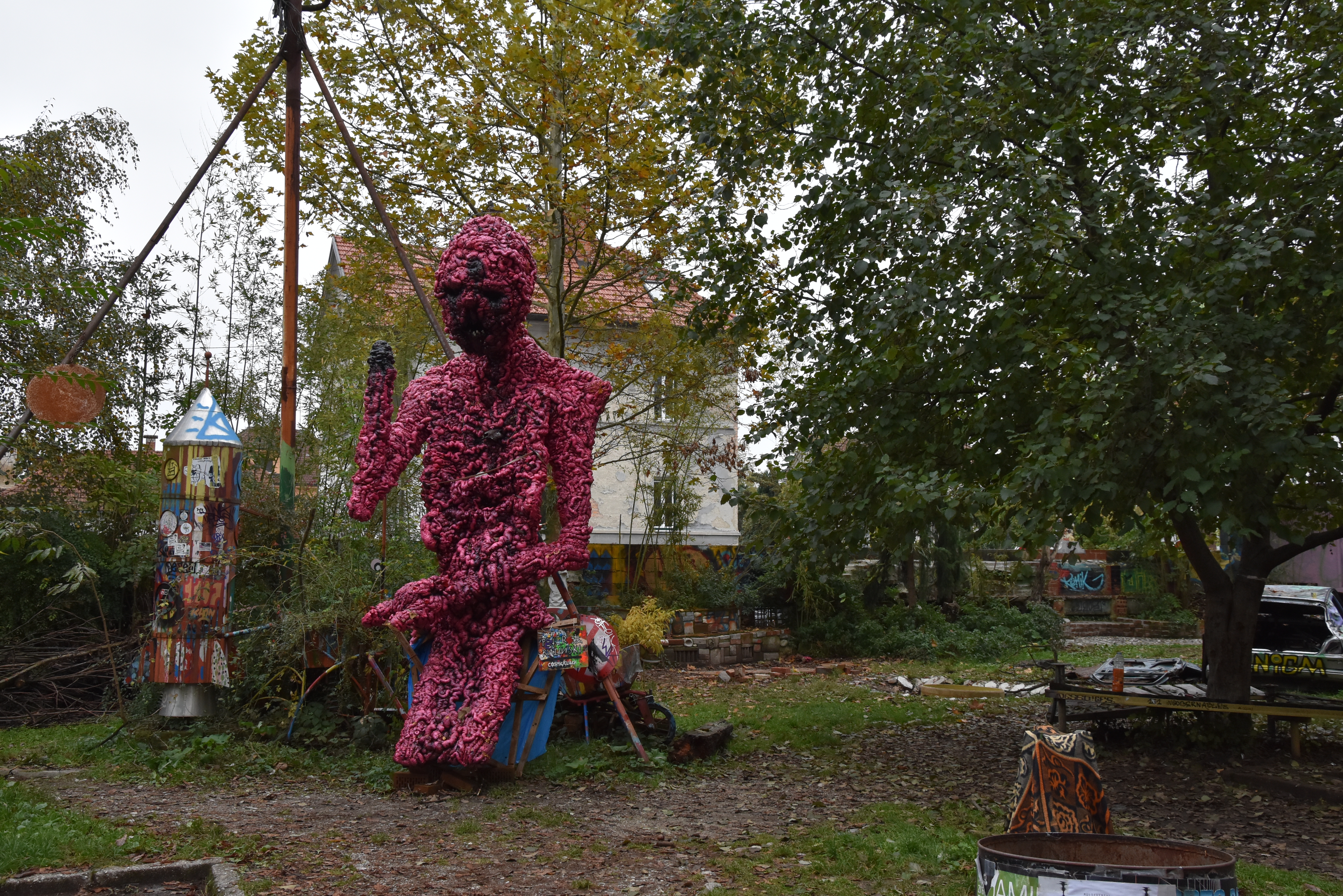
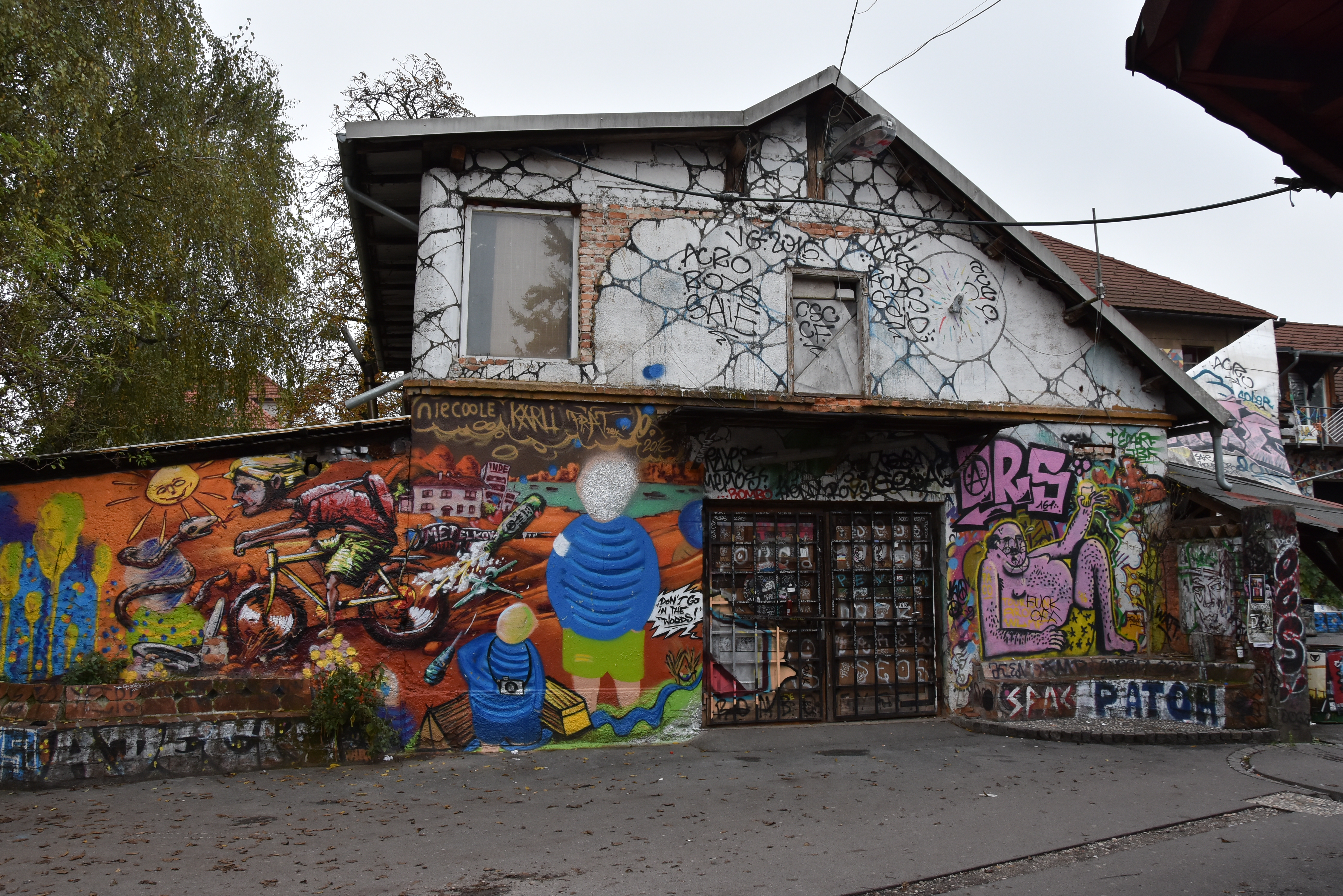
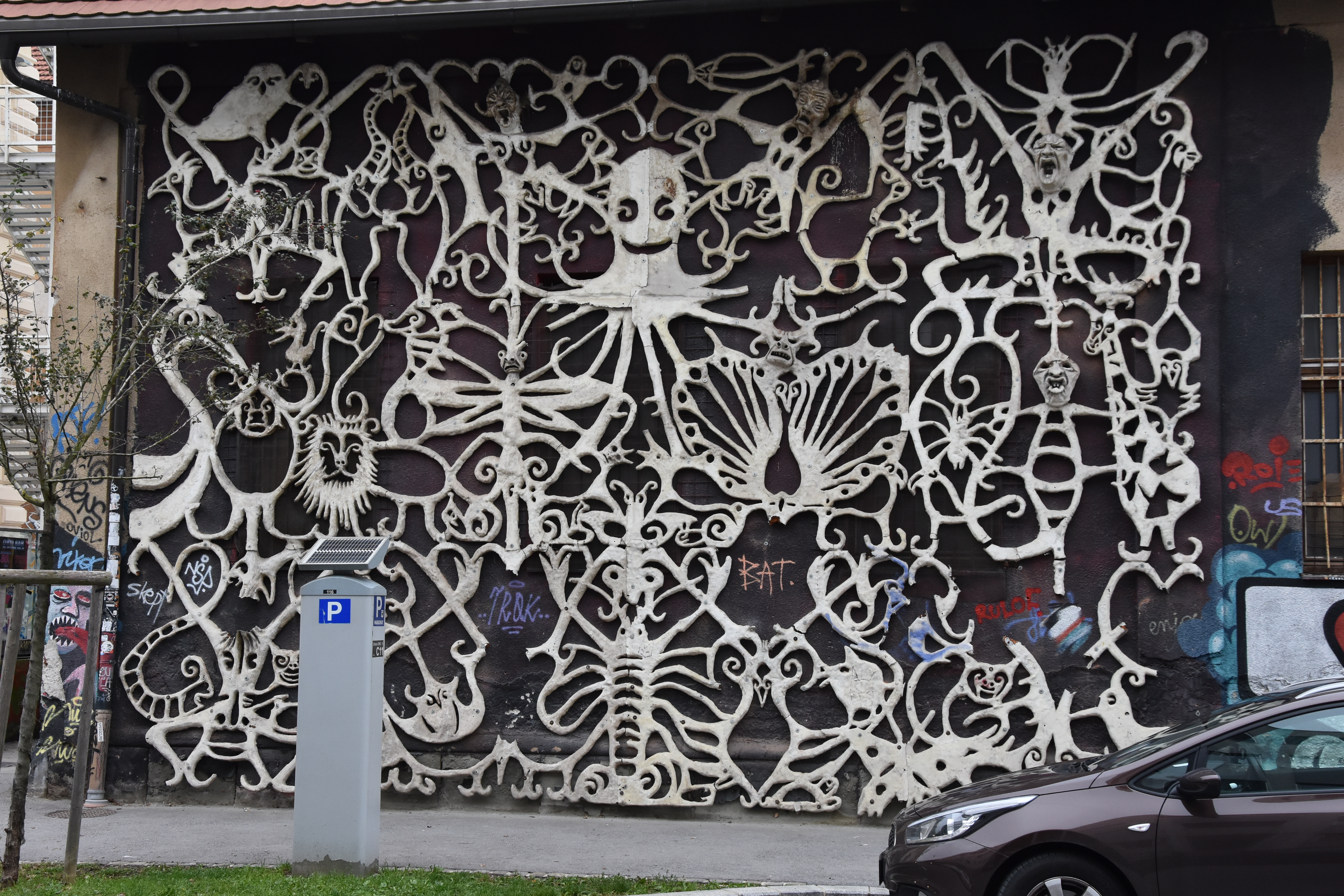
A few days no daily posting , because of a short holiday in a fascinating country…SLOVENIA. It takes only 2 days to drive there and enjoy one of the most beautiful sceneries in Europe. High mountains, rivers, castles and excellent food. An ideal mixture of ingredients to spent a week and enjoy everything this land has to offer. What about Modern Art…only one museum in Ljublana the MG+MSUM in the museum quarter, which has a nice contemporary art collection. But only 1 block away there is something which is not listed in the guides. A free haven of artists, living and working on approx. 2 ha and functioning like a small community. Paintings and sculptures everywhere and a great place to visit and absorb. Pictures tell a better story than words so i put some photos i took, with this blog. For Modern Art lovers this is not to be missed. So walk away from the centre canal to the North east ( about 15 minutes) and visit this place.
In my blog from Sunday you noticed that we visited the Gemeentemuseum Den Haag to have a look at the Riley CURVES exhibition. During this visit we walked the first floor of the museum with part of their permanent collection. Since the Bacon exhibition from 2001 , several painting are “on loan ” from other museums and they have now completed this room with a sculpture on loan from the Hauser & Wirth collection…and placed this in the same room as the Bacon’s….result….one of the most exciting and stunning Museum rooms i have ever seen.
Sometimes there are artists who look like brothers/sisters of each other, same approach to their subjects and this room is an example how closely both these artists are related in their art to each other. Here is the text the Gemeentemuseum published on their site www.gemeentemuseum.nl on Berlinde de Bruyckere.
Belgian artist Berlinde De Bruyckere (b. 1964) creates sculptures that reveal the human body and human life in all its frailty. Her installations of equine and human bodies evoke feelings of love and consolation, but also of terror and violence. The work is both emotionally immersive and provocative, regularly creating controversy. De Brucykere’s bitter-sweet images unite pain and suffering with a strong aesthetic appeal. Her Cripplewood presentation attracted great public attention at the 55th Venice Biennale. The Gemeentemuseum Den Haag acquired her sculpture Into One – Another II, To P.P.P., 2010-2011 in 2011 and is now about to hold a major retrospective of her work, much of it never previously exhibited in the Netherlands.
The human body and its visible suffering is the key theme in De Bruyckere’s whole oeuvre. We are now almost immune to images of suffering; the constant stream of ghastly pictures fed to us by the mass media has seen to that. Berlinde De Bruyckere seeks to restore our sensitivity to the suffering that is a timeless and universal part of the human condition. She makes us stop and look at it but leaves us free to make of her work what we will. In doing so, she unerringly explores the limits of the visual representation of physical and emotional pain.
De Bruyckere constructs her sculptures of wax, resin, rope and worn leather or textile and strings together separate wax casts to create single bodies. She is concerned solely with bodies; faces are concealed behind shocks of hair or cloths; heads are often completely missing. Using special pigments, she transforms wax into pallid skin with vague glimpses of blood, veins and contusions. Red patches and ‘wounds’ give the impression of a tortured body and suggest associations with the religious symbolism surrounding martyrs like St. Sebastian – a figure of great significance to Cripplewood. In addition to these religious elements, classical mythology also has a place in De Bruyckere’s work. Ovid’s Metamorphoses are a constant source of inspiration.
Horses are also an important symbol in her oeuvre, used primarily as a metaphor to express profound human emotions surrounding death and mortality.
In addition to her sculpture, the forthcoming exhibition will also feature drawings and early works in textile. De Bruyckere uses her drawings – often made in a combination of watercolour and gouache on recycled paper or cardboard – as exploratory studies relating to the themes of her sculptures. In this respect, she frequently seeks inspiration in the bodies of dancers. The development of ideas with dancers in the studio is a technique of great importance to her and has resulted in various wax sculptures, as well as a number of different series of drawings. These series are not preparatory studies, but function as works of art in their own right, underlining the themes that together form the leitmotif of her entire oeuvre. De Bruyckere’s sketches, drawings, watercolours and sculptures are all interlinked and together constitute a single ‘body of work’.
De Bruyckere trained at the LUCA School of Arts in Ghent. Her work was first exhibited in the Italian Pavilion at the 2003 Venice Biennale. This led to immediate international recognition and her work has since been acquired by major museums, foundations and private collectors around the world. She returned to Venice in 2013 to represent her own country in the Belgian Pavilion.
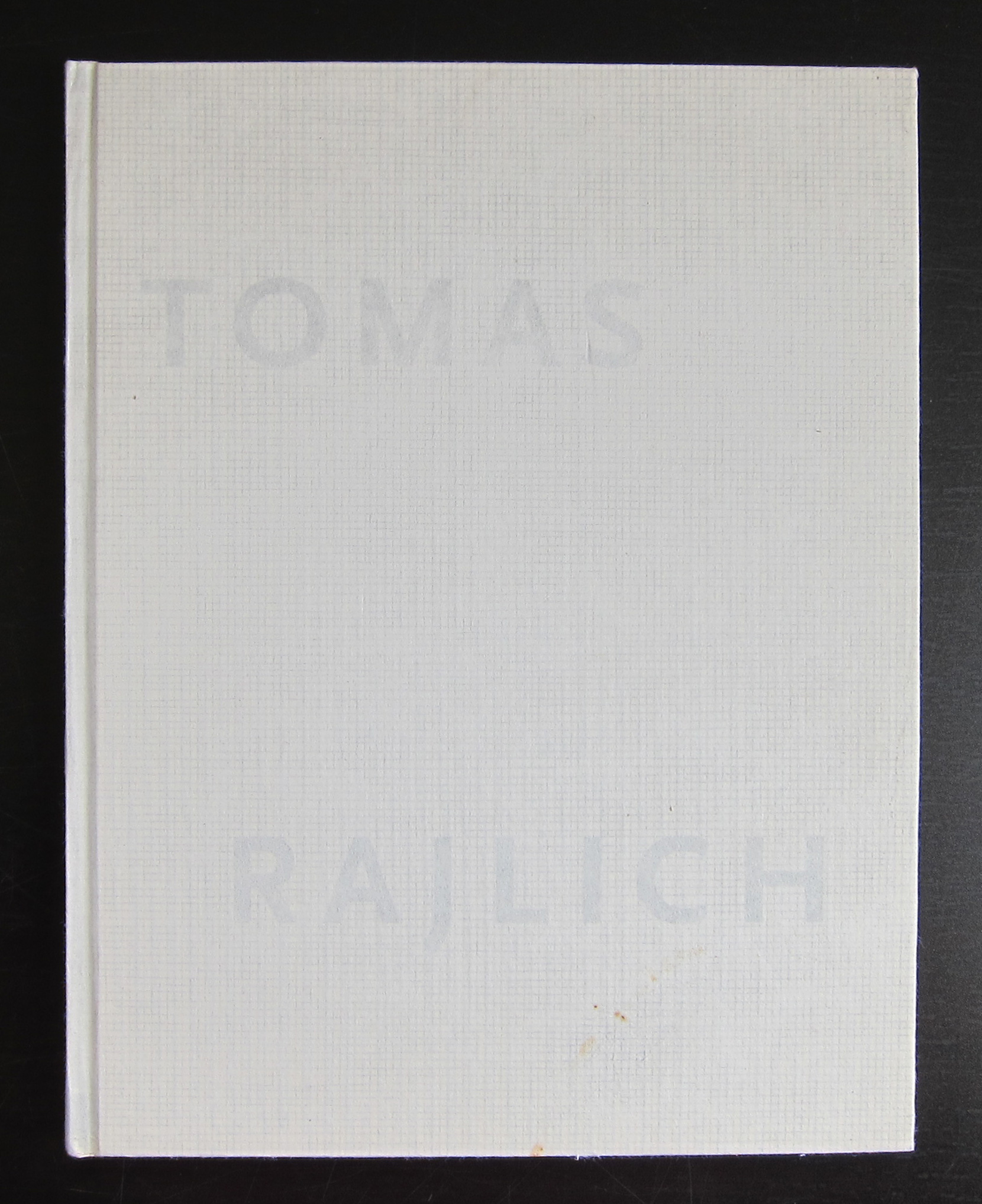
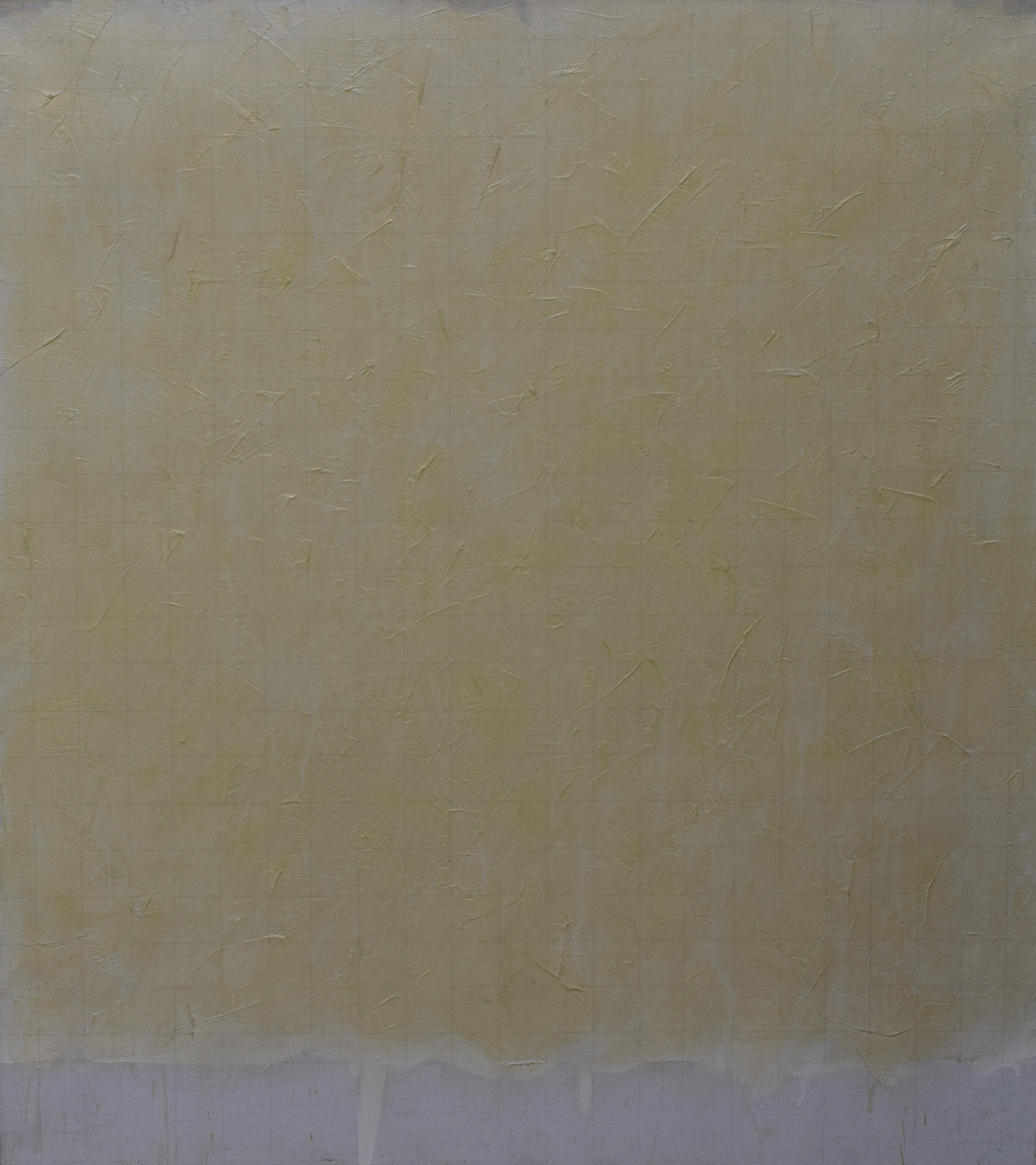
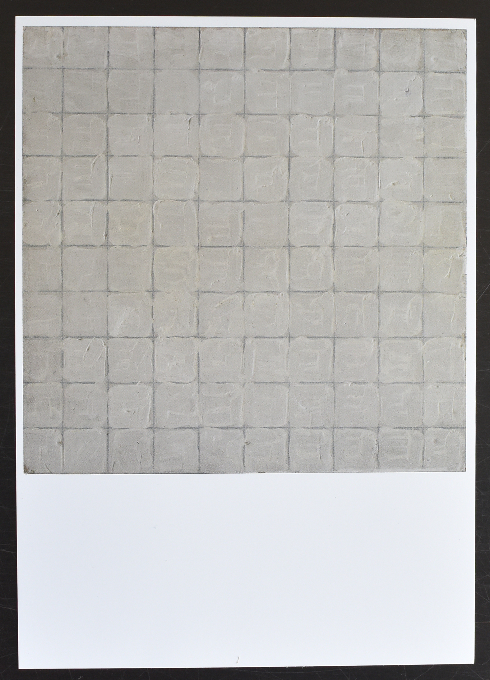
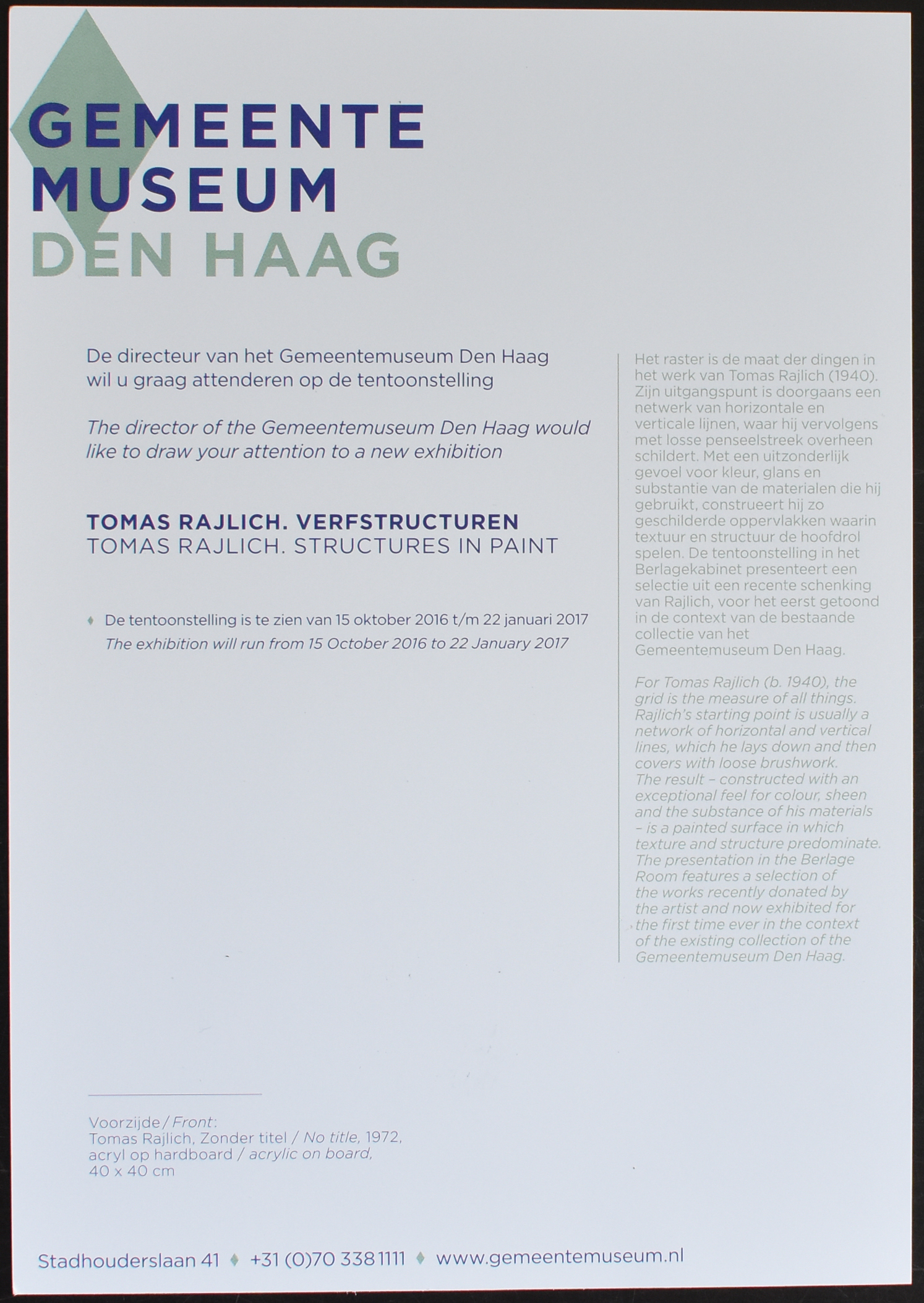
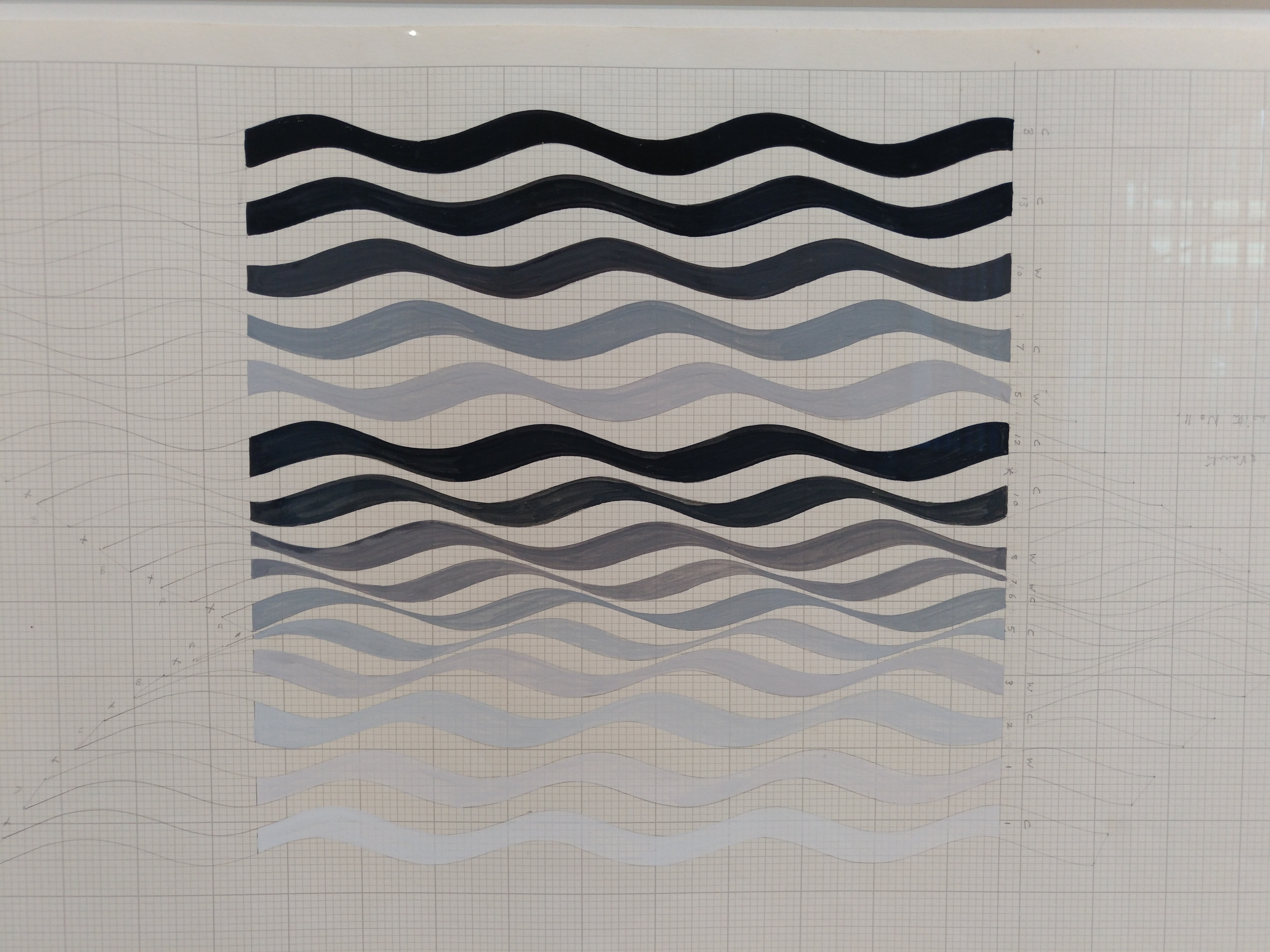
Just a short blog to let you know that a large retrospetcive on Tomas Rajlich will be opened on the 15th of October 2016 which will be on show until 22nd January 2017.
Tomas Rajlich, a minimal painter for whom the grid is the measure of things. Rajlich’s starting point is usually a network of horizontal and vertical lines, which he lays down and then covers them with loose brushwork. The result – constructed with an exceptional feel for colour, sheen and the substance of his materials- is a painted surface in which texture and structure predominate.
The exhibition is made partly with works that Rajlich recently has donated to the collections of the Gemeentemuseum.
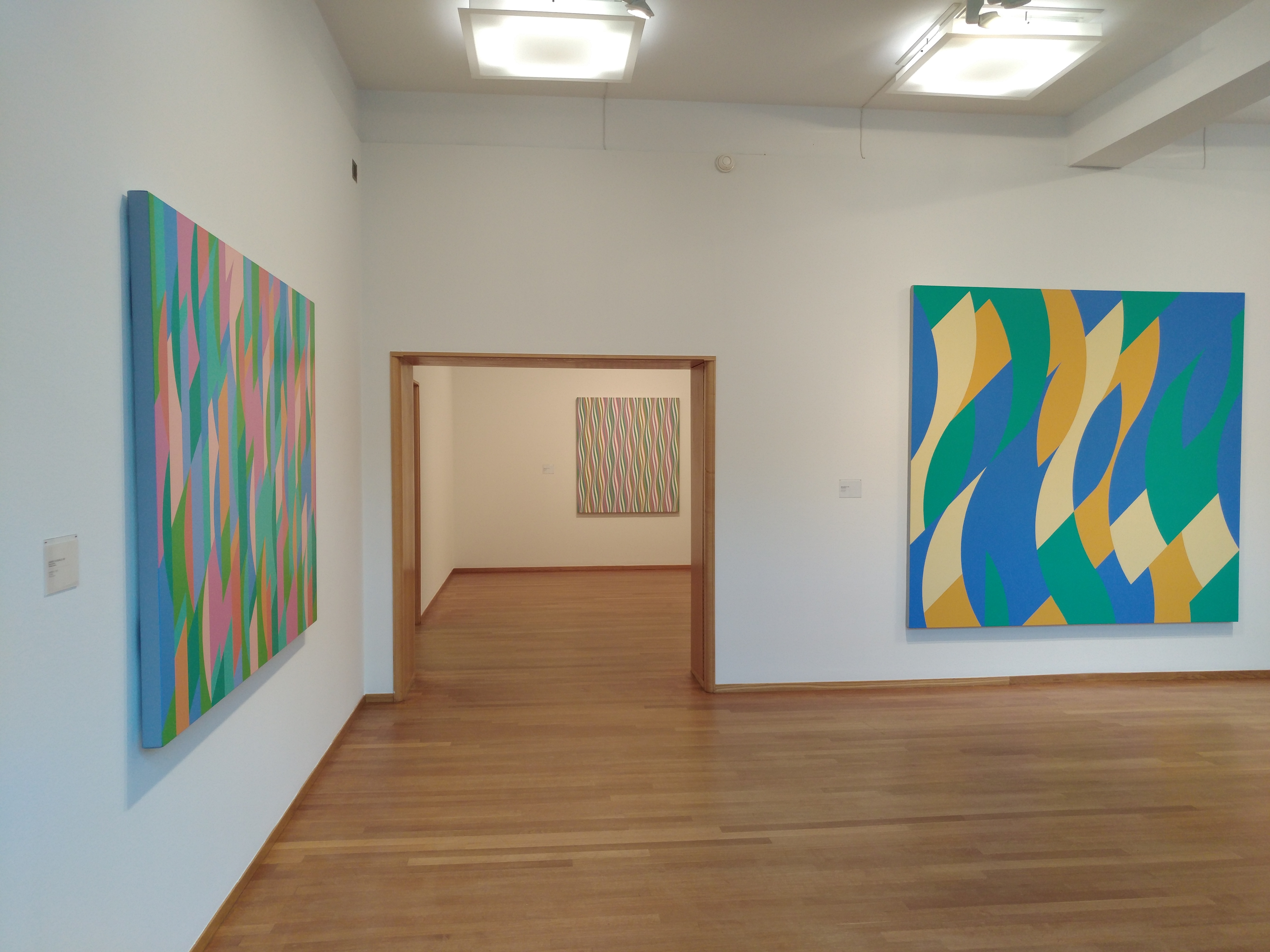
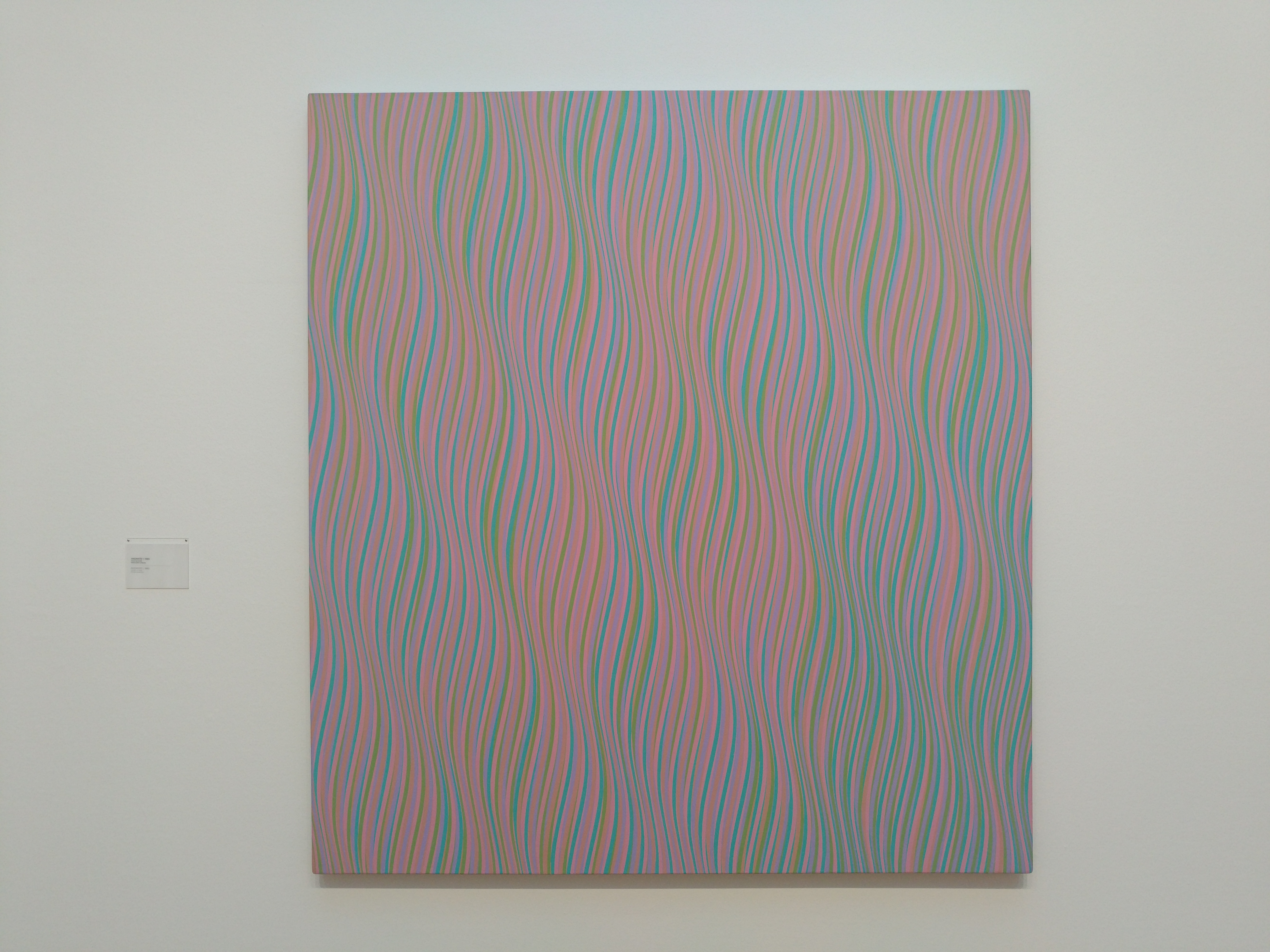
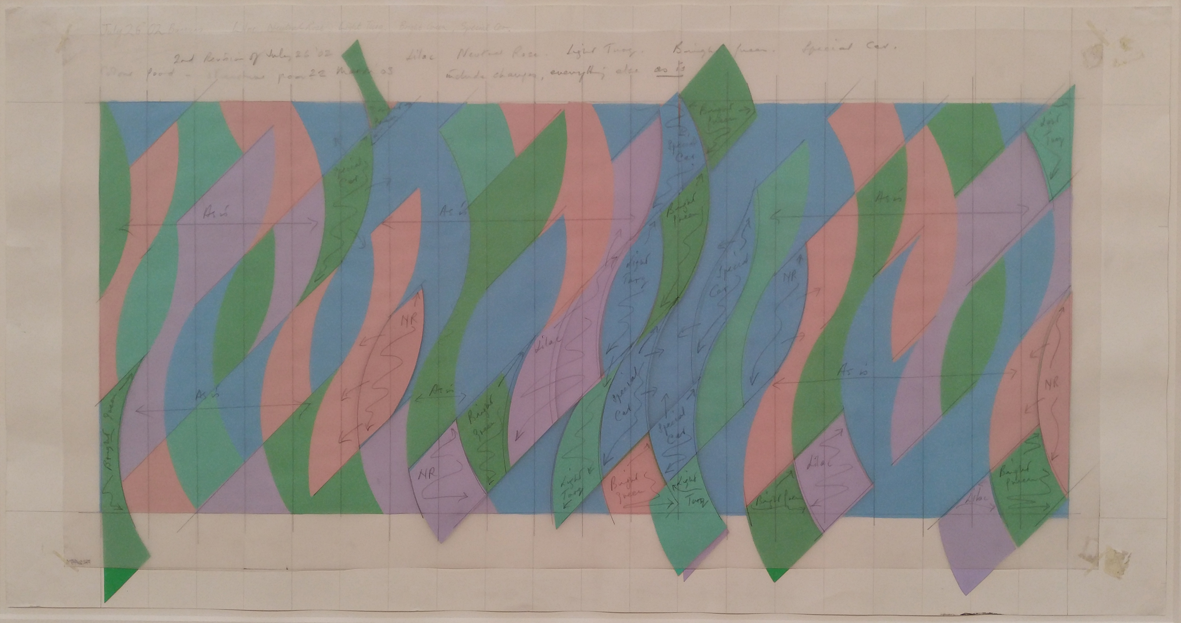
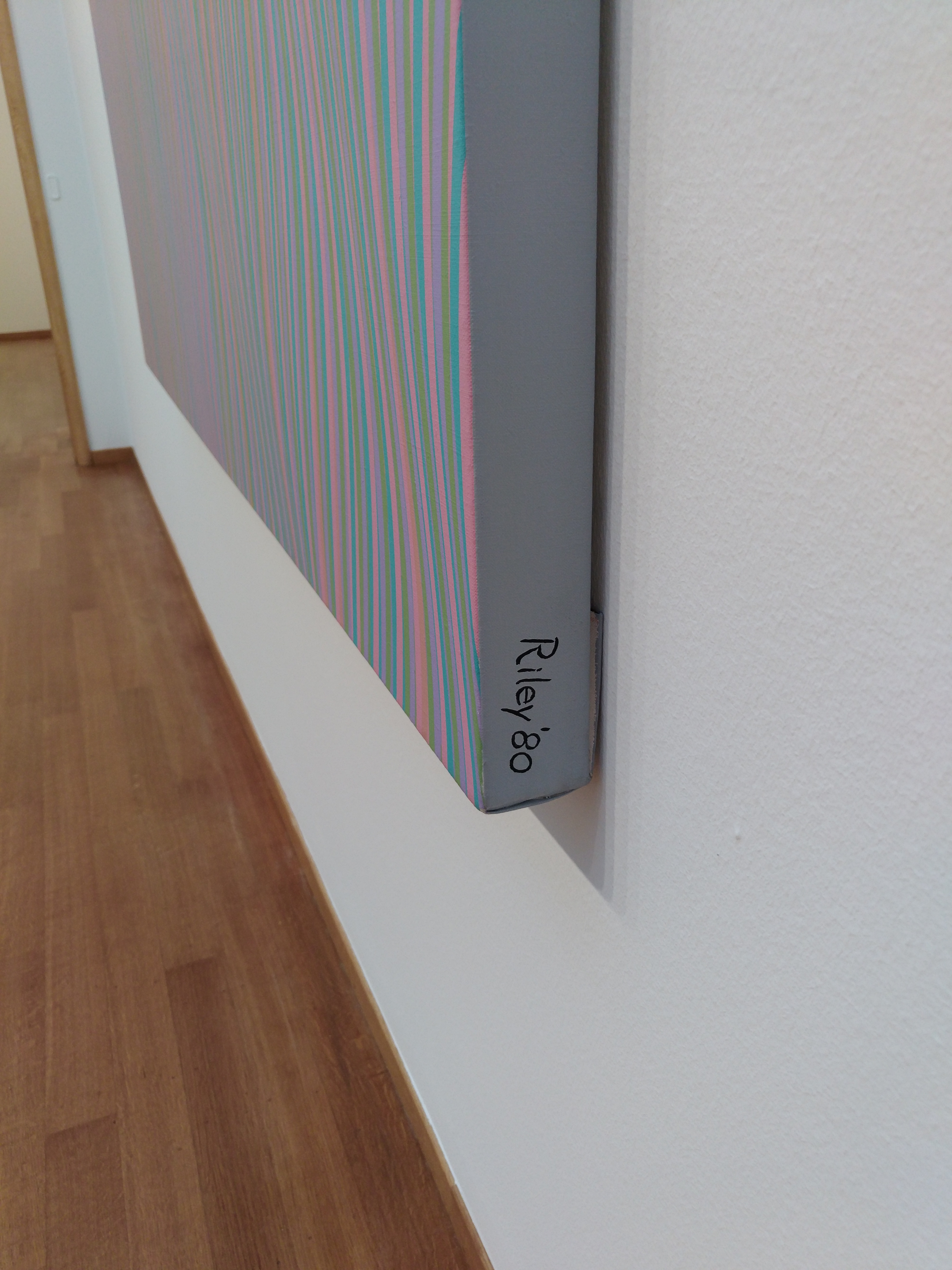
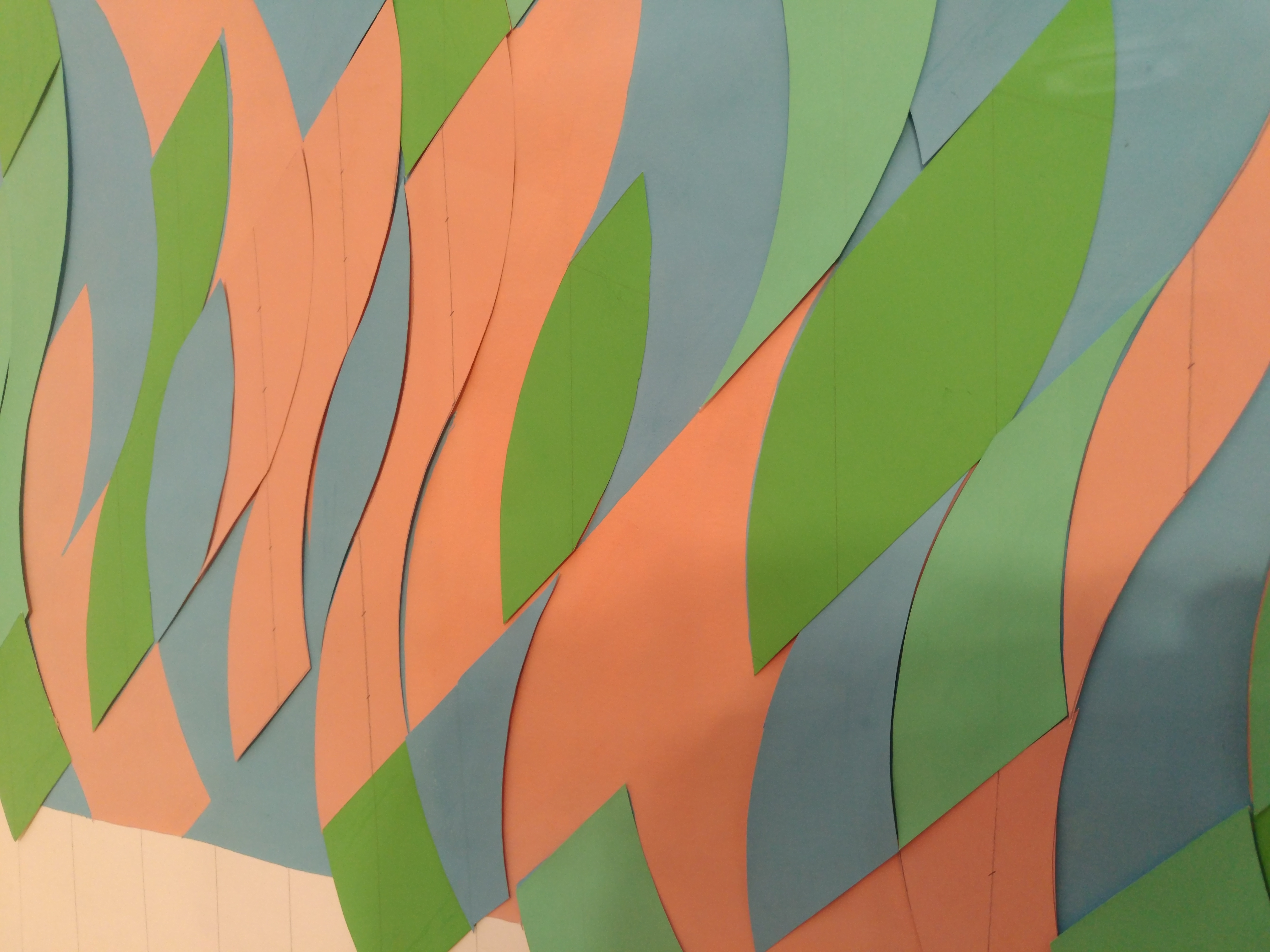
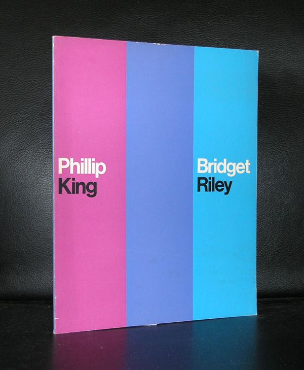
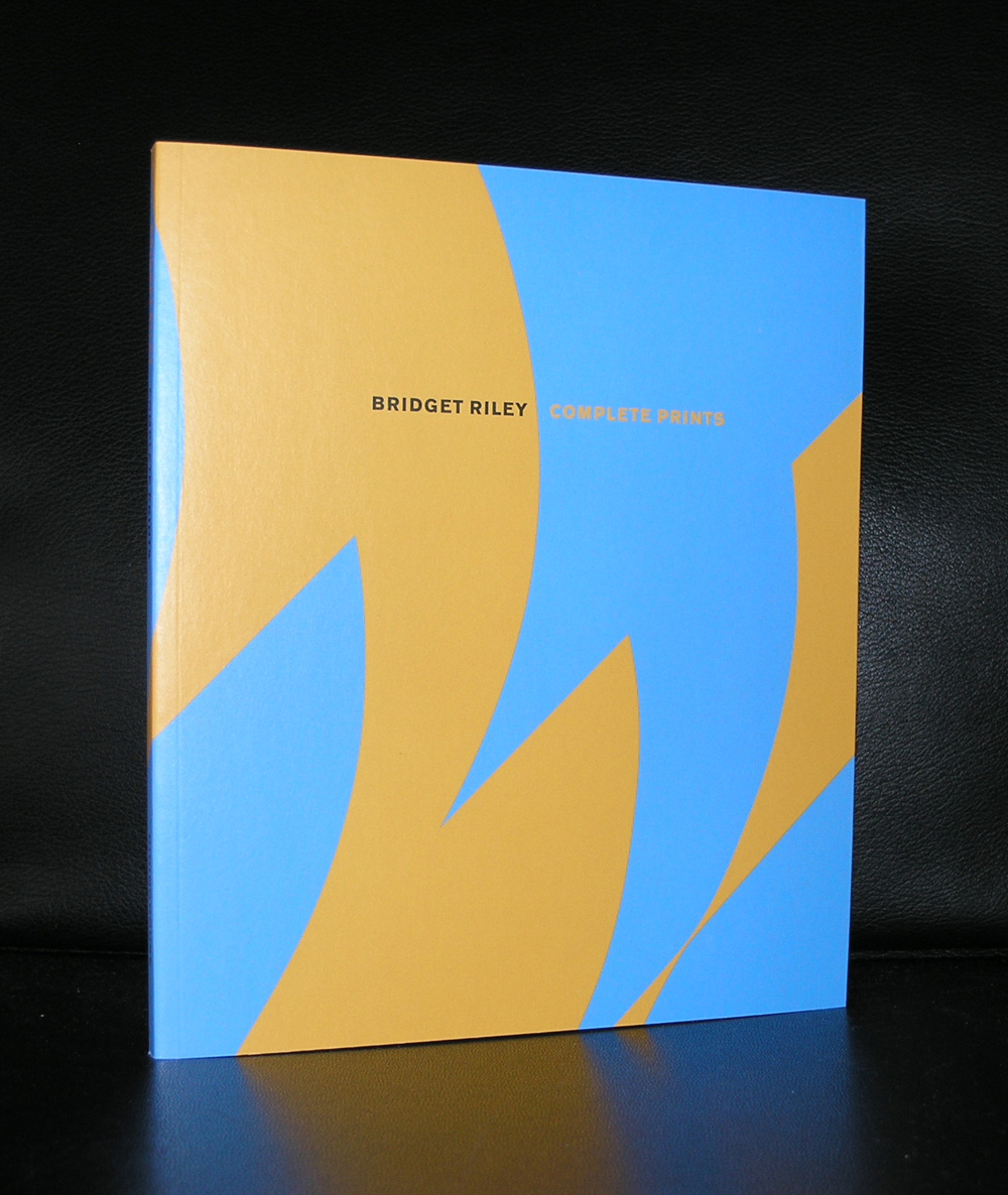
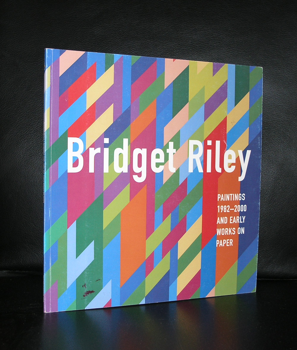
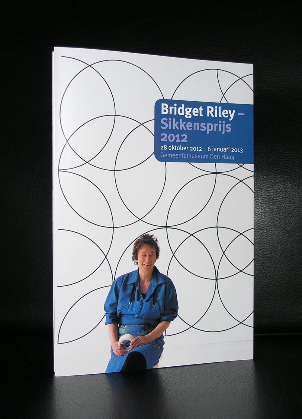
Yesterday we visited the exhibition of Bridget Riley in the Gemeentemuseum Den Haag. ( the exhibition is till open until the 15th of October 2016).
A fascinating show on the Curved paintings she made from the early sixties until 2014. Paintings which are extremely detailed painted and very well thought out. The sketches and colored cardboard models show the way in which Riley makes these projects from idea into a large canvas. Walking through the exhibition ( yes passing these paintings) shows the effect these patterns have on your eyes. Waves and curves begin to dance before your eyes and show that a still painting can have the effect of movement in your perception. Fascinating to discover this Optical illusion and certainly very effective Op Art . Riley stayed true to this way of painting and did not produce many of these paintings over the years. These paintings take a long time to paint, but when they are ready they are all masterpieces.
Her first solo exhibion she had at the Gallery One in London in 1964, after that she was invited for the Biennale in Venice and het break through exhibition ” The Responsive Eye” in the Museum of Modern Art in 1965.
Her works can be found in Modern Art Museums all over the world, but the Tate modern has the largest collection of them.
Look at the pictures i took at the exhibition and get an impression how she meticulously prepares each new painting. www.ftn-books.com has some nice early Riley titles available including the leperello which was published on the occasion she received the Sikkensprijs in 1992.
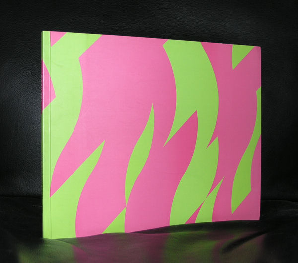
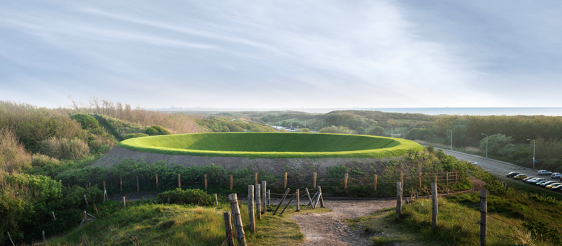
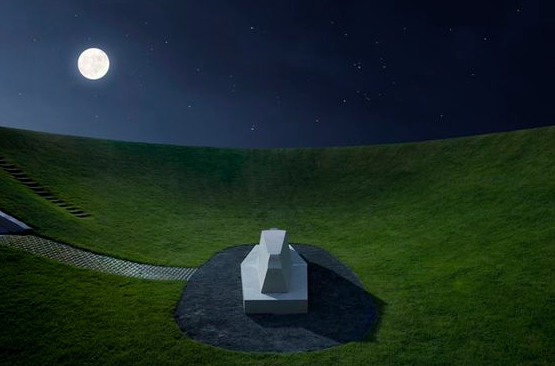
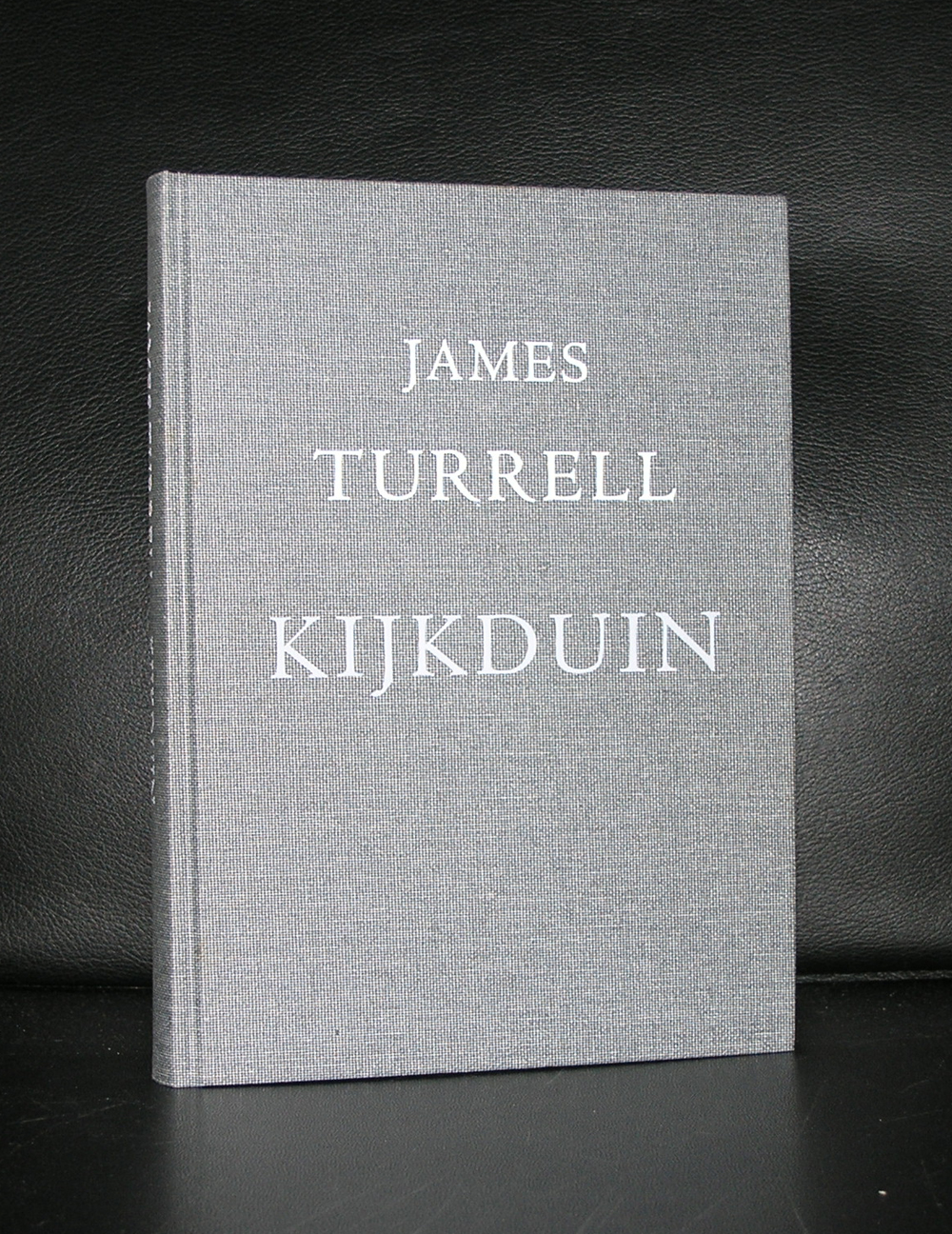
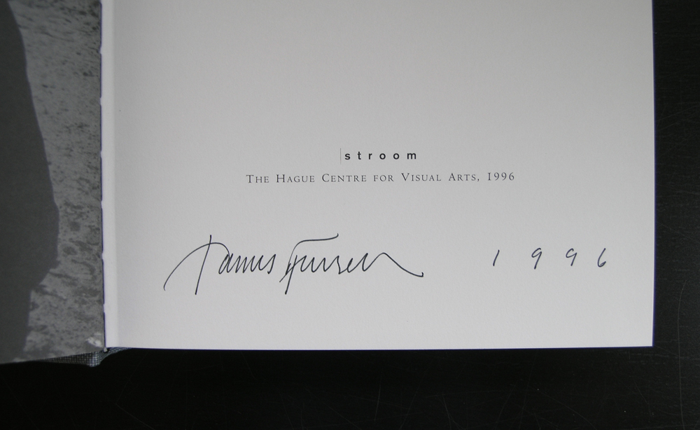
Nearby the city of Den Haag, close by the beach of Kijkduin you can visit one of the most important works of art in the Netherlands. Stroom has commissioned James Turrell some 20 years ago to realize a Turrell masterpiece in the dunes of Kijkduin titles CELESTIAL VAULT. You can enter through a tunnel a beautiful shaped bowl covered with grass , with in the middle a stone bench, which functions as a bed. When laid down, you can experience the serene surroundings and look at the sky, which of course is always different. Dutch landscapes are renowned for their skies and because of the focus on the sky when you are lying down you can experience this for the full 100%
An absolute must for the Turrell admirers and good to know that the CELESTIAL VAULT has been restored to its original splendor some 5 years ago.
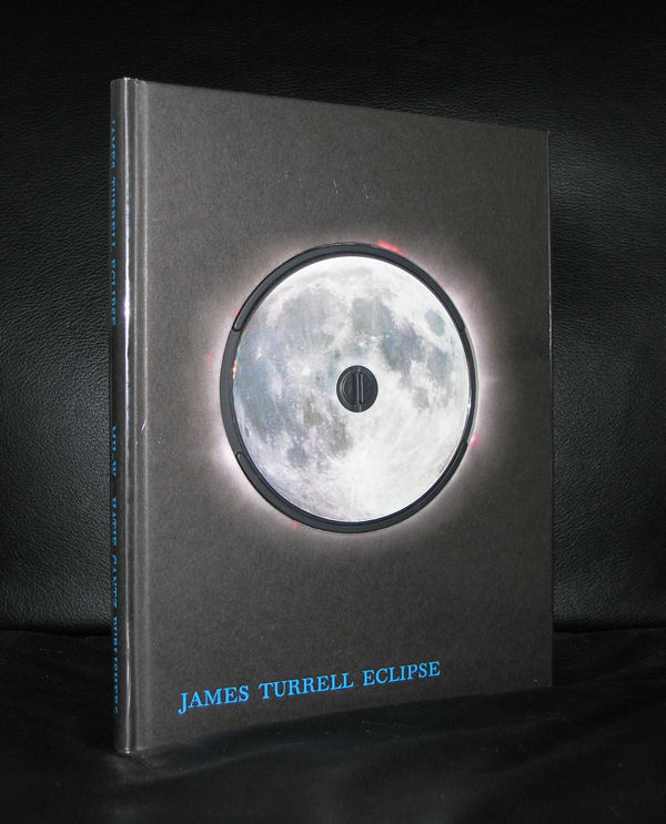
www.ftn-books.com has some nice titles on Turrell including the one on this masterpeice in the dunes. This one is signed and from a limited signed edition. Beautiful publication and today for the special price USD 150.00
The title sounds like a sequel to a popular horror movie, but it isn’t.
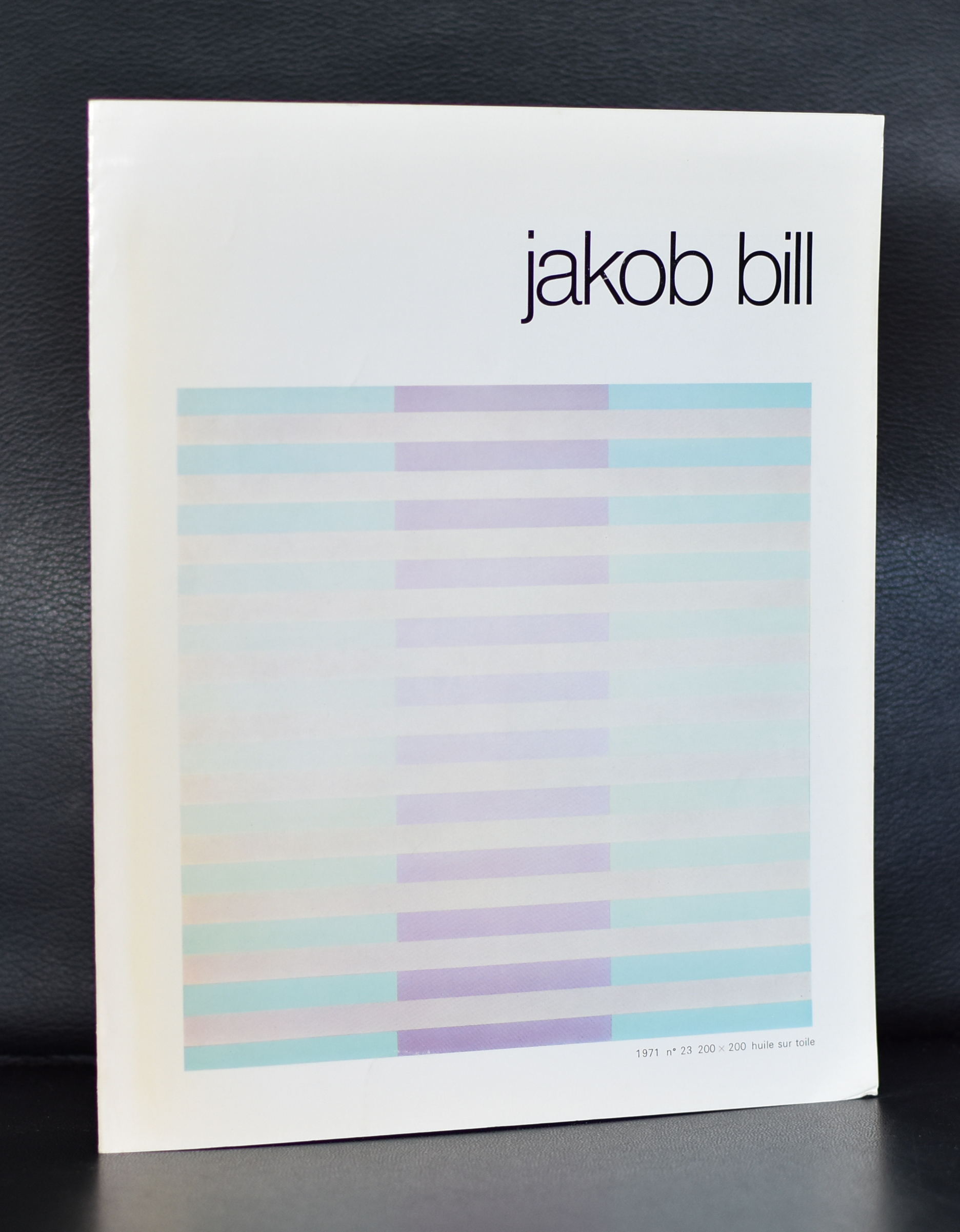
Somehow i have developed a liking for Swiss contemporary KONKRETE artists. Almost all are constructivists and Richard Paul Lohse and Jakob Bill are two of them. This time i will blog on Jakob Bill the son of the famous Max Bill and belonging to the group of Zurich Konkrete Kunst.
Outside Switzerland and Germany , Bill is not very well known, but when you visit the collections in Switzerland you encounter many works by Bill. The Zurich Museum/ Haus Konstruktiv organized some exhibitions with Bill, but his most important major exhibitions were all in Swiss Museums . Except for one…..Organized by one of the best galleries in the world. Galerie Denise Rene organized an exhibition in 1972. Denise Rene was the perfect gallery for an artist like Bill, they already represented great artist like Vasarely, Arp., Agam and Jesus Rafael Soto. Bill fits in perfectly. Perhaps this exhibition was a step forward for the popularity of the works by Jakob Bill, but still the artist is not very well known outside Switzerland and certainly deserves better.
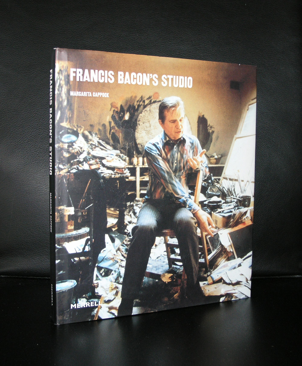
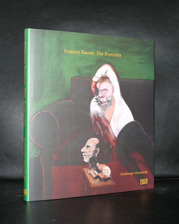
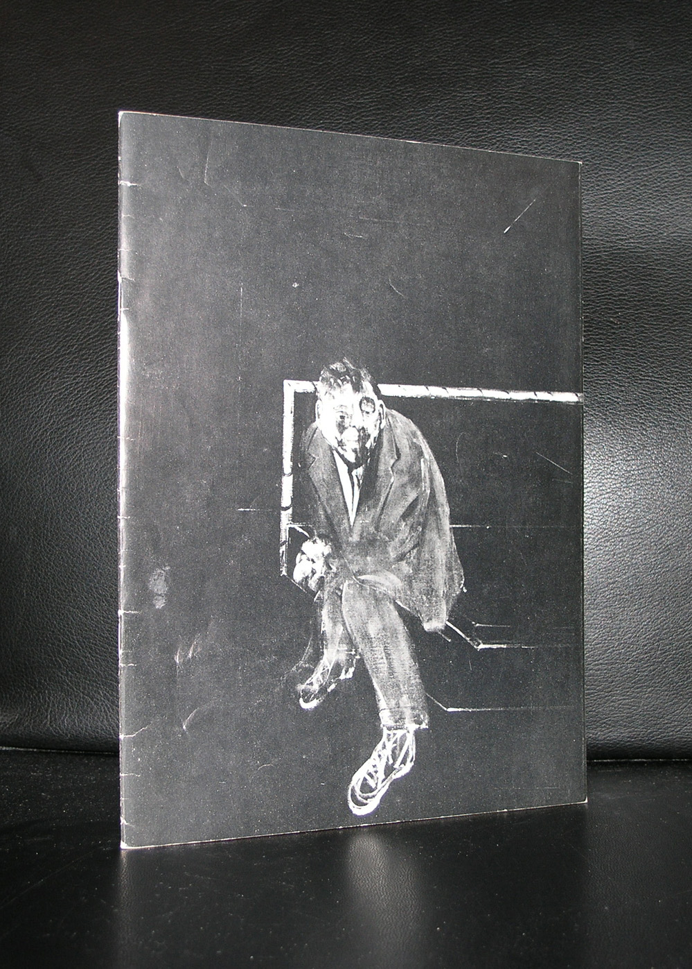
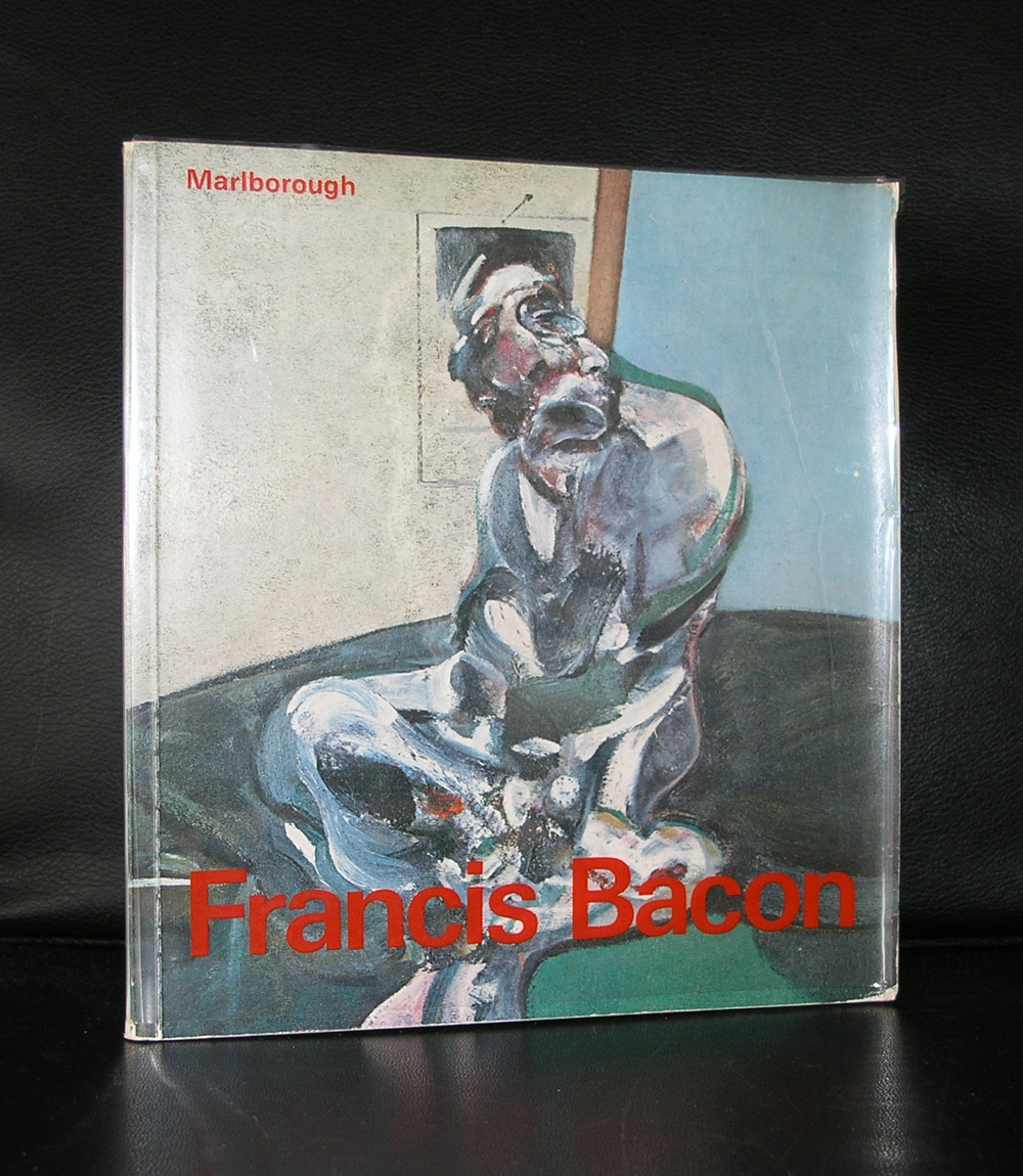
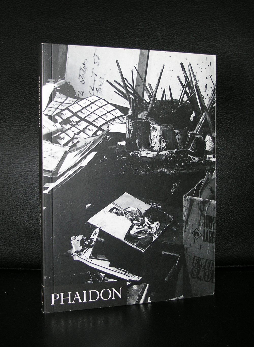
If you ask me which artist was represented with the most beautiful and best catalogues published for every exhibition organized with his works…. the answer is Francis Bacon.
Oversized catalogues with several hundreds of pages, excellent print quality and because of its content in many cases with multiple fold out pages to show Bacon’s Triptych’s in the best possible way outside a museum.
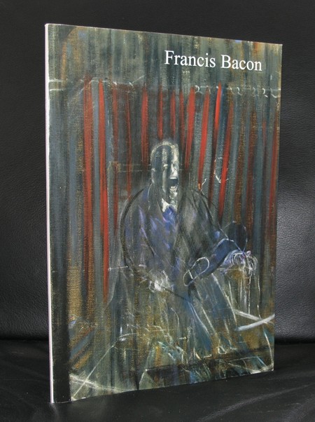
I followed Bacon closely because in 2001 the Gemeentemuseum organized its most expensive and logistically one of the most difficult exhibitions ever ….the one on Francis Bacon. The plan was to print the catalogue in Singapore, but because of a promised book publication to the former director, he decided for a dutch publisher. An initial publication run was set in relation with the expected number of visitors. Soon after opening it proved a wrong estimate, because fortunately, the works by Bacon proved to be far more popular than expected. 3 editions of the catalogue were printed during the exhibition and in total almost 8.00o copies were sold . A huge commercial succes, but even more important a great succes for Bacon as one of the leading modern artists from the 20th century.
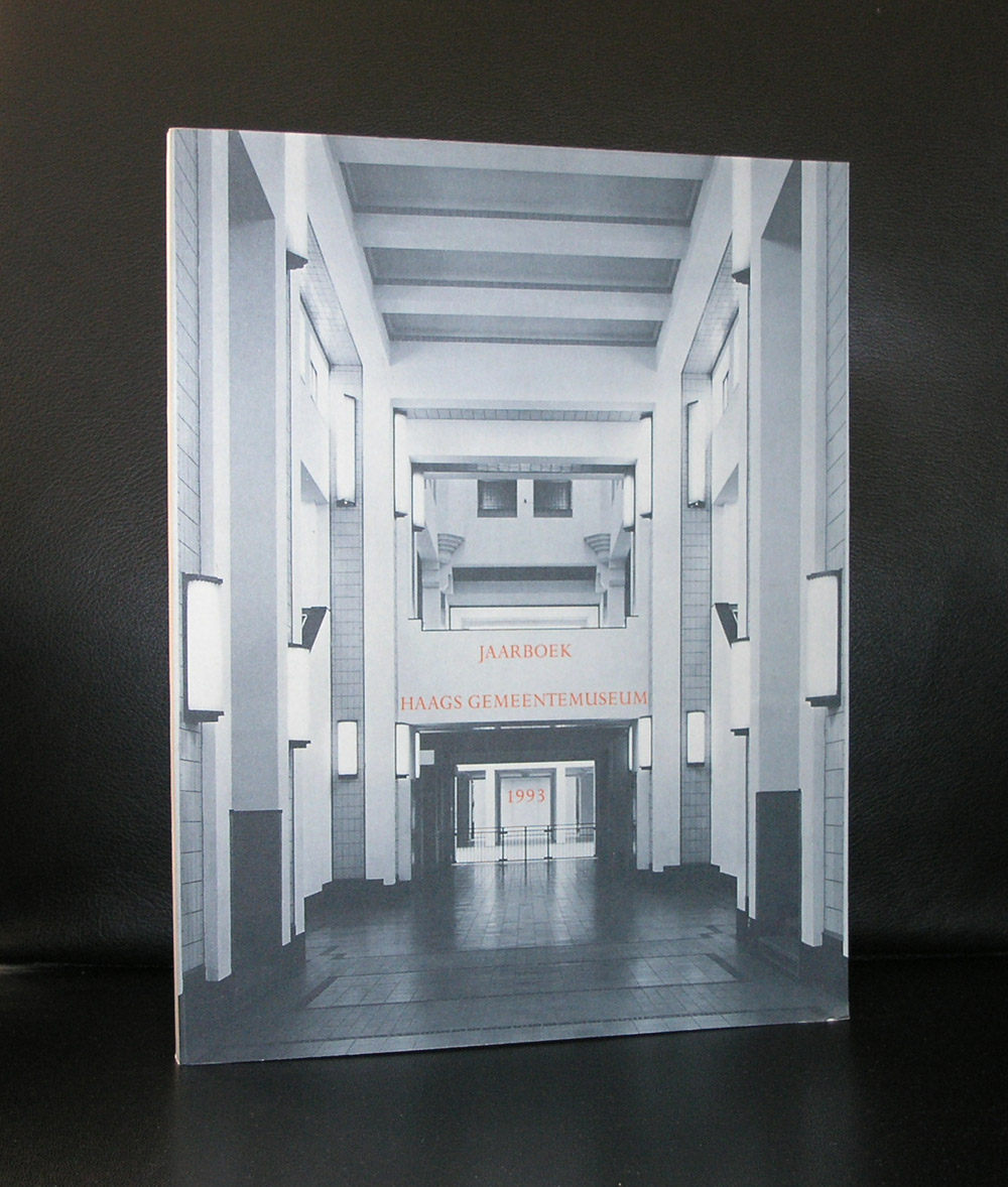
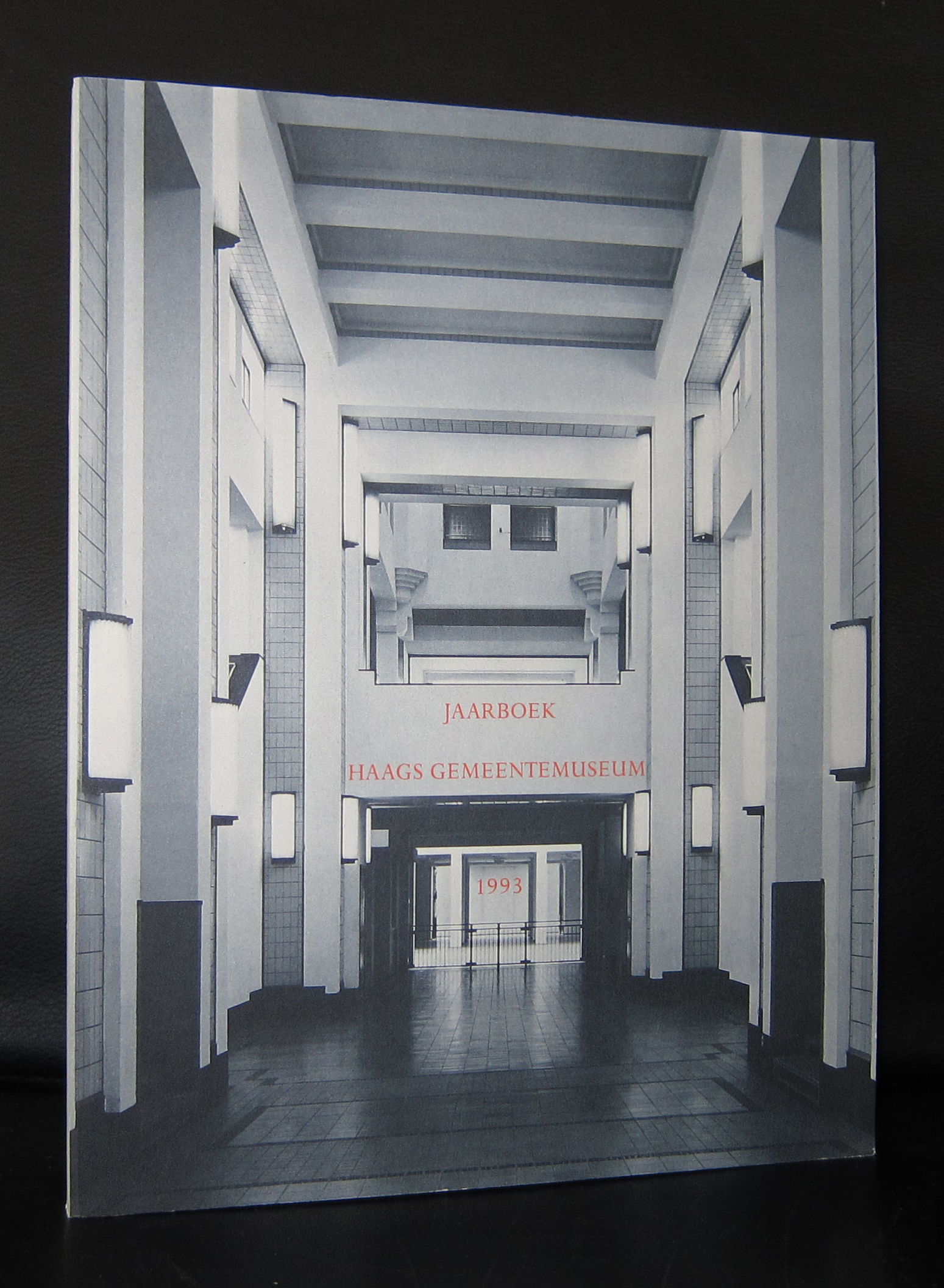
This was one of the last times so many large Bacon paintings ,including many Triptychs, were presented in one Bacon exhibition. The exhibition showed the importance of Bacon and because of this, the Gemeentemuseum got on loan the Bacon which is in the collection of the Museum Boijmans van Beuningen and one from the estate of Francis Bacon. Nowhere in the Netherlands so many Bacon paintings can be seen in one spot and and the sixties acquisition of the PARALYTIC CHILD WALKING ON ALL FOURS proved to be a worthy addition the collection of the Gemeentemuseum. ( in the JAARBOEK a study by Josephus Jitta is published on the “Paralytic child”)
Artist/ Author: Oliver Boberg
Title : Memorial
Publisher: Oliver Boberg
Measurements: Frame measures 51 x 42 cm. original C print is 35 x 25 cm.
Condition: mint
signed by Oliver Boberg in pen and numbered 14/20 from an edition of 20