Posted on Leave a comment

Claudia Kölgen

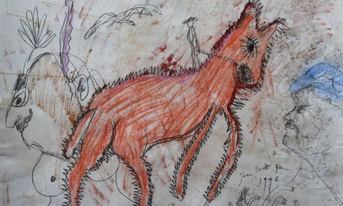
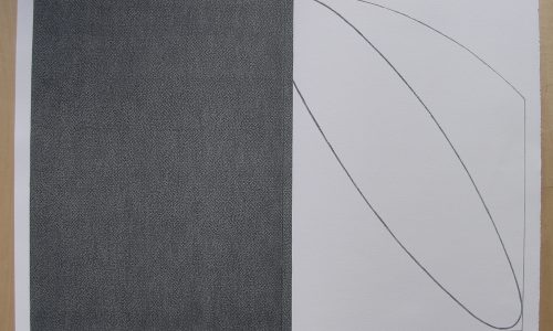
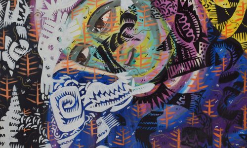
The best way to introduce Claudia Kölgen is to use a text I found on the internet page by Michael Gibbs.

Light, space, image, screen and language are the elements that form Claudia Kölgen’s artistic practice. Yet rather than dealing with these elements in a formalistic sense, she employs them in a poetic, almost abstract, metaphysical way, drawing attention to the specificity not of the medium but of the picture, the object, as well as the specific way these are perceived.

Her book objects are beautifully crafted, and extend our sense of what a book means – a sequence of identical pages in a closed form that invites an opening, a filigree of strands conducting the charge of meaning to a reader/viewer, a breath of air whispered between the leaves. Stéphane Mallarmé, who once compared the printed page to an elusive white butterfly would certainly have approved of Claudia Kölgen’s books. Mallarmé described the book as a ‘spiritual instrument’, but whereas he envisaged a Total Book containing ‘everything that exists’, Claudia Kölgen reduces the book to its essence. Her infra-red photograph of a still-life arrangement of open and closed books allows us to conceive of the book as a warm comforting object, as a body.The page of a book is analogous to a screen, so it should come as no surprise to learn that Claudia Kölgen has worked extensively with film and film installation. The first time I ever saw her work was at a group exhibition of film installations in a decrepit building on the Warmoesstraat in Amsterdam. Claudia’s work stood out for the simple economy of its means and its utter effectiveness. The piece was entitled ‘Choreographie der Bilder’ and consisted of two loop films of candle flames photographed in slow motion projected through a board (with a grid of circular holes cut out of it) onto a double screen cantilevered like the open cover of a book. The random, organic tongues of flame thus became transformed into a computer-like grid of dancing circular spots of light. In one cinematic jump we are carried from the primeval to the electronic age.


A similar breadth and economy is achieved in her previous film installation ‘Lighthouse’ in which a vertical beam of light is rotated from a central, beacon-like axis around the walls of the space, which includes a sheet of copper and a glass frame. At the same time a film is being projected, which we occasionally get glimpses of. A lighthouse usually projects beam of light into the distance – it is meant to be seen from afar, but Claudia Kölgen’s lighthouse is just that: a light house, an enclosed space whose internal contours and surfaces are made visible reflectively, as a sign of introversion. The continuously moving beam of light intersecting with the film being projected challenges the spectator’s sense of space as something static. The viewer’s gaze becomes mobilized, disoriented.

The interference of one space with another is also the theme of her film ‘Ricercar’. The title is a musical term meaning to start again anew, and this is interpreted by the cello music on the sound track. The film is a journey through an abandoned industrial building, but it is really two films in one, since the centre of the frame is occupied by another moving image taken from a second camera placed at a right angle to the first, so that what we see are two views literally interfering with one another in a continual, vertiginous process of change. What we are left with is a vision of the pure relativity of space. This is not the modernist, fractured space of cubism, but a completely conditioned, reductive sense of space – one that offers not progress but recurrence. And this is where the element of time comes in – the endless, repetitive time of the film loop, or the steady revolving of a tower, or the pace of walking. Time is not a simultaneity (as in the modernist vision) but an ordered, self-effacing sequence.
Kölgen’s film ‘Wende’ (Turn) epitomises the dualities and dialectics that inform her work. The undulations of a sandy beach are filmed in positive and negative and overlaid with enlarged typewritten letters. On the sound track we hear layers of random spoken words which gradually disintegrate into phonemes and consonants. Language becomes reduced to what Barthes refers to as the ‘grain’ of the voice/text, a polysemy without origin or end.

The grid of circular holes used in her film installation recurs in her recent photoworks. In one piece, circular pieces of colour film negatives are sandwiched between two sheets of perspex and lit from behind – we cannot make out what is depicted; the images remain imaginary, waiting as it were to be realized through the action of light and chemicals. Kölgen’s screens are at once opaque and transparent – their grid structure makes them indices of infinity, like so many zeros, but we are reminded too of the mental screen that each of us possesses which filters everything that we perceive. Whether we call this screen rationality or the unconscious, it is always resisted by the immediacy of lived experience and by the knowledge (or at least the suspicion) that our perceptions are more than just fleeting shadows on the walls of a cave.


Photographs are traces of experience, not the experience itself; their logic is that of an absent presence, of what Barthes calls a ‘having-been-there’. Yet the photograph is also a type of icon, a model of that which is represented. As André Bazin has written, ‘The photographic image is the object itself, the object freed from the conditions of time and space that govern it. No matter how fuzzy, distorted, or discoloured, no matter how lacking in documentary value the image may be, it shares, by virtue of the very process of its becoming, the being of the model of which it is the reproduction; it is the model.’
The images that appear in Kölgen’s photoworks – clouds, a room, a figure on a beach – are not documents; they need no captions to explain them. They are models within a larger model having to do with seeing and not seeing. Natural light is combined with artificial light, reality with construction. We are no longer certain of what we see, since we are made conscious of the very determinants of seeing – the screen separating blindness and insight, the spectacle and the spectator.

Michael Gibbs
February 1989

Now that she is introduced properly I like you to know that I have added 2 important publications by Kölgen. The one that stands out is the HEFTIG ALS EEN STORMWIND. Published in an edition of 10 copies. Each numbered and signed. Package contains 20 cigarettes all printed with different texts by Claudi Kölgen , each package is signed and numbered

available at www.ftn-books.com

Posted on Leave a comment

GÜNTHER UECKER and galerie Denise Rene

Readers of this blog know of my admiration for the Galerie Denise Rene. In all past decades they were the first to present Avant Garde artists and in the sixties they were one of the first to show ZERO artists and their works. One of these shows was the legendary UECKER exhibition in 1968. The catalogue is like a “ghost” catalogue since it is rarely seen or offered, but now I have a copy for sale. This is certainly not cheap , but extremely scarce and a solid investment. available at www.ftn-books.com

Posted on Leave a comment

Travel posters

Kees van Dongen/ France/ 1960

There are a few iconic travel posters that always surface when people are decorating their homes. Many by Cassandre. But the one I am selling now at www.ftn-books.com is one of my personal favorites.

This one is from a painting by Kees van Dongen who depicted the Le Bar du Soleit at the Deauville beach. It has everything. Great art, atmosphere and really wants you to go there and have a drink on the beach.

artist : Kees van Dongen

Title : France, Deauville /Bar du Soleil

published: 1960, Commissariat general au tourisme

Text / Language: french

Measurements: 99 x 62,2 cm. cm .

Condition: B++

scarce 

Posted on Leave a comment

Frank van den Broeck (1950)

Franck van den Broeck

Frank Van den Broeck’s (1950) drawings and paintings have a characteristic and unmistakable handwriting. In mobile lines he draws performances that are concrete but ambiguous. The hovering often returns in Van den Broeck’s work, objects seem to be in a state of transition, on the way to another place or dimension. The artist’s universe is often the subject of his work.

Motives such as the painter’s palette and the open book, of which the butterfly is a derivative, play an important role in the drawings. Other representations are more threatening with ghostly creatures and mask-like faces that suddenly appear. There is always a sense of transition present, the objects and figures seem to refer to an underlying reality.

Both the above publications are available at www.ftn-books.com

Posted on Leave a comment

Bernard Buffet ( continued)

Schermafbeelding 2021-07-14 om 14.07.29

Readers will notice this second blog on Bernard Buffet. Buffet was a well known painter in the late Fifties and Early Sixties, but became out of fashion by the end of that decade. But lately there is a new interest in this painter and i can explain why. HIs gallery , galerie Garnier stayed with him during his career and never lost faith and secondly…..his way of painting in series was a way of producing a large number of paintings and i must say not all are of interest and have enough quality to convince, but there is one quality they have in common. These paintings have a style of their own. The Buffet style is there and it really is a style Buffet developed by himself. This makes these paintings stand out and the truly great ones are paintings one must admire. Perhaps Buffet is not the artist who has rose to absolute fame lije Picasso or Pollock. But his art is still there and with this art Buffet is a name which deserves a place in art history. www.ftn-books.com has added some galerie Garnier exhibtion catalogues and has collected a nice series of exhibition catalogues by Garnier which are still available.

Posted on Leave a comment

Visible Language

Because of a recent addition to my inventory here is the information on the VISIBLE LANGUAGE magazine. It is one of the leading publications in the world of graphic design and i have added some important volumes from the 70’s and 80’s to my inventory.

Visible Language is an American journal presenting visual communication research. Founded in 1967 as The Journal of Typographical Research by Merald Wrolstad, occasional Visible Language issues are co-edited with a guest editor-author.

The journal was founded with the primary tenet of the journal being that reading and writing together form a new, separate, and autonomous language system. The journal has evolved to focus on research in visual communication. The journal has covered the subject of concrete poetry, the Fluxus art movement, painted text, textual criticism, the abstraction of symbols, articulatory synthesis and text, and the evolution of the page from print to on-screen display. Guest editor-authors have included Colin Banks, John Cage, Adrian Frutiger, Dick Higgins, Richard Kostelanetz, Craig Saper, and George Steiner.

The journal was edited for 26 years (1987–2012) by Sharon Poggenpohl of the Illinois Institute of Technology’s Institute of Design, with administrative offices at the Rhode Island School of Design. It is currently edited by Mike Zender of the University of Cincinnati, which publishes and provides administrative offices for the journal.

Below a first selection of the volumes available:


Posted on Leave a comment

Charlotte Mutsaers ( continued )

One of my earliest blogs (2016) was dedicated to Charlotte Mutsaers. I explained the importance of Mutsaers for dutch art in general. Mutsaers has started as a teacher in art and as as higy original painter. I Think her paintings from the early Eighties belong to the most important ones from that period. This conclusion is not lightly taken. Yesterday evening i leafed throught the catalogue which was published on the occasion of her exhibition at the Koninklijke Bibliotheek in Den Haag and i was really impressed. Timeless, Poignant and colorful they impressed me once again. Some 25 yeasr ago, Mutsaers made a career swith and decided for a career in writing and since she has published some of the most important books in the dutch language. I like her books, but when i had to chose i always would chose one of her paintings instead of one of her books.

www.ftn-books.com  has several Mutsaers items / books available including the Den Haag poster from  2010

Posted on Leave a comment

Barend Blankert (1941)

Schermafbeelding 2021-06-29 om 14.43.32

Some will say and compare him as being a dutch Lucian Freud, but Barend Blankert is for me still Barend Blankert and personally i would not compare him with anybody else.

Every time i encounter a painting by Blankert and study it i make up my own story. The scene and composition are the inspiration and the result always an original story and probabaly not the story Blankert intended.

So beside the impressive painting technique in which Blankert excels his storytelling is another quality this artist has. It is well worth studying this artist and whenever there is a possibility to see his paintings, do not hesitate and go there to admire these.

www.ftn-books.com has some Blankert publicatons available.

blankert

Posted on Leave a comment

Christian Boltanski (1944-1921)

Schermafbeelding 2021-07-16 om 09.25.33

For me personally Boltanski stands for “remembering” and expressing this in gloomy art. The dark side is always present in his art and publications. Now Boltanski is dead and he leaves us with some of the greatest art from the last 50 years.

Christian Boltanski was born in 1944 in Paris and died in 2021 in Paris. In the 1960s he began to develop a “personal ethnology” marked, among others, by the influence of Claude Lévi-Strauss and Harald Szeemann. At the same time, drawing on museology, Boltanski exhibited inventories of items of anonymous owners. It is often the case in Boltanski’s work that objects (photos, pieces of clothing, bells, flowers…) give voice to absent subjects and are an invitation to the viewer to meditate and contemplate.

Since his first exhibition at LeRanelagh cinema in 1968 Boltanski’s work has been shown in numerous countries. Recent solo shows have been at Centre Pompidou, Paris, France (2019); Espace Louis Vuitton Tokyo, Japan (2019); The National Museum of Art, Osaka, Japan and the National Art Gallery, Tokyo, Japan (2019); The Israel Museum, Jerusalem (2018); The Power Station of Art, Shanghai, China (2018); the Museo Nacional de Bellas Artes, Buenos Aires, Argentina (2017); Museo d’Arte Moderna di Bologna, Italy (2017); The Museum of Contemporary Art of Monterrey, Mexico (2016); Instituto Valenciano Arte Moderno (IVAM), Spain (2016); Mac’s Grand Hornu, Belgium (2015); and Museo Nacional de Bellas Artes, Santiago, Chile (2014).

Boltanski was recognized with several awards over his lifetime, including the Praemium Imperiale Award (2006) and the Kaiser Ring Award (2001). He participated in Documenta (1977 and 1972) and numerous Venice Biennales (2011, 1995, 1993, 1980, and 1975).

www.ftn-books.com  has a large selection of Boltanski titles available

Posted on Leave a comment

Project KATSHOEK

Without knowing . The VOORMOLEN company made an artist book which contains contributions by the very best artists from the Netherlands from the Sixties. Katshoek was an architectural project in the rebuilding of Rotterdam after WWII. New architectural design , enhanced with art from the very best of dutch artists.

Together with the project the Voormolen company made an artist book. with contributions by Boezem, Bonies, Dekkers, Dibbets, Eikelenboom, van Elk, Gribling, Koetsdier, Manders, n, Rous, Schuitema, Graatsma, Slothouber, Staakman, Struycken, Volten

katshoek a

the above publication is also in the collection of several dutch museums and now available at www.ftn-books.com

Katshoek office building

Heer Bokelweg became the connection between Schiekade and the Rotte Tracé, a wide road from the centre to the motorway to Utrecht. The Katshoek building was the first structure built on this new and wide city boulevard.

Katshoek multi-tenant building on Heer Bokelweg.

Katshoek multi-tenant building on Heer Bokelweg.

Foto Kramer/Rotterdam City Archives

What a contrast between the large modern building faced in white Kirchheimer limestone and the Oude Noorden district behind it! The huge structure has been built on Heer Bokelweg in the Zomerhof District.

It was originally designed as a multi-tenant building for small industries that had previously been housed in temporary structures in the area. However, this plan was dropped on account of the drastic increase in construction costs since the plan was launched in 1959. The idea now is to house ten large offices in the building, among them probably, subject to approval by the city council, a number of municipal departments. In addition, the Voormolen contracting firm that built the structure hopes to move from its current address on Westersingel into the new building on Heer Bokelweg in early 1968.

Het Vrije Volk, 28 September 1967

Katshoek-Bouw-1966

Flashy perspective drawing of Katshoek multi-tenant building.

Bouw, 1966

The post-war Basis Plan for the centre of Rotterdam earmarked Heer Bokelweg as a main access route into the new city from the north-east; an entrance between ‘gateways’ like the Shell building and the Schieblok to the renewed Hofplein and Coolsingel. Heer Bokelweg later became the connection between Schiekade and the Rotte Tracé, a wide road from the centre to the motorway to Utrecht. The Katshoek building was the first structure built on this new and wide city boulevard. After completion of the building the widening was extended on the north side, including an unsophisticated gap punched in the Hofbogen viaduct. But the changing insights of the early 1990s are visible on the southern side in the narrowing of the street with the construction of the Scala apartment complex beside the RAC garage, which today houses the city archives.
Katshoek-Stedenbouw-1968-11-12c

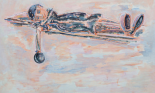
Model of Katshoek multi-tenant building.

Stedenbouw, 1968

Multi-tenant building

The sturdy seven-floor concrete-frame building is designed as a multi-tenant building, but it differs considerably in both layout and architecture from Maaskant’s other multi-tenant buildings such as the Industriegebouw, Groothandelsgebouw and Verzamelgebouw Zuidplein. According to Maaskant expert Michelle Provoost, this is an atypical work for Maaskant. “Especially the facade, which is very flat. You don’t see that very often in Maaskant’s buildings. The facades of his buildings are usually very expressive.”

The exterior is indeed fairly flat, with sleek bands of fenestration in aluminium profiles and stone cladding. The interior and the columns along the lower volume on Almondestraat are finished in bush-hammered concrete, a technique used to leave the concrete surface rough. The use of luxury materials gives the building a strongly representative feel. The floors of the two halls of the main staircases and of the shopping gallery are finished in Jura stone. The walls of the halls and the ground-floor columns feature exposed concrete adorned with a relief, while the entrances to the staff lifts are finished in white anodized aluminium.

The angle on the front facade is elegantly highlighted by the stone bands that continue as a vertical series of balconies.

Clearing the way for cars

The widening of Heer Bokelweg cleared the way for cars, but the building facilitates cars in other ways too. A car park for 250 vehicles was built behind the building and was directly connected to the office volume. In addition, an Aral petrol station was built on the triangular site between Heer Bokelweg and Almondestraat. And so the number of petrol stations within a 100-metre radius came to three!

Artwork

Art plays an important role in the building. The facade features an entrance relief by André Volten (1925-2002), one of the best-known abstract sculptors of the post-war period, whom Maaskant frequently worked with. The piece (Untitled, 1968) is a facade element with circular segments. The lines of the architecture are repeated in the work and distorted to form a new image. It was originally made of stainless steel and stone, but during renovation it was painted black along with the columns, ruining the effect. An art event was held in the entrance hall to mark the opening of the building in 1968.

Katshoek-Stedenbouw-1968-11-12e

Advertisement for NV Aannemingsmij. v/h H & P. Voormolen, proud builder and owner of the Katshoek multi-tenant building.

Stedenbouw, 1968

Until 21 December, the ground floor of the new Katshoek office building in Rotterdam is the venue for an exhibition that is as unusual as it is striking. At the invitation of Voormolen, the contractors responsible for building Katshoek, sixteen artists were given an opportunity to express themselves creatively with all sorts of construction materials.

Het Parool, 14 December 1968

It was, according to organizer Bob Bonies, a remarkable project:

“After all those exhibitions, which always consisted of the finest possible arrangement of existing works, I wanted to try another approach. I proposed inviting a number of Dutch artists to create their contribution inside that wonderful space by using construction materials supplied by Voormolen. Including engines, blowers and the like. And with the help of skilled workmen from Voormolen. It was an expensive project, but I immediately received full cooperation.

I chose sixteen artists: the cool guys Dekkers, Manders, Koetsier, Struycken and myself, Boezem, Dibbets and Van Elk with their micro-emotive art, the kinetic artist Staakman, Eikelenboom with his utopian situations, Rous, who makes a sort of minimal art, André Volten, Paul Schuitema with his colour scheme and his alphabet and the Slothouber-Graatsma team from the Cubic Construction Centre. And Gribling with his space structures.”

Het Parool, 21 December 1968

Today

The building housed the offices of Robeco, Procter & Gamble Benelux and a number of municipal departments. Owing to its out-of-the-way location, the building later fell out of favour. The current tenants are OMA and Havensteder.