Posted on Leave a comment

Jeff Koons / Ushering in Banality


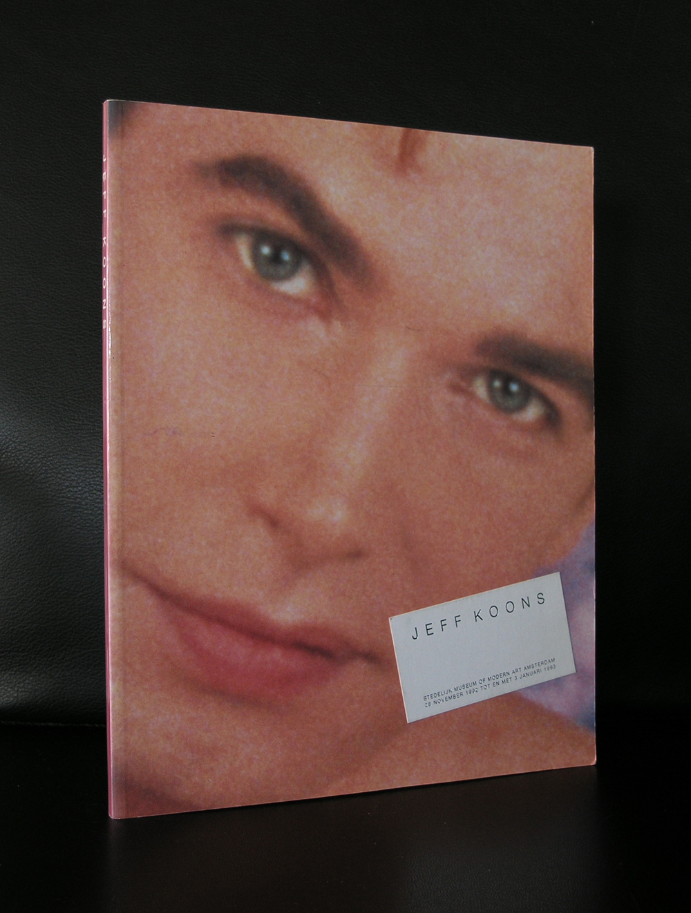
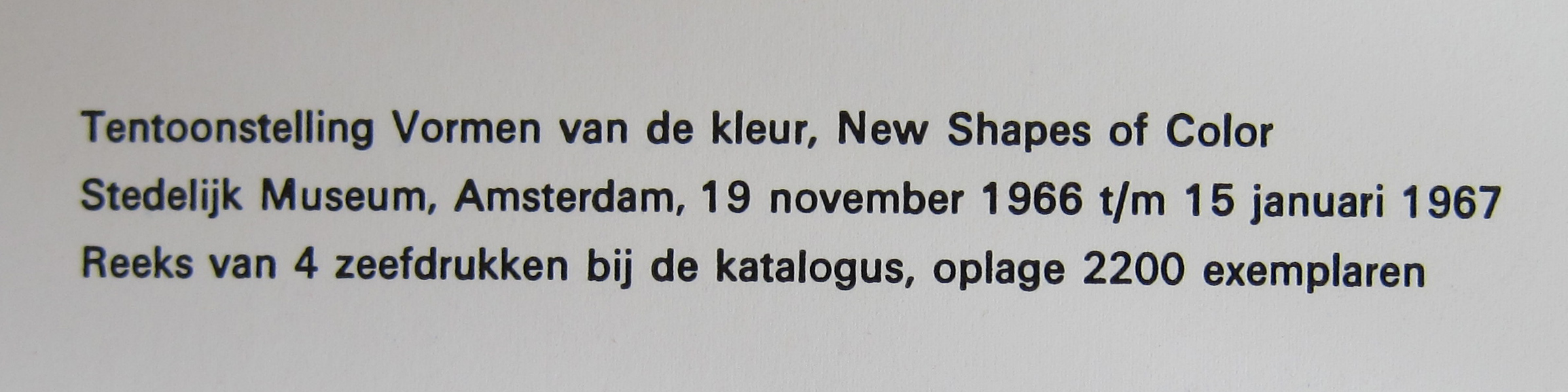
The first time i could see the works by Jeff Koons in a museum setting was during his first exhibition in the Stedelijk Museum Amsterdam. It was 1992 and Wim Beeren, the former director of the Stedelijk, had just bought Ushering in Banality. It was  a scandal , because of the price he had paid for the sculpture. ( If i remember well it was 300.000 guilders / is $ 120.000) …. a steal, but more important it is still on show and one of the works that raises many smiles. I even saw people taking photographs leaning on the statue. Of course this is not allowed , but it shows the popularity of this impressive work.

Since, i have encountered on many occasions the works by Koons in different settings and he always amazes me. There are several in the Guggenheim in Bilbao ( In and outside the building), of which the most important is the very large PUPPY outside covered with flowers. Koons is an artist who shocks and pleases, but in almost all cases , you look differently at an object after you have seen the work  Koons has made after it.

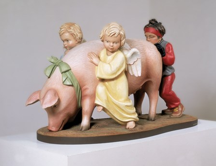
For me it means …i can not pass a shop with “Hummel” statues without thinking about the USHERING IN BANALITY by Koons.

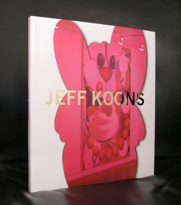
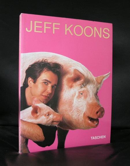
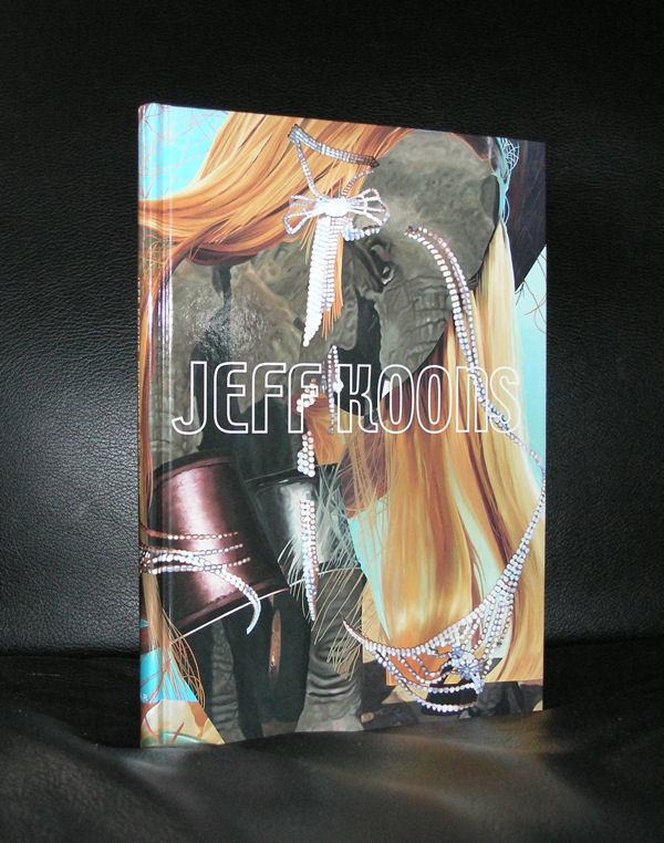
For some nice publications on Koons visit my shop www.ftn-books.com

Posted on Leave a comment

Tapio Wirkkala (1915-1985)

schermafbeelding-2016-10-08-om-16-28-59

The Finnish master of design and glas has had some great exhibitions in the Netherlands, but the most important one was the one in the Stedelijk Museum ( 1976). The Stedelijk Museum took a special interest in Wirkkala and acquired many beautiful works by him and from his wife Rut Bryk, who also had her exhibition in the Stedelijk Museum (1970) , even before her husband had his. Both their catalogues were designed by Wim Crouwel and both catalogues are collectors items now.

Wirkkala designed many great glas objects for Iitala which are still in production. I wish i had more publications on Wirkkala and his wife, but these are rare. The ones i have are both from the Stedelijk Museum. One is the monography and the other two are on a group exhibitions on Finnish glas and design.

Posted on Leave a comment

James Turrell…a magic place in the dunes

Nearby the city of Den Haag, close by the beach of Kijkduin you can visit one of the most important works of art in the Netherlands. Stroom has commissioned James Turrell some 20 years ago to realize a Turrell masterpiece in the dunes of Kijkduin titles CELESTIAL VAULT. You can enter through a tunnel a beautiful shaped bowl covered with grass , with in the middle a stone bench, which functions as a bed. When laid down, you can experience the serene surroundings and look at the sky, which of course is always different. Dutch landscapes are renowned for their skies and because of the focus on the sky when you are lying down you can experience this for the full 100%

An absolute must for the Turrell admirers and good to know that the CELESTIAL VAULT has been restored to its original splendor some 5 years ago.

www.ftn-books.com has some nice titles on Turrell including the one on this masterpeice in the dunes. This one is signed and from a limited signed edition. Beautiful publication and today for the special price USD 150.00


Posted on Leave a comment

Victor Vasarely

OLYMPUS DIGITAL CAMERA

It must have been the early 70’s. There was an art dealer in the Hoogstraat in The Hague, who had in his window 2 silkscreen prints by Vasarely. I thought them wonderful, but lost interest in them because the edition size was 100 numbered /signed copies. At that moment i never had heard of art published in an edition. Nowadays it is common practice. Artists make a living out of these editions and people can purchase an affordable original piece of art. I should have bought them at that time, but time passes and one forgets about these. All of Vasarely’s works are practically forgotten in the 3 decades to follow, but now in the present days, Vasarely works are sought after and well worth collecting…even the one’s which are published in editions of over 100 copies.

Vasarely has become one of the leading artists from the Geometric Abstract art/ optical art movement and the interest in his works is well deserved. With a highly original point of view and approach to Modern Art he has made many beautiful and impressive works of art and you can encounter them in all the large museums of the world.

When you travel Budapest do not forget to visit the Vasarely museum on the outskirts of this town. ( half an hour by tram ). It is not a museum as we nowadays have grown used to, but the art by Vasarely within this “basic” Museum is fantastic and the best OP ART you will seen gathered within one place .

It even has in a showcase one of the Kriwin catalogues which is depicted below.

It is nice to know that the Vasarely catalogue published by the Stedelijk Museum has on the backside of the cover an original relief print in black and white. (above)

wilfried

www.ftn-books.comwww.ftn-books.com

Posted on Leave a comment

DYLABY…Raysse+Tinguely+de Saint Phalle+Rauschenberg

DYLABY stands for Dynamisch Labyrint. It was one of the iconic sixties exhibitions (1962) in the Stedelijk Museum Amsterdam . A melting pot of modern art with some of the greatest names. Tinguely, Niki de Saint Phalle, Robert Rauschenberg and Martial Raysse. Planned “chaos”, but once you take a closer look and study the plan which came with the exhibition catalogue, you can clearly see that everything is planned. It now is over fifty years ago, but what still remains is the catalogue…. not only a souvenir, but an important art historic document, because of the event DYLABY was but also for its appearance. A complete inside in the exhibition.

…..and the series of photographs by Ed van der Elsken is one of the best he ever shot.

available at www.ftn-books.com

Artist/ Author: Robert Rauschenberg, Raysse, Niki de Saint Phalle, Daniel Spoerri, Jean Tinguely, Per Olaf Ultvedt Title : DYLABY ( Dynamisch Labyrint ) Publisher: Stedelijk Museum, 1962 Number of pages: 24 pages plus 4 page cover/ foldout page and separate plan of the exhibition Text / Language: dutch and english Measurements: 10.2 x 7.5 inches Condition: near mint extra information on this item: This DYLABY catalogue belongs to the top 3 of most wanted and searched Stedelijk Museum catalogues, but there is more this copy because it still holds the separate plan for the exhibition ( see picture). Catalogue photo’s by Ed van der Elsken which makes it even more special. This same catalogue is now in the permanent exhibition on the works by Jean Tinguely in the Tinguely Museum. Published with no.314

Posted on Leave a comment

Samuel Jessurun de Mesquita teached Maurits Cornelis Escher

Schermafbeelding 2016-08-31 om 09.38.31.png

Did you know that Jessurun de Mesquita was the teacher of M.C. Escher?

Escher developed his woodcutting skills under the supervision of Jessurun de Mesquita. From both sides there was a great admiration and respect for the other and Escher wrote the text on the commemorative exhibition Jessurun de Mesquita and Mendes da Costa received right after WWII in the Stedelijk Museum Amsterdam. An exhibition curated by another “star” from the forties an fifties, Willem Sandberg. Sandberg started right after WWII with this exhibition because he wanted to show the world the great loss of these 2 great jewish artists that did not survive the war. But lets focus on the works by Jessurun de Mesquita. Technically one of the very best at that time and with subjects that stood very nearby daily life and some surrealistic / Sensivistic drawings.

Many animals were depicted because the Artis Zoo was allways nearby and a much appreciated source for all his animal drawings and woodcuts.  Nature, art deco and the best possible technique in the art of the woodcut print resulted in almost all of the cases in the best dutch art prints from that time.

Some excellent publications at www.ftn-books.com and for those reading the blog and want to order the very special Samuel Jessurun de Mesquita by Wassenaar/van Es  from 1928. Use the code JESSURUNes and receive 10% discount on this title. Only 1 available and valid in september 2016.

This title from 1928 is the highlight in the book publications by Jessurun de Mesquita. It contains 2 original woodcuts on the inside and one original on the cover ( owl).

There is one other publication i can recommend and it is the monograph on Jessurun de Mesquita by the late Jonieke van Es, who wrote it and put one of the most complete catalogue Raisone’s together on any artist. This one for Samuel Jessurun de Mesquita is very special indeed.

And finally . for all readers of this blog….I have a nice set of Jessurun de Mesquita available 7 postcards for $15.00 including Worldwide shipping.

wilfried

www.ftn-books.com

jessurun set a

Posted on Leave a comment

M.C. Escher….not only prints

Maurits Cornelis Escher was one of the most gifted pupils of Samuel Jessurun de Mesquita (1868-1944). His teacher died at the end of WWII in a Nazi concentration camp and was commemorated by Escher in a text which was published in a catalogue on the art of Jessurun de Mesquita and Mendes da Costa  ( 1863-1939) who had an exhibition in the Stedelijk Museum Amsterdam right after the war to honor them both.

This is believed to be the first printed text by Escher. The catalogue with this text is still available at www.ftn-books.com

and is one of the first to be published by the Stedelijk Museum Amsterdam after WWII. Since, Escher has had many other publications with text and of course prints , but the text on his former teacher is special and touching. The design of the book is done by Willem Sandberg himself and all these ingredients put together in one publication makes it very special indeed. I very much like the works by Jessurun de Mesquita and admire the artist he was. His woodcuts are fabulous and when you admire the Escher prints, do not forget that perhaps his teacher Jessurun de Mesquita was even a greater artist, but unfortunately has not become as famous as his pupil. ( later this month a blog on Jessurun de Mesquita with a special offer).

wilfried

Posted on Leave a comment

Stedelijk Museum….Over 2500 catalogues available….and discount code.


The Stedelijk Museum Amsterdam published roughly over 1000 catalogues with their exhibitions over the last 70 years. A very large number of publications. Designs were always done by the best . Willem Sandberg, Wim Crouwel, Piet Zwart ao.

These catalogues deserve to be collected. Their appearance, printing, lay out, typography and use of different materials and original art work ( yes, also original silkscreens and lithographs ) used as cover makes them stand out from the others which were made in this period. For instance compare the Stedelijk Museum from the 50’s and 60’s with their german counterparts and you see and appreciate the quality of these publications. Because of Sandberg many great names in art were first presented in the Stedelijk and received their first major publication with the exhibition. Pollock, Rothko, minimal art . You could see them for the first time in the Stedelijk …..that is the first time in Europe.

For the readers of my blog i have made a discount of 10% available that is valid for a week for all your purchases on www.ftn-books.com

use : stedelijk1000 and you will receive 10% on the total of your order.

This is probably the largest collection of Stedelijk Museum Amsterdam catalogues available on the internet and even if you do not order….look at them, because it is a great overview of their publications.

Check these catalogues out and see for yourself why these catalogues are among the best in the art world.


wilfried

www.ftn-books.com

Posted on Leave a comment

Instant photography / POLAROID

There was a time when our generation was amazed when we saw the instant result when you took a picture with a Polaroid camera. It was at the end of the seventies that these camera’s were hugely popular and many artists in those days used them to get an immediate result. Recently i only know of Araki who still uses the technique of instant photography.  However , a few weeks ago, a friend of the family took a new camera out of his pocket and showed it to us. It was a similar camera to a Polaroid camera , same technique, but much much smaller. Personally i do not think it will replace the digital photography we all got used to nowadays, but maybe some artists will see new opportunities and will use it in their art. Time will tell.

There are some very nice publications to be found on the technique and the artists that used it. Of course Andy Warhol is one of the best known, but there are many more and this form of art was recognized by the Stedelijk Museum in 1982 with a large exhibition on instant photography. An excellent Wim Crouwel designed catalogue which shows many great examples of INSTANT PHOTOGRAPHY.


wilfried

ftn-books.com

Posted on Leave a comment

Wim Crouwel + Ellsworth Kelly = Vormen van de Kleur

One of the most spectacular publications in the history of the Stedelijk Museum was the VORMEN VAN DE KLEUR catalogue. A cassette containing biographies on all the participating artists ( a.o. Donald Judd ) and 4 original silkscreens . The silkscreens were published in an edition of only 2200 copies and all had the same basic colors (red, white and blue ).

Ellsworth Kelly, William Turnbull, Bob Bonies and K.G. Pfahler were invited to make a contribution for these silkscreens. 4 square large silkscreens were included in this publication. A challenge too for Wim Crouwel who designed a cardboard container/sleeve in which the loose pages on the participating artists were presented and on top of them the 4 original silkscreens.

Crouwel chose a larger size ( 10.2 x 10.2 inches ) than usual for he thought this to be an important publications too……and it was . It is one of the many highlights in the publication history of the Stedelijk Museum Amsterdam and will be a quintessential catalogue to have if you are a serious collector of Stedelijk Museum material or Wim Crouwel publications, but compared to the other beautiful and collectable SM publications this is in my personal top 5.

Only for FTN-books blog readers there is now a discount of $ 50.00 on this item to be had if you order and use the discount code: CrouwKel (there is only 1 copy available)

Catalogue design by Wim Crouwel, NM+ condition for the sleeve ( see picture), all sheets and silkscreens are in MINT- condition. Book measures 10.6 x 10.6 inches, silkscreens measure 10.2 x 10.2 inches. VORMEN VAN DE KLEUR/NEW SHAPES OF COLOUR. With 4 silkscreens in blue and red by Ellsworth Kelly, Bob Bonies, Georg-Karl Pfahler and William Turnbull. Amst., SM, 1966. Orig. wrappers. Illustr. b/w. 27 sheets. – Trends in abstract art of the past 10 years: Josef Albers, Donald Judd, Frank Stella, Vasarely, Max Bill, Peter Struycken a.o. – Silkscreens printed in 2200 copies. – In slipcase/sleeve

wilfried / www.ftn-books.com