He is an important dutch Typographer, but is not that known outside the Netherlands, but because Treebus has witnessed the transsition from lead printing into the digital age of printing it is nice to see how this process has taken effect in the designs of Treebus. Treebus has made numerous designs in those 32 years he was sdesigning papers, letters and forms for the STAATSDRUKKERIJ /Uitgeverij.
Treebus is one of those people that has influenced 3 genarations of designers, because his designs used by many over a period of 40 years
www.ftn-books.com has an excellent monographic book on Treebus available.
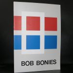
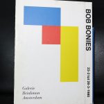
For me the only true “Hard edge” artist in the Netherlands is Bob Bonies, however Michiel Morel refers to the art of Bob Bonies as a rearrangement of FORMS AND COLORS.
I read his excellent article and it is unfortunate that it is only available in dutch, but for those who understand the language here is the link :
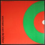
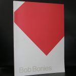
As you can read in the article . Bonies stayed true to his art of rearranging , shifting and placing forms and colors in a new context and one of the earliest silkscreen that was published in a larger edition was the one he made for the Stedelijk Museum catalogue VORMEN VAN DE KLEUR
in which his contribution stands out together with the one Ellsworth Kelly made for the same publication. This Wim Crouwel designed publication is available at www.ftn-books.com
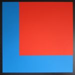
left Bonies and right Kelly
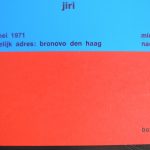
I have a lifetime admiration for Bob Bonies. He was one of the first artists i personally met at the Gemeentemuseum and a few years ago i bought a small collection of his publications from another bookdealer who had bought them from a Bonies collector and within one of the publications i found the birth card of his son Jiri. Even this card shows the quality of his works. The card is for sale too together with many other Bonies publications.
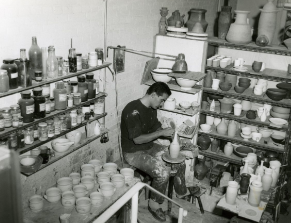
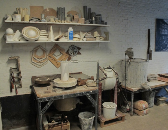
The picture by Eva Besnyo above, i encountered in a Museum Bulletin from 1999 in which Marjan Boot wrote an article on Potst and sculptures. Van der Vaart is a highly original ceramic artist who’s quality is the shapes he created his ceramics in. Forms and shapes which were never before used as a ceramic form, but van der Vaart invented them and made them into real ceramic objects.
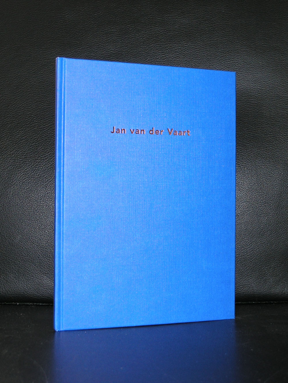
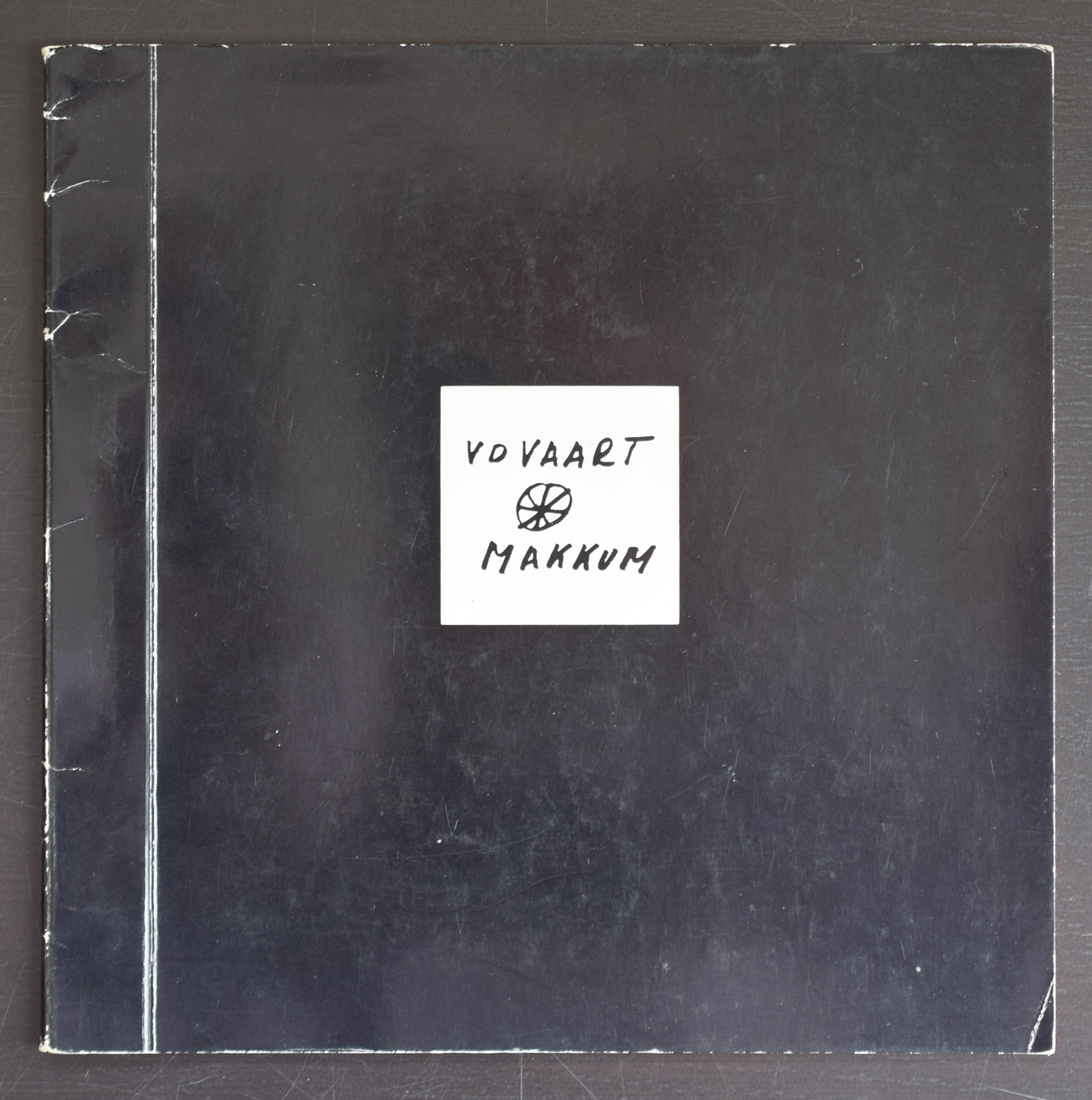
The pictures tell a far better story than i can, but there are some remarks to be be made about this blog and the life and exhibitions by van der Vaart. First there is this great photograph of van der Vaart working which was made by Eva Besnyo and secondly one of the most beautiful catalogues Wim Crouwel ever designed was the van der Vaart catalogue from 1975.
Artist/ Author: Oliver Boberg
Title : Memorial
Publisher: Oliver Boberg
Measurements: Frame measures 51 x 42 cm. original C print is 35 x 25 cm.
Condition: mint
signed by Oliver Boberg in pen and numbered 14/20 from an edition of 20