Posted on Leave a comment

André François (1915-2005)

Schermafbeelding 2020-05-26 om 09.24.22

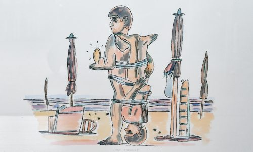
Born Rumanian, but living for most of his life in France.  From the early Fifties on, France had a very lively comic art scene. This surely has been an influence since his cartoon-like drawings were strongly rooted in this kind of art in France BD / Bandes Dessinees) became increasingly popular and so did the art by André François. This was picked up by Willem Sandberg who curated an exhibition on André François in 1966. Catalogue design by Wim Crouwl makes this one of my personal favourite catalogues from the Sixties. the article below was published in the Guardian some years ago…..and of course www.ftn-books.com has the 1966 Stedelijk Museum catalogue available.

OLYMPUS DIGITAL CAMERA

André François born André Farkas in 1915 was an illustrator known for his satirical cartoons and comics. He was born in Romania and but eventually moved to Paris. He was a left-wing Jewish and during WWII he hid away from the Germans, and after the war moved to Grisy-les-Plâtres where he eventually passed away in 2005 after a long successful career.

Francois took his early inspiration from the Art Deco movement and the renowned illustrator A.M. Cassandre. When he moved to Paris he actually studied under Cassandre for some time.

Image result for andre francois illustration

He worked in many satirical publications in France and also in American publications like the New Yorker, Vogue, Holiday and Sports Illustrated. Beyond magazines he also worked in the realm of children’s book illustration, adult content illustration and within the advertising industry (as many illustrators of the time did). In advertising he often created visual puns usually. This usually involved turning inanimate objects into human forms as well as the opposite.

Image result for andre francois

He became known in Paris for the sense of humour in his work, which he primarily completed in crude black and white ink drawings, with the occasional injection of vibrant colour. He became well-known and sought after by art directors in America after he published several anthologies of his cartoon work titled “The Penguin André François”, “The Tattooed Sailor and Other Cartoons From France” and “The Half-Naked Knight”. His obituary published in the New York Times describes his style perfectly: “François’ crude but sensual black-and-white brush drawings and starkly colored paintings, employing surreal and ironic juxtapositions, introduced serious whimsy to conservative commercial art. He also injected a comedic eroticism that broke various taboos.”

Image result for andre francois illustrations

At the age of 86, his house underwent a terrible house fire and he lost almost all of his work. His friends report that he wanted to create a completely new set of work to replace that which was lost. In 2005 he died from heart and kidney failure.

Image result for andre francois illustration

What drew me to François’ work is the looseness and simplicity. It reminds me of another contemporary illustrator who I love named Manddy Wyckens. It also reminds me of the illustrations done by Jean-Jacques Sempé for the children’s comic Petit Nicolas. What I love about François’ work is that he doesn’t just create cute, or beautiful images, he is always saying something. While he aims to convey a message, he also doesn’t give the audience all of the puzzle pieces. Sometimes it takes a little longer to understand what the illustration means but when you understand it, it’s all the more rewarding.

I think part of the reason I’m attracted to his work is that I can relate to it as I feel that I am always trying to say something with my work, but often the results are crude drawings and paintings.

The looseness and simplicity is also something I love about his work. Being able to communicate a message with a style that seems effortless is commendable. Looseness and simplicity is something I would love to learn how to use in my own work so I will be sure to look to André François for future inspiration.

Image result for andre francois illustration

Sources:
https://www.nytimes.com/2005/04/16/world/europe/obituary-andr-franois-illustrator-and-cartoonist.html

Posted on Leave a comment

Daphne van Peski (Duijvelshoff)(1942)

Schermafbeelding 2020-05-25 om 16.51.32

In the beginning, when I started with FTN books I had a hard time to distinguish Wim Crouwel his designs from the ones made by Daphne Duijveshoff. Later the differences became more clear to me. Duijvelshoff even had even more clean designs than Wim Crouwel had. Still, I sometimes make the error to think it is a Crouwel design I am looking at and to discover a few moments later that it is made by Daphne Duijvelshoff. They worked for a very long time together at Total design but she stopped with her design work in 2006. The excellent site on Dutch designers has done a special on her which can be found over here: https://www.dutchgraphicroots.nl/?p=2144

Of course www.ftn-books.com has some great Duijvelshoff designs available.

OLYMPUS DIGITAL CAMERA


Posted on Leave a comment

Niko Pirosmani (1862-1918)

Schermafbeelding 2020-05-25 om 14.51.54

Possibly the longest blog of all i have written if you take your time to watch the included documentary on Pirosmani. Just a short intro to the book that i have recently added to my inventory ( available at www.ftn-books.com). It is the official catalogue ( sold out during the exhibition because only a few hundred were printed ) IN SEARCH OF PIROSMANI.

pirosmani

An exhibition held at the Dordrechts Museum in 2012 on the Georgian naive painter Niko Pirosman. At the time successful at the Dordrechts Museum, but almost immediately forgotten. Still a nice exhibition on a very talented self taught painter, who stayed true to his naive style of painting during his life. When I searched for information on Pirosmani I stumbled upon a 90 minute documentary on his life and painting. Watch this and Pirosmani has no secrets for you anymore. The catalogue is now available at www.ftn-books.com


Posted on Leave a comment

Otto Mueller (1874-1930)

Schermafbeelding 2020-05-25 om 14.31.50

Otto Mueller, member of the DIE BRÜCKE movement is one of the lesser-known artists from this group of artist, but he is certainly not the least talented of them all.

Mueller was born in Liebau (now Lubawka, Kamienna Góra County), Kreis Landeshut, Silesia. Between 1890 and 1892 he was trained in lithography in Görlitz and Breslau. From 1894 to 1896 he studied at the Academy of Fine Arts in Dresden and continued his study in Munich during 1898. He left Munich’s academy after Franz von Stuck classified him as untalented.

His early works are influenced by impressionism, Jugendstil and Symbolism. When he settled to Berlin in 1908, his style became more expressionist. During this time there were meetings with Wilhelm Lehmbruck, Rainer Maria Rilke and Erich Heckel. In 1910, he joined ‘Die Brücke’, a Dresden-based group of Expressionist artists. He was a member of the group until it disbanded in 1913 due to artistic differences. At the same time, Mueller also had contact with the artist’s group ‘Der Blaue Reiter’.

During World War I he fought as a German soldier in France and Russia. After the war he became a professor at the academy of arts (Akademie der Bildenden Kunste) in Breslau where he taught until his death on 24 September 1930. Johnny Friedlaender and Isidor Ascheim were among his pupils there.

In 1937 the Nazis seized 357 of his works from German museums, since the pictures were considered to be degenerate art.[1]

Mueller was one of the most lyrical of German expressionist painters. The main topic of Mueller’s works is the unity of humans and nature; his paintings emphasize a harmonious simplification of form, colour and contours. He is known especially for his characteristic paintings of nudes and Romani (Gypsy) women; his nickname was “Gypsy Mueller” and his mother was perhaps Romani. The medium he preferred for his paintings was distemper on coarse canvas, which produced a mat surface. Altogether his printmaking amounted to 172 prints, nearly all of these being lithographs, but including a few woodcuts and etchings. www.ftn-books.com has some nice Brucke and Mueller publications available.

mueller koln

Posted on Leave a comment

Otis Laubert (1946)

Schermafbeelding 2020-05-25 om 10.05.57

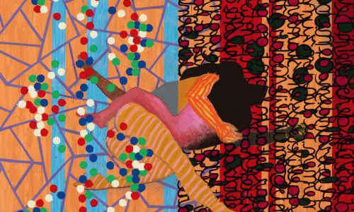
Two reasons why this artist caught my eye. First, he was born in Slovakia and not many artists who have become familiar names in the art scene come from that country and second…..he uses all kinds of household objects and clippings from magazines to build his compositions.

Schermafbeelding 2020-05-25 om 10.06.30

His canvasses are not randomly built “paintings” but well-constructed compositions in which he uses randomly chosen ordinary objects. It makes his works stand out and they need to be studied in detail to see what kind of clippings he has used.

DSC_4802laubert

Posted on Leave a comment

Gabriele Münter (1877-1962)

Schermafbeelding 2020-05-22 om 17.00.49

There are two things that i always have connected with Gabriele Münter , …..first there is that she was a student of Kandinsky and second, she was great with “behind glass painting”. This is an artist who i have not followed until recently. A week ago I discovered at the bookmarket a catalogue on Gabriele Münter published by the MARLBOROUGH GALLERY from 1960 and the first thing I noticed was the influence of van Gogh . Subject , use of colour and size all reflect that she must have admired van Gogh  immensly and where Kandinsky must have taught her to discover abstract painting, she found herself more at ease with realism in her paintings. Later she became part of the ” BLAUE REITER  group and together with Macke she became a respected name in the history of Modern Art. www.ftn-books.com has some nice Gabriele Münter titles available.

gabriel munter

Posted on Leave a comment

Thierry van Hasselt (1969)

Schermafbeelding 2020-05-19 om 14.33.51

By chance and because i am always keen on comic art i found a delightful little book by Thierry van Hasselt which is now available at www.ftn-books.com

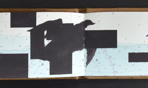
Thierry Van Hasselt was born in 1969. Founding member of the publishing house Fréon and later of Frémok, he is a publisher, set designer, installation artist and graphic designer. His first book Gloria Lopez, an obsessive study of a certain “virtuous Justine”, attracted considerable critical acclaim.

Seduced by the atmosphere and subject matter of his images, Karine Ponties invited him to participate in a joint creation resulting in a book and a dance performance. For his second collaboration with Ponties, Holeulone, Van Hasselt produced an animated film to integrate with the performance and the dancers’ movements.

The work of Van Hasselt rejoices in the material: ground up, rubbed, diluted, whether it be the velvety blackness of the aquarelle pencil, the black ink of monotype, or the colourful acidity of oil paint in his project: La petite main.

hasselt

This van Hasselt publication is signed and numbered 129/500


Posted on Leave a comment

Giorgio Armani (1934)

Schermafbeelding 2020-05-19 om 09.31.01

I have a soft spot for fashion catalogues. It is not that I am a “fashionado” but the way these seasonal publications by the greatest of fashion designers are published I admire. They search for the best photographers, stylists, designers and really spent serious money on a publication that is in most cases given away for free. Chanel is arguably my personal favourite. They published in the Lagerfeld years really great catalogues and the combination Claudia Schiffer / Karl Lagerfeld is hard to beat by others.

Still, a great effort was done during the last 30 years by “Giorgio Armani” being in the fashion business since 1975 , they currently have over 300 stores spread all over the world ( except Africa). This means their appeal has to be truly international and with the seasonal catalogues, they presented in a universal way their fashion to their public. Besides some very nice Chanel catalogues, FTN books has also some great and classic Giorgio Armani catalogues available.

Posted on Leave a comment

Gerard Verdijk (continued)

Schermafbeelding 2020-05-13 om 15.35.39

There was a time that Den Haag had multiple important art galeries, but it now looks like practically all have disappeared. I do not why , but many have stopped their business. One of them must have been Roger Verstraten , since it was about 8 years ago that I encountered at the local book market a box containing all kinds of small publications on Gerard Verdijk. Being a collector of his works I bought the box and many have since become part of my personal library, but one publication was present with multiple copies in the box and 2 of these were signed by Gerard. I did not discover this until recently I leafed through them and noticed that, besides my own personal copy, another one was signed and dedicated to Roger Verstraten. The little book ” VERGETEN DAT JE HET VERGAT ” was published on the occasion of the Artoteek exhibition in 2000.

The second signed copy of this book, which was published in an edition of only 750 copies, is now available at www.ftn-books.com

Posted on Leave a comment

Edward Sheriff Curtis (1868-1952)

Schermafbeelding 2020-05-14 om 14.06.17

I did not realize that Curtis is almost a contemporary photographer. When you look at his photographs you get an impression that these were made in the earliest days of photography, but studying his works you discover that many were made well after 1930.

His most important contribution is however, the series he made around 1915 on the history of the North American Indian people. He photographed the Indian peoples in a way that his works were not only important as a photography document but also they reflected the way the Indian peoples in North America, lived, dressed and were present in US society.

In 1906, J. P. Morgan provided Curtis with $75,000 to produce a series on Native Americans This work was to be in 20 volumes with 1,500 photographs. Morgan’s funds were to be disbursed over five years and were earmarked to support only fieldwork for the books, not for writing, editing, or production of the volumes. Curtis received no salary for the project, which was to last more than 20 years. Under the terms of the arrangement, Morgan was to receive 25 sets and 500 original prints as repayment.

Once Curtis had secured funding for the project, he was able to hire several employees to help him. For writing and for recording Native American languages, he hired a former journalist, William E. Myers. For general assistance with logistics and fieldwork, he hired Bill Phillips, a graduate of the University of Washington. Perhaps the most important hire for the success of the project was Frederick Webb Hodge, an anthropologist employed by the Smithsonian Institution, who had researched Native American peoples of the southwestern United States.[ Hodge was hired to edit the entire series.
Eventually 222 complete sets were published. Curtis’s goal was not just to photograph but also to document as much of Native American traditional life as possible before that way of life disappeared. He wrote in the introduction to his first volume in 1907, “The information that is to be gathered … respecting the mode of life of one of the great races of mankind, must be collected at once or the opportunity will be lost.” Curtis made over 10,000 wax cylinder recordings of Native American language and music. He took over 40,000 photographic images of members of over 80 tribes. He recorded tribal lore and history, and he described traditional foods, housing, garments, recreation, ceremonies, and funeral customs. He wrote biographical sketches of tribal leaders. His material, in most cases, is the only written recorded history, although there is still a rich oral tradition that preserves history.[His work was exhibited at the Rencontres d’Arles festival in France in 1973.

The book by Curtis on the North American Indians is available at www.ftn-books.com

curtis legacy