Posted on Leave a comment

Paul Blanca (1958-2021)

Paul Blanca

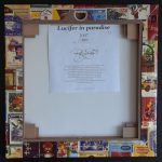
Last Saturday dutch photographer Paul Blaca died. His body was worn out after years of drug and alcohol abuse. Without Blanca dutch photography would have been half as interesting as it is now. He was self taught and discovered and explored portrait photography in a very special and own way, transforming it and perfecting it into his preferred form of photography.

the following text comes from the Paul Blanca site:

Paul Blanca (1958) is a Dutch self-taught photographer who started with a Canon F1 and later switched to a 6×6 cm Haselblad camera. In the 80s he created a series of violent self-portraits inspired by Robert Mapplethorpe (1946 – 1989) and Andres Serrano. Mapplethorpe introduced Blanca into the art world to artists like Grace Jones and Keith Haring stating “Paul Blanca is my only competitor”. Mapplethorpe’s favourite was Blanca’s self-portrait ‘Mother and Son’.

Hans van Maanen and Erwin Olaf call Paul Blanca the photographer of emotion. That ties in with his work. His self-portraits run like a thread through his overall work. For some things you can’t ask a model. For example, to hit a nail through someone’s hand. And like the self-portrait Mickey Mouse. In which a smiling Mickey Mouse is carved into his back with a thumb up.

For his series ‘Par la Pluie des Femmes’ women were captured in tears by thinking of their most traumatic experience. When he lived in Spain for 2 years, he stood with his camera at the front of the Spanish bullfighting arena. This resulted in the portfolio Sangre de Toro (Blood of the Bull): silk-screen prints with Bull’s blood.

In the beginning of the 90s he photographed the facial expression of speedball hookers for the series ‘Wit en Bruin’. Speedball is a very dangerous mixture of cocaine with heroin or morphine and has a substantial risk of overdose.

In the series ‘Deformation’ he was inspired by Rob Leer‘s SM scene. Models mutulated by fishline and hanging in the air, supported by the same fishline. This series was made for Amsterdam International Fashion Week (AIFW), in collaboration with fashion designer Hester Slaman, and exposed in Apart Gallery Amsterdam.

With the series ‘Kristal’ and ‘Mi Matties’ he had a double exhibition at Witzenhausen Gallery in 2008. Kristal is a series about the sweet and the bitter in relation with women. Presented in Witzenhausen Gallery Amsterdam in 2008. Mi Matties (my friends) is a series made in one of the neighborhoods of old Amsterdam. The portraits show young men who are presenting themselves as a group, sort of a gang.

In 2014 he created a self-portrait ‘Mother and Son’, 32 years after the first self-portrait, where he carries his mother, just like he carried her to bed for 4 years because she couldn‘t walk.

Posted on Leave a comment

The Living Room (1981-1993)

Schermafbeelding 2019-04-12 om 12.34.01

The gallery was founded by Bart van de Ven and Peer Veneman. In the beginning of its existence the gallery revolved around a tight-knit group of artists who worked closely together, both professionally and socially. A group of young Dutch artists in the postmodern 1980s, including Rob Scholte, Henk Visch and Fortuijn O’Brien, were part of the scene around the gallery and they became very well known. At that time, they stood at the center of the Dutch art world.

The Living Room was launched in a small third-floor apartment in East Amsterdam in 1981 by art history student Bart van de Ven and artist Peer Veneman. The gallery’s focus was on painting and sculpture, most often from a select group of Dutch artists working in the typically anti-academic, ‘wild’ style of the early 1980s. After moving to Amsterdam’s city centre in 1983, and up until its closure in 1993, the activity of the gallery became increasingly formalised. The gallery’s production of catalogues and its participation in several international art fairs, underlined The Living Room’s professional acclaim and secured their influence well beyond the borders of the Netherlands.

The Living Room is now closed for a very long time, But when you look at their list of exhibitions you realize that here is a “classic” among dutch galleries and their publications are well worth collecting. Some of these are available at www.ftn-books.com

Posted on Leave a comment

Rob Scholte ( continued )


scholte cont b

Since ii have sold several Scholte multiples during the last months , i was on the look out for more of these excellent mScholte multiple editions and……found them. I contacted a collector of whom i knew he had sold me several in the past and he could help me with 6 more of these Scholte multiples. All from the” Lucifer in paradise ” edition which was originally sold at the Kruidvat stores in 2007. As far as i know all are unique because every one of them depicts a different kind of set of match boxes. The one on the upper right is not available. It is now part of my personal collection because Donald Duck is an all time favorite of mine. The other 5 are all available at www.ftn-books.com. For more inquiries please mail me at wvdelshout@ziggo.nl

scholte cont a

Posted on 1 Comment

Rob Scholte (1958)

Schermafbeelding 2018-07-17 om 13.58.04

For me the first confrontation with Scholte’s art was at the gallery ‘t Venster where he had a show on the floor below where Piet Dirks was having his first Rotterdam gallery exhibition. I was shown around by mrs van Gennep who told me that Scholte was a rising star in the art world. Rob Scholte is one of the great dutch contemporary artists. He was on the rise when there was an assassination attempt on him. His car was blown up and in the vent he lost both his legs. This story is known by almost everyone in the Netherland. People who know something of the art scene in the Eighties know that Scholte, Klashorst and Ploeg were the names that rose to fame and of these three Rob Scholte was picked up by important german galleries. Since the bomb explosion it took Scholte a very long time to come back as an artist, but finally he managed to make a come back and have his art in the spot light again, although it never became as important as before his assassination attempt. But his name was important enough to be invited for a “Kruidvat” project. Schermafbeelding 2018-07-17 om 14.10.46

The shops of Kruidvat had the idea to make important art and artists financially accessible to their customers and Scholte was invited to participate. Scholte made silkscreens on canvas of collages of lucifer boxes. Which were sold out immediately after they were published and presented in the Kruidvat stores. www.ftn-books.com has managed to acquire 2 of these highly collectable art works of which the last one is now available at www.ftn-books.com

scholte lucifer a

Posted on Leave a comment

de Angst … Juni 1983

de angst a

If ever there was an obscure magazine in the Netherlands it was de Angst. Only a few volumes were published and the one depicted in this blog is one of them. It is from June 1983, was published in an edition size of only 100 copies. Printed/stencilled contents, hand bound signed in the plate by the authors Edzard Diderik, Martin Bril, Dirk van Weelden and Rob Scholte, who also made the original etching which was used as cover.

de angst b

The etchinh was colored by hand and the design was later used for one of his editions and a painting with the same name. In the magazine contributions a.o. by members of the ( Amsterdam) punk/avant garde scene which were finding their way into the multiple disciplines of Contemporary Art. There are contributions by Scholte, Maarten Ploeg and Peter Klashorst, who all made a serious art career. This rare magazine is now available at www.ftn-books.com