
Piet Dirkx cigarbox 653
Piet Dirkx cigarbox 653

Lets start a five day blog session with forgotten artists and here is the first to appear in this FTN blog.
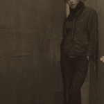
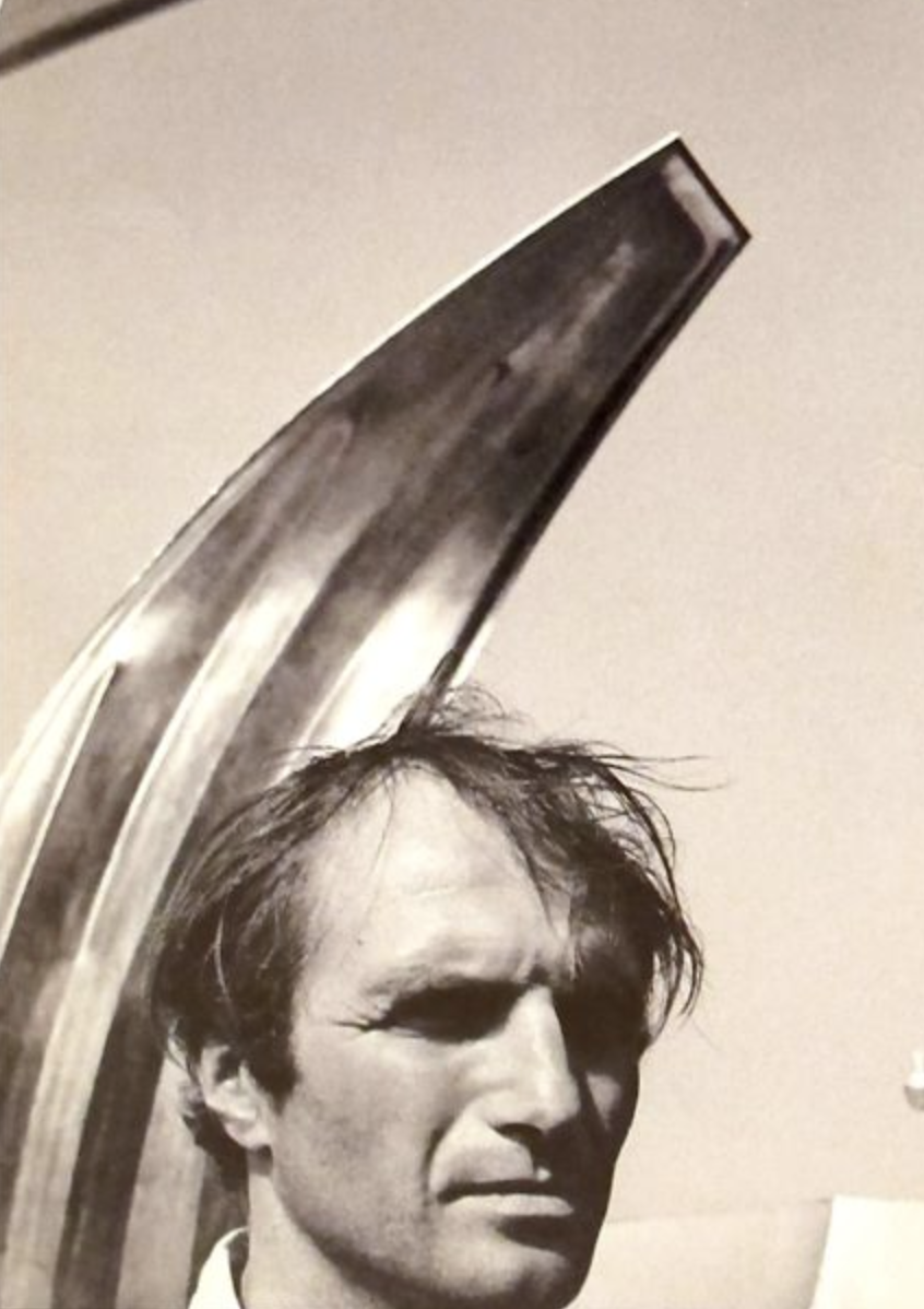
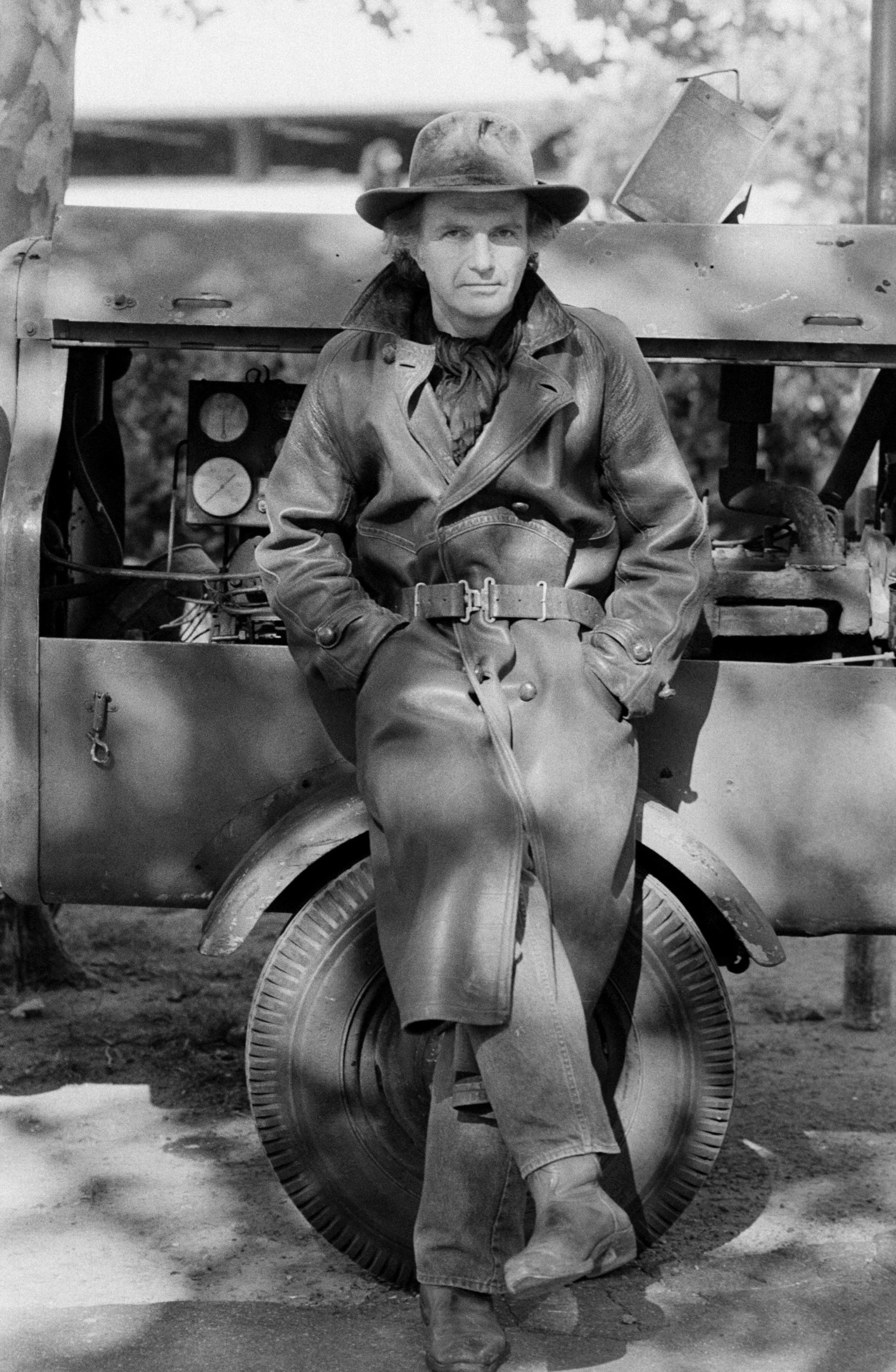
An American artist with an Italian background, but born , raised and died in New York. In between he moved to California and studied art in Rome. I tried to figure out the italian influence in his works, but can only see his American roots. If ever there is an influence it probably is the American Pop Art scene that influenced him. What struck me in his life that he was a passionate racing driver and at one time even had his own racing team. His life and progression in art develop a little like the Italian multi talented artist Carlo Mollino, who was also a passionate racing driver, but where Mollino convinces with his aesthetics, Scarpitta is a far more robust and less subtile artist. Still his works stand out from his contemporaries with the frequent use of wood, steel and bandaged objects.

He fascinates…and deserves to be known by far more people . www.ftn-books.com has a few titles on Scarpitta available.

You want to learn the story of Salvatore Scarpitta as a racing driver? you will find it over here:
https://www.classicdriver.com/en/article/classic-life/monuments-man-dirt-track-racer-tale-salvatore-scarpitta

Piet Dirkx cigarbox 652
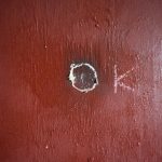
A month ago i was contacted by Ryu Tajiri ( the widow of Maarten Ploeg ) with a question regarding 2 paintings that were possibly in the collection of our family. The first was one of my very first acquisitions “OK hoofd” which i bought after seen it in the “Keus van de Kunstenaar” show at the Gemeentemuseum. The second one was a much smaller painting which landed in the collection of my parents, after they had traded in a much larger work which they could not hang in their small house. I know that Maarten Ploeg was married to a daughter of Shinkichi Tajiri, but what i did not know is that there has been a small but excellent publications on the collectors of Maarten Ploeg works. If you search you will find the book “PLOEG IS OK” , but it will not be an easy search since i only have one copy which was presented to me by Ryu and i could not find a second one on the internet.
Ryu contacted me because she was trying to trace several paintings by Maarten Ploeg that were sold by Rob Jurka . I could help her with 2, because they are still in my collection.
There are not many publications on Ploeg. There is the Metropolis M publication, De Keus van de Kunstenaar and the Ploeg is OK, one but to my knowledge that is all…. except…….there will be a large publication of over 500 pages published by te end of the year. Crowdfunding is now ended and the project can be executed. As i read the publication will be 500 pages and an edition of only 350 copies. Interested ? do not hesitate to fill in the form at the Maarten Ploeg homepage :
http://www.maartenploeg.nl
Maarten Ploeg was a great artist and one of the most original multi talents that emerged in the Eighties and the PLOEG + WERK book will prove his importance for Modern Art.
There is one publication on Maarten Ploeg available at www.ftn-books.com


Piet Dirkx cigarbox 651

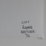
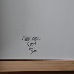
Here is a seldom offered and rare publication by Arno Nollen. Arno Nollen is certainly now established as one of the great dutch photographers, but at the time of this publication he was a “rising star”. “Regarde” is one of the first publications by the Annet Gelink gallery. The book Regarde is sold out, but a few gallery copies are still sold at the gallery for euro 150,–, but……… This is not the ordinary copy, but a very special one. Book is signed and numbered and published in an edition of only 25 copies, packed and protected in a special container/book cover. Made of carton and wood this cove protects the book and the book includes an original photograph by Arnold Nollen( loosely inserted).

The photograph, book and container are all signed and numbered with corresponding numbers. All are in excellent condition. This makes the Arnold Nollen a rare offering. This special publication available at www.ftn-blog the FTN art section
Here is a short bio on Nollen for those who do not know him.
Arno Nollen (b. 1964) is a storyteller. His work is exploratory and revolves around photo series; he is not interested in single photographic images viewed in isolation. His repetitive series, sometimes almost devoid of variation, inhabit a grey area between film and photography. The repetition triggers an unconscious process of association, comparison and recall and evokes emotions that range from fascination and excitement to disgust and discomfort. The end result is to prompt the viewer to imagine his or her own narrative. To present his images, Nollen uses a variety of media, including books, video, prints and installations.

Piet Dirkx cigarbox 650
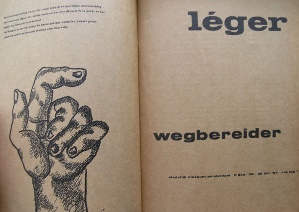
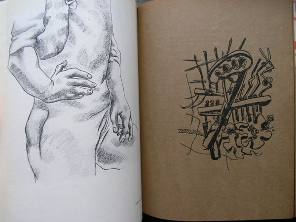
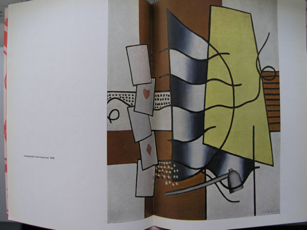
If there is one book book from the Fifties published by the Stedelijk Museum and designed by Willem Sandberg, it is the catalogue no. 158…Fernand Leger / Wegbereider. The typography and book design is typical Sandberg and “stunning” and to mark the end of January this book is for a limited time (until the 5th of February) for sale for only $ 25.00 when you use the discount code “Sandbergforonly25”

More Leger and Stedelijk Museum publications available at www.ftn-books.com
Another obscure artist from the exhibition history of the Stedelijk Museum is this Piotr Kowalski who had his dutch SM presentation in 1970. The catalogue design was done by Wim Crouwel, who made this publication a very special one and for me personally one of the most striking from the Seventies

Piotr Kowalski was an artist, sculptor, and architect. He was born 2 March 1927, in Poland, and died 7 January 2004 in Paris, France
Piotr Kowalski worked in non-traditional materials including electronic and mechanical devices, neon art, large earth works, explosions and other natural phenomena including plant growth and gravity. His work often expressed science or natural laws in direct and tangible ways, immediate to the senses.

A refugee of World War II, a graduate of MIT, he immigrated to France as an architect for UNESCO and spent most of the rest of his life in Paris. Along with gallery works, he installed several large outdoors projects.
The catalogue is available at www.ftn-books.com

Piet Dirkx cigarbox 648


