Posted on Leave a comment

Another rare Wim Crouwel designed catalogue

Last weeks i presented the GEDRUKT IN JAPAN catalogue from the Stedelijk Museum as one of the best from the sixties by Wim Crouwel.

hongaarse

Now there is another one which is far less known, extremely rare and a typical Wim Crouwel design. Year of publications is 1977. A publication year in which Wim Crouwel was part of the Total Design agency and worked ao. together with Daphne Duyvelshof. The catalogue was commissioned by an institution that wanted to present contemporary Hungarian art in The Netherlands. From the names presented only a few have become popular in Modern Art. Among them Dora Maurer who had her exhibitions all over Europe since, but most of them stayed rather obscure names in art.

maurer signed a

The catalogue however has become important because of the design. A very nice “construction ” of horizantal and vertical letter. The colors used are from the Hungarian national flag, making it immediately clear what the subject is about. The catalogue and Maurer print areavailable at www.ftn-books.com

Posted on Leave a comment

Franz von Stuck (1863-1928)

Schermafbeelding 2018-05-20 om 13.48.28

If it was not for the van Gogh Museum, not many would have known of Franz von Stuck in the Netherlands, but because of an exhibition in 1995/1996 his works are now much better known over here. The impressive catalogue is available at www.ftn-books.com.

From humble Miller’s son to prince of artists in Munich: the career of Franz von Stuck is the dream of every artist. After the young Stuck caused a stir with his first major painting, The GUARDIAN OF PARADISE he was suddenly the centre of attention in the art world.

In works such as Sphinx and SIN he reflected the Symbolist themes of the age, concentrating on the erotic and highly dramatic aspects. The flat decorative compositions and the focus on the essential, without superfluous detail, ensure that his art is still relevant today.

Schermafbeelding 2018-05-20 om 14.01.11

The book available at www.ftn-books shows exactly why von Stuck is important for todays art. The focus on the most important part in a composition is what nowadays artists do in abstract painting. This is the link between von Stuck and todays contemporary abstract expressionist art.

Posted on Leave a comment

Tshibumba Kanda Matulu ( 1947 – 1981)

Schermafbeelding 2018-05-20 om 13.34.43

Last weeks bookmarket brought a surprise. There was this catalogue published by KIT on the dramatic history of the Congo as painted by Tshibumba Kanda Matulu / TKM.

tshibumba a

This catalogue/book is now available at www.ftn-books.com

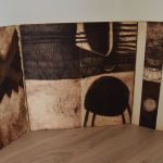
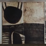
TKM was born in Élisabethville (modern-day Lubumbashi), in the south of the Belgian Congo, in 1947. TKM worked within the period of cultural authenticité in the 1970s.[2] TKM was one of the leading figures of “African genre painting” which had emerged in the Belgian Congo in the late 1950s and which integrated both European and Congolese styles and techniques.

TKM’s best-known paintings form part of a series of 107 works commissioned by the German anthropologist Johannes Fabian to illustrate Congolese history as it appeared in national collective memory. The series was produced between 1974 and 1976 and forms the body of TKM’s work and was used as the basis for an academic collaboration between the two.[2] The result, Remembering the Present: Paintings and popular history in Zaire, was published in 1996. TKM viewed the purpose of the book as presenting the history of his country to a child born in the country. by contrast, Fabian presents it as an anthropological work for Western study.

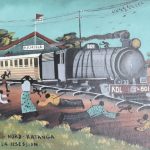
Among the scenes depicted by TKM was the Elisabethville Massacre of 1941, Patrice Lumumba’s independence speech of 30 June 1960, the introduction of culture obligatoire farming, and the trial of the religious leader Simon Kimbangu by the Belgian colonial authorities in 1921. All the paintings were made at the time of the Shaba Invasions during which TKM’s native province of Shaba witnessed widespread political instability.

The work is historically significant because of the interviews between Fabian and TKM included in the work. In those interviews, TKM subtly critiques the government of Mobutu Sese Seko, making statements such as “What Mobutu has in mind is true – or else it is a lie. But that’s something I keep to myself. What is true is that he started out with ideas that were correct. So he spoke and we all agreed; not a single thing was disputed.”

The work also emphasizes TKM’s admiration of Patrice Lumumba, particularly in the use of deliberate Christ imagery in the paintings of Lumumba, specifically mirroring Jesus’ wounds after the crucifixion. The parallel is so clear that Fabian names the section “The Passion of Patrice Lumumba,” a reference to “The Passion of the Christ.”

tshibumba c

102 of TKM’s paintings were purchased by the Tropenmuseum, an ethnographic museum in Amsterdam, in 2000

TKM disappeared in 1981 and is believed to have been killed in rioting.

So far the history of this African artist. Personally i think this is an important oeuvre although i have doubts about the artistic value. Still …ALL of the paintings have a strong power and presence and perhaps that is what great art always is.

Posted on 7 Comments

Guillaume Le Roy a Triptych

Schermafbeelding 2018-04-04 om 12.04.10

Just a short story how i found the Triptych by Guillaume Le Roy. I have been impressed by the graphic art of Guillaume Le Roy for over 15 years now. Since i began visiting specialized book auctions, i found that his works were offered on some occasions. In the beginnig i was not interested in buying them , but some 10 years ago i bought my first ” lot” which included 4 large prints ( ca. 120 x 80 cm). I began to admire his techniques and his compositions were fascinating to look at.

This was the beginning of a small collection of works by Le Roy. His black and /white ( now some are for sale at ftn art ) prints showed within the limit of the use of only black and white so many detail and shades that come alive as soon as you put them on a wall. So far the earliest of history on Le Roy and me as a collector.

2 years ago , at the november sale of which i could not visit the viewing days,  my interest was raised in the catalogue when i saw a description of an item that looked to be an early print by Guillaume Le Roy. The description was not that clear but i recognized his graphic signature. I placed a written bid and i won the item…… picked it up at the auctionhouse and discovered it was a genuine Guillaume Le Roy . …. a Triptych.


roy drieluik d


roy drieluik b

Two folding panels covered on both sides with etchings and in the middle another 2 etchings. In total 6 etchings and another discovery….it was signed, numbered and dated. very hard to discover the signature, but it was there , together with the other edition information ( see the photograph with the item).

One problem, i do not have the place to present it properly, so decided to put it up for sale and now it is available for the true admirer who values and cherishes Le Roy works too.

https://wordpressstrato-pacfwc5kp0.live-website.com/product/20416/

Posted on Leave a comment

Wim Crouwel….SM Gedrukt in Japan / 1967

Wim Crouwel is a regular name appearing in my blog. This is not only because i have many titles available at www.ftn-books.com, but mainly because i consider Wim Crouwel the most important graphic designer from last century. There are some that are important too and i think of Gerstner and Sandberg, but Wim Crouwel is in my opnion the absolute best. Wim Crouwel made some 200+ designs between 1960 and 1980 for the Stedelijk Museum, Among them posters, catalogues an folders and many have become iconic for graphic design in the Sixties. There was of course the VORMGEVERS catalogue which is in high demand and extremely hard to find, but the one i would like to discuss now is the GEDRUKT IN JAPAN catalogue, which has become rare and expensive too. It is of great graphici quality and although it is only 20 pages, for me it is the summit in design from the sixties. A simple but highly effective lay out. The use of Magenta on the front . The SM logo and underneath a very very fine line with below it one of the logo’s for the Osaka Art Festival . Published in 1967 with no. 407……it is perfection on the 20 pages.

OLYMPUS DIGITAL CAMERA