Posted on Leave a comment

Enzo Maiolino (1926-2016)

Schermafbeelding 2021-09-07 om 17.10.36

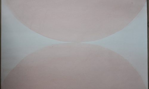
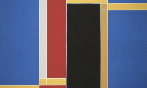
Not much information to be found on this artist. Still he is an established artist influenced by Hard Edge painting but with a much softer , subdued choice of colors he makes compositions that are typical for the Italian Sixties. These paintings are great and timeless and that is the reason why the Josef Albers Museum recognized the qualities of this lesser known artist. His works were presented in combination with the “square” paintinsg by Albers. The result /…… a feast in abstract ( minimal) art.

The Maiolino poster is availabel at www.ftn-books.com

maiolino aa

Posted on Leave a comment

Marcello Morandini (1940)

Schermafbeelding 2021-09-07 om 16.48.55

The first time i encountered work by Morandini was at the occasion of his special exhibition at the Josef Albers Museum in Bottrop in 2001.

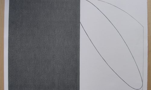
Marcello Morandini was born in Mantova in 1940, but in 1947 he moved to Varese. He attended the school of Arts in Milano, where he works as an assistant designer. He is one of the most important exponents of the “Arte Costruttiva” in Europe.  He started his artistic career in 1963 and since then has been holding many personal exhibitions in Europe, USA and Japan. He was invited to historical expositions and to International Biennials, among which the ones in Sao Paulo, Brazil in 1967 and in Venice in 1968. He has always been professionally interested in design and architecture collaborations, but for me the quality that impressed me most was the OP ART . Most of his works being executed in Black/White and greys. Making these for me like a bridege between the multi colorod POP ART from the sixties and the ZERO art from some years later.

OLYMPUS DIGITAL CAMERA

www.ftn-books.com has some Morandini items available among them the Bottrop poster which is an original silkscreen print.


Posted on 1 Comment

Willem Witjens (1884-1962)

This is at true “Petit Maitre”. Possibly only known in the region in which he painted . The Bommelerwaard was one of his favorit spots to paint so many landscape where made in that surroundings. This is a painter who knows his techniques and materials but the result nothing special, but pleasing to the eye.. Witsen made many of this pleasing paintings which now appear at auctions and in the “classic” art galleries. They find their way to those who like art, but can not afford to buy the best from the 19th and early 20th century. Possibly there will be a time that his paintings are valued as great art from the 20th century but personally i doubt this,

www.ftn-books.com has a small Witsen publication available

witjens

Posted on Leave a comment

Paul César Helleu (1859-1927)

Schermafbeelding 2021-08-29 om 11.33.31

Paul César Helleu was a close and life-long friend of Sargent. According to Stanley Olson, John Singer Sargent bought a pastel from Helleu. “They were constant companions, going everywhere together, having their meals together, seeing each other every day. . .” In a letter to his daughter, Paulette, in December 1922 Helleu wrote, “J’ai voulu faire photographier Sargent qui à été pour moi, tout au long de ma vie, plus qu’un père.”

During the summer of 1889, Sargent had a number of guests to stay at his house at Fladbury near Pershore, including Vernon Lee, Ansttruther Thomson, Flora Priestly, and Paul and Alice Helleu. Helleu’s intimate portrait of his wife at Fladbury was painted in that summer when both he and especially Sargent, were experimenting in Impressionism. Sargent completed among others, Two Girls with Parasols at Fladbury, Fishing, Two Girls in a Punt, A Boating Party, and probably the best know of the Fladbury pictures, Paul Helleu Sketching with His Wife (now in the Brooklyn Museum, New York).

In Patricia Hill’s book John Singer Sargent (New York, 1987), William H. Gerdts writes in his essay entitled “The Arch Apostle of the Dab-and-spot School, John Singer Sargent as an Impressionist”, p. 131: “Finally, Paul Helleu Sketching must be seen as a further step in Sargent’s development of the theme of out-door- painting. Helleu’s canvas is turned away from the spectator, just as it had been in Dennis Bunker Painting.  But whereas Bunker was shown ruminating, away from his easel, Paul César Helleu is busily at work, and presumably confidently so. The subject he paints is of no concern nor does the spectator have a view of the scene which might be serving Helleu for his subject. What is certain is that it is an outdoor view, immediately recorded. Moreover, Helleu, like Sargent, was first and foremost a portrait painter, and by definition a portraitist of studio conceptions. Thus, Sargent presents Helleu as a convert to the new method, exploring new thematic interests. And it must be noted that Helleu is depicted doing exactly what Sargent was doing in his picture – painting out-of-doors. Helleu therefore becomes, in a sense, a surrogate Sargent himself, both men established artists in one tradition, sailing off into what was for them relatively uncharted waters.”

www.ftn-books.com has the 1974 Knoedler /New York catalogue available.

helleu


Posted on Leave a comment

Roelof Mulder (1962)

Schermafbeelding 2021-08-27 om 15.54.15

Roelof Mulder is a multidisciplinary artist, operating in the field of graphic design, type design, interior and exhibition design. He studied fine art at the Academy in Arnhem and he attended the Jan van Eyck Academy in Maastricht for a year in order to underline his love for the graphic arts. Mulder’s departure from the academy was quickly followed by the announcement that he was to be the first winner of the Rotterdam Design Prize.
His graphic and editorial work includes books for Droog, MVRDV architects, Marcel Wanders, Stedelijk Museum Amsterdam, E&Y, and artists Yasumasa Yonehara, Marijke van Warmerdam and Marlene Dumas. He was member of the editorial staff and designer of Forum magazine and he has been art director of Frame magazine twice. Mulder also did campaign work for fashion brands such as Takeo Kikuchi and Diesel, various exhibition and communication work for incubator Platform21, and stamps for the Royal Dutch Post.

From his early years www.ftn-books.com has a nice book in its inventory

Posted on 3 Comments

Centraal Museum Utrecht , 1979


Schermafbeelding 2021-08-11 om 15.15.32

It is not the book itself, condition is fair+, but the realisation that all artists included in the book have become highly collectable artist, who’s works you can only acquire at steep prices nowadays. It shows the importance of collecting at an early stage by the museums. It is not difficult to pay millions for a work of art, but when you can see the quality at an early stage you can build a great collection…well done Centraal Museum.

the book is now available at www.ftn-books.com

abstract keus utrecht

Posted on 1 Comment

Helvetica (1957)

Max MIedinger

Here is in short the story on one of the greatest and most popular typefaces from the last 100 years….HELVETICA by Max Miedinger.
Helvetica is one of the most famous and popular typefaces in the world. It lends an air of lucid efficiency to any typographic message with its clean, no-nonsense shapes. The original typeface was called Neue Haas Grotesk, and was designed in 1957 by Max Miedinger for the Haas’sche Schriftgiesserei (Haas Type Foundry) in Switzerland. In 1960 the name was changed to Helvetica (an adaptation of Helvetia”, the Latin name for Switzerland).

Over the years, the original Helvetica family was expanded to include many different weights, but these were not as well coordinated with each other as they might have been. In 1983, D. Stempel AG and Linotype re-designed and digitized Neue Helvetica and updated it into a cohesive font family. At the beginning of the 21st Century, Linotype again released an updated design of Helvetica, the Helvetica World typeface family. This family is much smaller in terms of its number of fonts, but each font makes up for this in terms of language support. Helvetica World supports a number of languages and writing systems from all over the globe.

Helvetica World, an update to the classic Helvetica design using the OpenType font format, contains the following Microsoft code pages:
1252 Latin 1,
1250 Latin 2 Eastern,
1251 Cyrillic,
1253 Greek,
1254 Turk,
1255 Hebrew,
1256 Arabic,
1257 Windows Baltic,
1258 Windows Vietnamese,
as well as a mixture of box drawing element glyphs and mathematical symbols & operators.
In total, each weight of Helvetica World contains 1866 different glyph characters!

Many customers ask us what good non-Latin typefaces can be mixed with Helvetica World. Fortunately, Helvetica World already includes Greek, Cyrillic and a specially-designed Hebrew in its OpenType character set. But Linotype also offers a number of CJK fonts that can be matched with Helvetica World.

Helvetica didn’t start out with that name. The story of Helvetica began in the fall of 1956 in the small Swiss town of Münchenstein. This is where Eduard Hoffmann, managing director of the Haas Type Foundry, commissioned Max Miedinger to draw a typeface that would unseat a popular family offered by one his company’s competitors.

Miedinger, who was an artist and graphic designer before training as a typesetter, came up with a design based on Hoffmann’s instructions, and by the summer or 1957, produced a new sans serif typeface which was given the name “Neue Haas Grotesk.” Simply translated this meant “New Haas Sans Serif.”


The Stempel type foundry, the parent company of Haas, decided to offer the design to its customers in Germany, where Stempel was based. The company, however, felt it would be too difficult to market a new face under another foundry’s name and looked for one that would embody the spirit and heritage of the face. The two companies settled on “Helvetica,” which was a close approximation of “Helvetia,” the Latin name for Switzerland. (“Helvetia” was not chosen because a Swiss sewing machine company and an insurance firm had already taken the name.)

Over the years, the Helvetica family was expanded to encompass an extensive selection of weights and proportions and has been adapted for every typesetting technology.

Helvetica is among the most widely used sans serif typefaces and has been a popular choice for corporate logos, including those for 3M, American Airlines, American Apparel, BMW, Jeep, JCPenney, Lufthansa, Microsoft, Mitsubishi Electric, Orange, Target, Toyota, Panasonic, Motorola, Kawasaki and Verizon Wireless. Apple has incorporated Helvetica in the iOS® platform and the iPod® device. Helvetica is widely used by the U.S. government, most notably on federal income tax forms, and NASA selected the type for the space shuttle orbiters.


One of the greatest books. Published in Japan on the Helvetica is now available at www.ftn-books.com

Posted on Leave a comment

Anna Reinders (Born Landgraaf)

Anna Reinders is not very well known among the dutch art collectors, but the reason i write this blog on her is because of a recent discovery of a small portfolio containing 16 original postcard size ink drawings. What struck me most was that these drawings made me think of Lucebert his drawings. Still her style is a style of her own and if presented among works by other artists it should be no problem in selecting these from all drawings presented….meaning these are original enough. She will have a small following of admirers and for them the portfolio, which is now for sale at www.ftn-books.com will be a great addition, to his or her collection.


Posted on 1 Comment

Karianne Krabbendam (1951)

Schermafbeelding 2021-08-25 om 14.18.33

Another artist , born in Den Haag but who lives and works now in the northern part of the Netherlands is Karianne Krabbendam. I discovered her works for the first time when we visited the “HET DEPOT” museum in Wageningen.

Her almost abstract female figure sculptures reminded me of the pre historic female god figures that were found in the last centuries. They have something modern and and at the same time classic in them This kind of art is timeless and will have admirers in the decades and centuries to come.

The Karianne Krabbendam publication is now available at www.ftn-books.com

krabbendam

Posted on 2 Comments

Jannes de Vries (1901-1986)

Schermafbeelding 2021-08-24 om 12.33.43

People who studied Werkman, Siep van den Berg and Dijkstra,….probably have encountered the name of Jannes de Vries who was in the Fifties a respected artist in the northern part of the Netherlands. Member of “de PLOEG” his works resemble those of Dijkstra and were influenced by DIE BRUCKE. Later he became less abstract and painted more and more realistically, but always using a colorful painters palette.

He used his colors like in the days of the Fauves exagerating reality and creating a colorful world which was in reality much less colorful.

www.ftn-books.com has now some Jannes de Vries publications available.

jannes de vries