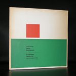
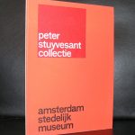
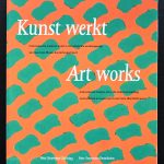
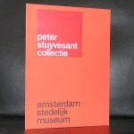
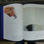
Readers of this blog know of my admiration for Gerard Verdijk and did not hesitate a single secoond when in 2011 a very large painting by Verdijk was put up for auction and did not receive its first bid. It appeared to be the winning bid and since the moment this painting entered our home it has been on display in our living room. The painting was part of the Peter Stuyvesant collection but a decade ago the staff of the Turmac Tobacco company and the founders of the Stuyvesant foundation decided to sell their collection. This collection is very well documented and from its earliest of beginnings the best dutch designers made the catalogues which documented their additions. I knew almost for certain that our paintings was in one of these publications but i never found the right one, but…..i now have it and i am very pleased that our painting is prominently present in a beautiful large catalogue, designed by Anton Beeke …and the title of it is “GROOT” in de collectie Peter Stuyvesant.
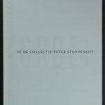

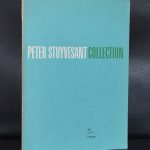
Published in 1997, the new additions were curated by the former director of the Stedelijk Museum, Wim Beeren.( see photo above this blog) An interesting final addition which almost completes all Peter Stuyvesant publications. This one is not for sale but there are others which are available at www.ftn-books.com.