Piet Dirkx cigarbox 854
Piet Dirkx cigarbox 854

Finally, after a period of over 7 years , the long awaited publication on Gerard Verdijk and his art was presented last month in Amsterdam. After hard work and contributions by many a true MAGNUS OPUS has been published on the art and life of Gerard Verdijk. To give an impression….. it is thick and heavy, a publication with approximately 1000 photographs on Verdijk and his works. 382 pages, size is 12 x 12 inches and the weight…. a heavy 3.1 kg.
But what is more important, this publication has hardly any faults and is an absolute must for the art lover and collector. Edition size is only 700 copies of this 1st and only printing. The MOUNTAIN OF EINSTEIN is a book to hold, collect and cherish and can be ordered as long as it is available for only euro 99,00 ( excl. postage) at :
www.ftn-books.com or you can place your order with Josephine Sloet at : josephinesloet@gmail.com.
btw. More news on Josephine Sloet and her art in the next couple of days.

Piet Dirkx cigarbox 853

Never heard of him before until i found a beautiful and impressive catalogue on this painter some years ago. Put together is a jar the works by Picasso, Tremois and Buffet. Hussle and the result is a work by Pierre Buraglio. THis look simple , but study more closely and you will see that his art is a very personal kind of art with some subtle influences by the mentioned artists. Outside France this artist is hardly known and i do not know of any exhibitions held in the Netherlands and when you look at the very long Wikipedia lists of exhibitions held in Museums and at art galleries you will only see venues in France where exhibitions were held. Still it is a very good artist of whom some publications are available at www.ftn-books.com


Piet Dirkx cigarbox 852

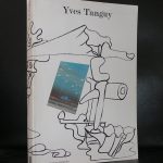
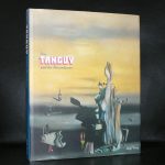
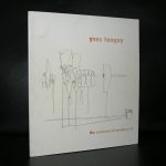
Look at the portrait and you think Tanguy is a punk from the Seventies, but he is far from ….
He is rooted in the surreal mouvement of the mid Twenties from last century and met with artists like Dali, Miro and de Chirico and found himself in the middle of a surrealistic art mouvement. His paintings are typical for surrealism, but because of the landscape qualities and the typical Tanguy surreal elements they more look like abstract forms in a landscape than other typical surreal paintings that always have a realistic element in them.

For me Tanguy’s art goes beyond surrealism and is more an abstract kind of art than surreal. In the Netherlands there was a painter who had the same qualities. Pieter Ouborg started as a surreal painter but later he developed an art language of his own. Turning surreal elements into abstract elements. This is the same what i think Tanguy does. Turning forms in to abstract elements and composing them in the landscape of the painting. www.ftn-books.com has Tanguy titles available

Piet Dirkx cigarbox 8521

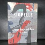
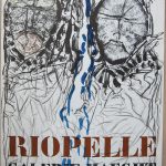
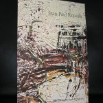
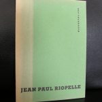
Two names spring to mind when you look at the works by Jean Paul Riopelle ( Canada , 1923) and read about his life. He lived near Giverny ( the place where Monet had his studio and gardens) and he used a technique much the same as Jackson Pollock did. Dripping paint on a horizontal canvas. The result ….. colorful and abstract compositions which have the colors of a Monet painting and the abstract construction of a Pollock one.

Riopelle’s style in the 1940s changed quickly from Surrealism to Lyrical Abstraction (related to abstract expressionism), in which he used myriad tumultuous cubes and triangles of multicolored elements, facetted with a palette knife, spatula, or trowel, on often large canvases to create powerful atmospheres.
The presence of long filaments of paint in his painting from 1948 through the early 1950s has often been seen as resulting from a dripping technique like that of Jackson Pollock. Rather, the creation of such effects came from the act of throwing, with a palette knife or brush, large quantities of paint onto the stretched canvas (positioned vertically).
For me Riopelle is a fascinating artist and because of the beautiful publications Maeght made with this artist it is not entirely out of reach financially. A very nice Riopelle publications can be obtained for less than euro 100,– at www.ftn-books.com

Piet Dirkx cigarbox 850

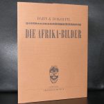
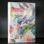
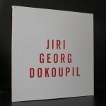
We are from the dame generation and perhaps that is why i appreciate Dokoupil’s painting. Always extremely colorful and becoming more and more abstract.
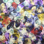
The association is one of “stained glass” and i would not be surprised that in the end of his career he will be invited to make some church windows ( btw. Marc Mulders made some for the Chapel in the Gouda Museum). It takes some time to get accustomed to the art of Dokoupil, but once you get know his paintings you only can admire them. Fled to Germany from Tsjechoslovakia in 1968, he soon joined the Mulheimer Freiheit group and participated in performances and group exhibitions together with Dahn and Adamski. In the Nethertlands he had his “one man” exhibitions at the iconic galerie Riekje Swart and became part of the exhibitions organized on the NEUE WILDEN by Frans Haks in the Groninger Museum and the Centraal Museum Utrecht. From these early days on his art developed into an abstract kind of art which is personal and typical for Dokoupil. An artist to keep following and see what his next step in art will be .
There are some Dokoupil publications available at www.ftn-books.com