
A master in Blue . A bit like Yves Klein had his favorit color too and executed many of his paintings in Blue. Zinsser uses the available commercial paints with their standard bright colors.
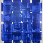
John Zinsser’s abstract paintings investigate formal properties of gestures, supports, color, and paint through simple actions and two-toned compositions that explore the relationship between figure and ground. After studying art history at Yale, Zinsser relocated to New York, where he has remained since the 1980s. Color is a preeminent concern for Zinsser; he typically works with naturally occurring commercially available colors such as cobalt blue or cadmium red. The properties and values of the ground determine what colors and forms he chooses to include in the foreground. “I always put a faith in materials first—that paint has a kind of authority of its own,” he says. “Paint has a unique power to assert tactile reality, pushing toward a larger visual and bodily response.”
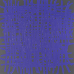
For me personally il compare his paintings with the one Tomas Rajlich has done in the last 2 decades / also monochrome paintings with working the paint over that it the paint is moulded into a shape. Both arftists i like very much, but for me personally i prefer the Rajlich paintings , because i have met Tomas on several occasions and beside an excellent painter he is a an aimable person.
www.ftn-books.com has a nice Zinsser catalogue available.


