Posted on Leave a comment

K.R.H. Sonderborg (1921-2008)

German Informel is closely associated with K.R.H. Sonderborg. Inspired by the gestural painting of American Abstract Expressionism, his paintings and drawings reveal a fascination with technical constructions and their traces of movement. It shows the form in its process of creation. In doing so, Sonderborg used a spontaneous application of paint. He thus created a dynamic structural system. His brushstrokes were rather strokes with the painting tool, executed in a quick gesture. His preferred colours were black and white with red elements, which he applied with a rubbing or wiping technique. From the 1970s onwards, his work increasingly approached a controlled, almost representational formal language. He limited himself to a few high-contrast colour tones, usually black on white. He distilled motifs from private and press photographs, isolating them from their narrative context and using them as a basic optical structure to inspire him. He remained true to his preference for technical constructions, whereby the graphic structure of car windscreen wipers and overhead cables inspired him just as much as harbour cranes or gas tanks. 

www.ftn-books.com has multiple Sonderborg publications available.

Posted on Leave a comment

Robert Zandvliet (1970)

Over the past 3 decades, s Robert Zandvliet has developed a versatile as well as consistent oeuvre. That diversity is expressed the choice of motif, but also in the manner of painting, in the degree of figuration and abstraction, in the character of the brushstroke and in the use of or perhaps even the very avoidance of color. The coherence among the works has to do with their subject matter. From the very start Zandvliet has been fascinated with the medium of painting. As a theme found throughout his work, the desire to fathom its potential is given shape in all sorts of ways.

Zandvliet uses the tradition of painting as a guiding thread. Aside from traditional genres such as the still life, landscape and, in recent years, the human figure, specific works by other artists can also serve as points of departure. Whether he opts for a commonplace utilitarian object, a ‘coulisse’ landscape, an etching by Rembrandt or a painting by Picasso, the motifs are no end in themselves but rather a means by which to relate to painting; to its grammar and vocabulary, its pictorial richness, its eloquence and energy.

Zandvliet operates in the realm between abstraction and figuration. This is precisely where painting, in his view, has the opportunity to unfold and reveal its true diversity. The motif provides the painting with a foundation. It prompts the choice of painterly means and possibilities and, in that way, continues to have resonance in the finished painting. During the process of painting, the image becomes autonomous. Abstraction keeps the personal anecdote at a distance. The paint takes over the narrative. The development of Zandvliet’s oeuvre follows no straight course. One can sooner speak of circling movements. In his search for the purest form, Zandvliet frequently shifts his focus. New motifs give rise to other painterly challenges, and applied artistic solutions are further developed or set aside in order, once again, to make new discoveries possible.

For a number of years Zandvliet concentrated on the control of the brushstroke, the basis of painting. In his paintings he developed the movement of the brush into a distinct handwriting of his own. The acquired virtuosity became an obstacle for him, however, and in 2014 the dancing or sometimes fluid movements of the brush gave way to the recurring imprint of a paint roller. Zandvliet now painted his immense canvases in a single session and, with Seven Stones and the 2017-18 series Stage of Being, he pinned his hopes on the ‘momentum’ and the physical and mental energy that this could generate.

After a period in which robustly applied black gesso predominated, color has returned in full glory to his recent works. Zandvliet’s investigation into the essence of individual colors led to a range of ways in which to apply the paint. Striking in his recent paintings are the tactility and subtle nuances of the painted surface.

In his pursuit of the ultimate image, Zandvliet also goes back to motifs and painterly solutions from previous work. With the boulders placed centrally on the image surface in his Seven Stones, he went back to his earliest paintings of commonplace utilitarian objects; in Stage of Being the screen from his early ‘cinema’ works returned. With the landscapes from recent years, his earlier, nearly abstract approach to the genre was given a new twist. Motifs recur; they acquire new uses and new levels of meaning. As Zandvliet’s oeuvre grows, the paintings take on new interrelationships. These make his body of work even more tightly woven and challenge the viewer to discover its wealth of meaning.

www.ftn-books.com has some highly collectible Zandvliet titles now available.

Posted on Leave a comment

Gé-Karel van der Sterren (1969)

Gé-Karel van der Sterren (Stadskanaal, July 29, 1969) is a Dutch painter. The visual artist Van der Sterren, born in Stadskanaal, was trained from 1990 to 1996 at the art academy in Enschede. Soon after his training he exhibited at home and abroad. His work has been shown in Amsterdam, The Hague, Reykjavik, Dijon and New York. In 2009 Van der Sterren made for the Gemeentemuseum Den Haag the monumental canvas Oopsie Daisy of 14 meters long and three meters high, in which he visualized his view on the contemporary consumer society. The work of Van der Sterren was awarded the following prizes: Royal Prize for Free Painting – 1999 Prix de Rome – 1999 Jeanne Oosting Price – 2007

www.ftn-books.com has 2 publications available on Ge-Karel van der Sterren.

Posted on Leave a comment

Jus Juchtmans (1952)

Known for his apparently monochrome paintings, and clearly related with minimal art, that rejected the dominance of visual perception and presented the idea of artworks as objects to be experienced, to be made aware of, and no longer to be seen for their visual impact, Jus Juchtmans works with a translucent painting that he applies to the canvas in different consecutive layers, not necessarily of the same color.

Sometimes there are even thirty different layers, and in this way, colors that we haven´t perceived at first sight appear under the apparently dominant color.

The result is an extremely shiny surface that resists the viewer, and looking at them is often a frustrating process that makes the spectator to feel uneasy. This reflection as well as the reflection of the gallery’s surroundings, is an integral part of the work. He wants the spectator to become conscious of the viewing conditions of his work, particularly the transitory and time specific nature of those conditions.

Born in Morstel in 1952, Jus Juchtmans studied Fine Arts and Design in Antwerp, where he has developed his artistic career from the beginning.

Since then, he has grown up to become a well-known artist, participating in different group shows in museums and institutions, among other ones the Ludwig Museum, with Callum Innes and Nicola Rae, the Kunsthalle of Recklinghaussen, and Budapest, the Kunstmuseum Celle, etc.

In the late years he has reinforced his career with individual shows in London, Munich, Cologne, Graz, Berlin, Paris and New York.

His works can be found in museums like the SMAK of Gante, The Contemporary Art museum of San Diego, the PMMPK of Belgium, the Karl Ernst Osthaus Museum of Hagen… and in collections like the Peter Stuyvesant Collection of Amsterdam, Fondation Carmignac, Porquerolles and F. van Lanschot Bankiers.

www.ftn-books.com has the DIPTYCHON IV catalog from Gent now available.

Posted on Leave a comment

Terry Winters (1948)

Over the last four decades, Terry Winters has expanded the concerns of abstract painting by engaging contemporary concepts of the natural world. Many of his earliest paintings depict organic forms reminiscent of botanical imagery. Over time, his range of themes expanded to include the architecture of living systems, mathematical diagrams, musical notation, and new orders of data visualization. His brilliant palette reflects his continual experimentation with materials. Throughout his paintings and works on paper a metaphoric sensibility reveals itself in the expressive language of resonant forms and figures. Winters has described being motivated to describe how “abstract processes can be used to build real-world images.”

Terry Winters (b. 1949) lives and works in New York City and Columbia County, New York. He has had one-person exhibitions at numerous museums, including the Whitney Museum of American Art in New York, the Whitechapel Art Gallery in London, the Kunsthalle Basel, and the Metropolitan Museum of Art in New York. Most recently, the Drawing Center in New York organized a survey of his drawings in 2018.

www.ftn-books.com has the PRINTED WORKS book from 2001 now available.

Posted on Leave a comment

Helen Britton (1966)

From a young age, Helen Britton used art as a form of communication and was soon making jewellery. She still has a cow horn bracelet she made when she was 12 and some earrings made from old beads and fuse wire.

As an artist-jeweller, Britton approaches her practice without distinguishing between forms of creative production: “Some bodies of work contain jewellery, sculpture and drawings; some only one or another — it depends on what I am trying to say.”

Britton is one of the world’s most established artist-jewellers and is known for creating colorful pieces that are just as likely to include recycled plastics as precious stones.

“Preciousness is a construct and culturally driven. All materials are interesting and carry their stories with them,” she says. “I choose the materials because of what they have to say and for no other reason.”

Over the years, she has set blackened silver rings with diamonds and sapphires, or combined silver and pearls with plastic or glass. Her creations are part of jewellery collections of museums such as the Metropolitan Museum of Art in New York and the Stedelijk Museum in Amsterdam.

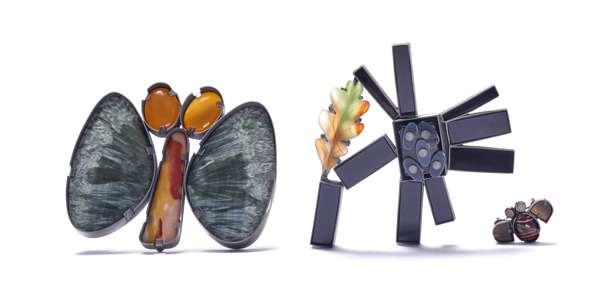
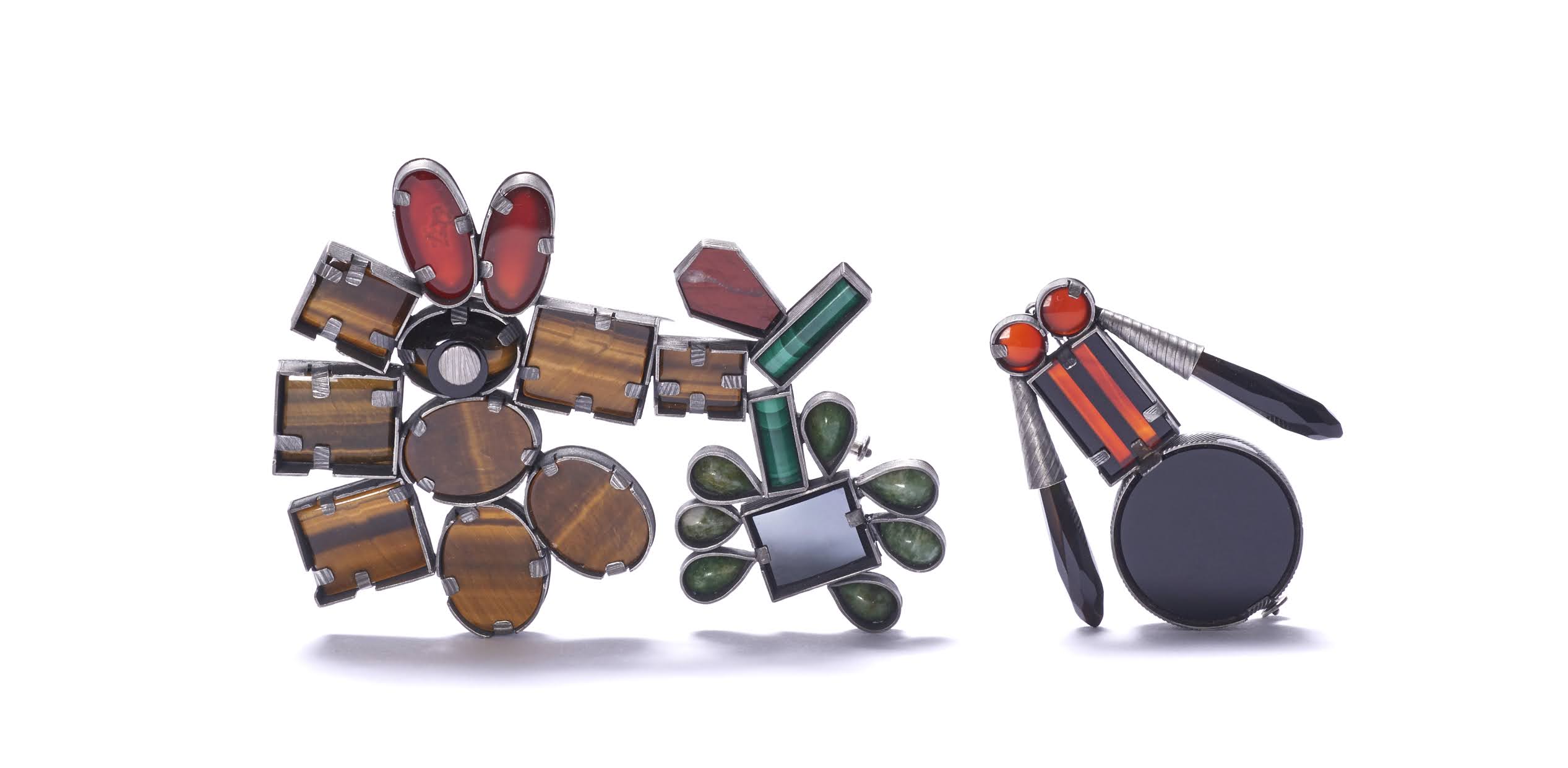
In her most recent body of work, Arachne’s Garden, Britton played with stones she had collected over her lifetime, such as jasper, agate, garnet, malachite and onyx. Like pictograms constructed in stone, she says the brooches and pendants formed on her table almost by themselves, “while sliding the piles around, animals and insects and flowers appeared, like watching clouds or reading tea leaves”

Britton’s preference for repurposing materials is deliberate and she notes that with our planet’s resources being constantly depleted, “it is difficult to justify the production of even more things. All I can do is carefully use up what I already have.”

www.ftn-books.com has now the catalog with Special cover from 2010 available.

Of her creative process, Britton explains: “It’s hard to say succinctly what I do. Sometimes I don’t know myself. I only know that the work wants to be made, that the selection of materials and choice of art form are dependent on the theme and when a work is finished, I can stand back and see if I have given it enough power and autonomy to live a life in the world without me. That’s the wonder of the creative process. A lot of it remains a mystery even to me.”

Sienna Patti, who has championed artist- jewellers since founding her gallery in Lenox, Massachusetts, in the late 1990s, remarks that while some artists who create jewellery as an extension of their practice have their work outsourced, Britton creates everything herself. Artist-jewellers like Britton, she points out, “choose to communicate their concept intentionally in a jewellery form as opposed to a painter or sculptor who decides to make jewellery”.

Posted on Leave a comment

Caro Suerkemper (1964).

Berlin-based artist Caro Suerkemper (1964) shows no mercy. She undermines the fundamental contradiction between the position of the absolute and the dialectics of the relative and prompts us to replace a historically sufficiently legitimised, supremely untroubled self-confidence with a reflex action of self-mockery. However, what is apparent in the foreground of her work – obvious situations of bondage, women relieving themselves, constricting clothes, laced breasts, exposed buttocks, but also snub-nosed kids who make you smile – in short, appearances, the entire sphere of the empirical inner and outer world – is just a means and a form of pathos, leading us to the underlying realities. Subtly and efficiently in work of outstanding quality, using brush, crayon, and her fingers, Suerkemper manages not merely to question but also to unmask what not just the church and society have been attempting for centuries: to curb women’s tongues – mulierem ornat silentium (silence becomes a woman). She wants to take us down to the depths, down to the tectonic plates where social, normative, moral and aesthetic earthquakes interconnect in a complicated way. Kant’s idea that what is important in reception (or “aesthetic judgement”) is what we make of given ideas is preluded by Suerkemper to the extent that, although she makes the impression created by what is desirable or beautiful dependent on certain conditions, these in themselves are not the truth but merely a precondition. Suerkemper likes to point out that her work also contains some baroque elements. In fact, not only her drawings, china figures, underglaze painting and marble sculptures, but also the titles of her works (Anmut (Grace), Würde (Dignity), Gnade (Mercy), Carokoko, etc.) are extraordinary and for this reason alone baroque – though also ambiguous. Whereas we are gripped by the extraordinary in the art of Ancient Greece and Rome, it repels us in baroque art: we find it disturbing, an annoying ambiguity, e.g. a praying figure, bent over in convulsions, a woman of “baroque” proportions urinating in a wheelchair. Why these gestures, we ask ourselves. Why indeed? Have mercy on us, the recipients.

www.ftn-books.com has the Wasserfarben book published by CARO now available.

Posted on Leave a comment

Daniel SIlver (1972)

‘I think all my interest in archaeology and work that was made a thousand years ago, thousands of years ago, still carries that humanity in it, and I hope my objects will carry this in them in times to come.’

The sculptures of Daniel Silver (b. 1972, London) explore the many forms and iterations of the human body. His practice is influenced by the art of ancient Greece, modernism and Freudian psychoanalytic theory. Silver uses concrete, bronze, marble, stone, wood and clay, and his sculptures often manifest as monuments or fragments, as if belonging to an archaeological excavation. Silver moves restlessly between styles, always examining the physical and emotional impact of the body and its representations.

Silver’s 2013 installation Dig, an Artangel commission, took place in a derelict London cinema, where he presented an imagined archaeological dig of sculptures looking both ancient and futuristic, conceived by the artist as a ‘history of sculpture’. In 2019, a commission for London’s Bloomberg Space resulted in a set of monumental, figurative works that spoke of the artist’s fascination with psychology as well as his profound interest in ancient cultures and archaeology. Recently, Silver has made a group of sculptures constructed from segments of unglazed ceramic, which he finishes with oil paint. In parallel with these sculptures, which he calls ‘totems’, the artist has created a series of ceramic heads. Once fired, each head is painted with oils, allowing the pigments to interact with the unglazed ceramic to create tactile surfaces and intimate expressions. Though his figures are fictitious, Silver regards them as familiar characters from anyone’s family. ‘I try to condense and carry the whole world into a person when I make them’, he says. 

www.ftn-books.com has the art angel published book DIG now available.

Posted on Leave a comment

Han Klinkhamer (1950)

The paintings by Han Klinkhamer show landscape in two respects. First, the view of the land opens up, with the painting serving as a window that opens up the view of a horizon, a sky and contours of trees, shrubs or flowers.
At the same time, each painting has a very independent rough structure, the artist has put a lot of work into the texture – it often looks like the magnification of a surface or a cutout from nature. These two perspectives – far away and close – are combined without the focus being affected. Or, in other words, Klinkhamer’s works combine a spiritual image with a material, physical view of real landscapes.
The artist lives in a village directly behind a dike on the Meuse. He only has to climb this dike if he wants to see water, meadows or the moving sky. Nevertheless, one does not feel as if his paintings depict this outer world. Although his works deal with nature, his daily encounter with the elements undoubtedly serves as a framework for him. But the true landscape is created in the studio – “true” here means the landscape created with color, conjured up. Sometimes one gets the impression that plant stems or grains of sand are added to the colour. But the illusion arises from the thickness of the paint layer and scratching with a sharp tool, everything is painted.
Klinkhamer’s works are about the transformation of nature into paintings – and about making this transformation look authentic and credible. As far as the colour spectrum is concerned, Klinkhamer is limited. One almost gets the impression that he is hiding the colors in the motifs. Is this perhaps due to the limited colour diversity of the Dutch river landscape, where Klinkhamer is at home? Hardly. The colours are determined in the studio, in the painter’s head, in the image he wants to create, by the inner truth of the respective image. There is always a primer, often in black or white, and the potential for color, which, however, is reluctant to appear – as if the viewer witnessed the moment of the first rays of sunshine when things take on color. Then we can indeed see a hint of green in the black, and a hint of pink in white.
Do these images radiate a love of nature? Maybe, yes. On the other hand, however, there is also effort and struggle, a pulling and pulling. “With every picture,” says the artist, “you have to start from scratch as if it were the very first image.” Klinkhamer’s paintings thus address not only the outside world, but also the inner landscapes, moods and convictions – without words, and yet as an essential part of the paintings.

www.ftn-books.com has several books on Klinkhamer now available.


Posted on Leave a comment

Yves Velter (1967)

Yves Velter lives and works in Ostend, Belgium. An awareness of displacement and alienation constitutes the basis for his work, in which an interest in human (and humane) values comes to the fore. The muted characters in his work are based on existing people who have been made unrecognizable by making them abstract to a certain extent. They are placed in situations in which they create an opening in reality, thus enabling them to break through the impossibility of showing emotions. The images show the contrast between representation and abstraction. It is an aspect that works on several levels: the elusiveness of emotions, sensuality, fears, desires, individuality

n contrast to science, art is a domain where unconventional reasoning remains a possibility. The artist immerses himself in the world of a woman who is caught up in a closed-off logic of writing letters in a code all of her own. He considers these intimate scripts to provide a parallel with the world of the arts, where an artist also creates codes in order to translate his own world of thoughts. In the eyes, the mirrors of the soul, of his figures we can see small pieces of the aforementioned letters. Other objects and materials from several origins that carry a comparable tension within them (red dots, soil from his parents garden, cardboard, clothing) are also being used as ingredients in his works. In a world of his own he investigates and reorders the experiences, objects and metaphors which possess this tension. With connection to this, the artists speaks of making corrections of ratio which enable him to use his very own code of images in order to give expression to the unanswerable.

www.ftn-books.com has the Oostende 1997 catalogue available.