At the outset, Hans Houwing worked with stainless steel mesh with a mesh size of 1 x 1 mm. This was during the time of Orez Mobil Gallery in The Hague, where Jan Schoonhoven often exhibited. The majority of the pieces were created by cutting and unraveling the mesh, and then reassembling various pieces by sewing them together or securing them with wires wound around each other.
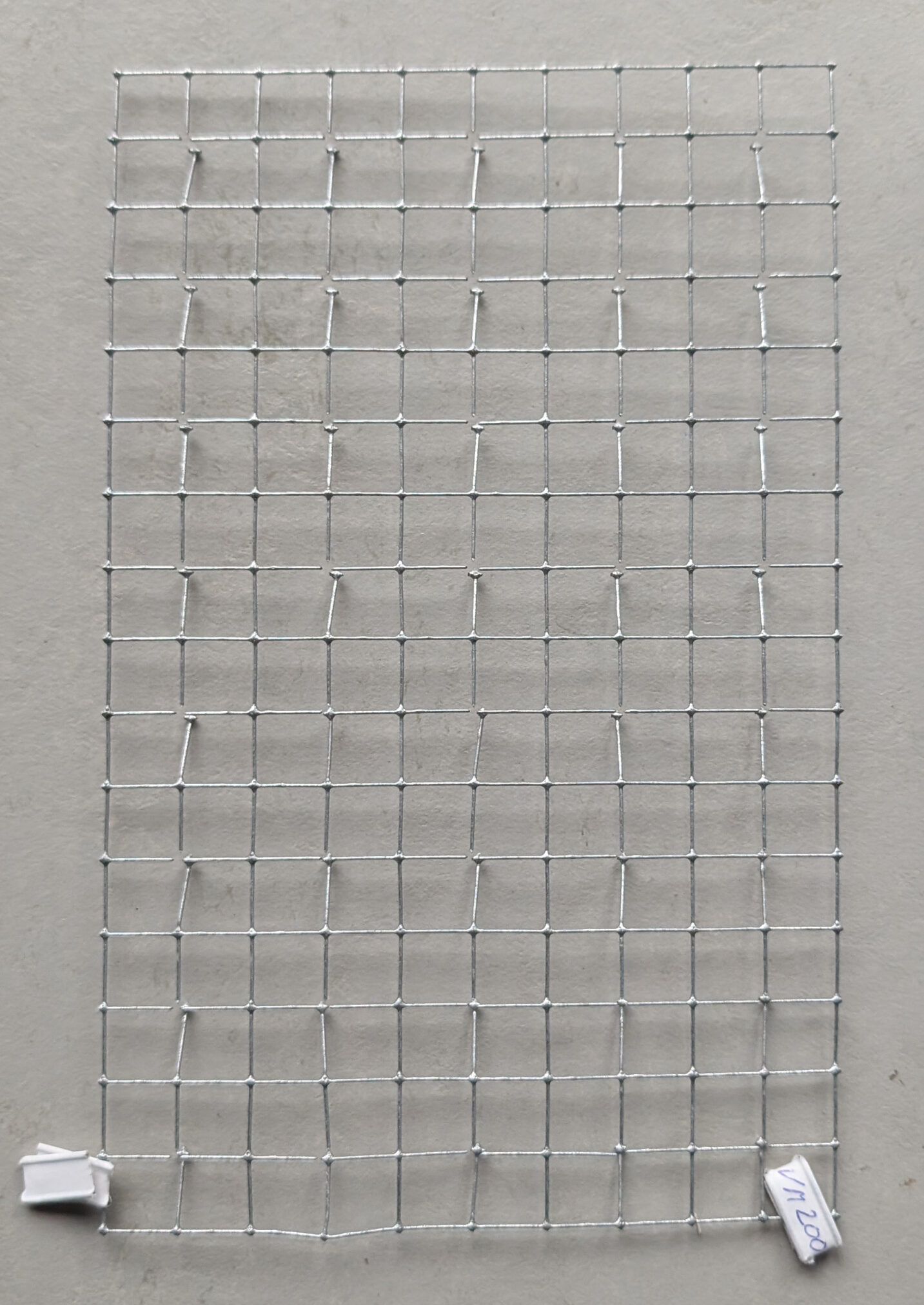
After primarily working with fine stainless steel mesh for nine years, Hans Houwing began using aviary mesh, specifically galvanized square mesh with a mesh size of 12 x 12 mm, between 2000-2006. After that, he worked with all types of metal mesh. One notable change was the increase in scale. In addition to the previously mentioned materials, he also used chicken wire and chick mesh, or ‘quarter mesh’; ‘dime mesh’ with larger square or hexagonal meshes of varying sizes; and the sturdy chrysanthemum mesh with a mesh size of 12 x 12 cm.
All of the pieces are variations on a basic linear and regular grid. The strict grid is distorted and manipulated, creating a three-dimensional effect. In this sense, all of the pieces are spatial drawings. Sometimes, short pieces of wire (taken from the used mesh) are bent backwards, creating a distance from the wall on which the work hangs. This results in a doubling of the line drawing of metal wires and a shadow drawing on the wall, which becomes stronger or weaker with the changing light. Light plays a significant role in bringing Hans Houwing’s work to life. Many Dutch houses are through-house homes, so the angled light works well!
The limitation in materials and techniques allows for a wealth of possible variations and leads to a tremendous abundance of forms. Each piece is a standalone work of art – although the artist prefers to call them ‘pieces’. Furthermore, all of the pieces are of a manageable size and can easily be hung on one or two nails.
www.ftn-books.com has a Houwing multiple now available.