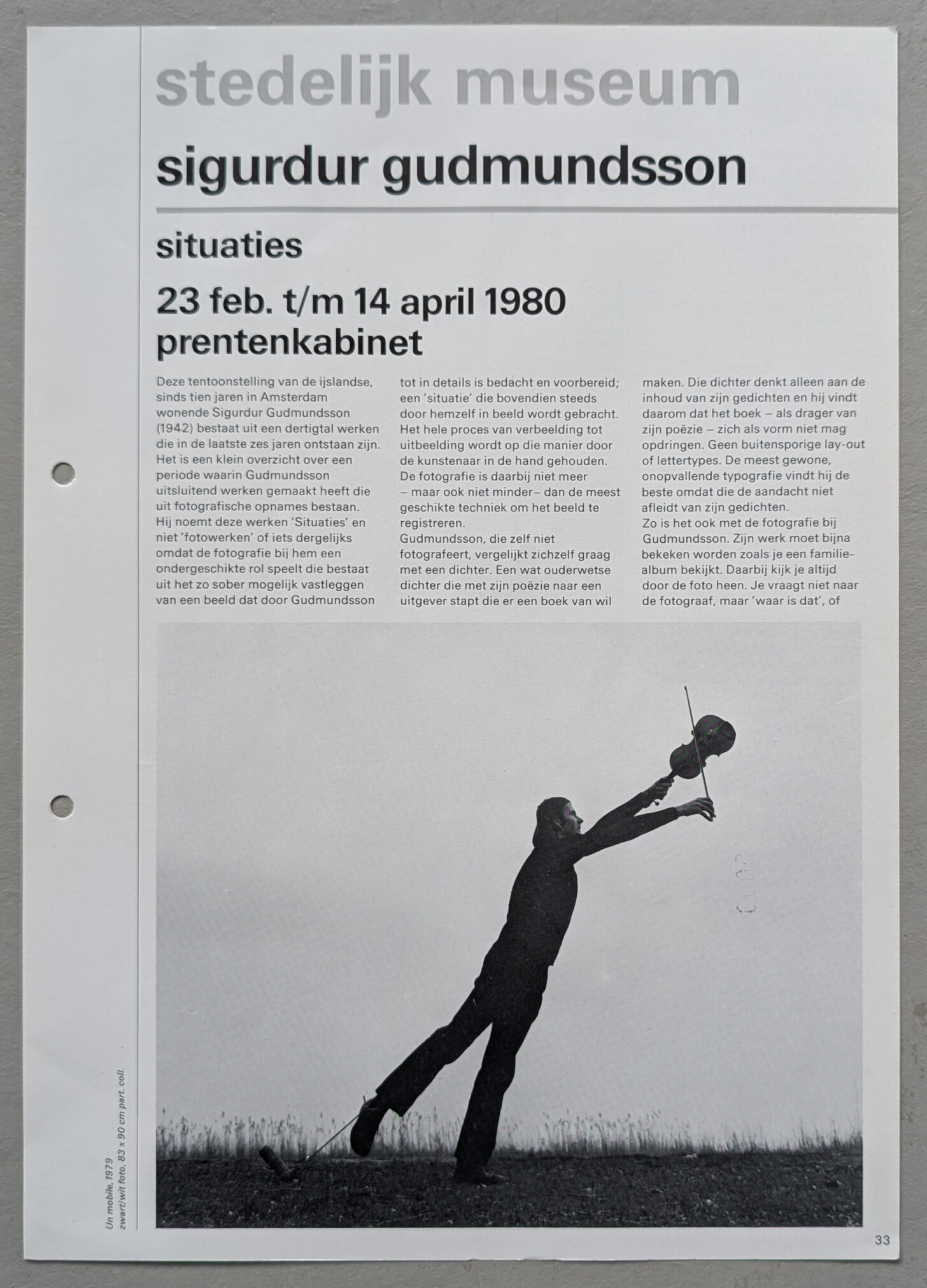
When Icelandic artist Sigurdur Gudmundsson settled in the Netherlands in 1970, his focus was primarily on “staged photography”: constructed images in which he himself played a role, often in absurd or ironic-melancholic situations. The museum also holds several pieces of this nature in its collection. “The Great Poem” from 1981 marks Gudmundsson’s shift from photography to sculpture. Three grey concrete pyramid forms stand on a steel base, with a swan’s neck and head emerging from them – as if the swans are about to break free from the pyramid, a symbol of rational thought. Poetic passion and a romantic sensibility are hallmarks of Gudmundsson’s entire body of work, setting him apart from his fellow artists, from his Fluxus period in the 1960s to present day. The artist’s origins, with the Icelandic landscape and atmosphere of folktales and legends, play a significant role. “I am deeply attached to the transformation of emotion into material. A good work of art is a fingerprint of the soul.”
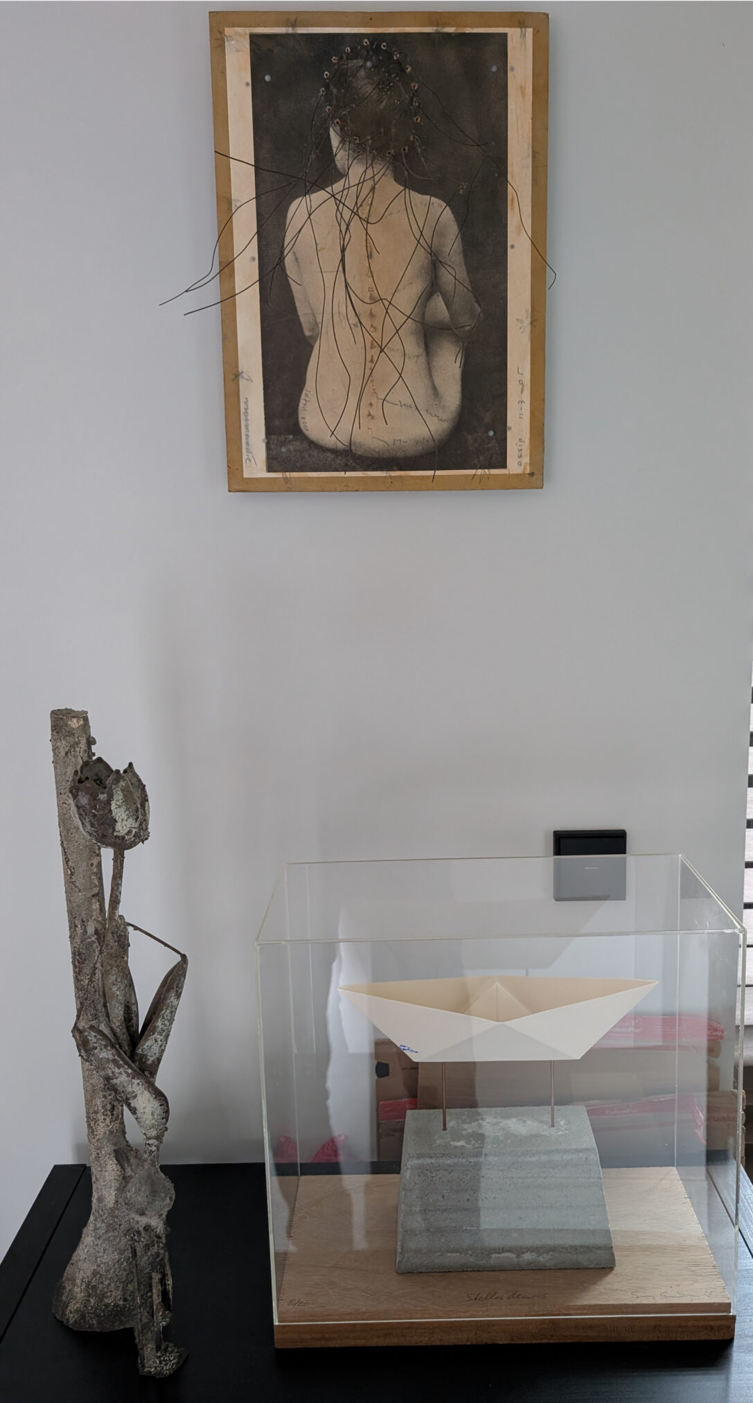
I personally have a weak spot for the works by Gudmundsson and have been following his career since the early 90’s. In that period i acquired an impressive multiple / Stella Maris which is still , since i have bought it, on display in my office. On my new location it is now presented together with a bronze tulip by Guido Geelen and an even impressive ” nude/ back ” by OSSIP.
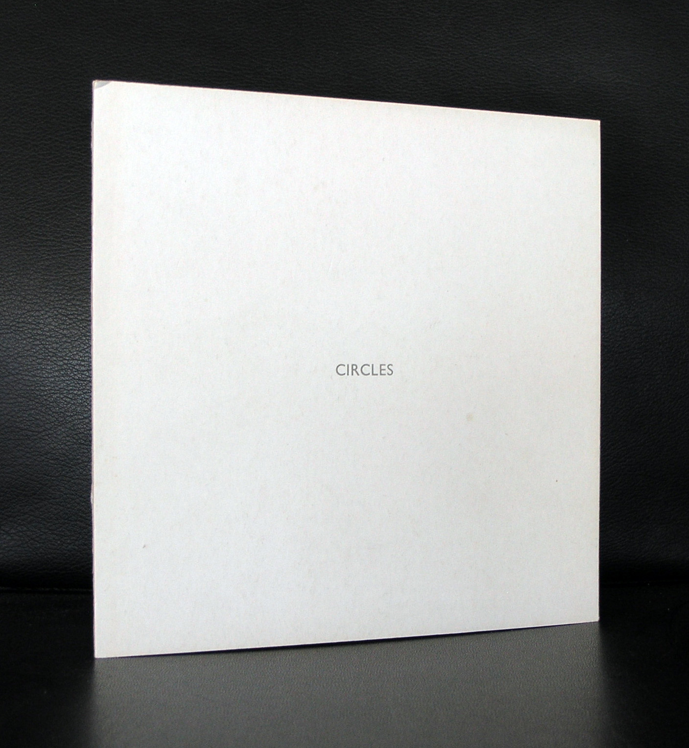
www. ftn-books.com has a a nice selection of Gudmundsson publications including the much sought after “CIRCLES”
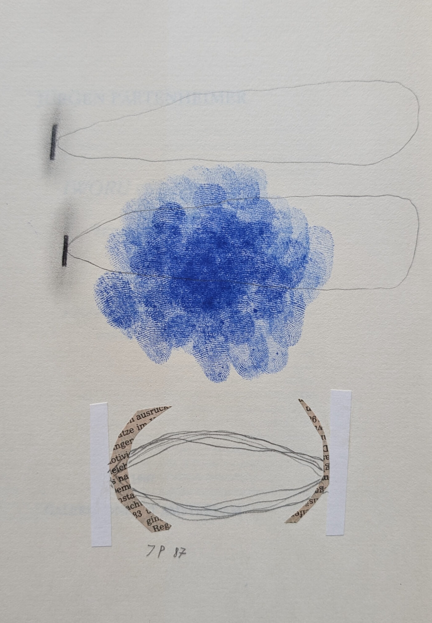
Born in München, born in 1947, Jürgen Partenheimer is renowned as one of the most distinctive and literary artists of our time. His oeuvre is characterized by a minimal yet deeply poetic visual language. Early in his career, he made a name for himself on the international stage at the Paris, Venice, and São Paulo biennials. The Archive is a retrospective of his more than thirty-five year career, as well as a unique collaborative project between the Gemeentemuseum Den Haag, Pinakothek der Moderne in Munich, Deichtorhallen Hamburg/Sammlung Falckenberg, and Contemporary Art Gallery in Vancouver. The Gemeentemuseum Den Haag houses a collection of paintings, works on paper, ceramics, sculptures, and artist books. A special highlight is the return of the first model of his work Weltachse, a vertical axis composed of stacked blue cubes, from a private Dutch collection to the museum where it was first exhibited twenty years ago.
The artistic works of Jürgen Partenheimer have carved a unique niche in the realm of abstract art. His “metaphysically abstract” pieces have evolved into a highly personal universe, with drawings, sculptures, and artists’ books serving as gateways to a new spiritual reality. Through his research, he intertwines art, music, philosophy, and literature, with drawing remaining at the core. Partenheimer is widely regarded as one of the most important contemporary German artists, having received numerous national and international prizes and accolades. He was also the first German contemporary artist to have a retrospective exhibition in China, at the National Gallery in Beijing and the Museum in Nanjing. This year, he was awarded the “Audain Distinguished Residency Award,” one of the most renowned Canadian prizes for visual art, by the Emily Carr University of Art+Design in Vancouver.
www.ftn-books.com just added an important Partenheimer title which includes a drawing by Partenheimer on the title page and was published in a special edition of only 10 copies.
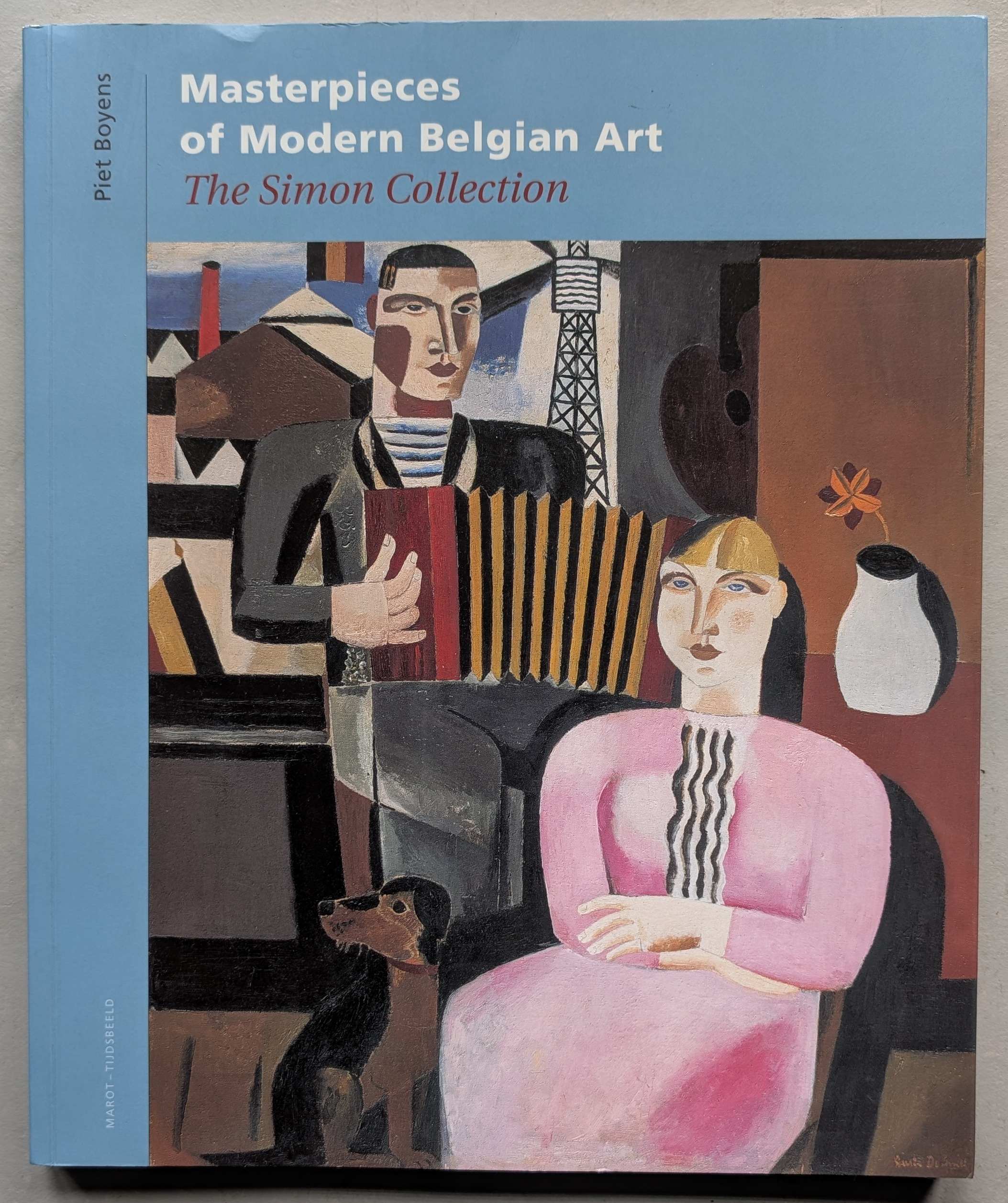
The Simon anthology, situated in the urban sprawl of London and Paris, represents the paramount anthology of modern Belgian art outside the confines of Belgium itself. This monumental volume accompanies a remarkable exhibition held at the Charles S. and Isabella V. McMullen Museum at Boston College from February 10 to July 22, 2007. Never before displayed on the North American continent, the fifty-three masterpieces featured in the McMullen exhibition include notable works by renowned artists such as Rene Magritte, James Ensor, Frits van den Berghe, Paul Delvaux, Theo van Rysselberghe, Emile Claus, Leon Spilliaert, and Constant Permeke, among other distinguished names.
Every piece showcased in this exhibition is vividly depicted in full color, accompanied by seven eloquent essays authored by esteemed scholars from various disciplines. These experts delve into the profound significance of each composition, while also shedding light on the striking impact of Belgian art’s contributions to the development and evolution of modernism. The authors not only examine Belgium’s intricate history as a nation, but also delve into the history of collecting Belgian art. In doing so, they also explore the connections between these masterpieces and significant themes of the twentieth century, such as the rise of Freudian psychology and the upheavals of war. Additionally, the recurring motif of carnival in many of these paintings serves as a link between Belgian art and the rich traditions of the past. Through its carnivalesque depiction of the world, these works offer an outlet for the anxieties of modern times.
While art history has traditionally focused on major cities like Paris, Berlin, Moscow, and New York as the centers of modern art, this volume and exhibition seek to challenge conventional notions by shining a spotlight on Belgium. It depicts how the history of modern art takes on a whole new perspective when viewed through the lens of this “marginal” center – giving rise to the fitting title of the exhibition: A New Key.
The process of painting is captivating and endless, and José Heerkens’ work is centered on concentration and intensity. Color is the main theme and means of creating space, rhythm, and openness. The balance between tension and calm, movement and stillness, objectivity and subjectivity of color are elements that unfold while observing José Heerkens’ work. This multi-layered quality in her paintings demands a close examination from the observer. It is crucial that the viewer does not just look at the painting, but steps into it and becomes a part of it. Simultaneously, José Heerkens works on multiple concepts, including the times of the day since 2010. Titles such as Morning, Evensong, Vespere, Predawn, and Dawn refer to this. Pure, transparent linen is used in various concepts. This allows the color of the linen to be present from the beginning. Colors have a different intensity and lightness on pure linen than when applied on white primed canvas. Each color is deliberately chosen. Sometimes, colors are created that closely resemble the color of the linen. This brings out the differences between the woven and painted surface. Formats and dimensions are carefully selected. For the exhibition NOONTIDE at the Mies van der Rohe Haus in Berlin, Germany, she created the piece Laying Down On Seven Greens. “Sincerely yours” is the title of the exhibition at O-68. Even in square formats, the image appears more horizontal than vertical. The horizontal lines draw the image towards the sides, creating a sense of horizontal space. The lines sometimes run from edge to edge, and sometimes they end sooner. Colors flow from line to line, from shape to shape, from left to right. This invites the viewer to read her paintings, as one would read a letter. This brings the method of reading into a surprising connection with painting.
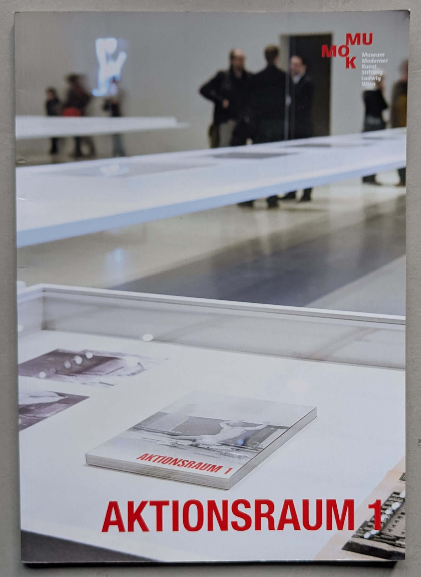
In 1969, Eva Madelung (patron), Peter Nemetschek (artist/photographer), and Alfred Gulden (writer/filmmaker) established the avant-garde collective known as Aktionsraum 1 in Munich. Their aim was to create a space for young artists that would deviate from traditional artistic practices in order to provide a platform for new performative, institutional, and societal critiques in the art world.
For one year, a vacant factory hall served as the location for over 50 projects featuring action, conceptual art, and Arte Povera. Artists such as Klaus Rinke, HA Schult, Jochen Gerz, Christian Attersee, Günter Brus, Peter Nemetschek, Hermann Nitsch, Giuseppe Penone, Braco Dimitrijevic, Ben Vautier, Günter Sarée, Luciano Fabro, Stanley Brouwn, and the OHO group experimented with alternative and innovative forms of art in this precursor to today’s off-spaces. The international roster of artists reflects the significance and avant-garde nature of this enterprise. Some of the most legendary actions included Günter Brus’s shredding performance and Hermann Nitsch’s 7th Abreaction Game.
The Aktionsraum also served as a testing ground for involving the audience and incorporating the mediation of art through lectures and discussions. Project failures were just as much a part of the potential new experiences as the ignorance or animosity from parts of the public and authorities. Various documents remain from the predominantly process-oriented and actionist works, including reflections of audience and media responses. The MUMOK exhibited films, posters, sketches, letters, and photographs that traced this boundary-pushing chapter of recent art history with its complex themes and organization.
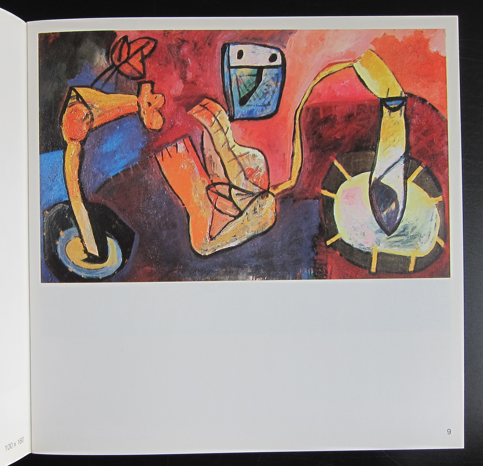
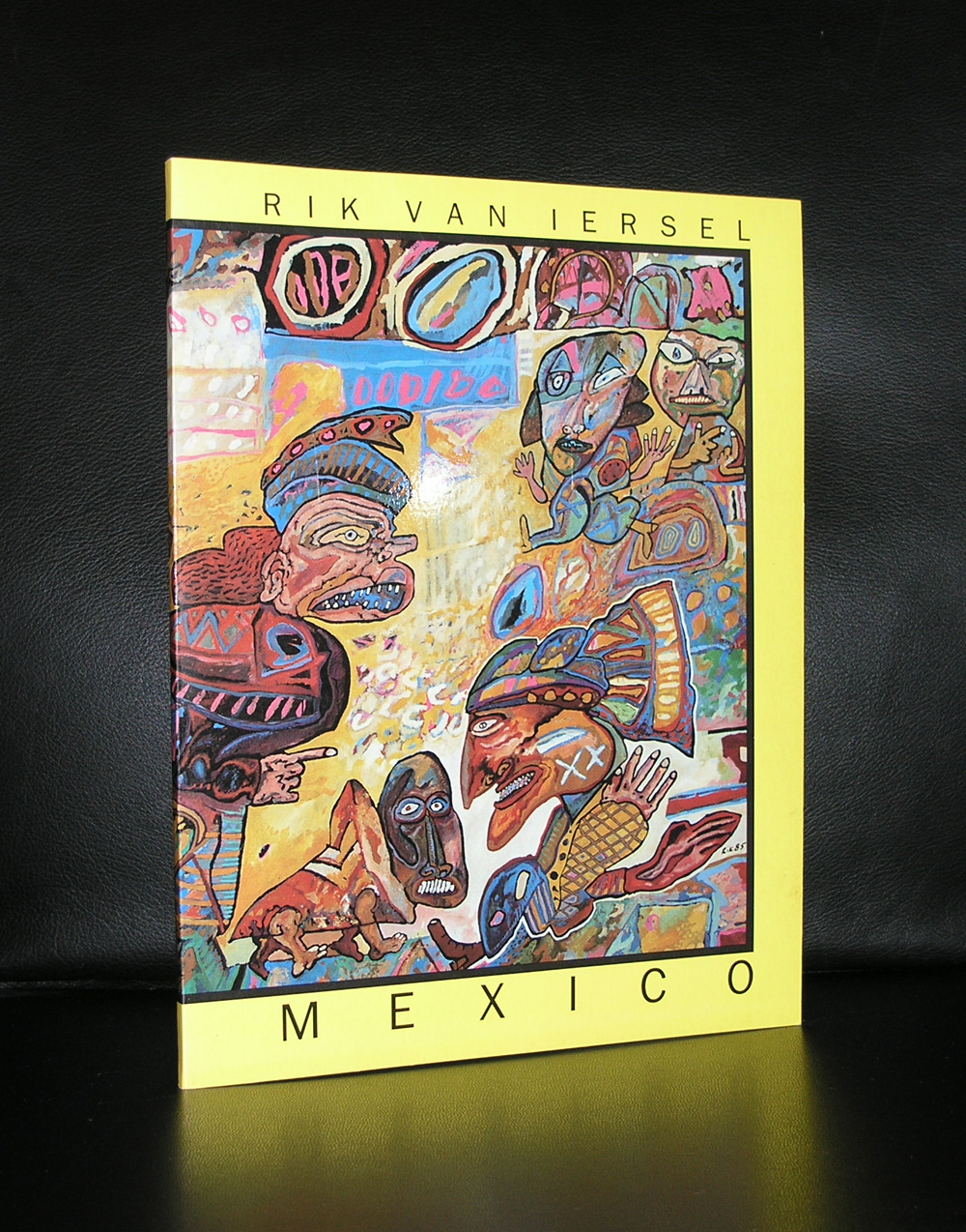
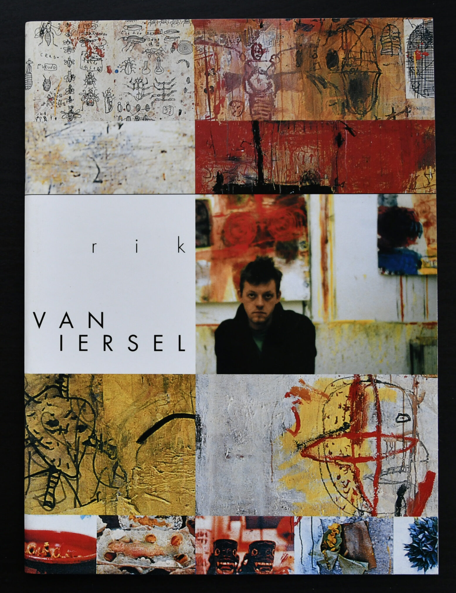
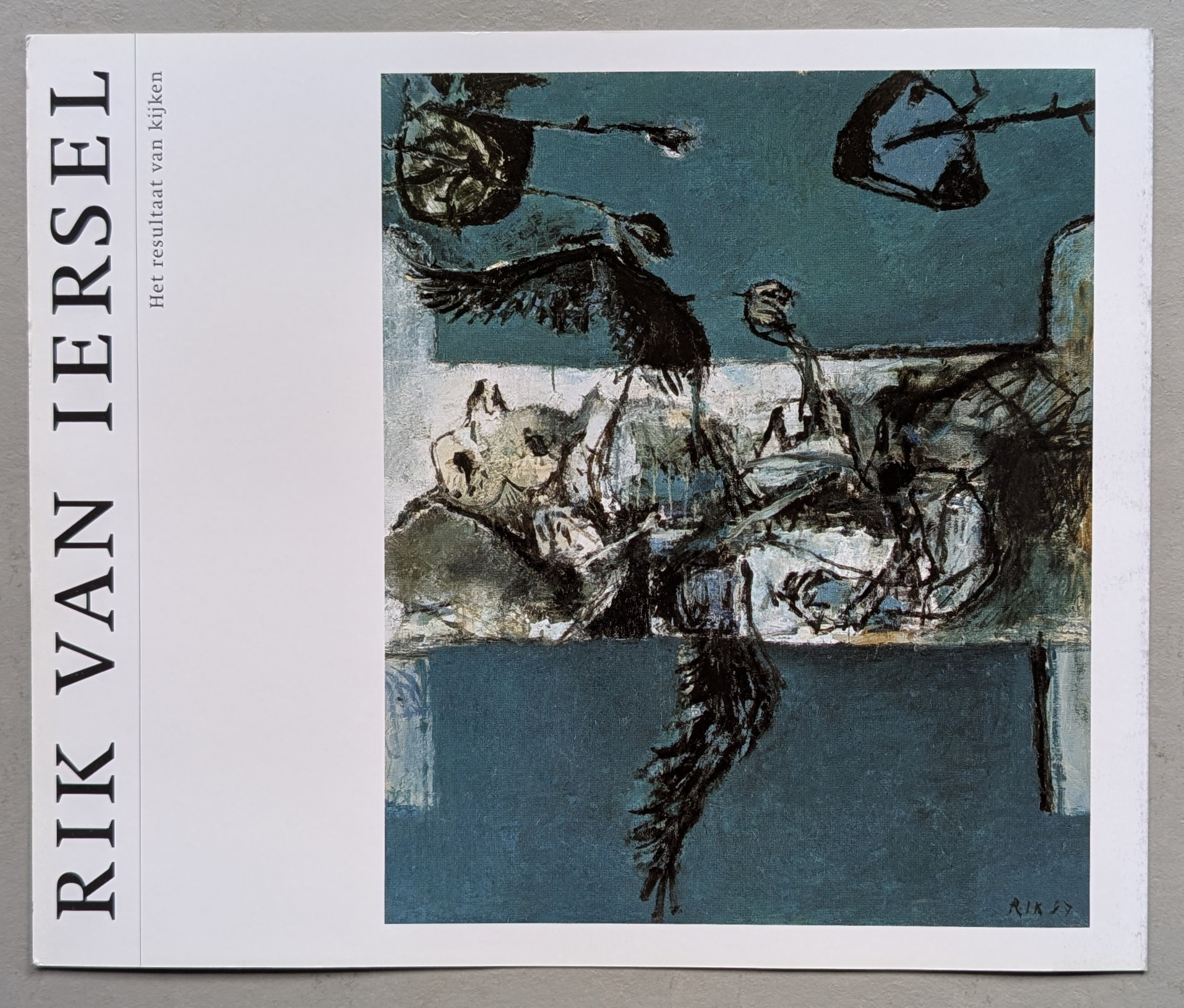
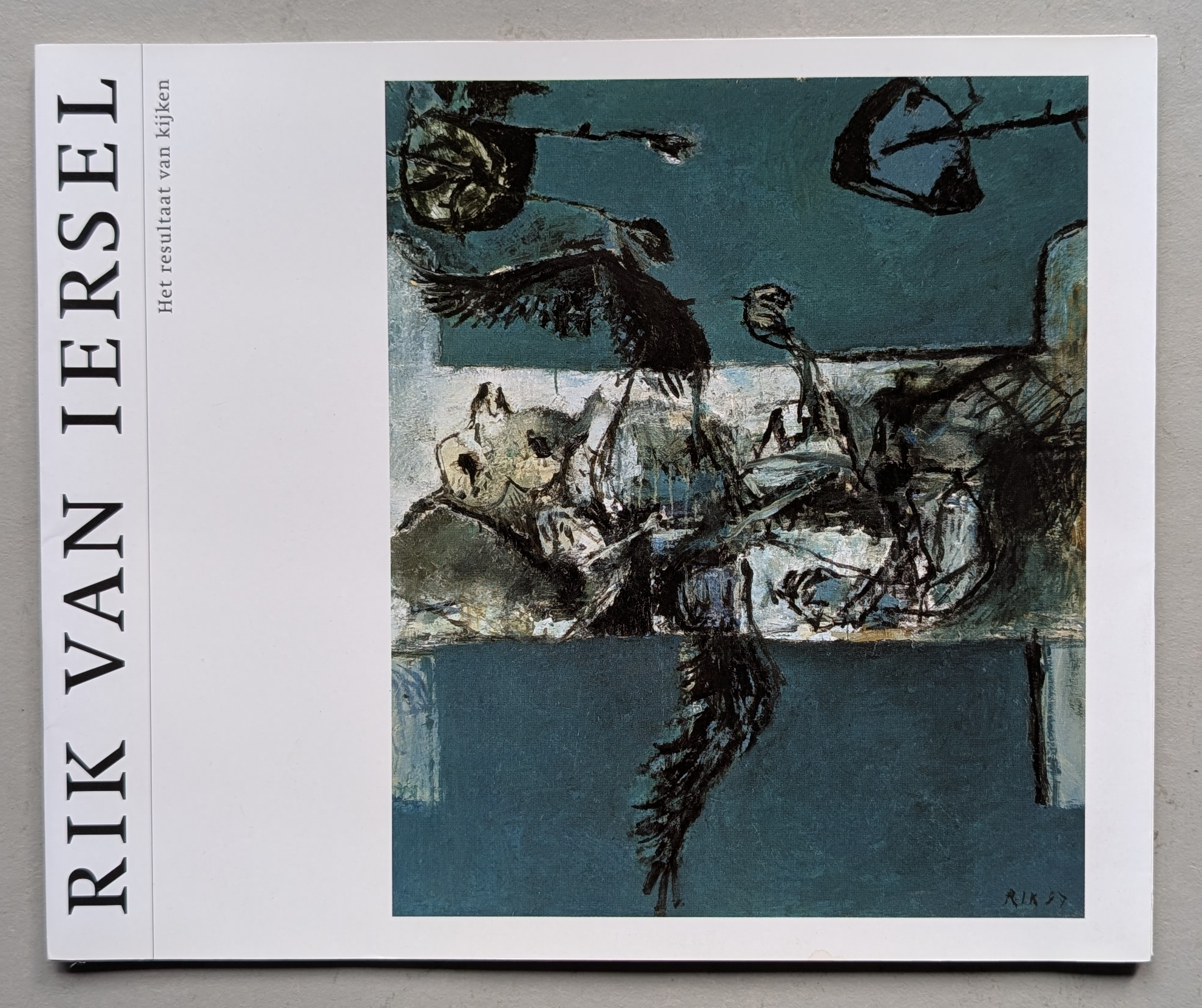
Rik van Iersel was born in 1961 in Maastricht, Netherlands. He currently resides and works in Eindhoven. In the early stages of his career, van Iersel delved into the realm of cartoon illustration. However, he eventually shifted his artistic focus to the possibilities of painting, both technically and subjectively. Despite his lack of formal education, van Iersel’s work aligns with the ethos of Art Brut, celebrating marginalized and outsider artists, and the COBRA movement, which saw a resurgence of expressionism.
Over the years, van Iersel has honed a unique collection of raw and authentic subject matter, blending his everyday experiences with his internal musings. Painting, for him, is a never-ending and all-consuming journey of discovery. It allows him to satisfy his constant curiosity and explore the complexities of human relationships in all its forms. The act of painting itself is a powerful form of communication for van Iersel, with the dynamic nature of the process fueling his artistic expression. His use of thick, vibrant paints, charged color palettes, bold and determined strokes, and free-flowing sketches and textures reveal a raw and unrestrained approach to art. The elongated body structures, distorted facial expressions, and whimsical lines all contribute to the idiosyncratic nature of van Iersel’s work, displaying both intense psychology and childlike innocence.
www.ftn-books.com has an excellent collection of van iersel publications.
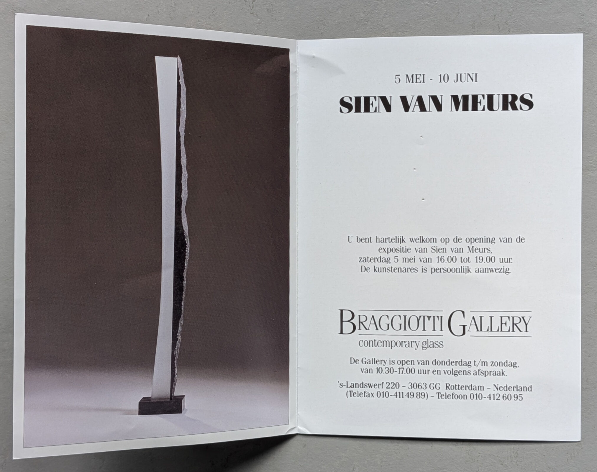
Sien van Meurs (born 1953 in Landsmeer, passed away 2018 in Almelo, both in the Netherlands) was a Dutch glass artist. A hallmark of Sien van Meurs’ work is the combination of glass with stone and metal.
She studied at the Stockholm Art Academy in Sweden, and at the Orrefors Glass School in Sweden, as well as at the Gerrit Rietveld Academy in the Glass Atelier in Amsterdam, Netherlands. She served as head of the glass department at the National College of Art and Design in Dublin, Ireland, and taught at institutions in England, Sweden, Canada, and the USA.
Sien van Meurs’ first exhibition was “Via Venice to Ebeltoft” at the Glasmuseet Ebeltoft in Denmark in 1997, and her last exhibition was “A Selection from The Permanent Collection” at the Glasmuseet Ebeltoft in 2010. While Sien van Meurs is most commonly exhibited in Denmark, she has also had shows in Germany, Switzerland, Austria, and the Netherlands, as well as in Michigan, USA. Her works can be found in, among other places, the Museum of Glass Art in Ebeltoft, Denmark.
www.ftn-books.com has just added another van Meurs item to its inventory.
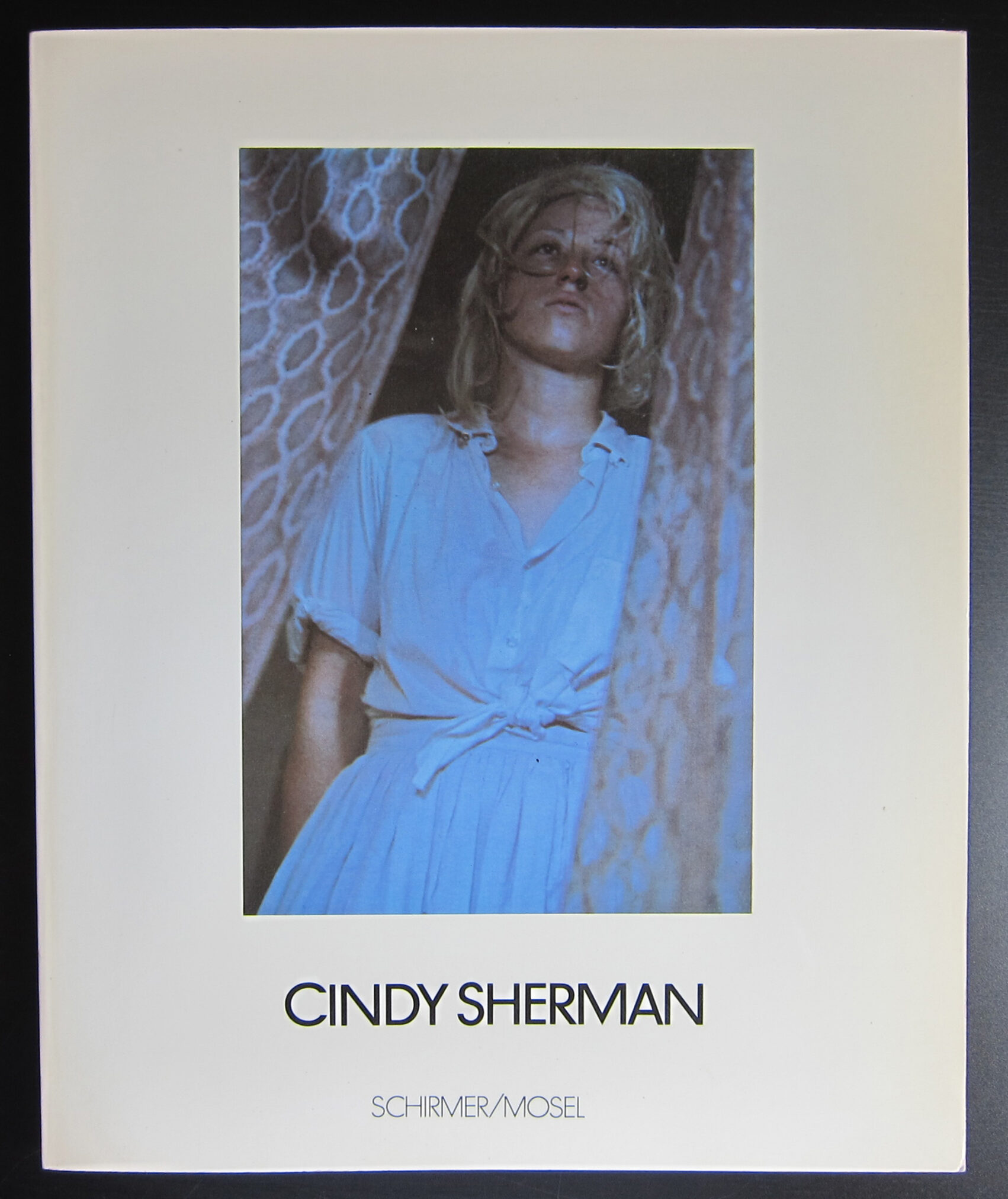
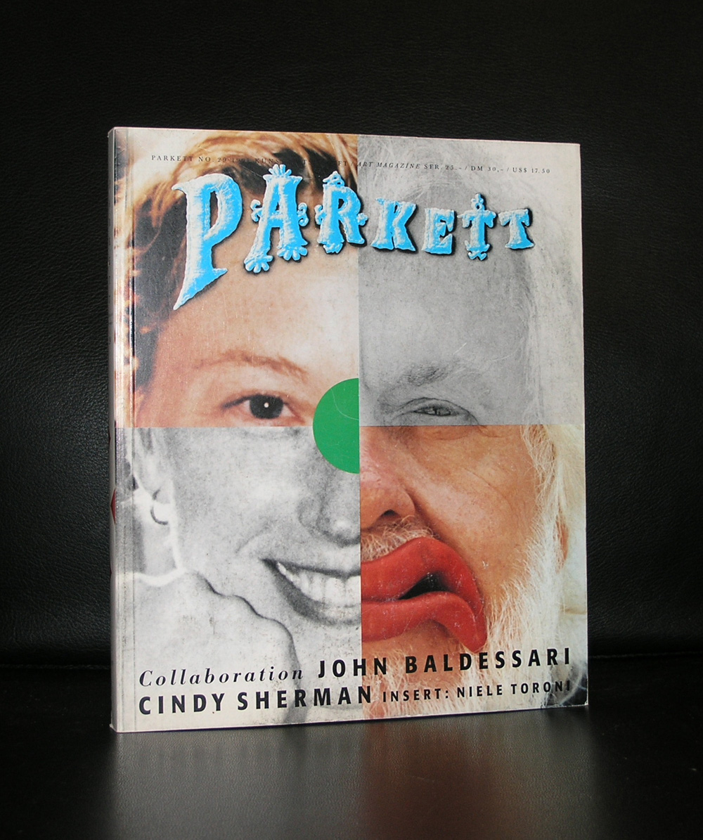
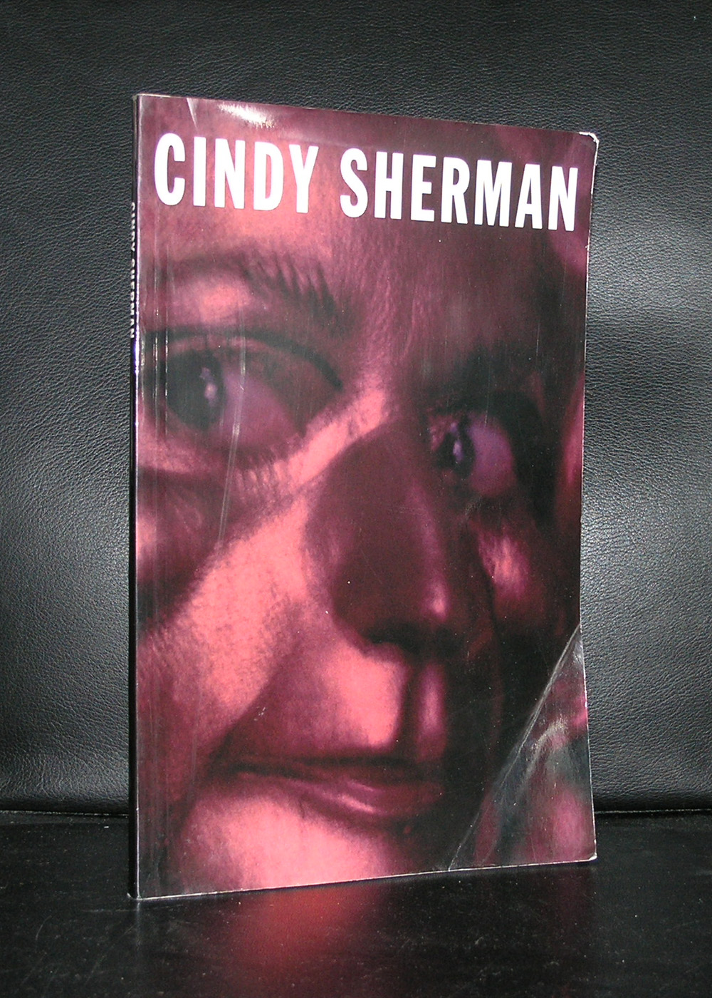
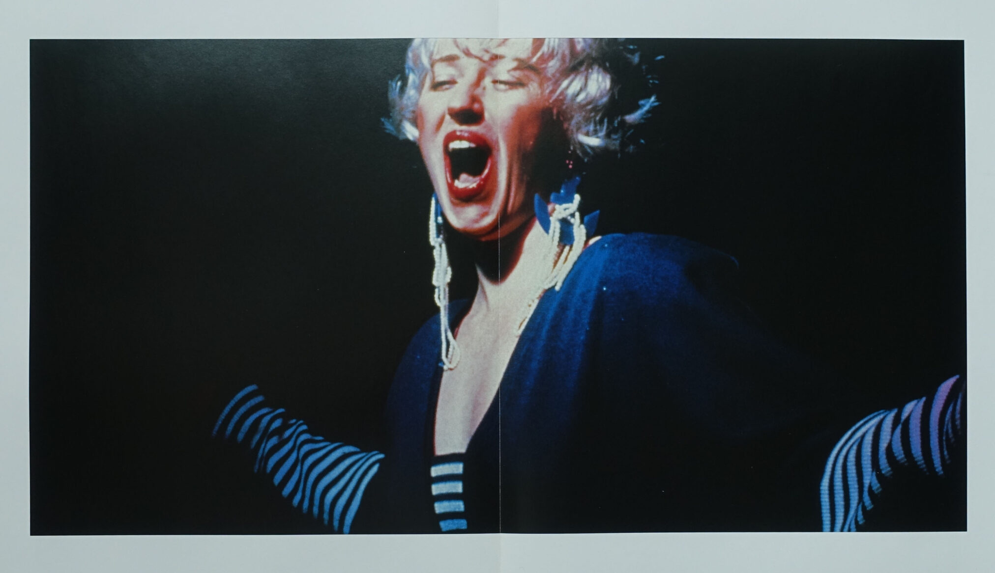
Throughout a span of forty years, Cindy Sherman has delved into the intricacies of identity, musing with the visual and cultural norms found within art, celebrity, gender, and photography. As a member of the Pictures Generation, alongside other notable artists such as Richard Prince, Louise Lawler, Sherrie Levine, and Robert Longo, she emerged during the 1970s, responding to the inundation of mass media with both witty satire and insightful critique. Utilizing material from advertising, film, television, and magazines, they repurposed it in their artwork.
Sherman has always been intrigued by the concept of donning various identities. As she once revealed, “I yearn to seize every day as if it were Halloween, dressing up and immersing myself in the outside world as a peculiar character.”
Not long after her move to New York, she produced her renowned series “Untitled Film Stills” (1977-1980). Here, she transforms herself into different personas, capturing her image within carefully curated settings with specific accouterments, creating scenes reminiscent of mid-20th-century B movies. Creating these works at the young age of 23, Sherman relies on archetypal female characters and their caricatures, such as the dejected femme fatale, the unhappy homemaker, the jilted lover, and the vulnerable innocent. Using cinematic techniques to structure these photographs, they bring to mind traditional film stills used for promoting movies, which inspired the series’ title. The 70 Film Stills immediately sparked discussions on feminism, postmodernism, and representation, solidifying their place as her most renowned works.
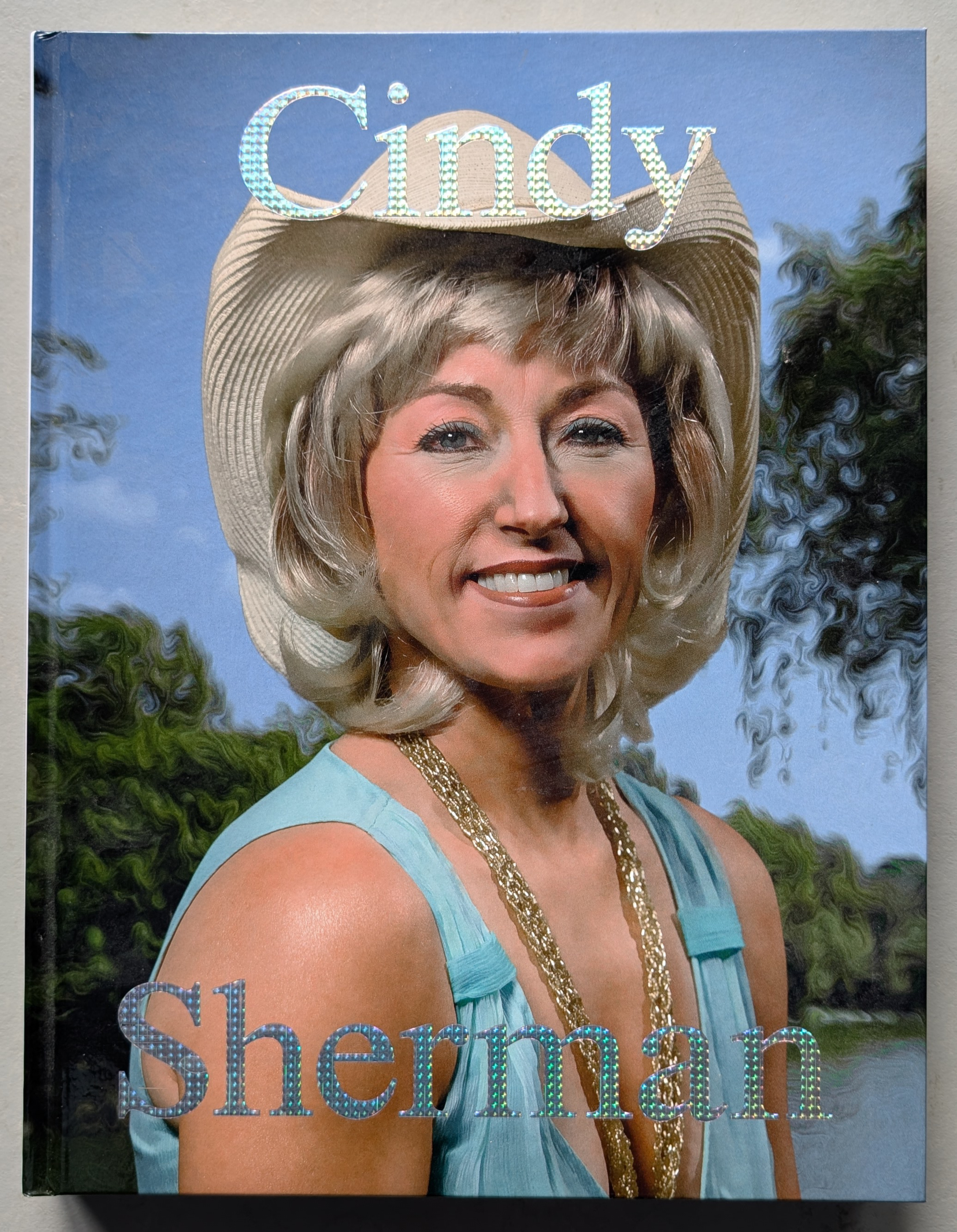
Since the beginning of her career, Sherman has continually reinvented herself, showcasing the myriad of human archetypes and preconceptions through her art. Working primarily in series, she delves into themes such as centerfolds (1981) and society portraits (2008), always improvising and challenging traditional norms.
One of her well-known works, Untitled #216 from her history portraits (1981), highlights her use of dramatic effects to embody various roles without trying to conceal her efforts. Often, her wigs are askew, her prosthetics are peeling, and her makeup is poorly blended, purposely drawing attention to the artificiality of these fabrications and acting as a metaphor for the artificiality of identity construction.
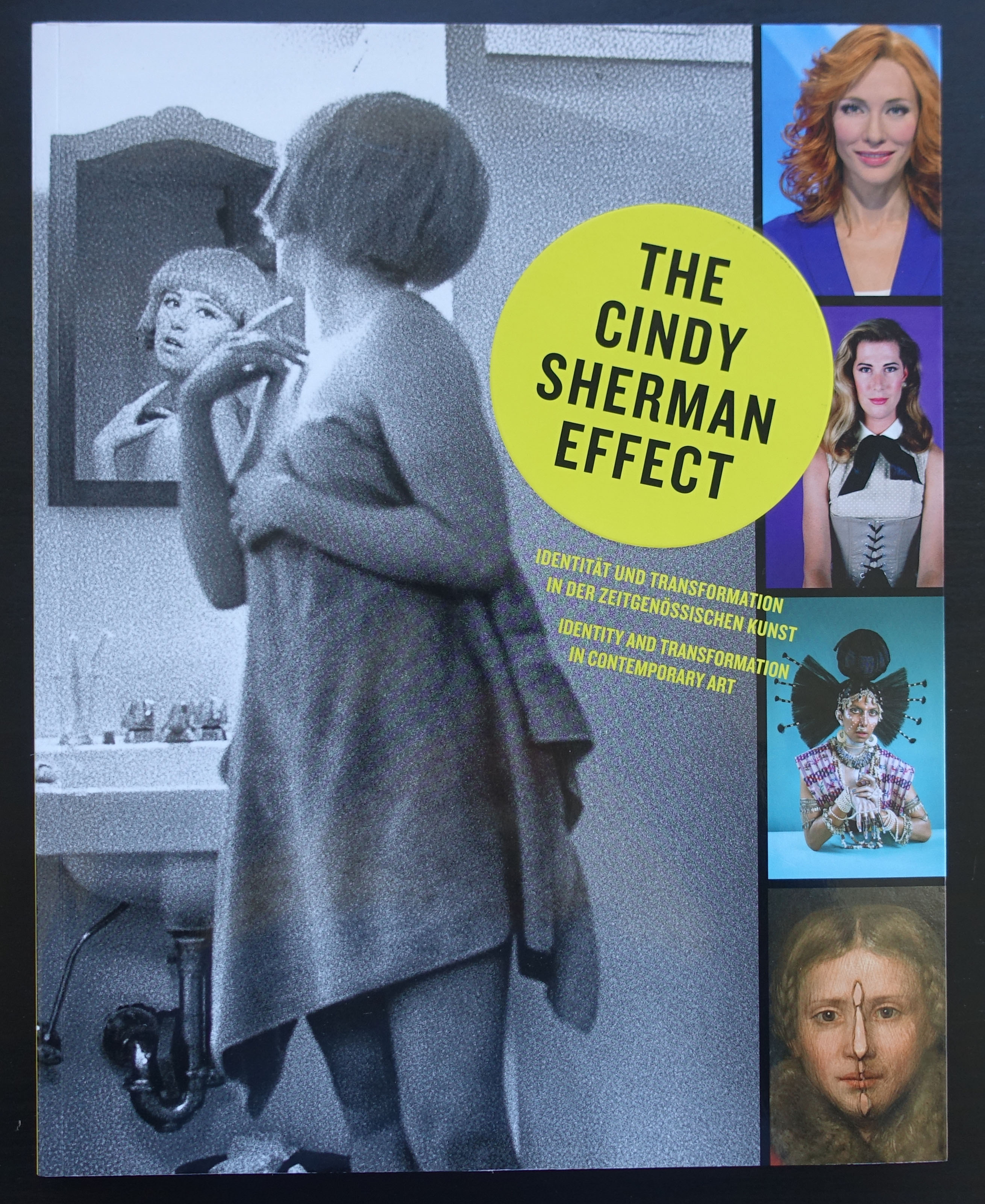
While Sherman does occasionally portray glamorous characters, she has always been drawn to the grotesque. In the 1980s and 1990s, she captured the world’s bizarre and unattractive side through series such as the disasters (1986-89) and the sex pictures (1992), presenting explicit and visceral images that confront the viewer. As she stated in 1986, “I’m disgusted with people’s obsession with beauty; I find the other side much more intriguing”. During this time, the media was flooded with images of sick bodies during the AIDS crisis, adding a poignant layer to her exploration of the grotesque and the various forms of violence inflicted upon the body. Throughout her work, Sherman challenges the visual stereotypes we use to categorize the world, shedding light on their artificiality and ambiguity and questioning their accuracy in understanding a complex reality.
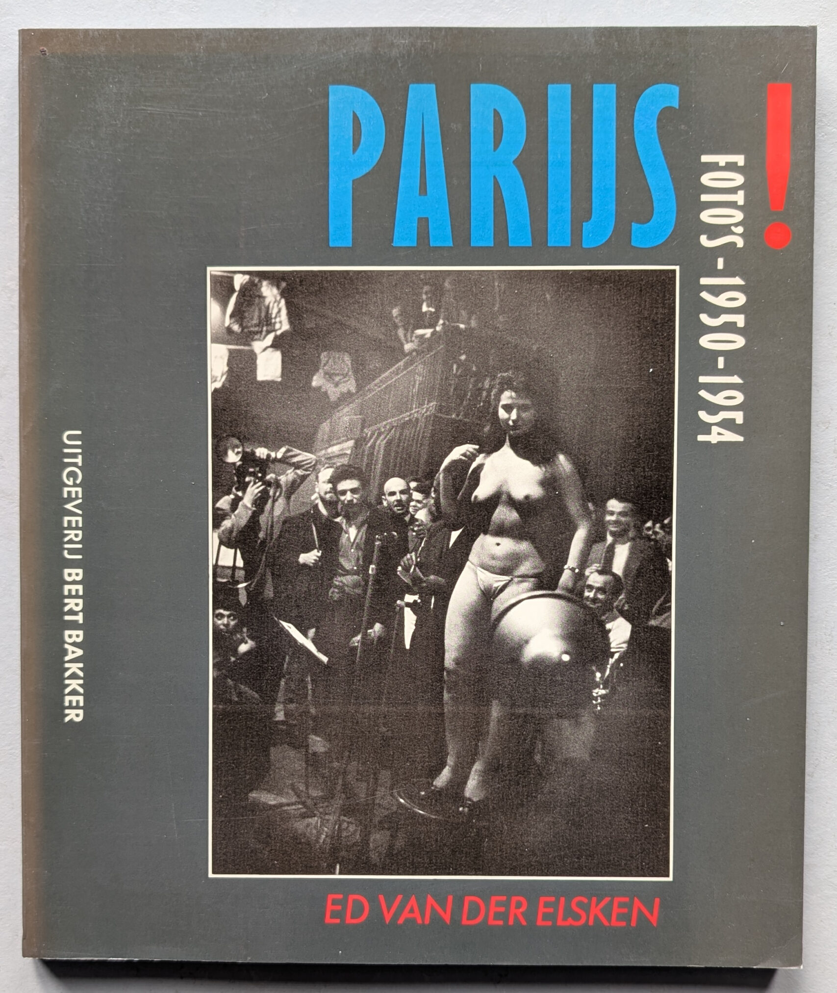
A woman sits on a café terrace with closed eyes, a young woman and man standing to her right, their gazes empty and distant. Three spherical hanging lamps and their reflections illuminate the nocturnal scene, printed in velvety shades of black. This is the opening photo of A Love Story in Saint Germain des Prés, the photoromance that propelled Ed van der Elsken to international fame in 1956. Ann and Manuel, the standing characters, are the main protagonists in this tale of doomed love. The backdrop is the life of a group of young people on the fringes of post-war Paris. They hang out, drink and smoke hash in cafés, dance frenziedly to jazz music, and live on the streets or in cheap hotels. The photographer was personally involved with his subjects. In fact, Manuel Van der Elsken was his alter ego, and the book is a tribute to artist and muse Vali Myers. She dominates this image, captured from a low angle – and many others in A Love Story.
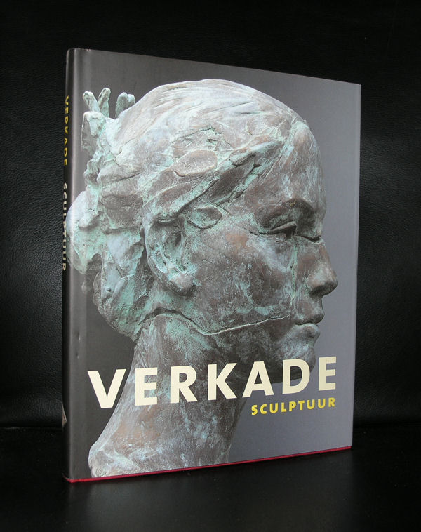
Kees Verkade (1941-2020) was a highly acclaimed Dutch sculptor of the 20th century, renowned for his expressive and realistic sculptures.
His works, often crafted in bronze, portray people in motion: dancing, playing sports, and mother-child relationships are recurring themes in his oeuvre. With his masterful command of bronze, Verkade evokes a sense of lightness and movement, making his sculptures beloved worldwide. His ability to realistically depict the texture and dynamics of the human body has earned him respect and high demand as an artist Verkade’s work embodies humanity and captures both the power of movement and the vulnerability of life. Through his art, he brings everyday life to life. Until 1970, Verkade worked in his studio in Zandvoort, creating sculptures and monumental works for various municipalities, including Haarlem, Zandvoort, Groningen, Drachten, and Amsterdam. After 1970, he gained international recognition with exhibitions in galleries in London, Paris, and the United States. In 1979, Verkade relocated to Monaco, where he passed away in 2020.
Verkade’s work can be found all over the world, in public spaces, museums, and private collections. His art is appreciated for the way he portrays universal human experiences.
www.ftn-books.com has the most important tilte on Verkade now available.
Artist/ Author: Oliver Boberg
Title : Memorial
Publisher: Oliver Boberg
Measurements: Frame measures 51 x 42 cm. original C print is 35 x 25 cm.
Condition: mint
signed by Oliver Boberg in pen and numbered 14/20 from an edition of 20